22.6 Geodemographic Classification
Example by Nick Bearman
#Load libraries
library(scales)
library(ggplot2)


#set up data and data frame
oac_names <-
    c(
        "Blue Collar Communities",
        "City Living",
        "Countryside",
        "Prospering Suburbs",
        "Constrained by Circumstances",
        "Typical Traits",
        "Multicultural"
    )

broadsheets <- c(73.2, 144, 103.9, 109.1, 78.2, 97.1, 120.2)
oac_broadsheets <- data.frame(oac_names, broadsheets)
#convert the percentage values (e.g. 144%) to decimal increase or decrease (e.g. 0.44)
oac_broadsheets$broadsheets <-  broadsheets / 100 - 1

oac_broadsheets
## oac_names broadsheets
## 1 Blue Collar Communities -0.268
## 2 City Living 0.440
## 3 Countryside 0.039
## 4 Prospering Suburbs 0.091
## 5 Constrained by Circumstances -0.218
## 6 Typical Traits -0.029
## 7 Multicultural 0.202plot each group’s percentage difference from the mean
#select the colours we are going to use
my_colour <-
    c("#33A1C9",
      "#FFEC8B",
      "#A2CD5A",
      "#CD7054",
      "#B7B7B7",
      "#9F79EE",
      "#FCC08F")

#plot the graph - this has several bits to it
#the first three lines setup the data and type of graph
ggplot(oac_broadsheets, aes(oac_names, broadsheets)) +
    geom_bar(stat = "identity",
             fill = my_colour,
             position = "identity") +
    theme(axis.text.x = element_text(
        angle = 90,
        hjust = 1,
        vjust = 1,
        size = 12
    )) +
    #this line add the lables to each bar
    geom_text(aes(
        label = paste(round(broadsheets * 100, digits = 0), "%"),
        vjust = ifelse(broadsheets >= 0,-0.5, 1.5)
    ), size = 3) +
    #these lines as the axis labels and these fonts
    theme(axis.title.x = element_text(size = 12)) +
    theme(axis.title.y = element_text(size = 12)) +
    scale_y_continuous("Difference from national average for broadsheet", labels = percent_format()) +
    scale_x_discrete("OAC SuperGroups")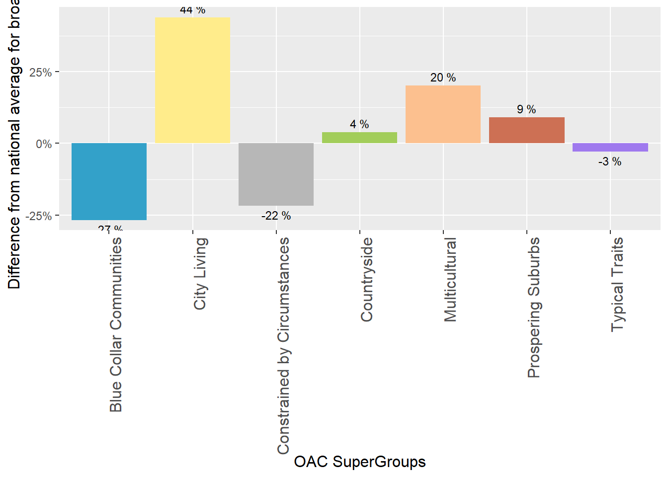
Create plot for another variable
tabloids <- c(110.8, 82.2, 104.9, 94.5, 108.4, 96.4, 96.0)
oac_tabloids <- data.frame(oac_names, tabloids)

#convert the percentage values (e.g. 144%) to decimal increase or decrease (e.g. 0.44)
oac_tabloids$tabloids <-  tabloids / 100 - 1

oac_tabloids
## oac_names tabloids
## 1 Blue Collar Communities 0.108
## 2 City Living -0.178
## 3 Countryside 0.049
## 4 Prospering Suburbs -0.055
## 5 Constrained by Circumstances 0.084
## 6 Typical Traits -0.036
## 7 Multicultural -0.040# plot
ggplot(oac_tabloids, aes(oac_names, tabloids)) +
geom_bar(stat = "identity",
fill = my_colour,
position = "identity") +
theme(axis.text.x = element_text(
angle = 90,
hjust = 1,
vjust = 1,
size = 12
)) +
#this line add the lables to each bar
geom_text(aes(
label = paste(round(tabloids * 100, digits = 0), "%"),
vjust = ifelse(tabloids >= 0, -0.5, 1.5)
), size = 3) +
#these lines as the axis labels and these fonts
theme(axis.title.x = element_text(size = 12)) +
theme(axis.title.y = element_text(size = 12)) +
scale_y_continuous("Difference from national average for tabloids", labels = percent_format()) +
scale_x_discrete("OAC SuperGroups")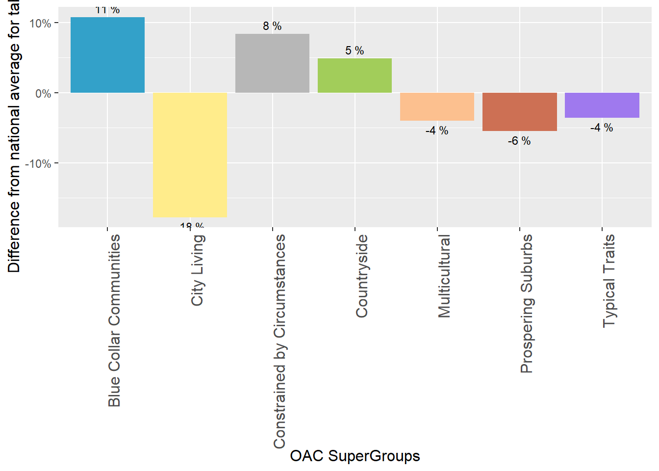
To visualize how these two variables are distributed in a location such as Liverpool in this case.
We load the shapefile
#load library
library(maptools)


#download file
# download.file("https://raw.githubusercontent.com/nickbearman/r-geodemographic-analysis-20140710/master/liverpool_OA.zip", "liverpool_OA.zip", method = "internal") #if you are running this on OSX, you will need to replace method = "internal" with method = "curl"

#unzip file
unzip("images/liverpool_OA.zip")


#read in shapefile
liverpool <- readShapeSpatial('liverpool_OA/liverpool', proj4string = CRS("+init=epsg:27700"))

plot(liverpool)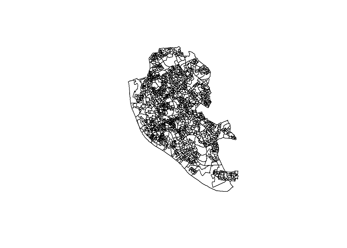
The dataset can be attained here select 2011 OAC Clusters and Names csv (1.1 Mb ZIP)
library(tidyverse)

#read in OAC by OA csv file
OAC <- rio::import("images/2011oacclustersandnamescsvv2.zip") %>%
    select(
        "Output Area Code",
        "Supergroup Name",
        "Supergroup Code",
        "Group Name",
        "Group Code",
        "Subgroup Name",
        "Subgroup Code"
    ) %>%
    rename("OA_CODE" = "Output Area Code")
Merge data (OAC) to its location (liverpool)
# check dataset
# head(liverpool@data)
# head(OAC)

#Join OAC classification on to LSOA shapefile
liverpool@data = data.frame(liverpool@data, OAC[match(liverpool@data[, "OA01CD"], OAC[, "OA_CODE"]),]) %>% drop_na()
#Show head of liverpool
head(liverpool@data)
## OA01CD OA01CDOLD OA_CODE Supergroup.Name Supergroup.Code
## 2 E00032987 00BYFA0003 E00032987 Ethnicity Central 3
## 3 E00032988 00BYFA0004 E00032988 Cosmopolitans 2
## 4 E00032989 00BYFA0005 E00032989 Ethnicity Central 3
## 5 E00032990 00BYFA0006 E00032990 Ethnicity Central 3
## 6 E00032991 00BYFA0007 E00032991 Ethnicity Central 3
## 7 E00032992 00BYFA0008 E00032992 Ethnicity Central 3
## Group.Name Group.Code Subgroup.Name
## 2 Ethnic Family Life 3a Established Renting Families
## 3 Students Around Campus 2a Students and Professionals
## 4 Endeavouring Ethnic Mix 3b Multi-Ethnic Professional Service Workers
## 5 Aspirational Techies 3d Old EU Tech Workers
## 6 Endeavouring Ethnic Mix 3b Multi-Ethnic Professional Service Workers
## 7 Endeavouring Ethnic Mix 3b Striving Service Workers
## Subgroup.Code
## 2 3a1
## 3 2a3
## 4 3b3
## 5 3d3
## 6 3b3
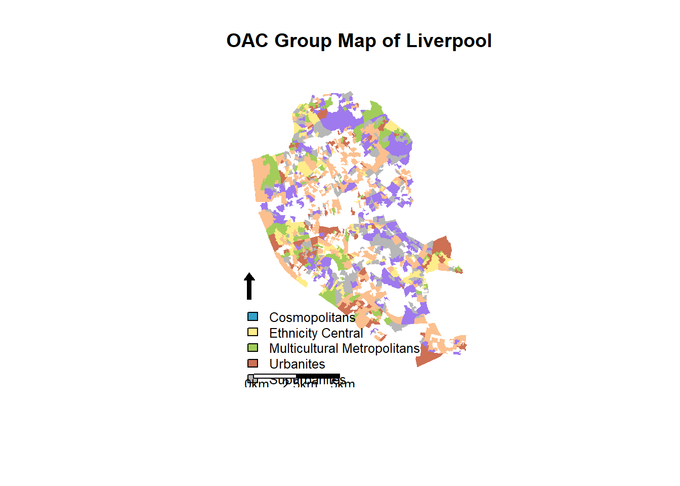
## 7 3b1#Define a set of colours, one for each of the OAC supergroups
my_colour <-
c("#33A1C9",
"#FFEC8B",
"#A2CD5A",
"#CD7054",
"#B7B7B7",
"#9F79EE",
"#FCC08F")
#Create a basic OAC choropleth map
plot(liverpool,
col = my_colour[liverpool@data$Supergroup.Code],
axes = FALSE,
border = NA)
#Name the groups we've used
oac_names <-
liverpool@data %>% select(Supergroup.Name, Supergroup.Code) %>% unique() %>% arrange(Supergroup.Code) %>% select(Supergroup.Name) %>% deframe()
#Add the legend (the oac_names object was created earlier)
legend(
x = 332210,
y = 385752,
legend = oac_names,
fill = my_colour,
bty = "n",
cex = .8,
ncol = 1
)
#Add North Arrow
SpatialPolygonsRescale(
layout.north.arrow(2),
offset = c(332610, 385852),
scale = 1600,
plot.grid = F
)
#Add Scale Bar
SpatialPolygonsRescale(
layout.scale.bar(),
offset = c(333210, 381252),
scale = 5000,
fill = c("white", "black"),
plot.grid = F
)
#Add text to scale bar
text(333410, 380952, "0km", cex = .8)
text(333410 + 2500, 380952, "2.5km", cex = .8)
text(333410 + 5000, 380952, "5km", cex = .8)
#Add a title
title("OAC Group Map of Liverpool")