22.4 Customer Segmentation
22.4.1 Example 1
Continue from the RFM
segment_names <-
    c(
        "Premium",
        "Loyal Customers",
        "Potential Loyalist",
        "New Customers",
        "Promising",
        "Need Attention",
        "About To Churn",
        "At Risk",
        "High Value Churners/Resurrection",
        "Low Value Churners"
    )

recency_lower <- c(4, 2, 3, 4, 3, 2, 2, 1, 1, 1)
recency_upper <- c(5, 5, 5, 5, 4, 3, 3, 2, 1, 2)
frequency_lower <- c(4, 3, 1, 1, 1, 2, 1, 2, 4, 1)
frequency_upper <- c(5, 5, 3, 1, 1, 3, 2, 5, 5, 2)
monetary_lower <- c(4, 3, 1, 1, 1, 2, 1, 2, 4, 1)
monetary_upper <- c(5, 5, 3, 1, 1, 3, 2, 5, 5, 2)

rfm_segments <-
    rfm_segment(
        rfm_result,
        segment_names,
        recency_lower,
        recency_upper,
        frequency_lower,
        frequency_upper,
        monetary_lower,
        monetary_upper
    )

head(rfm_segments, n = 5)


rfm_segments %>%
    count(rfm_segments$segment) %>%
    arrange(desc(n)) %>%
    rename(Count = n)

# median recency
rfm_plot_median_recency(rfm_segments)

# median frequency
rfm_plot_median_frequency(rfm_segments)

# Median Monetary Value
rfm_plot_median_monetary(rfm_segments)
22.4.2 Example 2
Example by Sergey
22.4.2.1 LifeCycle Grids
# loading libraries
library(dplyr)
library(reshape2)
library(ggplot2)

# creating data sample
set.seed(10)
data <- data.frame(
    orderId = sample(c(1:1000), 5000, replace = TRUE),
    product = sample(
        c('NULL', 'a', 'b', 'c'),
        5000,
        replace = TRUE,
        prob = c(0.15, 0.65, 0.3, 0.15)
    )
)
order <- data.frame(orderId = c(1:1000),
                    clientId = sample(c(1:300), 1000, replace = TRUE))
gender <- data.frame(clientId = c(1:300),
                     gender = sample(
                         c('male', 'female'),
                         300,
                         replace = TRUE,
                         prob = c(0.40, 0.60)
                     ))
date <- data.frame(orderId = c(1:1000),
                   orderdate = sample((1:100), 1000, replace = TRUE))
orders <- merge(data, order, by = 'orderId')
orders <- merge(orders, gender, by = 'clientId')
orders <- merge(orders, date, by = 'orderId')
orders <- orders[orders$product != 'NULL',]
orders$orderdate <- as.Date(orders$orderdate, origin = "2012-01-01")
rm(data, date, order, gender)
# reporting date
today <- as.Date('2012-04-11', format = '%Y-%m-%d')
# processing data
orders <-
dcast(
orders,
orderId + clientId + gender + orderdate ~ product,
value.var = 'product',
fun.aggregate = length
)
orders <- orders %>%
group_by(clientId) %>%
mutate(frequency = n(),
recency = as.numeric(today - orderdate)) %>%
filter(orderdate == max(orderdate)) %>%
filter(orderId == max(orderId)) %>%
ungroup()
# exploratory analysis
ggplot(orders, aes(x = frequency)) +
theme_bw() +
scale_x_continuous(breaks = c(1:10)) +
geom_bar(alpha = 0.6, width = 1) +
ggtitle("Dustribution by frequency")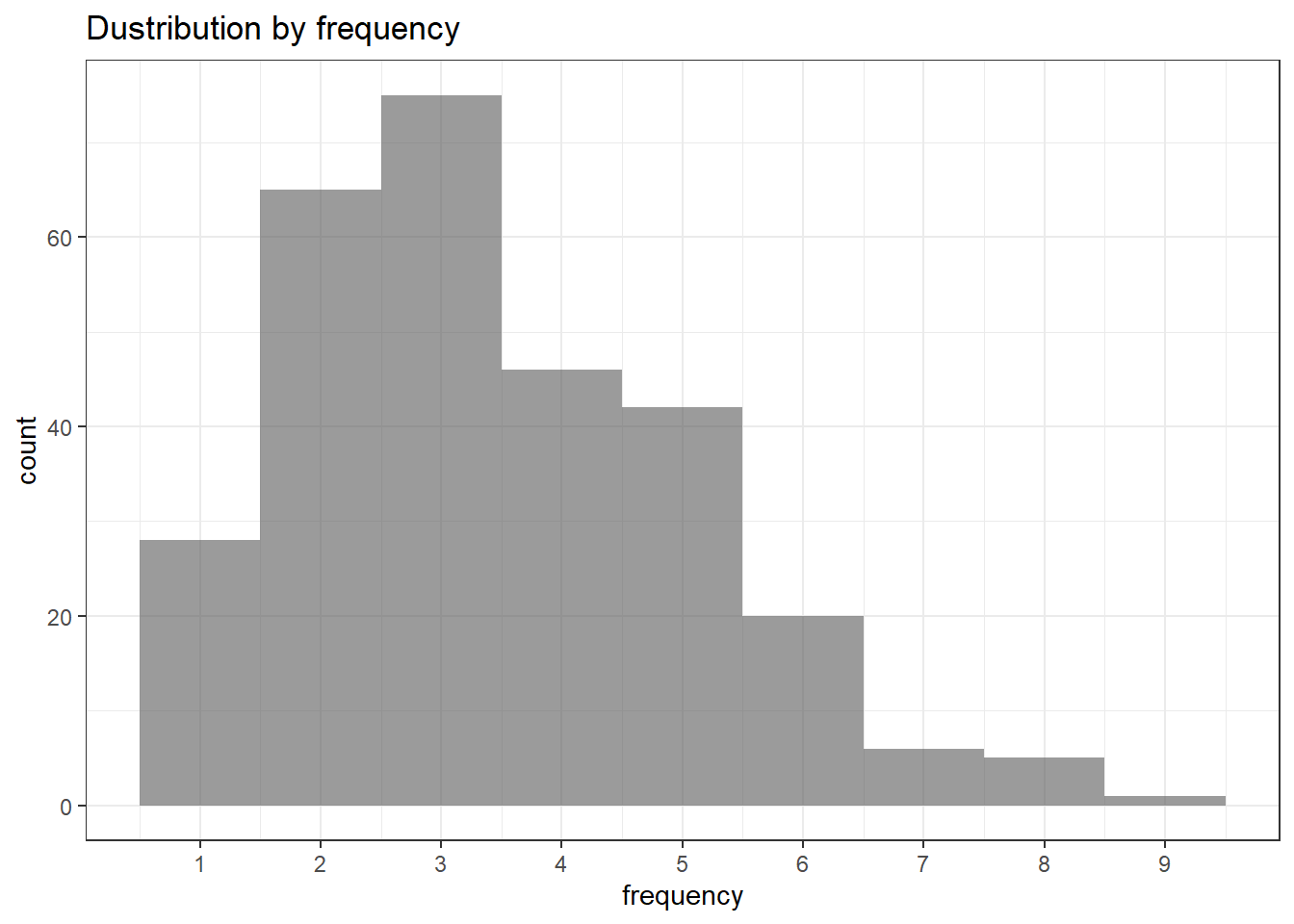
ggplot(orders, aes(x = recency)) +
    theme_bw() +
    geom_bar(alpha = 0.6, width = 1) +
    ggtitle("Dustribution by recency")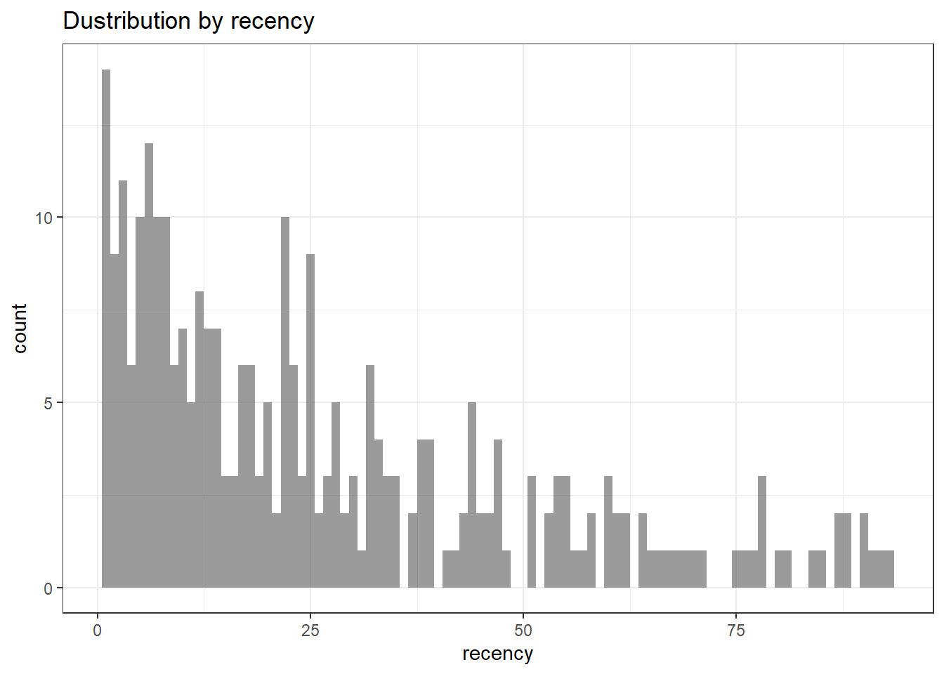
orders.segm <- orders %>%
    mutate(segm.freq = ifelse(between(frequency, 1, 1), '1',
                              ifelse(
                                  between(frequency, 2, 2), '2',
                                  ifelse(between(frequency, 3, 3), '3',
                                         ifelse(
                                             between(frequency, 4, 4), '4',
                                             ifelse(between(frequency, 5, 5), '5', '>5')
                                         ))
                              ))) %>%
    mutate(segm.rec = ifelse(
        between(recency, 0, 6),
        '0-6 days',
        ifelse(
            between(recency, 7, 13),
            '7-13 days',
            ifelse(
                between(recency, 14, 19),
                '14-19 days',
                ifelse(
                    between(recency, 20, 45),
                    '20-45 days',
                    ifelse(between(recency, 46, 80), '46-80 days', '>80 days')
                )
            )
        )
    )) %>%
    # creating last cart feature
    mutate(cart = paste(
        ifelse(a != 0, 'a', ''),
        ifelse(b != 0, 'b', ''),
        ifelse(c != 0, 'c', ''),
        sep = ''
    )) %>%
    arrange(clientId)

# defining order of boundaries
orders.segm$segm.freq <-
    factor(orders.segm$segm.freq, levels = c('>5', '5', '4', '3', '2', '1'))
orders.segm$segm.rec <-
    factor(
        orders.segm$segm.rec,
        levels = c(
            '>80 days',
            '46-80 days',
            '20-45 days',
            '14-19 days',
            '7-13 days',
            '0-6 days'
        )
    )
lcg <- orders.segm %>%
group_by(segm.rec, segm.freq) %>%
summarise(quantity = n()) %>%
mutate(client = 'client') %>%
ungroup()
lcg.matrix <-
dcast(lcg,
segm.freq ~ segm.rec,
value.var = 'quantity',
fun.aggregate = sum)
ggplot(lcg, aes(x = client, y = quantity, fill = quantity)) +
theme_bw() +
theme(panel.grid = element_blank()) +
geom_bar(stat = 'identity', alpha = 0.6) +
geom_text(aes(y = max(quantity) / 2, label = quantity), size = 4) +
facet_grid(segm.freq ~ segm.rec) +
ggtitle("LifeCycle Grids")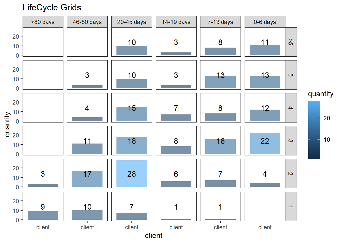
lcg.adv <- lcg %>%
    mutate(
        rec.type = ifelse(
            segm.rec %in% c("> 80 days", "46 - 80 days", "20 - 45 days"),
            "not recent",
            "recent"
        ),
        freq.type = ifelse(segm.freq %in% c(" >
          5", "5", "4"), "frequent", "infrequent"),
        customer.type = interaction(rec.type, freq.type)
    )

ggplot(lcg.adv, aes(x = client, y = quantity, fill = customer.type)) +
    theme_bw() +
    theme(panel.grid = element_blank()) +
    facet_grid(segm.freq ~ segm.rec) +
    geom_bar(stat = 'identity', alpha = 0.6) +
    geom_text(aes(y = max(quantity) / 2, label = quantity), size = 4) +
    ggtitle("LifeCycle Grids")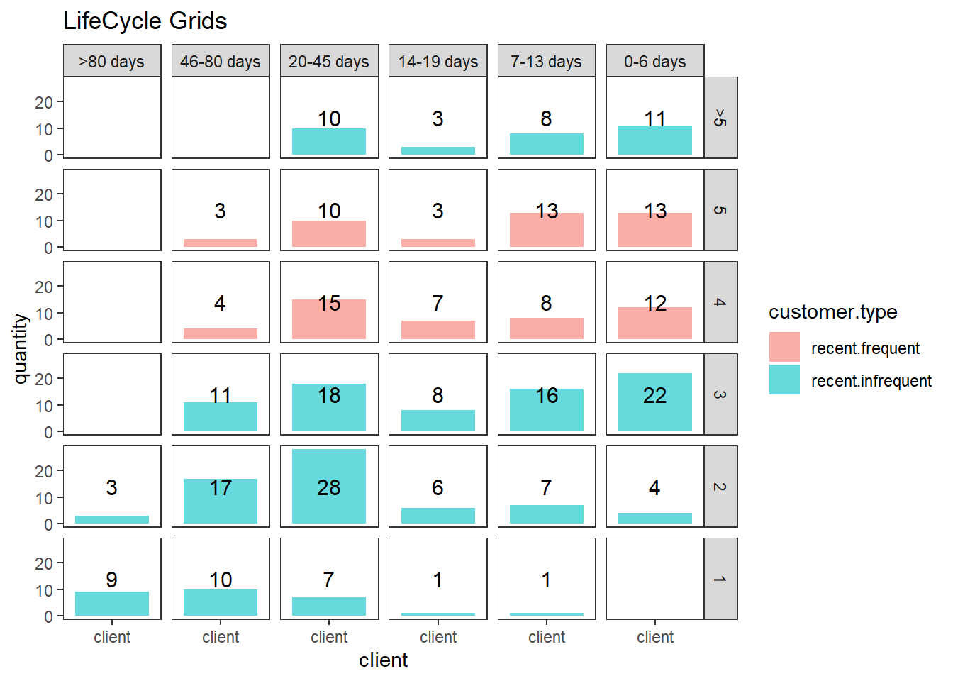
# with background
ggplot(lcg.adv, aes(x = client, y = quantity, fill = customer.type)) +
    theme_bw() +
    theme(panel.grid = element_blank()) +
    geom_rect(
        aes(fill = customer.type),
        xmin = -Inf,
        xmax = Inf,
        ymin = -Inf,
        ymax = Inf,
        alpha = 0.1
    ) +
    facet_grid(segm.freq ~ segm.rec) +
    geom_bar(stat = 'identity', alpha = 0.7) +
    geom_text(aes(y = max(quantity) / 2, label = quantity), size = 4) +
    ggtitle("LifeCycle Grids")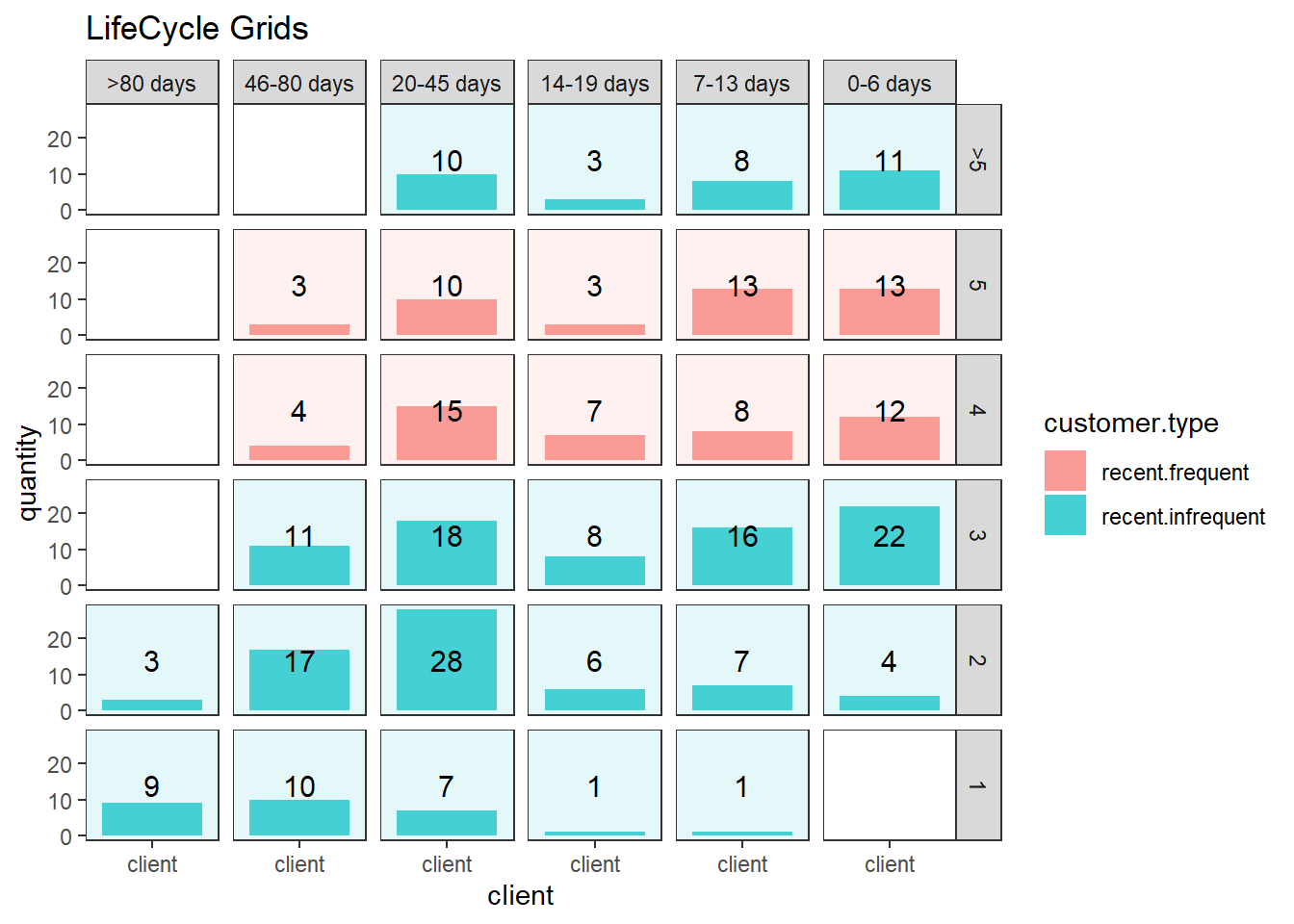
lcg.sub <- orders.segm %>%
    group_by(gender, cart, segm.rec, segm.freq) %>%
    summarise(quantity = n()) %>%
    mutate(client = 'client') %>%
    ungroup()

ggplot(lcg.sub, aes(x = client, y = quantity, fill = gender)) +
    theme_bw() +
    scale_fill_brewer(palette = 'Set1') +
    theme(panel.grid = element_blank()) +
    geom_bar(stat = 'identity',
             position = 'fill' ,
             alpha = 0.6) +
    facet_grid(segm.freq ~ segm.rec) +
    ggtitle("LifeCycle Grids by gender (propotion)")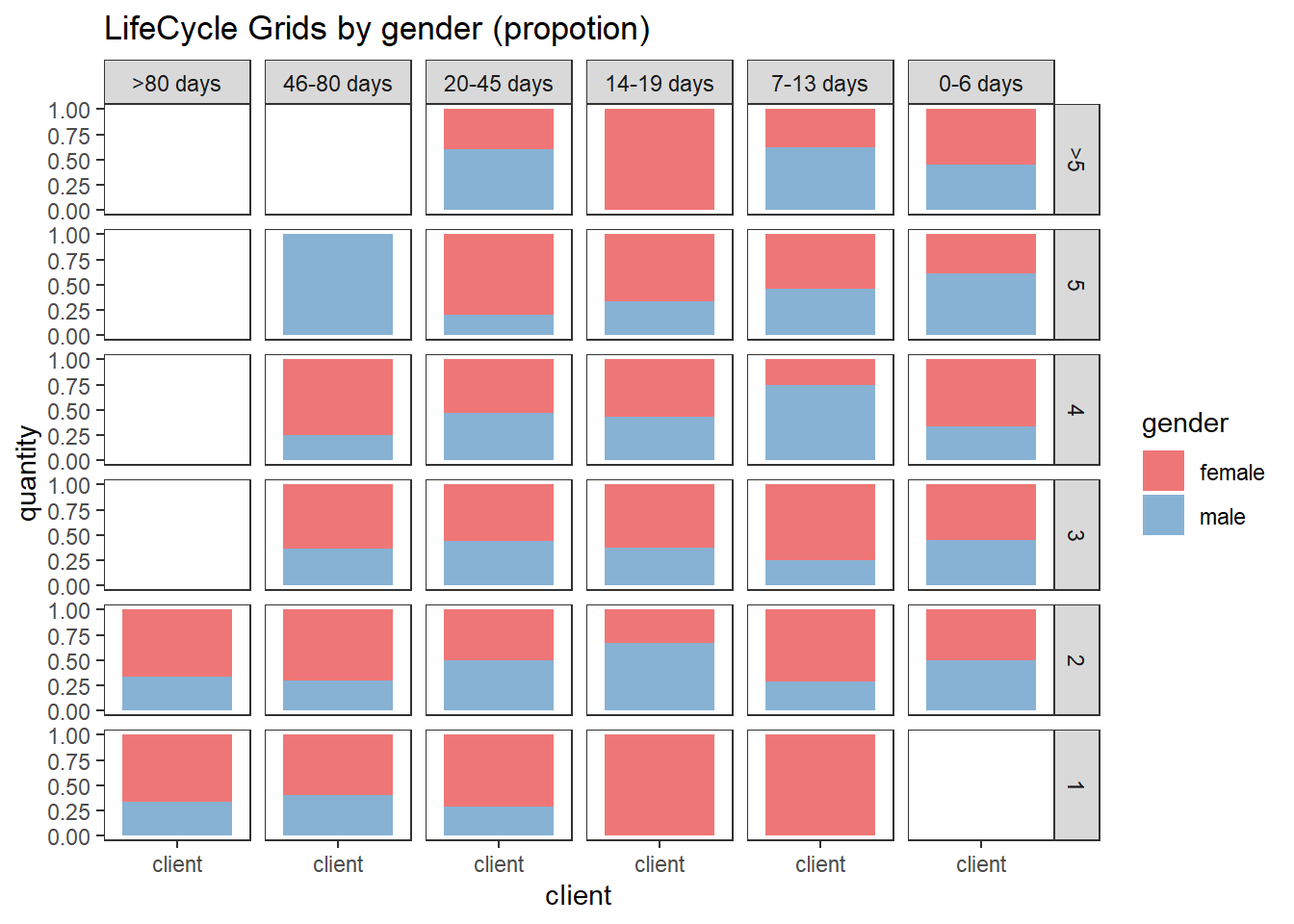
ggplot(lcg.sub, aes(x = gender, y = quantity, fill = cart)) +
    theme_bw() +
    scale_fill_brewer(palette = 'Set1') +
    theme(panel.grid = element_blank()) +
    geom_bar(stat = 'identity',
             position = 'fill' ,
             alpha = 0.6) +
    facet_grid(segm.freq ~ segm.rec) +
    ggtitle("LifeCycle Grids by gender and last cart (propotion)")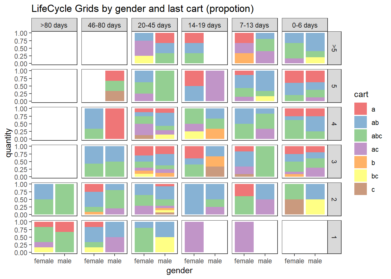
22.4.2.2 CLV & CAC
calculate customer acquisition cost (CAC) and customer lifetime value (CLV)
# loading libraries
library(dplyr)
library(reshape2)
library(ggplot2)

# creating data sample
set.seed(10)
data <- data.frame(
    orderId = sample(c(1:1000), 5000, replace = TRUE),
    product = sample(
        c('NULL', 'a', 'b', 'c'),
        5000,
        replace = TRUE,
        prob = c(0.15, 0.65, 0.3, 0.15)
    )
)
order <- data.frame(orderId = c(1:1000),
                    clientId = sample(c(1:300), 1000, replace = TRUE))
gender <- data.frame(clientId = c(1:300),
                     gender = sample(
                         c('male', 'female'),
                         300,
                         replace = TRUE,
                         prob = c(0.40, 0.60)
                     ))
date <- data.frame(orderId = c(1:1000),
                   orderdate = sample((1:100), 1000, replace = TRUE))
orders <- merge(data, order, by = 'orderId')
orders <- merge(orders, gender, by = 'clientId')
orders <- merge(orders, date, by = 'orderId')
orders <- orders[orders$product != 'NULL', ]
orders$orderdate <- as.Date(orders$orderdate, origin = "2012-01-01")

# creating data frames with CAC and Gross margin
cac <-
    data.frame(clientId = unique(orders$clientId),
               cac = sample(c(10:15), 288, replace = TRUE))
gr.margin <-
    data.frame(product = c('a', 'b', 'c'),
               grossmarg = c(1, 2, 3))

rm(data, date, order, gender)

# reporting date
today <- as.Date('2012-04-11', format = '%Y-%m-%d')

# calculating customer lifetime value
orders <- merge(orders, gr.margin, by = 'product')

clv <- orders %>%
    group_by(clientId) %>%
    summarise(clv = sum(grossmarg)) %>%
    ungroup()

# processing data
orders <-
    dcast(
        orders,
        orderId + clientId + gender + orderdate ~ product,
        value.var = 'product',
        fun.aggregate = length
    )

orders <- orders %>%
    group_by(clientId) %>%
    mutate(frequency = n(),
           recency = as.numeric(today - orderdate)) %>%
    filter(orderdate == max(orderdate)) %>%
    filter(orderId == max(orderId)) %>%
    ungroup()

orders.segm <- orders %>%
    mutate(segm.freq = ifelse(between(frequency, 1, 1), '1',
                              ifelse(
                                  between(frequency, 2, 2), '2',
                                  ifelse(between(frequency, 3, 3), '3',
                                         ifelse(
                                             between(frequency, 4, 4), '4',
                                             ifelse(between(frequency, 5, 5), '5', '>5')
                                         ))
                              ))) %>%
    mutate(segm.rec = ifelse(
        between(recency, 0, 6),
        '0-6 days',
        ifelse(
            between(recency, 7, 13),
            '7-13 days',
            ifelse(
                between(recency, 14, 19),
                '14-19 days',
                ifelse(
                    between(recency, 20, 45),
                    '20-45 days',
                    ifelse(between(recency, 46, 80), '46-80 days', '>80 days')
                )
            )
        )
    )) %>%
    # creating last cart feature
    mutate(cart = paste(
        ifelse(a != 0, 'a', ''),
        ifelse(b != 0, 'b', ''),
        ifelse(c != 0, 'c', ''),
        sep = ''
    )) %>%
    arrange(clientId)

# defining order of boundaries
orders.segm$segm.freq <-
    factor(orders.segm$segm.freq, levels = c('>5', '5', '4', '3', '2', '1'))
orders.segm$segm.rec <-
    factor(
        orders.segm$segm.rec,
        levels = c(
            '>80 days',
            '46-80 days',
            '20-45 days',
            '14-19 days',
            '7-13 days',
            '0-6 days'
        )
    )

orders.segm <- merge(orders.segm, cac, by = 'clientId')
orders.segm <- merge(orders.segm, clv, by = 'clientId')

lcg.clv <- orders.segm %>%
    group_by(segm.rec, segm.freq) %>%
    summarise(quantity = n(),
              # calculating cumulative CAC and CLV
              cac = sum(cac),
              clv = sum(clv)) %>%
    ungroup() %>%
    # calculating CAC and CLV per client
    mutate(cac1 = round(cac / quantity, 2),
           clv1 = round(clv / quantity, 2))

lcg.clv <-
    reshape2::melt(lcg.clv, id.vars = c('segm.rec', 'segm.freq', 'quantity'))

ggplot(lcg.clv[lcg.clv$variable %in% c('clv', 'cac'), ], aes(x = variable, y =
                                                                 value, fill = variable)) +
    theme_bw() +
    theme(panel.grid = element_blank()) +
    geom_bar(stat = 'identity', alpha = 0.6, aes(width = quantity / max(quantity))) +
    geom_text(aes(y = value, label = value), size = 4) +
    facet_grid(segm.freq ~ segm.rec) +
    ggtitle("LifeCycle Grids - CLV vs CAC (total)")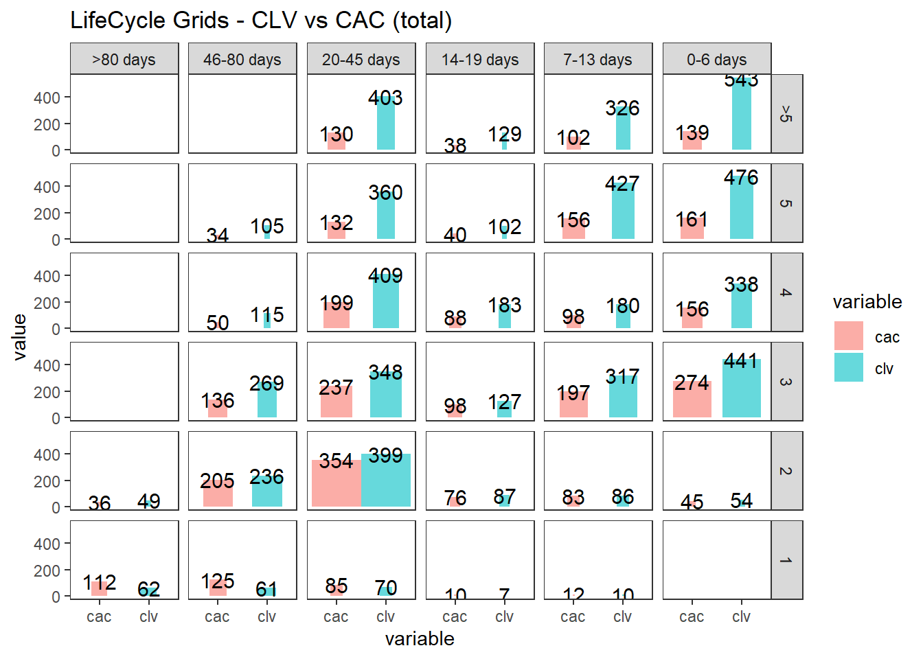
ggplot(lcg.clv[lcg.clv$variable %in% c('clv1', 'cac1'), ], aes(x = variable, y =
                                                                   value, fill = variable)) +
    theme_bw() +
    theme(panel.grid = element_blank()) +
    geom_bar(stat = 'identity', alpha = 0.6, aes(width = quantity / max(quantity))) +
    geom_text(aes(y = value, label = value), size = 4) +
    facet_grid(segm.freq ~ segm.rec) +
    ggtitle("LifeCycle Grids - CLV vs CAC (average)")
22.4.2.3 Cohort Analysis
combine customers through common characteristics to split customers into homogeneous groups
# loading libraries
library(dplyr)
library(reshape2)
library(ggplot2)
library(googleVis)

set.seed(10)
# creating orders data sample
data <- data.frame(
    orderId = sample(c(1:5000), 25000, replace = TRUE),
    product = sample(
        c('NULL', 'a', 'b', 'c'),
        25000,
        replace = TRUE,
        prob = c(0.15, 0.65, 0.3, 0.15)
    )
)
order <- data.frame(orderId = c(1:5000),
                    clientId = sample(c(1:1500), 5000, replace = TRUE))
date <- data.frame(orderId = c(1:5000),
                   orderdate = sample((1:500), 5000, replace = TRUE))
orders <- merge(data, order, by = 'orderId')
orders <- merge(orders, date, by = 'orderId')
orders <- orders[orders$product != 'NULL',]
orders$orderdate <- as.Date(orders$orderdate, origin = "2012-01-01")
rm(data, date, order)
# creating data frames with CAC, Gross margin, Campaigns and Potential CLV
gr.margin <-
    data.frame(product = c('a', 'b', 'c'),
               grossmarg = c(1, 2, 3))
campaign <- data.frame(clientId = c(1:1500),
                       campaign = paste('campaign', sample(c(1:7), 1500, replace = TRUE), sep =
                                            ' '))
cac <-
    data.frame(campaign = unique(campaign$campaign),
               cac = sample(c(10:15), 7, replace = TRUE))
campaign <- merge(campaign, cac, by = 'campaign')
potential <- data.frame(clientId = c(1:1500),
                        clv.p = sample(c(0:50), 1500, replace = TRUE))
rm(cac)

# reporting date
today <- as.Date('2013-05-16', format = '%Y-%m-%d')
where
- campaign, which includes campaign name and customer acquisition cost for each customer,
- margin, which includes gross margin for each product,
- potential, which includes potential values / predicted CLV for each client,
- orders, which includes orders from our customers with products and order dates.
# calculating CLV, frequency, recency, average time lapses between purchases and defining cohorts

orders <- merge(orders, gr.margin, by = 'product')

customers <- orders %>%
    # combining products and summarising gross margin
    group_by(orderId, clientId, orderdate) %>%
    summarise(grossmarg = sum(grossmarg)) %>%
    ungroup() %>%
    # calculating frequency, recency, average time lapses between purchases and defining cohorts
    group_by(clientId) %>%
    mutate(
        frequency = n(),
        recency = as.numeric(today - max(orderdate)),
        av.gap = round(as.numeric(max(orderdate) - min(orderdate)) / frequency, 0),
        cohort = format(min(orderdate), format = '%Y-%m')
    ) %>%
    ungroup() %>%
    # calculating CLV to date
    group_by(clientId, cohort, frequency, recency, av.gap) %>%
    summarise(clv = sum(grossmarg)) %>%
    arrange(clientId) %>%
    ungroup()
# calculating potential CLV and CAC
customers <- merge(customers, campaign, by = 'clientId')
customers <- merge(customers, potential, by = 'clientId')
# leading the potential value to more or less real value
customers$clv.p <-
    round(customers$clv.p / sqrt(customers$recency) * customers$frequency,
          2)

rm(potential, gr.margin, today)
# adding segments
customers <- customers %>%
    mutate(segm.freq = ifelse(between(frequency, 1, 1), '1',
                              ifelse(
                                  between(frequency, 2, 2), '2',
                                  ifelse(between(frequency, 3, 3), '3',
                                         ifelse(
                                             between(frequency, 4, 4), '4',
                                             ifelse(between(frequency, 5, 5), '5', '>5')
                                         ))
                              ))) %>%
    mutate(segm.rec = ifelse(
        between(recency, 0, 30),
        '0-30 days',
        ifelse(
            between(recency, 31, 60),
            '31-60 days',
            ifelse(
                between(recency, 61, 90),
                '61-90 days',
                ifelse(
                    between(recency, 91, 120),
                    '91-120 days',
                    ifelse(between(recency, 121, 180), '121-180 days', '>180 days')
                )
            )
        )
    ))

# defining order of boundaries
customers$segm.freq <-
    factor(customers$segm.freq, levels = c('>5', '5', '4', '3', '2', '1'))
customers$segm.rec <-
    factor(
        customers$segm.rec,
        levels = c(
            '>180 days',
            '121-180 days',
            '91-120 days',
            '61-90 days',
            '31-60 days',
            '0-30 days'
        )
    )
22.4.2.3.1 First-purchase date cohort
lcg.coh <- customers %>%
    group_by(cohort, segm.rec, segm.freq) %>%
    # calculating cumulative values
    summarise(
        quantity = n(),
        cac = sum(cac),
        clv = sum(clv),
        clv.p = sum(clv.p),
        av.gap = sum(av.gap)
    ) %>%
    ungroup() %>%
    # calculating average values
    mutate(
        av.cac = round(cac / quantity, 2),
        av.clv = round(clv / quantity, 2),
        av.clv.p = round(clv.p / quantity, 2),
        av.clv.tot = av.clv + av.clv.p,
        av.gap = round(av.gap / quantity, 2),
        diff = av.clv - av.cac
    )

# 1. Structure of averages and comparison cohorts

ggplot(lcg.coh, aes(x = cohort, fill = cohort)) +
    theme_bw() +
    theme(panel.grid = element_blank()) +
    geom_bar(aes(y = diff), stat = 'identity', alpha = 0.5) +
    geom_text(aes(y = diff, label = round(diff, 0)), size = 4) +
    facet_grid(segm.freq ~ segm.rec) +
    theme(axis.text.x = element_text(
        angle = 90,
        hjust = .5,
        vjust = .5,
        face = "plain"
    )) +
    ggtitle("Cohorts in LifeCycle Grids - difference between av.CLV to date and av.CAC")

ggplot(lcg.coh, aes(x = cohort, fill = cohort)) +
    theme_bw() +
    theme(panel.grid = element_blank()) +
    geom_bar(aes(y = av.clv.tot), stat = 'identity', alpha = 0.2) +
    geom_text(aes(
        y = av.clv.tot + 10,
        label = round(av.clv.tot, 0),
        color = cohort
    ), size = 4) +
    geom_bar(aes(y = av.clv), stat = 'identity', alpha = 0.7) +
    geom_errorbar(aes(y = av.cac, ymax = av.cac, ymin = av.cac),
                  color = 'red',
                  size = 1.2) +
    geom_text(
        aes(y = av.cac, label = round(av.cac, 0)),
        size = 4,
        color = 'darkred',
        vjust = -.5
    ) +
    facet_grid(segm.freq ~ segm.rec) +
    theme(axis.text.x = element_text(
        angle = 90,
        hjust = .5,
        vjust = .5,
        face = "plain"
    )) +
    ggtitle("Cohorts in LifeCycle Grids - total av.CLV and av.CAC")

# 2. Analyzing customer flows
# customers flows analysis (FPD cohorts)

# defining cohort and reporting dates
coh <- '2012-09'
report.dates <- c('2012-10-01', '2013-01-01', '2013-04-01')
report.dates <- as.Date(report.dates, format = '%Y-%m-%d')

# defining segments for each cohort's customer for reporting dates
df.sankey <- data.frame()

for (i in 1:length(report.dates)) {
    orders.cache <- orders %>%
        filter(orderdate < report.dates[i])

    customers.cache <- orders.cache %>%
        select(-product,-grossmarg) %>%
        unique() %>%
        group_by(clientId) %>%
        mutate(
            frequency = n(),
            recency = as.numeric(report.dates[i] - max(orderdate)),
            cohort = format(min(orderdate), format = '%Y-%m')
        ) %>%
        ungroup() %>%
        select(clientId, frequency, recency, cohort) %>%
        unique() %>%
        filter(cohort == coh) %>%
        mutate(segm.freq = ifelse(
            between(frequency, 1, 1),
            '1 purch',
            ifelse(
                between(frequency, 2, 2),
                '2 purch',
                ifelse(
                    between(frequency, 3, 3),
                    '3 purch',
                    ifelse(
                        between(frequency, 4, 4),
                        '4 purch',
                        ifelse(between(frequency, 5, 5), '5 purch', '>5 purch')
                    )
                )
            )
        )) %>%
        mutate(segm.rec = ifelse(
            between(recency, 0, 30),
            '0-30 days',
            ifelse(
                between(recency, 31, 60),
                '31-60 days',
                ifelse(
                    between(recency, 61, 90),
                    '61-90 days',
                    ifelse(
                        between(recency, 91, 120),
                        '91-120 days',
                        ifelse(between(recency, 121, 180), '121-180 days', '>180 days')
                    )
                )
            )
        )) %>%
        mutate(
            cohort.segm = paste(cohort, segm.rec, segm.freq, sep = ' : '),
            report.date = report.dates[i]
        ) %>%
        select(clientId, cohort.segm, report.date)

    df.sankey <- rbind(df.sankey, customers.cache)
}

# processing data for Sankey diagram format
df.sankey <-
    dcast(df.sankey,
          clientId ~ report.date,
          value.var = 'cohort.segm',
          fun.aggregate = NULL)
write.csv(df.sankey, 'customers_path.csv', row.names = FALSE)
df.sankey <- df.sankey %>% select(-clientId)

df.sankey.plot <- data.frame()
for (i in 2:ncol(df.sankey)) {
    df.sankey.cache <- df.sankey %>%
        group_by(df.sankey[, i - 1], df.sankey[, i]) %>%
        summarise(n = n()) %>%
        ungroup()

    colnames(df.sankey.cache)[1:2] <- c('from', 'to')

    df.sankey.cache$from <-
        paste(df.sankey.cache$from, ' (', report.dates[i - 1], ')', sep = '')
    df.sankey.cache$to <-
        paste(df.sankey.cache$to, ' (', report.dates[i], ')', sep = '')

    df.sankey.plot <- rbind(df.sankey.plot, df.sankey.cache)
}

# plotting
plot(gvisSankey(
    df.sankey.plot,
    from = 'from',
    to = 'to',
    weight = 'n',
    options = list(
        height = 900,
        width = 1800,
        sankey = "{link:{color:{fill:'lightblue'}}}"
    )
))

# purchasing pace

ggplot(lcg.coh, aes(x = cohort, fill = cohort)) +
    theme_bw() +
    theme(panel.grid = element_blank()) +
    geom_bar(aes(y = av.gap), stat = 'identity', alpha = 0.6) +
    geom_text(aes(y = av.gap, label = round(av.gap, 0)), size = 4) +
    facet_grid(segm.freq ~ segm.rec) +
    theme(axis.text.x = element_text(
        angle = 90,
        hjust = .5,
        vjust = .5,
        face = "plain"
    )) +
    ggtitle("Cohorts in LifeCycle Grids - average time lapses between purchases")
22.4.2.3.2 Campaign Cohorts
# campaign cohorts
lcg.camp <- customers %>%
    group_by(campaign, segm.rec, segm.freq) %>%
    # calculating cumulative values
    summarise(
        quantity = n(),
        cac = sum(cac),
        clv = sum(clv),
        clv.p = sum(clv.p),
        av.gap = sum(av.gap)
    ) %>%
    ungroup() %>%
    # calculating average values
    mutate(
        av.cac = round(cac / quantity, 2),
        av.clv = round(clv / quantity, 2),
        av.clv.p = round(clv.p / quantity, 2),
        av.clv.tot = av.clv + av.clv.p,
        av.gap = round(av.gap / quantity, 2),
        diff = av.clv - av.cac
    )

ggplot(lcg.camp, aes(x = campaign, fill = campaign)) +
    theme_bw() +
    theme(panel.grid = element_blank()) +
    geom_bar(aes(y = diff), stat = 'identity', alpha = 0.5) +
    geom_text(aes(y = diff, label = round(diff, 0)), size = 4) +
    facet_grid(segm.freq ~ segm.rec) +
    theme(axis.text.x = element_text(
        angle = 90,
        hjust = .5,
        vjust = .5,
        face = "plain"
    )) +
    ggtitle("Campaigns in LifeCycle Grids - difference between av.CLV to date and av.CAC")
ggplot(lcg.camp, aes(x = campaign, fill = campaign)) +
    theme_bw() +
    theme(panel.grid = element_blank()) +
    geom_bar(aes(y = av.clv.tot), stat = 'identity', alpha = 0.2) +
    geom_text(aes(
        y = av.clv.tot + 10,
        label = round(av.clv.tot, 0),
        color = campaign
    ), size = 4) +
    geom_bar(aes(y = av.clv), stat = 'identity', alpha = 0.7) +
    geom_errorbar(aes(y = av.cac, ymax = av.cac, ymin = av.cac),
                  color = 'red',
                  size = 1.2) +
    geom_text(
        aes(y = av.cac, label = round(av.cac, 0)),
        size = 4,
        color = 'darkred',
        vjust = -.5
    ) +
    facet_grid(segm.freq ~ segm.rec) +
    theme(axis.text.x = element_text(
        angle = 90,
        hjust = .5,
        vjust = .5,
        face = "plain"
    )) +
    ggtitle("Campaigns in LifeCycle Grids - total av.CLV and av.CAC")
ggplot(lcg.camp, aes(x = campaign, fill = campaign)) +
    theme_bw() +
    theme(panel.grid = element_blank()) +
    geom_bar(aes(y = av.gap), stat = 'identity', alpha = 0.6) +
    geom_text(aes(y = av.gap, label = round(av.gap, 0)), size = 4) +
    facet_grid(segm.freq ~ segm.rec) +
    theme(axis.text.x = element_text(
        angle = 90,
        hjust = .5,
        vjust = .5,
        face = "plain"
    )) +
    ggtitle("Campaigns in LifeCycle Grids - average time lapses between purchases")
22.4.2.3.3 Retention Rate
# loading libraries
library(dplyr)
library(reshape2)
library(ggplot2)
library(scales)
library(gridExtra)
# creating data sample
set.seed(10)
cohorts <-
    data.frame(
        cohort = paste('cohort', formatC(
            c(1:36),
            width = 2,
            format = 'd',
            flag = '0'
        ), sep = '_'),
        Y_00 = sample(c(1300:1500), 36, replace = TRUE),
        Y_01 = c(sample(c(800:1000), 36, replace = TRUE)),
        Y_02 = c(sample(c(600:800), 24, replace = TRUE), rep(NA, 12)),
        Y_03 = c(sample(c(400:500), 12, replace = TRUE), rep(NA, 24))
    )
# simulating seasonality (Black Friday)
cohorts[c(11, 23, 35), 2] <-
    as.integer(cohorts[c(11, 23, 35), 2] * 1.25)
cohorts[c(11, 23, 35), 3] <-
    as.integer(cohorts[c(11, 23, 35), 3] * 1.10)
cohorts[c(11, 23, 35), 4] <-
    as.integer(cohorts[c(11, 23, 35), 4] * 1.07)

# calculating retention rate and preparing data for plotting
df_plot <-
    reshape2::melt(
        cohorts,
        id.vars = 'cohort',
        value.name = 'number',
        variable.name = "year_of_LT"
    )

df_plot <- df_plot %>%
    group_by(cohort) %>%
    arrange(year_of_LT) %>%
    mutate(number_prev_year = lag(number),
           number_Y_00 = number[which(year_of_LT == 'Y_00')]) %>%
    ungroup() %>%
    mutate(
        ret_rate_prev_year = number / number_prev_year,
        ret_rate = number / number_Y_00,
        year_cohort = paste(year_of_LT, cohort, sep = '-')
    )

##### The first way for plotting cycle plot via scaling
# calculating the coefficient for scaling 2nd axis
k <-
    max(df_plot$number_prev_year[df_plot$year_of_LT == 'Y_01'] * 1.15) / min(df_plot$ret_rate[df_plot$year_of_LT == 'Y_01'])

# retention rate cycle plot
ggplot(
    na.omit(df_plot),
    aes(
        x = year_cohort,
        y = ret_rate,
        group = year_of_LT,
        color = year_of_LT
    )
) +
    theme_bw() +
    geom_point(size = 4) +
    geom_text(
        aes(label = percent(round(ret_rate, 2))),
        size = 4,
        hjust = 0.4,
        vjust = -0.6,
        fontface = "plain"
    ) +
    # smooth method can be changed (e.g. for "lm")
    geom_smooth(
        size = 2.5,
        method = 'loess',
        color = 'darkred',
        aes(fill = year_of_LT)
    ) +
    geom_bar(aes(y = number_prev_year / k, fill = year_of_LT),
             alpha = 0.2,
             stat = 'identity') +
    geom_bar(aes(y = number / k, fill = year_of_LT),
             alpha = 0.6,
             stat = 'identity') +
    geom_text(
        aes(y = 0, label = cohort),
        color = 'white',
        angle = 90,
        size = 4,
        hjust = -0.05,
        vjust = 0.4
    ) +
    geom_text(
        aes(y = number_prev_year / k, label = number_prev_year),
        angle = 90,
        size = 4,
        hjust = -0.1,
        vjust = 0.4
    ) +
    geom_text(
        aes(y = number / k, label = number),
        angle = 90,
        size = 4,
        hjust = -0.1,
        vjust = 0.4
    ) +
    theme(
        legend.position = 'none',
        plot.title = element_text(size = 20, face = "bold", vjust = 2),
        axis.title.x = element_text(size = 18, face = "bold"),
        axis.title.y = element_text(size = 18, face = "bold"),
        axis.text = element_text(size = 16),
        axis.text.x = element_blank(),
        axis.ticks.x = element_blank(),
        axis.ticks.y = element_blank(),
        panel.border = element_blank(),
        panel.grid.major = element_blank(),
        panel.grid.minor = element_blank()
    ) +
    labs(x = 'Year of Lifetime by Cohorts', y = 'Number of Customers / Retention Rate') +
    ggtitle("Customer Retention Rate - Cycle plot")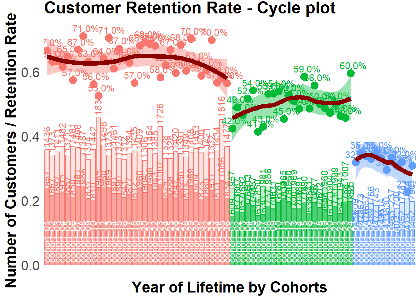
##### The second way for plotting cycle plot via multi-plotting
# plot #1 - Retention rate
p1 <-
    ggplot(
        na.omit(df_plot),
        aes(
            x = year_cohort,
            y = ret_rate,
            group = year_of_LT,
            color = year_of_LT
        )
    ) +
    theme_bw() +
    geom_point(size = 4) +
    geom_text(
        aes(label = percent(round(ret_rate, 2))),
        size = 4,
        hjust = 0.4,
        vjust = -0.6,
        fontface = "plain"
    ) +
    geom_smooth(
        size = 2.5,
        method = 'loess',
        color = 'darkred',
        aes(fill = year_of_LT)
    ) +
    theme(
        legend.position = 'none',
        plot.title = element_text(size = 20, face = "bold", vjust = 2),
        axis.title.x = element_blank(),
        axis.title.y = element_text(size = 18, face = "bold"),
        axis.text = element_blank(),
        axis.ticks.x = element_blank(),
        axis.ticks.y = element_blank(),
        panel.border = element_blank(),
        panel.grid.major = element_blank(),
        panel.grid.minor = element_blank()
    ) +
    labs(y = 'Retention Rate') +
    ggtitle("Customer Retention Rate - Cycle plot")

# plot #2 - number of customers
p2 <-
    ggplot(na.omit(df_plot),
           aes(x = year_cohort, group = year_of_LT, color = year_of_LT)) +
    theme_bw() +
    geom_bar(aes(y = number_prev_year, fill = year_of_LT),
             alpha = 0.2,
             stat = 'identity') +
    geom_bar(aes(y = number, fill = year_of_LT),
             alpha = 0.6,
             stat = 'identity') +
    geom_text(
        aes(y = number_prev_year, label = number_prev_year),
        angle = 90,
        size = 4,
        hjust = -0.1,
        vjust = 0.4
    ) +
    geom_text(
        aes(y = number, label = number),
        angle = 90,
        size = 4,
        hjust = -0.1,
        vjust = 0.4
    ) +
    geom_text(
        aes(y = 0, label = cohort),
        color = 'white',
        angle = 90,
        size = 4,
        hjust = -0.05,
        vjust = 0.4
    ) +
    theme(
        legend.position = 'none',
        plot.title = element_text(size = 20, face = "bold", vjust = 2),
        axis.title.x = element_text(size = 18, face = "bold"),
        axis.title.y = element_text(size = 18, face = "bold"),
        axis.text = element_blank(),
        axis.ticks.x = element_blank(),
        axis.ticks.y = element_blank(),
        panel.border = element_blank(),
        panel.grid.major = element_blank(),
        panel.grid.minor = element_blank()
    ) +
    scale_y_continuous(limits = c(0, max(df_plot$number_Y_00 * 1.1))) +
    labs(x = 'Year of Lifetime by Cohorts', y = 'Number of Customers')

# multiplot
grid.arrange(p1, p2, ncol = 1)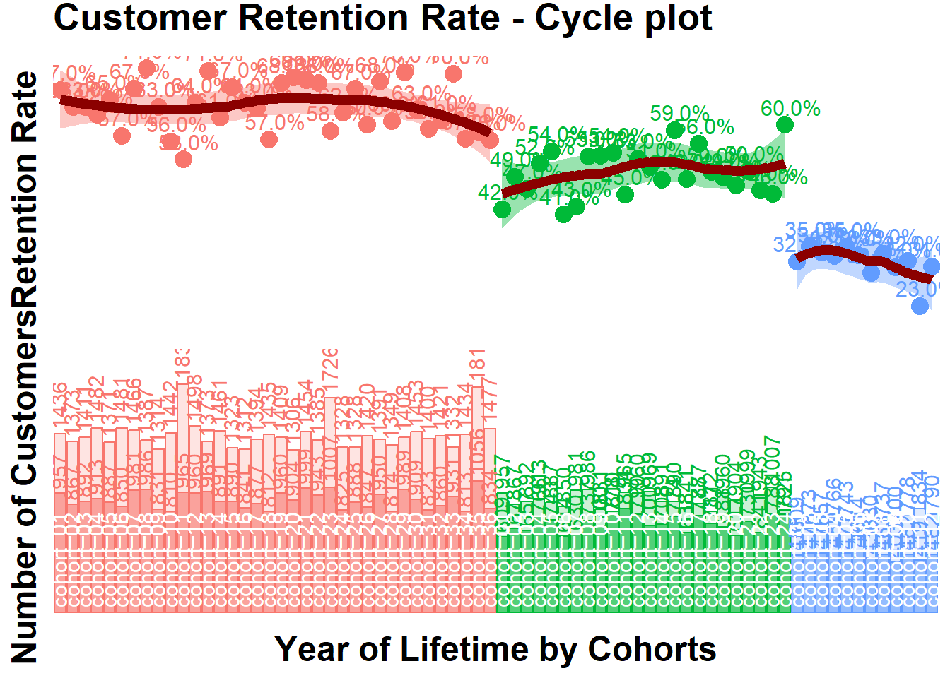
# retention rate bubble chart
ggplot(na.omit(df_plot),
       aes(
           x = cohort,
           y = ret_rate,
           group = cohort,
           color = year_of_LT
       )) +
    theme_bw() +
    scale_size(range = c(15, 40)) +
    geom_line(size = 2, alpha = 0.3) +
    geom_point(aes(size = number_prev_year), alpha = 0.3) +
    geom_point(aes(size = number), alpha = 0.8) +
    geom_smooth(
        linetype = 2,
        size = 2,
        method = 'loess',
        aes(group = year_of_LT, fill = year_of_LT),
        alpha = 0.2
    ) +
    geom_text(
        aes(label = paste0(
            number, '/', number_prev_year, '\n', percent(round(ret_rate, 2))
        )),
        color = 'white',
        size = 3,
        hjust = 0.5,
        vjust = 0.5,
        fontface = "plain"
    ) +
    theme(
        legend.position = 'none',
        plot.title = element_text(size = 20, face = "bold", vjust = 2),
        axis.title.x = element_text(size = 18, face = "bold"),
        axis.title.y = element_text(size = 18, face = "bold"),
        axis.text = element_text(size = 16),
        axis.text.x = element_text(
            size = 10,
            angle = 90,
            hjust = .5,
            vjust = .5,
            face = "plain"
        ),
        axis.ticks.x = element_blank(),
        axis.ticks.y = element_blank(),
        panel.border = element_blank(),
        panel.grid.major = element_blank(),
        panel.grid.minor = element_blank()
    ) +
    labs(x = 'Cohorts', y = 'Retention Rate by Year of Lifetime') +
    ggtitle("Customer Retention Rate - Bubble chart")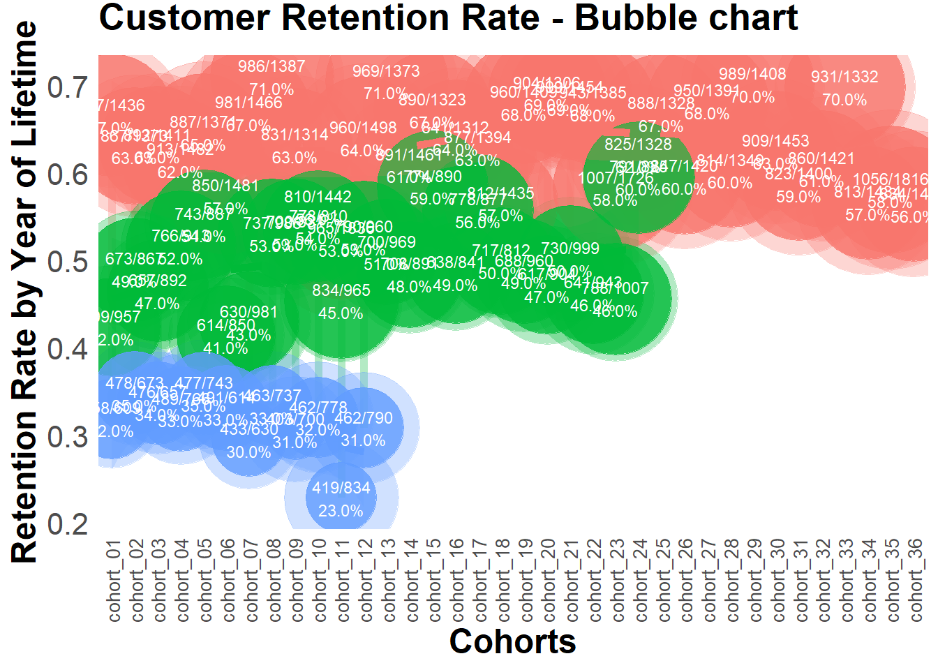
# retention rate falling drops chart
ggplot(df_plot,
       aes(
           x = cohort,
           y = ret_rate,
           group = cohort,
           color = year_of_LT
       )) +
    theme_bw() +
    scale_size(range = c(15, 40)) +
    scale_y_continuous(limits = c(0, 1)) +
    geom_line(size = 2, alpha = 0.3) +
    geom_point(aes(size = number), alpha = 0.8) +
    geom_text(
        aes(label = paste0(number, '\n', percent(round(
            ret_rate, 2
        )))),
        color = 'white',
        size = 3,
        hjust = 0.5,
        vjust = 0.5,
        fontface = "plain"
    ) +
    theme(
        legend.position = 'none',
        plot.title = element_text(size = 20, face = "bold", vjust = 2),
        axis.title.x = element_text(size = 18, face = "bold"),
        axis.title.y = element_text(size = 18, face = "bold"),
        axis.text = element_text(size = 16),
        axis.text.x = element_text(
            size = 10,
            angle = 90,
            hjust = .5,
            vjust = .5,
            face = "plain"
        ),
        axis.ticks.x = element_blank(),
        axis.ticks.y = element_blank(),
        panel.border = element_blank(),
        panel.grid.major = element_blank(),
        panel.grid.minor = element_blank()
    ) +
    labs(x = 'Cohorts', y = 'Retention Rate by Year of Lifetime') +
    ggtitle("Customer Retention Rate - Falling Drops chart")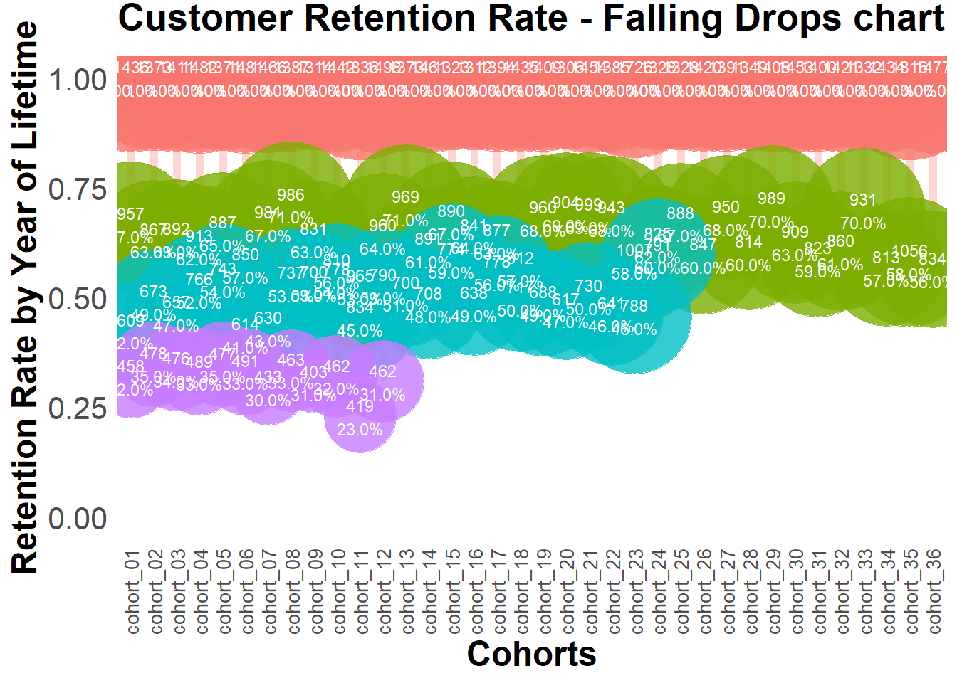
22.4.2.3.4 Retention Charts
# libraries
library(dplyr)
library(ggplot2)
library(reshape2)

cohort.clients <- data.frame(
    cohort = c(
        'Cohort01',
        'Cohort02',
        'Cohort03',
        'Cohort04',
        'Cohort05',
        'Cohort06',
        'Cohort07',
        'Cohort08',
        'Cohort09',
        'Cohort10',
        'Cohort11',
        'Cohort12'
    ),
    M01 = c(11000, 0, 0, 0, 0, 0, 0, 0, 0, 0, 0, 0),
    M02 = c(1900, 10000, 0, 0, 0, 0, 0, 0, 0, 0, 0, 0),
    M03 = c(1400, 2000, 11500, 0, 0, 0, 0, 0, 0, 0, 0, 0),
    M04 = c(1100, 1300, 2400, 13200, 0, 0, 0, 0, 0, 0, 0, 0),
    M05 = c(1000, 1100, 1400, 2400, 11100, 0, 0, 0, 0, 0, 0, 0),
    M06 = c(900, 900, 1200, 1600, 1900, 10300, 0, 0, 0, 0, 0, 0),
    M07 = c(850, 900, 1100, 1300, 1300, 1900, 13000, 0, 0, 0, 0, 0),
    M08 = c(850, 850, 1000, 1200, 1100, 1300, 1900, 11500, 0, 0, 0, 0),
    M09 = c(800, 800, 950, 1100, 1100, 1250, 1000, 1200, 11000, 0, 0, 0),
    M10 = c(800, 780, 900, 1050, 1050, 1200, 900, 1200, 1900, 13200, 0, 0),
    M11 = c(750, 750, 900, 1000, 1000, 1180, 800, 1100, 1150, 2000, 11300, 0),
    M12 = c(740, 700, 870, 1000, 900, 1100, 700, 1050, 1025, 1300, 1800, 20000)
)

cohort.clients.r <- cohort.clients #create new data frame
totcols <-
    ncol(cohort.clients.r) #count number of columns in data set
for (i in 1:nrow(cohort.clients.r)) {
    #for loop for shifting each row
    df <- cohort.clients.r[i,] #select row from data frame
    df <- df[, !df[] == 0] #remove columns with zeros
    partcols <-
        ncol(df) #count number of columns in row (w/o zeros)
    #fill columns after values by zeros
    if (partcols < totcols)
        df[, c((partcols + 1):totcols)] <- 0
    cohort.clients.r[i,] <- df #replace initial row by new one
}
# Retention ratio = # clients in particular month / # clients in 1st month of life-time

#calculate retention (1)
x <- cohort.clients.r[, c(2:13)]
y <- cohort.clients.r[, 2]
reten.r <- apply(x, 2, function(x)
    x / y)
reten.r <- data.frame(cohort = (cohort.clients.r$cohort), reten.r)

#calculate retention (2)
c <- ncol(cohort.clients.r)
reten.r <- cohort.clients.r
for (i in 2:c) {
    reten.r[, (c + i - 1)] <- reten.r[, i] / reten.r[, 2]
}
reten.r <- reten.r[,-c(2:c)]
colnames(reten.r) <- colnames(cohort.clients.r)


#charts
reten.r <- reten.r[,-2] #remove M01 data because it is always 100%
#dynamics analysis chart
cohort.chart1 <- melt(reten.r, id.vars = 'cohort')
colnames(cohort.chart1) <- c('cohort', 'month', 'retention')
cohort.chart1 <- filter(cohort.chart1, retention != 0)
p <-
    ggplot(cohort.chart1,
           aes(
               x = month,
               y = retention,
               group = cohort,
               colour = cohort
           ))
p + geom_line(size = 2, alpha = 1 / 2) +
    geom_point(size = 3, alpha = 1) +
    geom_smooth(
        aes(group = 1),
        method = 'loess',
        size = 2,
        colour = 'red',
        se = FALSE
    ) +
    labs(title = "Cohorts Retention ratio dynamics")
#second month analysis chart
cohort.chart2 <-
    filter(cohort.chart1, month == 'M02') #choose any month instead of M02
p <-
    ggplot(cohort.chart2, aes(x = cohort, y = retention, colour = cohort))
p + geom_point(size = 3) +
    geom_line(aes(group = 1), size = 2, alpha = 1 / 2) +
    geom_smooth(
        aes(group = 1),
        size = 2,
        colour = 'red',
        method = 'lm',
        se = FALSE
    ) +
    labs(title = "Cohorts Retention ratio for 2nd month")
#cycle plot
cohort.chart3 <- cohort.chart1
cohort.chart3 <-
    mutate(cohort.chart3, month_cohort = paste(month, cohort))
p <-
    ggplot(cohort.chart3,
           aes(
               x = month_cohort,
               y = retention,
               group = month,
               colour = month
           ))
#choose any cohorts instead of Cohort07 and Cohort06
m1 <- filter(cohort.chart3, cohort == 'Cohort07')
m2 <- filter(cohort.chart3, cohort == 'Cohort06')
p + geom_point(size = 3) +
    geom_line(aes(group = month), size = 2, alpha = 1 / 2) +
    labs(title = "Cohorts Retention ratio cycle plot") +
    geom_line(
        data = m1,
        aes(group = 1),
        colour = 'blue',
        size = 2,
        alpha = 1 / 5
    ) +
    geom_line(
        data = m2,
        aes(group = 1),
        colour = 'blue',
        size = 2,
        alpha = 1 / 5
    ) +
    theme(axis.text.x = element_text(angle = 90, hjust = 1))
22.4.2.4 Lifecycle phase sequential analysis
- analyze the path patterns of each cohort
- identify cohorts that attracted customers with the path we prefer to make offers.
library(TraMineR)

min.date <- min(orders$orderdate)
max.date <- max(orders$orderdate)

l <-
    c(seq(0, as.numeric(max.date - min.date), 10), as.numeric(max.date - min.date))

df <- data.frame()
for (i in l) {
    cur.date <- min.date + i
    print(cur.date)

    orders.cache <- orders %>%
        filter(orderdate <= cur.date)

    customers.cache <- orders.cache %>%
        select(-product,-grossmarg) %>%
        unique() %>%
        group_by(clientId) %>%
        mutate(frequency = n(),
               recency = as.numeric(cur.date - max(orderdate))) %>%
        ungroup() %>%
        select(clientId, frequency, recency) %>%
        unique() %>%

        mutate(segm =
                   ifelse(
                       between(frequency, 1, 2) & between(recency, 0, 60),
                       'new customer',
                       ifelse(
                           between(frequency, 1, 2) &
                               between(recency, 61, 180),
                           'under risk new customer',
                           ifelse(
                               between(frequency, 1, 2) & recency > 180,
                               '1x buyer',

                               ifelse(
                                   between(frequency, 3, 4) &
                                       between(recency, 0, 60),
                                   'engaged customer',
                                   ifelse(
                                       between(frequency, 3, 4) &
                                           between(recency, 61, 180),
                                       'under risk engaged customer',
                                       ifelse(
                                           between(frequency, 3, 4) & recency > 180,
                                           'former engaged customer',

                                           ifelse(
                                               frequency > 4 & between(recency, 0, 60),
                                               'best customer',
                                               ifelse(
                                                   frequency > 4 &
                                                       between(recency, 61, 180),
                                                   'under risk best customer',
                                                   ifelse(frequency > 4 &
                                                              recency > 180, 'former best customer', NA)
                                               )
                                           )
                                       )
                                   )
                               )
                           )
                       )
                   )) %>%

        mutate(report.date = i) %>%
        select(clientId, segm, report.date)

    df <- rbind(df, customers.cache)
}

# converting data to the sequence format
df <-
    dcast(df,
          clientId ~ report.date,
          value.var = 'segm',
          fun.aggregate = NULL)
df.seq <- seqdef(df,
                 2:ncol(df),
                 left = 'DEL',
                 right = 'DEL',
                 xtstep = 10)

# creating df with first purch.date and campaign cohort features
feat <- df %>% select(clientId)
feat <- merge(feat, campaign[, 1:2], by = 'clientId')
feat <- merge(feat, customers[, 1:2], by = 'clientId')

par(mar = c(1, 1, 1, 1))

# plotting the 10 most frequent sequences based on campaign
seqfplot(df.seq, border = NA, group = feat$campaign)

# plotting the 10 most frequent sequences based on campaign
seqfplot(
    df.seq,
    border = NA,
    group = feat$campaign,
    cex.legend = 0.9
)

# plotting the 10 most frequent sequences based on first purch.date cohort
coh.list <- sort(unique(feat$cohort))
# defining cohorts for plotting
feat.coh.list <- feat[feat$cohort %in% coh.list[1:6] ,]
df.coh <- df %>% filter(clientId %in% c(feat.coh.list$clientId))
df.seq.coh <-
    seqdef(
        df.coh,
        2:ncol(df.coh),
        left = 'DEL',
        right = 'DEL',
        xtstep = 10
    )
seqfplot(
    df.seq.coh,
    border = NA,
    group = feat.coh.list$cohort,
    cex.legend = 0.9
)