4.4 Outcomes on a continuous scale: Uniform distributions
Uniform probability measures are the continuous analog of equally likely outcomes. The standard uniform model is the Uniform(0, 1) distribution corresponding to the spinner in Figure 2.2 which returns values between79 0 and 1. Recall that the values in the picture are rounded to two decimal places, but the spinner represents an idealized model where the spinner is infinitely precise so that any real number between 0 and 1 is a possible value. We assume that the (infinitely fine) needle is “equally likely” to land on any value between 0 and 1.
For example, if Regina is “equally likely” to arrive for lunch at any time between noon (time 0) and 1:00PM (time 1), then a Uniform(0, 1) distribution is an appropriate probability model for her arrival time.
The following Symbulate code defines a probability space representing the Uniform(0, 1) model, and a random variable equal to the result of a single spin: \(U(\omega)=\omega\). Recall that the default function used to define a Symbulate RV is the identity.
P = Uniform(0, 1)
U = RV(P)

U.sim(10)| Index | Result |
|---|---|
| 0 | 0.11806934303148087 |
| 1 | 0.8682705854094447 |
| 2 | 0.5313215011086251 |
| 3 | 0.18627722803438063 |
| 4 | 0.7300331967645011 |
| 5 | 0.30300717192440163 |
| 6 | 0.40244347615834386 |
| 7 | 0.38178064790323796 |
| 8 | 0.7878460721895723 |
| ... | ... |
| 9 | 0.6829204341662063 |
Notice the number of decimal places. Remember that for a continuous random variable, any value in some uncountable interval is possible. For the Uniform(0, 1) distribution, any value in the continuous interval between 0 and 1 is a distinct possible value: 0.25000000000… is different from 0.25000000001… is distinct from 0.2500000000000000000001… and so on.
The rug plot displays 100 simulated values of \(U\). Note that the values seem to be “evenly spread” between 0 and 1.
u = U.sim(100)

u.plot('rug')
plt.show()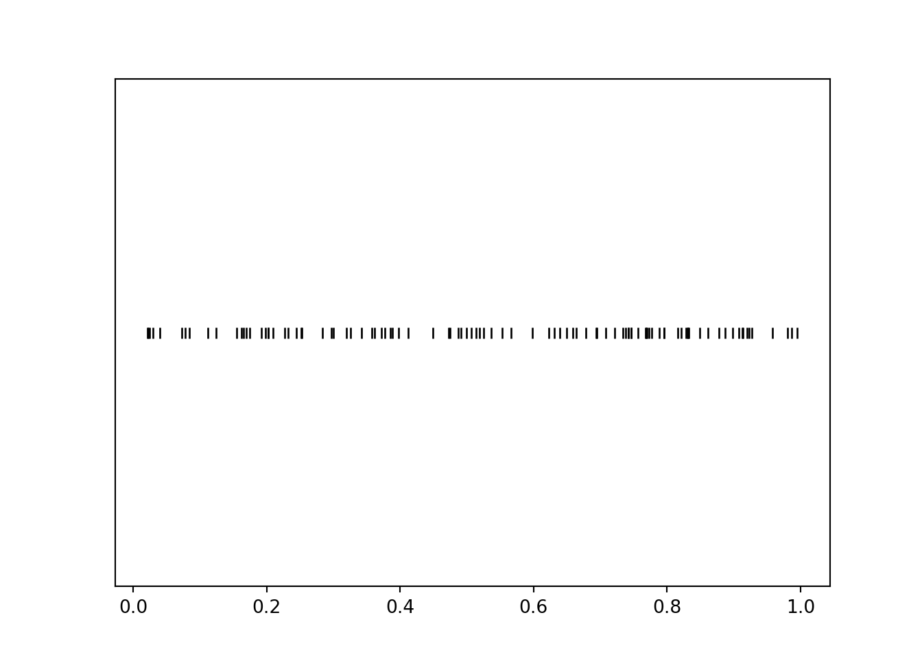
A histogram groups the observed values into “bins” and plots frequencies for each bin80.
u.plot(['rug', 'hist'], bins = 10, normalize = False)
plt.show()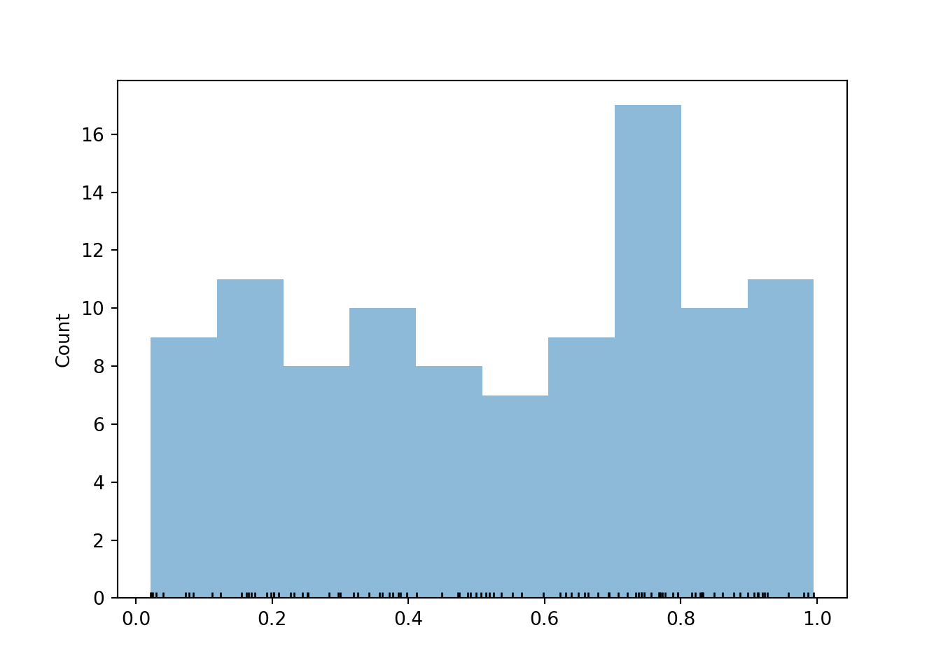
A histogram is the Symbulate default plot for summarizing values on a continuous scale. Typically, in a histogram areas of bars represent relative frequencies; in which case the axis which represents the height of the bars is called “density”. It is recommended that the bins all have the same width so that the ratio of the heights of two different bars is equal to the ratio of their areas. That is, with equal bin widths, bars with the same height represent the same area/relative frequency. Symbulate will always produces a histogram with equal bin widths.
Now we simulate many values of \(U\). We see that the bars all have roughly the same height, represented by the horizontal line, and hence the same area, though there are some natural fluctuations due to the randomness in the simulation.
u = U.sim(10000)

u.plot()
Uniform(0, 1).plot() # plots the horizontal line of constant height
plt.show()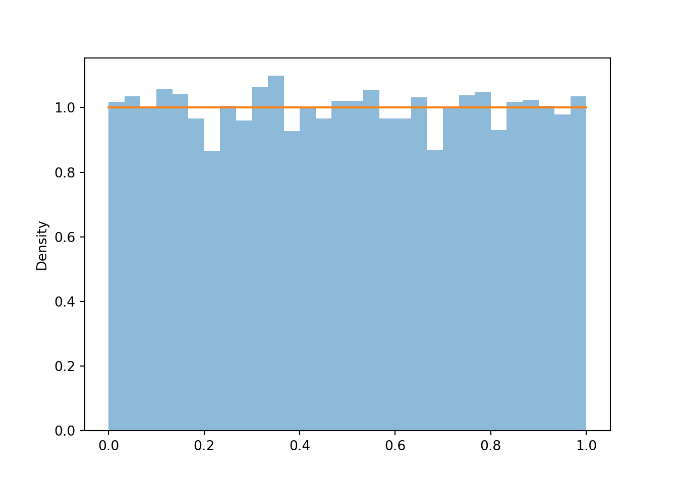
Recall that in a uniform probability model, the probability of an event is proportional to the size (length, area, volume) of the set comprising the event; two events with the same size will have the same probability.
\[ \textrm{P}(A) = \frac{|A|}{|\Omega|} = \frac{\text{size of } A}{\text{size of } \Omega} \qquad \text{if $\textrm{P}$ is a uniform probability measure} \]
For example, if \(U\) follows a Uniform(0, 1) distribution then \(\textrm{P}(U < 0.25) = 0.25 = \textrm{P}(U > 0.75)\). We can approximate \(\textrm{P}(U < 0.25)\) and \(\textrm{P}(U > 0.75)\) with their corresponding simulated relative frequencies, which are roughly equal to 0.25. (Remember that the simulation margin of error based on 10000 repetitions is roughly \(1/\sqrt{10000} = 0.01\).) That is, the area of the histogram corresponding to the region \(U<0.25\) is approximately 0.25.
u.plot()
plt.axvspan(0, 0.25, alpha = 0.5, color = 'gray'); # shades the plot
plt.show()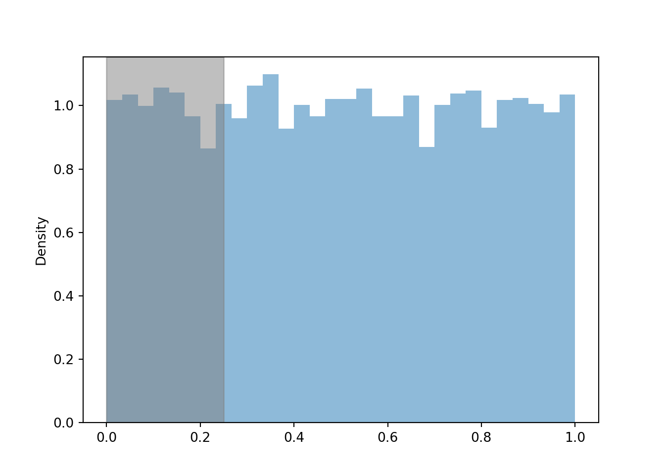
u.count_lt(0.25) / 10000## 0.2486u.plot()
plt.axvspan(0.75, 1, alpha = 0.5, color = 'gray'); # shades the plot
plt.show()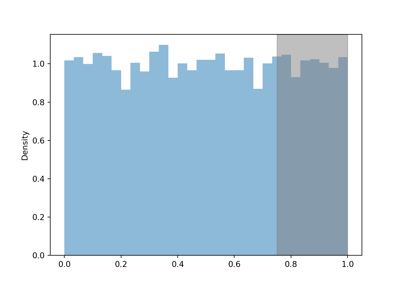
u.count_gt(0.75) / 10000## 0.2514As discussed in Section 2.4.4, the probability that the continuous random variable \(U\) equals any particular value (e.g., 0.25) precisely is 0.
u.count_eq(0.25)## 0However, the probability that \(U\) is “close to” a value is non-zero. For example, the probability that \(U\) is within 0.01 of 0.25 — that is, that \(U\) lies in the interval (0.24, 0.26) of length 0.02 — is 0.02. That is, \(\textrm{P}(|U - 0.25| < 0.01) = 0.02\).
abs(u - 0.25).count_lt(0.01) / 10000## 0.021We can approximate the long run average value of continuous random variables in the usual way: simulate many values and average. We see that the simulated average is approximately 0.5, the “balance point” of the distribution.
u.mean()## 0.4995223976039475The standard uniform distribution, Uniform(0, 1), is a distribution on the interval \([0, 1]\). The uniform distribution on the interval \([a, b]\), for \(a<b\), is called the Uniform(\(a\), \(b\)) distribution.
For example, suppose that \(X\), the SAT Math score of a randomly selected student, follows a Uniform distribution on the interval \([200, 800]\). (This is certainly NOT true, and we will consider a more realistic distribution later.) Remember that we can define a random variable by specifying its distribution.
X = RV(Uniform(200, 800))

x = X.sim(10000)

x.plot()
Uniform(200, 800).plot() # draws the horizontal line of constant height
plt.show()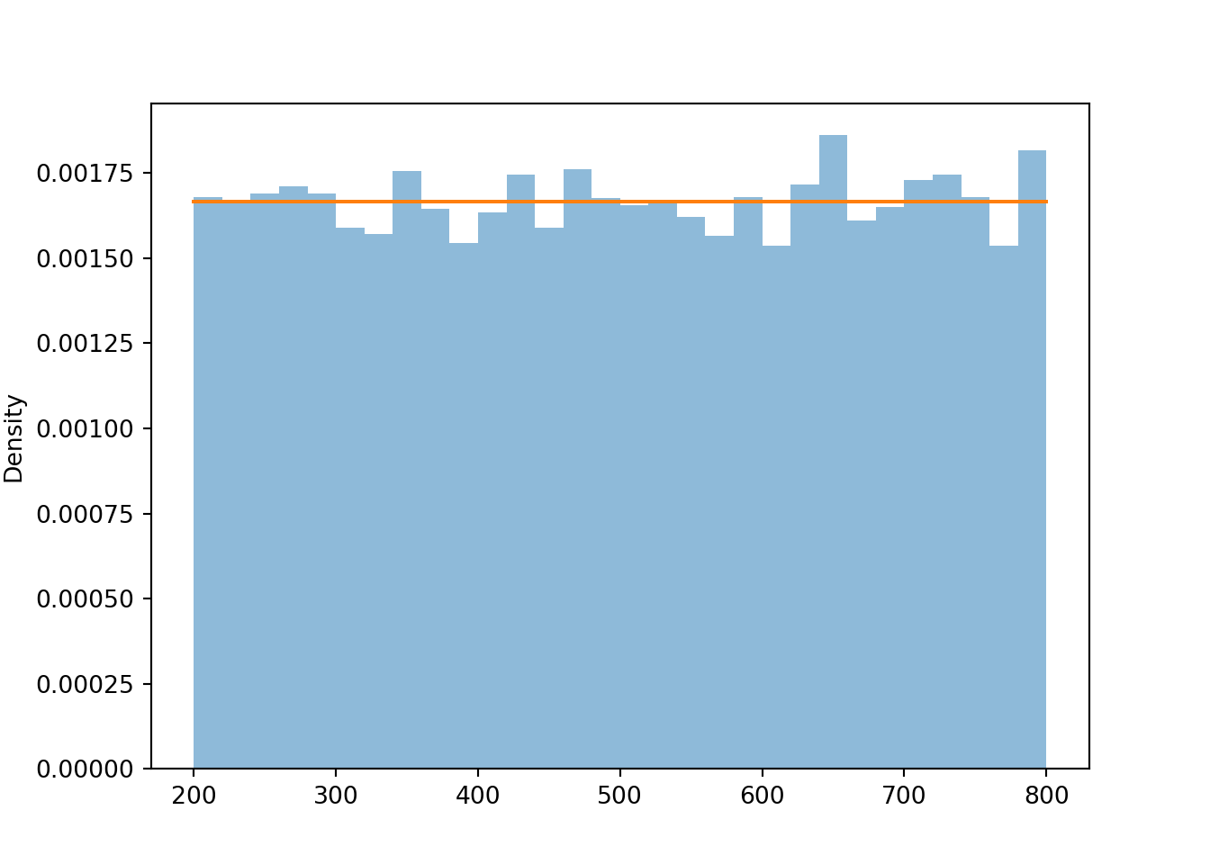
x.count_lt(300) / 10000, x.count_lt(400) / 10000, x.count_lt(500) / 10000## (0.1683, 0.3307, 0.4988)The plots show that the values are roughly uniformly distributed between 200 and 800. Recall from Section 2.4.4 that for a continuous uniform distribution in one-dimension, probability is a ratio of lengths. For example, \(\textrm{P}(X \le 300)\) \(= \frac{300-200}{800-200}\) \(= \frac{100}{600}\approx 0.167\). About 17% of values are between 200 and 300, about 17% between 300 and 400, and about 17% between 400 and 500. Each of these intervals is length 100, and the total length of the interval of possible values is 600, so the theoretical probability for each interval is \(100/600\approx 0.167\). The long run average value is 500, the midpoint of the interval \([200, 800]\).
x.mean()## 501.1779962112187Remember that in a histogram, area represents relative frequency. The Uniform(200, 800) distribution covers a wider range of possible values than the Uniform(0, 1) distribution. Notice how the values on the vertical density axis change to compensate for the longer range on the horizontal variable axis. The histogram bars now all have a height of roughly \(\frac{1}{800-200} = \frac{1}{600} = 0.00167\) (aside from natural simulation variability). The total area of the rectangle with a height of \(\frac{1}{800-200}\) and a base of \(800-200\) is 1.
4.4.1 Summary
- A histogram can be used to summarize the distribution of a random variable that takes values on a continuous scale.
- When plotting values on a continuous scale in a histogram, relative frequencies are represented by areas.
- For a Uniform(\(a\), \(b\)) distribution, the probability of a subinterval of \([a, b]\) is proportional to the length of the interval.
Why is the interval \([0, 1]\) the standard instead of some other range of values? Because probabilities take values in \([0, 1]\). We will see why this is useful in more detail later.↩︎
Symbulate chooses the number of bins automatically, but you can set the number of bins using the
binsoption, e.g.,.plot(bins = 10)↩︎