2.10 Normal distributions
In the previous section we assumed a Uniform(200, 800) distribution for \(X\), the SAT Math score of a single randomly selected student. The corresponding spinner would be like the one in Figure 2.1 but now labeled with equally spaced values from 200 to 800 (instead of 0 to 1). However, this would not lead to very realistic SAT scores. The average SAT Math score is around 500, and a much higher percentage of students score closer to average than to the extreme scores of 200 or 800.
To simulate SAT Math scores, we might use a spinner like the following. Notice that the values on the spinner axis are not equally spaced. Even though only some values are displayed on the spinner axis, imagine this spinner represents an infinitely fine model where any value between 200 and 800 is possible82.
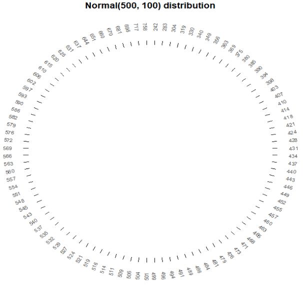
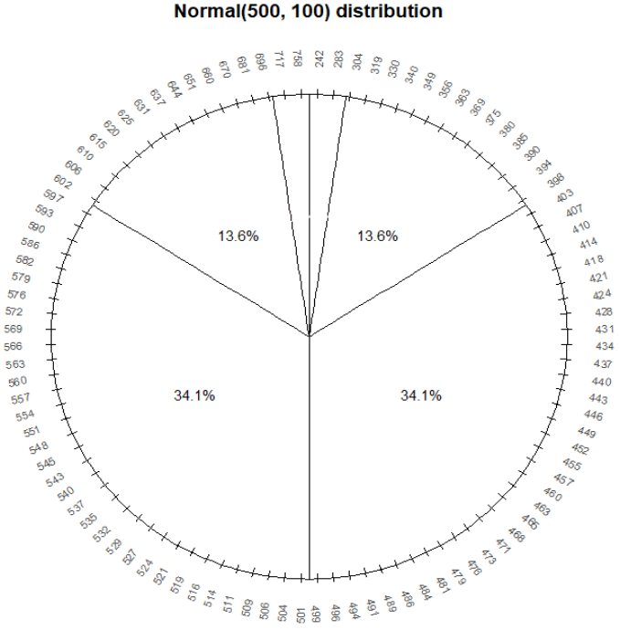
Figure 2.37: A spinner representing the “Normal(500, 100)” distribution. The spinner is duplicated on the right; the highlighted sectors illustrate the non-linearity of axis values and how this translates to non-uniform probabilities.
Since the axis values are not evenly spaced, different intervals of the same length will have different probabilities. For example, the probability that this spinner lands on a value in the interval [400, 500] is about 0.341, but it is about 0.136 for the interval [300, 400].
Consider what the distribution of values simulated using this spinner would look like.
- About half of values would be below 500 and half above
- Because axis values near 500 are stretched out, values near 500 would occur with higher frequency than those near 200 or 800.
- The shape of the distribution would be symmetric about 500 since the axis spacing of values below 500 mirrors that for values above 500. For example, about 34% of values would be between 400 and 500, and also 34% between 500 and 600.
- About 68% of values would be between 400 and 600.
- About 95% of values would be between 300 and 700.
And so on. We could compute percentages for other intervals by measuring the areas of corresponding sectors on the spinner to complete the pattern of variability that values resulting from this spinner would follow. This particular pattern is called a “Normal(500, 100)” distribution. Note that the arguments for a Normal distribution play a different role than those for a Uniform distribution. In a Uniform(\(a, b\)) distribution, \(a\) represents the minimum possible value and \(b\) the maximum. In a Normal(\(\mu\), \(\sigma\)) distribution, \(\mu\) represents the long run mean (a.k.a. long run average) and \(\sigma\) the standard deviation. We will discuss standard deviation in more detail soon.
As in the previous section we can define a random variable by specifying its distribution.
X = RV(Normal(500, 100))We can then simulate values. Remember that the Normal distribution is only a model for the distribution of SAT Math scores. In particular, a Normal distribution assumes values on a continuous scale. Also, it is possible to see values outside of the range \([200, 800]\), though such values do not occur often.
x = X.sim(100)
x| Index | Result |
|---|---|
| 0 | 575.6518014003996 |
| 1 | 416.4621134982175 |
| 2 | 384.59491321842495 |
| 3 | 446.8980703056774 |
| 4 | 485.3642976370468 |
| 5 | 474.5136403502107 |
| 6 | 454.5125160331383 |
| 7 | 537.4886606020688 |
| 8 | 504.895499743142 |
| ... | ... |
| 99 | 535.9165623828203 |
Plotting the values, we see that values near 500 occur more frequently than those near 200 or 800.
x.plot('rug')
plt.show()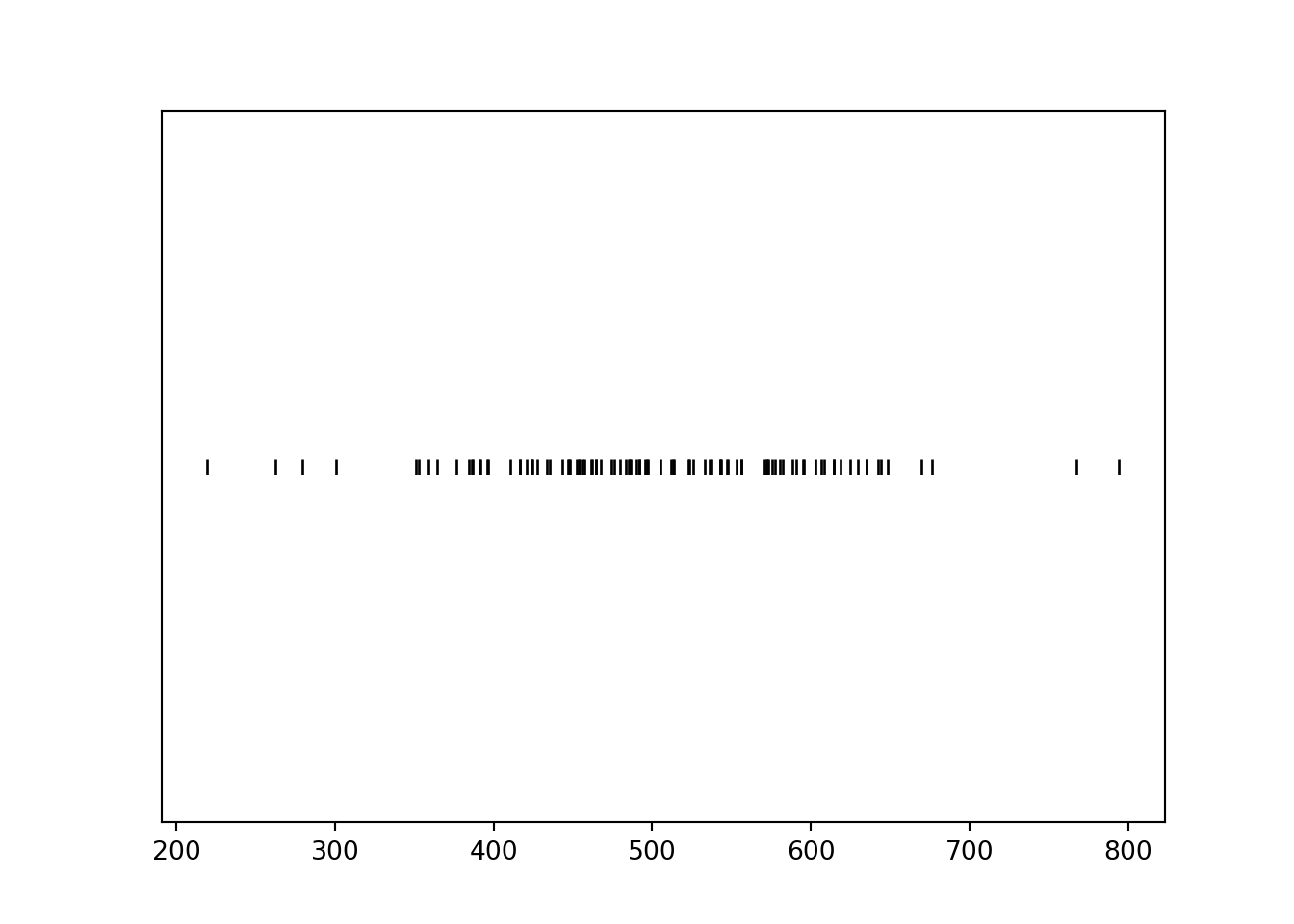
We now simulate many values.
Histogram representing the approximate distribution of values simulated using the spinner in Figure 2.14. The smooth solid curve models the theoretical shape of the distribution, called the “Normal(30, 10)” distribution. Histogram representing the approximate distribution of values simulated using the spinner in Figure 2.37. The smooth solid curve models the theoretical shape of the distribution of \(X\), called the “Normal(500, 100)” distribution).
x = X.sim(10000)
x| Index | Result |
|---|---|
| 0 | 481.0941313504256 |
| 1 | 528.7855980532639 |
| 2 | 489.1807684522834 |
| 3 | 477.89221994097636 |
| 4 | 513.7222623432034 |
| 5 | 606.7251984747766 |
| 6 | 617.3118584558941 |
| 7 | 628.3041190143381 |
| 8 | 553.8563507266994 |
| ... | ... |
| 9999 | 530.246051052059 |
We see that the histogram appears like it can be approximated by a smooth, “bell-shaped” curve, called a Normal density.
x.plot() # plot the simulated values
Normal(500, 100).plot() # plot the smooth density curve
plt.show()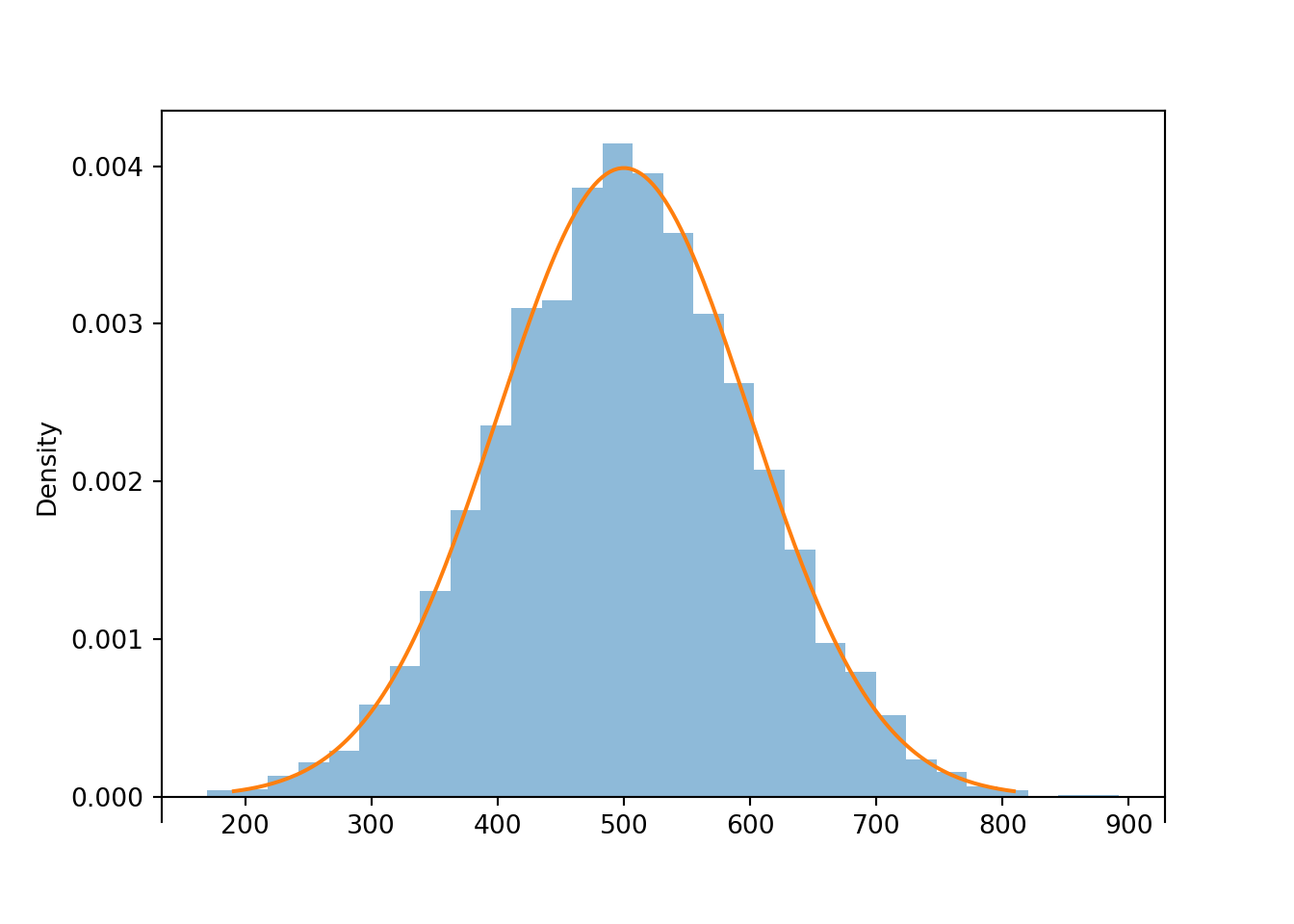
Figure 2.38: Histogram representing the approximate distribution of values simulated using the spinner in Figure 2.14. The smooth solid curve models the theoretical shape of the distribution, called the “Normal(30, 10)” distribution.
The parameter 500 represents the long run average (a.k.a. mean) value. Calling x.mean() will compute an average as usual: sum the 10000 simulated values in x and divide by 10000. This average should be close to 500. The more simulated values included in the average, the closer we would expect the simulated average value to be to 500.
x.mean()## 501.2245820548879Technically, for a Normal distribution, any real value is possible. But values that are more than 3 or 4 standard deviations occur with small probability.↩︎