2.8 Marginal distributions
Even when outcomes of a random phenomenon are equally likely, values of related random variables are usually not. The (probability) distribution of a collection of random variables identifies the possible values that the random variables can take and their relative likelihoods. We will see many ways of describing a distribution, depending on how many random variables are involved and their types (discrete or continuous).
In the context of multiple random variables, the distribution of any one of the random variables is called a marginal distribution.
2.8.1 Discrete random variables
The probability distribution of a single discrete random variable \(X\) is often displayed in a table containing the probability of the event \(\{X=x\}\) for each possible value \(x\).
Example 2.42 Roll a four-sided die twice; recall the sample space in Example 2.10 and Table 2.5. One choice of probability measure corresponds to assuming that the die is fair and that the 16 possible outcomes are equally likely. Let \(X\) be the sum of the two dice, and let \(Y\) be the larger of the two rolls (or the common value if both rolls are the same).
- Construct a table and plot displaying the marginal distribution of \(X\).
- Construct a table and plot displaying the marginal distribution of \(Y\).
- Describe the distribution of \(Y\) in terms of long run relative frequency.
- Describe the distribution of \(Y\) in terms of relative degree of likelihood.
Solution. to Example 2.42
Show/hide solution
- The possible values of \(X\) are \(2, 3, 4, 5, 6, 7, 8\). Find the probability of each value using Table 2.5. For example, \(\textrm{P}(X = 3) = \textrm{P}(\{(1, 2), (2, 1)\}) = 2/16\). Table 2.21 displays the distribution in a table, and Figure 2.27 displays the corresponding impulse plot.
- The possible values of \(Y\) are \(1, 2, 3, 4\). For example, \(\textrm{P}(Y = 3) = \textrm{P}(\{(1, 3), (2, 3), (3, 1), (3, 2), (3, 3)\}) = 5/16\). Table 2.22 displays the distribution in a table, and Figure 2.28 displays the corresponding impulse plot.
- Suppose we roll a fair four-sided die twice and find the larger of the two rolls. If we repeat this process many times, resulting in many pairs of rolls, then in the long run the larger of the two rolls will be 1 in 6.25% of pairs, 2 in 18.75% pairs, 3 in 31.25% of pairs, and 4 in 43.75% of pairs.
- When we roll a fair four-sided die twice and find the larger of the two rolls, 1 is the least likely value, 2 is 3 times more likely than 1, 3 is 1.67 times more likely than 2, and 4 is 1.4 times more likely than 3.
| x | P(X=x) |
|---|---|
| 2 | 0.0625 |
| 3 | 0.1250 |
| 4 | 0.1875 |
| 5 | 0.2500 |
| 6 | 0.1875 |
| 7 | 0.1250 |
| 8 | 0.0625 |
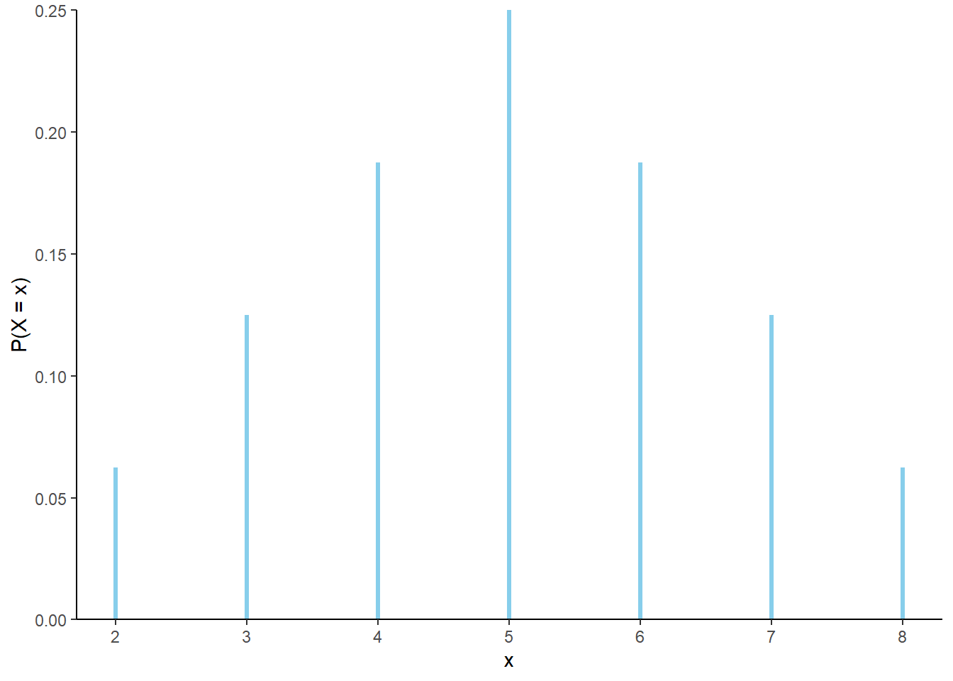
Figure 2.27: The marginal distribution of \(X\), the sum of two rolls of a fair four-sided die.
| y | P(Y=y) |
|---|---|
| 1 | 0.0625 |
| 2 | 0.1875 |
| 3 | 0.3125 |
| 4 | 0.4375 |
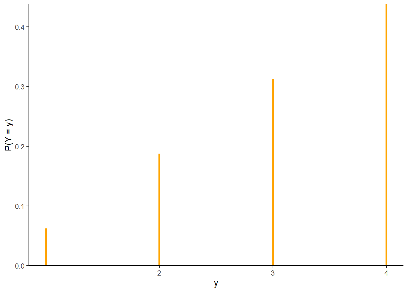
Figure 2.28: The marginal distribution of \(Y\), the larger (or common value if a tie) of two rolls of a fair four-sided die.
Example 2.43 Continuing Example 2.42, suppose that instead of a fair die, the weighted die in Example 2.21 is rolled twice. Answer the following without doing any computations.
- Are the possible values of \(X\) the same as in Table 2.21? Is the distribution of \(X\) the same as in Table 2.21?
- Are the possible values of \(Y\) the same as in Table 2.22? Is the distribution of \(Y\) the same as in Table 2.22?
Solution. to Example 2.43
Show/hide solution
In both parts, yes the possible values are the same. There are still 16 possible outcomes and the random variables are still measuring the same quantities as before. But the distributions are all different. With the weighted die some outcomes are more likely than others, and some values of the random variables are more likely than before. For example, the probabilities of the events \(\{X = 8\}\), \(\{Y=4\}\), and \(\{X = 8, Y=4\}\) are larger with the weighted die than with the fair die, because each roll of the weighted die is more likely to result in a 4 than the fair die.
The distribution of a random variable depends on the underlying probability measure. Changing the probability measure can change the distribution of the random variable. In particular, conditioning on an event can change the distribution of a random variable.
In some cases, a distribution has a “formulaic” shape. For a discrete random variable \(X\), \(\textrm{P}(X=x)\) can often be written explicitly as a function of \(x\).
Consider again \(X\), the sum of two rolls of a fair four-sided die. The probabilities of the possible values \(x\) follow a clear triangular pattern as a function of \(x\).
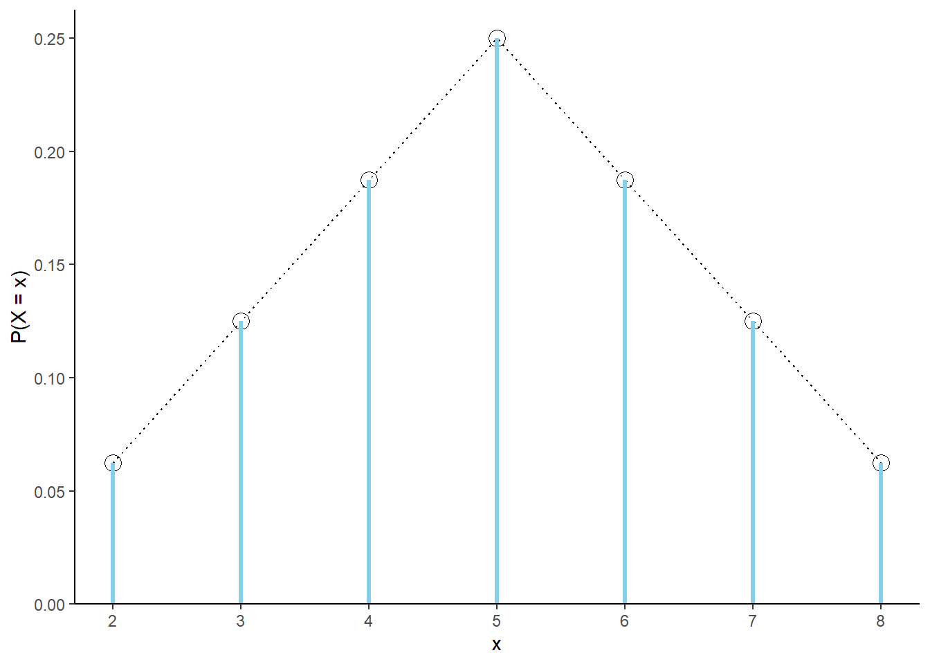
Figure 2.29: The marginal distribution of \(X\), the sum of two rolls of a fair four-sided die. The black dots represent the marginal probability mass function of \(X\).
For each possible value \(x\) of the random variable \(X\), \(\textrm{P}(X=x)\) can be obtained from the following formula
\[ p(x) = \begin{cases} \frac{4-|x-5|}{16}, & x = 2, 3, 4, 5, 6,7, 8,\\ 0, & \text{otherwise.} \end{cases} \]
That is, \(\textrm{P}(X = x) = p(x)\) for all \(x\). For example, \(\textrm{P}(X = 2) = 1/16 = p(2)\); \(\textrm{P}(X=5)=4/16=p(5)\); \(\textrm{P}(X=7.5)=0=p(7.5)\). To specify the distribution of \(X\) we could provide Table 2.5, or we could just provide the function \(p(x)\) above. Notice that part of the specification of \(p(x)\) involves the possible values of \(x\); \(p(x)\) is only nonzero for \(x=2,3, \ldots, 8\). Think of \(p(x)\) as a compact way of representing Table 2.21. The function \(p(x)\) is called the probability mass function of the discrete random variable \(X\).
2.8.2 Simulating from a marginal distribution
The distribution of a random variable specifies the long run pattern of variation (or relative degree of likelihood) of values of the random variable over many repetitions of the underlying random phenomenon. The distribution of a random variable (\(X\)) can be approximated by
- simulating an outcome of the underlying random phenomenon (\(\omega\))
- observing the value of the random variable for that outcome (\((X(\omega)\))
- repeating this process many times
- then computing relative frequencies involving the simulated values of the random variable to approximate probabilities of events involving the random variable (e.g., \(\textrm{P}(X\le x)\)).
We carried out this process for the dice rolling example in Section 2.5.2, where each repetition involved simulating a pair of rolls (outcome \(\omega\)) and then finding the sum (\(X(\omega)\)) and max (\(Y(\omega)\)).
Any marginal distribution can be represented by a single spinner, as the following example illustrates.
Example 2.44 Continuing Example 2.42.
- Construct a spinner to represent the marginal distribution of \(X\).
- How could you use the spinner from the previous part to simulate a value of \(X\).
- Construct a spinner to represent the marginal distribution of \(Y\).
- How could you use the spinner from the previous part to simulate a value of \(Y\).
- Donny Don’t says: “Great! I can simulate an \((X, Y)\) pair just by spinning the spinner in Figure 2.30 to generate \(X\) and the one in Figure 2.31 to generate \(Y\).” Is Donny correct? If not, can you help him see why not?
Solution. to Example 2.44.
Show/hide solution
- The spinner in Figure 2.30 represents the marginal distribution of \(X\); see Table 2.21.
- Just spin it! The spinner returns the possible values of \(X\) according to the proper probabilities. If we’re interested in simulating the sum of two rolls of a fair four-sided dice, we don’t have to roll the dice; we can just spin the \(X\) spinner once.
- The spinner in Figure 2.31 represents the marginal distribution of \(Y\); see Table 2.22.
- Just spin it! The spinner returns the possible values of \(Y\) according to the proper probabilities. If we’re interested in simulating the larger of two rolls of a fair four-sided dice, we don’t have to roll the dice; we can just spin the \(Y\) spinner once.
- Donny is incorrect. Yes, spinning the \(X\) spinner in Figure 2.30 will generate values of \(X\) according to the proper marginal distribution, and similarly with Figure 2.31 and \(Y\). However, spinning each of the spinners will not produce \((X, Y)\) pairs with the correct joint distribution. For example, Donny’s method could produce \(X=2\) and \(Y=4\), which is not a possible \((X, Y)\) pair. Donny’s method treats the values of \(X\) and \(Y\) as if they were independent; the result of the \(X\) spin would not change what could happen with the \(Y\) spin (since the spins are physically independent). However, the \(X\) and \(Y\) values are related. For example, if \(X=2\) then \(Y\) must be 1; if \(X=4\) then \(Y\) must be 2 or 3; etc. Later we’ll see a spinner which does properly simulate \((X, Y)\) pairs.
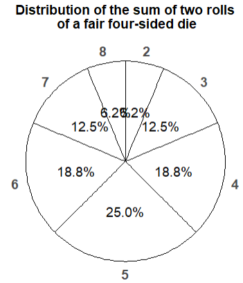
Figure 2.30: Spinner representing the marginal distribution of \(X\), the sum of two rolls of a fair four-sided die.
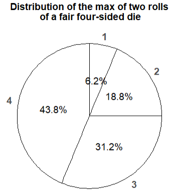
Figure 2.31: Spinner representing the marginal distribution of \(Y\), the larger of two rolls of a fair four-sided die.
In principle, there are always two ways of simulating a value \(x\) of a random variable \(X\).
- Simulate from the probability space. Simulate an outcome \(\omega\) from the underlying probability space and set \(x = X(\omega)\).
- Simulate from the distribution. Construct a spinner corresponding to the distribution of \(X\) and spin it once to generate \(x\).
The second method requires that the distribution of \(X\) is known. However, as we will see in many examples, it is common to specify the distribution of a random variable directly without defining the underlying probability space.
Example 2.45 Continuing the dice rollowing example, we saw the Symbulate code for the “simulate from the probability space” method in Section 2.5.2. Now we consider the “simulate from the distribution method”.
- Write the Symbulate code to define \(X\) by specifying its marginal distribution.
- Write the Symbulate code to define \(Y\) by specifying its marginal distribution.
Solution. to Example 2.45.
Show/hide solution
We simulate a value of \(X\) from its marginal distribution by spinning the spinner in Figure 2.30.
Similarly, we simulate a value of \(Y\) from its marginal distribution by spinning the spinner in Figure 2.31.
We can define a BoxModel corresponding to each of these spinners, and then define a random variable through the identify function.
Essentially, we define the random variable by specifying its distribution, rather specifying the underlying probability space.
Note that the default size argument in BoxModel is size = 1, so we have omitted it.
Careful: the method below will not work if we want to simulate \((X, Y)\) pairs.
X = RV(BoxModel([2, 3, 4, 5, 6, 7, 8], probs = [1 / 16, 2 / 16, 3 / 16, 4 / 16, 3 / 16, 2 / 16, 1 / 16]))

x = X.sim(10000)
x.tabulate(normalize = True)| Value | Relative Frequency |
|---|---|
| 2 | 0.0635 |
| 3 | 0.1201 |
| 4 | 0.1889 |
| 5 | 0.253 |
| 6 | 0.1902 |
| 7 | 0.1236 |
| 8 | 0.0607 |
| Total | 1.0 |
x.plot()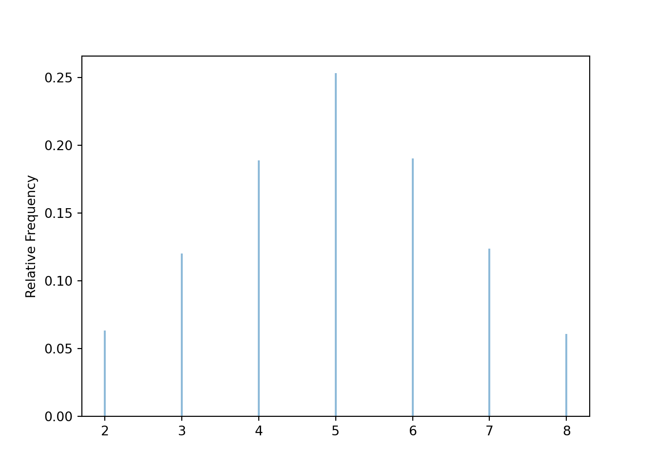
Similarly we can define \(Y\) as
Y = RV(BoxModel([1, 2, 3, 4], probs = [1 / 16, 3 / 16, 5 / 16, 7 / 16]))BoxModel with the probs option can be used to define general discrete distributions (when there are finitely many possible values).
Many commonly encountered distributions have special names and are in built in to Symbulate.
For example, we will see that a random variable that takes values 0, 1, 2, 3 with respective probability 1/8, 3/8, 3/8, 1/8 follows a “Binomial(3, 0.5)” distribution; in Symbulate we can use Binomial(3, 0.5) in place of BoxModel([0, 1, 2, 3], probs = [1 / 8, 3 / 8, 3 / 8, 1 / 8 ]).
2.8.3 Continuous random variables
Uniform probability measures are the continuous analog of equally likely outcomes. The standard uniform model is the Uniform(0, 1) distribution corresponding to the spinner in Figure 2.32 which returns values between77 0 and 1. Only select rounded values are displayed, but the spinner represents an idealized model where the spinner is infinitely precise so that any real number between 0 and 1 is a possible value. We assume that the (infinitely fine) needle is “equally likely” to land on any value between 0 and 1.
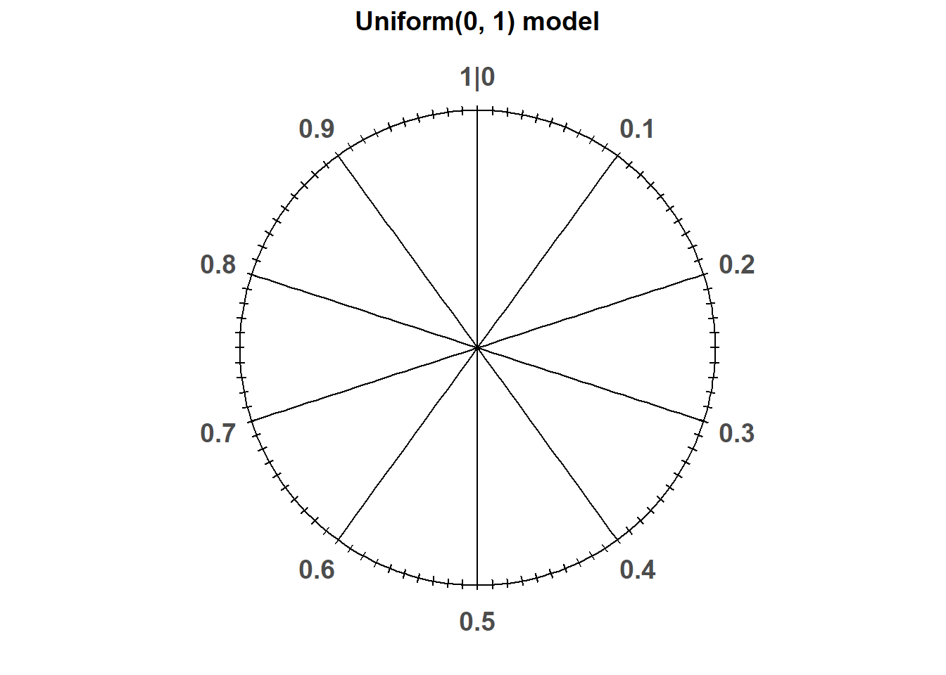
Figure 2.32: A continuous Uniform(0, 1) spinner. Only selected rounded values are displayed, but in the idealized model the spinner is infinitely precise so that any real number between 0 and 1 is a possible value.
Let \(U\) be the random variable representing the result of a single spin of the Uniform(0, 1) spinner.
The following Symbulate code defines an RV that follows the Uniform(0, 1) distribution.
(Recall that the default function used to define a Symbulate RV is the identity.)
U = RV(Uniform(0, 1))

u = U.sim(100)

u| Index | Result |
|---|---|
| 0 | 0.5549746363234234 |
| 1 | 0.9684212202658108 |
| 2 | 0.954639281961819 |
| 3 | 0.5739616027653673 |
| 4 | 0.09644299063866535 |
| 5 | 0.21221638801119558 |
| 6 | 0.4112582234386002 |
| 7 | 0.08649766671703973 |
| 8 | 0.3877794586058394 |
| ... | ... |
| 99 | 0.020013918497303496 |
Notice the number of decimal places. Remember that for a continuous random variable, any value in some uncountable interval is possible. For the Uniform(0, 1) distribution, any value in the continuous interval between 0 and 1 is a distinct possible value: 0.20000000000… is different from 0.20000000001… is different from 0.2000000000000000000001… and so on.
The rug plot displays 100 simulated values of \(U\). Note that the values seem to be “evenly spread” between 0 and 1, though there is some natural simulation variability.
u.plot('rug')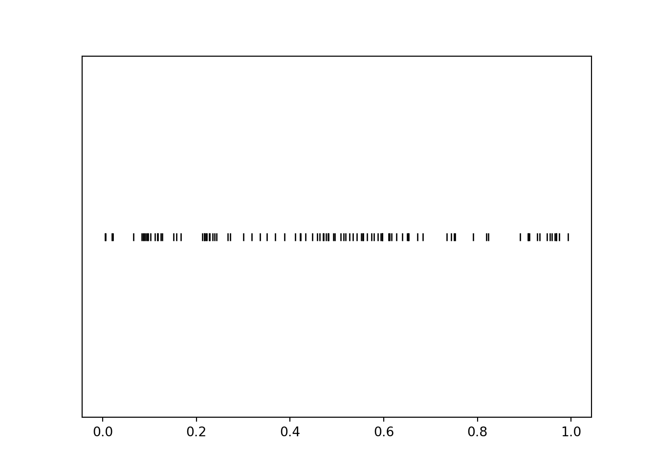
For continuous random variables, finding frequencies of individual values and impulse plots don’t make any sense since each simulated value will only occur once in the simulation. (Again, note the number of decimal places; if the first simulated value is 0.234152908738084237900631086, we’re not going to see that exact value again.) Instead, we summarize simulated values of continuous random variables in a histogram (the Symbulate default plot for summarizing values on a continuous scale). A histogram groups the observed values into “bins” and plots densities or frequencies for each bin78.
u.plot()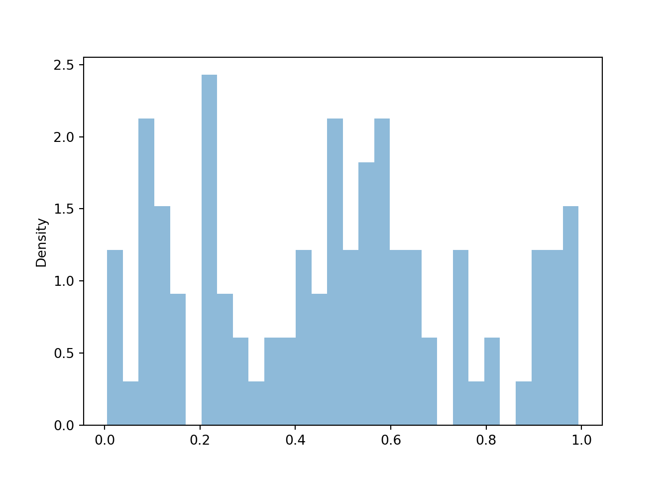
Below we add a rug plot to the histogram to see the individual values that into each bin.
We also add the argument normalize = False to display bin frequencies, that is, counts of the simulated values falling in each bin, on the vertical axis.
u.plot(['rug', 'hist'], bins = 10, normalize = False)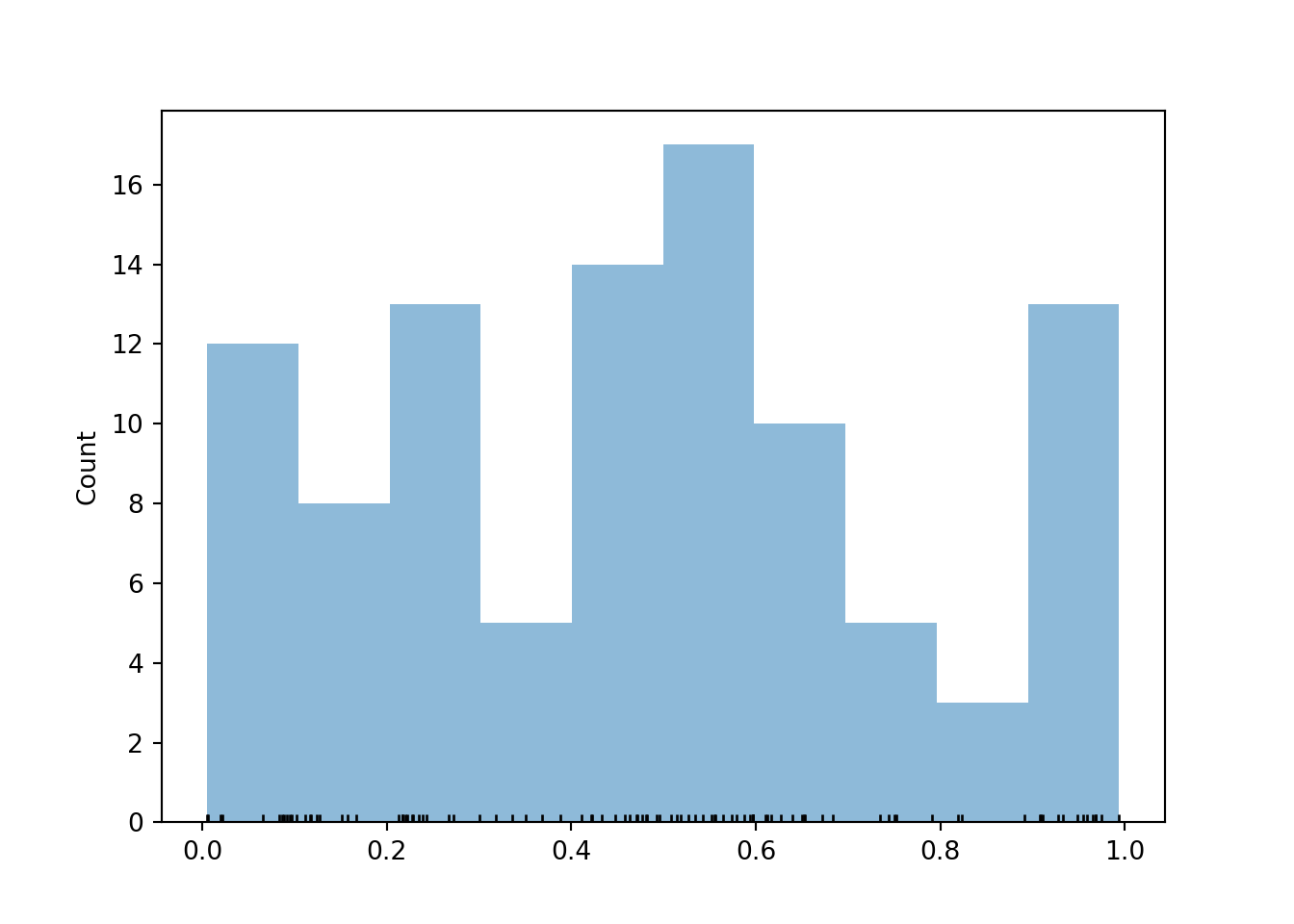
Typically, in a histogram areas of bars represent relative frequencies; in which case the axis which represents the height of the bars is called “density”. It is recommended that the bins all have the same width79 so that the ratio of the heights of two different bars is equal to the ratio of their areas. That is, with equal bin widths, bars with the same height represent the same area/relative frequency; though the area of the bar rather than the height is the actual relative frequency.
The distribution of a random variable represents in long run pattern of variation, so we won’t get a very clear picture with just 100 simulated values. Now we simulate many values of \(U\). We see that the bars all have roughly the same height, represented by the horizontal line, and hence roughly the same area/relative frequency, though there are some natural fluctuations due to the randomness in the simulation.
u = U.sim(10000)

u.plot()
Uniform(0, 1).plot() # plots the horizontal line of constant height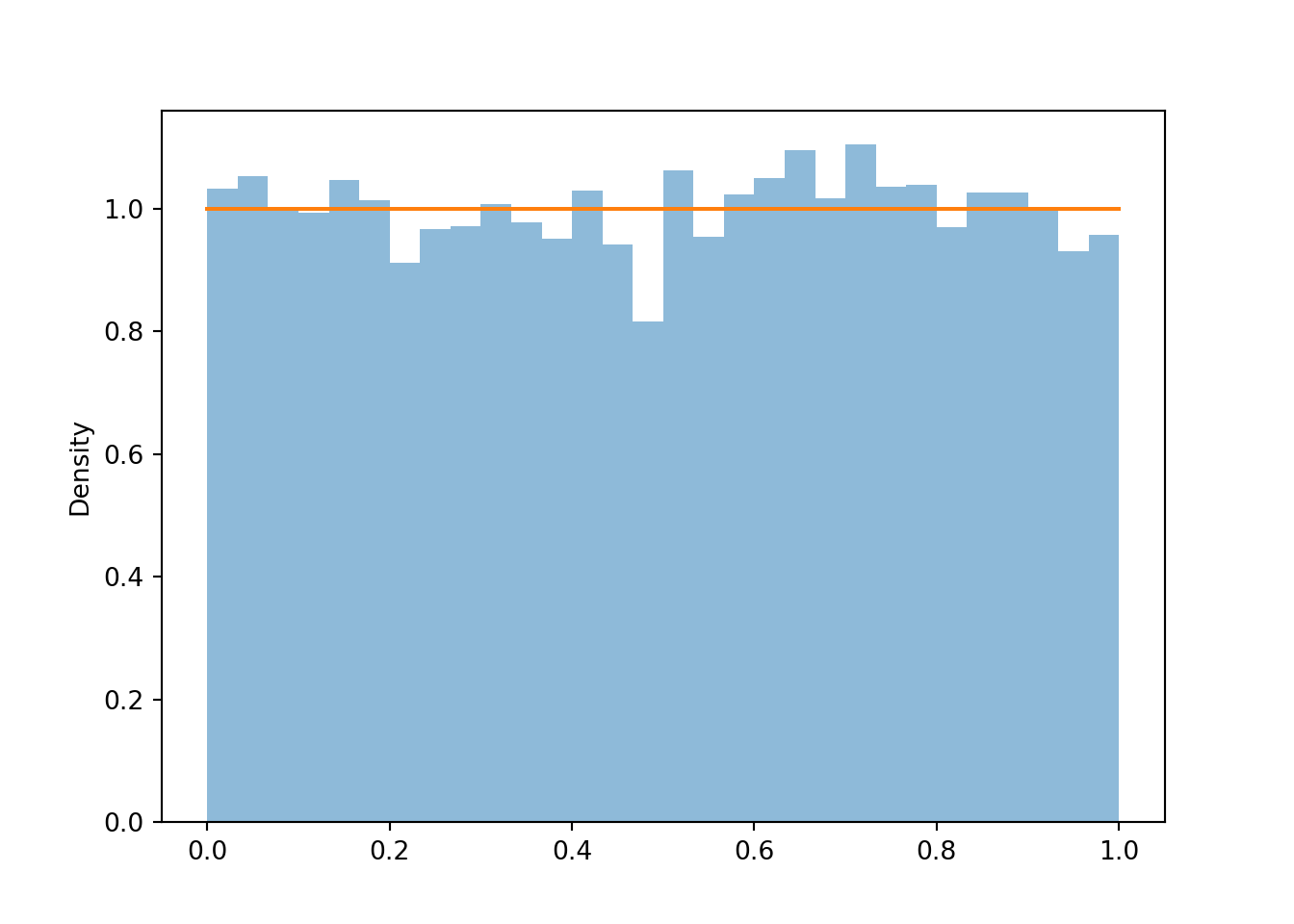
If we simulate even more values and use even more bins, we can see that the density height is roughly the same for all possible value (aside from some natural simulation variability). This “curve” with constant height over [0, 1] is called the “Uniform(0, 1) density”.
u = U.sim(100000)
u.plot(bins = 100)
Uniform(0, 1).plot() # plots the horizontal line of constant height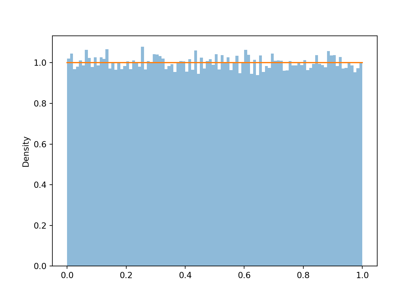
Area represents relative frequency/probability for histograms and densities. We can approximate the probability that \(U\) is less than 0.2 by the corresponding relative frequency, which is represented by the area of the histogram over [0, 0.2].
u.count_lt(0.2) / u.count()## 0.20092u.plot()
Uniform(0, 1).plot() # plots the horizontal line of constant height
plt.fill_between(np.arange(0.0, 0.21, 0.01), 0, 1, alpha = 0.7, color = 'gray'); # shades the plot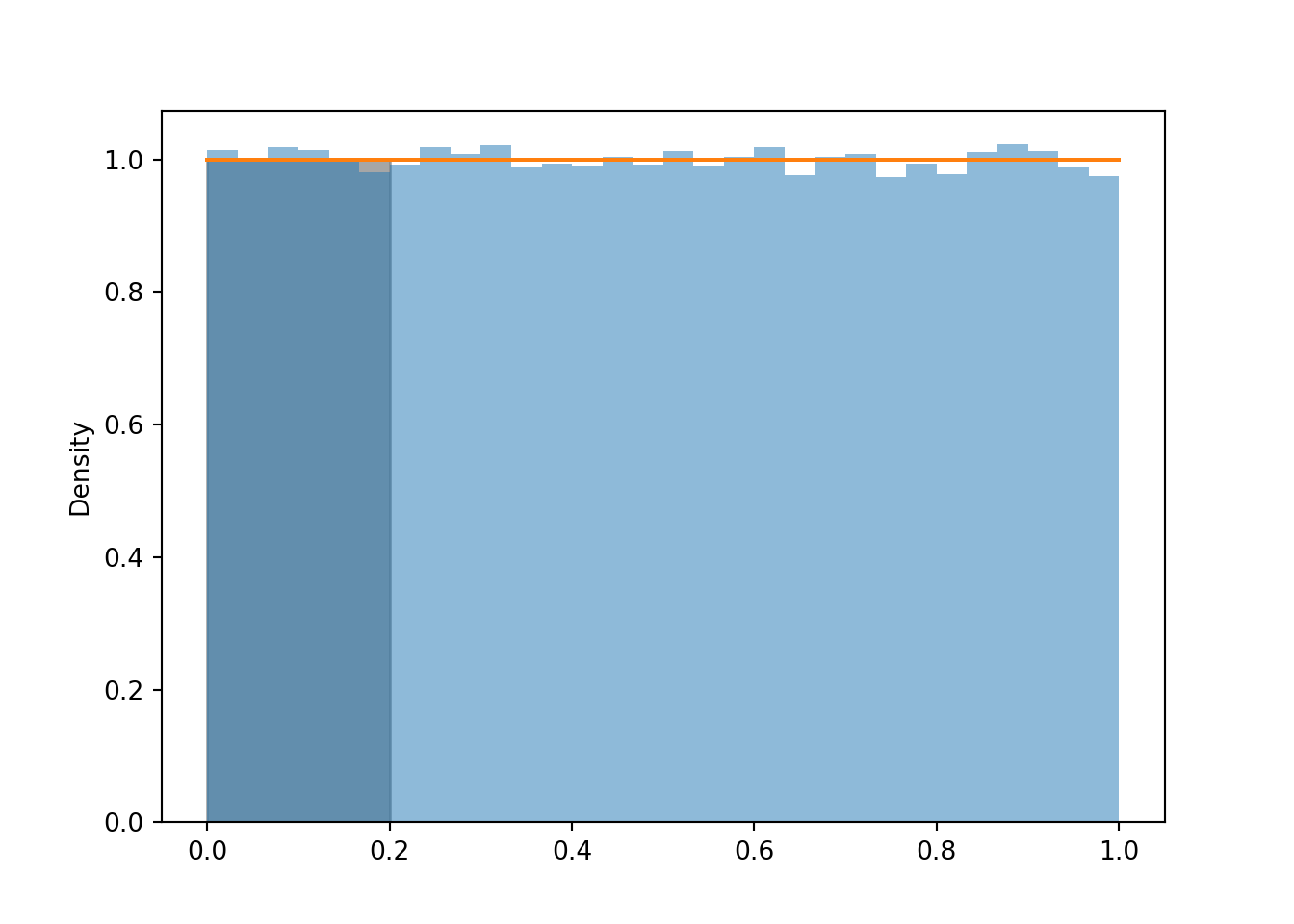
Example 2.46 Let \(U\) be a random variable with a Uniform(0, 1) distribution. Suppose we want to approximate \(\textrm{P}(U = 0.2)\); that is, \(\textrm{P}(U = 0.2000000000000000000000\ldots)\), the probability that \(U\) is equal to 0.2 with infinite precision.
- Use simulation to approximate \(\textrm{P}(U = 0.2)\).
- What do you notice? Why does this make sense?
- Use simulation to approximate \(\textrm{P}(|U - 0.2|<0.005) = \textrm{P}(0.195 < U < 0.205)\), the probability that \(U\) rounded to two decimal places is equal to 0.2.
- Use simulation to approximate \(\textrm{P}(|U - 0.2|<0.0005) = \textrm{P}(0.1995 < U < 0.2005)\), the probability that \(U\) rounded to three decimal places is equal to 0.2.
- Explain why \(\textrm{P}(U = 0.2) = 0.\) Also explain, why this is not a problem in practical applications.
Solution. to Example 2.46
Show/hide solution
- No matter how many values we simulate, the simulated frequency of 0.2000000000000000000000 is going to be 0.
- Any value in the uncountable, continuous interval [0, 1] is possible. The chance of getting 0.2000000000000000000, with infinite precision, is 0.
- While no simulated value is equal to 0.2, about 1% of the simulated values are within 0.005 of 0.2.
- While no simulated value is equal to 0.2, about 0.1% of the simulated values are within 0.0005 of 0.2.
- See below for discussion.
u.count_eq(0.2000000000000000000000)## 0
u.filter_lt(0.205).filter_gt(0.195)| Index | Result |
|---|---|
| 0 | 0.20076519635615264 |
| 1 | 0.20333908698658987 |
| 2 | 0.20367881835343815 |
| 3 | 0.19599831420257996 |
| 4 | 0.2007347979291363 |
| 5 | 0.20314994070561887 |
| 6 | 0.20135546618293232 |
| 7 | 0.19606278669522503 |
| 8 | 0.19558440716387837 |
| ... | ... |
| 983 | 0.19628454388807137 |
abs(u - 0.2).count_lt(0.01 / 2) / u.count()## 0.00984
u.filter_lt(0.2005).filter_gt(0.1995)| Index | Result |
|---|---|
| 0 | 0.19988924158859456 |
| 1 | 0.2003513249311828 |
| 2 | 0.20025658535644786 |
| 3 | 0.19972619849951678 |
| 4 | 0.20045182821278917 |
| 5 | 0.19984734738808807 |
| 6 | 0.19967628724024022 |
| 7 | 0.1995046852760809 |
| 8 | 0.19954264585524617 |
| ... | ... |
| 94 | 0.20042918435184476 |
abs(u - 0.2).count_lt(0.001 / 2) / u.count()## 0.00095The probability that a continuous random variable \(X\) equals any particular value is 0. That is, if \(X\) is continuous then \(\textrm{P}(X=x)=0\) for all \(x\). A continuous random variable can take uncountably many distinct values. Simulating values of a continuous random variable corresponds to an idealized spinner with an infinitely precise needle which can land on any value in a continuous scale. Of course, infinite precision is not practical, but continuous distributions are often reasonable and tractable mathematical models.
In the Uniform(0, 1) case, \(0.200000000\ldots\) is different than \(0.200000000010\ldots\) is different than \(0.2000000000000001\ldots\), etc. Consider the spinner in Figure 2.32. The spinner in the picture only has tick marks in increments of 0.01. When we spin, the probability that the needle lands closest to the 0.2 tick mark is 0.01. But if the spinner were labeled in 1000 increments of 0.001, the probability of landing closest to the 0.2 tick mark is 0.001. And with four decimal places of precision, the probability is 0.0001. And so on. The more precise we mark the axis, the smaller the probability the spinner lands closest to the 0.2 tick mark. The Uniform(0, 1) density represents what happens in the limit as the spinner becomes infinitely precise. The probability of landing closest to the 0.2 tick mark gets smaller and smaller, eventually becoming 0 in the limit.
Even though any specific value of a continuous random variable has probability 0, intervals still can have positive probability. In particular, the probability that a continuous random variable is “close to” a specific value can be positive. In practical applications involving continuous random variables we always have some reasonable degree of precision in mind. For example, if we’re interested in the probability that the high temperature tomorrow is 70 degrees F, we’re talking to the nearest degree, or maybe 0.1 degrees, but not “exactly equal to 70.0000000000000”. In practical applications involving continuous random variables, “equal to” really means “close to”, and “close to” probabilities correspond to intervals which can have positive probability.
In the meeting problem, assume that Regina’s arrival time \(R\) follows a Uniform(0, 60) distribution. Here is a histogram of simulated values, along with the Uniform(0, 60) density.
R = RV(Uniform(0, 60))

R.sim(10000).plot()
Uniform(0, 60).plot()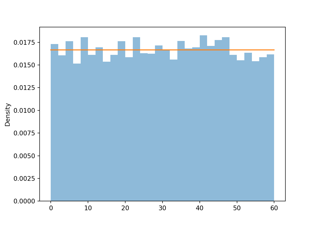
Remember that in a histogram, area represents relative frequency. The Uniform(0, 60) distribution covers a wider range of possible values than the Uniform(0, 1) distribution. Notice how the values on the vertical density axis change to compensate for the longer range on the horizontal variable axis. The histogram bars now all have a height of roughly \(\frac{1}{60} = 0.0167\) (aside from natural simulation variability). The total area of the rectangle with a height of \(\frac{1}{60}\) and a base of \(60\) is 1.
2.8.4 Normal distributions
Now suppose that in the meeting problem we assume that Regina’s arrival time \(R\) follows a Normal(30, 10) distribution. Recall that we represented a Normal(30, 10) distribution with the following spinner. (It’s the same spinner on both side, just with different features highlighted.)
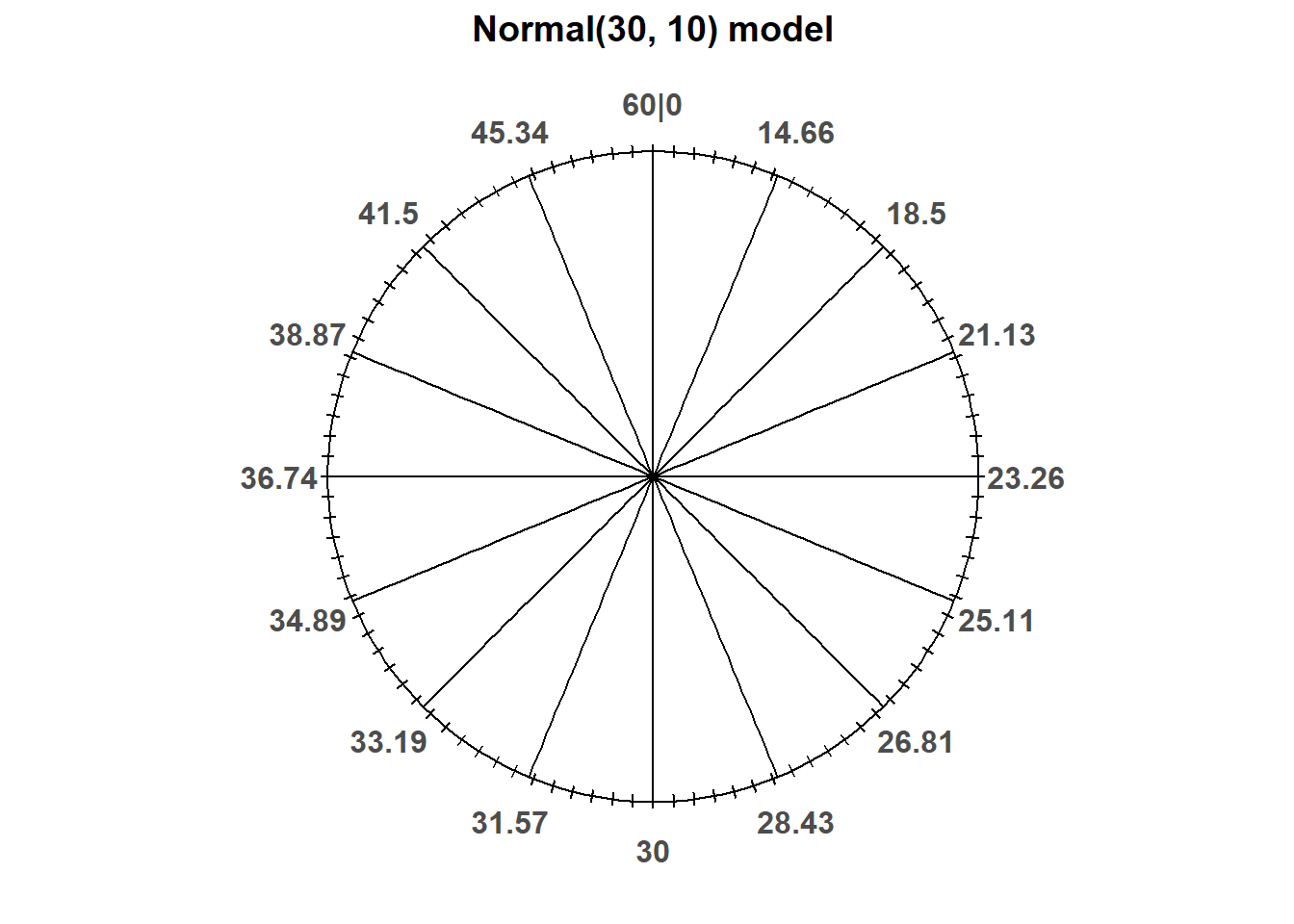
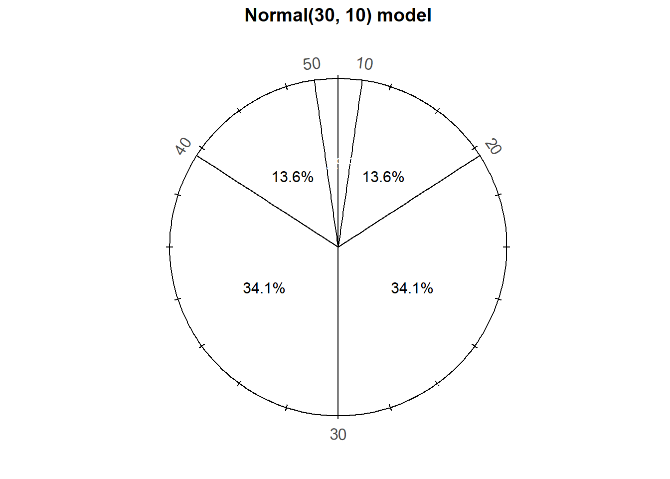
Notice that the values on the spinner axis are not equally spaced. Even though only some values are displayed on the spinner axis, imagine this spinner represents an infinitely fine model where any value between 0 and 60 is possible80.
Since the axis values are not evenly spaced, different intervals of the same length will have different probabilities. For example, the probability that this spinner lands on a value in the interval [20, 30] is about 0.341, but it is about 0.136 for the interval [10, 20].
Consider what the distribution of values simulated using this spinner would look like.
- About half of values would be below 30 and half above
- Because axis values near 30 are stretched out, values near 30 would occur with higher frequency than those near 0 or 60.
- The shape of the distribution would be symmetric about 30 since the axis spacing of values below 30 mirrors that for values above 500. For example, about 34% of values would be between 20 and 30, and also 34% between 30 and 40.
- About 68% of values would be between 20 and 40.
- About 95% of values would be between 10 and 50.
And so on. We could compute percentages for other intervals by measuring the areas of corresponding sectors on the spinner to complete the pattern of variability that values resulting from this spinner would follow. This particular pattern is called a “Normal(30, 10)” distribution.
As in the previous section we can define a random variable in Symbulate by specifying its distribution.
R = RV(Normal(30, 10))

r = R.sim(100)
r| Index | Result |
|---|---|
| 0 | 36.29113016687114 |
| 1 | 37.4094007313228 |
| 2 | 14.264301528381651 |
| 3 | 20.042727701969817 |
| 4 | 37.15955257761388 |
| 5 | 26.099398211524964 |
| 6 | 32.88325519093003 |
| 7 | 38.322039770311406 |
| 8 | 18.92786217353366 |
| ... | ... |
| 99 | 32.913981083519204 |
Plotting the values, we see that values near 30 occur more frequently than those near 0 or 60. The histogram is not “flat” like in the Uniform case.
r.plot(['rug', 'hist'])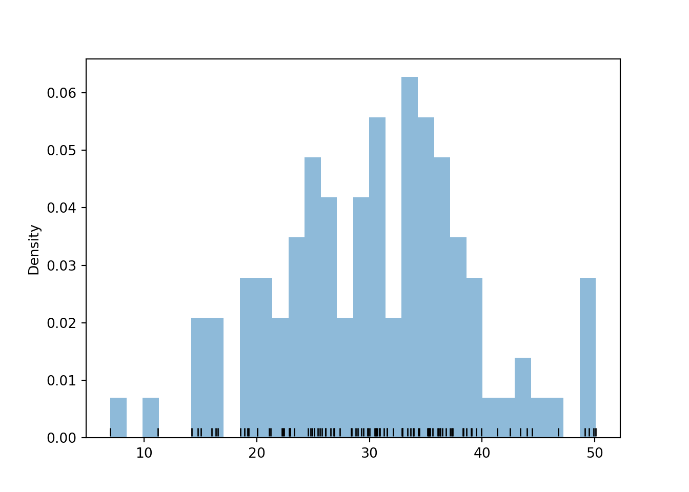
We’ll get a much clearer picture of the distribution if we simulate many values. We see that the histogram appears like it can be approximated by a smooth, “bell-shaped” curve, called the Normal(30, 10) density.
r = R.sim(10000)

r.plot() # plot the simulated values
Normal(30, 10).plot() # plot the smooth density curve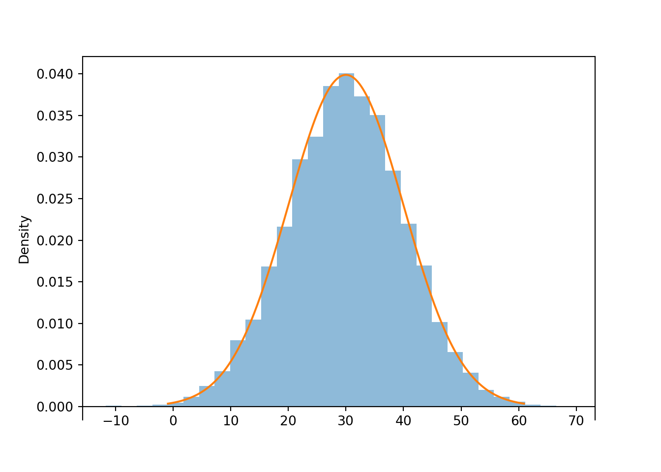
Figure 2.33: Histogram representing the approximate distribution of values simulated using the spinner in Figure 2.14. The smooth solid curve models the theoretical shape of the distribution, called the “Normal(30, 10)” distribution.
The bell-shaped curve depicting the Normal(30, 10) density is one probability density function. Probability density functions for continuous random variables are analogous to probability mass functions for discrete random variables. However, while they play analogous roles, they are different in one fundamental way; namely, a probability mass function outputs probabilities directly, while a probability density function does not. A probability density function only provides the density height; the area under the density curve determines probabilities. We will investigate densities in more detail later.
For the Normal(30, 10) distribution the parameter 30 represents the mean, and the parameter 10 represents the standard deviation. We will discuss these ideas in more detail later.
2.8.5 Percentiles
A distribution is characterized by its percentiles.
Example 2.47 Recall that the spinner in Figure 2.14 represents the Normal(30, 10) distribution. According to this distribution:
- What percent of values are less than 23.26?
- What is the 25th percentile?
- What is the 75th percentile?
- A value of 40 corresponds to what percentile?
Solution. to Example 2.47
Show/hide solution
- From the picture of the spinner, 25% of values are less than 23.26.
- The previous part implies that 23.26 is the 25th percentile.
- 75% of values are less than 36.74, so 36.74 is the 75th percentile.
- 40 is (roughly) the 84th percentile. About 84% of values are less than 40.
Roughly, the value \(x\) is the \(p\)th percentile (a.k.a. quantile) of a distribution of a random variable \(X\) if \(p\) percent of values of the variable are less than or equal to \(x\): \(\textrm{P}(X\le x) = p\). A spinner basically describes a distribution by specifying all the percentiles.
- The 25th percentile goes 25% of the way around the axis (at “3 o’clock”)
- The 50th percentile goes 50% of the way around the axis (at “6 o’clock”)
- The 75th percentile goes 75% of the way around the axis (at “9 o’clock”)
And so on. Filling in the circular axis of the spinner with the appropriate percentiles determines the probability that the random variable lies in any interval.
In Symbulate, percentiles of simulated values can be computed using quantile.
The 25th percentile of the simulated values of \(R\) is
r.quantile(0.25)## 23.127424687927032Remember, we’re dealing with simulated values so they won’t follow the distribution exactly. Compare with
r.count_lt(23.26) / r.count()## 0.2539The 75th percentile of simulated values is
r.quantile(0.75)## 36.79561736330196We can also compute quantiles of the theoretical distribution; compare with the spinner.
Normal(30, 10).quantile(0.25)## 23.255102498039182Normal(30, 10).quantile(0.75)## 36.744897501960814Normal(30, 10).quantile(0.84)## 39.944578832097534Normal(30, 10).quantile(0.975)## 49.59963984540054Continuing in this way we can fill in the rest of the axis labels on the Normal(30, 10) spinner. For example, Normal(30, 10).quantile(0.854) tells us the value that should go 85.4% of the way around the spinner axis (at “10:15”).
The percentiles of the Normal(30, 10) distribution are what determine that particular bell-shape.
2.8.6 Transformations
Many random variables are derived as transformations of other random variables. A function of a random variable is a random variable: if \(X\) is a random variable and \(g\) is a function then \(Y=g(X)\) is a random variable. In general, the distribution of \(g(X)\) will have a different shape than the distribution of \(X\). The exception is when \(g\) is a linear rescaling.
A linear rescaling is a transformation of the form \(g(u) = a +bu\), where \(a\) (intercept) and \(b\) (slope81) are constants. For example, converting temperature from Celsius to Fahrenheit using \(g(u) = 32 + 1.8u\) is a linear rescaling.
If \(U\) has a Uniform(0, 1) distribution, its possible values lie in [0, 1]. The random variable \(60U\), a linear rescaling of \(U\), takes values in [0, 60], and its distribution has a uniform shape. The linear rescaling changes the range of possible values, but not the general shape of the distribution.
U = RV(Uniform(0, 1))

R = 60 * U


R.sim(10000).plot()
Uniform(0, 60).plot() # plot the Uniform(0, 60) density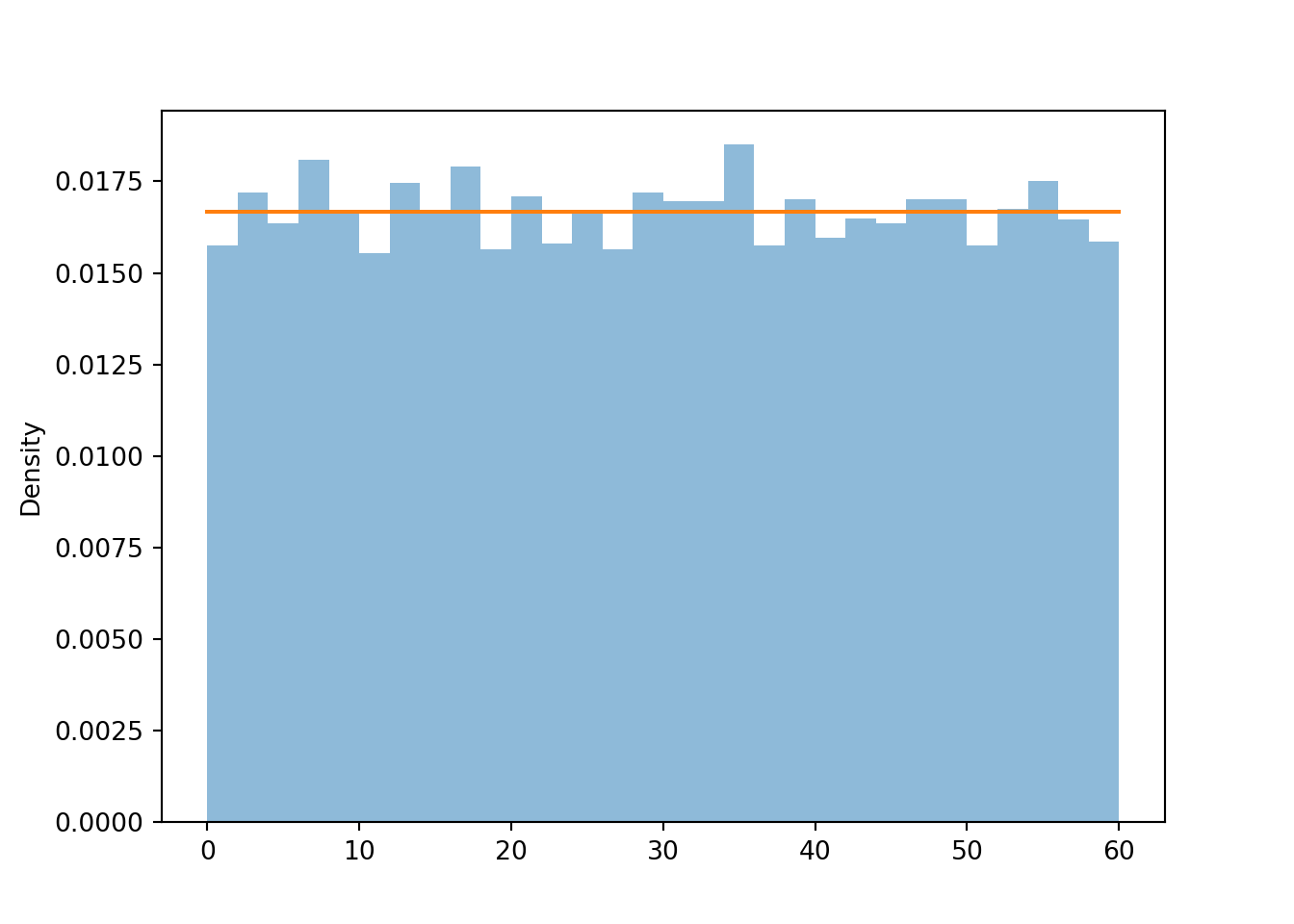
This suggests two ways of simulating a value from a Uniform(0, 60) distribution:
- Construct a Uniform(0, 60) spinner and spin it.
- Spin a Uniform(0, 1) spinner and multiply the result by 60.
What about a nonlinear transformation, like a logarithmic or square root transformation? In contrast to a linear rescaling, a nonlinear rescaling does change the shape of a distribution.
Let’s consider \(U^22\), where \(U\) has a Uniform(0, 1) distribution. Now \(U^2\) also takes values in [0, 1], but its distribution does not have a uniform shape.
Z = U ** 2

z = Z.sim(10000)

z.plot()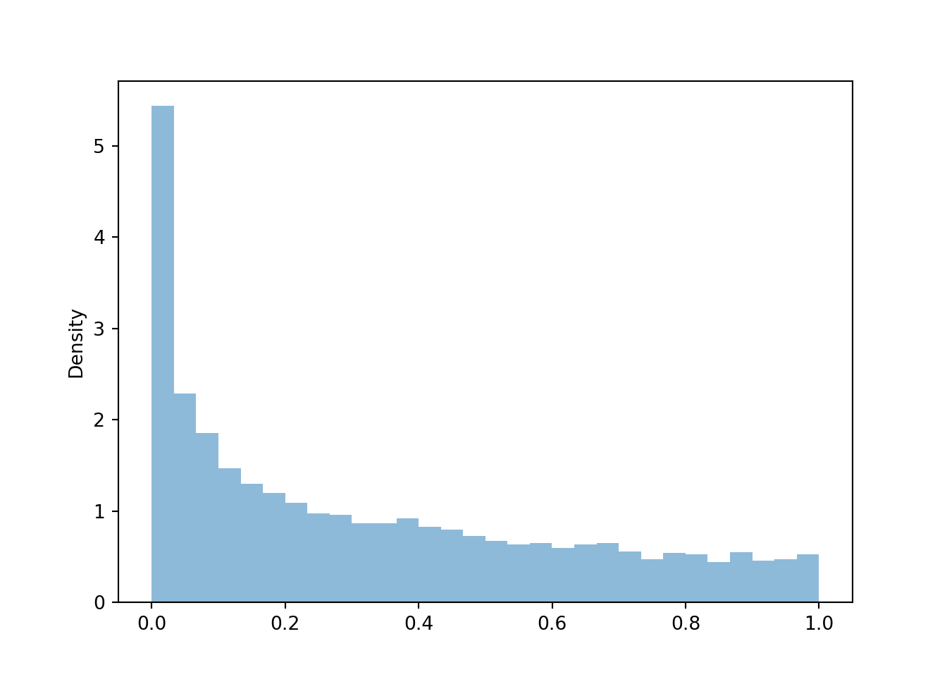
We see that \(U^2\) is more likely to be near 0 than near 1. Squaring numbers between 0 and 1 makes “pushes” them towards \(0.5^2 = 0.25\), \(0.1^2 = 0.01\), etc. The following spinner corresponds to the distribution approximated by the histogram above.
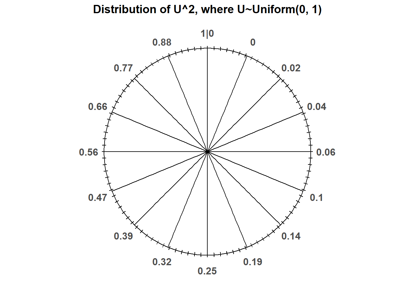
See how the values on the spinner correspond to the percentiles of the simulated values.
z.quantile(0.25)## 0.06312946962346765
z.quantile(0.5)## 0.2472516869650312
z.quantile(0.75)## 0.544010541083931Why is the interval \([0, 1]\) the standard instead of some other range of values? Because probabilities take values in \([0, 1]\). We will see why this is useful in more detail later.↩︎
Symbulate chooses the number of bins automatically, but you can set the number of bins using the
binsoption, e.g.,.plot(bins = 10)↩︎Symbulate will always produce a histogram with equal bin widths.↩︎
Technically, for a Normal distribution, any real value is possible. But values that are more than 3 or 4 standard deviations occur with small probability.↩︎
You might be familiar with “\(mx+b\)” where \(b\) denotes the intercept. In Statistics, \(b\) is often used to denote slope. For example, in R
abline(a = 32, b = 1.8)draws a line with intercept 32 and slope 1.8.↩︎