16.1 Motivation
The CER model for monthly asset returns assumes that returns are jointly normally distributed with a constant mean vector and covariance matrix. This model captures many of the stylized facts for monthly asset returns. While the CER model captures the covariances and correlations between different asset returns it does not explain where these covariances and correlations come from. The single index model is an extension of the CER model that explains the covariance and correlation structure among asset returns as resulting from common exposures to an underlying market index. The intuition behind the single index model can be illustrated by examining some example monthly returns.
For the single index model examples in this chapter, consider the monthly adjusted closing prices on four Northwest stocks (with tickers in parentheses): Boeing (BA), Nordstrom (JWN), Microsoft (MSFT), Starbucks (SBUX). We will also use the monthly adjusted closing prices on the S&P 500 index (^GSPC) as the proxy for the market index. These prices are extracted from the IntroCompFinR package as follows:
# get data from IntroCompFin package
data(baDailyPrices, jwnDailyPrices,
     msftDailyPrices, sbuxDailyPrices, sp500DailyPrices)
baPrices = to.monthly(baDailyPrices, OHLC=FALSE)
jwnPrices = to.monthly(jwnDailyPrices, OHLC=FALSE)
msftPrices = to.monthly(msftDailyPrices, OHLC=FALSE)
sbuxPrices = to.monthly(sbuxDailyPrices, OHLC=FALSE)
sp500Prices = to.monthly(sp500DailyPrices, OHLC=FALSE)
siPrices = merge(baPrices, jwnPrices, msftPrices,
                 sbuxPrices, sp500Prices)
The data sample is from January, 1998 through May, 2012 and returns are simple returns:
smpl = "1998-01::2012-05"
siPrices = siPrices[smpl]
siRetS = na.omit(Return.calculate(siPrices, method="simple"))
head(siRetS, n=3)
## BA JWN MSFT SBUX SP500
## Feb 1998 0.1425 0.1298 0.13640 0.0825 0.07045
## Mar 1998 -0.0393 0.1121 0.05570 0.1438 0.04995
## Apr 1998 -0.0396 0.0262 0.00691 0.0629 0.00908Prices are shown in Figure 16.1, created using:
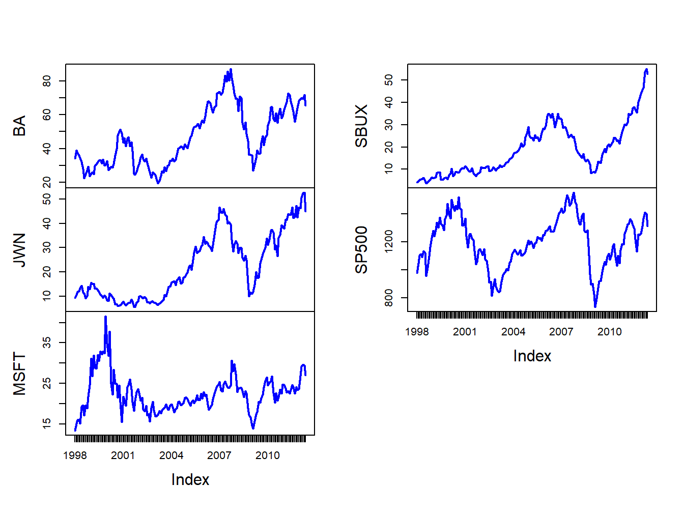
Figure 16.1: Monthly closing prices on four Northwest stocks and the S&P 500 index.
The time plots of prices show some common movements among the stocks that are similar to movements of the S&P 500 index . During the dot-com boom-bust at the beginning of the sample, except for Starbucks, prices rise during the boom and fall during the bust. For all assets, prices rise during the five year boom period prior to the financial crisis, fall sharply after 2008 during the bust, and then rise afterward.
Figure 16.2 shows time plots of the monthly returns on each stock together with the return on the S&P 500 index, created using
par(mfrow=c(2,2))
plot.zoo(siRetS[,c("SP500","BA")], plot.type="single",
         main="S&P 500 and Boeing", ylab="returns",
         col=c("blue","orange"), lwd=c(2,2))
abline(h=0)
plot.zoo(siRetS[,c("SP500","JWN")], plot.type="single",
         main="S&P 500 and Nordstom", ylab="returns",
         col=c("blue","orange"), lwd=c(2,2))
abline(h=0)
plot.zoo(siRetS[,c("SP500","MSFT")], plot.type="single",
         main="S&P 500 and Microsoft", ylab="returns",
         col=c("blue","orange"), lwd=c(2,2))
abline(h=0)
plot.zoo(siRetS[,c("SP500","SBUX")], plot.type="single",
         main="S&P 500 and Starbucks", ylab="returns",
         col=c("blue","orange"), lwd=c(2,2))
abline(h=0) 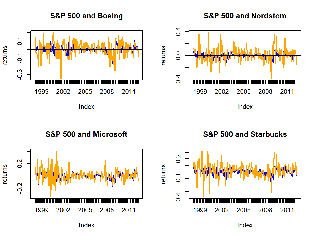
Figure 16.2: Monthly returns on four Northwest stocks. The orange line in each panel is the monthly return on the stock, and the blue line is the monthly return on the S&P 500 index.
Figure 16.2 shows that the individual stock returns are more volatile than the S&P 500 returns, and that the movement in stock returns (orange lines) tends to follow the movements in the S&P 500 returns indicating positive covariances and correlations.
The sample return covariance and correlation matrices are computed using:
##            BA     JWN    MSFT    SBUX   SP500
## BA    0.00796 0.00334 0.00119 0.00245 0.00223
## JWN   0.00334 0.01492 0.00421 0.00534 0.00339
## MSFT  0.00119 0.00421 0.01030 0.00348 0.00298
## SBUX  0.00245 0.00534 0.00348 0.01191 0.00241
## SP500 0.00223 0.00339 0.00298 0.00241 0.00228## BA JWN MSFT SBUX SP500
## BA 1.000 0.306 0.131 0.251 0.524
## JWN 0.306 1.000 0.340 0.401 0.581
## MSFT 0.131 0.340 1.000 0.314 0.614
## SBUX 0.251 0.401 0.314 1.000 0.463
## SP500 0.524 0.581 0.614 0.463 1.000The sample correlation matrix is visualized in Figure 16.3
using the corrplot function corrplot.mixed():
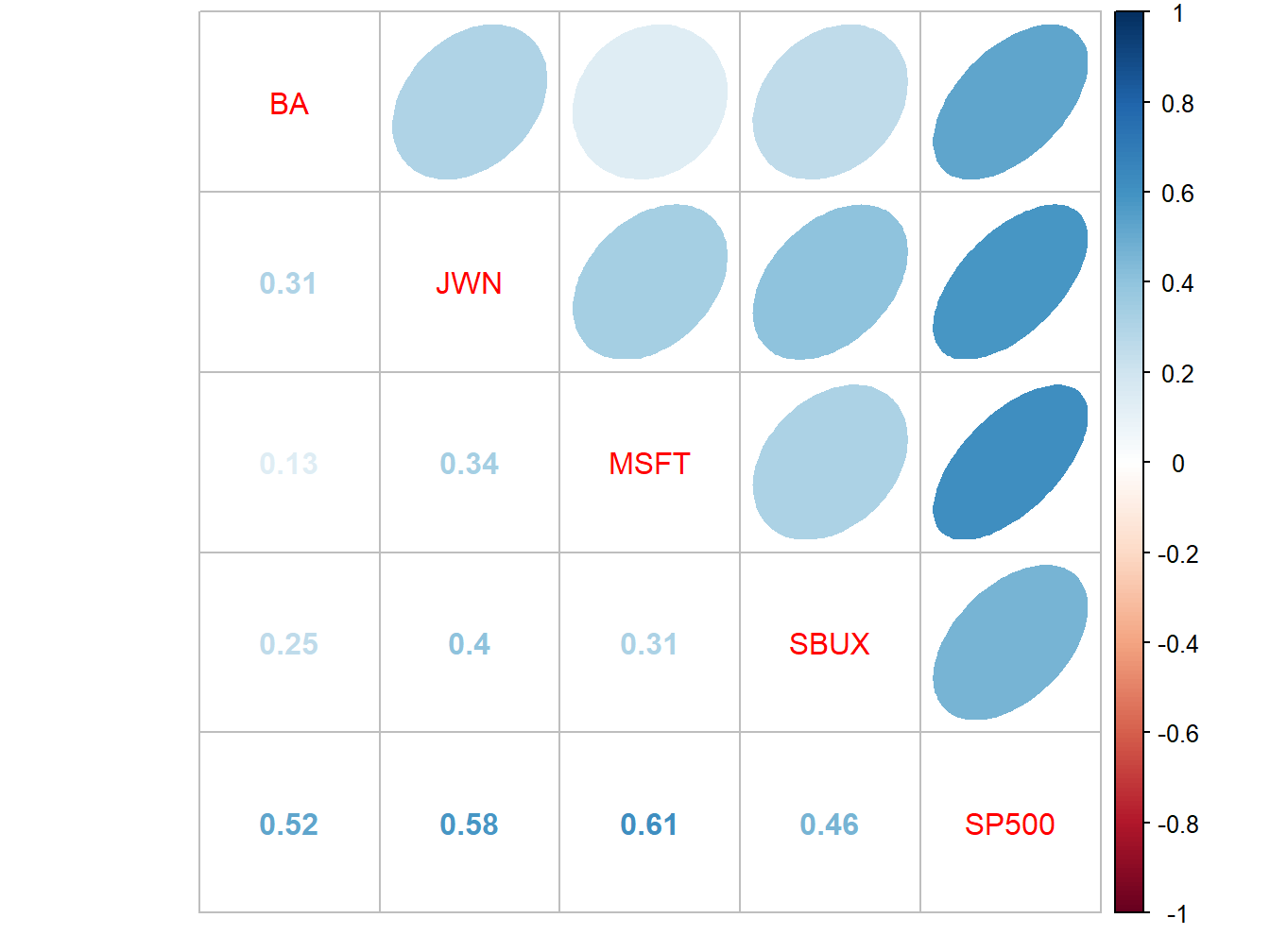
Figure 16.3: Sample correlation matrix of monthly returns.
All returns are positively correlated and each stock return has the highest positive correlation with the S&P 500 index.
The positive covariance and correlation of each stock return with the market return can also be visualized with scatterplots as illustrated in Figure 16.4, created with:
siRetSmat = coredata(siRetS)
par(mfrow=c(2,2))
plot(siRetSmat[, "SP500"], siRetSmat[, "BA"],
     main="S&P 500 and Boeing", col="cornflowerblue",
     lwd=2, pch=16, cex=2, xlab="S&P 500",
     ylab="BA", ylim=c(-0.4, 0.4))
abline(h=0,v=0)
plot(siRetSmat[, "SP500"], siRetSmat[, "JWN"],
     main="S&P 500 and Nordstrom", col="cornflowerblue",
     lwd=2, pch=16, cex=2, xlab="S&P 500",
     ylab="JWN", ylim=c(-0.4, 0.4))
abline(h=0,v=0)
plot(siRetSmat[, "SP500"], siRetSmat[, "MSFT"],
     main="S&P 500 and Microsoft", col="cornflowerblue",
     lwd=2, pch=16, cex=2, xlab="S&P 500",
     ylab="MSFT", ylim=c(-0.4, 0.4))
abline(h=0,v=0)
plot(siRetSmat[, "SP500"], siRetSmat[, "SBUX"],
     main="S&P 500 and Starbucks", col="cornflowerblue",
     lwd=2, pch=16, cex=2, xlab="S&P 500",
     ylab="SBUX", ylim=c(-0.4, 0.4))
abline(h=0,v=0)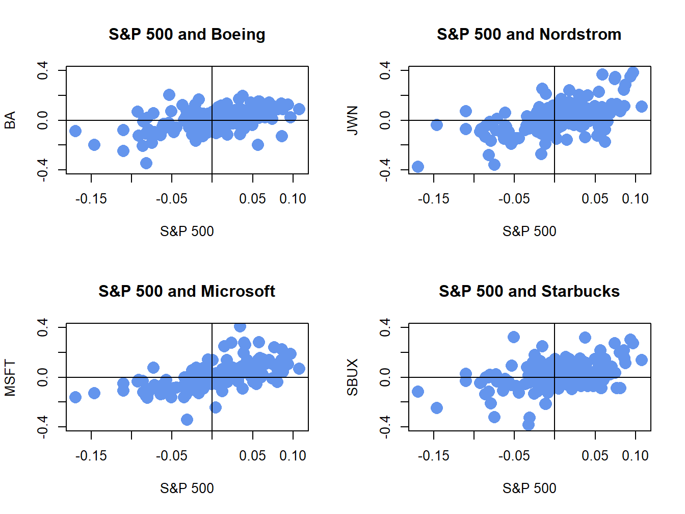
Figure 16.4: Monthly return scatterplots of each stock vs. the S&P 500 index.
The scatterplots show that as the market return increases, the returns on each stock increase in a linear way.
\(\blacksquare\)