5.1 Univariate Descriptive Statistics
Let \(\{R_{t}\}\) denote a univariate time series of asset returns (simple or continuously compounded). Throughout this chapter we will assume that \(\{R_{t}\}\) is a covariance stationary and ergodic stochastic process such that: \[\begin{align*} E[R_{t}] & =\mu\textrm{ independent of }t,\\ \mathrm{var}(R_{t}) & =\sigma^{2}\textrm{ independent of }t,\\ \mathrm{cov}(R_{t},R_{t-j}) & =\gamma_{j}\textrm{ independent of }t,\\ \mathrm{corr}(R_{t},R_{t-j}) & =\gamma_{j}/\sigma^{2}=\rho_{j}\textrm{ independent of }t. \end{align*}\] In addition, we will assume that each \(R_{t}\) is identically distributed with unknown pdf \(f_{R}(r)\).
An observed sample of size \(T\) of historical asset returns \(\{r_{t}\}_{t=1}^{T}\) is assumed to be a realization from the stochastic process \(\{R_{t}\}\) for \(t=1,\ldots,T.\) That is, \[ \{r_{t}\}_{t=1}^{T}=\{R_{1}=r_{1},\ldots,R_{T}=r_{T}\} \] The goal of exploratory data analysis (eda) is to use the observed sample \(\{r_{t}\}_{t=1}^{T}\) to learn about the unknown pdf \(f_{R}(r)\) as well as the time dependence properties of \(\{R_{t}\}\).
5.1.1 Example data
We illustrate the descriptive statistical analysis of financial data
using daily and monthly adjusted closing prices on Microsoft stock
(ticker symbol msft) and the S&P 500 index (ticker symbol
^gspc) over the period January 2, 1998 and May
31, 2012.20
These data are obtained from (finance.yahoo.com) and are available
in the R package IntroCompFinR. We first use the daily and
monthly data to illustrate descriptive statistical analysis and to
establish a number of stylized facts about the distribution and time
dependence in daily and monthly returns.
Daily adjusted closing price data on Microsoft and the S&P 500 index
over the period January 4, 1993 through December 31, 2014 are available
in the IntroCompFinR package as the xts objects
msftDailyPrices and sp500DailyPrices, respectively.
We restrict the sample period to January 2, 1998 and May 31, 2012 using:
smpl = "1998-01::2012-05"
msftDailyPrices = msftDailyPrices[smpl]
sp500DailyPrices = sp500DailyPrices[smpl]
End-of-month prices are extracted from the daily prices using the
xts function to.monthly():
msftMonthlyPrices = to.monthly(msftDailyPrices, OHLC=FALSE)
sp500MonthlyPrices = to.monthly(sp500DailyPrices, OHLC=FALSE)
It will also be convenient to create a merged xts object
containing both the Microsoft and S&P 500 index prices:
msftSp500DailyPrices = merge(msftDailyPrices, sp500DailyPrices)
msftSp500MonthlyPrices = merge(msftMonthlyPrices, sp500MonthlyPrices)
We create xts objects containing simple returns using
the PerformanceAnalytics function Return.calculate() (and remove the first NA
value with na.omit()):
msftMonthlyRetS = na.omit(Return.calculate(msftMonthlyPrices,
                                           method="simple"))
msftDailyRetS = na.omit(Return.calculate(msftDailyPrices,
                                         method="simple"))
sp500MonthlyRetS = na.omit(Return.calculate(sp500MonthlyPrices,
                                            method="simple"))
sp500DailyRetS = na.omit(Return.calculate(sp500DailyPrices,
                                          method="simple"))
msftSp500MonthlyRetS = na.omit(Return.calculate(msftSp500MonthlyPrices,
                                                method="simple"))
msftSp500DailyRetS = na.omit(Return.calculate(msftSp500DailyPrices,
                                              method="simple"))
We also create xts objects containing monthly continuously
compounded (cc) returns:
msftMonthlyRetC = log(1 + msftMonthlyRetS)
sp500MonthlyRetC = log(1 + sp500MonthlyRetS)
msftSp500MonthlyRetC = merge(msftMonthlyRetC, sp500MonthlyRetC)
\(\blacksquare\)
5.1.2 Time plots
A natural graphical descriptive statistic for time series data is a time plot. This is simply a line plot with the time series data on the y-axis and the time index on the x-axis. Time plots are useful for quickly visualizing many features of the time series data.
A two-panel plot showing the monthly prices is given in Figure 5.1,
and is created using the plot method for xts objects:
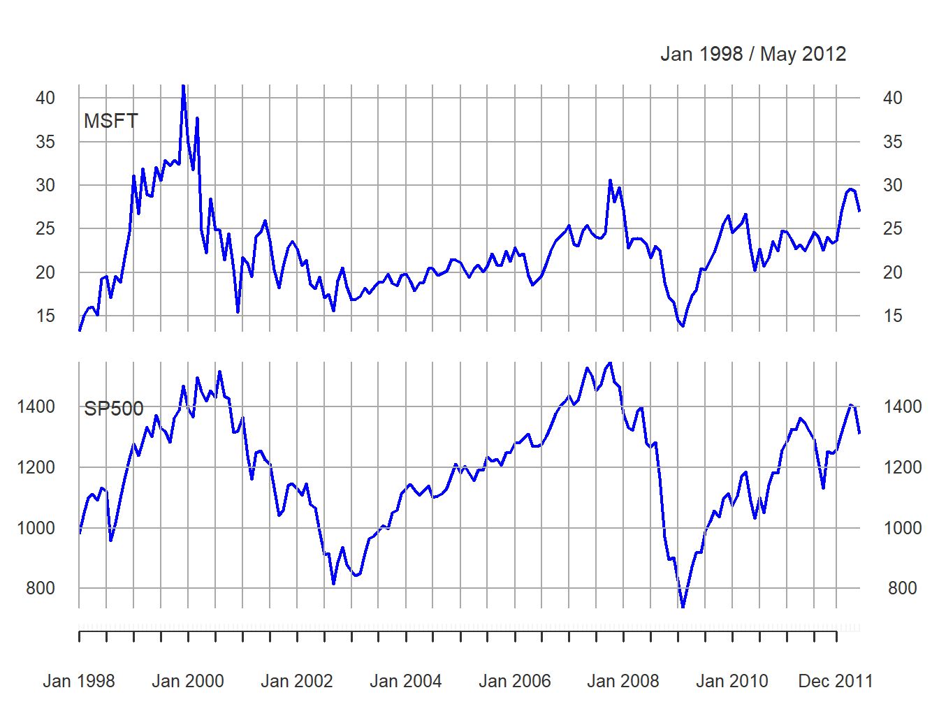
Figure 5.1: End-of-month closing prices on Microsoft stock and the S&P 500 index.
The prices exhibit random walk like behavior (no tendency to revert to a time independent mean) and appear to be non-stationary. Both prices show two large boom-bust periods associated with the dot-com period of the late 1990s and the run-up to the financial crisis of 2008. Notice the strong common trend behavior of the two price series.
A time plot for the monthly simple returns is created using:
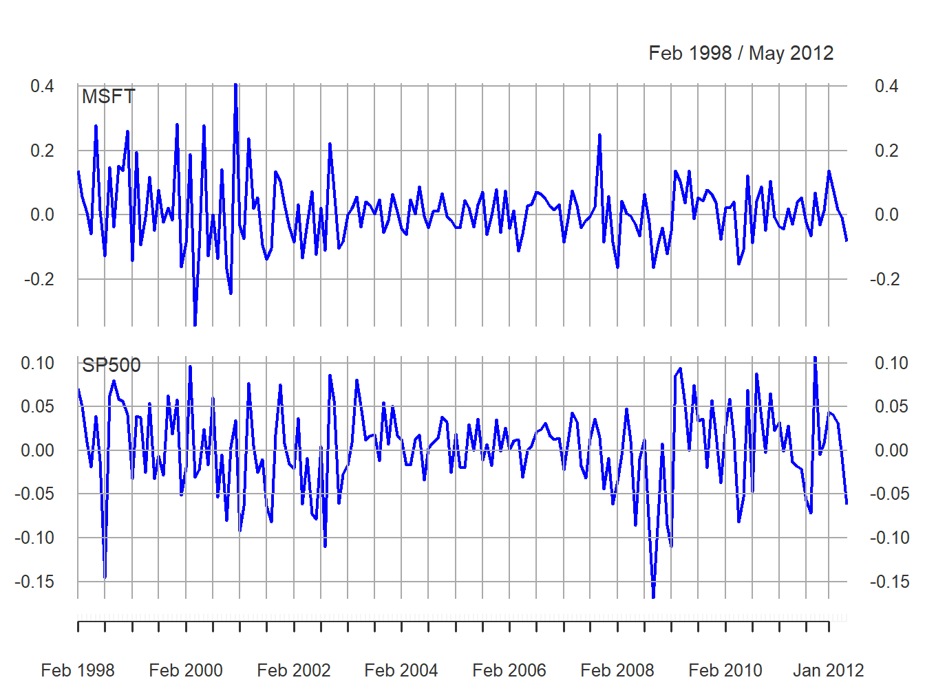
Figure 5.2: Monthly simple returns on Microsoft stock and the S&P 500 index.
and is given in Figure 5.2. In contrast to prices, returns show clear mean-reverting behavior and the common monthly mean values look to be very close to zero. Hence, the common mean value assumption of covariance stationarity looks to be satisfied. However, the volatility (i.e., fluctuation of returns about the mean) of both series appears to change over time. Both series show higher volatility over the periods 1998 - 2003 and 2008 - 2012 than over the period 2003 - 2008. This is an indication of possible non-stationarity in volatility.21 Also, the coincidence of high and low volatility periods across assets suggests a common driver to the time varying behavior of volatility. There does not appear to be any visual evidence of systematic time dependence in the returns. Later on we will see that the estimated autocorrelations are very close to zero. The returns for Microsoft and the S&P 500 tend to go up and down together suggesting a positive correlation.
\(\blacksquare\)
In Figure 5.2, the volatility of the returns on Microsoft and the S&P 500 looks to be similar but this is illusory. The y-axis scale for Microsoft is much larger than the scale for the S&P 500 index and so the volatility of Microsoft returns is actually much larger than the volatility of the S&P 500 returns. Figure 5.3 shows both returns series on the same time plot created using:
plot(msftSp500MonthlyRetS, main="", multi.panel=FALSE, lwd=2,
     col=c("red", "blue"), lty=c("dashed", "solid"),
     legend.loc = "topright")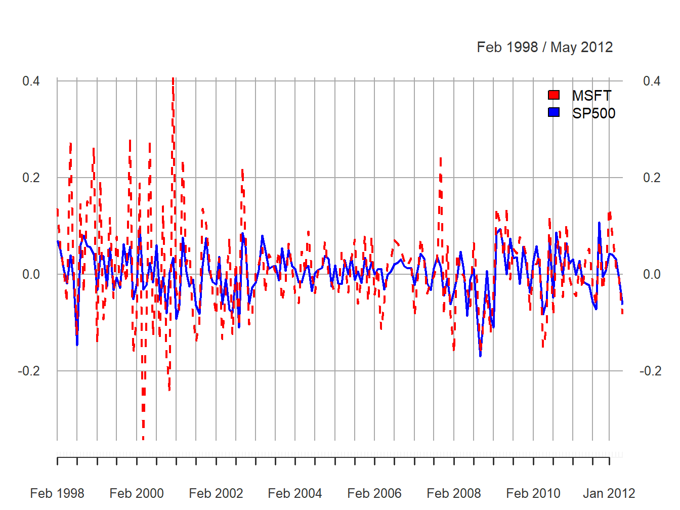
Figure 5.3: Monthly simple returns for Microsoft and S&P 500 index on the same graph.
Now the higher volatility of Microsoft returns, especially before 2003, is clearly visible. However, after 2008 the volatilities of the two series look quite similar. In general, the lower volatility of the S&P 500 index represents risk reduction due to holding a large diversified portfolio.
\(\blacksquare\)
Figure 5.4 compares the simple and continuously compounded (cc) monthly returns for Microsoft created using:
retDiff = msftMonthlyRetS - msftMonthlyRetC
dataToPlot = merge(msftMonthlyRetS, msftMonthlyRetC, retDiff)
colnames(dataToPlot) = c("Simple", "cc", "Diff")
plot(dataToPlot, multi.panel=TRUE, yaxis.same=FALSE, main="",
         lwd=2, col=c("black", "blue", "red"))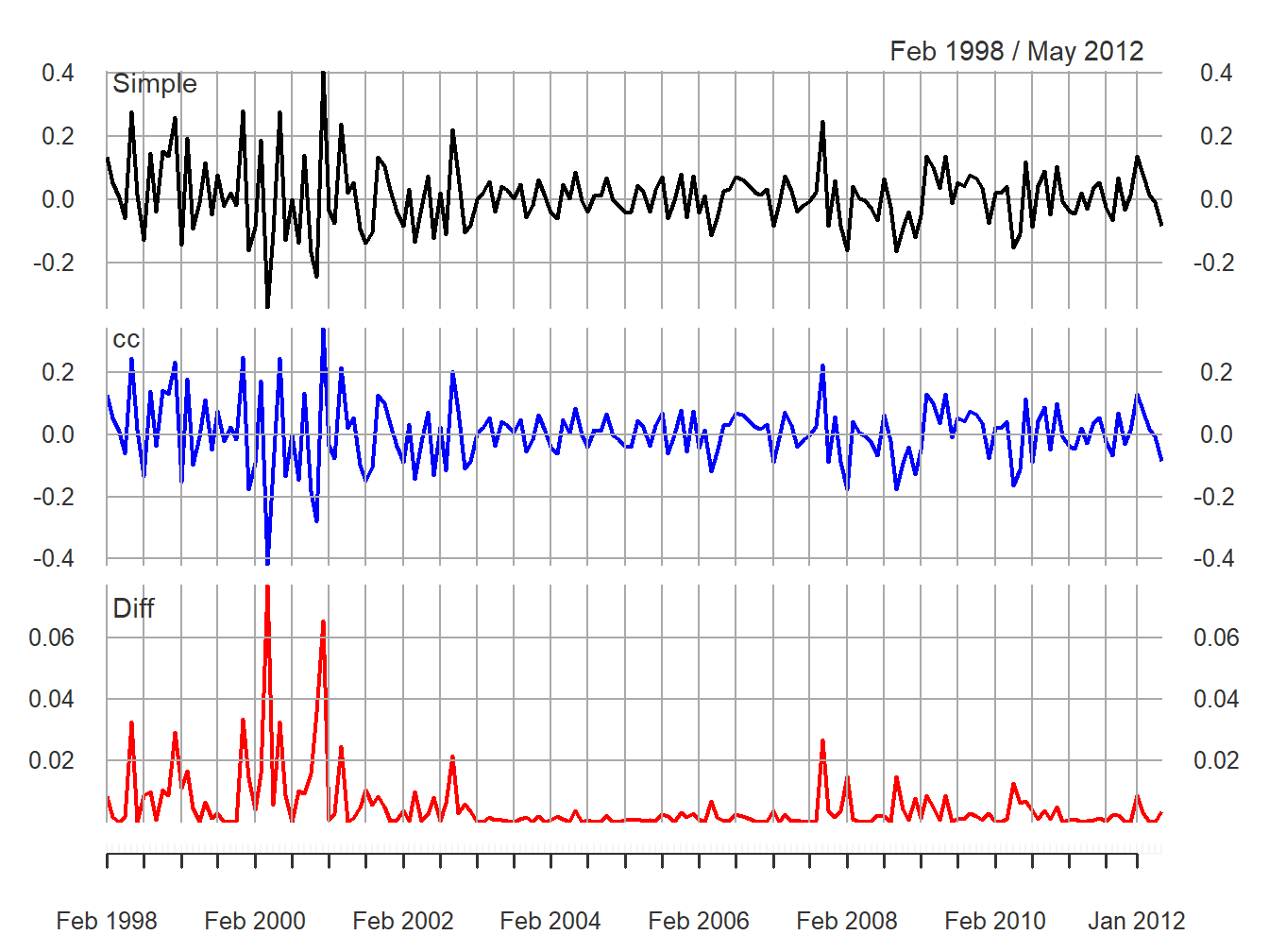
Figure 5.4: Monthly simple and cc returns on Microsoft. Top panel: simple returns; middle panel: cc returns; bottom panel: difference between simple and cc returns.
The top panel shows the simple returns, the middle panel shows the cc returns, and the bottom panel shows the difference between the simple and cc returns. Qualitatively, the simple and cc returns look almost identical. The main differences occur when the simple returns are large in absolute value (e.g., mid 2000, early 2001 and early 2008). In this case the difference between the simple and cc returns can be fairly large (e.g., as large as 0.08 in mid 2000). When the simple return is large and positive, the cc return is not quite as large; when the simple return is large and negative, the cc return is a larger negative number.
\(\blacksquare\)
Figure 5.5 shows the daily simple returns on Microsoft and the S&P 500 index created with:
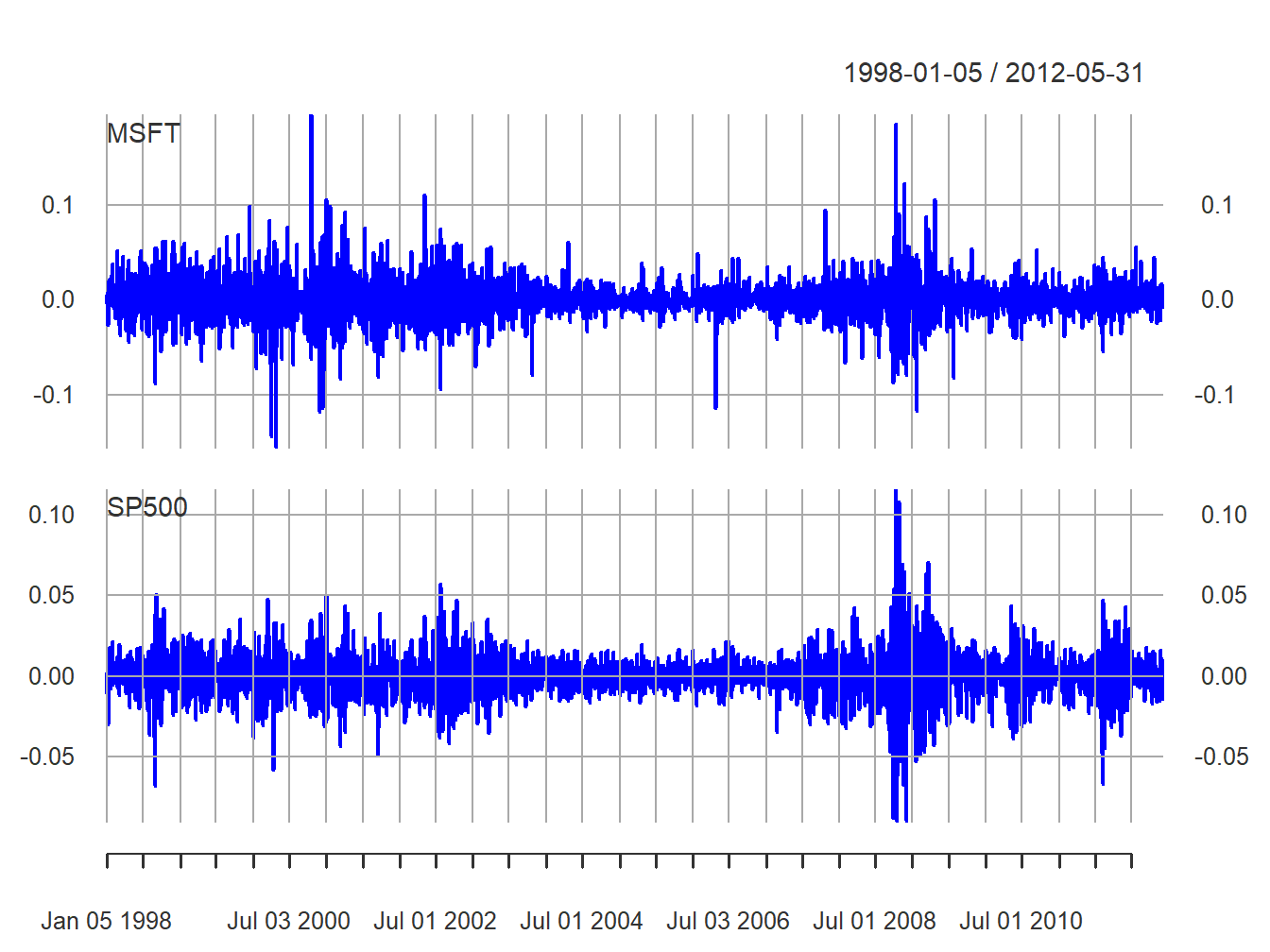
Figure 5.5: Daily returns on Microsoft and the S&P 500 index.
Compared with the monthly returns, the daily returns are closer to zero and the magnitude of the fluctuations (volatility) is smaller. However, the clustering of periods of high and low volatility is more pronounced in the daily returns. As with the monthly returns, the volatility of the daily returns on Microsoft is larger than the volatility of the S&P 500 returns. Also, the daily returns show some large and small “spikes” that represent unusually large (in absolute value) daily movements (e.g., Microsoft up 20% in one day and down 15% on another day). The monthly returns do not exhibit such extreme movements relative to typical volatility.
\(\blacksquare\)
5.1.3 Descriptive statistics for the distribution of returns
In this section, we consider graphical and numerical descriptive statistics for the unknown marginal pdf, \(f_{R}(r)\), of returns. Recall, we assume that the observed sample \(\{r_{t}\}_{t=1}^{T}\) is a realization from a covariance stationary and ergodic time series \(\{R_{t}\}\) where each \(R_{t}\) is a continuous random variable with common pdf \(f_{R}(r)\). The goal is to use \(\{r_{t}\}_{t=1}^{T}\) to describe properties of \(f_{R}(r)\).
We study returns and not prices because prices are random walk non-stationary. Sample descriptive statistics are only meaningful for covariance stationary and ergodic time series.
5.1.3.1 Histograms
A histogram of returns is a graphical summary used to describe the general shape of the unknown pdf \(f_{R}(r).\) It is constructed as follows. Order returns from smallest to largest. Divide the range of observed values into \(N\) equally sized bins. Show the number or fraction of observations in each bin using a bar chart.
Figure 5.6 shows the histograms of
the daily and monthly returns on Microsoft stock and the S&P 500
index created using the R function hist():
par(mfrow=c(2,2))
hist(msftMonthlyRetS, main="", col="cornflowerblue")
hist(msftDailyRetS, main="", col="cornflowerblue")
hist(sp500MonthlyRetS, main="", col="cornflowerblue")
hist(sp500DailyRetS, main="", col="cornflowerblue")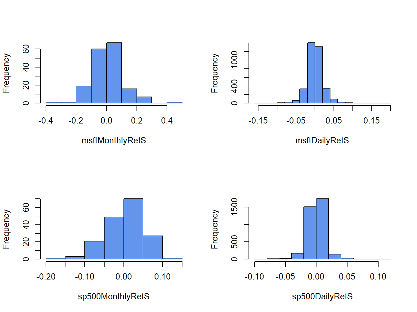
Figure 5.6: Histograms of monthly continuously compounded returns on Microsoft stock and S&P 500 index.
All histograms have a bell-shape like the normal distribution. The histograms of daily returns are centered around zero and those for the monthly return are centered around values slightly larger than zero. The bulk of the daily (monthly) returns for Microsoft and the S&P 500 are between -5% and 5% (-20% and 20%) and -3% and 3% (-10% and 10%), respectively. The histogram for the S&P 500 monthly returns is slightly skewed left (long left tail) due to more large negative returns than large positive returns whereas the histograms for the other returns are roughly symmetric.
When comparing two or more return distributions, it is useful to use the same bins for each histogram. Figure 5.7 shows the histograms for Microsoft and S&P 500 returns using the same 15 bins, created with the R code:
msftHist = hist(msftMonthlyRetS, plot=FALSE, breaks=15)
par(mfrow=c(2,2))
hist(msftMonthlyRetS, main="", col="cornflowerblue")
hist(msftDailyRetS, main="", col="cornflowerblue",
     breaks=msftHist$breaks)
hist(sp500MonthlyRetS, main="", col="cornflowerblue",
     breaks=msftHist$breaks)
hist(sp500DailyRetS, main="", col="cornflowerblue",
     breaks=msftHist$breaks)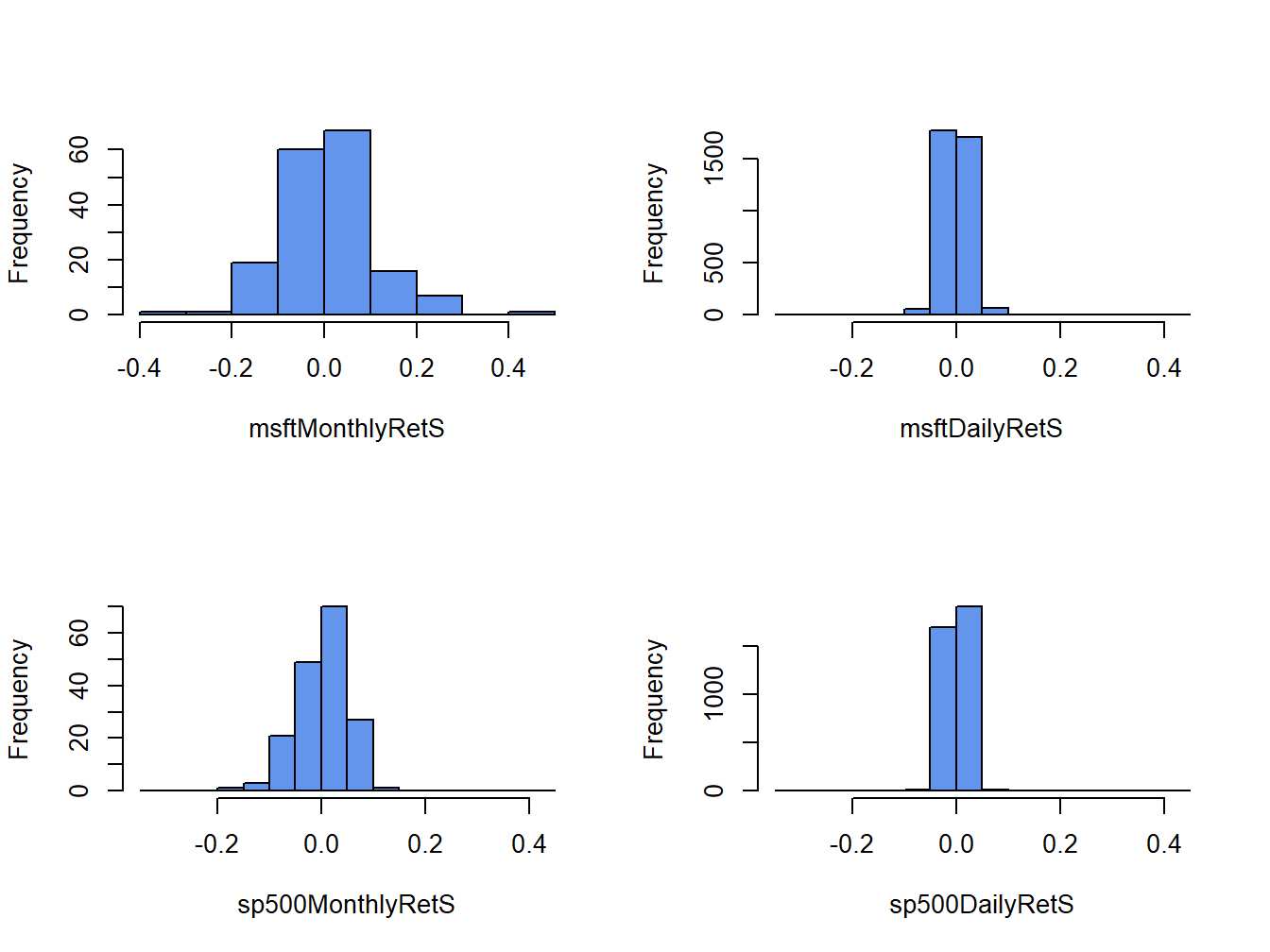
Figure 5.7: Histograms for Microsoft and S&P 500 returns using the same bins.
Using the same bins for all histograms allows us to see more clearly that the distribution of monthly returns is more spread out than the distributions for daily returns, and that the distribution of S&P 500 returns is more tightly concentrated around zero than the distribution of Microsoft returns.
\(\blacksquare\)
The shape of the histogram for Microsoft returns suggests that a normal distribution might be a good candidate for the unknown distribution of Microsoft returns. To investigate this conjecture, we simulate random returns from a normal distribution with mean and standard deviation calibrated to the Microsoft daily and monthly returns using:
set.seed(123)
gwnDaily = rnorm(length(msftDailyRetS),
                 mean=mean(msftDailyRetS), sd=sd(msftDailyRetS))
gwnDaily = xts(gwnDaily, index(msftDailyRetS))
gwnMonthly = rnorm(length(msftMonthlyRetS),
                   mean=mean(msftMonthlyRetS), sd=sd(msftMonthlyRetS))
gwnMonthly = xts(gwnMonthly, index(msftMonthlyRetS))
Figure 5.8 shows the Microsoft monthly returns together with the simulated normal returns created using:
par(mfrow=c(2,2))
plot.zoo(msftMonthlyRetS, main="Monthly Returns on MSFT",
         lwd=2, col="blue", ylim=c(-0.4, 0.4), ylab="Returns")
abline(h=0)
plot.zoo(gwnMonthly, main="Simulated Normal Returns",
         lwd=2, col="blue", ylim=c(-0.4, 0.4), ylab="Returns")
abline(h=0)
hist(msftMonthlyRetS, main="", col="cornflowerblue",
     xlab="returns")
hist(gwnMonthly, main="", col="cornflowerblue",
     xlab="returns", breaks=msftHist$breaks)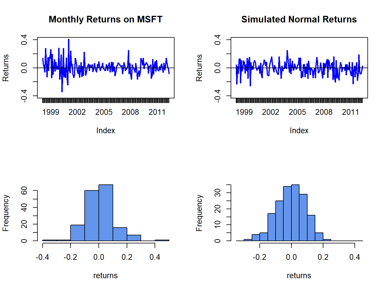
Figure 5.8: Comparison of Microsoft monthly returns with simulated normal returns with the same mean and standard deviation as the Microsoft returns.
msftDailyHist = hist(msftDailyRetS, plot=FALSE, breaks=15)
par(mfrow=c(2,2))
plot.zoo(msftDailyRetS, main="Monthly Returns on MSFT",
     lwd=2, col="blue", ylim=c(-0.15, 0.15), ylab="Returns")
abline(h=0)
plot.zoo(gwnDaily, main="Simulated Normal Returns",
     lwd=2, col="blue", ylim=c(-0.15, 0.15), ylab="Returns")
abline(h=0)
hist(msftDailyRetS, main="", col="cornflowerblue",
     xlab="returns")
hist(gwnDaily, main="", col="cornflowerblue",
     xlab="returns", breaks=msftDailyHist$breaks)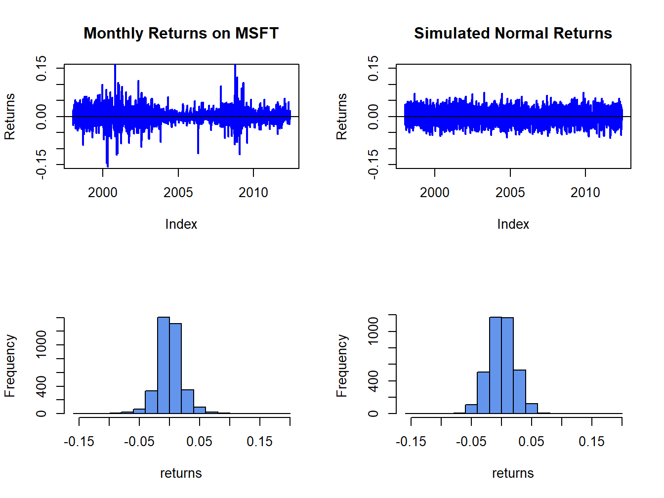
Figure 5.9: Comparison of Microsoft daily returns with simulated normal returns with the same mean and standard deviation as the Microsoft returns.
The simulated normal returns shares many of the same features as the Microsoft returns: both fluctuate randomly about zero. However, there are some important differences. In particular, the volatility of Microsoft returns appears to change over time (large before 2003, small between 2003 and 2008, and large again after 2008) whereas the simulated returns has constant volatility. Additionally, the distribution of Microsoft returns has fatter tails (more extreme large and small returns) than the simulated normal returns. Apart from these features, the simulated normal returns look remarkably like the Microsoft monthly returns.
Figure 5.9 shows the Microsoft daily returns together with the simulated normal returns. The daily returns look much less like GWN than the monthly returns. Here the constant volatility of simulated GWN does not match the volatility patterns of the Microsoft daily returns, and the tails of the histogram for the Microsoft returns are “fatter” than the tails of the GWN histogram.
\(\blacksquare\)
5.1.3.2 Smoothed histogram
Histograms give a good visual representation of the data distribution.
The shape of the histogram, however, depends on the number of bins
used. With a small number of bins, the histogram often appears blocky
and fine details of the distribution are not revealed. With a large
number of bins, the histogram might have many bins with very few observations.
The hist() function in R smartly chooses the number of bins
so that the resulting histogram typically looks good.
The main drawback of the histogram as a descriptive statistic for the
underlying pdf of the data is that it is discontinuous. If it is believed
that the underlying pdf is continuous, it is desirable to have a continuous
graphical summary of the pdf. The smoothed histogram achieves
this goal. Given a sample of data \(\{x_{t}\}_{t=1}^{T}\) the R function
density() computes a smoothed estimate of the underlying
pdf at each point \(x\) in the bins of the histogram using the formula:
\[
\hat{f}_{X}(x)=\frac{1}{Tb}\sum_{t=1}^{T}k\left(\frac{x-x_{t}}{b}\right),
\]
where \(k(\cdot)\) is a continuous smoothing function (typically a
standard normal distribution) and \(b\) is a bandwidth (or bin-width)
parameter that determines the width of the bin around \(x\) in which
the smoothing takes place. The resulting pdf estimate \(\hat{f}_{X}(x)\)
is a two-sided weighted average of the histogram values around \(x\).
Figure 5.10 shows the histogram of Microsoft returns overlaid with the smoothed histogram created using:
par(mfrow=c(1,1))
MSFT.density = density(msftMonthlyRetS)
hist(msftMonthlyRetS, main="", xlab="Microsoft Monthly Returns",
     col="cornflowerblue", probability=TRUE, ylim=c(0,5.5))
points(MSFT.density,type="l", col="orange", lwd=2)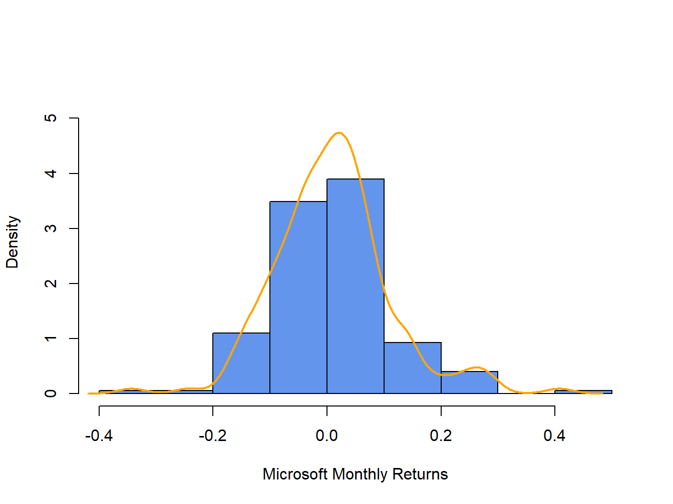
Figure 5.10: Histogram and smoothed density estimate for the monthly returns on Microsoft.
In Figure 5.10, the histogram is normalized (using the argument ), so that its total area is equal to one. The smoothed density estimate transforms the blocky shape of the histogram into a smooth continuous graph.
\(\blacksquare\)
5.1.3.3 Empirical CDF
Recall, the CDF of a random variable \(X\) is the function \(F_{X}(x)=\Pr(X\leq x).\) The empirical CDF of a data sample \(\{x_{t}\}_{t=1}^{T}\) is the function that counts the fraction of observations less than or equal to \(x\): \[\begin{align} \hat{F}_{X}(x) & =\frac{1}{T}(\#x_{i}\leq x)\tag{5.1}\\ & =\frac{\textrm{number of }x_{i}\textrm{ values }\leq x}{\textrm{sample size}}\nonumber \end{align}\]
Computing the empirical CDF of Microsoft monthly returns at a given point, say \(R=0\), is a straightforward calculation in R:
## [1] 0.471Here, the expression msftMonthlyRetS <= 0 creates
a logical vector the same length as msftMonthlyRetS that
is equal to TRUE when returns are less than or equal to 0
and FALSE when returns are greater than zero. Then Fhat.0
is equal to the fraction of TRUE values (returns less than
or equal to zero) in the data, which gives (5.1)
evaluated at zero. The R function ecdf() can be used to compute
and plot (5.1) for all of the observed returns.
For example, Figure 5.11 shows the empirical CDF
for Microsoft monthly returns computed using:
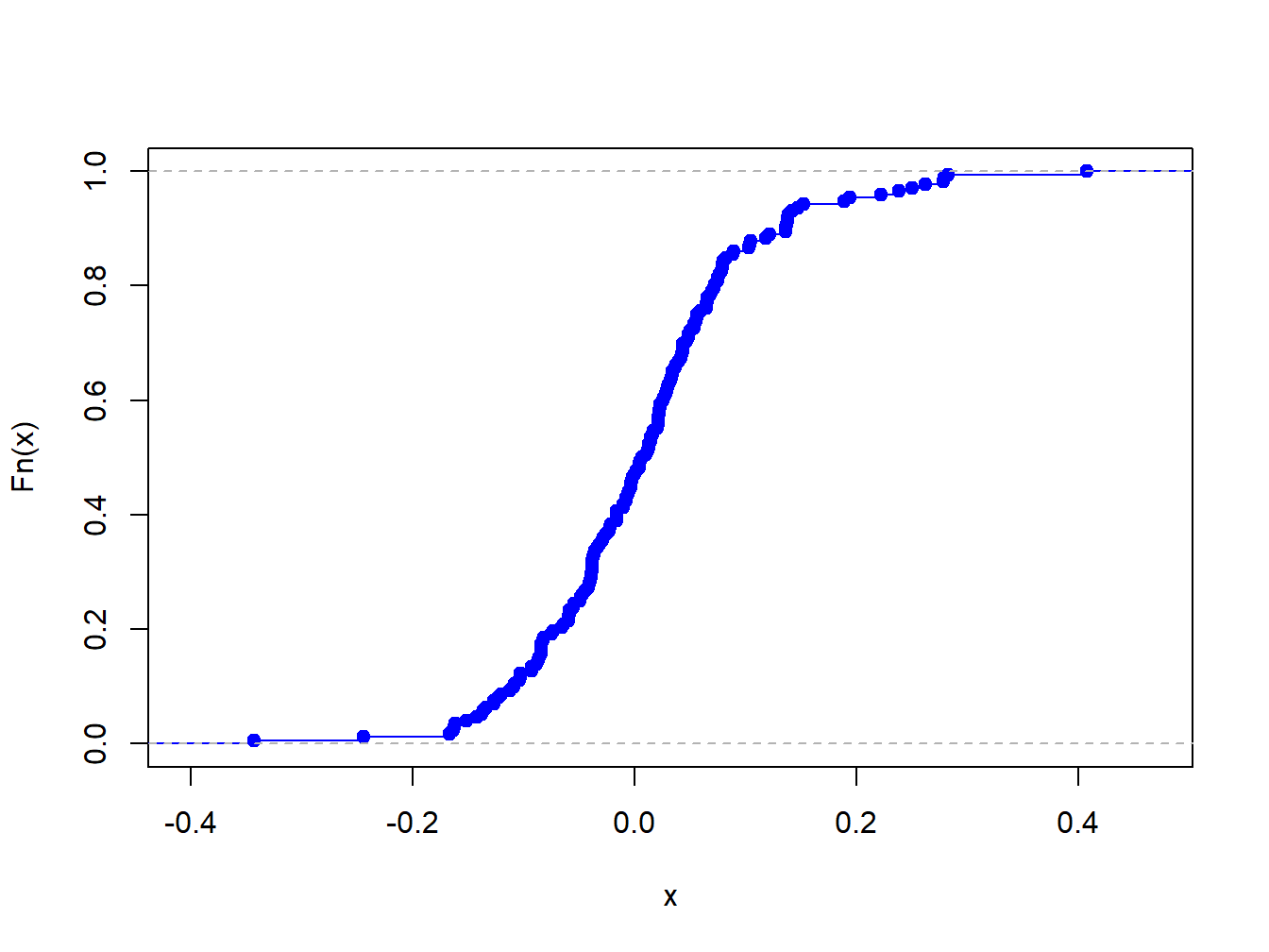
Figure 5.11: Empirical CDF of monthly returns on Microsoft
The “S” shape of the empirical CDF of Microsoft monthly returns is due to the symmetric shape of the histogram of monthly returns.
5.1.3.4 Empirical quantiles/percentiles
Recall, for \(\alpha\in(0,1)\) the \(\alpha\times100\%\) quantile of the distribution of a continuous random variable \(X\) with CDF \(F_{X}\) is the point \(q_{\alpha}^{X}\) such that \(F_{X}(q_{\alpha}^{X})=\Pr(X\leq q_{\alpha}^{X})=\alpha\). Accordingly, the \(\alpha\times100\%\) empirical quantile (or \(100\times\alpha^{\textrm{th}}\) percentile) of a data sample \(\{x_{t}\}_{t=1}^{T}\) is the data value \(\hat{q}_{\alpha}\) such that \(\alpha\cdot100\%\) of the data are less than or equal to \(\hat{q}_{\alpha}\).
Empirical quantiles can be easily determined by ordering the data from smallest to largest giving the ordered sample (also known as order statistics): \[ x_{(1)}<x_{(2)}<\cdots<x_{(T)}. \] The empirical quantile \(\hat{q}_{\alpha}\) is the order statistic closest to \(\alpha\times T\).22
The empirical quartiles are the empirical quantiles for \(\alpha=0.25,0.5\) and \(0.75,\) respectively. The second empirical quartile \(\hat{q}_{.50}\) is called the sample median and is the data point such that half of the data is less than or equal to its value. The interquartile range (IQR) is the difference between the 3rd and 1st quartile: \[ \mathrm{IQR}=\hat{q}_{.75}-\hat{q}_{.25}, \] and shows the size of the middle of the data distribution.
The R function quantile() computes empirical quantiles for
a single data series. By default, quantile() returns the
empirical quartiles as well as the minimum and maximum values:
##          MSFT    SP500
## 0%   -0.34339 -0.16942
## 25%  -0.04883 -0.02094
## 50%   0.00854  0.00809
## 75%   0.05698  0.03532
## 100%  0.40765  0.10772
In the above code, the R function apply() is used to compute the empirical quantiles on each column of the xts object msftSp500MonthlyRetS. The syntax for apply() is:
## function (X, MARGIN, FUN, ...)
## NULL
where X is a multi-column data object, MARGIN specifies looping over rows (MARGIN=1) or columns (MARGIN=2), FUN specifies the R function to be applied,
and ... represents any optional arguments to be passed to FUN.
Here we see that the lower (upper) quartiles of the Microsoft monthly returns are smaller (larger) than the respective quartiles for the S&P 500 index.
To compute quantiles for a specified \(\alpha\) use the probs
argument. For example, to compute the 1% and 5% quantiles of the
monthly returns use:
##      MSFT   SP500
## 1% -0.189 -0.1204
## 5% -0.137 -0.0818
Historically, there is a \(1\%\) chance of losing more than \(19\%\) (\(12\%\)) on Microsoft (S&P 500) in a given month, and a \(5\%\) chance of losing more than \(14\%\) (\(8\%\)) on Microsoft (S&P 500) in a given month.
To compute the median and IQR values for monthly returns use the R
functions median() and IQR(), respectively:
med = apply(msftSp500MonthlyRetS, 2, median)
iqr = apply(msftSp500MonthlyRetS, 2, IQR)
rbind(med, iqr)
## MSFT SP500
## med 0.00854 0.00809
## iqr 0.10581 0.05626The median returns are similar (about 0.8% per month) but the IQR for Microsoft is about twice as large as the IQR for the S&P 500 index.
\(\blacksquare\)
5.1.3.5 Historical/Empirical VaR
Recall, the \(\alpha\times100\%\) value-at-risk (VaR) of an investment of \(\$W\) is \(\mathrm{VaR}_{\alpha}=-\$W\times q_{\alpha}^{R}\), where \(q_{\alpha}^{R}\) is the \(\alpha\times100\%\) quantile of the probability distribution of the investment simple rate of return \(R\) (recall, we multiply by \(-1\) to represent loss as a positive number). The \(\alpha\times100\%\) historical VaR (sometimes called empirical VaR or Historical Simulation VaR) of an investment of \(\$W\) is defined as: \[ \mathrm{VaR}_{\alpha}^{HS}=-\$W\times\hat{q}_{\alpha}^{R}, \] where \(\hat{q}_{\alpha}^{R}\) is the empirical \(\alpha\) quantile of a sample of simple returns \(\{R_{t}\}_{t=1}^{T}\). For a sample of continuously compounded returns \(\{r_{t}\}_{t=1}^{T}\) with empirical \(\alpha\) quantile \(\hat{q}_{\alpha}^{r}\), \[ \mathrm{VaR}_{\alpha}^{HS}=-\$W\times\left(\exp(\hat{q}_{\alpha}^{r})-1\right). \]
Historical VaR is based on the distribution of the observed returns and not on any assumed distribution for returns (e.g., the normal distribution or the log-normal distribution).
Consider investing \(W=\$100,000\) in Microsoft and the S&P 500 over a month. The 1% and 5% historical VaR values for these investments based on the historical samples of monthly returns are:
W = 100000
msftQuantiles = quantile(msftMonthlyRetS, probs=c(0.01, 0.05))
sp500Quantiles = quantile(sp500MonthlyRetS, probs=c(0.01, 0.05))
msftVaR = -W*msftQuantiles
sp500VaR = -W*sp500Quantiles
cbind(msftVaR, sp500VaR)
## msftVaR sp500VaR
## 1% 18929 12040
## 5% 13694 8184Based on the empirical distribution of the monthly returns, a $100,000 monthly investment in Microsoft will lose $13694 or more with 5% probability and will lose $18928 or more with 1% probability. The corresponding values for the S&P 500 are $8183 and $12039, respectively. The historical VaR values for the S&P 500 are considerably smaller than those for Microsoft. In this sense, investing in Microsoft is riskier than investing in the S&P 500 index.
\(\blacksquare\)
5.1.4 QQ-plots
Often it is of interest to see if a given data sample could be viewed as a random sample from a specified probability distribution. One easy and effective way to do this is to compare the empirical quantiles of a data sample to the quantiles from a reference probability distribution. If the quantiles match up, then this provides strong evidence that the reference distribution is appropriate for describing the distribution of the observed data. If the quantiles do not match up, then the observed differences between the empirical quantiles and the reference quantiles can be used to determine a more appropriate reference distribution. It is common to use the normal distribution as the reference distribution, but any distribution can in principle be used.
The quantile-quantile plot (QQ-plot) gives a graphical comparison of the empirical quantiles of a data sample to those from a specified reference distribution. The QQ-plot is an xy-plot with the reference distribution quantiles on the x-axis and the empirical quantiles on the y-axis. If the quantiles exactly match up then the QQ-plot is a straight line. If the quantiles do not match up, then the shape of the QQ-plot indicates which features of the data are not captured by the reference distribution.
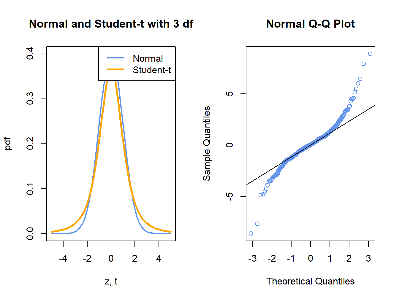
Figure 5.12: Normal QQ-Plot for Fat-tailed Data
Figure 5.12 shows a normal QQ-plot for data simulated from a Student’s t distribution with 3 degrees-of-freedom which has fatter tails than the normal distribution. Notice how the normal QQ-plot deviates from the straight line for both large and small quantiles of the normal distribution. This S-shape tells us that both extremely small and extremely large empirical quantiles (on the vertical axis) are larger (in absolute value) than the corresponding theoretical quantiles of the normal distribution.
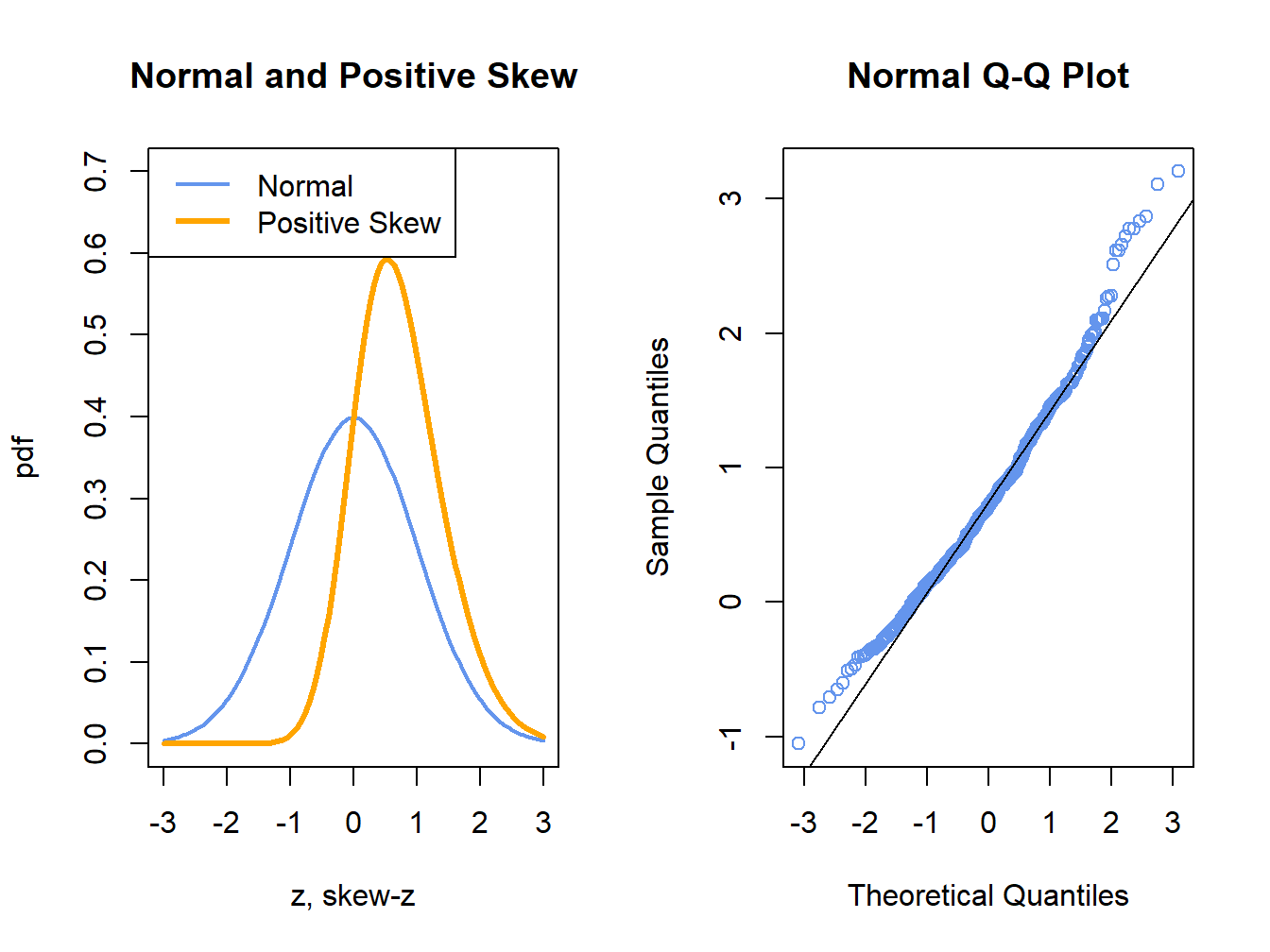
Figure 5.13: Normal QQ-Plot for Positively Skewed Data
Figure 5.13 shows a normal QQ-plot for data simulated from a distribution with positive skewness which has more density in the right tail than in the left tail. Here the normal QQ-plot has a convex shape relative to the straight line indicating that the lower (upper) empirical quantiles are closer to (farther from) zero than the corresponding theoretical quantiles of the normal distribution.
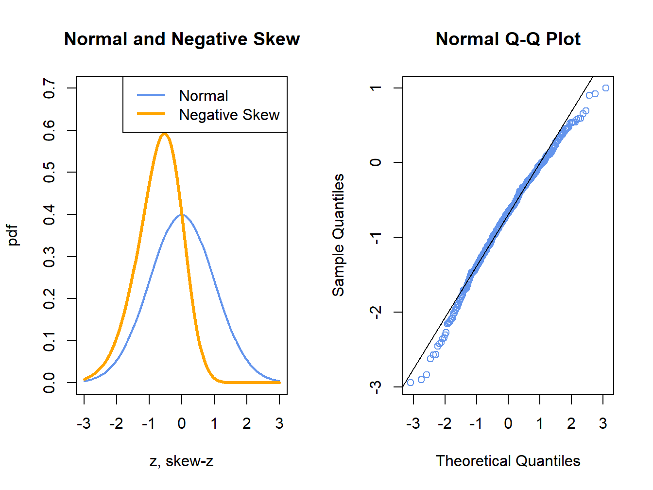
Figure 5.14: Normal QQ-Plot for Negatively Skewed Data
Figure 5.14 shows a normal QQ-plot for data simulated from a distribution with negative skewness which has more density in the left tail than in the right tail. Here the normal QQ-plot has a concave shape relative to the straight line indicating that the lower (upper) empirical quantiles are farther from (closer to) zero than the corresponding theoretical quantiles of the normal distribution.
The R function qqnorm() creates a QQ-plot for a data sample
using the normal distribution as the reference distribution. Figure
5.15 shows normal QQ-plots for the simulated GWN
data, Microsoft returns and S&P 500 returns.
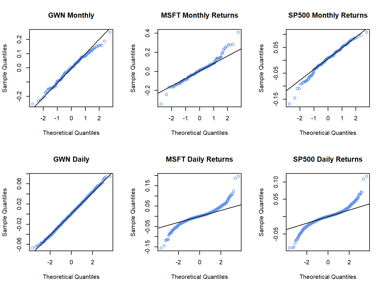
Figure 5.15: Normal QQ-plots for GWN, Microsoft returns and S&P 500 returns.
The normal QQ-plot for the simulated GWN data is very close to a straight
line, as it should be since the data are simulated from a normal
distribution.23
The qqline() function draws a straight line through the points
to help determine if the quantiles match up. The normal QQ-plots for
the Microsoft and S&P 500 monthly returns are linear in the middle
of the distribution but deviate from linearity in the tails of the
distribution. In the normal QQ-plot for Microsoft monthly returns,
the theoretical normal quantiles on the x-axis are too small in both
the left and right tails because the points fall below the straight
line in the left tail and fall above the straight line in the right
tail. Hence, the normal distribution does not match the empirical
distribution of Microsoft monthly returns in the extreme tails of
the distribution. In other words, the Microsoft returns have fatter tails than the normal distribution. For the S&P 500 monthly returns,
the theoretical normal quantiles are too small only for the left tail
of the empirical distribution of returns (points fall below the straight
line in the left tail only). This reflects the long left tail (negative
skewness) of the empirical distribution of S&P 500 returns. The normal
QQ-plots for the daily returns on Microsoft and the S&P 500 index
both exhibit a pronounced tilted S-shape with extreme departures from
linearity in the left and right tails of the distributions. The daily
returns clearly have much fatter tails than the normal distribution.
\(\blacksquare\)
The function qqPlot() from the car package or the
function chart.QQPlot() from the PerformanceAnalytics
package can be used to create a QQ-plot against any reference distribution
that has a corresponding quantile function implemented in R. For example,
a QQ-plot for the Microsoft returns using a Student’s t reference
distribution with 5 degrees of freedom can be created using:
## Loading required package: carData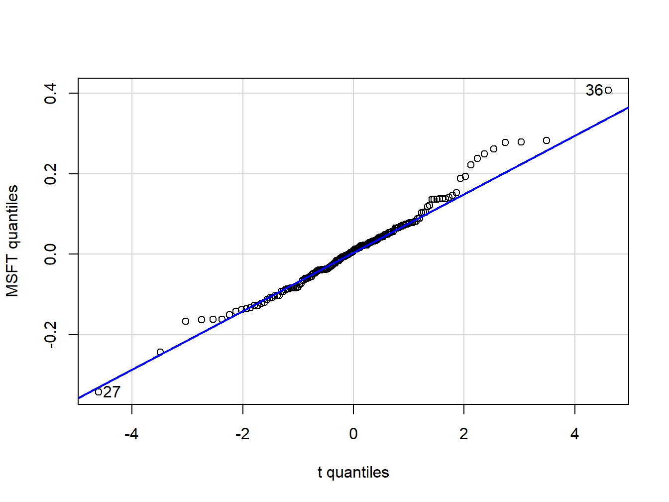
Figure 5.16: QQ-plot of Microsoft returns using Student’s t distribution with 5 degrees of freedom as the reference distribution.
## [1] 36 27In the function qqPlot(), the argument distribution= "t"
specifies that the quantiles are to be computed using the R function
qt().24 Figure 5.16 shows the resulting graph. Here,
with a reference distribution with fatter tails than the normal distribution
the QQ-plot for Microsoft returns is closer to a straight line. This
indicates that the Student’s t distribution with 5 degrees of freedom
is a better reference distribution for Microsoft returns than the
normal distribution.
\(\blacksquare\)
5.1.5 Shape Characteristics of the Empirical Distribution
Recall, for a random variable \(X\) the measures of center, spread, asymmetry and tail thickness of the pdf are: \[\begin{align*} \textrm{center} & :\mu_{X}=E[X],\\ \text{spread} & :\sigma_{X}^{2}=\mathrm{var}(X)=E[(X-\mu_{X})^{2}],\\ \text{spread} & :\sigma_{X}=\sqrt{\mathrm{var}(X)}\\ \text{asymmetry} & :\mathrm{skew}_{X}=E[(X-\mu_{X})^{3}]/\sigma^{3},\\ \text{tail thickness} & :\mathrm{kurt}_{X}=E[(X-\mu_{X})^{4}]/\sigma^{4}. \end{align*}\] The corresponding shape measures for the empirical distribution (e.g., as measured by the histogram) of a data sample \(\{x_{t}\}_{t=1}^{T}\) are the sample statistics:25 \[\begin{align} \hat{\mu}_{x} & =\bar{x}=\frac{1}{T}\sum_{t=1}^{T}x_{t},\tag{5.2}\\ \hat{\sigma}_{x}^{2} & =s_{x}^{2}=\frac{1}{T-1}\sum_{t=1}^{T}(x_{t}-\bar{x})^{2},\tag{5.3}\\ \hat{\sigma}_{x} & =\sqrt{\hat{\sigma}_{x}^{2}},\tag{5.4}\\ \widehat{\mathrm{skew}}_{x} & =\frac{\frac{1}{T-1}\sum_{t=1}^{T}(x_{t}-\bar{x})^{3}}{s_{x}^{3}},\tag{5.5}\\ \widehat{\mathrm{kurt}}_{x} & =\frac{\frac{1}{T-1}\sum_{t=1}^{T}(x_{t}-\bar{x})^{4}}{s_{x}^{4}}.\tag{5.6} \end{align}\] The sample mean, \(\hat{\mu}_{X}\), measures the center of the histogram; the sample standard deviation, \(\hat{\sigma}_{x}\), measures the spread of the data about the mean in the same units as the data; the sample skewness, \(\widehat{\mathrm{skew}}_{x}\), measures the asymmetry of the histogram; the sample kurtosis, \(\widehat{\mathrm{kurt}}_{x}\), measures the tail-thickness of the histogram. The sample excess kurtosis, defined as the sample kurtosis minus 3: \[\begin{equation} \widehat{\mathrm{ekurt}}_{x}=\widehat{\mathrm{kurt}}_{x}-3,\tag{5.7} \end{equation}\] measures the tail thickness of the data sample relative to that of a normal distribution.
Notice that the divisor in (5.3)-(5.6) is \(T-1\) and not \(T\). This is called a degrees-of-freedom correction. In computing the sample variance, skewness and kurtosis, one degree-of-freedom in the sample is used up in the computation of the sample mean so that there are effectively only \(T-1\) observations available to compute the statistics.26
The R functions for computing (5.2) - (5.6)
are mean(), var() and sd(), respectively.
There are no functions for computing (5.5) and
(5.6) in base R. The functions skewness()
and kurtosis() in the PerformanceAnalytics package
compute the sample skewness (5.5) and the sample excess kurtosis
(5.7), respectively.27
The sample statistics for the Microsoft and S&P 500 monthly returns
are computed using:
statsMonthly = rbind(apply(msftSp500MonthlyRetS, 2, mean),
                     apply(msftSp500MonthlyRetS, 2, var),
                     apply(msftSp500MonthlyRetS, 2, sd),
                     apply(msftSp500MonthlyRetS, 2, skewness),
                     apply(msftSp500MonthlyRetS, 2, kurtosis))
rownames(statsMonthly) = c("Mean", "Variance", "Std Dev",
                           "Skewness",  "Excess Kurtosis")
round(statsMonthly, digits=4)
## MSFT SP500
## Mean 0.0092 0.0028
## Variance 0.0103 0.0023
## Std Dev 0.1015 0.0478
## Skewness 0.4853 -0.5631
## Excess Kurtosis 1.9148 0.6545The mean and standard deviation for Microsoft monthly returns are 0.9% and 10%, respectively. Annualized, these values are approximately 10.8% (.009 \(\times12\)) and 34.6% (.10 \(\times\) \(\sqrt{12}\)), respectively. The corresponding monthly and annualized values for S&P 500 returns are .3% and 4.7%, and 4.8% and 16.6%, respectively. Microsoft has a higher mean and volatility than S&P 500. The lower volatility for the S&P 500 reflects risk reduction due to diversification (holding many assets in a portfolio). The sample skewness for Microsoft, 0.485, is slightly positive and reflects the approximate symmetry in the histogram in Figure 5.6. The skewness for S&P 500, however, is moderately negative at -0.563 which reflects the somewhat long left tail of the histogram in Figure 5.6. The sample excess kurtosis values for Microsoft and S&P 500 are 1.915 and 0.654, respectively, and indicate that the tails of the histograms are slightly fatter than the tails of a normal distribution.
The sample statistics for the daily returns are:
statsDaily = rbind(apply(msftSp500DailyRetS, 2, mean),
                   apply(msftSp500DailyRetS, 2, var),
                   apply(msftSp500DailyRetS, 2, sd),
                   apply(msftSp500DailyRetS, 2, skewness),
                   apply(msftSp500DailyRetS, 2, kurtosis))
rownames(statsDaily) = rownames(statsMonthly)
round(statsDaily, digits=4)
## MSFT SP500
## Mean 0.0005 0.0002
## Variance 0.0005 0.0002
## Std Dev 0.0217 0.0135
## Skewness 0.2506 0.0012
## Excess Kurtosis 7.3915 6.9971For a daily horizon, the sample mean for both series is zero (to three decimals). As with the monthly returns, the sample standard deviation for Microsoft, 2.2%, is about twice as big as the sample standard deviation for the S&P 500 index, 1.4%. Neither daily return series exhibits much skewness, but the excess kurtosis values are much larger than the corresponding monthly values indicating that the daily returns have much fatter tails and are more non-normally distributed than the monthly return series.
The daily simple returns are very close to the daily cc returns so the square-root-of-time rule (with 20 trading days within the month) can be applied to the sample mean and standard deviation of the simple returns:
##    MSFT   SP500
## 0.00933 0.00345## MSFT SP500
## 0.0971 0.0603Comparing these values to the corresponding monthly sample statistics shows that the square-root-of-time-rule applied to the daily mean and standard deviation gives results that are fairly close to the actual monthly mean and standard deviation.
\(\blacksquare\)
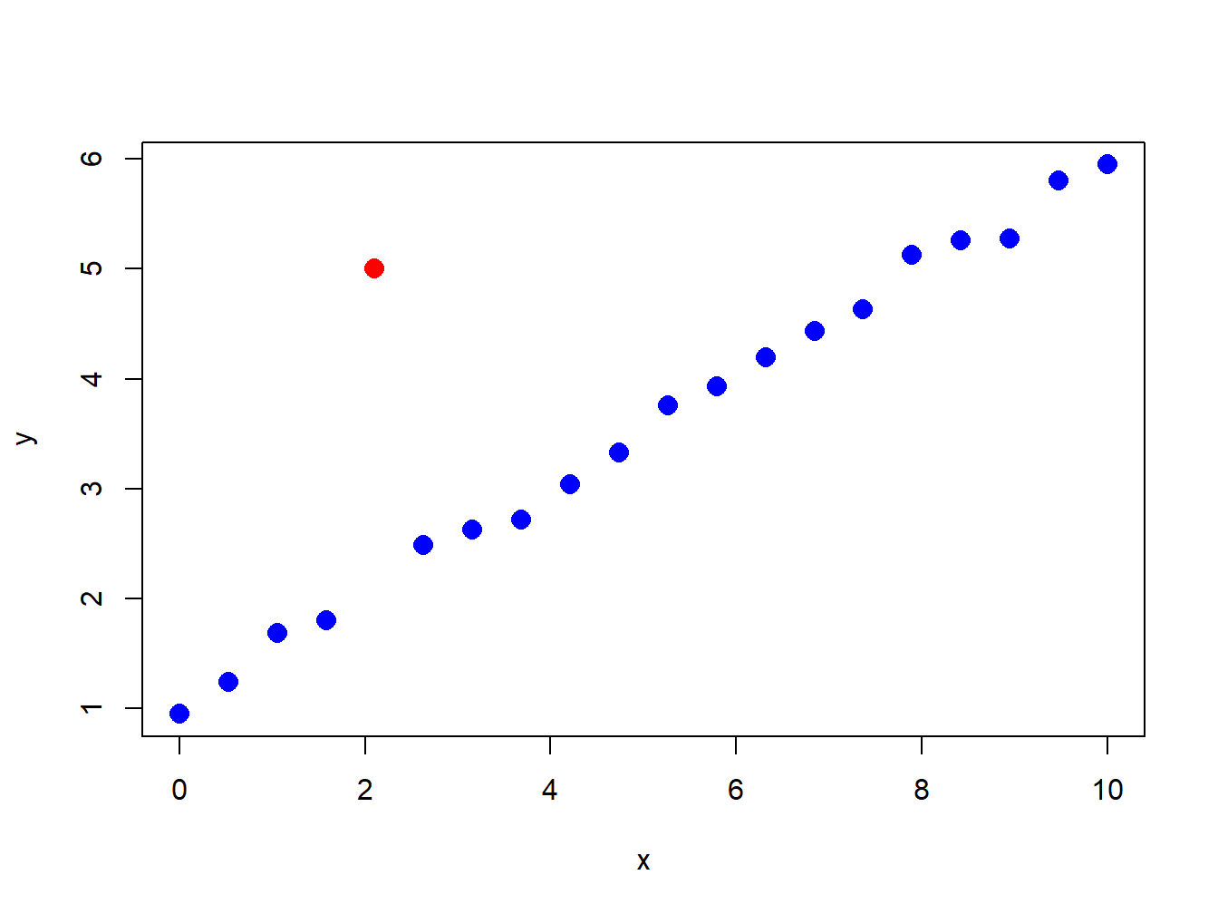
Figure 5.17: Illustration of an “outlier” in a data sample.
5.1.6 Outliers
Figure 5.17 nicely illustrates the concept of an outlier in a data sample. All of the points are following a nice systematic relationship except one - the red dot “outlier”. Outliers can be thought of in two ways. First, an outlier can be the result of a data entry error. In this view, the outlier is not a valid observation and should be removed from the data sample. Second, an outlier can be a valid data point whose behavior is seemingly unlike the other data points. In this view, the outlier provides important information and should not be removed from the data sample. For financial market data, outliers are typically extremely large or small values that could be the result of a data entry error (e.g. price entered as 10 instead of 100) or a valid outcome associated with some unexpected bad or good news. Outliers are problematic for data analysis because they can greatly influence the value of certain sample statistics.
| Statistic | GWN | GWN with Outlier | %\(\Delta\) |
|---|---|---|---|
| Mean | -0.0054 | -0.0072 | 32% |
| Variance | 0.0086 | 0.0101 | 16% |
| Std. Deviation | 0.0929 | 0.1003 | 8% |
| Skewness | -0.2101 | -1.0034 | 378% |
| Kurtosis | 2.7635 | 7.1530 | 159% |
| Median | -0.0002 | -0.0002 | 0% |
| IQR | 0.1390 | 0.1390 | 0% |
To illustrate the impact of outliers on sample statistics, the simulated monthly GWN data is polluted by a single large negative outlier:
Figure 5.18 shows the resulting data. Visually, the outlier is much smaller than a typical negative observation and creates a pronounced asymmetry in the histogram. Table 5.1 compares the sample statistics (5.2) - (5.6) of the unpolluted and polluted data. All of the sample statistics are influenced by the single outlier with the skewness and kurtosis being influenced the most. The mean decreases by 32% and the variance and standard deviation increase by 16% and 8%, respectively. The skewness changes by 378% and the kurtosis by 159%. Table 5.1 also shows the median and the IQR, which are quantile-based statistics for the center and spread, respectively. Notice that these statistics are unaffected by the outlier.
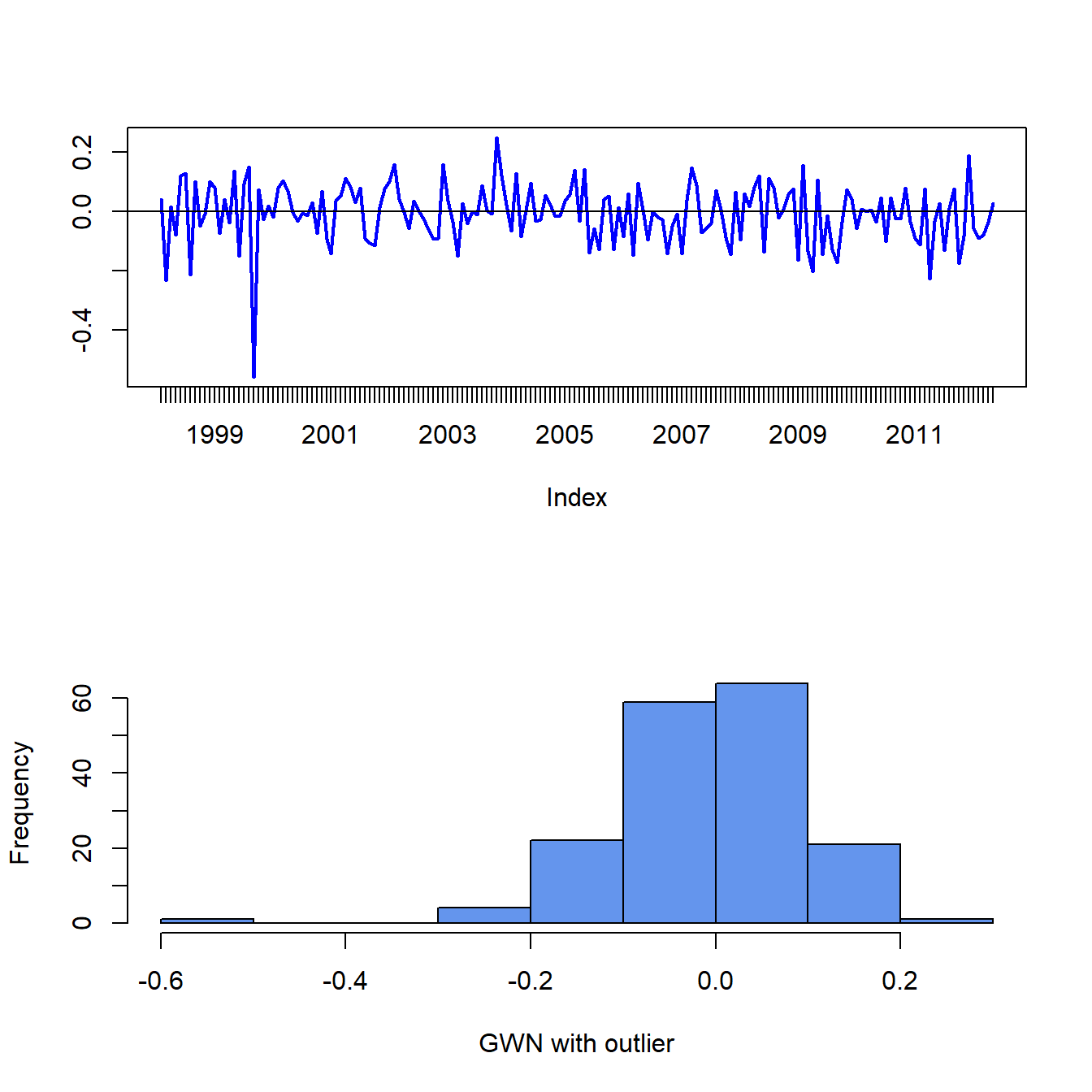
Figure 5.18: Monthly GWN data polluted by a single outlier.
\(\blacksquare\)
The previous example shows that the common sample statistics (5.2) - (5.6) based on the sample average and deviations from the sample average can be greatly influenced by a single outlier, whereas quantile-based sample statistics are not. Sample statistics that are not greatly influenced by a single outlier are called (outlier) robust statistics.
5.1.6.1 Defining outliers
A commonly used rule-of-thumb defines an outlier as an observation that is beyond the sample mean plus or minus three times the sample standard deviation. The intuition for this rule comes from the fact that if \(X\sim N(\mu,\sigma^{2})\) then \(\Pr(\mu-3\sigma\leq X\leq\mu+3\sigma)\approx0.99\). While the intuition for this definition is clear, the practical implementation of the rule using the sample mean, \(\hat{\mu}\), and sample standard deviation, \(\hat{\sigma}\), is problematic because these statistics can be heavily influenced by the presence of one or more outliers (as illustrated in the previous sub-section). In particular, both \(\hat{\mu}\) and \(\hat{\sigma}\) become larger (in absolute value) when there are outliers and this may cause the rule-of-thumb rule to miss identifying an outlier or to identify a non-outlier as an outlier. That is, the rule-of-thumb outlier detection rule is not robust to outliers!
A natural fix to the above outlier detection rule-of-thumb is to use outlier robust statistics, such as the median and the IQR, instead of the mean and standard deviation. To this end, a commonly used definition of a moderate outlier in the right tail of the distribution (value above the median) is a data point \(x\) such that: \[\begin{equation} \hat{q}_{.75}+1.5\cdot\mathrm{IQR}<x<\hat{q}_{.75}+3\cdot\mathrm{IQR}.\tag{5.8} \end{equation}\] To understand this rule, recall that the IQR is where the middle 50% of the data lies. If the data were normally distributed then \(\hat{q}_{.75}\approx\hat{\mu}+0.67\times\hat{\sigma}\) and \(\mathrm{IQR}\approx1.34\times\hat{\sigma}\). Then (5.8) is approximately: \[ \hat{\mu}+2.67\times\hat{\sigma}<x<\hat{\mu}+4.67\times\hat{\sigma} \] Similarly, a moderate outlier in the left tail of the distribution (value below the median) is a data point such that, \[ \hat{q}_{.25}-3\cdot IQR<x<\hat{q}_{.25}-1.5\cdot\mathrm{IQR}. \] Extreme outliers are those observations \(x\) even further out in the tails of the distribution and are defined using: \[\begin{align*} x & >\hat{q}_{.75}+3\cdot\mathrm{IQR},\\ x & <\hat{q}_{.25}-3\cdot\mathrm{IQR}. \end{align*}\] For example, with normally distributed data an extreme outlier would be an observation that is more than \(4.67\) standard deviations above the mean.
5.1.7 Box plots
A boxplot of a data series describes the distribution using outlier robust statistics. The basic boxplot is illustrated in Figure 5.19. The middle of the distribution is shown by a rectangular box whose top and bottom sides are approximately the first and third quartiles, \(\hat{q}_{.25}\) and \(\hat{q}_{.75},\) respectively. The line roughly in the middle of the box is the sample median, \(\hat{q}_{.5}.\) The top whisker is a horizontal line that represents either the largest data value or \(\hat{q}_{.75}+1.5\cdot IQR\), whichever is smaller. Similarly, the bottom whisker is located at either the smallest data value or \(\hat{q}_{.25}-1.5\cdot IQR,\) whichever is closer to \(\hat{q}_{.25}\). Data values above the top whisker and below the bottom whisker are displayed as circles and represent extreme observations. If a data distribution is symmetric then the median is in the center of the box and the top and bottom whiskers are approximately the same distance from the box. Fat tailed distributions will have observations above and below the whiskers.
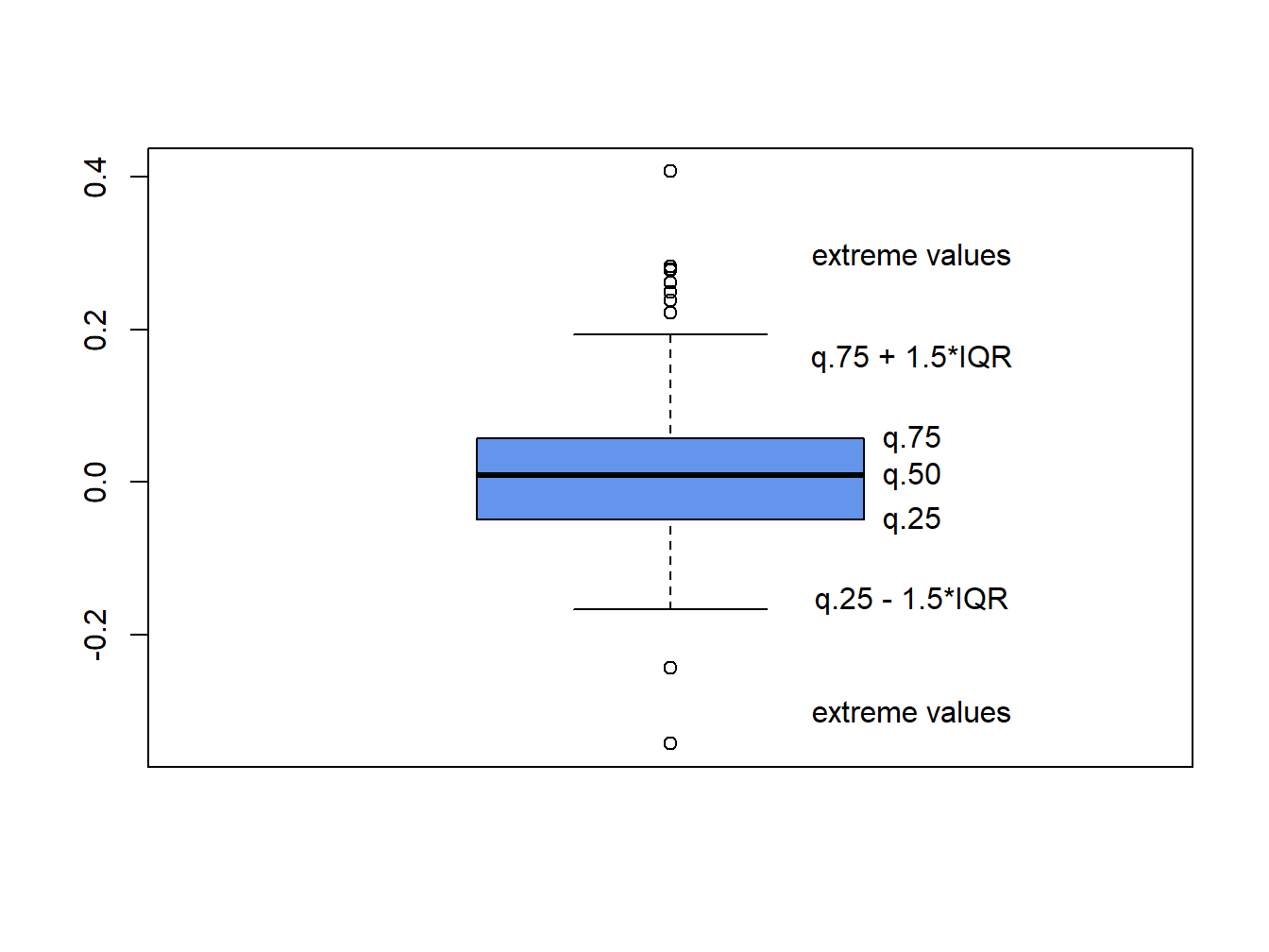
Figure 5.19: Boxplot of return distribution.
Boxplots are a great tool for visualizing the return distribution of one or more assets. Figure 5.20 shows the boxplots of the monthly continuously compounded and simple returns on Microsoft and the S&P 500 index computed using:28
dataToPlot = merge(msftMonthlyRetS, msftMonthlyRetC,
                   sp500MonthlyRetS, sp500MonthlyRetC)
colnames(dataToPlot) = c("msftRetS", "msftRetC",
                         "sp500RetS", "sp500RetC")
boxplot(coredata(dataToPlot), main="Simple vs. CC Monthly Returns",
        col="cornflowerblue")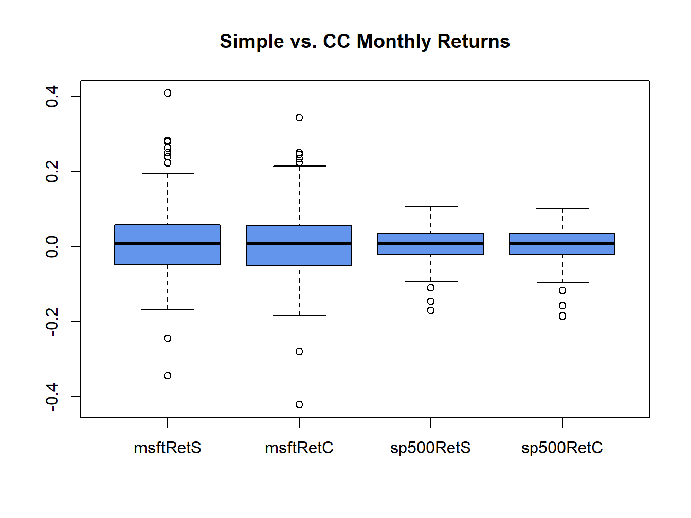
Figure 5.20: Boxplots of the continuously compounded and simple monthly returns on Microsoft stock and the S&P 500 index.
The Microsoft returns have both positive and negative outliers whereas the S&P 500 index returns only have negative outliers. The boxplots also clearly show that the distributions of the continuously compounded and simple returns are very similar except for the extreme tails of the distributions.
\(\blacksquare\)
An adjusted closing price is adjusted for dividend payments and stock splits. Any dividend payment received between closing dates are added to the close price. If a stock split occurs between the closing dates then the all past prices are divided by the split ratio. The ticker symbol
^gspcrefers to the actual S&P 500 index, which is not a tradeable security. There are several mutual funds (e.g., Vanguard’s S&P 500 fund with ticker VFINF) and exchange traded funds (e.g., State Street’s SPDR S&P 500 ETF with ticker SPY) which track the S&P 500 index that are investable.↩︎The returns can still be covariance stationary and exhibit time varying conditional volatility. This is explored in chapter 10.↩︎
There is no unique way to determine the empirical quantile from a sample of size \(N\) for all values of \(\alpha\). The R function
quantile()can compute empirical quantile using one of seven different definitions.↩︎Even with data simulated from a normal distribution, the empirical quantiles in the extreme left and right tails can deviate a bit from the straight line due to estimation error. For this reason, small deviations from linearity in the tails should be ignored.↩︎
The
coredata()function is used to extract the data as a"numeric"object becauseqqPlot()does not work correctly with"zoo"orxtsobjects.↩︎Values with hats,
"^", denote sample estimates of the corresponding population quantity. For example, the sample mean \(\hat{\mu}_{x}\) is the sample estimate of the population expected value \(\mu_{X}\).↩︎If there is only one observation in the sample then it is impossible to create a measure of spread in the sample. You need at least two observations to measure deviations from the sample average. Hence the effective sample size for computing the sample variance is \(T-1\).↩︎
Similar functions are available in the moments package.↩︎
The
coredata()function is used to extract the data from the zoo object becauseboxplot()doesn’t like"xts"or"zoo"objects.↩︎