12.5 Two quantitative variables
Scatterplots display the relationship between two quantitative variables. Conventionally, the “response” variable is on the vertical axis, and the the “explanatory” variable is on the horizontal axis.
As with any graph, explaining what the graph tells us is important because the purpose of a graph is to display the information in the clearest, simplest possible way, to help the reader understand the message(s) in the data. Scatterplot can be described by briefly explaining how the variables are related to each other. Scatterplots are studied again later (Sect. 12.5).


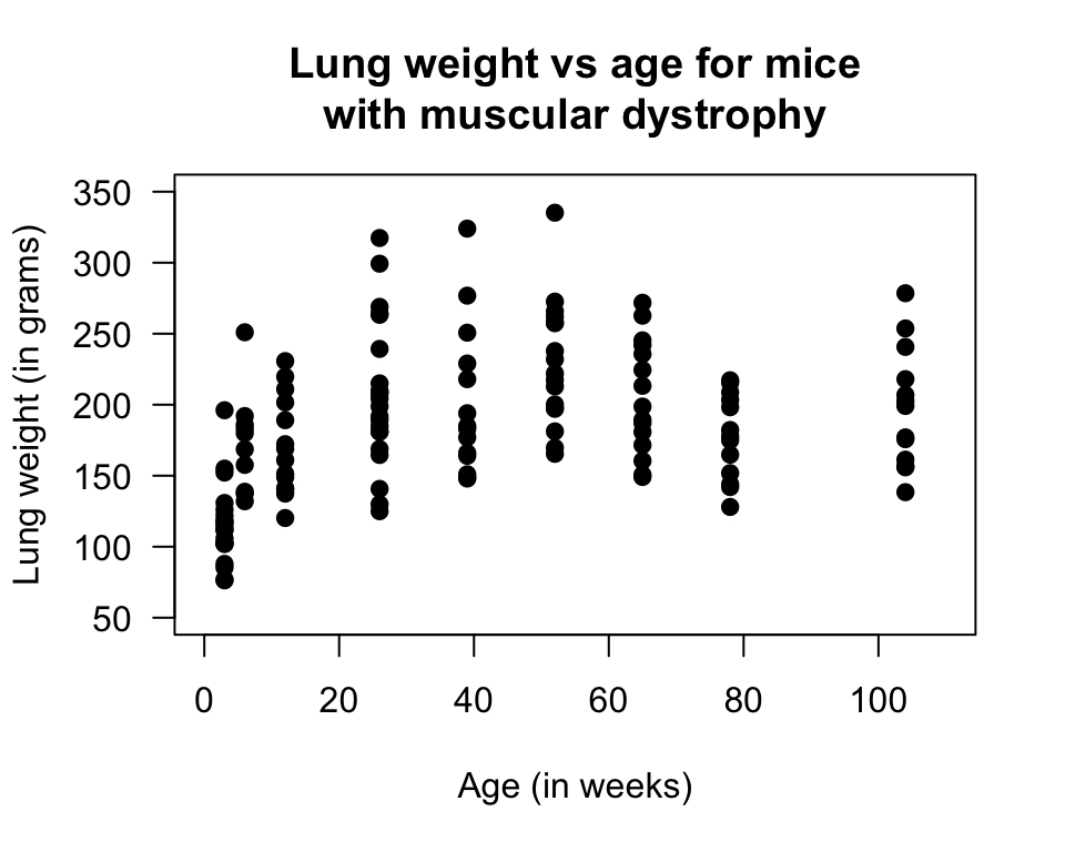
FIGURE 12.20: Scatterplot of lung weight vs age for mice with muscular dystrophy

Example 12.17 (Scatterplots) A study of athletes at the Australian Institute of Sport (AIS) measured numerous physical and blood measurements from high performance athletes (Telford and Cunningham 1991).
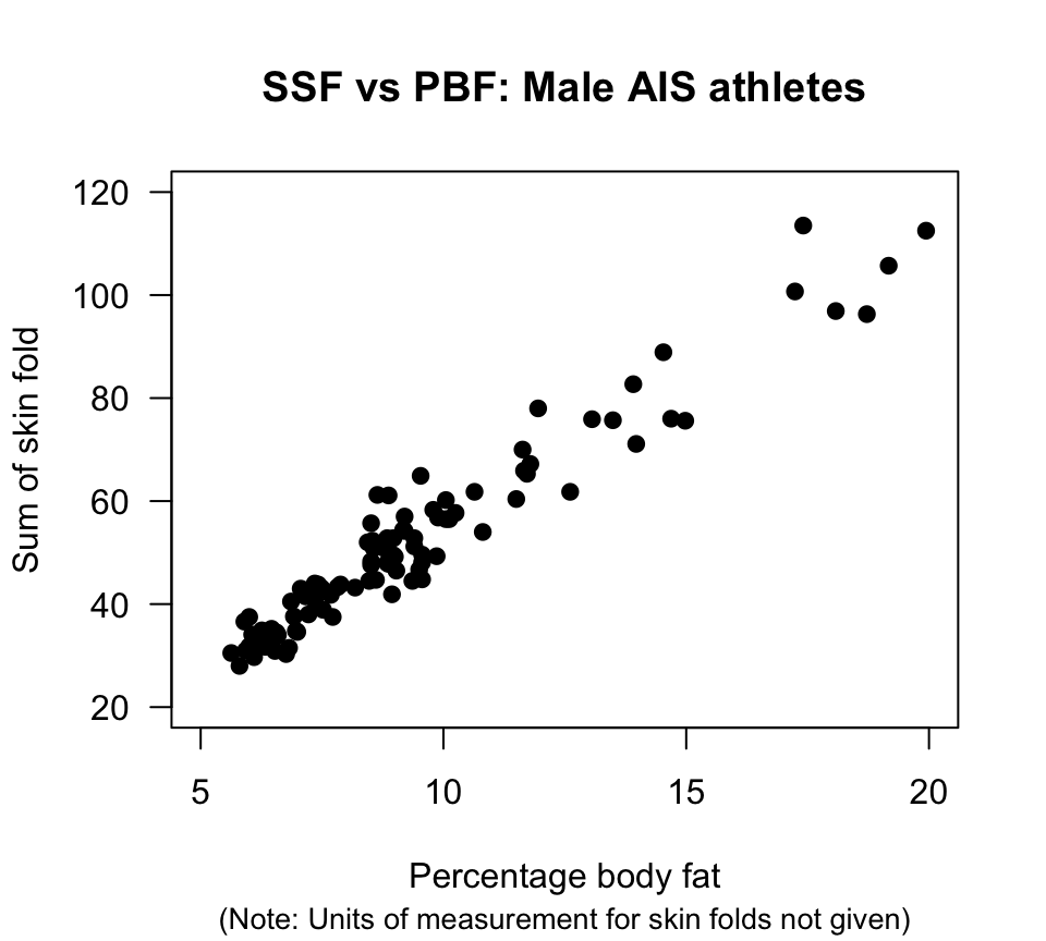
Many relationships were of interest. Fig. 12.21 shows the relationship between the sum of skin folds (SSF) and percentage body fat.
Each point represents the percentage body fat and the SSF for one athlete. Clearly, the greater the percentage body fat, the greater the sum of skin folds, in general.
FIGURE 12.21: Scatterplot of SSF against percentage body fat for male AIS athletes