5.13 Optional: Evaluating graphics
This question is optional; e.g., if you need more practice, or you are studying for the exam.
(Answers are available in Sect. A.3)
An Australian study (Jennings et al. 2012) studied patients in severe pain and compared two different treatments to determine which to recommend.
Patients were randomly allocated to receive one of two pain treatments: either morphine, or morphine and ketamine.
The pain reduction for each patient was then measured (using the 'pain verbal numeric rating scale': \(0\) is no pain, and \(10\) the worst pain imaginable, such as Australia losing the Ashes), by taking pain measurements before and after giving the treatment.
The graph in Fig. 5.10 summarises the data.
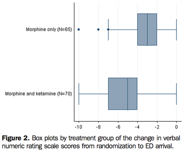
FIGURE 5.10: A graphic from Jennings et al. (2002). 'ED' means 'Emergency Department
- Identify the type of study: experimental or observational.
- Identify the units of observation, and the units of analysis.
- Critique this graph.
- What do you think the negative numbers on the graph mean?
- Do you think that a real difference exists between the nedian for the two treatments in the population? Explain