A.5 Solutions (05)

Here are the solutions of the exercises on tibbles of Chapter 5 (Section 5.4).
Introduction
The following exercises require the essential tibble commands and repeat many commands from earlier chapters (involving dplyr and ggplot2).
A.5.1 Exercise 1
Flower power
Turn the iris data — contained in R datasets — into a tibble and conduct an EDA on it.
Hint: iris provides the measurements (in cm) of plant parts (length and width of sepal and petal parts) for 50 flowers from each of three iris species (called setosa, versicolor, and virginica). (Evaluate ?iris to obtain a description of the dataset.)
- Save
datasets::irisas a tibbleirthat contains this data and inspect it. Are there any missing values?
Solution
# ?iris

# 1. Turn into tibble and inspect: -----
ir <- tibble::as_tibble(datasets::iris)
dim(ir)         # 150 observations (rows) x 5 variables (columns)
#> [1] 150   5

sum(is.na(ir))  # 0 missing values
#> [1] 0- Compute a summary table that shows the means of the four measurement columns (
Sepal.Length,Sepal.Width,Petal.Length,Petal.Width) for each of the threeSpecies(in rows). Save the resulting table of means as a tibbleim1.
Solution
# 2. Compute counts and means by species: -----
im1 <- ir %>%
  group_by(Species) %>%
  summarise(n = n(),
            mn_sep.len = mean(Sepal.Length),
            mn_sep.wid = mean(Sepal.Width),
            mn_pet.len = mean(Petal.Length),
            mn_pet.wid = mean(Petal.Width)
            )

# Print im1 (as table with 4 variables of means):
knitr::kable(im1, caption = "Average iris measures (4 variables of mean values).") | Species | n | mn_sep.len | mn_sep.wid | mn_pet.len | mn_pet.wid |
|---|---|---|---|---|---|
| setosa | 50 | 5.006 | 3.428 | 1.462 | 0.246 |
| versicolor | 50 | 5.936 | 2.770 | 4.260 | 1.326 |
| virginica | 50 | 6.588 | 2.974 | 5.552 | 2.026 |
- Create a histogram that shows the distribution of
Sepal.Widthvalues across all species.
## Graphical exploration: -----

## Distribution of 1 (continuous) variable:

# 3. Distribution of Sepal.Width across species:
ggplot(ir, aes(x = Sepal.Width)) +
  geom_histogram(binwidth = .1, fill = "skyblue", color = "black") +
  labs(title = "Distribution of sepal width across iris species") +
  theme_bw()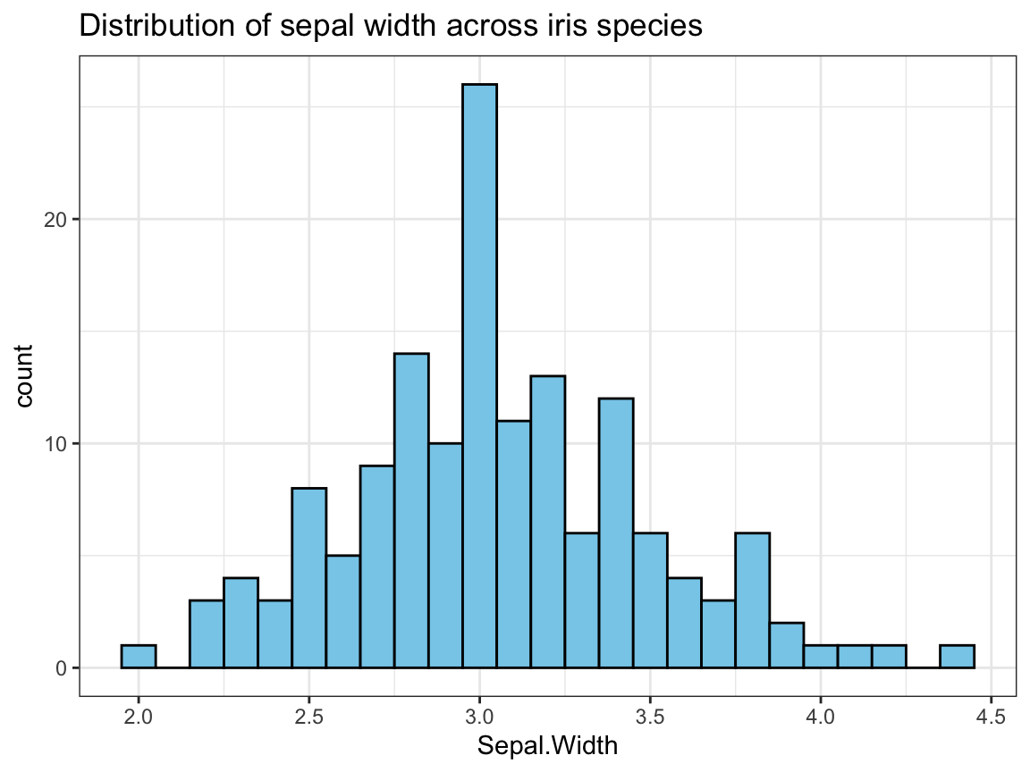
- Create a plot that shows the shape of the distribution of
Sepal.Widthvalues for each species.
Solution
To show the distributions/relationships between 2 variables (1 categorical, 1 continuous),
we combine a violin plot with a raw data plot (using geom_jitter and transparency):
## 4. The distributions of Sepal.Width by species:
ggplot(ir, aes(x = Species, y = Sepal.Width)) +
  geom_violin(fill = "grey90", linetype = 0, alpha = 2/3, width = .5) +
  geom_jitter(aes(color = Species, shape = Species), size = 3, alpha = 1/2, width = .10) +
  labs(title = "Distributions of sepal width by iris species") +
  # scale_color_manual(values = c("forestgreen", "steelblue", "firebrick")) +
  scale_color_manual(values = unikn::usecol(c(Seegruen, Seeblau, Pinky))) +
  theme_bw()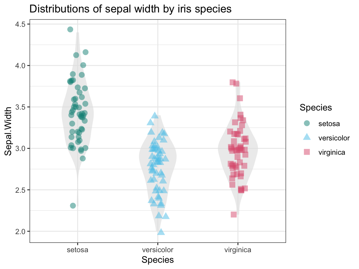
An alternative solution could use density plots and different facets by Species:
ggplot(ir, aes(x = Sepal.Width, fill = Species)) +
  facet_wrap(~Species) +
  geom_density(alpha = 2/3) +
  labs(title = "Distributions of sepal width by iris species") +
  coord_fixed() +
  # scale_fill_manual(values = c("forestgreen", "steelblue", "firebrick")) +
  scale_fill_manual(values = unikn::usecol(c(Seegruen, Seeblau, Pinky))) +
  theme_bw()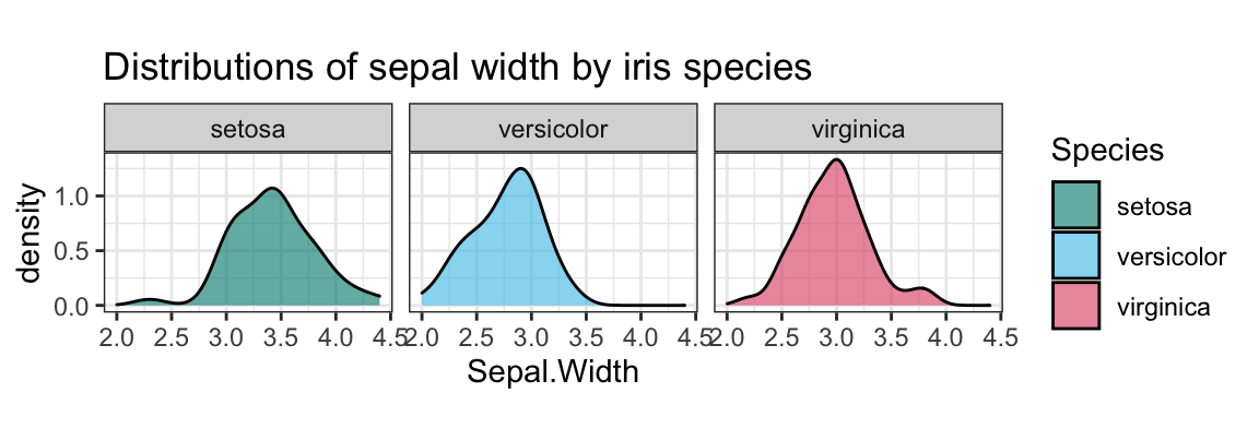
- Create a plot that shows
Petal.Widthas a function ofSepal.Widthseparately (i.e., in three facets) for each species.
Solution
We typically use a scatterplot to examine the relationship between 2 continuous variables.
To avoid overplotting, we use geom_jitter and add some transparency:
## 5. Petal.Width as a function of Sepal.Width by iris species:
ggplot(ir, aes(x = Sepal.Width, y = Petal.Width, color = Species, shape = Species)) +
  facet_wrap(~Species) +
  geom_jitter(size = 2, alpha = 2/3) +
  # geom_density2d() +
  coord_fixed() +
  labs(title = "Petal width as a function of sepal width by iris species") +
  # scale_color_manual(values = c("forestgreen", "steelblue", "firebrick")) +
  scale_color_manual(values = unikn::usecol(c(Seegruen, Seeblau, Pinky))) +
  theme_bw()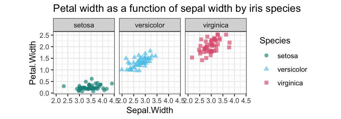
A.5.2 Exercise 2
Rental accounting
Anna, Brian, and Caro are sharing a flat and keep a record of the items that each of them purchased for the household. At the end of each week, they use this data to balance their account. As an aspiring data scientist, you offer your help. Here’s last week’s data:
| Name | Mon | Tue | Wed | Thu | Fri | Sat | Sun |
|---|---|---|---|---|---|---|---|
| Anna | Bread: $2.50 | Pasta: $4.50 | Pencils: $3.25 | Milk: $4.80 | – | Cookies: $4.40 | Cake: $12.50 |
| Butter: $2.00 | Cream: $3.90 | ||||||
| Brian | Chips: $3.80 | Beer: $11.80 | Steak: $16.20 | – | Toilet paper: $4.50 | – | Wine: $8.80 |
| Caro | Fruit: $6.30 | Batteries: $6.10 | – | Newspaper: $2.90 | Honey: $3.20 | Detergent: $9.95 | – |
- Which variables and which observations would you define here? Go ahead and enter the data into a tibble
acc_1.
Solution
Rather than entering the data in the format shown in the Table above, we need to ask ourselves: Which observations are described by which variables? The fundamental unit of observation here is a purchase: Each cell of the table is a data point, that is characterized on four dimensions (variables). To describe each purchase (in a row), we need four variables (columns):
- the
nameof the buyer,
- the
dayof the purchase,
whatwas bought, and
- how much was
paid.
It seems most natural to enter the purchases into a table that contains each observation as a row.
This can be done by using the tribble command:
## Entering data into tibble: ------

acc_1 <- tibble::tribble(
  ~name, ~day, ~what, ~paid,
  #------|-----|-----|------|
  "Anna",  "Mon", "Bread",   2.50,
  "Anna",  "Mon", "Butter",  2.00,
  "Anna",  "Tue", "Pasta",   4.50,
  "Anna",  "Wed", "Pencils", 3.25,
  "Anna",  "Thu", "Milk",    4.80,
  "Anna",  "Sat", "Cookies", 4.40,
  "Anna",  "Sun", "Cake",   12.50,
  "Anna",  "Sun", "Cream",   3.90,
  "Brian", "Mon", "Chips",   3.80,
  "Brian", "Tue", "Beer",   11.80,
  "Brian", "Wed", "Steak",  16.20,
  "Brian", "Fri", "Toilet paper", 4.50,
  "Brian", "Sun", "Wine",      8.80,
  "Caro",  "Mon", "Fruit",     6.30,
  "Caro",  "Tue", "Batteries", 6.10,
  "Caro",  "Thu", "Newspaper", 2.90,
  "Caro",  "Fri", "Honey",     3.20,
  "Caro",  "Sat", "Detergent", 9.95 )

knitr::kable(acc_1, caption = "Table with purchases as observations (using the `tribble` command).")| name | day | what | paid |
|---|---|---|---|
| Anna | Mon | Bread | 2.50 |
| Anna | Mon | Butter | 2.00 |
| Anna | Tue | Pasta | 4.50 |
| Anna | Wed | Pencils | 3.25 |
| Anna | Thu | Milk | 4.80 |
| Anna | Sat | Cookies | 4.40 |
| Anna | Sun | Cake | 12.50 |
| Anna | Sun | Cream | 3.90 |
| Brian | Mon | Chips | 3.80 |
| Brian | Tue | Beer | 11.80 |
| Brian | Wed | Steak | 16.20 |
| Brian | Fri | Toilet paper | 4.50 |
| Brian | Sun | Wine | 8.80 |
| Caro | Mon | Fruit | 6.30 |
| Caro | Tue | Batteries | 6.10 |
| Caro | Thu | Newspaper | 2.90 |
| Caro | Fri | Honey | 3.20 |
| Caro | Sat | Detergent | 9.95 |
Alternatively, we could use the tibble command to enter the same table as four column variables (as vectors for name, day, what, and paid, each of which contains 18 elements). However, as this would require to keep track of the order of elements (i.e., which element belongs to which purchase), it is easier to enter this data row-by-row (by observations/purchases, using the tribble command).
Use
acc_1to answer the following questions (by using dplyr for creating tables that contain the answer):- How much money was spent this week?
- Which percentage of the overall amount was spent by each person?
- How many items did each person purchase?
- How much did each person pay overall?
- Who buys the cheapest/most expensive items (on average)?
- How much is being spent on each day of the week (overall and on average)?
- What is the order of days sorted by the overall amount spent (from most expensive to least expensive)?
Solution
We first summarize the purchases by name:
total_paid <- sum(acc_1$paid)
total_paid
#> [1] 111.4

## Transformations: ------

# (1) Purchases by name:
buy_by_name <- acc_1 %>%
  group_by(name) %>%
  summarise(n = n(),
            sm_pay = sum(paid),
            mn_pay = sm_pay/n,
            pc_pay = sm_pay/total_paid * 100
            )
knitr::kable(buy_by_name, caption = "Purchases by name.")| name | n | sm_pay | mn_pay | pc_pay |
|---|---|---|---|---|
| Anna | 8 | 37.85 | 4.73125 | 33.97666 |
| Brian | 5 | 45.10 | 9.02000 | 40.48474 |
| Caro | 5 | 28.45 | 5.69000 | 25.53860 |
Alternatively, we can summarize the purchases by day:
# Define the day variable as an ordered factor (to preserve its order):
acc_1$day <- factor(acc_1$day,
                    levels = c("Mon", "Tue", "Wed", "Thu", "Fri", "Sat", "Sun"), ordered = TRUE)

# Purchases by day:
buy_by_day <- acc_1 %>%
  group_by(day) %>%
  summarise(n = n(),
            sm_pay = sum(paid),
            mn_pay = sm_pay/n)
knitr::kable(buy_by_day, caption = "Purchases by day.")| day | n | sm_pay | mn_pay |
|---|---|---|---|
| Mon | 4 | 14.60 | 3.650000 |
| Tue | 3 | 22.40 | 7.466667 |
| Wed | 2 | 19.45 | 9.725000 |
| Thu | 2 | 7.70 | 3.850000 |
| Fri | 2 | 7.70 | 3.850000 |
| Sat | 2 | 14.35 | 7.175000 |
| Sun | 3 | 25.20 | 8.400000 |
# Arrange buy_by_day by overall expense:
buy_by_day %>%
  arrange(desc(sm_pay))
#> # A tibble: 7 × 4
#>   day       n sm_pay mn_pay
#>   <ord> <int>  <dbl>  <dbl>
#> 1 Sun       3   25.2   8.4
#> 2 Tue       3   22.4   7.47
#> 3 Wed       2   19.4   9.72
#> 4 Mon       4   14.6   3.65
#> 5 Sat       2   14.4   7.18
#> 6 Fri       2    7.7   3.85
#> 7 Thu 2 7.7 3.85- Interpret and re-create the following graphs (using ggplot2 and possibly dplyr):
Solution
## Visualizations: ------

# (A) Bar charts: ----
ggplot(acc_1) +
  geom_bar(aes(x = day, fill = name)) +
  labs(title = "Number of purchases per person by day") +
  # scale_fill_brewer(palette = "Set1") +
  # theme_classic()
  scale_fill_manual(values = unikn::usecol(c(Pinky, Seeblau, Signal))) +
  ds4psy::theme_ds4psy()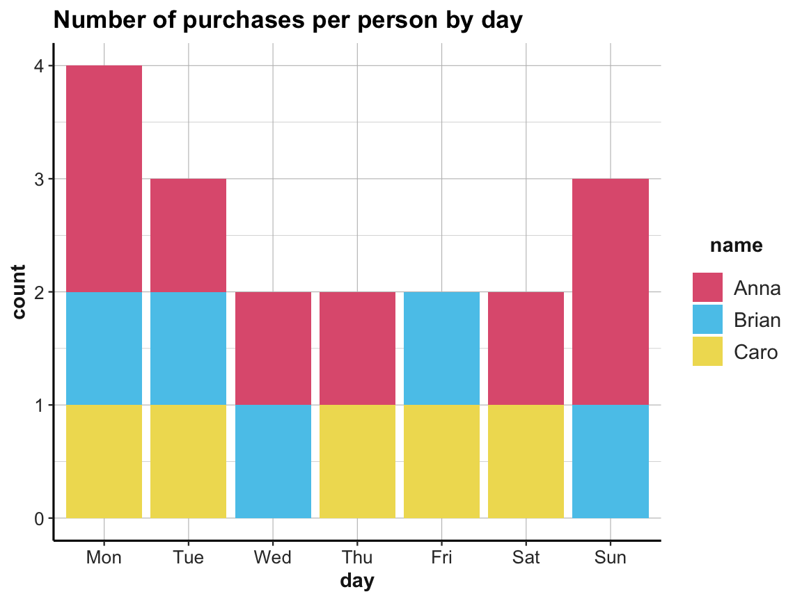
ggplot(acc_1) +
  geom_bar(aes(x = day, y = paid, fill = name), stat = "identity") +
  labs(title = "Amount paid (overall and per person) by day") +
  # scale_fill_brewer(palette = "Set1") +
  # theme_classic()
  scale_fill_manual(values = unikn::usecol(c(Pinky, Seeblau, Signal))) +
  ds4psy::theme_ds4psy()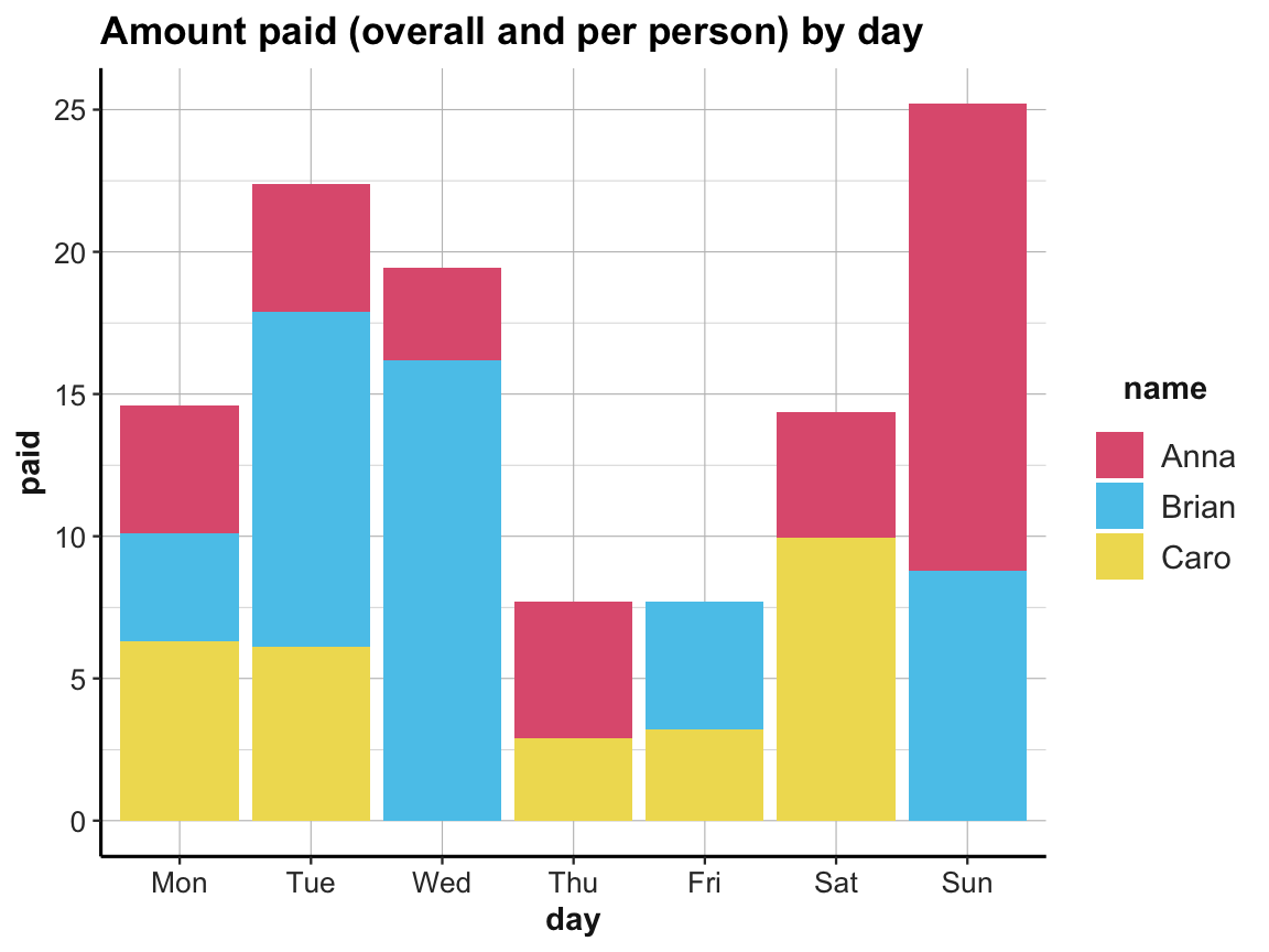
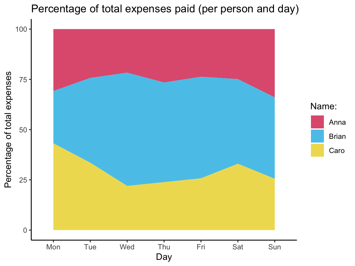
- Bonus task: What do the following plots show? Try re-creating the plots from the data in
acc_1.
Hint: These plots are created with geom_step and geom_area. However, rather than directly calling ggplot, consider first using dplyr to transform the data of acc_1 into summary tables that contain the values needed for the plots. You may have to combine multiple group_by and mutate commands to compute all required variables.
Solution
We first compute a table that contains the cumulative sum for each person over time (i.e., per day):
| day | name | n | sm_pay | cum_sum |
|---|---|---|---|---|
| Mon | Anna | 2 | 4.50 | 4.50 |
| Mon | Brian | 1 | 3.80 | 3.80 |
| Mon | Caro | 1 | 6.30 | 6.30 |
| Tue | Anna | 1 | 4.50 | 9.00 |
| Tue | Brian | 1 | 11.80 | 15.60 |
| Tue | Caro | 1 | 6.10 | 12.40 |
| Wed | Anna | 1 | 3.25 | 12.25 |
| Wed | Brian | 1 | 16.20 | 31.80 |
| Thu | Anna | 1 | 4.80 | 17.05 |
| Thu | Caro | 1 | 2.90 | 15.30 |
| Fri | Brian | 1 | 4.50 | 36.30 |
| Fri | Caro | 1 | 3.20 | 18.50 |
| Sat | Anna | 1 | 4.40 | 21.45 |
| Sat | Caro | 1 | 9.95 | 28.45 |
| Sun | Anna | 2 | 16.40 | 37.85 |
| Sun | Brian | 1 | 8.80 | 45.10 |
Plot a summary of the cumulative purchases (as a step function):
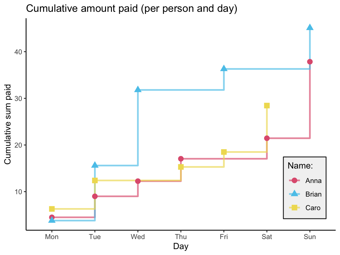
Note that the tibble acc_1 does not contain rows for a person and day without a purchase.
As a consequence, the summary tables (computed above) with group_by(day, name) contain fewer than 7 x 3 = 21 variables.
We could fix this by adding data points with a paid value of 0 for people and days without a purchase and combining both tables into a larger table all:
(Instead of using the dplyr::full_join command, we could have added the missing data points to acc_1 above.)
Next, we transform all into a summary table that contains cumulative sums:
| day | name | n | sum_name_day | cum_sum_name | cum_sum_day | pc_name |
|---|---|---|---|---|---|---|
| Mon | Anna | 2 | 4.50 | 4.50 | 14.60 | 30.82192 |
| Mon | Brian | 1 | 3.80 | 3.80 | 14.60 | 26.02740 |
| Mon | Caro | 1 | 6.30 | 6.30 | 14.60 | 43.15068 |
| Tue | Anna | 1 | 4.50 | 9.00 | 37.00 | 24.32432 |
| Tue | Brian | 1 | 11.80 | 15.60 | 37.00 | 42.16216 |
| Tue | Caro | 1 | 6.10 | 12.40 | 37.00 | 33.51351 |
| Wed | Anna | 1 | 3.25 | 12.25 | 56.45 | 21.70062 |
| Wed | Brian | 1 | 16.20 | 31.80 | 56.45 | 56.33304 |
| Wed | Caro | 1 | 0.00 | 12.40 | 56.45 | 21.96634 |
| Thu | Anna | 1 | 4.80 | 17.05 | 64.15 | 26.57833 |
| Thu | Brian | 1 | 0.00 | 31.80 | 64.15 | 49.57132 |
| Thu | Caro | 1 | 2.90 | 15.30 | 64.15 | 23.85035 |
| Fri | Anna | 1 | 0.00 | 17.05 | 71.85 | 23.72999 |
| Fri | Brian | 1 | 4.50 | 36.30 | 71.85 | 50.52192 |
| Fri | Caro | 1 | 3.20 | 18.50 | 71.85 | 25.74809 |
| Sat | Anna | 1 | 4.40 | 21.45 | 86.20 | 24.88399 |
| Sat | Brian | 1 | 0.00 | 36.30 | 86.20 | 42.11137 |
| Sat | Caro | 1 | 9.95 | 28.45 | 86.20 | 33.00464 |
| Sun | Anna | 2 | 16.40 | 37.85 | 111.40 | 33.97666 |
| Sun | Brian | 1 | 8.80 | 45.10 | 111.40 | 40.48474 |
| Sun | Caro | 1 | 0.00 | 28.45 | 111.40 | 25.53860 |
The resulting table cum_sum_by_day can be visualized as follows:
Note: An alternative way to represent the purchases would as a list (an R data structure that — in contrast to vectors — allows a mix of different data types):
# A more natural format (to represent a purchase) would have been:

buy  <- list("Anna", "Mon", "Bread", 2.50)  # by purchase

# but as column vectors don't allow mixing data types (e.g., characters and numbers),
# we represented the purchases as the rows of a table/tibble above.
A.5.3 Exercise 3
Positive psychology tibbles
In this exercise, we will enter some results from the Exploring data chapter (Chapter 4) as a tibble. Next, we re-compute the results from the raw data and visualize the results.
To do this exercise, re-load the following data files (into R objects posPsy_wide and posPsy_long):
# Load data:
posPsy_wide <- ds4psy::posPsy_wide  # from ds4psy package
# posPsy_wide <- readr::read_csv(file = "http://rpository.com/ds4psy/data/posPsy_data_wide.csv")  # online
dim(posPsy_wide)  # 295 294
#> [1] 295 294

# 3. Corrected DVs in long format:
posPsy_long <- ds4psy::posPsy_long  # from ds4psy package
# posPsy_long <- readr::read_csv(file = "http://rpository.com/ds4psy/data/posPsy_AHI_CESD_corrected.csv")  # online
dim(posPsy_long)  # 990 x 50
#> [1] 990  50
See Section B.1 of Appendix B for details on the data.
The following table shows the mean depression scores per intervention for each of the 5 occasions (with means rounded to one decimal):
| intervention | mn_cesd_0 | mn_cesd_1 | mn_cesd_2 | mn_cesd_3 | mn_cesd_4 | mn_cesd_5 |
|---|---|---|---|---|---|---|
| 1 | 15.1 | 15.3 | 13.6 | 12.0 | 11.2 | 13.5 |
| 2 | 16.2 | 14.6 | 11.4 | 12.5 | 13.4 | 14.6 |
| 3 | 16.1 | 12.3 | 14.8 | 13.9 | 14.9 | 13.0 |
| 4 | 12.8 | 9.9 | 9.5 | 9.1 | 7.7 | 10.2 |
In case this table is too wide to be displayed in full, here is how it looks in the Console:
#> # A tibble: 4 × 7
#>   intervention mn_cesd_0 mn_cesd_1 mn_cesd_2 mn_cesd_3 mn_cesd_4 mn_cesd_5
#>          <int>     <dbl>     <dbl>     <dbl>     <dbl>     <dbl>     <dbl>
#> 1            1      15.1      15.3      13.6      12        11.2      13.5
#> 2            2      16.2      14.6      11.4      12.5      13.4      14.6
#> 3            3      16.1      12.3      14.8      13.9      14.9      13
#> 4 4 12.8 9.9 9.5 9.1 7.7 10.2- Enter this data directly into a tibble
my_tbl(by using either thetibbleor thetribblecommand).
Solution
# (1a): Create the tibble displayed above.
my_tbl <- tibble(intervention = c(1:4),
                 mn_cesd_0 = c(15.1, 16.2, 16.1, 12.8),
                 mn_cesd_1 = c(15.3, 14.6, 12.3, 9.9),
                 mn_cesd_2 = c(13.6, 11.4, 14.8, 9.5),
                 mn_cesd_3 = c(12.0, 12.5, 13.9, 9.1),
                 mn_cesd_4 = c(11.2, 13.4, 14.9, 7.7),
                 mn_cesd_5 = c(13.5, 14.6, 13.0, 10.2) )

# Check resulting tibble:
my_tbl
#> # A tibble: 4 × 7
#>   intervention mn_cesd_0 mn_cesd_1 mn_cesd_2 mn_cesd_3 mn_cesd_4 mn_cesd_5
#>          <int>     <dbl>     <dbl>     <dbl>     <dbl>     <dbl>     <dbl>
#> 1            1      15.1      15.3      13.6      12        11.2      13.5
#> 2            2      16.2      14.6      11.4      12.5      13.4      14.6
#> 3            3      16.1      12.3      14.8      13.9      14.9      13
#> 4 4 12.8 9.9 9.5 9.1 7.7 10.2- Re-compute an identical tibble
my_tbl_2by transforming one of theposPsy_...datasets (usingdplyr) and verify thatmy_tblandmy_tbl_2are equal.
Solution
my_tbl_2 <- posPsy_wide %>%
  group_by(intervention) %>%
  summarise(mn_cesd_0 = round(mean(cesdTotal.0, na.rm = TRUE), 1),
            mn_cesd_1 = round(mean(cesdTotal.1, na.rm = TRUE), 1),
            mn_cesd_2 = round(mean(cesdTotal.2, na.rm = TRUE), 1),
            mn_cesd_3 = round(mean(cesdTotal.3, na.rm = TRUE), 1),
            mn_cesd_4 = round(mean(cesdTotal.4, na.rm = TRUE), 1),
            mn_cesd_5 = round(mean(cesdTotal.5, na.rm = TRUE), 1) )

# Check resulting tibble:
my_tbl_2
#> # A tibble: 4 × 7
#>   intervention mn_cesd_0 mn_cesd_1 mn_cesd_2 mn_cesd_3 mn_cesd_4 mn_cesd_5
#>          <dbl>     <dbl>     <dbl>     <dbl>     <dbl>     <dbl>     <dbl>
#> 1            1      15.1      15.3      13.6      12        11.2      13.5
#> 2            2      16.2      14.6      11.4      12.5      13.4      14.6
#> 3            3      16.1      12.3      14.8      13.9      14.9      13
#> 4            4      12.8       9.9       9.5       9.1       7.7      10.2

# Make intervention an integer variable:
my_tbl_2$intervention <- as.integer(my_tbl_2$intervention)

# Verify that they are equal:
all.equal(my_tbl, my_tbl_2)  # TRUE
#> [1] TRUE- Visualize the information expressed by
my_tblin a transparent way (e.g., by creating a bar or line plot).
Hint: If this is difficult by using data = my_tbl in ggplot, use a data file that is better suited for this purpose.
Why can’t you just directly plot my_tbl?
Solution
Problem: The tibble my_tbl contains the relevant results, but they are distributed over 6 different variables (columns).
To plot this data with ggplot2, we would need a table with only 1 dependent variable (i.e., a table in long-format).
As an alternative, we use the data from posPsy_long in which cesdTotal is contained as 1 variable, which we can group by occasion and intervention:
my_tbl_3 <- posPsy_long %>%
  group_by(occasion, intervention) %>%
  summarize(mean_cesd = round(mean(cesdTotal), 1))
# my_tbl_3

# Turn intervention into a factor:
my_tbl_3$intervention <- factor(my_tbl_3$intervention)
# my_tbl_3

# Note the difference:
knitr::kable(my_tbl_3, caption = "This table contains our key dependent variable (mean_cesd) in 1 column.")| occasion | intervention | mean_cesd |
|---|---|---|
| 0 | 1 | 15.1 |
| 0 | 2 | 16.2 |
| 0 | 3 | 16.1 |
| 0 | 4 | 12.8 |
| 1 | 1 | 15.3 |
| 1 | 2 | 14.6 |
| 1 | 3 | 12.3 |
| 1 | 4 | 9.9 |
| 2 | 1 | 13.6 |
| 2 | 2 | 11.4 |
| 2 | 3 | 14.8 |
| 2 | 4 | 9.5 |
| 3 | 1 | 12.0 |
| 3 | 2 | 12.5 |
| 3 | 3 | 13.9 |
| 3 | 4 | 9.1 |
| 4 | 1 | 11.2 |
| 4 | 2 | 13.4 |
| 4 | 3 | 14.9 |
| 4 | 4 | 7.7 |
| 5 | 1 | 13.5 |
| 5 | 2 | 14.6 |
| 5 | 3 | 13.0 |
| 5 | 4 | 10.2 |
# Visualize summary table as line graph:
ggplot(my_tbl_3, aes(x = occasion, y = mean_cesd, group = intervention,
                     color = intervention, shape = intervention)) +
  geom_line(size = 1, alpha = .25) +
  geom_point(size = 4) +
  labs(title = "Mean depression scores by intervention and occasion",
       x = "Occasion", y = "Mean CES-D score") +
  scale_color_manual(values = unikn::usecol(c(Pinky, Seeblau, Seegruen, "black"))) +
  theme_classic()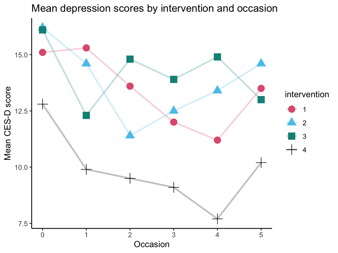
A.5.4 Exercise 4
False-positive psychology
Having considered the benefits of positive psychology, we can now consider the pitfalls of false-positive psychology: Presenting incidential and irrelevant results as statistically significant findings. An intriguing article on this phenomenon reports noteworthy results based on two datasets (Simmons, Nelson, & Simonsohn, 2011):
- Simmons, J.P., Nelson, L.D., & Simonsohn, U. (2011). False-positive psychology: Undisclosed flexibility in data collection and analysis allows presenting anything as significant. Psychological Science, 22(11), 1359–1366. doi: https://doi.org/10.1177/0956797611417632
The data was published separately (Simmons, Nelson, & Simonsohn, 2014) and pre-processed to facilitate working with it. (See Section B.2 of Appendix B for details on the data and corresponding articles.)
The following table was created by summarizing the data of both studies.
It reports the mean, minimum, and maximum age of participants per condition cond, as well as the number of people in those conditions who reported to feel a certain age (from very young to very old):
| cond | n | mn_ag | mi_ag | mx_ag | fl_vyng | fl_yng | fl_mid | fl_old | fl_vold |
|---|---|---|---|---|---|---|---|---|---|
| 64 | 25 | 21.09 | 18.30 | 38.24 | 0 | 13 | 10 | 2 | 0 |
| control | 22 | 20.80 | 18.53 | 27.23 | 3 | 15 | 3 | 1 | 0 |
| potato | 31 | 20.60 | 18.18 | 27.37 | 1 | 17 | 11 | 2 | 0 |
- Enter this data as a tibble
tbl_1(by using thetibbleor thetribblecommand).
Solution
Using the tibble command:
# (a) Using tibble:
tbl_1 <- tibble(
  cond = c("64", "control", "potato"),
  n = c(25, 22, 31),
  mean_age = c(21.09, 20.80, 20.60),
  youngest = c(18.30, 18.53, 18.18),
  oldest = c(38.24, 27.23, 27.37),
  feel_vyoung = c(0, 3, 1),
  feel_young = c(13, 15, 17),
  feel_neither = c(10, 3, 11),
  feel_old = c(2, 1, 2),
  feel_vold = c(0, 0, 0) )

knitr::kable(tbl_1, caption = "Data entered (by using tibble).")| cond | n | mean_age | youngest | oldest | feel_vyoung | feel_young | feel_neither | feel_old | feel_vold |
|---|---|---|---|---|---|---|---|---|---|
| 64 | 25 | 21.09 | 18.30 | 38.24 | 0 | 13 | 10 | 2 | 0 |
| control | 22 | 20.80 | 18.53 | 27.23 | 3 | 15 | 3 | 1 | 0 |
| potato | 31 | 20.60 | 18.18 | 27.37 | 1 | 17 | 11 | 2 | 0 |
Using the tribble command:
# (a) Using tribble:
tbl_2 <- tribble(~cond, ~n, ~mean_age, ~youngest, ~oldest,
                 ~feel_vyoung, ~feel_young, ~feel_neither, ~feel_old,   ~feel_vold,
                 #--------|----|------|------|------|---|---|---|---|---|
                 "64",      25, 21.09, 18.30,   38.24,  0, 13, 10,  2,  0,
                 "control", 22, 20.80, 18.53,   27.23,  3, 15,  3,  1,  0,
                 "potato",  31, 20.60, 18.18,   27.37,  1, 17, 11,  2,  0 )

knitr::kable(tbl_2, caption = "Data entered (by using tribble).")| cond | n | mean_age | youngest | oldest | feel_vyoung | feel_young | feel_neither | feel_old | feel_vold |
|---|---|---|---|---|---|---|---|---|---|
| 64 | 25 | 21.09 | 18.30 | 38.24 | 0 | 13 | 10 | 2 | 0 |
| control | 22 | 20.80 | 18.53 | 27.23 | 3 | 15 | 3 | 1 | 0 |
| potato | 31 | 20.60 | 18.18 | 27.37 | 1 | 17 | 11 | 2 | 0 |
## Check identity:
# all.equal(tbl, tbl_1)   # same, except for type differences
all.equal(tbl_1,  tbl_2)  # TRUE
#> [1] TRUE- Import the original dataset (either from the ds4psy package or from CSV-file) and re-create the data of
tbl_1from the original data as a new tibbletbl_org(by using dplyr).
# Import the dataset:
falsePosPsy_all <- ds4psy::falsePosPsy_all  # from ds4psy package
# falsePosPsy_all <- readr::read_csv("http://rpository.com/ds4psy/data/falsePosPsy_all.csv")  # online
Hints: Check the codebook of the False positive psychology data
(see Section B.2 of Appendix B)
to understand the variables of the dataset.
For instance, participants’ age in years is stored in a variable called aged365.
Solution
# Re-creating the data in tbl_1 from the original data:
tbl_org <- falsePosPsy_all %>%
  group_by(cond) %>%
  summarise(n = n(),
            mean_age = round(mean(aged365, na.rm = TRUE), digits = 2),
            youngest = round(min(aged365, na.rm = TRUE), digits = 2),
            oldest = round(max(aged365, na.rm = TRUE), digits = 2),
            feel_vyoung = sum(feelold == 1),
            feel_young = sum(feelold == 2),
            feel_neither = sum(feelold == 3),
            feel_old = sum(feelold == 4),
            feel_vold = sum(feelold == 5)
            )
knitr::kable(tbl_org, caption = "Same data re-created from raw data.")| cond | n | mean_age | youngest | oldest | feel_vyoung | feel_young | feel_neither | feel_old | feel_vold |
|---|---|---|---|---|---|---|---|---|---|
| 64 | 25 | 21.09 | 18.30 | 38.24 | 0 | 13 | 10 | 2 | 0 |
| control | 22 | 20.80 | 18.53 | 27.23 | 3 | 15 | 3 | 1 | 0 |
| potato | 31 | 20.60 | 18.18 | 27.37 | 1 | 17 | 11 | 2 | 0 |
## Verify identity:
# all.equal(tbl_1,  tbl_org)  # TRUE, except for different column types (numeric vs. integer).
Visualize the following aspects of the data (by using ggplot2):
Use the tibble
tbl_orgto plot the number of participants per condition (e.g., as a bar plot).Plot the mean age per condition with the minimum and the maximum age (e.g., by using
geom_pointrange).
Solution
# Plotting the number of participants per condition:
ggplot(tbl_org, aes(x = cond, y = n, fill = cond)) +
  geom_bar(stat = "identity") +
  labs(title = "Distribution of participants per condition",
       x = "Condition", y = "Number of participants") +
  # scale_fill_brewer(palette = "Set1") +
  scale_fill_manual(values = unikn::usecol(c(Pinky, Seeblau, Signal))) +
  ds4psy::theme_ds4psy()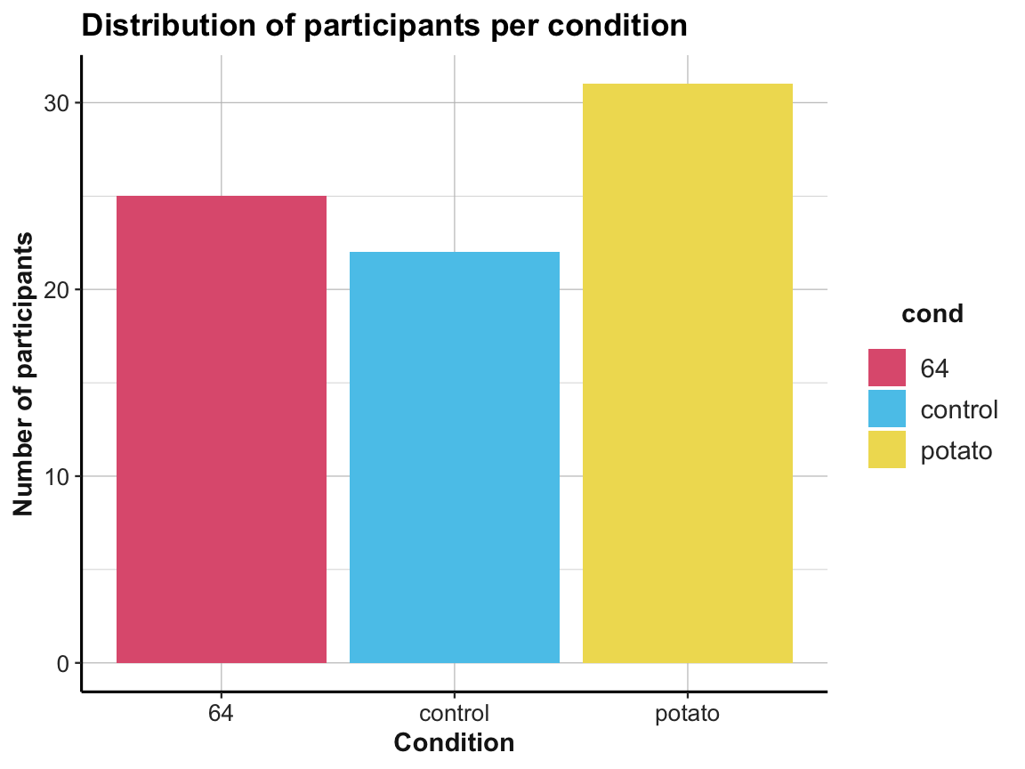
# Plotting mean age per condition with the minimum and the maximum age:
ggplot(tbl_org, aes(x = cond, y = mean_age, color = cond)) +
  geom_pointrange(aes(ymin = youngest, ymax = oldest), size = 1, shape = 19) +
  labs(title = "Mean age per condition with minimum and maximum age",
       x = "Condition", y = "Age (in years)") +
  # scale_color_brewer(palette = "Set1") +
  scale_color_manual(values = unikn::usecol(c(Pinky, Seeblau, Signal))) +
  ds4psy::theme_ds4psy()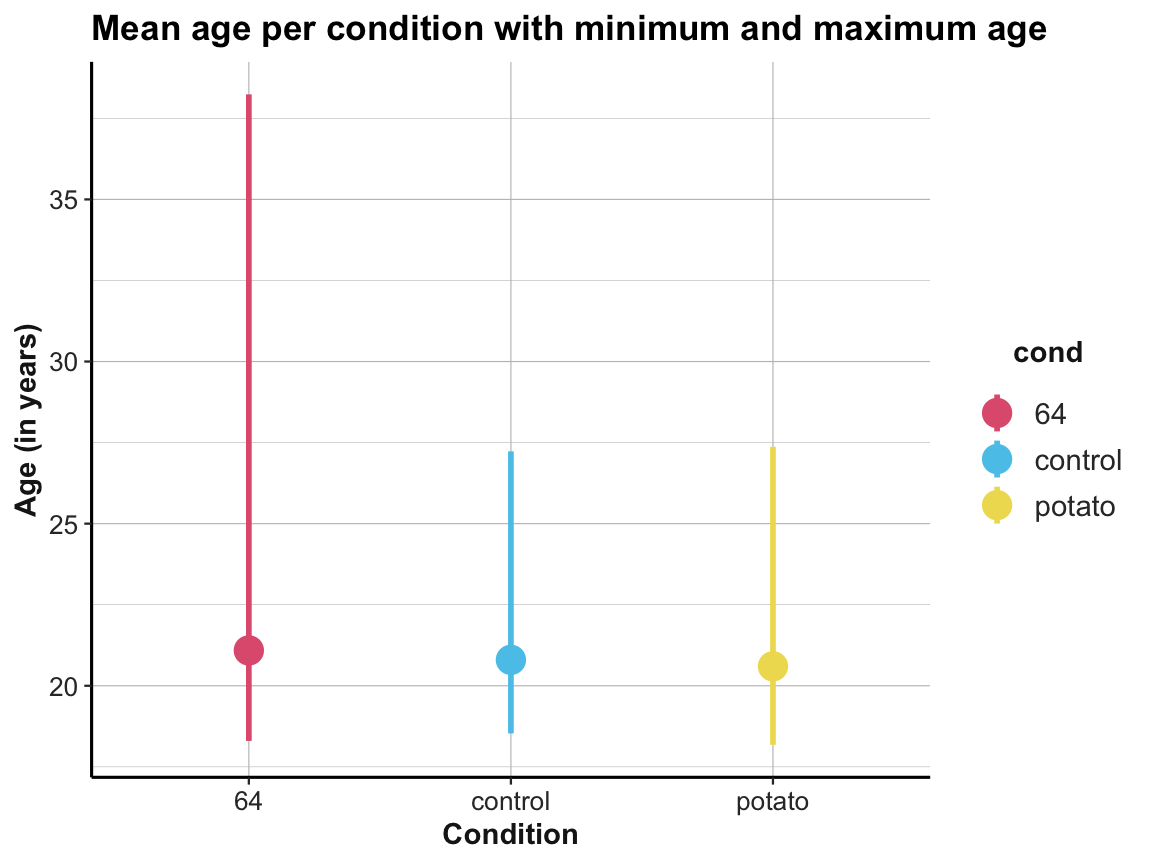
## Compare with a plot from raw data: -------
# falsePosPsy_all

ggplot(falsePosPsy_all, aes(x = cond, y = aged365, color = cond)) +
  geom_violin(width = .40) +
  geom_boxplot(width = .20) +
  geom_jitter(width = .10, color = "black", alpha = 1/2) +
  labs(title = "Age values per condition",
       x = "Condition", y = "Age (in years)",
       color = "Condition:") +
  scale_color_manual(values = unikn::usecol(c(Pinky, Seeblau, Signal))) +
  ds4psy::theme_ds4psy()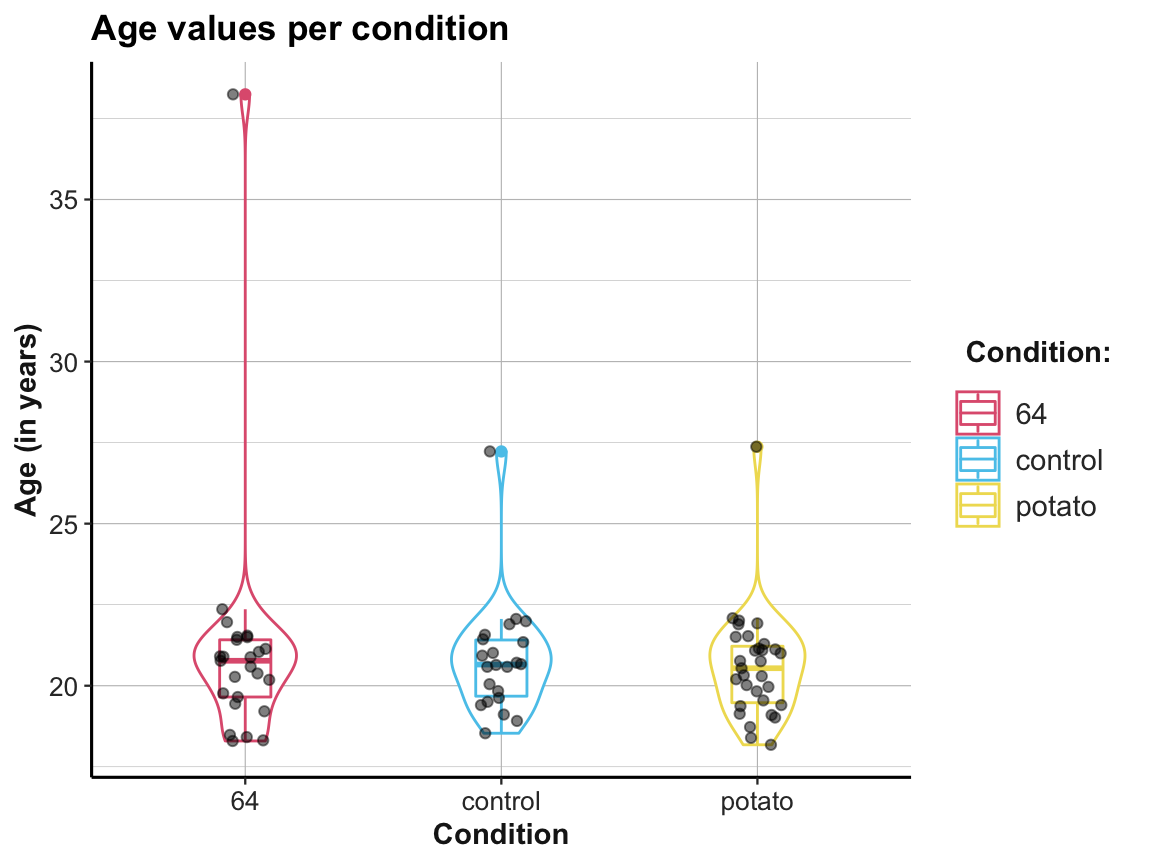
This concludes our set of exercises on tibbles, but we will keep using tibbles throughout this book.