A.2 Solutions (02)
Here are the solutions to the ggplot() exercises of Chapter 2 (Section 2.7).
A.2.1 Exercise 1
Scattered highways
A scatterplot shows a data point (observation) as a function of 2 (typically continuous) variables x and y.
This allows judging the relationship between x and y in the data.
- Use the
mpgdata of ggplot2 to create a scatterplot that shows a car’s fuel economy on the highway (on the y-axis) as a function of its fuel economy in the city (on the x-axis). How would you describe this relationship?
Solution
## Data:
# ggplot2::mpg

# Scatterplot: ------
# A minimal scatterplot + reference line:
ggplot(mpg) +
  geom_point(aes(x = cty, y = hwy)) +
  geom_abline(color = "red3")  # adds x = y (45-degree) line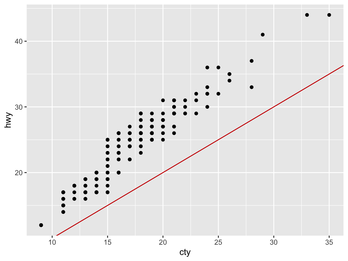
Answer: Not surprisingly, we see a positive correlation and a linear relationship between the two fuel economy measures cty and hwy.
- Does your plot suffer from overplotting? If so, create at least 2 different versions that address this problem.
Solution
Yes, it seems that multiple points appear at the same position, which is a common issue with scatterplots and sign of overplotting.
Dealing with overplotting
There are several ways of dealing with this issue:
jitteradds randomness to positions;
alphauses transparency to show overlaps and the frequency of objects at positions;
geom_sizeallows mapping count values (e.g., frequency) to object size;facet_wrapallows disentangling plots by levels of (other) variables.
Some possible solutions in our present case include:
## Dealing with overplotting: -----

# Adding randomness to point positions:
ggplot(mpg) +
  geom_point(aes(x = cty, y = hwy), position = "jitter") +
  geom_abline(color = "red3")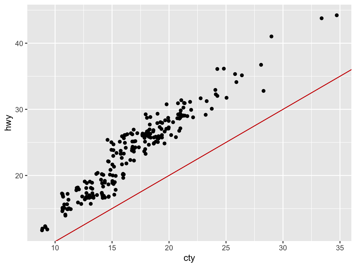
## Note: Setting position = "jitter"
## is the same as (except for randomness):
# ggplot(mpg) +
#  geom_jitter(aes(x = cty, y = hwy)) +
#  geom_abline(color = "red3")

# Using transparency (via setting alpha to < 1):
my_plot <- ggplot(mpg) +
  geom_point(aes(x = cty, y = hwy), position = "identity",
             pch = 21, fill = "steelblue", alpha = 1/4, size = 4) +
  geom_abline(linetype = 2, color = "red3") # +
  # geom_rug(aes(x = cty, y = hwy), position = "jitter", alpha = 1/4, size = 1)
my_plot  # plots the plot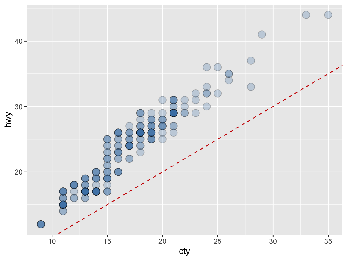
# Faceting (by another variable):
ggplot(mpg) +
  facet_wrap(~class) +
  geom_point(aes(x = cty, y = hwy)) +
  geom_abline(color = "red3")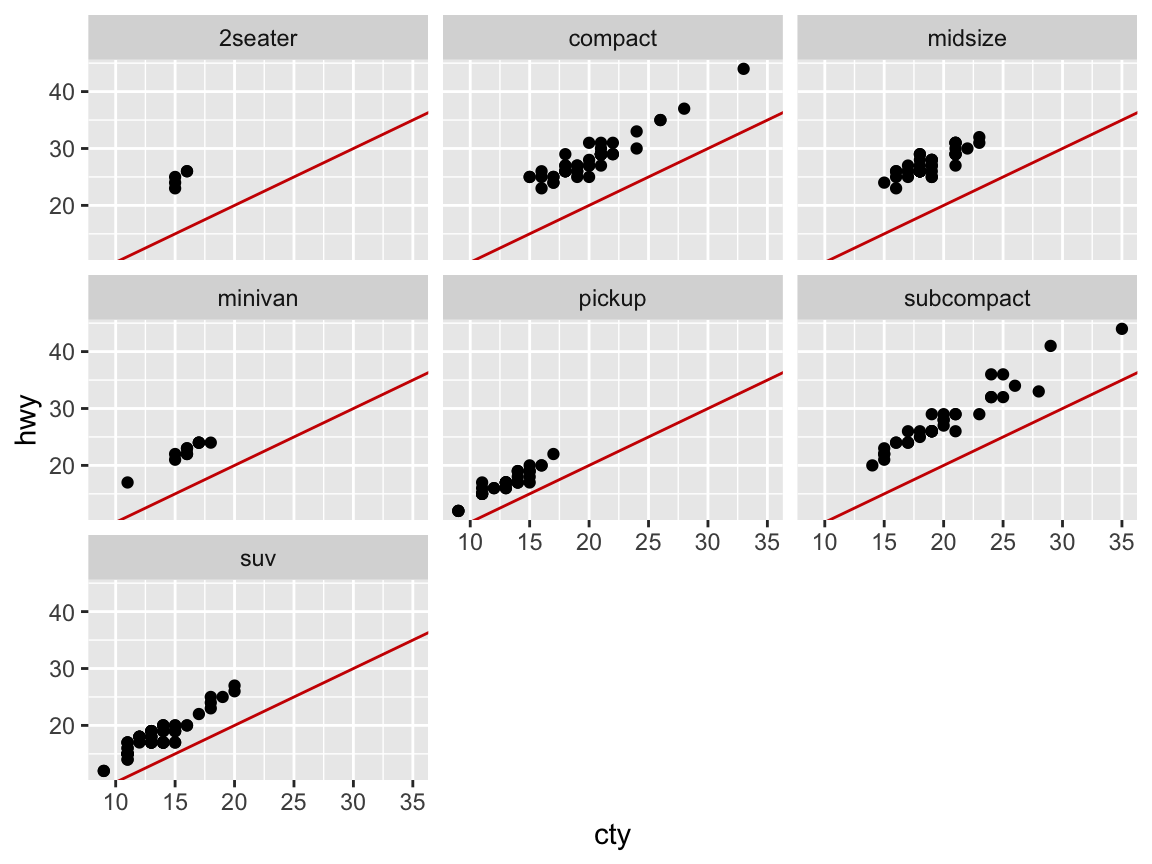
- Add informative titles, labels, and a theme to the plot.
Solution
# Adding labels and themes to plots: -----
my_plot +       # use the plot defined above
  labs(title = "Fuel economy on highway vs. city",
                x = "City (miles per gallon)",
                y = "Highway (miles per gallon)",
                caption = "Data from ggplot2::mpg") +
  # coord_fixed() +
  theme_bw()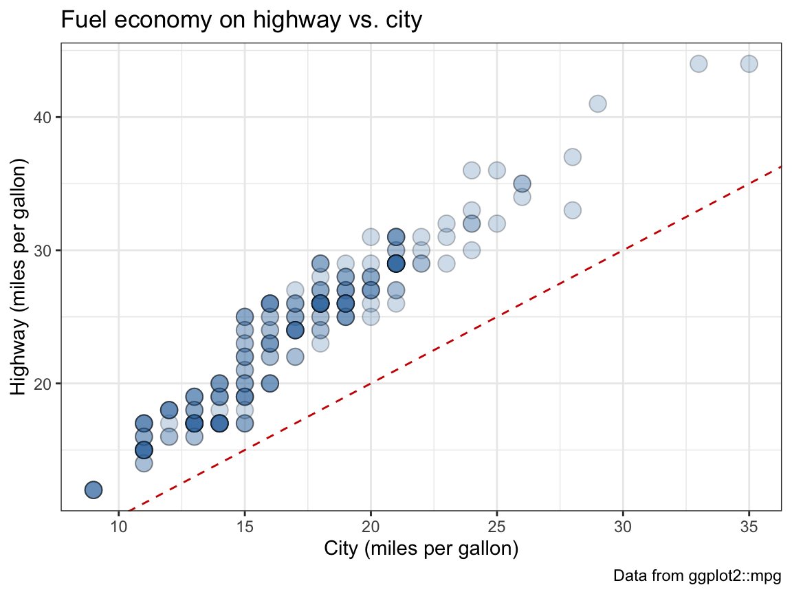
- Group the points in your scatterplot by the
classof vehicles (in at least 2 different ways).
Solution
# Grouping by (the categorical variable) class: ------

# Grouping by color:
ggplot(mpg) +
  geom_point(aes(x = cty, y = hwy, color = class),
             position = "jitter", alpha = 1/2, size = 4) +
  geom_abline(linetype = 2) +
  theme_bw()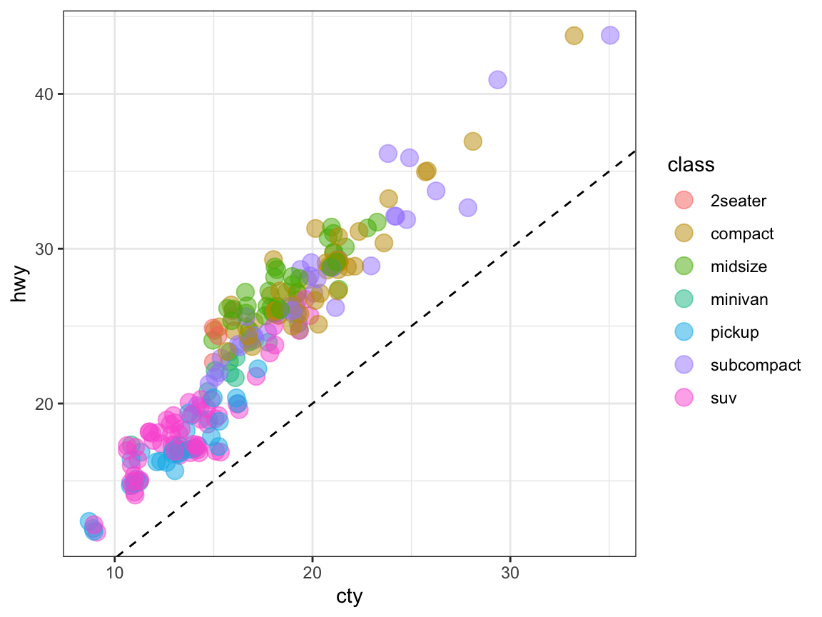
Note that jittering points is less accurate at a small scale to be more informative on a larger scale.
# Grouping by facets:
ggplot(mpg) +
  geom_point(aes(x = cty, y = hwy),
             position = "jitter", alpha = 1/2, size = 2) +
  geom_abline(linetype = 2) +
  facet_wrap(~class) +
  theme_bw()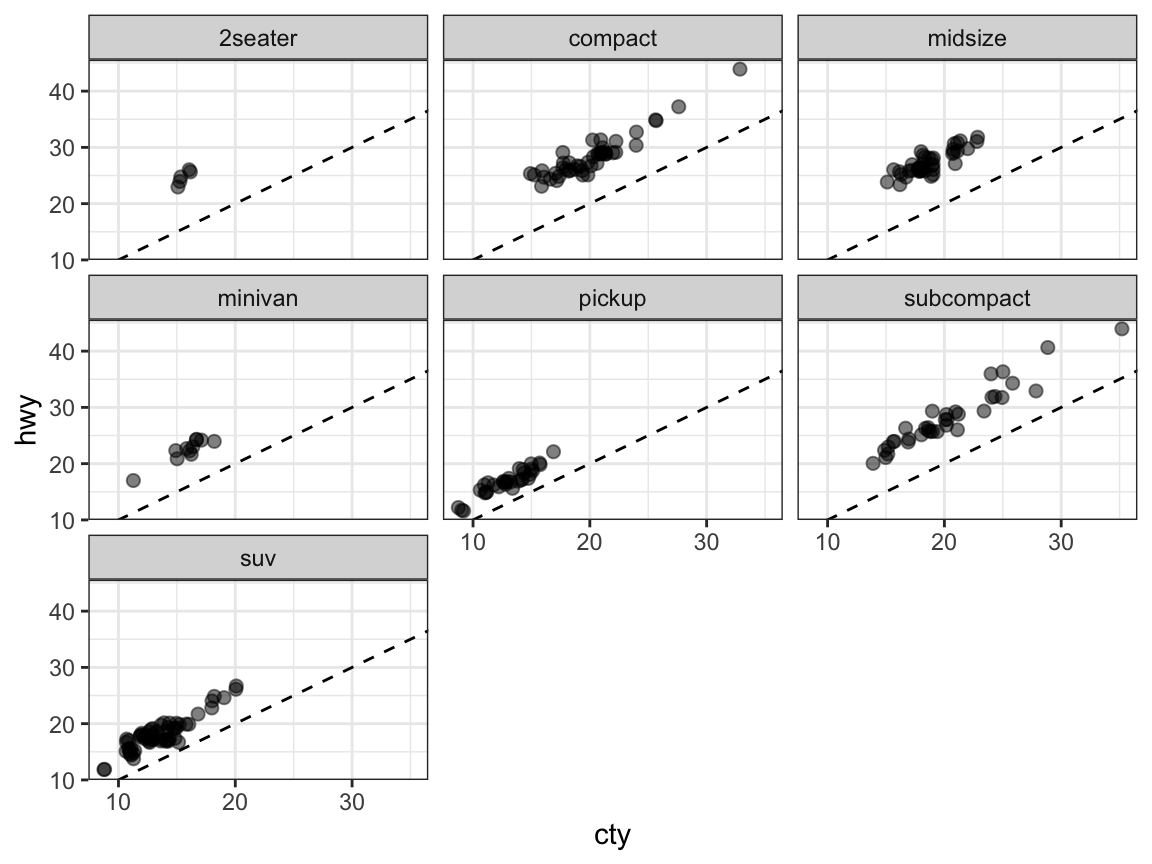
A.2.2 Exercise 2
Strange histograms
The following plot repeats the histogram code from above (to plot the distribution of fuel economy in city environments), but adds a frequency polygon as a 2nd geom (see ?geom_freqpoly).
# Plot from above with an additional geom:
ggplot(mpg, aes(x = cty)) +    # set mappings for ALL geoms
  geom_histogram(aes(x = cty), binwidth = 2, fill = "gold", color = "black") +
  geom_freqpoly(color = "steelblue", size = 2) +
  labs(title = "Distribution of fuel economy",
       x = "Miles per gallon (in city)",
       caption = "Data from ggplot2::mpg") +
  theme_light()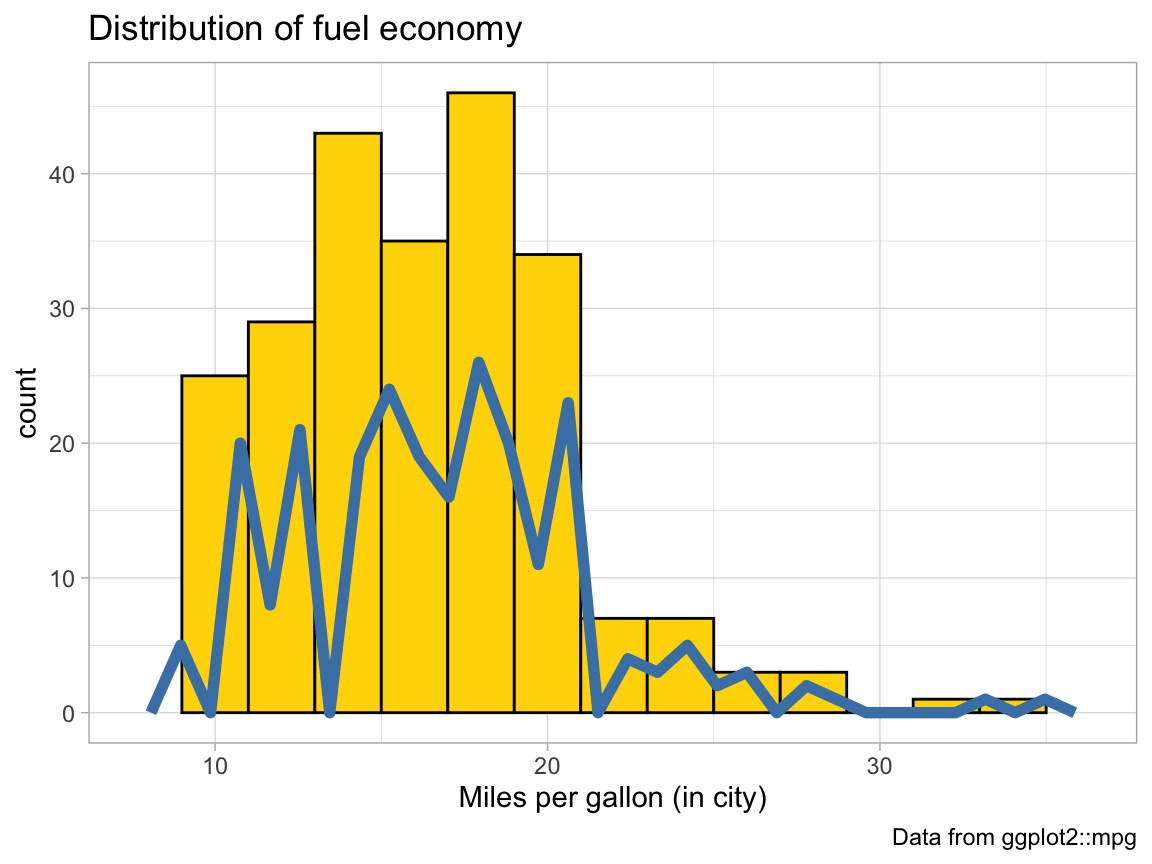
- Why is the (blue) line of the polygon lower than the (yellow) bars of the histogram?
Solution
Explanation: The histogram uses a binwidth of 2, which doubles the count values (shown on the y-axis).
- Change 1 value in the code so that both (lines and bars) have the same heights.
Solution
# Setting bindidth = 1 puts both on the same scale:
ggplot(mpg, aes(x = cty)) +    # set mappings for ALL geoms
  geom_histogram(aes(x = cty), binwidth = 1, fill = "gold", color = "black") +
  geom_freqpoly(color = "steelblue", size = 2) +
  labs(title = "Distribution of fuel economy",
       x = "Miles per gallon (in city)",
       caption = "Data from ggplot2::mpg") +
  theme_light()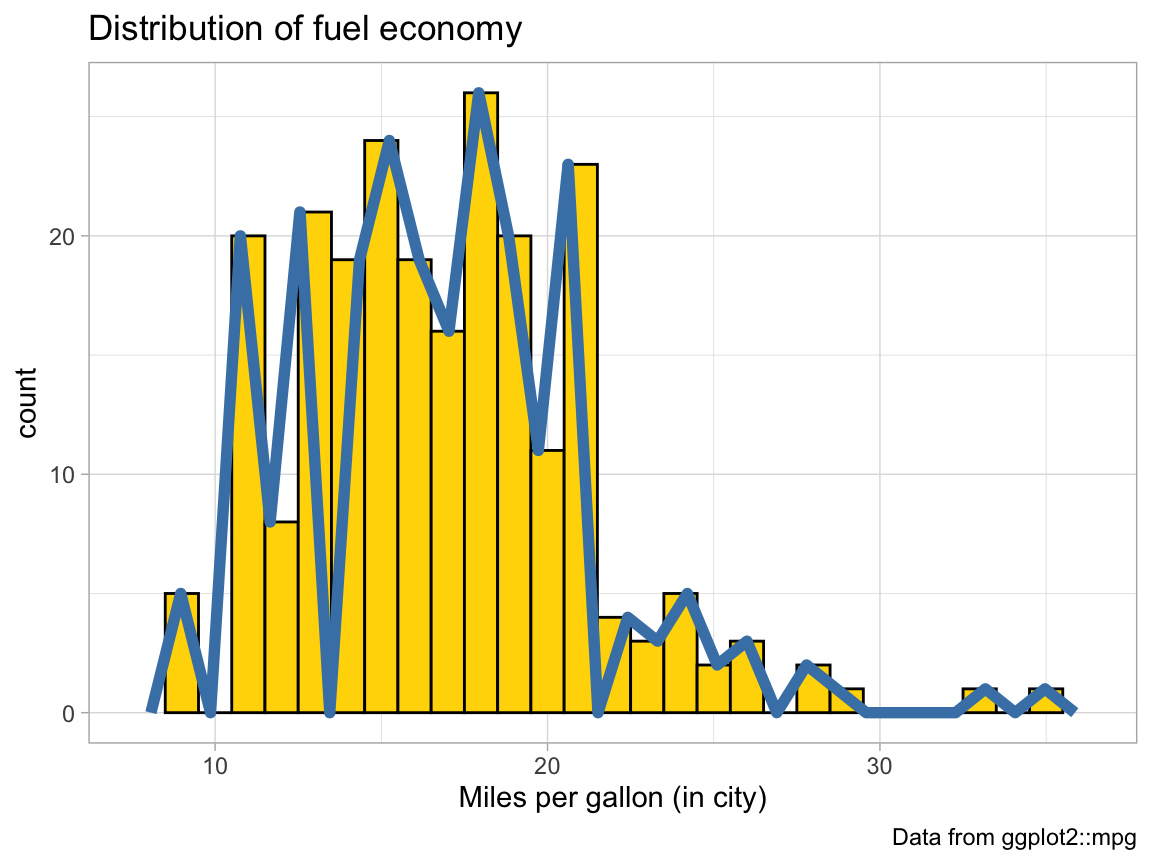
# Alternatively, we can add the same binwidth = 2 argument to geom_freqpoly:
ggplot(mpg, aes(x = cty)) +    # set mappings for ALL geoms
  geom_histogram(aes(x = cty), binwidth = 2, fill = "gold", color = "black") +
  geom_freqpoly(color = "steelblue", binwidth = 2, size = 2) +
  labs(title = "Distribution of fuel economy",
       x = "Miles per gallon (in city)",
       caption = "Data from ggplot2::mpg") +
  theme_light()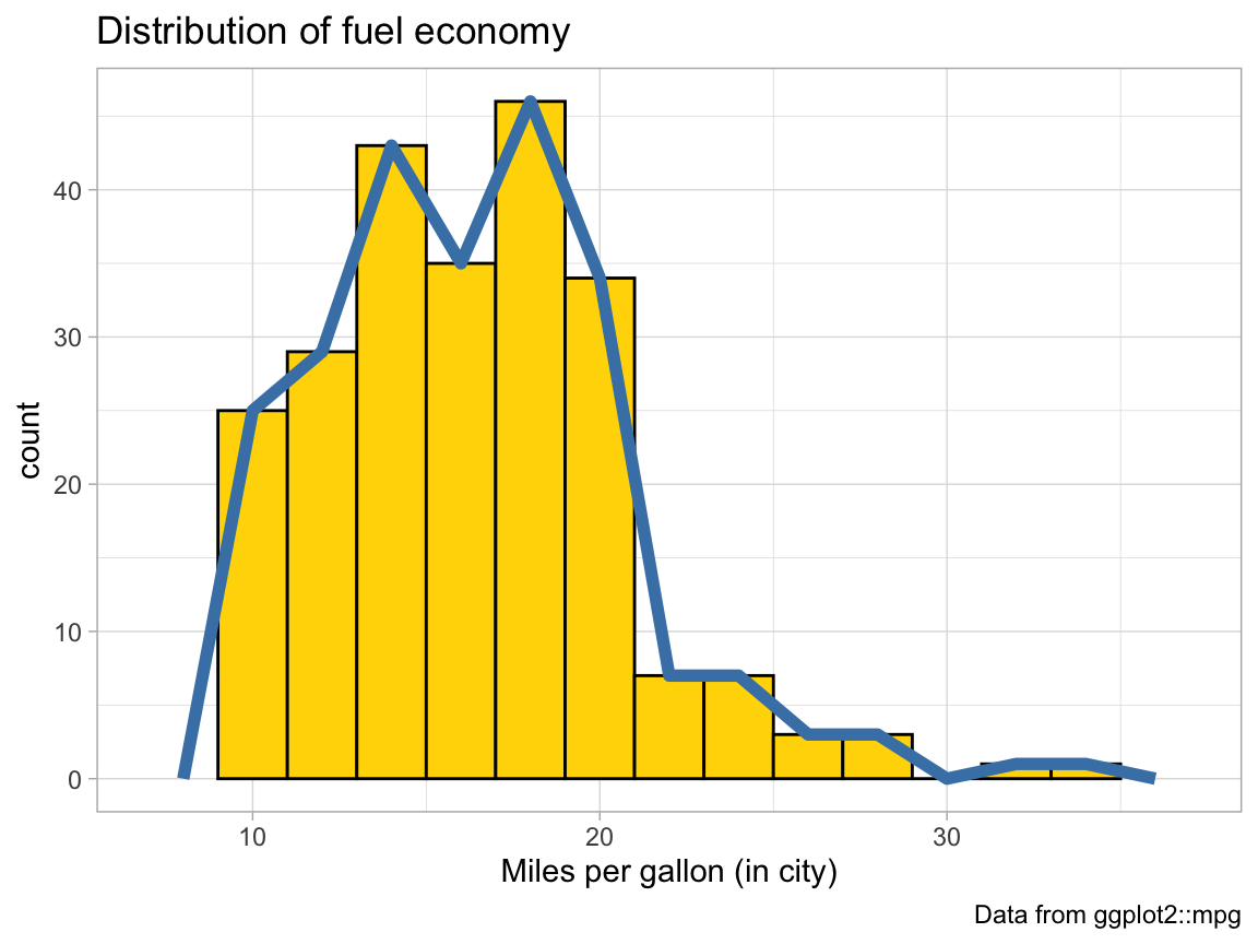
- The code above repeats the aesthetic mapping
aes(x = cty)in 2 locations. Which of these can be deleted without changing the resulting graph? Why?
Solution
The code above specifies the mapping aes(x = cty) for geom_histogram twice: Once globally for the entire graph (on the 1st line), and a 2nd time locally (within the geom_histogram() function). We can omit the 2nd (local) setting, as the global one applies to geom_histogram() as well:
# Plot from above with an additional geom:
ggplot(mpg, aes(x = cty)) +    # set mappings for ALL geoms
  geom_histogram(binwidth = 1, fill = "gold", color = "black") +
  geom_freqpoly(color = "steelblue", size = 2) +
  labs(title = "Distribution of fuel economy",
       x = "Miles per gallon (in city)",
       caption = "Data from ggplot2::mpg") +
  theme_light()
- Why can’t we simply replace
geom_freqpolybygeom_lineorgeom_smoothto get a similar line?
Solution
# Try replacing geom_freqpoly by geom_line and geom_smooth:

ggplot(mpg, aes(x = cty)) +    # set mappings for ALL geoms
  geom_histogram(aes(x = cty), binwidth = 2, fill = "gold", color = "black") +
  geom_freqpoly(color = "steelblue", binwidth = 2, size = 2) +
  geom_line() +      # Error: geom_line requires the following missing aesthetics: y
  # geom_smooth() +  # Error: stat_smooth requires the following missing aesthetics: y
  labs(title = "Distribution of fuel economy",
       x = "Miles per gallon (in city)",
       caption = "Data from ggplot2::mpg") +
  theme_light()

# Note: Both geoms require a y-aesthetic (here: the count of cars per x-value).
Answer: Whereas geom_histogram and geom_freqpoly count the frequency of elements in each bin, both geom_line and geom_smooth require a y-aesthetic.
A.2.3 Exercise 3
Cylinder bars
Let’s create some bar plots with the ggplot2::mpg data.
- Plot the number or frequency of cases by
cylas a bar plot (in at least 2 different ways).
Solution
# Count the number of cases by cylinders: ------
ggplot(mpg) +
geom_bar(aes(x = cyl), fill = unikn::Seeblau) 
ggplot(mpg) +
  geom_bar(aes(x = cyl, y = ..count..), fill = unikn::Pinky)
ggplot(mpg) +
  geom_bar(aes(x = cyl), stat = "count", fill = unikn::Seegruen)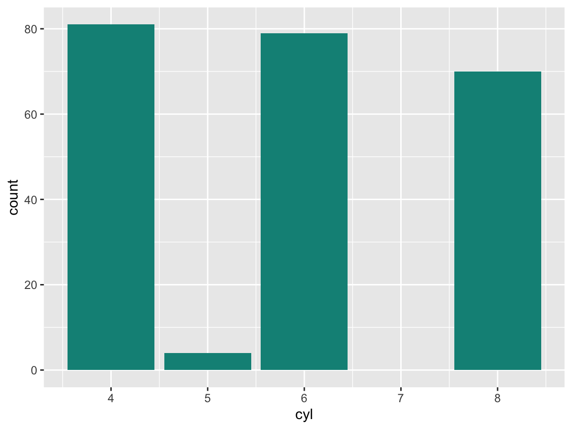
- Plot the proportion of cases in the
mpgdata bycyl(in at least 2 different ways).
Solution
# Proportion of cases: -----
ggplot(mpg) +
  geom_bar(aes(x = cyl, y = ..prop.., group = 1),
           fill = unikn::Seeblau)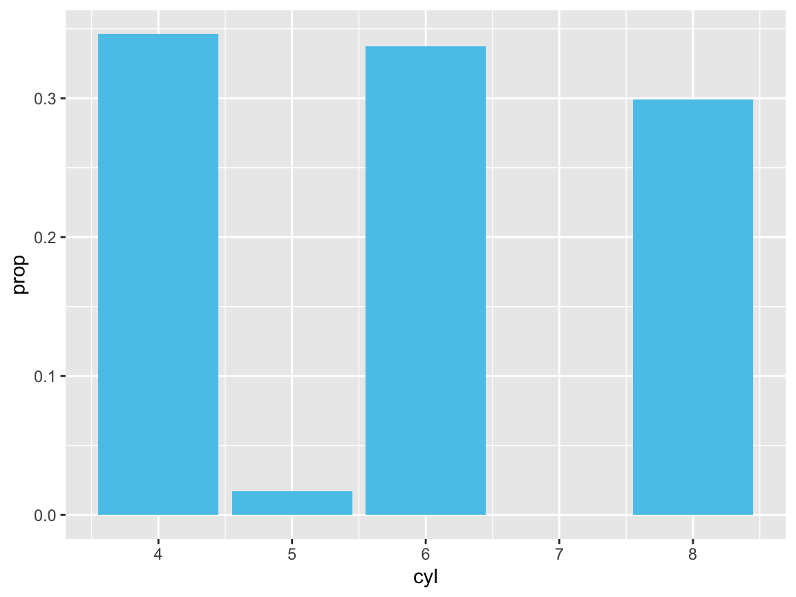
# is the same as:
ggplot(mpg) +
  geom_bar(aes(x = cyl, y = ..count../sum(..count..)),
fill = unikn::Peach) 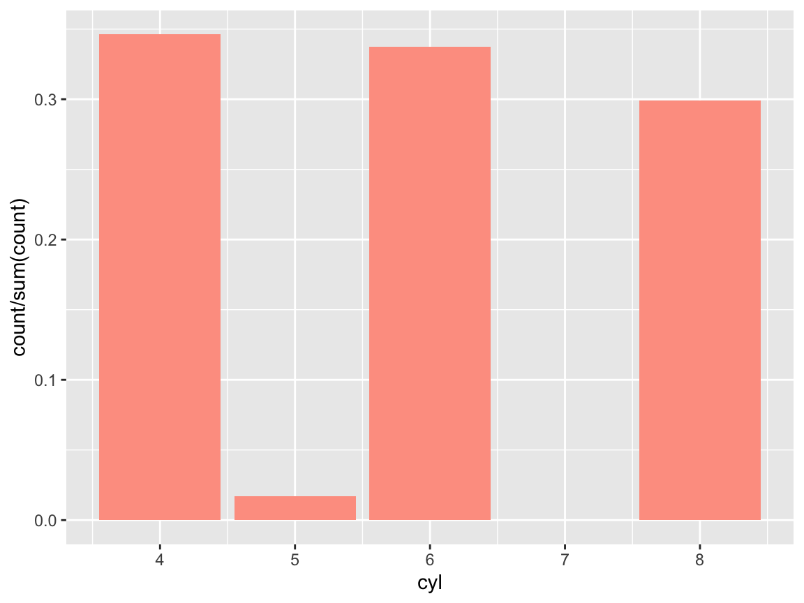
- Create a prettier version by adding different colors, appropriate labels, and a suitable theme to your plot.
Solution
Using the Spectral palette of ggplot2::scale_fill_brewer():
# Prettier version: -----
ggplot(mpg) +
  geom_bar(aes(x = cyl, fill = as.factor(cyl)),
           stat = "count", color = "black") +
  labs(title = "Counts of cars by class",
       x = "Cylinders", y = "Frequency") +
  scale_fill_brewer(name = "Cylinders:", palette = "Spectral") +
  # coord_flip() +
  theme_bw()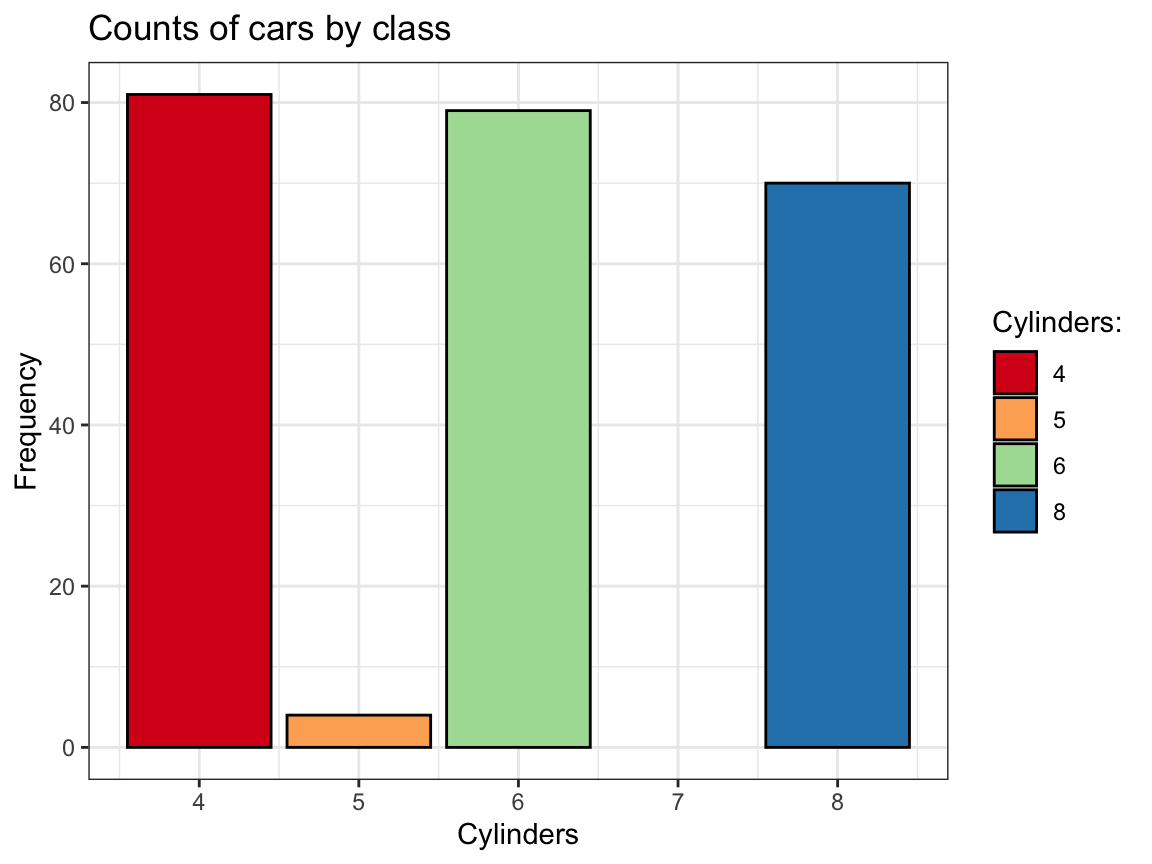
Using 5 shades of pal_seeblau from the unikn package (Neth & Gradwohl, 2021):
# Prettier version: -----
ggplot(mpg) +
  geom_bar(aes(x = cyl, fill = as.factor(cyl)),
           stat = "count", color = "black") +
  labs(title = "Counts of cars by class",
       x = "Cylinders", y = "Frequency") +
  scale_fill_manual(values = unikn::usecol(unikn::pal_seeblau, n = 5)) +
  # coord_flip() +
  theme_bw()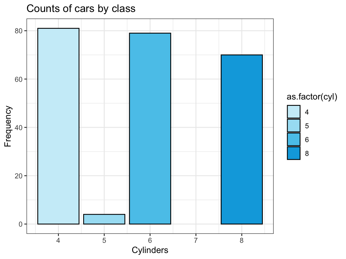
See Appendix D for additional color options in R.
A.2.4 Exercise 4
Chick diets
The ChickWeight data (contained in R datasets) contains the results of an experiment that measures the effects of Diet on the early growth of chicks.
- Save the
ChickWeightdata as a tibble and inspect its dimensions and variables.
# ?datasets::ChickWeight

# (a) Save data as tibble and inspect:
cw <- as_tibble(ChickWeight)
cw  # 578 observations (rows) x 4 variables (columns)
#> # A tibble: 578 × 4
#>    weight  Time Chick Diet
#>     <dbl> <dbl> <ord> <fct>
#>  1     42     0 1     1
#>  2     51     2 1     1
#>  3     59     4 1     1
#>  4     64     6 1     1
#>  5     76     8 1     1
#>  6     93    10 1     1
#>  7    106    12 1     1
#>  8    125    14 1     1
#>  9    149    16 1     1
#> 10    171    18 1     1
#> # … with 568 more rows- Create a line plot showing the
weightdevelopment of each indivdual chick (on the y-axis) overTime(on the x-axis) for eachDiet(in 4 different facets).
Solution
# Basic version:
ggplot(cw) +
  geom_line(aes(x = Time, y = weight, group = Chick, color = Chick)) +
  facet_wrap(~Diet)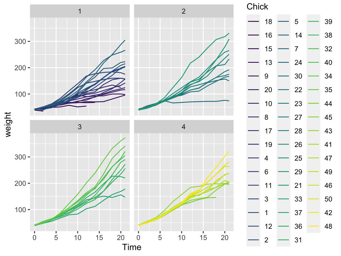
# Fancy version:
# Scatter and/or line plot showing the weight development of each chick (on the y-axis)
# over Time (on the x-axis) for each Diet (as different facets):
ggplot(cw, aes(x = Time, y = weight, group = Diet)) +
  facet_wrap(~Diet) +
  geom_point(alpha = 1/2) +
  geom_line(aes(group = Chick)) +
  geom_smooth(aes(color = Diet)) +
  labs(title = "Chick weight by time for different diets",
       x = "Time (number of days)", y = "Weight (in gm)",
       caption = "Data from datasets::ChickWeight.") +
  theme_bw()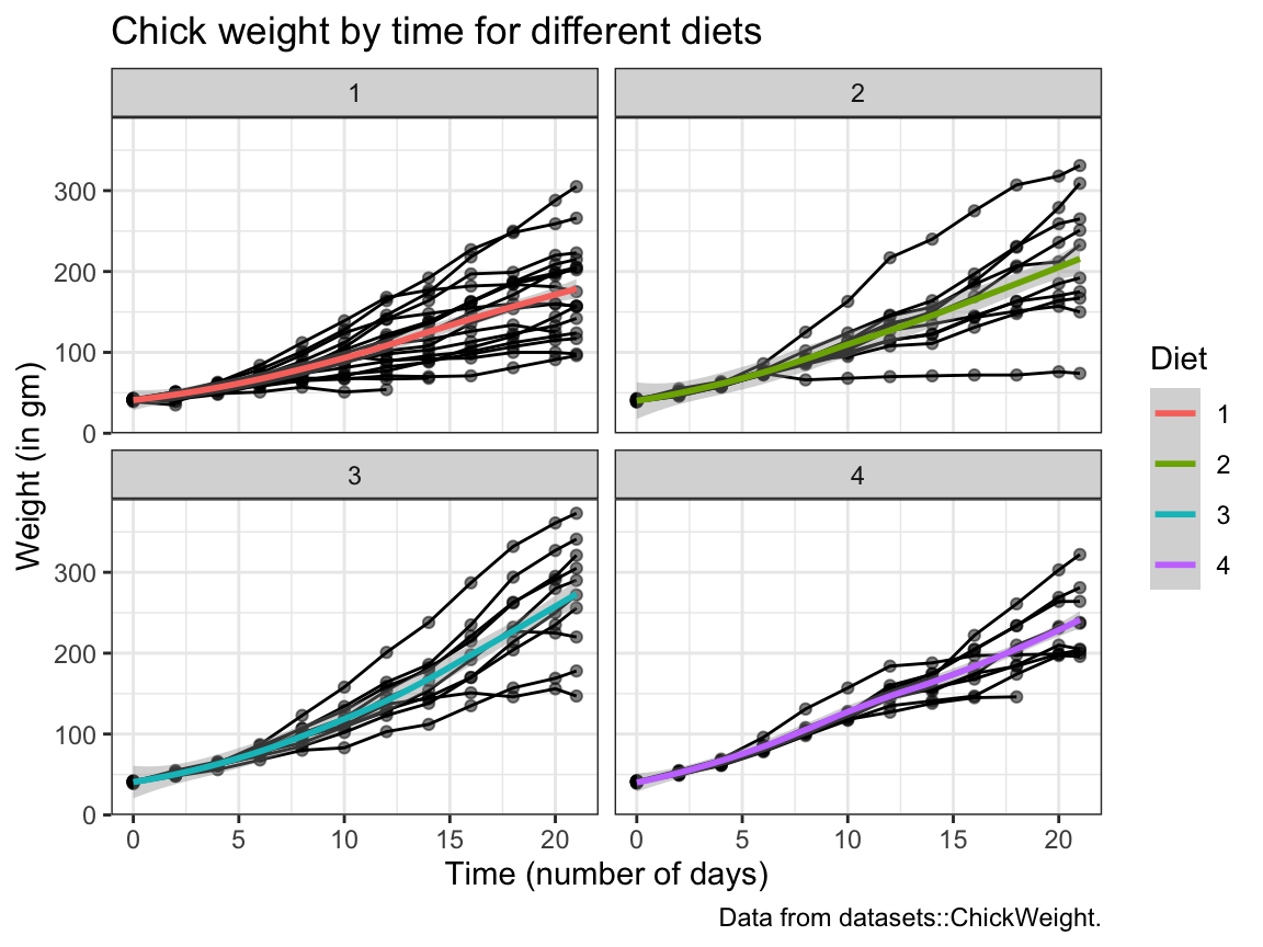
- The following bar chart shows the number of chicks per
DietoverTime.
We see that the initialDietgroups contain a different numbers of chicks and some chicks drop out overTime:
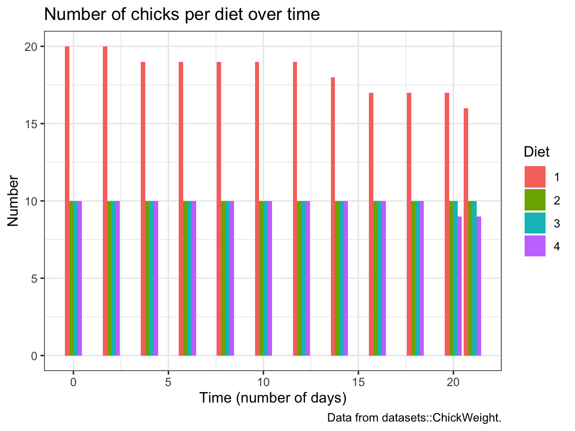
Try re-creating this plot (with geom_bar and dodged bar positions).
Solution
# (c) Bar plot showing the number (count) of chicks per diet over time:
ggplot(cw, aes(x = Time, fill = Diet)) +
  geom_bar(position = "dodge") +
  labs(title = "Number of chicks per diet over time", x = "Time (number of days)", y = "Number",
       caption = "Data from datasets::ChickWeight.") +
  theme_bw()
A.2.5 Exercise 5
Participant plots
Use the p_info data from Exercise 6 of Chapter 1 (available as posPsy_p_info in the ds4psy package) to create some plots that descripte the sample of participants:
# Load data:
p_info <- ds4psy::posPsy_p_info  # from ds4psy package
# p_info_2 <- readr::read_csv("http://rpository.com/ds4psy/data/posPsy_participants.csv")  # from online server
# all.equal(p_info, p_info_2)

# dim(p_info)      # 295 rows, 6 columns
# p_info           # prints a summary of the table/tibble
# glimpse(p_info)  # shows the first values for 6 variables (columns)

# Turn some categorial values into factors:
p_info$sex <- as.factor(p_info$sex)
p_info$intervention <- as.factor(p_info$intervention)

p_info  # Note that the variables intervention and sex are now listed as <fct>.
#> # A tibble: 295 × 6
#>       id intervention sex     age  educ income
#>    <dbl> <fct>        <fct> <dbl> <dbl>  <dbl>
#>  1     1 4            2        35     5      3
#>  2     2 1            1        59     1      1
#>  3     3 4            1        51     4      3
#>  4     4 3            1        50     5      2
#>  5     5 2            2        58     5      2
#>  6     6 1            1        31     5      1
#>  7     7 3            1        44     5      2
#>  8     8 2            1        57     4      2
#>  9     9 1            1        36     4      3
#> 10    10 2            1        45     4      3
#> # … with 285 more rows- A histogram that shows the distribution of participant
agein 3 ways:- overall,
- separately for each
sex, and - separately for each
intervention.
Solution
# (a) Histogramm showing the overall distribution of age:
ggplot(p_info) +
  geom_histogram(mapping = aes(age), binwidth = 4, fill = "gold", col = "black") +
  labs(title = "Distribution of age values") +
  theme_bw()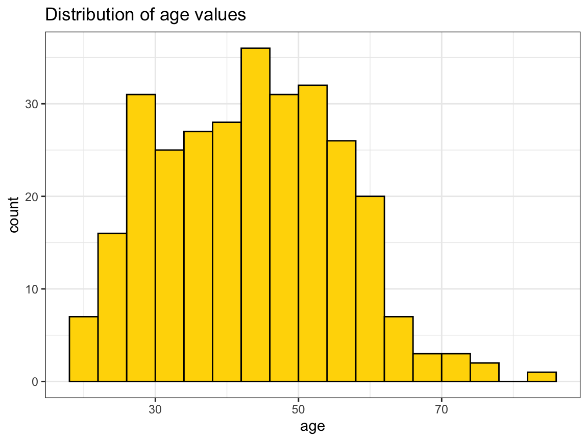
# Note: Same distribution as frequency polygon:
ggplot(p_info) +
  geom_freqpoly(mapping = aes(x = age), binwidth = 4, color = "forestgreen")+
  labs(title = "Distribution of age values",
       x="Age", y = "Count")+
  theme_bw()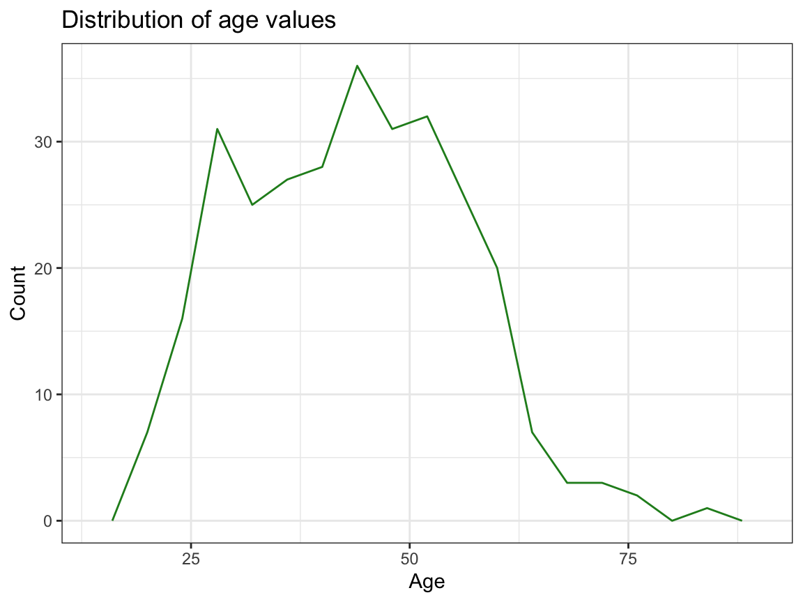
# (b) ... by sex:
ggplot(p_info) +
  geom_histogram(mapping = aes(age, fill = sex), binwidth = 4, col = "black") +
  labs(title = "Distribution of age values (by sex)") +
  scale_fill_brewer(name = "Gender:", palette = "Set1") +
  theme_bw()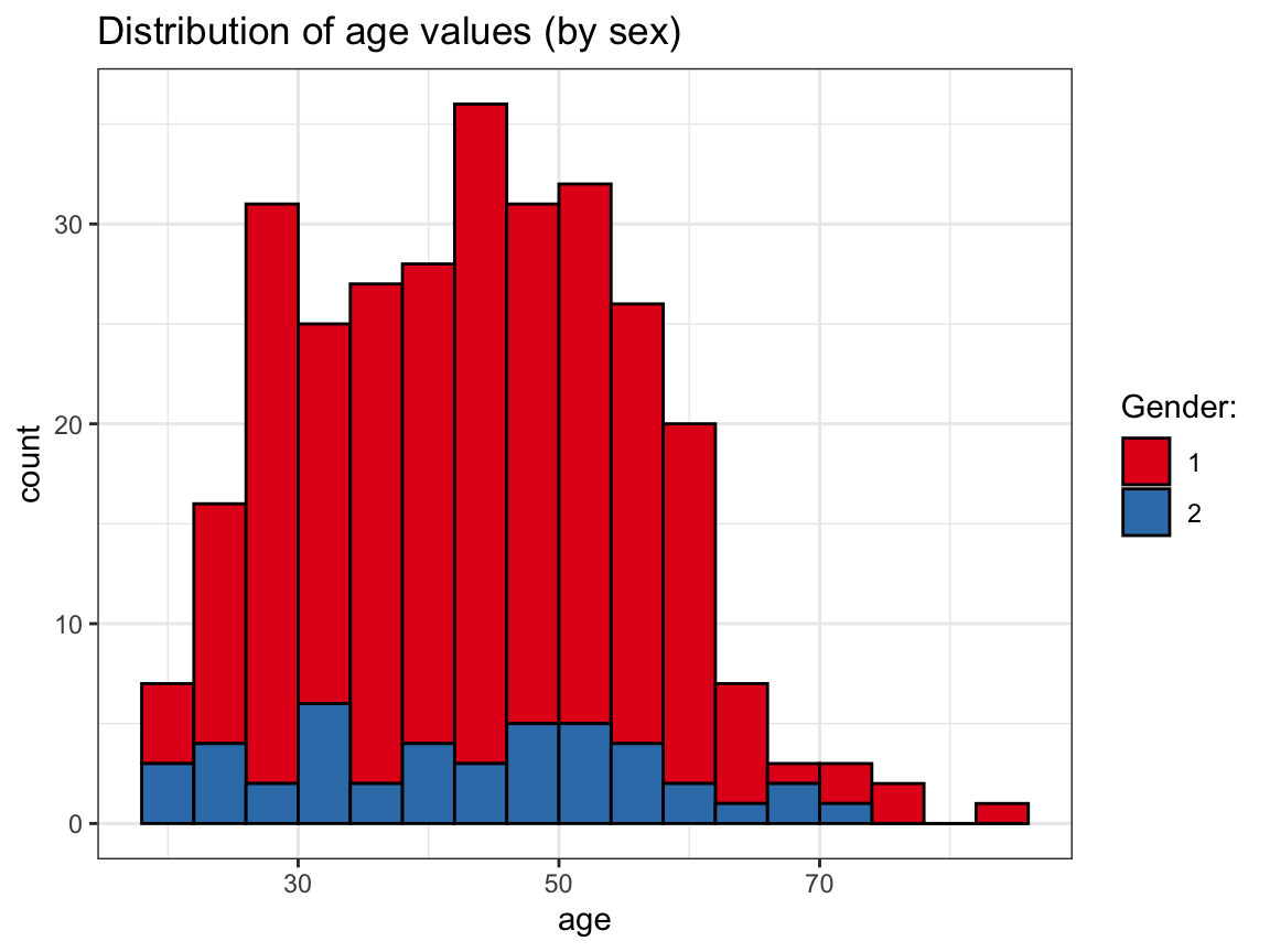
# OR:
ggplot(p_info) +
  geom_histogram(mapping = aes(age, fill = sex), binwidth = 4, col = "black") +
  facet_grid(~sex) +
  labs(title = "Distribution of age values (by sex)") +
  scale_fill_brewer(name = "Gender:", palette = "Set1") +
  theme_bw()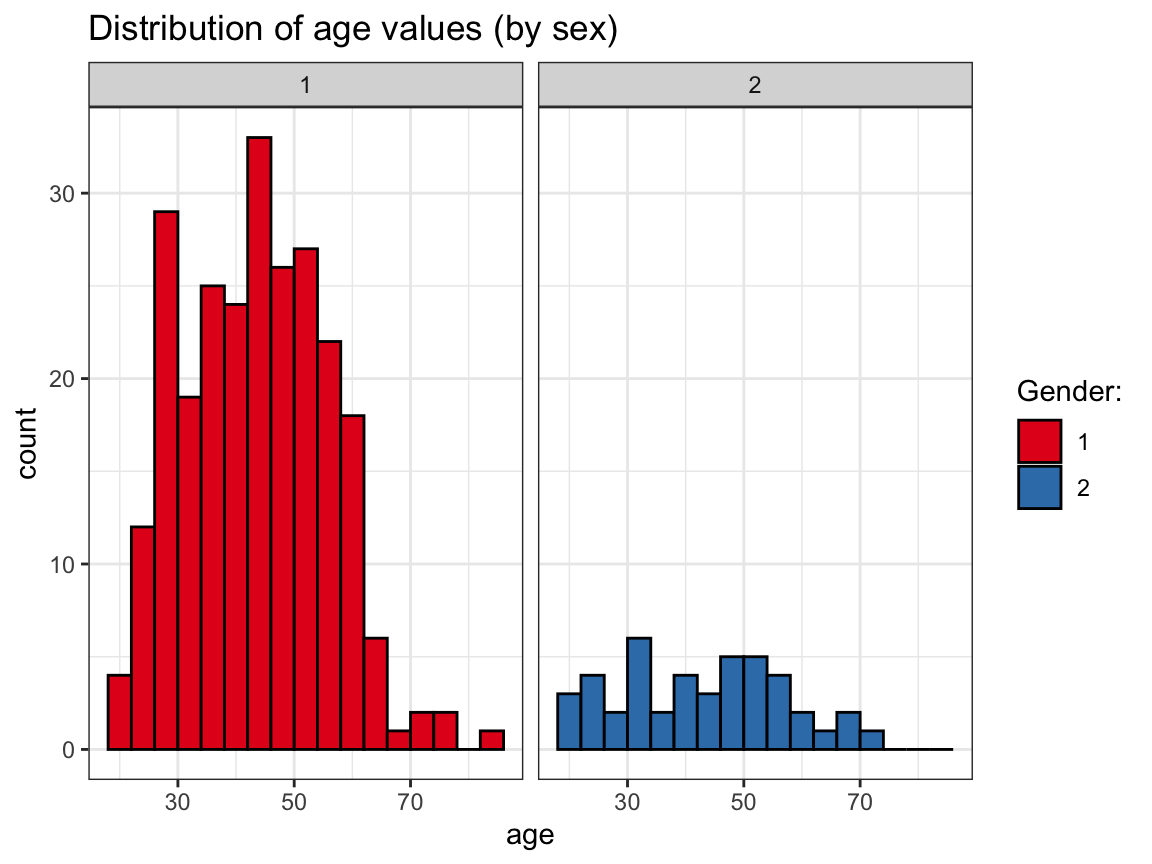
# (c) ... by intervention:
ggplot(p_info) +
  geom_histogram(mapping = aes(age, fill = intervention), binwidth = 4, col = "black") +
  facet_grid(~intervention) +
  labs(title = "Distribution of age values (by intervention)") +
  scale_fill_brewer(name = "Intervention group:", palette = "Spectral") +
  theme_bw()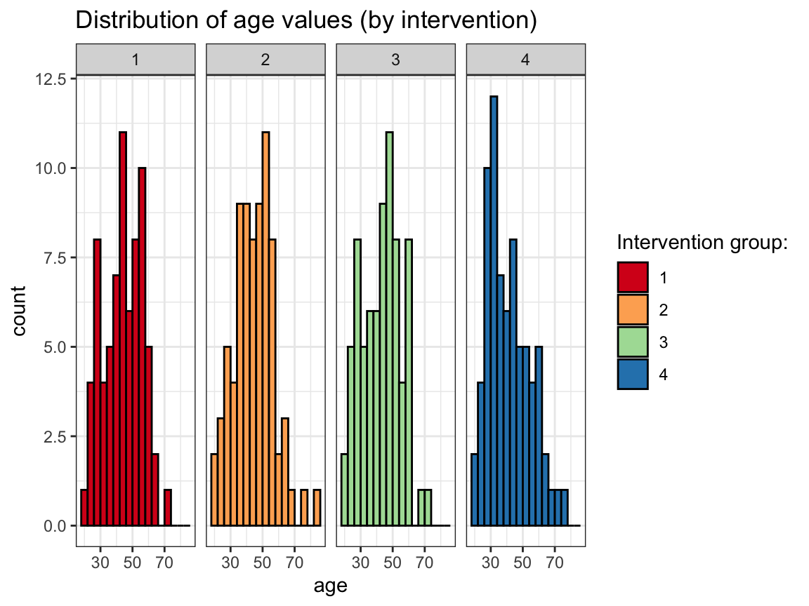
- A bar plot that
- shows how many participants took part in each
intervention; or - shows how many participants of each
sextook part in eachintervention.
- shows how many participants took part in each
Solution
# Number of participants per intervention:
ggplot(p_info)+
  geom_bar(mapping = aes(x = intervention),  fill = "gold")+
  labs(title = "Number of participants per intervention",
       x = "Intervention", y = "Count") +
  theme_bw()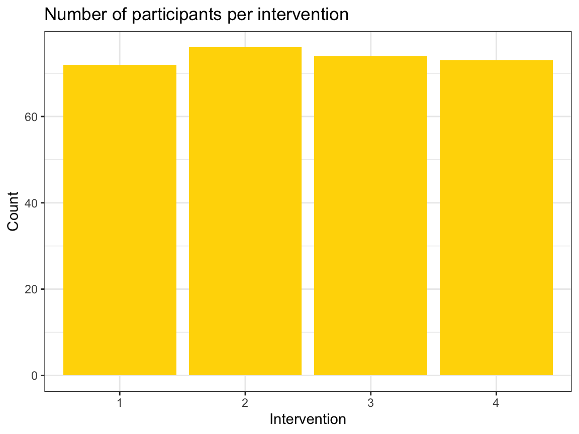
# ... & by sex:
ggplot(p_info) +
  geom_bar(aes(x = intervention, fill = sex), position = "dodge") +
  labs(title = "Number of participants per intervention (and sex)",
       x = "Intervention", y = "Count") +
  scale_fill_brewer(name = "Gender:", palette = "Set1") +
  theme_bw()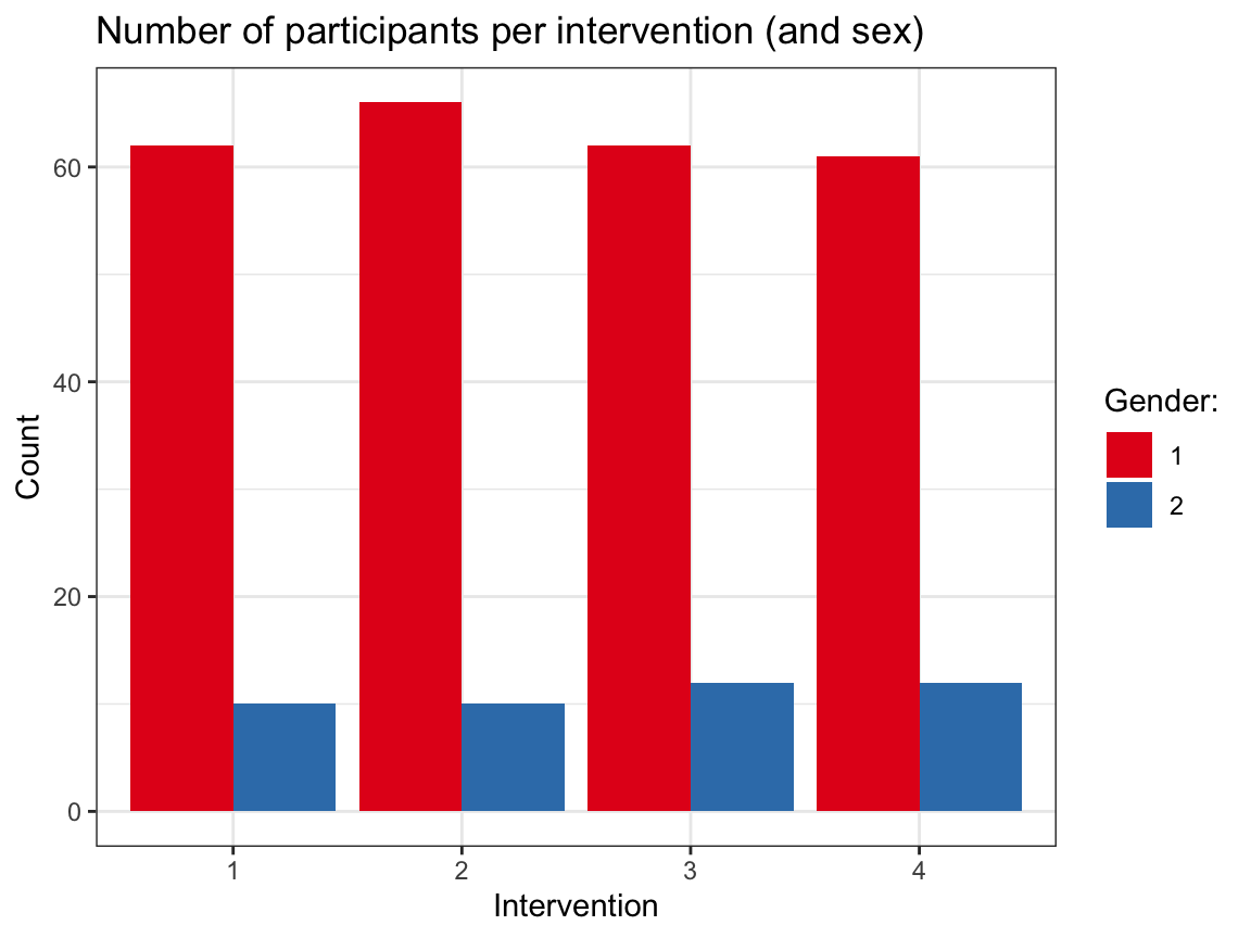
Note that it would be desirable to explain what gender is encoded by the values of 1 and 2.
For this, we currently need to inspect the definition in the codebook — it would probably make more sense to encode sex as a categorical variable (as a factor).
A.2.6 Exercise 6
Visual illusions
Not all visualizations need to depict data. For instance, visual illusions reveal something about the mechanisms of our visual system.
- Look up the term grid illusion (e.g., on Wikipedia) and re-create the so-called Hermann grid illusion using ggplot2.
Hints:
We can call
ggplot()without any data and aesthetics arguments and then explicitly provide the positions of desired lines (ingeom_hlineandgeom_vlinecommands).Creating a dark background in ggplot2 requires a combination of
theme,plot.backgroundandpanel.backgroundcommands. A decent compromise is usingtheme_dark().
Solution
# Hermann grid illusion:
# https://en.wikipedia.org/wiki/Grid_illusion#Hermann_grid_illusion

library(ggplot2)

xs <- 3
ys <- 2

# Plot with theme_dark():
ggplot() +
  geom_hline(yintercept = -ys:ys, size = 4, color = "white", alpha = 1) +
  geom_vline(xintercept = -xs:xs, size = 4, color = "white", alpha = 1) +
  coord_fixed() +
  labs(title = "Hermann grid illusion") +
  # theme:
  theme_dark()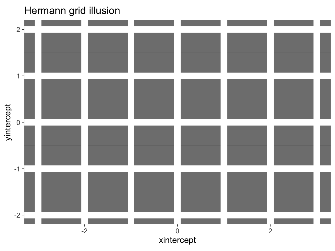
The same plot with a colored background:
# Plot with a colored background:
col_bg <- unikn::pal_bordeaux[[5]]

ggplot() +
  geom_hline(yintercept = -ys:ys, size = 4, color = "white", alpha = 1) +
  geom_vline(xintercept = -xs:xs, size = 4, color = "white", alpha = 1) +
  coord_fixed() +
  # theme:
  theme_void() +
  theme(plot.background = element_rect(fill = col_bg),
panel.background = element_rect(fill = col_bg))- Making visual illusions disappear:
Adjust the
alphaparameter of the (horizontal and vertical) grid lines until you have the impression that the dark dots disappear.
Solution
In the Hermann grid illusion, the intersections of grid lines appear to be darker than the lines. To counteract this effect, we actually make them brighter than the lines. Given white lines on a dark background, adding transparency to the line makes the lines darker, but their intersection brighter.
# Hermann grid illusion (with dimmed lines):

# Constant factor (used to add transparency to lines):
c <- .75

# Plot with theme_dark():
ggplot() +
  geom_hline(yintercept = -ys:ys, size = 4, color = "white", alpha = c) +
  geom_vline(xintercept = -xs:xs, size = 4, color = "white", alpha = c) +
  coord_fixed() +
  labs(title = "Disappearing Hermann grid illusion") +
  # theme:
  theme_dark()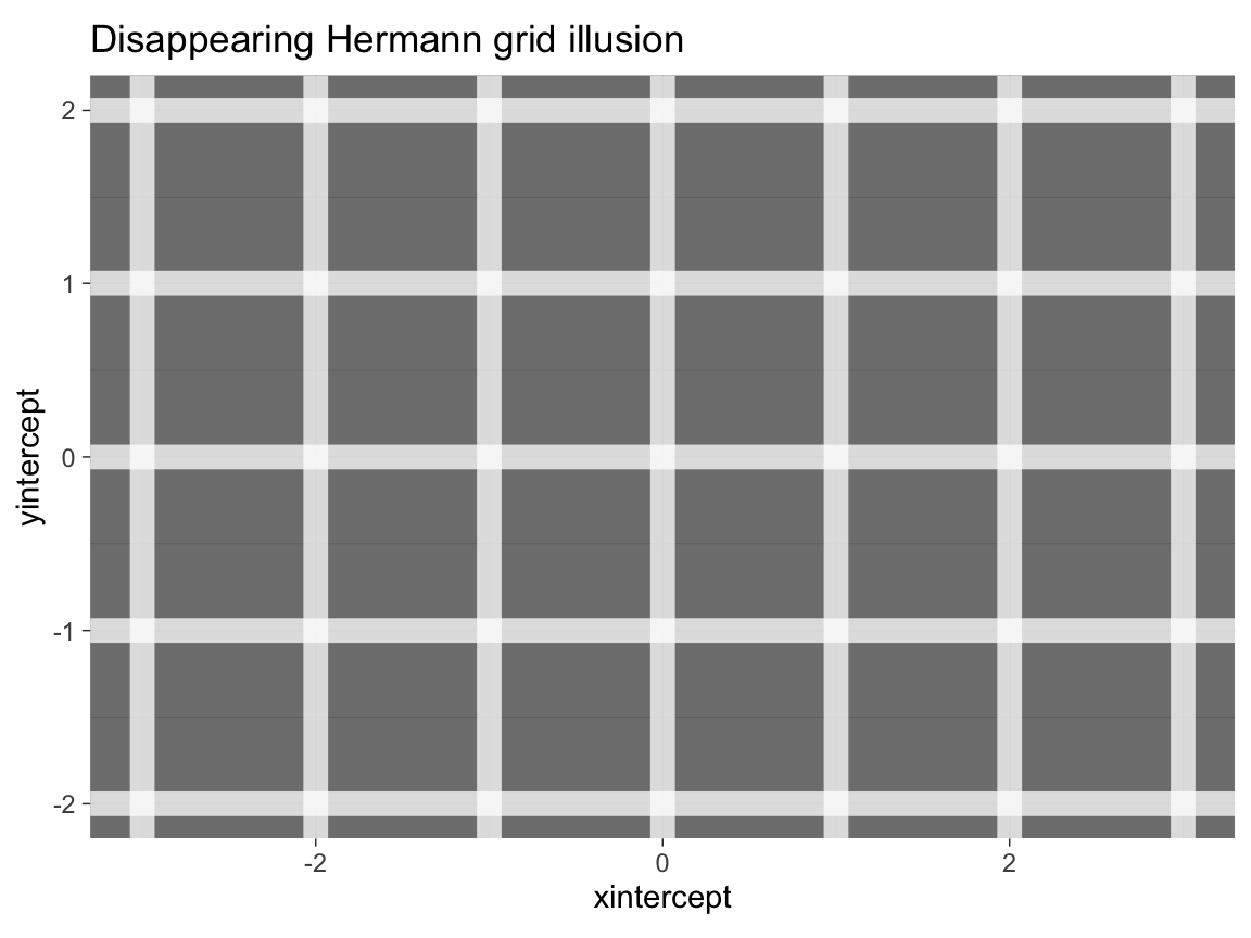
The same plot with a colored background:
# Plot with a colored background:
col_bg <- unikn::pal_petrol[[5]]

ggplot() +
  geom_hline(yintercept = -ys:ys, size = 4, color = "white", alpha = c) +
  geom_vline(xintercept = -xs:xs, size = 4, color = "white", alpha = c) +
  coord_fixed() +
  # theme:
  theme_void() +
  theme(plot.background = element_rect(fill = col_bg),
panel.background = element_rect(fill = col_bg))- Use the
make_grid()function — also available in the ds4psy package — to create a data objectdots:
# A function to generate a grid of x-y coordinates (as a tibble):
make_grid <- function(x_min = 0, x_max = 2, y_min = 0, y_max = 1){

  xs <- x_min:x_max
  ys <- y_min:y_max

  tb <- tibble::tibble(x = rep(xs, times = length(ys)),
                       y = rep(ys, each = length(xs)))

  return(tb)
}

# Set parameters:
X <- 4
Y <- 3

# Create dots data:
dots <- make_grid(x_min = -X, x_max = +X, y_min = -Y, y_max = +Y)  # using function
Then use dots as data input to a ggplot() call to create a Scintillating grid illusion.
Hint:
The code is almost identical to the Hermann grid illusion above, but we need to add geom_point() to create x by y points.
The dots dataset contains the coordinates of these points.
Solution
# Scintillating grid illusion:
# https://en.wikipedia.org/wiki/Grid_illusion#Scintillating_grid_illusion

# Set parameters:
X <- 4
Y <- 3
c <- .60

# Create dots data:
dots <- ds4psy::make_grid(x_min = -X, x_max = +X, y_min = -Y, y_max = +Y)  # using ds4psy

# Plot with theme_dark():
ggplot(dots, aes(x = x, y = y)) +
  geom_hline(yintercept = -Y:Y, size = 3, color = "white", alpha = c) +
  geom_vline(xintercept = -X:X, size = 3, color = "white", alpha = c) +
  geom_point(size = 4, color = "white", alpha = 1) +
  coord_fixed() +
  labs(title = "Scintillating grid illusion") +
  # theme:
  theme_dark()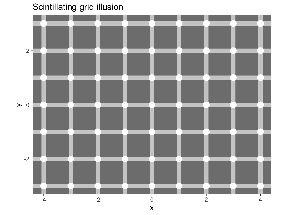
The same plot with a colored background:
# Plot with a colored background:
# col_bg <- unikn::pal_karpfenblau[[5]]
col_bg <- "black"

ggplot(dots, aes(x = x, y = y)) +
  geom_hline(yintercept = unique(dots$y), size = 3, color = "white", alpha = c) +
  geom_vline(xintercept = unique(dots$x), size = 3, color = "white", alpha = c) +
  geom_point(size = 4, color = "white", alpha = 1) +
  coord_fixed() +
  # theme:
  theme_void() +
  theme(plot.background = element_rect(fill = col_bg),
        panel.background = element_rect(fill = col_bg))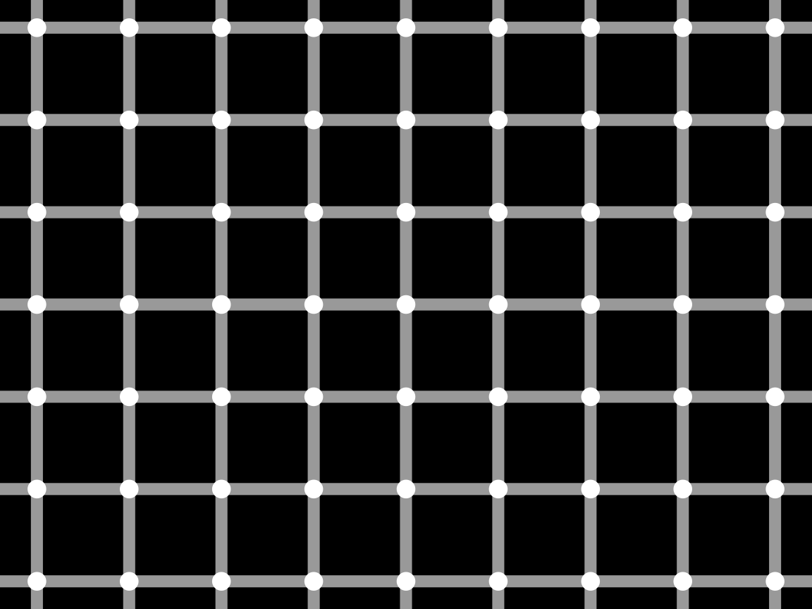
This concludes our first set of exercises on visualizing data — but ggplot2 will still feature prominently in the following chapters of this book.