A.4 Solutions (04)

Here are the solutions of the exercises on exploratory data analysis (EDA) of Chapter 4 (Section 4.4).
Introduction
Working through the essentials of EDA (in Section 4.2) has provided us with a pretty clear picture of the data and results of the AHI_CESD dataset.
However, we have not yet touched the data contained in posPsy_wide. Given that this file was described as a transformed and corrected version of AHI_CESD, we should not expect to find completely different results in it.
So let’s use posPsy_wide to exercise our skills in EDA, but also to answer some interesting questions about the study by Woodworth, O’Brien-Malone, Diamond, & Schüz (2017):
(Re-)load packages and data
# Load packages:
library(tidyverse)
library(rmarkdown)
library(knitr)
library(here)
library(ds4psy)

# Load data:
# 1. Participant data:
posPsy_p_info <- ds4psy::posPsy_p_info  # from ds4psy package
# posPsy_p_info <- readr::read_csv(file = "http://rpository.com/ds4psy/data/posPsy_participants.csv")  # online

# 2. Original DVs in long format:
AHI_CESD <- ds4psy::posPsy_AHI_CESD  # from ds4psy package
# AHI_CESD <- readr::read_csv(file = "http://rpository.com/ds4psy/data/posPsy_AHI_CESD.csv")  # online

# 4. Transformed and corrected version of all data (in wide format):
posPsy_wide <- ds4psy::posPsy_wide  # from ds4psy package
# posPsy_wide <- readr::read_csv(file = "http://rpository.com/ds4psy/data/posPsy_data_wide.csv")  # online
A.4.1 Exercise 1
Exploring wide data
Load the data stored as posPsy_wide (from the ds4psy package or this CSV-file) into posPsy_wide (if you haven’t done so above) and explore it.
- What are the data’s dimensions, variables, and types of variables? How would you describe the structure of this dataset?
Solution
Load packages and data:
# Load packages:
library(tidyverse)
library(rmarkdown)
library(knitr)

# Load data:
posPsy_wide <- ds4psy::posPsy_wide  # from ds4psy package
# posPsy_wide <- read_csv(file = "http://rpository.com/ds4psy/data/posPsy_data_wide.csv")  # online
Copy and inspect data:
df <- posPsy_wide  # copy data

## Checking:
# df
dim(df)  # 295 observations (participants) x 294 variables
#> [1] 295 294
# names(df)
# glimpse(df)
Answers:
posPsy_widecontains 295 observations (participants) and 294 variables.The first 6 variables (from
idtoincome) describe each particpant, while the rest contains 6 blocks of 48 variables (fromoccasion.i tocesdTotal.i, and \(i = 0, 1,... 5\)). [Check: (6 variables) \(+ 6 \cdot\ 48\) variables \(= 294\) variables.]Most variables are numbers of type integer, except for
elapsed.days.1toelapsed.days.5, which are numeric of type double.
Thus, we suspect that the data combines the information contained in posPsy_p_info and AHI_CESD, but – in contrast to AHI_CESD – presents it in wide format (1 row per participant) rather than long format (1 row per measurement).
- Verify that
posPsy_widecontains the same participants asposPsy_p_info.
Hint: In R, the equality of two objects x and y can be checked by all.equal(x, y)
or all.equal(x, y, check.attributes = FALSE).
Solution
# Select the first 6 variables of posPsy_wide:
p_info_2 <- posPsy_wide %>%
  select(id:income)

# Verify that they are equal to posPsy_p_info:
all.equal(p_info_2, posPsy_p_info, check.attributes = FALSE)
#> [1] TRUE- Inspect
posPsy_widefor missing (NA) values. Do you see some systematic pattern to them?
Solution
df <- posPsy_wide  # copy data
# df
sum(is.na(df))  # 37440
#> [1] 37440

# Hypothesis 1: ------
# When an occasion is missing, all corresponding variables are missing as well.

# Test for occasion.1:
df %>%
  filter(is.na(occasion.1)) %>%       # occasion.1 is missing:
  select(occasion.1:cesdTotal.1) %>%  # block of 48 variables corresponding to this occasion
  sum(., na.rm = TRUE)                # => 0 (i.e., only NA values left).
#> [1] 0

# Test for occasion.2:
df %>%
  filter(is.na(occasion.2)) %>%       # occasion.2 is missing:
  select(occasion.2:cesdTotal.2) %>%  # block of 48 variables corresponding to this occasion
  sum(., na.rm = TRUE)                # => 0 (i.e., only NA values left).
#> [1] 0

# Test for occasion.3:
df %>%
  filter(is.na(occasion.3)) %>%       # occasion.3 is missing:
  select(occasion.3:cesdTotal.3) %>%  # block of 48 variables corresponding to this occasion
  sum(., na.rm = TRUE)                # => 0 (i.e., only NA values left).
#> [1] 0

# Test for occasion.4:
df %>%
  filter(is.na(occasion.4)) %>%       # occasion.4 is missing:
  select(occasion.4:cesdTotal.4) %>%  # block of 48 variables corresponding to this occasion
  sum(., na.rm = TRUE)                # => 0 (i.e., only NA values left).
#> [1] 0

# Test for occasion.5:
df %>%
  filter(is.na(occasion.5)) %>%       # occasion.5 is missing:
  select(occasion.5:cesdTotal.5) %>%  # block of 48 variables corresponding to this occasion
  sum(., na.rm = TRUE)                # => 0 (i.e., only NA values left).
#> [1] 0

# Hypothesis 2: ------
# If missing measurements are the ONLY reason for NA values,
# there should be no other missing values (e.g., individual NA values within measurements).

# Test whether missing occasions account for all NA values:
all_missings <- sum(is.na(df))  # 37440
occ_missings <- sum(is.na(df$occasion.1), is.na(df$occasion.2), is.na(df$occasion.3),
                    is.na(df$occasion.4), is.na(df$occasion.5)) * 48
occ_missings == all_missings    # TRUE (qed).
#> [1] TRUE
Answer:
The 37440 missing values in posPsy_wide are due to dropouts: People present at the pre-test (occasion.0), but not showing up for one or more measurements at later occasions. When an occasion value (e.g., occasion.1) is NA, all corresponding measurements of that person are missing as well. Thus, all NA values are accounted for by dropouts.
A.4.2 Exercise 2
When screening the data contained in AHI_CESD (in Section 4.2.4 or available as ds4psy::posPsy_AHI_CESD), we have computed and plotted both the number of measurement occasions per particiant and the number of participants per measurement occasion. The fact that the number of people decreased from initial to later occasions motivated an important question:
- Are the dropouts (i.e., people present at first, but absent at one or more later measurements) random or systematic?
Selective dropouts?
Theoretically, the presence of dropouts — which we can define here as people being present initially, but missing one or more measurements at later occasions — raises an important issue:
Are the dropouts random (due to chance) or systematic (due to some other factor)?
Let’s explore this issue (for the data of posPsy_wide) in a sequence of four steps:
- Create a new filter variable
dropout(e.g., so thatdropoutisFALSEwhen a person was measured on all occasions andTRUEwhen a person missed one or more occasions), and add this variable to the data.
Solution
## Data:
df <- ds4psy::posPsy_wide
# df

# (A) Base R solution: ------
df$dropout <- NA        # Create a new variable and initialize with NA.
sum(is.na(df$dropout))  # Check: Start with 295 values of NA.
#> [1] 295

# Identify dropouts:
df$dropout[is.na(df$occasion.0) | is.na(df$occasion.1) | is.na(df$occasion.2) |
           is.na(df$occasion.3) | is.na(df$occasion.4) | is.na(df$occasion.5) ] <- TRUE
# Identify non-dropouts:
df$dropout[!is.na(df$occasion.0) & !is.na(df$occasion.1) & !is.na(df$occasion.2) &
           !is.na(df$occasion.3) & !is.na(df$occasion.4) & !is.na(df$occasion.5) ] <- FALSE

# Sums:
sum(is.na(df$dropout))    #   0 values of NA left.
#> [1] 0
sum(df$dropout == TRUE)   # 223 people with at least 1 NA value
#> [1] 223
sum(df$dropout == FALSE)  #  72 people without any NA values
#> [1] 72


# (B) dplyr solution: ------
# Compute number of occasions per participant:
df %>%
  group_by(id) %>%
  mutate(nr_occ_NA = sum(is.na(occasion.0), is.na(occasion.1), is.na(occasion.2),
                         is.na(occasion.3), is.na(occasion.4), is.na(occasion.5)),
         nr_occ =   sum(!is.na(occasion.0), !is.na(occasion.1), !is.na(occasion.2),
                        !is.na(occasion.3), !is.na(occasion.4), !is.na(occasion.5))

  ) %>%
  group_by(nr_occ) %>%
  count() # => 72 people without any NA values
#> # A tibble: 6 × 2
#> # Groups:   nr_occ [6]
#>   nr_occ     n
#>    <int> <int>
#> 1      1    93
#> 2      2    42
#> 3      3    24
#> 4      4    11
#> 5      5    53
#> 6 6 72- Use the
dropoutvariable to ask whether you see any group differences between dropouts and non-dropouts in their independent variables (sex,age,educ, andincome). This would imply that some of these factors may have co-determined whether a participant completed the study or dropped out.
Hints: The best way to do this depends on the types of variables of interest:
For categorical variables (here:
sex,educ,income), the question essentially asks you to compare the relative proportions (e.g., of females vs. males) in the dropout vs. non-dropout groups. You can do this with computing appropriate summary tables indplyr. However, it’s much easier to visually judge the similarity of graphs (e.g., by using bar charts in which stacked bars are scaled to 100% for each bar, i.e.,pos = "fill").For continuous variables (here:
age), it’s easiest to visualize their distributions (as histograms or density plots) with group-specific aesthetics or facets for the variables to be compared.
Solution
## Data:
df_drop <- df %>%
  select(id:income,
         ahiTotal.0, cesdTotal.0,
         ahiTotal.1, cesdTotal.1,
         ahiTotal.5, cesdTotal.5,
         dropout)
df_drop
#> # A tibble: 295 × 13
#>       id intervention   sex   age  educ income ahiTotal.0 cesdTotal.0 ahiTotal.1
#>    <dbl>        <dbl> <dbl> <dbl> <dbl>  <dbl>      <dbl>       <dbl>      <dbl>
#>  1     1            4     2    35     5      3         63          14         73
#>  2     2            1     1    59     1      1         73           7         89
#>  3     3            4     1    51     4      3         77           3         NA
#>  4     4            3     1    50     5      2         60          31         67
#>  5     5            2     2    58     5      2         41          27         41
#>  6     6            1     1    31     5      1         62          25         NA
#>  7     7            3     1    44     5      2         67           2         NA
#>  8     8            2     1    57     4      2         59          30         45
#>  9     9            1     1    36     4      3         48          25         NA
#> 10    10            2     1    45     4      3         58          21         NA
#> # … with 285 more rows, and 4 more variables: cesdTotal.1 <dbl>,
#> #   ahiTotal.5 <dbl>, cesdTotal.5 <dbl>, dropout <lgl>

# (a) Dropouts by sex: -----

# Compute with dplyr:
df_drop %>%
  mutate(male = sex - 1) %>%  # recode sex (1: female, 2: male) as male (0 vs. 1)
  group_by(male, dropout) %>%
  summarise(n_drop  = n(),
            pc_drop = n_drop/nrow(df_drop) * 100)
#> # A tibble: 4 × 4
#> # Groups:   male [2]
#>    male dropout n_drop pc_drop
#>   <dbl> <lgl>    <int>   <dbl>
#> 1     0 FALSE       61   20.7
#> 2     0 TRUE       190   64.4
#> 3     1 FALSE       11    3.73
#> 4     1 TRUE        33   11.2

# From Table:
# Dropouts among females:
61/(61 + 190)  # 24.3%
#> [1] 0.2430279
# Dropouts among males:
11/(11 + 33)   # 25.0%
#> [1] 0.25

# Visually:
ggplot(df_drop) +
  geom_bar(aes(x = dropout, fill = factor(sex)), pos = "fill") +
  labs(title = "Sex ratio by dropouts",
       x = "Dropout", fill = "Sex:") +
  scale_fill_brewer(palette = "Set1") +
  theme_bw()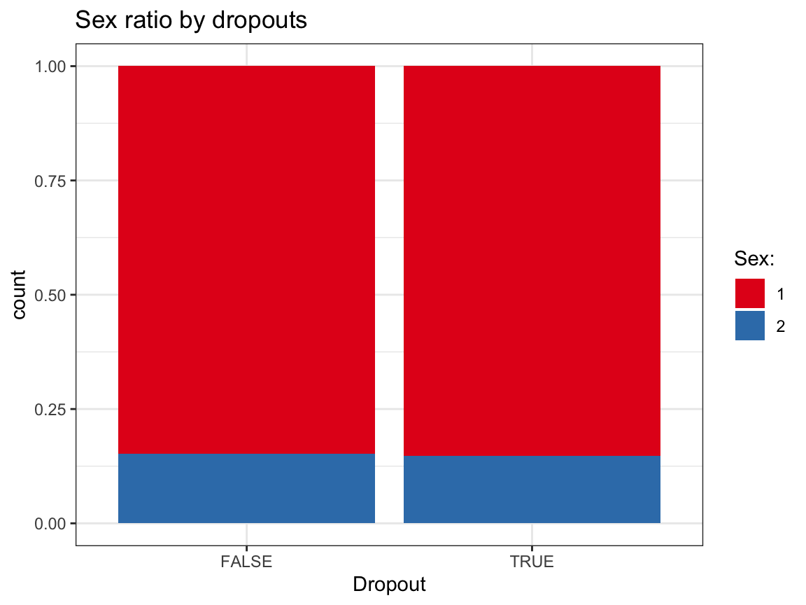
# (b) Dropouts by age: ------

# To compute distribution, we would need to categorize age values into bins (e.g., of 10 years).
# Rather than doing this manually, we can easily do this visually:
ggplot(df_drop) +
  geom_histogram(aes(x = age, fill = dropout), binwidth = 10) +
  facet_grid(~dropout) +
  labs(title = "Age distribution by dropouts",
       x = "Age", fill = "Dropout:") +
  scale_fill_brewer(palette = "Set1") +
  theme_bw()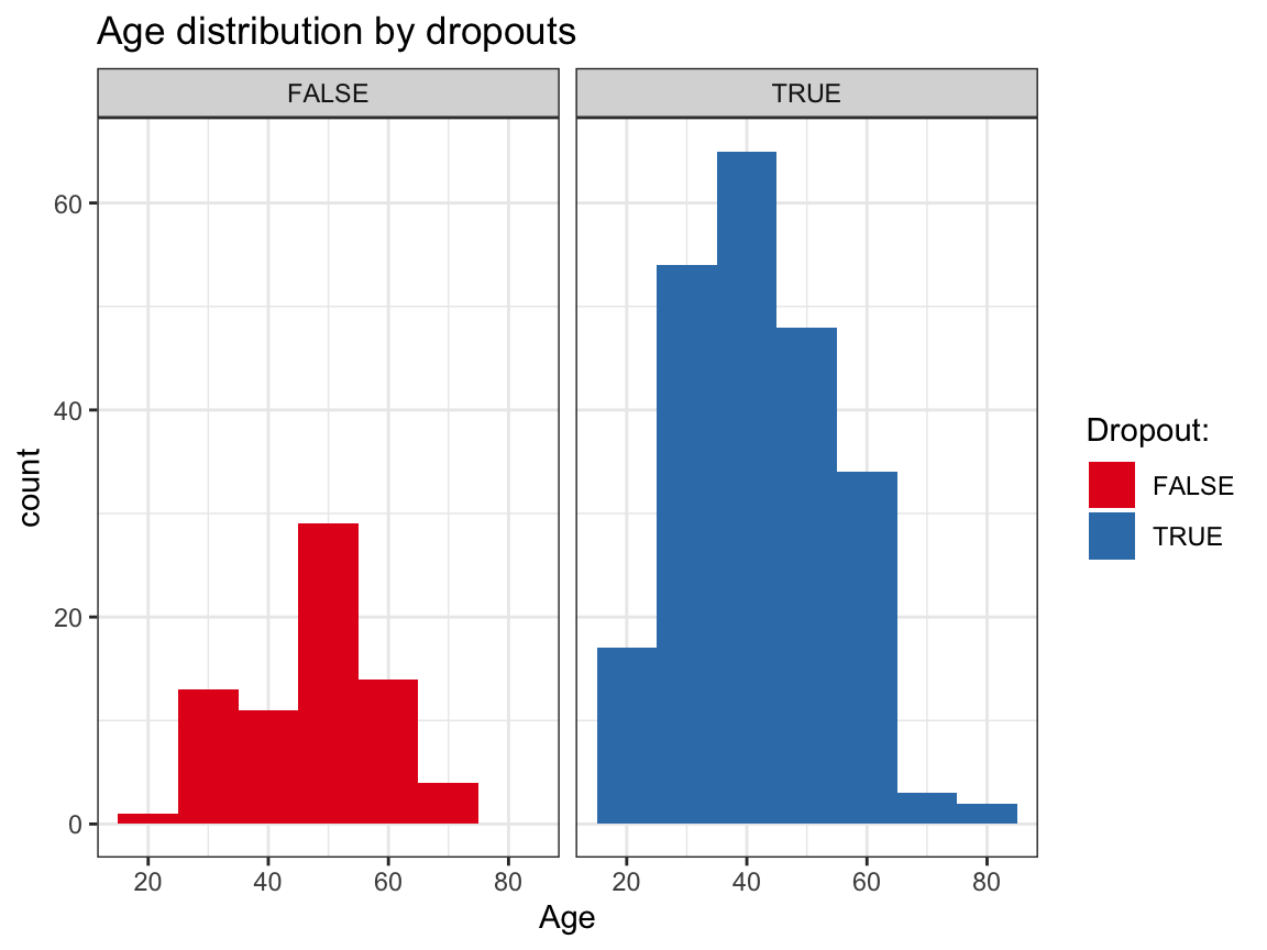
# Overlapping density plots:
ggplot(df_drop) +
  geom_density(aes(x = age, group = dropout, color = dropout, fill = dropout), size = 1, alpha = .3) +
  # facet_grid(~dropout) +
  labs(title = "Age distribution by dropouts",
       x = "Age", color = "Dropout:", fill = "Dropout:") +
  scale_fill_brewer(palette = "Set1") +
  theme_bw()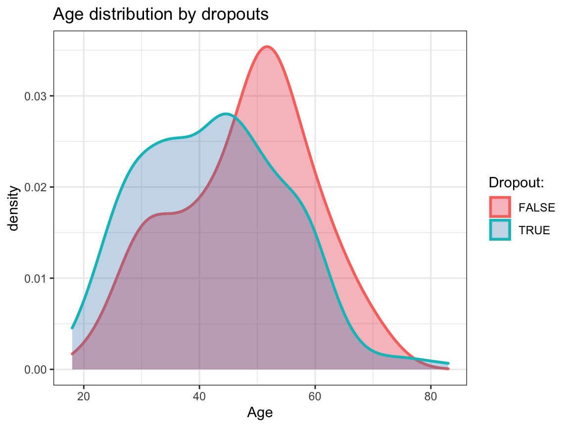
# (c) Dropouts by educ: ------

# Note: educ ranges from 1 (less than 12 years) to 5 (postgraduate degree).

# Compute with dplyr:
df_drop %>%
  group_by(educ, dropout) %>%
  summarise(n_drop  = n(),
            pc_drop = n_drop/nrow(df_drop) * 100)
#> # A tibble: 10 × 4
#> # Groups:   educ [5]
#>     educ dropout n_drop pc_drop
#>    <dbl> <lgl>    <int>   <dbl>
#>  1     1 FALSE        6    2.03
#>  2     1 TRUE         8    2.71
#>  3     2 FALSE        6    2.03
#>  4     2 TRUE        15    5.08
#>  5     3 FALSE        6    2.03
#>  6     3 TRUE        33   11.2
#>  7     4 FALSE       23    7.80
#>  8     4 TRUE        81   27.5
#>  9     5 FALSE       31   10.5
#> 10     5 TRUE        86   29.2

# From Table:
# Difficult to interpret.

# Visually:
ggplot(df_drop) +
  geom_bar(aes(x = dropout, fill = factor(educ)), pos = "fill") +
  labs(title = "Education level by dropouts",
       x = "Dropout", fill = "Education level:") +
  scale_fill_brewer(palette = "Set1") +
  theme_bw()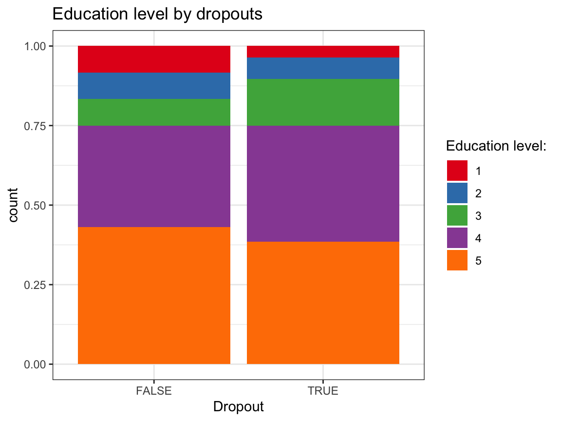
# (d) Dropouts by income: ------

# Note: income ranges from 1 (below average) to 3 (above average).

# Compute with dplyr:
df_drop %>%
  group_by(income, dropout) %>%
  summarise(n_drop  = n(),
            pc_drop = n_drop/nrow(df_drop) * 100)
#> # A tibble: 6 × 4
#> # Groups:   income [3]
#>   income dropout n_drop pc_drop
#>    <dbl> <lgl>    <int>   <dbl>
#> 1      1 FALSE       16    5.42
#> 2      1 TRUE        57   19.3
#> 3      2 FALSE       32   10.8
#> 4      2 TRUE       104   35.3
#> 5      3 FALSE       24    8.14
#> 6      3 TRUE        62   21.0

# From Table:
# Difficult to interpret.

# Visually:
ggplot(df_drop) +
  geom_bar(aes(x = dropout, fill = factor(income)), pos = "fill") +
  labs(title = "Income level by dropouts",
       x = "Dropout", fill = "Income level:") +
  scale_fill_brewer(palette = "Set1") +
  theme_bw()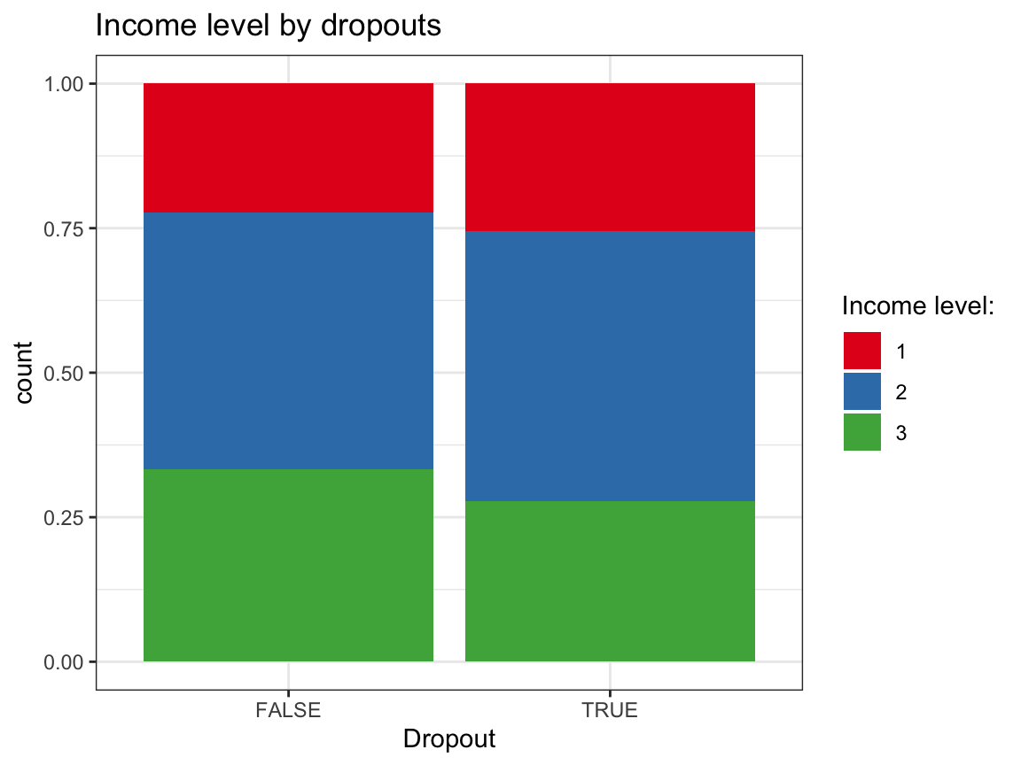
Answer:
Based on these exploratory analyses, we see no systematic differences in the independent variables (sex, age, educ, income) between the groups of dropouts vs. non-dropouts.
- Do you see any systematic differences between dropouts and non-dropouts by
intervention? This would imply that the type ofinterventionmay have co-determined whether a participant completed the study or dropped out.
Solution
## Data:
df_drop
#> # A tibble: 295 × 13
#>       id intervention   sex   age  educ income ahiTotal.0 cesdTotal.0 ahiTotal.1
#>    <dbl>        <dbl> <dbl> <dbl> <dbl>  <dbl>      <dbl>       <dbl>      <dbl>
#>  1     1            4     2    35     5      3         63          14         73
#>  2     2            1     1    59     1      1         73           7         89
#>  3     3            4     1    51     4      3         77           3         NA
#>  4     4            3     1    50     5      2         60          31         67
#>  5     5            2     2    58     5      2         41          27         41
#>  6     6            1     1    31     5      1         62          25         NA
#>  7     7            3     1    44     5      2         67           2         NA
#>  8     8            2     1    57     4      2         59          30         45
#>  9     9            1     1    36     4      3         48          25         NA
#> 10    10            2     1    45     4      3         58          21         NA
#> # … with 285 more rows, and 4 more variables: cesdTotal.1 <dbl>,
#> #   ahiTotal.5 <dbl>, cesdTotal.5 <dbl>, dropout <lgl>

# Table:
df_drop %>%
  group_by(intervention, dropout) %>%
  summarise(n = n())
#> # A tibble: 8 × 3
#> # Groups:   intervention [4]
#>   intervention dropout     n
#>          <dbl> <lgl>   <int>
#> 1            1 FALSE      17
#> 2            1 TRUE       55
#> 3            2 FALSE      24
#> 4            2 TRUE       52
#> 5            3 FALSE      11
#> 6            3 TRUE       63
#> 7            4 FALSE      20
#> 8            4 TRUE       53

# Note:
24 / (24 + 52)  # 31.2% in Intervention 2 did not drop out.
#> [1] 0.3157895
11 / (11 + 63)  # 14.9% in Intervention 3 did not drop out.
#> [1] 0.1486486
20 / (20 + 53)  # 27.4% in Intervention 4 did not drop out (= control group).
#> [1] 0.2739726

# Visually:
ggplot(df_drop) +
  geom_bar(aes(x = intervention, fill = factor(dropout)), pos = "fill") +
  labs(title = "Dropouts by intervention",
       x = "Intervention", fill = "Dropouts:") +
  scale_fill_brewer(palette = "Dark2") +
  theme_bw()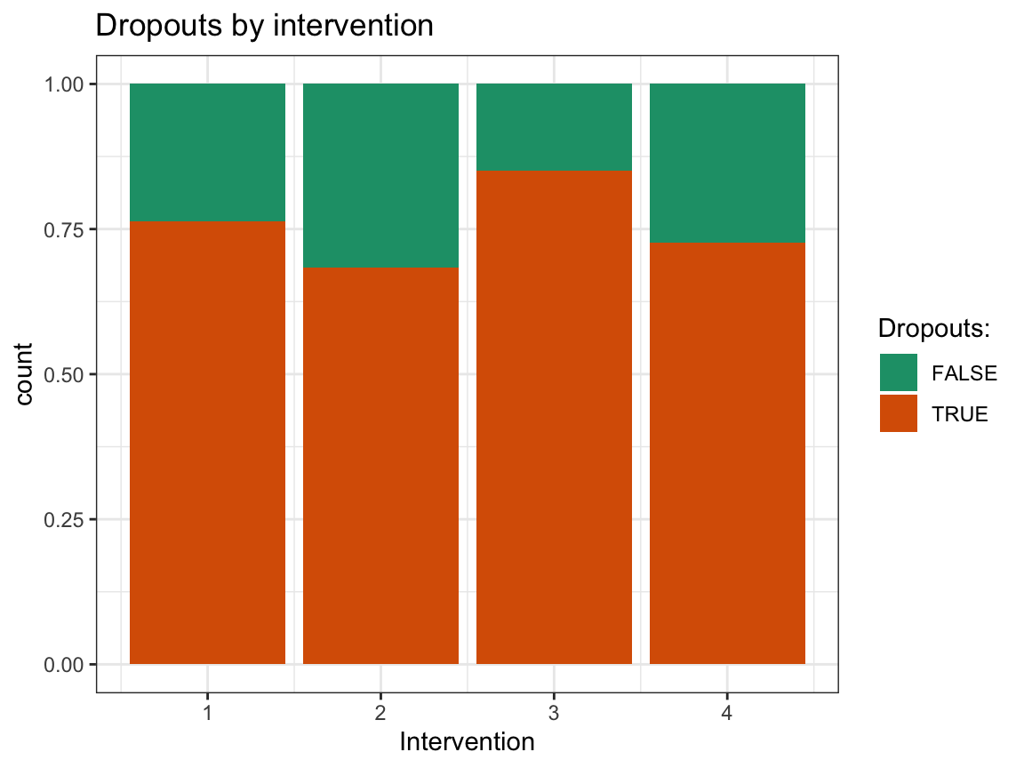
Answer: The completion rate (i.e., rate of participants being present at all 6 occasions) in the different intervention groups varies from a minimum of 14.9% (for Intervention 3: “Gratitude visit”) to a maximum of 31.2% (Intervention 2: “Three good things”). The control condition (Intervention 4: “Recording early memories”) had an intermediate completion rate of 27.4%. Thus, completion rates were generally low, but similar for all four types of interventions.
- Do dropouts vs. non-dropouts show any systematic differences in the dependent variables (i.e., happiness or depression scores)? This would imply that any changes in these scores — which were the main focus of this study — could have been co-determined by the fact that a participant completed the study vs. dropped out.
Hint: As this question addresses changes in scores between different measurement occasions, it could be operationalized in many ways. In our analysis of the number of participants per occasion above, we saw that only 148 of 295 pre-test participants (i.e., 50.2%) were present at Occasion 1. Hence, compare the (mean and raw) scores at the pre-test (Occasion 0) of the dropouts vs. non-dropouts of Occasion 1 (i.e., compare participants’ initial ahiTotal.0 and cesdTotal.0 scores based on their absence/presence at Occasion 1).
Solution
## Data:
df <- posPsy_wide
# df

# Create and add a filter variable: ------
df <- df %>%
  mutate(occ1_present = !is.na(occasion.1))

# Table of means: ------

tb_occ0_scores <- df %>%
  mutate(occ1_present = !is.na(occasion.1)) %>%
  group_by(occ1_present) %>%
  summarise(n = n(),
            pc = n/nrow(df) * 100,
            ahiTotal.0_mn = mean(ahiTotal.0),
            cesdTotal.0_mn = mean(cesdTotal.0)
            )
knitr::kable(tb_occ0_scores) # print table| occ1_present | n | pc | ahiTotal.0_mn | cesdTotal.0_mn |
|---|---|---|---|---|
| FALSE | 147 | 49.83051 | 70.07483 | 14.93878 |
| TRUE | 148 | 50.16949 | 69.33784 | 15.18919 |
# Visualizations: ------

# (a) Initial happiness scores (ahiTotal.0) by dropouts at Occasion 1:
ggplot(df, aes(x = occ1_present, y = ahiTotal.0)) +
  geom_violin(aes(color = occ1_present), size = 1, width = .3) +
  geom_boxplot(width = .2) +
  geom_jitter(width = .05, alpha = 1/3) +
  labs(title = "Initial happiness scores (ahiTotal.0) by Occasion 1 dropouts",
       x = "Present at Occasion 1?", y = "Initial happiness (ahiTotal.0)",
       color = "Present at Occasion 1?") +
  scale_color_brewer(palette = "Set1") +
  theme_bw()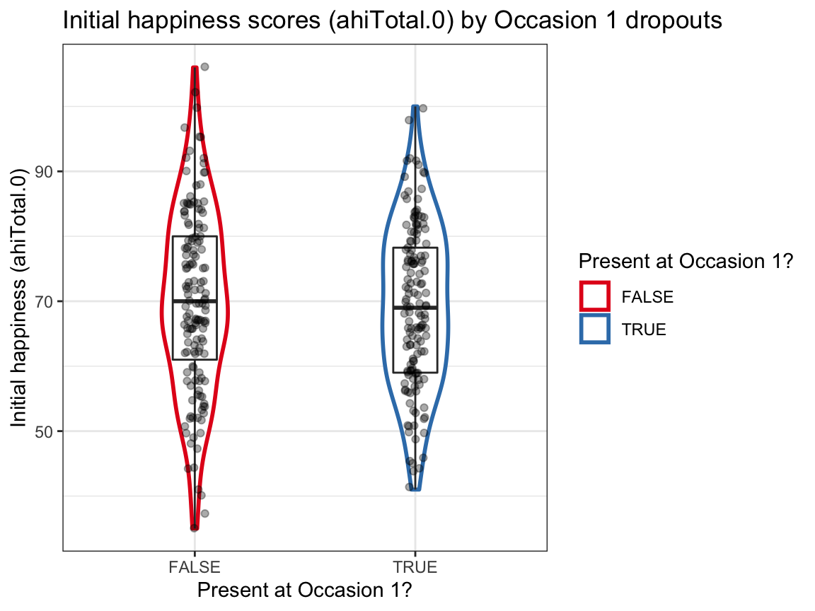
# (b) Initial depression scores (cesdTotal.0) by dropouts at Occasion 1:
ggplot(df, aes(x = occ1_present, y = cesdTotal.0)) +
  geom_violin(aes(color = occ1_present), size = 1, width = .3) +
  geom_boxplot(width = .1) +
  geom_jitter(width = .05, alpha = 1/3) +
  labs(title = "Initial depression scores (cesdTotal.0) by Occasion 1 dropouts",
       x = "Present at Occasion 1?", y = "Initial depression (cesdTotal.0)",
       color = "Present at Occasion 1?") +
  scale_color_brewer(palette = "Dark2") +
  theme_bw()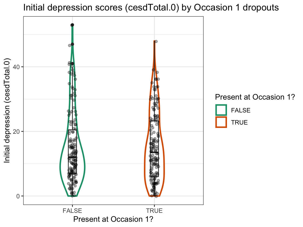
Answer: We find no evidence for selective dropouts from Occasion 0 to Occasion 1 based on initial happiness or depression scores. The initial range of scores seems to be somewhat larger for dropouts, but the group means and distributions seem comparable.
A.4.3 Exercise 3
In previous sessions, we already examined the age and sex distributions of participants.
But are the participants in the four intervention groups also balanced in terms of their levels of income?
And could the initial scores of the participants at occasion 0 (i.e., before any intervention took place) vary as a function of their income?
Let’s find out…
Effects of income
- Transform the data in
posPsy_wideto summarise the overall distribution ofincomelevels (i.e., the frequency or percentage of each level) and compare your results to those of Exercise 4 of Chapter 3 and Exercise 6 of Chapter 1, which both used thep_infodata (available fromds4psy::posPsy_p_infoor CSV-file).
Solution
## Data:
df <- posPsy_wide
# df

# 1. Table showing a distribution of income levels: ------
df %>%
  group_by(income) %>%
  summarise(n = n(),
            pc = n/nrow(df) * 100
            )
#> # A tibble: 3 × 3
#>   income     n    pc
#>    <dbl> <int> <dbl>
#> 1      1    73  24.7
#> 2      2   136  46.1
#> 3      3    86  29.2

# Compare with results from other data set:
p_info <- ds4psy::posPsy_p_info  # from ds4psy package
# p_info <- readr::read_csv(file = "http://rpository.com/ds4psy/data/posPsy_participants.csv")  # online

# Using dplyr on p_info data:
p_info %>%
  group_by(income) %>%
  summarise(n = n(),
            pc = n/nrow(p_info) * 100)
#> # A tibble: 3 × 3
#>   income     n    pc
#>    <dbl> <int> <dbl>
#> 1      1    73  24.7
#> 2      2   136  46.1
#> 3      3    86  29.2

# Using p_info and base R [Chapter 01, Exercise 06]:
n_income_low <- sum(p_info$income < 2)
pc_income_low <- n_income_low/nrow(p_info) * 100
pc_income_low  # 24.74576
#> [1] 24.74576
Answer: The results from both data files seem to be identical, which is good.
- Use two different ways to visualise the distributions of
incomelevels (a) overall, and (b) separately for eachintervention.
Hints: You can either directly plot the data contained in posPsy_wide (e.g., by selecting some of its variables) or first use dplyr to create a summary table that can be piped into (or used as the data of) a ggplot command. To create separate plots by intervention, use facetting on the overall plot.
Solution
## Data:
df <- posPsy_wide
# df

# 2. Visualizations: ------

# Plot of income levels overall:

# (a) Histogram:
plot_income_hist <- df %>%
  select(id:income) %>%
  ggplot(.) +
    geom_histogram(aes(x = income, fill = factor(income)), binwidth = 1) +
    labs(title = "Income levels (a: overall)",
         x = "Income level", y = "Number", fill = "Income:") +
    scale_fill_brewer(palette = "Set1") +
    theme_bw()
plot_income_hist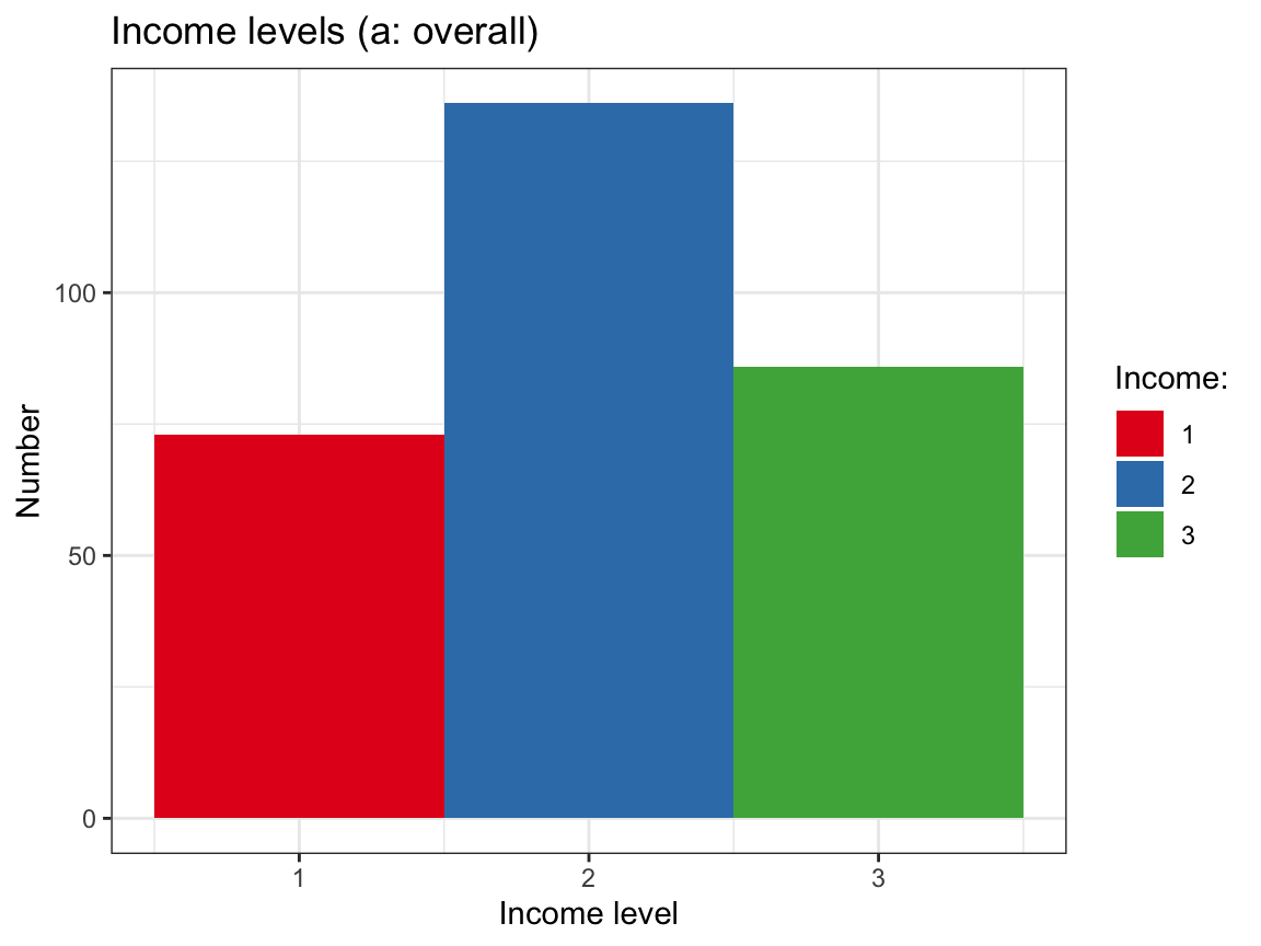
# (b) Bar chart:
df %>%
  group_by(income) %>%
  count() %>%
  ggplot(., aes(fill = factor(income))) +
    geom_bar(aes(x = income, y = n), stat = "identity", color = "grey10") +
    labs(title = "Income levels (a: overall)",
         x = "Income level", y = "Number", fill = "Income:") +
    scale_fill_brewer(palette = "Blues") +
    theme_bw()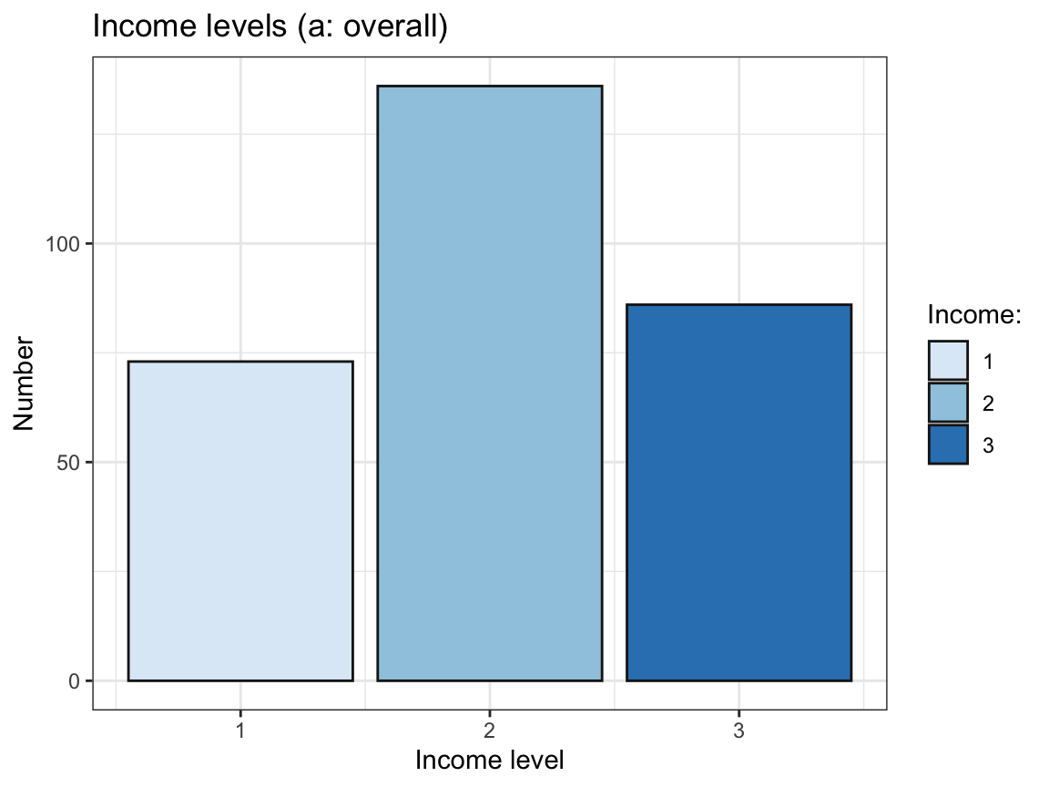
# Plot of income levels by intervention:

# (a) Histogram with facets:
plot_income_hist +   # use plot from above
    facet_wrap(~intervention) +
    labs(title = "Income levels (b: by intervention)")  # change title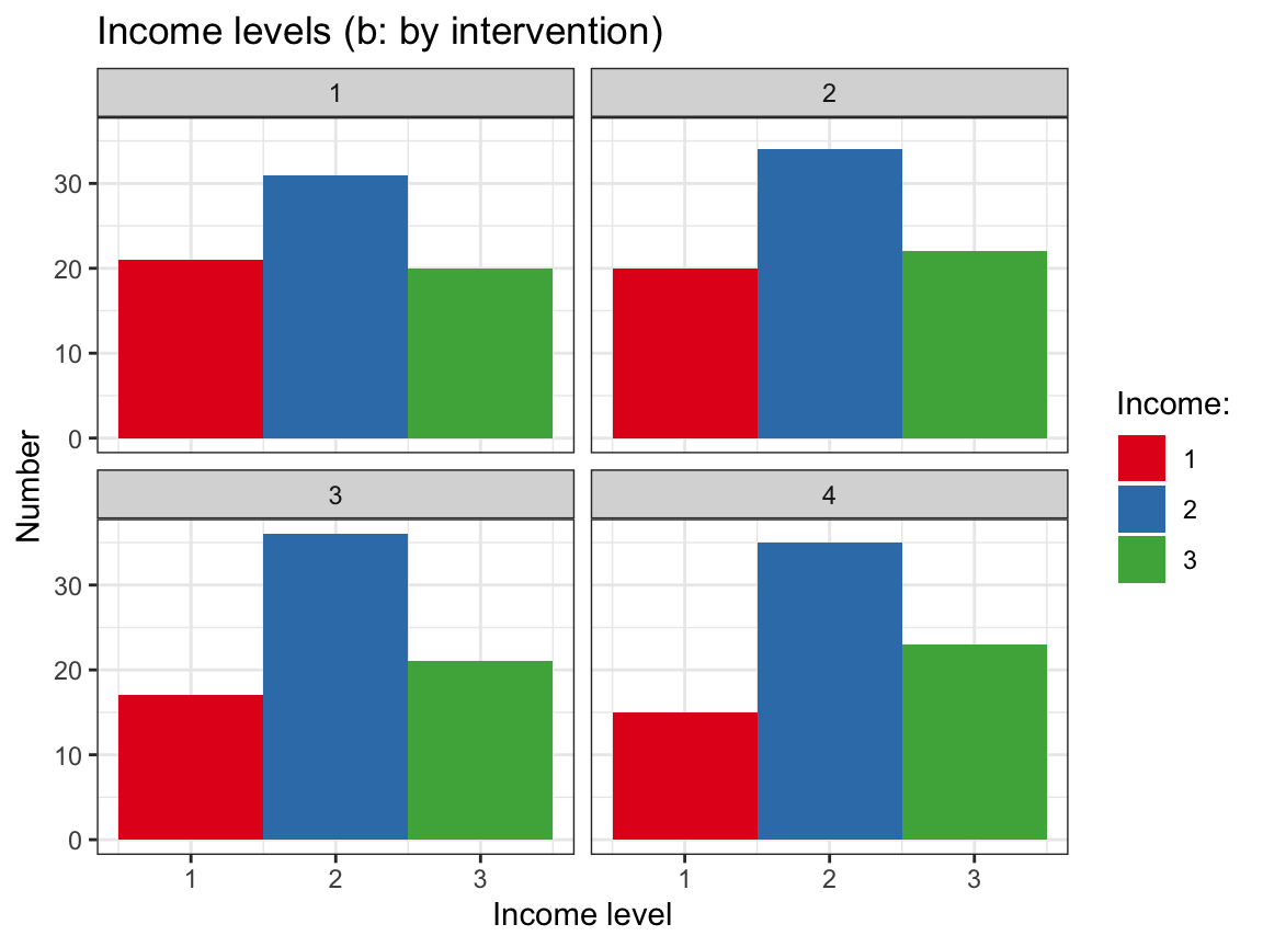
# (b) Bar chart with facets:
df %>%
  group_by(intervention, income) %>%  # include intervention in table
  count() %>%
  ggplot(., aes(fill = factor(income))) +
    geom_bar(aes(x = income, y = n), stat = "identity", color = "grey10") +
    labs(title = "Income levels (b: by intervention)",
         x = "Income level", y = "Number", fill = "Income:") +
    scale_fill_brewer(palette = "Blues") +
    theme_bw() +
    facet_wrap(~intervention)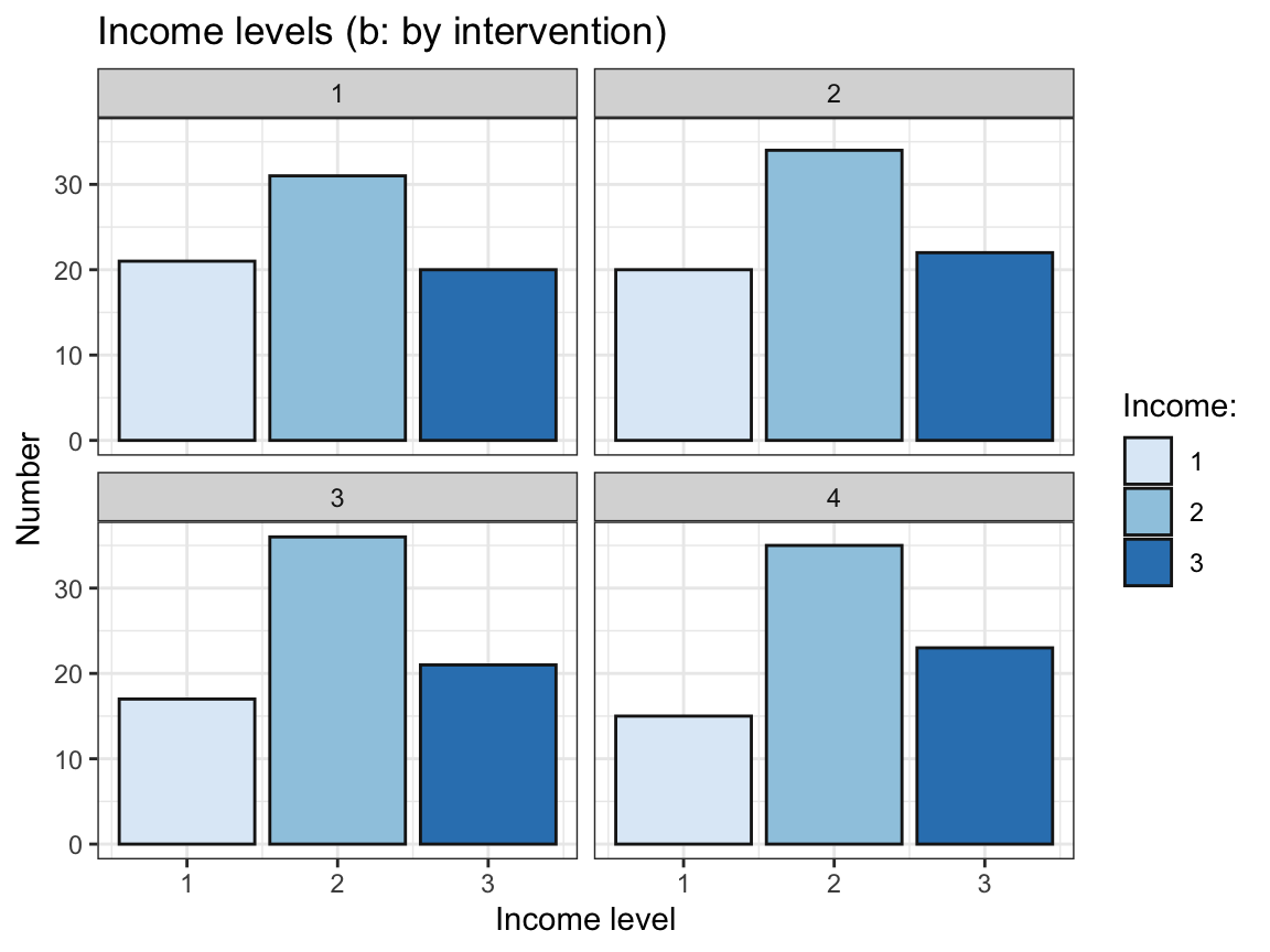
- Do the initial scores of happiness (
ahiTotal.0) or depression (cesdTotal.0) vary by the levels ofincome?
Examine this (a) by using dplyr to compute corresponding summary tables, and (b) by using ggplot2 to visualise all raw values, their means, and distributions per level of income.
Check whether the summary scores in your table (a) correspond to those shown in your plot (b) and interpret your plots (e.g., do you see any potential outliers?).
Hint: Use factor(income) to turn income from an integer into a categorical variable (factor).
Solution
## Data:
df <- posPsy_wide
# df

# Table: ------
# Summarise ahiTotal.0 and cesdTotal.0 by income:
tb_initial_scores_by_income <- df %>%
  group_by(income) %>%
  summarise(n = n(),
            ahiTotal.0_mn = mean(ahiTotal.0),
            ahiTotal.0_sd = sd(ahiTotal.0),
            cesdTotal.0_mn = mean(cesdTotal.0),
            cesdTotal.0_sd = sd(cesdTotal.0)
            )

knitr::kable(tb_initial_scores_by_income) # print table| income | n | ahiTotal.0_mn | ahiTotal.0_sd | cesdTotal.0_mn | cesdTotal.0_sd |
|---|---|---|---|---|---|
| 1 | 73 | 67.31507 | 13.45969 | 17.35616 | 12.668169 |
| 2 | 136 | 69.86765 | 12.62614 | 14.40441 | 9.982487 |
| 3 | 86 | 71.47674 | 13.59734 | 14.16279 | 10.142352 |
# Visualizations: ------

# Select a subset of needed variables:
df_part <- df %>%
  select(id, income, ahiTotal.0, cesdTotal.0)

df_part$income <- factor(df_part$income)  # turn income into a factor
# df_part

# Plot initial happiness (ahiTotal.0) by income:
ggplot(df_part, aes(x = income, y = ahiTotal.0, color = income)) +
  geom_violin(width = .5, size = 1) +
  geom_boxplot(width = .2, color = "grey20") +
  geom_jitter(color = "black", width = .1, alpha = 1/4) +
  labs(title = "Initial happiness scores (ahiTotal.0) by level of income ",
       x = "Income level", y = "Happiness (ahiTotal.0)", fill = "Income:") +
  scale_color_brewer(palette = "Set1") +
  theme_bw()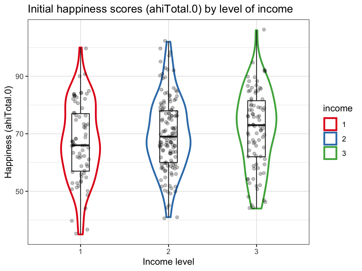
# Plot initial depression (cesdTotal.0) by income:
ggplot(df_part, aes(x = income, y = cesdTotal.0, color = income)) +
  geom_violin(width = .6, size = .3, color = "grey50") +
  geom_boxplot(width = .2, size = 1) +
  geom_jitter(color = "black", width = .1, alpha = 1/4) +
  labs(title = "Initial depression scores (cesdTotal.0) by level of income ",
         x = "Income level", y = "Depression (cesdTotal.0)", fill = "Income:") +
  scale_color_brewer(palette = "Dark2") +
  theme_bw()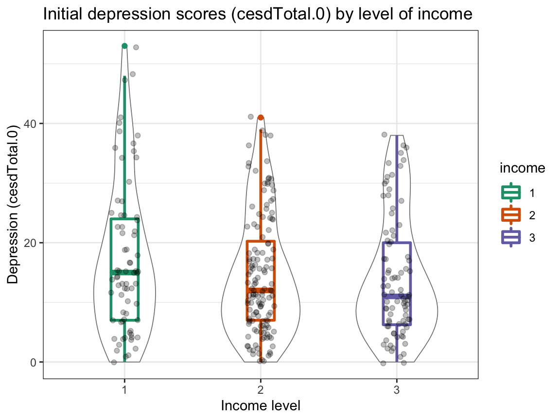
Interpretation:
The scores in the table correspond to those in the plots.
Happiness appears to (slightly) increase with income, whereas depression slightly decreases with income.
However, these trends are small (note the scale) and the range of values is large. Also, the distribution of initial depression scores shows potential outliers (with high scores at the low and medium income level).
A.4.4 Exercise 4
We have seen many plots that showed trends of happiness and depression scores for different interventions over measurement occasions. Now it’s time to take a stance: What are the main findings of the study?
Showing results
Summarize the main results as clearly as possible in 1 or 2 graphs.
Justify your choice of graph (prior to plotting it).
Interpret your graph. What does it show? What does it not show?
Hint: You may use the data in posPsy_wide (in wide format) or that in AHI_CESD (in long format).
Solution
Solution 1: Main trends The main goal of the study is to measure and contrast the effects of the four interventions (with 4 being a control condition) over time. There are two dependent measures that indicate participant’s psychological status (or level of well-being): happiness (operationalized by AHI scores) and depression (operationalized by CES-D scores). Both of these constructs are measured repeatedly (with Occasion 0 being a pre-test, and Occasion 1 to Occasion 5 post-intervention with increasing time intervals) for each participant (provided that the participant responded at an occasion).
Thus, we plot the trends of average happiness (mean AHI score per intervention) and average depression (mean CES-D score per intervention) over time (occasions) by intervention. We choose line graphs, as this allows grouping the trends by intervention, facilitating comparisons between them. However, we realize that we only have point measurements at various occasions, rather than continuous data (between occasions). To account for this, we could also use bar plots to visualize the trends. We partly acknowledge the lack of continuous measurements by making our lines transparent.
# Data:
df <- AHI_CESD
dim(df)  # 992 50
#> [1] 992  50
# df

# Table 2:
# Compute mean scores (n, ahiTotal_mn, and cesdTotal_mn) by occasion AND intervention:
tab_scores_by_iv <- df %>%
  group_by(occasion, intervention) %>%
  summarise(n = n(),
            ahiTotal_mn = mean(ahiTotal),
            cesdTotal_mn = mean(cesdTotal)
  )
dim(tab_scores_by_iv)  # 24 x 5
#> [1] 24  5

# Make occasion and intervention discrete factors (rather than continuous integers):
tab_scores_by_iv$occasion <- factor(tab_scores_by_iv$occasion)
tab_scores_by_iv$intervention <- factor(tab_scores_by_iv$intervention)
# tab_scores_by_iv

# Print table:
knitr::kable(head(tab_scores_by_iv)) | occasion | intervention | n | ahiTotal_mn | cesdTotal_mn |
|---|---|---|---|---|
| 0 | 1 | 72 | 68.38889 | 15.05556 |
| 0 | 2 | 76 | 68.75000 | 16.21053 |
| 0 | 3 | 74 | 70.18919 | 16.08108 |
| 0 | 4 | 73 | 71.50685 | 12.84932 |
| 1 | 1 | 30 | 69.53333 | 15.30000 |
| 1 | 2 | 48 | 71.58333 | 14.58333 |
# Plot 1:
# Line graph of mean AHI scores over occasions AND interventions:
ggplot(tab_scores_by_iv,
       aes(x = occasion, y = ahiTotal_mn,
           group = intervention, color = intervention, fill = intervention)) +
  geom_line(size = 1, alpha = 1/2) +
  geom_point(aes(shape = intervention), size = 3, alpha = 1) +
  scale_y_continuous(limits = c(65, 80)) +
  labs(tag = "A", title = "Happiness (mean ahiTotal) by occasion and intervention",
       x = "Measurement occasion", y = "Happiness (mean AHI)",
       caption = "Using AHI_CESD data.",
       fill = "Intervention:", color = "Intervention:", shape = "Intervention:") +
  scale_color_manual(values = c("red3", "steelblue", "forestgreen", "grey25")) +
  theme_bw()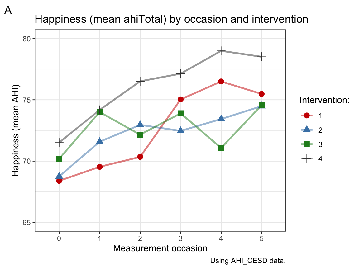
# Plot 2:
# Line graph of mean CES-D scores over occasions AND interventions:
ggplot(tab_scores_by_iv,
       aes(x = occasion, y = cesdTotal_mn,
           group = intervention, color = intervention, fill = intervention)) +
  geom_line(size = 1, alpha = 1/2) +
  geom_point(aes(shape = intervention), size = 3, alpha = 1) +
  scale_y_continuous(limits = c(5, 18)) +
  labs(tag = "B", title = "Depression (mean cesdTotal_mn) by occasion and intervention",
       x = "Measurement occasion", y = "Depression (mean CES-D)",
       caption = "Using AHI_CESD data.",
       fill = "Intervention:", color = "Intervention:", shape = "Intervention:") +
  scale_color_manual(values = c("red3", "steelblue", "forestgreen", "grey25")) +
  theme_bw()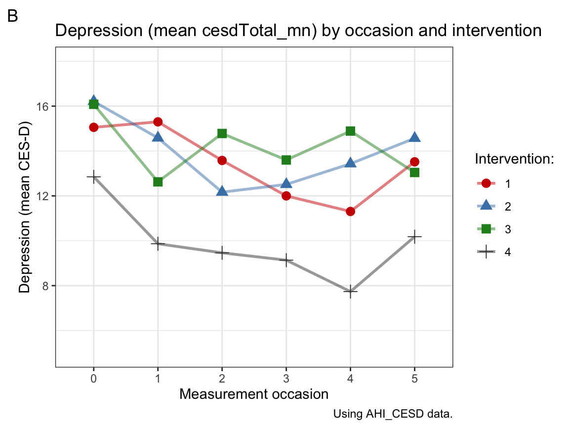
Interpretation: Panel A shows that participants’ mean level of happiness increases over measurement occasions in all 4 intervention groups. Panel B shows that participants’ mean level of depression tends to decrease over measurement occasions in all 4 intervention groups, but there is more fluctuation within groups, a tendency to fade out over time or perhaps even score reversals at later occasions.
Overall, the combination of a tendency towards increased happiness and reduced depression over time may suggest that the interventions work, if it wasn’t for the fact that the control condition (intervention 4) showed at least as large effects on both measures as any other condition. Assuming that the treatment of the control condition was a placebo (i.e., looked like a treatment without providing some crucial ingredient of an actual treatment), we can conclude that the benefits observed are not due to any treatment-specific mechanisms. Instead, the study suggests that participating in a long-term study on psychological well-being has benefits for psychological well-being.
Limitations: Note that the \(y\)-scales are truncated (do not start at zero), which makes the changes between occasions appear larger than they are. More generally, keep in mind that we are only looking at group trends and speculating about them. This has several limitations:
As we have not conducted any statistical tests, we don’t know whether any of them are systematic (or statistically significant).
A statistical interpretation of the plot would also require some measure of variability in the plots. For instance, we could compute confidence intervals around the means and add them with error bars.
Even if the effects turned out to be statistically significant, we would need to discuss effect sizes to decide whether any of the hypothesized effects are practically meaningful.
Individual participants may show different developments than the mean trend of their intervention group. (Actually, we have seen this in our line graphs of individuals above.)
A.4.5 Exercise 5
This is a bonus exercise, which you are welcome to skip.
Can we verify the computation of total scores?
Yes, we can. We use data transformation on the data in AHI_CESD (in long format) to answer the following questions:
- Is the total happiness score (
ahiTotal) the sum of all 24 corresponding scale values (fromahi01toahi24) at each measurement occasion?
Solution
AHI_CESD <- ds4psy::posPsy_AHI_CESD  # copy data
dim(AHI_CESD)  # 992 x 50
#> [1] 992  50

# Select 24 individual ahi__ items:
ahi_nr <- AHI_CESD %>% select(ahi01:ahi24)
# ahi_nr

# Compare 2 vectors:
# AHI_CESD$ahiTotal  # scores of ahiTotal with
# rowSums(ahi_nr)    # sum of 24 individual ahi__ items
all.equal(AHI_CESD$ahiTotal, rowSums(ahi_nr))
#> [1] TRUE
sum(AHI_CESD$ahiTotal == rowSums(ahi_nr))  # => 992 TRUE cases (i.e., always TRUE)
#> [1] 992
Answer: The score of ahiTotal corresponds to the sum of scores of the 24 individual items ahi01:ahi24.
- Is the total depression score (
cesdTotal) the sum of all 20 corresponding scale values (fromcesd01tocesd20) at each measurement occasion?
Solution
# Select 20 individual cesd__ items:
cesd_nr <- AHI_CESD %>% select(cesd01:cesd20)
# cesd_nr

# Compare 2 vectors:
# AHI_CESD$cesdTotal  # scores of cesdTotal with
# rowSums(cesd_nr)    # sum of 20 individual cesd__ items
all.equal(AHI_CESD$cesdTotal, rowSums(cesd_nr))
#> [1] "Mean relative difference: 1.859587"
sum(AHI_CESD$cesdTotal == rowSums(cesd_nr))  # => NEVER true!
#> [1] 0
Answer: The score of cesdTotal does not correspond to the sum of scores of the 20 individual items cesd01:cesd20.
- Assuming that your answer to the previous question (2.) is negative, try to verify how the
cesdTotalscores are computed from the individual values (cesd01tocesd20).
Solution
A quick web search on the CES-D scale confirms the suspicion that it contains 4 items that are reversed. For instance, the following study (Carlson et al., 2011):
- Carlson, M., Wilcox, R., Chou, C. P., Chang, M., Yang, F., Blanchard, J., … & Clark, F. (2011). Psychometric properties of reverse-scored items on the CES-D in a sample of ethnically diverse older adults. Psychological Assessment, 23, 558–562. doi: 10.1037/a0022484
states (see https://www.ncbi.nlm.nih.gov/pmc/articles/PMC3115428/):
“Scale items 4 (I felt that I was just as good as other people), 8 (I felt hopeful about the future), 12 (I was happy), and 16 (I enjoyed life) are reverse-scored and assess the absence of positive affect.”
Thus, we check whether subtracting the (sum of) scores of these four items from the sum of all others yields the overall score:
# Select negative vs. positive items:
cesd_neg <- cesd_nr %>% select(cesd04, cesd08, cesd12, cesd16)
cesd_pos <- cesd_nr %>% select(-cesd04, -cesd08, -cesd12, -cesd16)

# Compute new candidate scores:
cesdTest <- rowSums(cesd_pos) - rowSums(cesd_neg)

# Compare 2 vectors:
# AHI_CESD$cesdTotal  # scores of cesdTotal with
# cesdTest
all.equal(AHI_CESD$cesdTotal, cesdTest)
#> [1] TRUE
sum(AHI_CESD$cesdTotal == cesdTest)  # => 992 TRUE cases (i.e., always TRUE)
#> [1] 992
Answer:
The score of cesdTotal corresponds to the sum of the individual scores of 16 CES-D items minus the sum of 4 reverse-coded items (Items 4, 8, 12, and 16).
This concludes our exercises on exploratory data analysis (EDA) — but we will further improve our corresponding skills in subsequent chapters.