2.3 Essential ggplot commands
2.3.1 Mapping variables to parts of plots
We mentioned in the introduction that the ggplot package (Wickham, 2016) implements a larger framework by Leland Wilkinson that is called The Grammar of Graphics.
The corresponding book with the same title (Wilkinson, 2005) starts by defining grammar as rules that make languages expressive.
This sounds rather abstract at first, but is something we are all familiar with.
With respect to ggplot(), the main regularity that beginners tend to struggle with is to define the mapping between data and graph. As we stated in the previous section, the term mapping is a relational concept that essentially specifies what goes where. The “what” part typically refers to some part of the data, whereas the “where” part refers to parts of the graph.
Let’s consider an example, to make this more concrete.
If we want to plot the data contained in the mpg dataset that comes with ggplot2, we need to answer two questions:
What parts of the data could be mapped to some part of the graph?
To which parts of the graph can we map variables of the data?
To answer the first question, we need to inspect the dataset:
| manufacturer | model | displ | year | cyl | trans | drv | cty | hwy | fl | class |
|---|---|---|---|---|---|---|---|---|---|---|
| audi | a4 | 1.8 | 1999 | 4 | auto(l5) | f | 18 | 29 | p | compact |
| audi | a4 | 1.8 | 1999 | 4 | manual(m5) | f | 21 | 29 | p | compact |
| audi | a4 | 2.0 | 2008 | 4 | manual(m6) | f | 20 | 31 | p | compact |
| audi | a4 | 2.0 | 2008 | 4 | auto(av) | f | 21 | 30 | p | compact |
| audi | a4 | 2.8 | 1999 | 6 | auto(l5) | f | 16 | 26 | p | compact |
| audi | a4 | 2.8 | 1999 | 6 | manual(m5) | f | 18 | 26 | p | compact |
The mpg data contains 234 instances (rows), each of which describes a particular type of car.
However, the obvious candidates for potential mappings are the variables (columns) of the dataset.
In the case of mpg, there are 11 variables that could be mapped to parts of a graph.
To answer the second question, it helps to look at an actual graph. Here is an example:
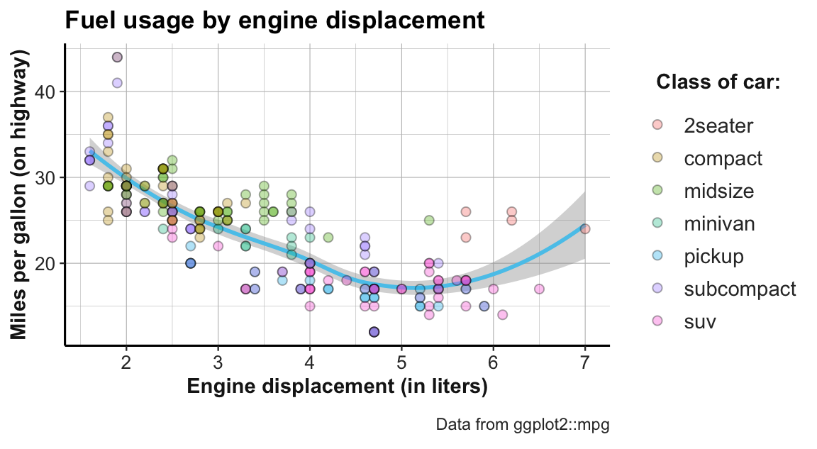
Figure 2.3: Example graph showing fuel usage of cars by engine displacement and class.
In this graph, each data point corresponds to one of the 234 instances in the dataset (i.e., represents a particular type of car). The location of each dot is determined by the meaning of the axes: The x-axis provides a numeric scale of a car’s engine displacement (in liters), while the y-axis shows how many miles of fuel the car uses (on highways). Thus, the dots and curve depict each car’s fuel usage as a function of its engine displacement.
But where do variables of the mpg dataset appear in this visualization?
To find out, we need to study the correspondence between variables in the data to parts of the graph.
When inspecting all variables of the mpg dataset in turn, we see that three of them are used in different locations of the graph:
Two continuous variables (displ and hwy, respectively) we mapped to the \(x\)- and the \(y\)-coordinates of the graph.
Additionally, a third variable (class) was mapped to the colors of the dots, as the legend illustrates.
Thus, the code that generates this visualization must contain corresponding mapping instructions (in the mapping = aes(...) arguments of a ggplot() function).
In psychology and statistics, we often describe data in terms of independent and dependent variables.
In its simplest form, we ask whether there is a systematic relationship between one or several independent variable(s) and some dependent variable.33 The same distinction can be applied to (many types of) graphs:
The dependent variable is typically shown on the y-axis (here: hwy) and the main independent variable is shown on the x-axis (here: displ). Additional independent variables (here: class) can be represented by grouping data points by visual features like color or shape. Importantly, all other variables of mpg (e.g., manufacturer, model, year, etc.) are not mapped to anything in this graph and therefore not expressed in this graph. This prompts some important insights into the relation between data and graphs:
We use visualization to see the relationship between one or more independent variables and one dependent variable.
The roles of variables (i.e., as independent, dependent, or ignored) are not fixed and pre-determined by the data, but assigned by our current interest.
Any visualization provides a particular perspective on a dataset, but remains silent about anything that is not explicitly represented.
Another aspect to note in the example graph is that it expresses the same relationship by multiple elements:
In addition to the individual dots, we can see some sort of trendline.
In ggplot, such graphical elements are called geoms (which is short for “geometric objects”) and specify how the values of mapped variables are to be shown in the graph.
The fact that we see 2 different types of geometric objects suggests that there are 2 different geoms involved (here: geom_point and geom_smooth).
Whereas the individual points show a straightforward relation between the values on the x- and y-axis (i.e., the car’s values on the variables displ and hwy), it is not immediately obvious how the y-value of the trendline is computed from the data. Generally, each geom comes with its own requirements for mappings and potentially different ways of computing statistics from the data.
Finally, the appearance of the graph is influenced by many additional factors: The dots and lines have certain colors, shapes, and sizes, various text labels are written in certain fonts, etc. In ggplot, these features are called aesthetics and can be customized extensively. We have already noted that the color of the dots varies as a function of a variable in the data (i.e., class), but most other aesthetics could be changed without changing the meaning of the graph. Thus, we need to find out how to set and change the aesthetics of each graphical element.
In the next section, we learn creating such graphs by studying simple and increasingly sophisticated ggplot() commands.
We will first illustrate the essential elements of ggplot() calls in the context of scatterplots (i.e., using geom_point). Section 2.4 later shows how the same elements generalize to other types of plots.
2.3.2 Scatterplots
A scatterplot maps 2 (typically continuous) variables to the x- and y-dimension of a plot and thus allows judging the relationship between the variables.
With ggplot, we can create scatterplots by using geom_point.
For instance, when exploring the mpg dataset (included in ggplot2), we can ask: How does a car’s mileage per gallon (on highways, hwy) relate to its engine displacement (displ)?
# Minimal scatterplot:
ggplot(data = mpg) +                             # 1. specify data set to use
geom_point(mapping = aes(x = displ, y = hwy)) # 2. specify geom + mapping 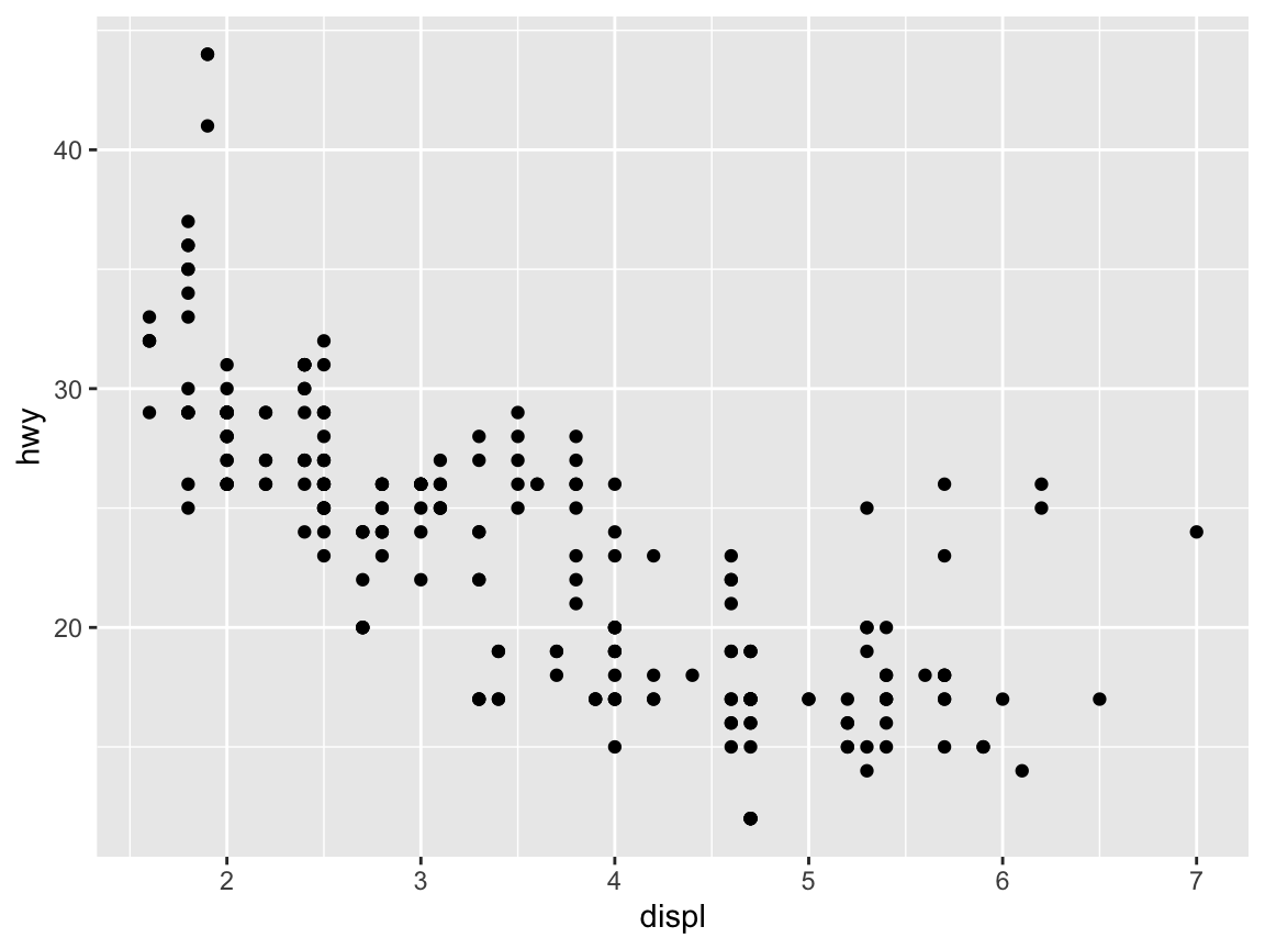
# Shorter version of the same plot:
ggplot(mpg) +                          # 1. specify data set to use
  geom_point(aes(x = displ, y = hwy))  # 2. specify geom + mapping
To obtain different types of plots of the same data, we select different geoms:
# Different geoms:
ggplot(mpg) +                           # 1. specify data set to use
  geom_jitter(aes(x = displ, y = hwy))  # 2. specify geom + mapping
ggplot(mpg) +                           # 1. specify data set to use
  geom_smooth(aes(x = displ, y = hwy))  # 2. specify geom + mapping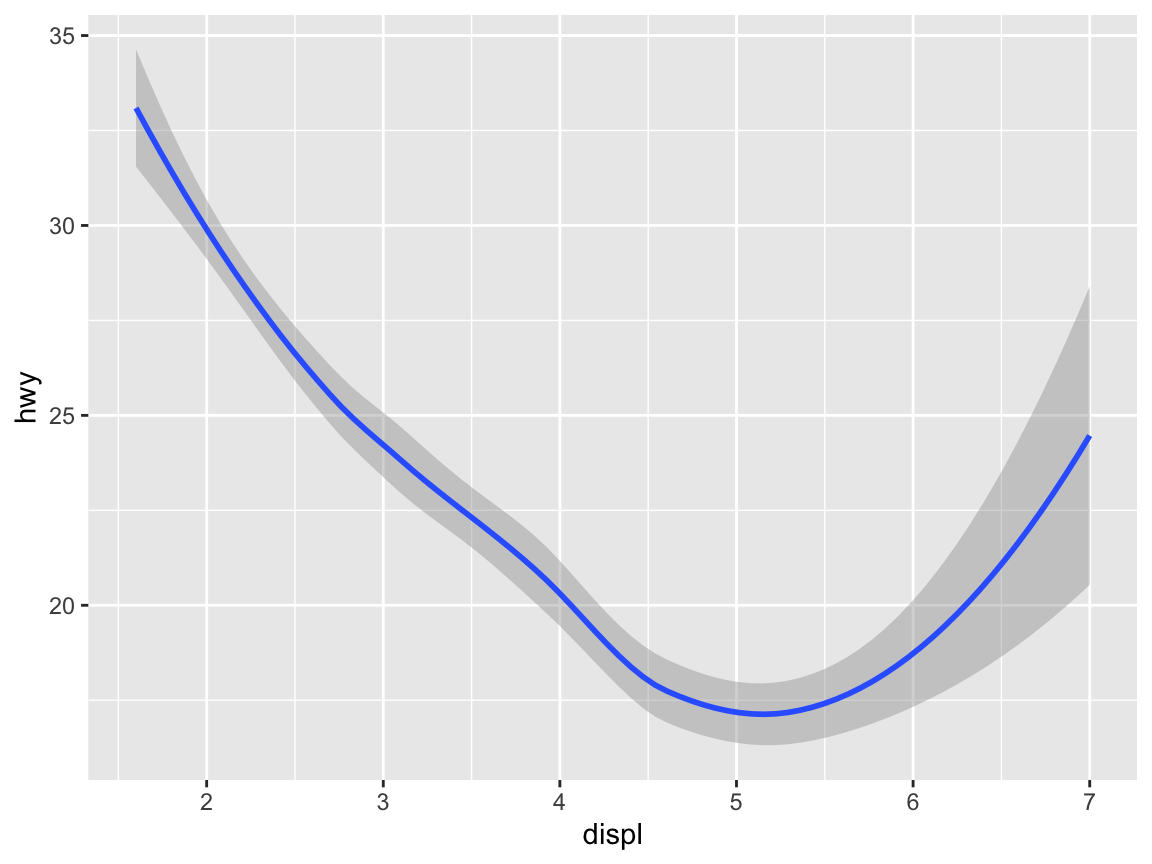
ggplot(mpg) +                           # 1. specify data set to use
  geom_bin2d(aes(x = displ, y = hwy))   # 2. specify geom + mapping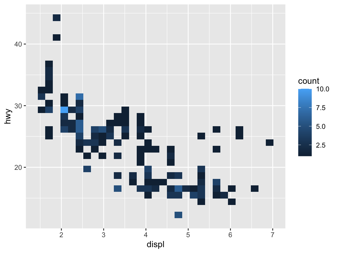
When specifying the aes(...) settings directly after the data (i.e., in a global fashion), they apply to all the geoms that may follow:
ggplot(mpg, aes(x = displ, y = hwy)) +  # 1. specify data and aes-mapping for ALL geoms
  geom_point()                          # 2. specify geom
An important feature of ggplot2 is that multiple geoms can be combined to form the layers of a plot.34 When aesthetic mappings are specified on the first line (i.e., globally), they apply to all subsequent geoms:
ggplot(mpg, aes(x = displ, y = hwy)) +  # 1. specify data and aes-mapping for ALL geoms
  geom_smooth() +                       # 2. specify a geom
  geom_point()                          # 3. specify another geom etc.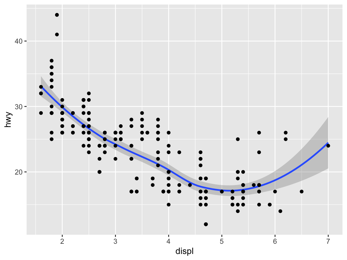
This may cause errors when different geoms require specific variables and aesthetic mappings. For instance, the following global definition of a mapping would yield an error:
ggplot(mpg, aes(x = displ, y = hwy)) +  # 1. specify data and mappings
   geom_bar()                           # 2. specify geom
as this is essentially the same as the following local definition:
ggplot(mpg) +                           # 1. specify data set to use
   geom_bar(aes(x = displ, y = hwy))    # 2. specify geom + mapping
Whereas mapping variables to both x and y makes sense for some geoms (e.g., geom_point() and geom_smooth()), other geoms require fewer or different arguments. Here, geom_bar() routinely calls a stat_count() function (to count the number of instances within a categorical variable) that must not be used with a aesthetic for y.
This illustrates that different types of graphs (or geoms) are not interchangeable.
Instead, each type of graph makes expresses certain relationship and comes with corresponding requirements regarding its mappings. If we desperately wanted to create a bar plot with the displ variable on its x-axis, we could do so by omitting the mapping of a y-variable.
However, the resulting graph would plot something else and not be very informative:
ggplot(mpg) +                                      # 1. specify data set to use
  geom_bar(aes(x = displ), fill = unikn::Seeblau)  # 2. specify geom + mapping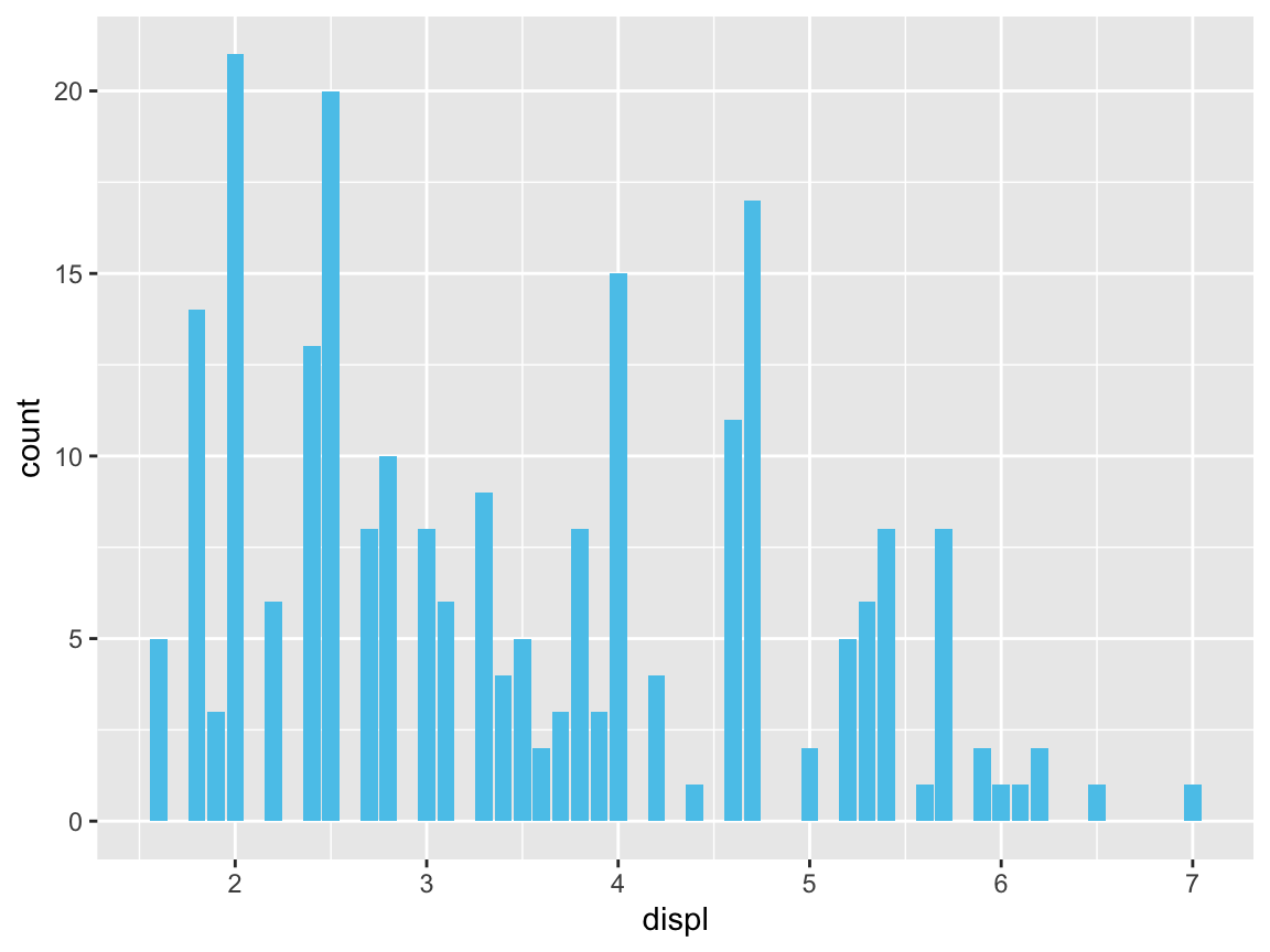
We will consider more informative bar plots in Section 2.4.2 below.
2.3.3 Aesthetics
For any type of plot, some aesthetic properties (like color, shape, size, transparency, etc.) can be used to structure information (e.g., by grouping objects into categories). Aesthetics can either be set of the entire plot (which may include multiple geoms) or as arguments to a specific geom.
In the following, we provide some examples of setting some aesthetics in ggplot calls.
Color
Using colors is one of the most powerful ways to structure information.
However, colors are an art and a science in itself, and using colors effectively requires a lot of experience and expertise (e.g., in selecting or defining appropriate color scales).
Fortunately, the default settings of ggplot2 are sensible and can be flexibly adjusted (by adding various scale_) commands.
As a start, we can set the color aesthetic to some variable:
# Color: ------
# Using color to group (as an aesthetic):
ggplot(mpg) +
  geom_point(aes(x = displ, y = hwy, color = class))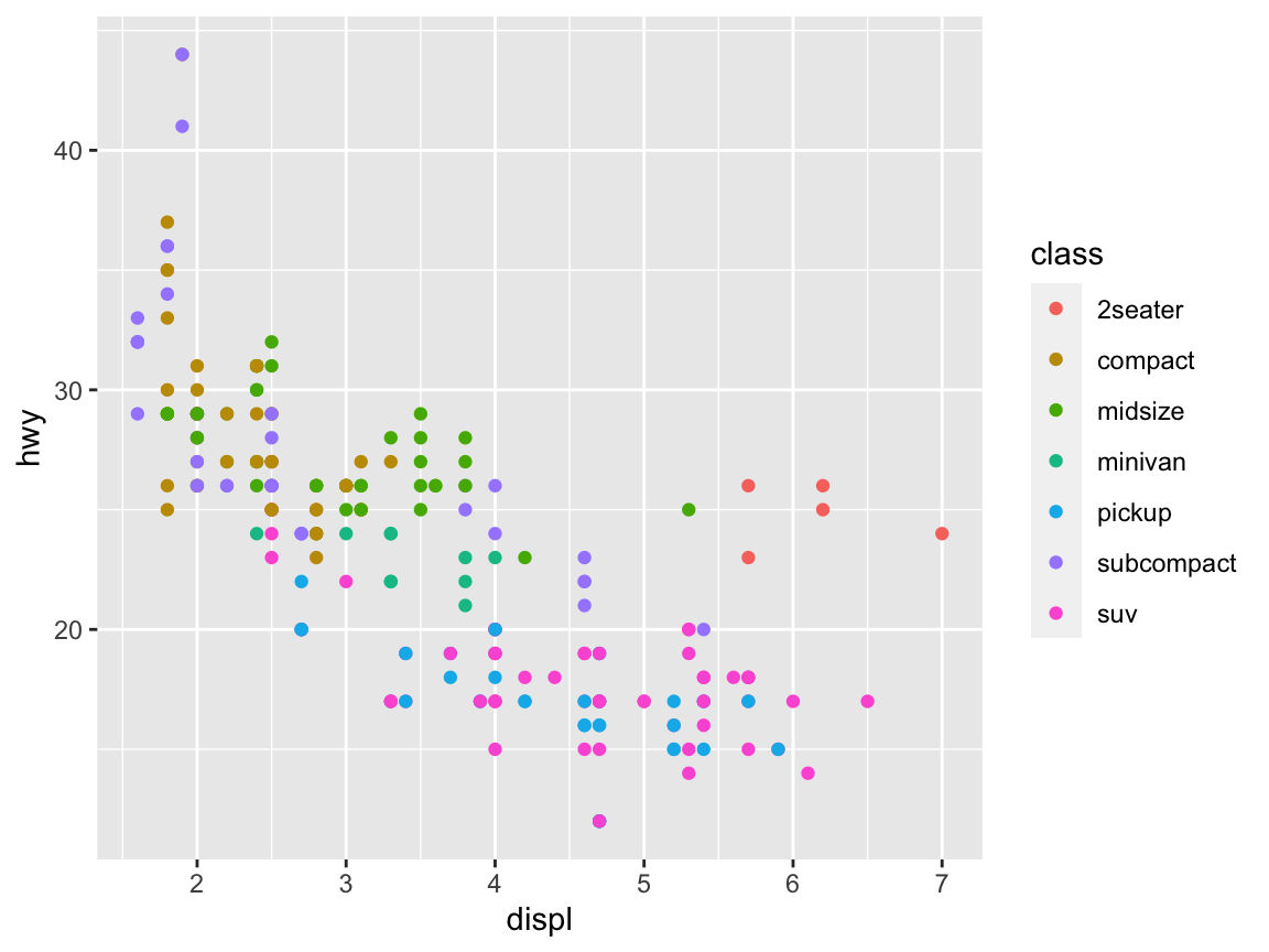
If you want to specify your own colors, you need to name them or select a color scale. R comes with 657 predefined colors, whose names can be viewed by evaluating colors() in the console, or running demo("colors"). Figure 2.4 shows a random sample of 100 colors (from all 657 colors, but excluding over 200 shades of grey and gray):
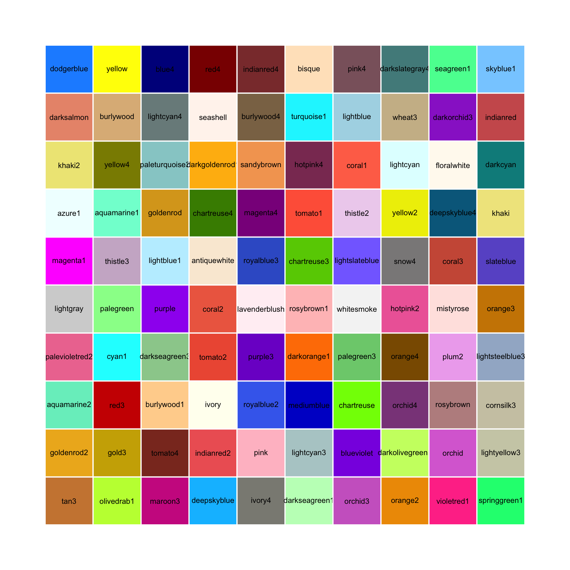
Figure 2.4: 100 random (non-gray) colors and their names in R.
See Appendix D for a primer on using colors in R.
To use a particular color in a plot, we can pass its name (as a character string) to functions that include a color or col argument:
# Setting color (as an argument):
ggplot(mpg) +
  geom_point(aes(x = displ, y = hwy), color = "steelblue", size = 3)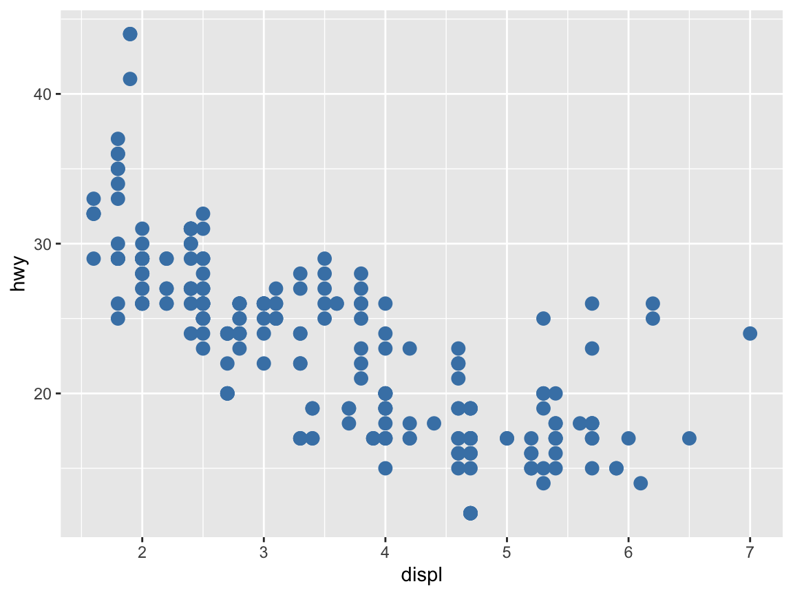
Note that placing the color = "steelblue" specification outside of the aes() function changed all points of our plot to this particular color.
Color palettes
A set or sequence of colors to be used together is called a color palette or color scale.
In R, it is easy to define a new color palette as a vector of exising colors or color names (e.g., as an object my_colors). To use the new color palette my_colors in ggplot, we need to add a scale_color_manual line that instructs ggplot to use this new color scale:
# Define a color palette (as a vector):
my_colors <- c("steelblue", "gold", "firebrick", "forestgreen")

ggplot(mpg) +
  geom_point(aes(x = displ, y = hwy, color = factor(cyl)), size = 3) +
scale_color_manual(values = my_colors) # use the manual color palette my_colors 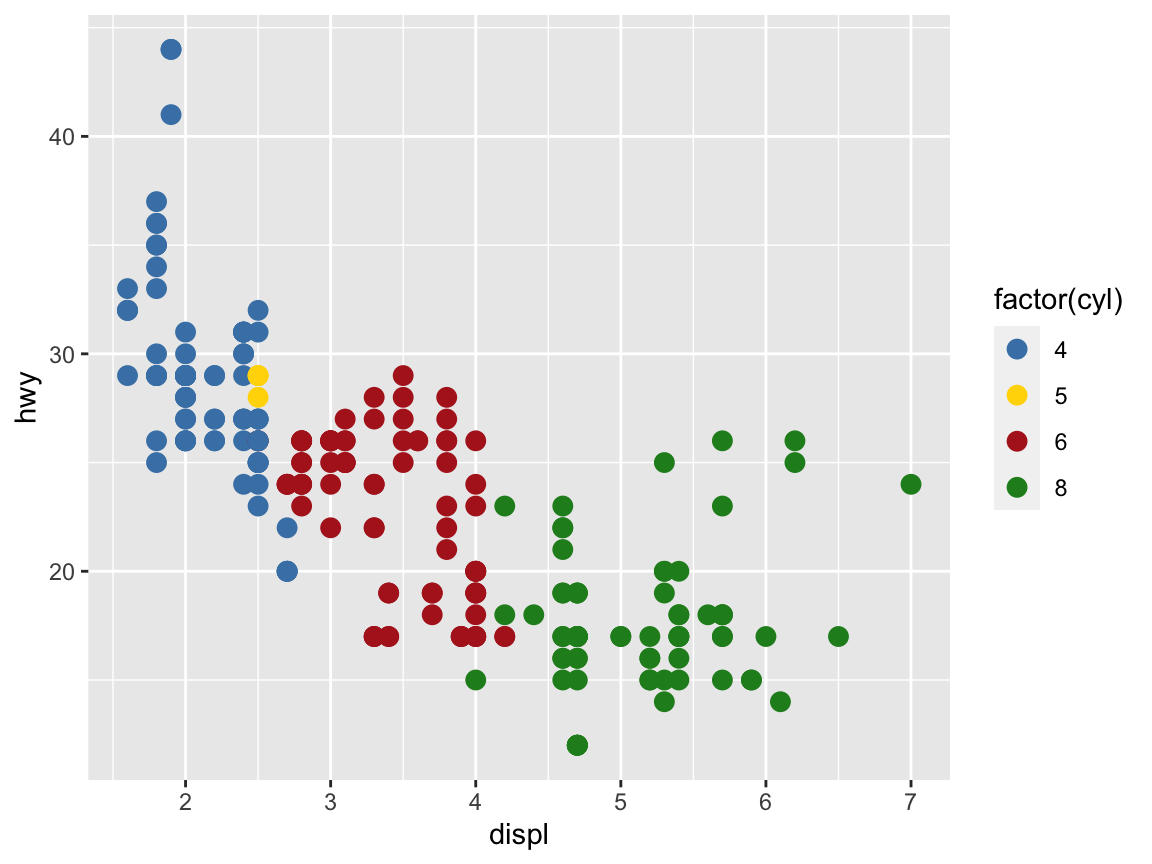
Defining our own color palettes is a great way to maintain a consistent color scheme for multiple graphs in a report or thesis. Alternatively, there are many R packages — including colorspace, ggsci, RColorBrewer, scico, unikn, viridis, wesanderson, yarrr — that provide color scales for all means and purposes.
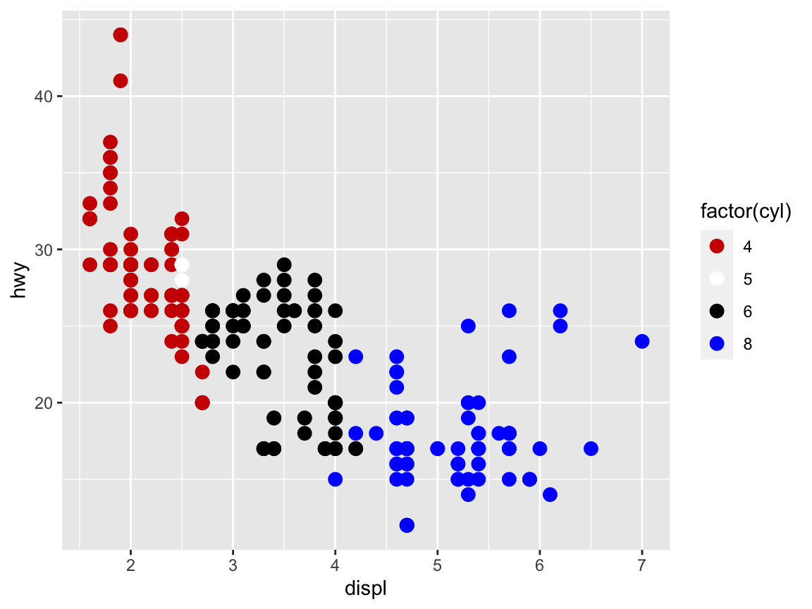
Practice
Evaluate the following command and explain why it fails to work (by trying to understand the error message):
my_palette <- c("red3", "white", "black", "blue")

ggplot(mpg) +
  geom_point(aes(x = displ, y = hwy, color = cyl), size = 3) +
  scale_color_manual(values = my_palette)
Then compare this command to the previous one and fix it, so that it works with the new color palette to show the following graph:
Shape
Another aesthetic property of some geoms is the shape of symbols, which can either be set to some variable (i.e., using shape as a scale) or to some specific shape (using shape as a value):
# Shape:  ------
# Using shape to group (as an aesthetic):
ggplot(mpg) +
  geom_point(aes(x = displ, y = hwy, shape = class), size = 3)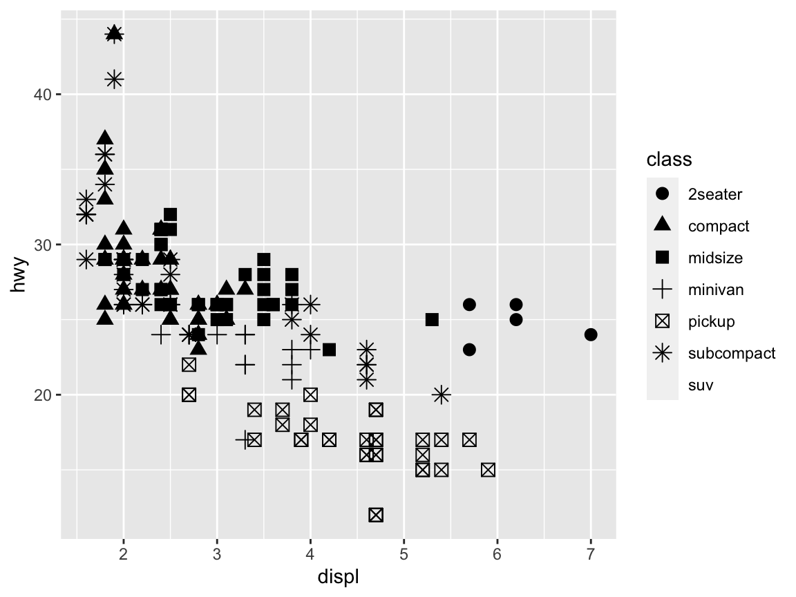
# Setting shape (as an argument):
ggplot(mpg) +
  geom_point(aes(x = displ, y = hwy), shape = 2, size = 3)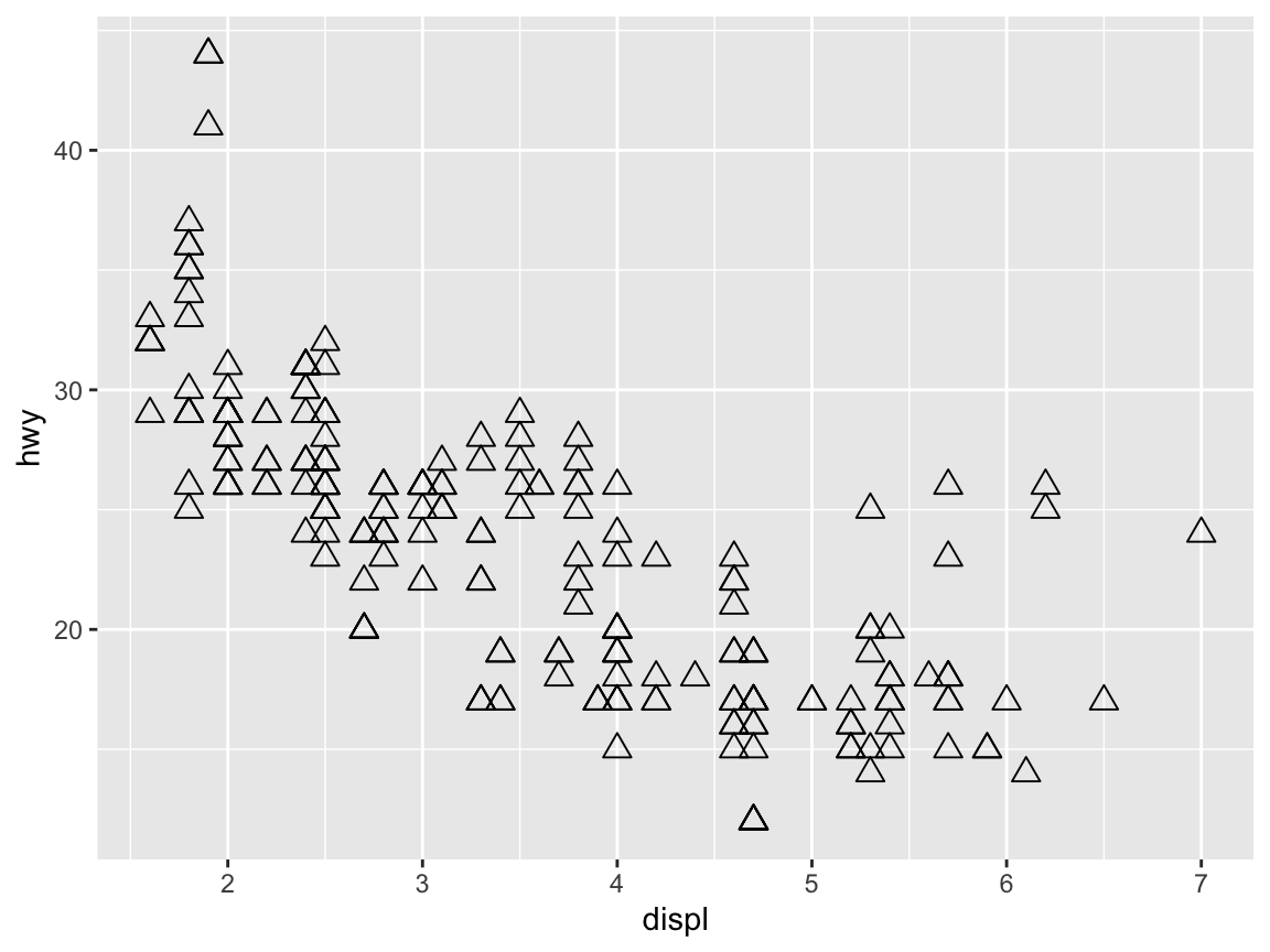
Size
Many geoms support a size aesthetic.
In fact, we have been using this aesthetic above to increase the default size of points or shapes above to some numeric value (here: size = 3):
# Setting size (to a fixed value):
ggplot(mpg) +
  geom_point(aes(x = displ, y = hwy), color = "firebrick", size = 3)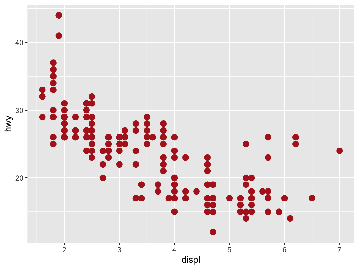
To use size as an aesthetic, we move it into the aes() function and set it to some (discrete) variable by which we want to group our cases:
# Using size to group (as an aesthetic):
ggplot(mpg) +
  geom_point(aes(x = displ, y = hwy, size = drv), color = "firebrick")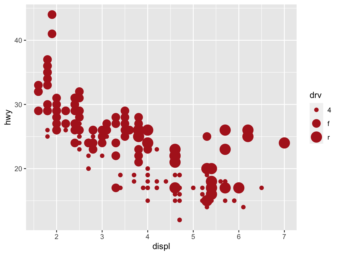
Transparency
The transparency of visual objects can be set by setting their alpha argument — which ranges from 0 to 1 — to values lower than 1:
# Setting alpha (as an aesthetic):
ggplot(data = mpg) +
  geom_point(mapping = aes(x = displ, y = hwy, alpha = class), size = 3)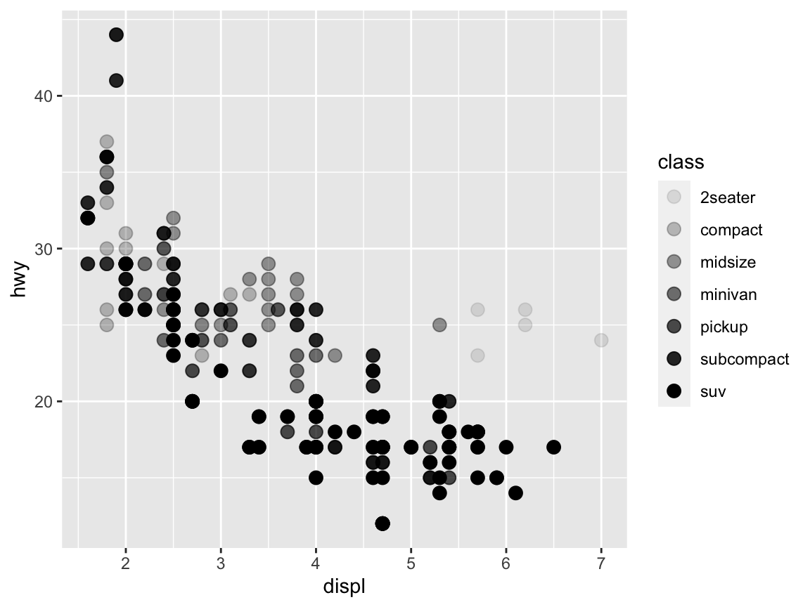
When setting transparency to a fixed value (e.g., alpha = 1/3) we can see whether multiple objects are located at the same position:
# Setting alpha (to a fixed value):
ggplot(data = mpg) +
  geom_point(mapping = aes(x = displ, y = hwy), alpha = 1/3, size = 3)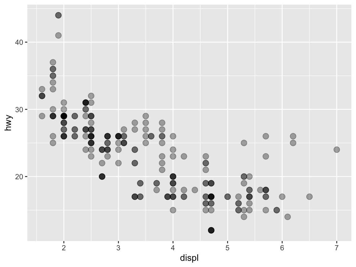
Additional aesthetics include fill (for setting fill colors of symbols supporting this feature),
linetype (for using different types of lines), size (for setting the size of objects), and stroke (for setting borders).
The examples above already illustrate that not all aesthetics work equally well to make a particular point. In fact, setting aesthetics in both an effective and pleasing fashion requires a lot of experience and trial-and-error experimentation. This is not a fault of R or ggplot2, but due to the inherent complexity of visual displays: Not all geoms support all aesthetics and not all aesthetics are equally suited to serve all visual functions.
2.3.4 Dealing with overplotting
A frequent problem that renders many plots difficult to decipher is overplotting: Too much information is concentrated at the same locations.
Multiple facets
A possible solution to the issue of overplotting is provided by faceting, which provides an alternative way of grouping plots into several sub-plots.35
The easiest way to distribute a graph into multiple panels is provided by facet_wrap, which is used in combination with a ~variable specification:
# Setting alpha (as an aesthetic):
ggplot(data = mpg) +
  geom_point(mapping = aes(x = displ, y = hwy)) +
  facet_wrap(~class)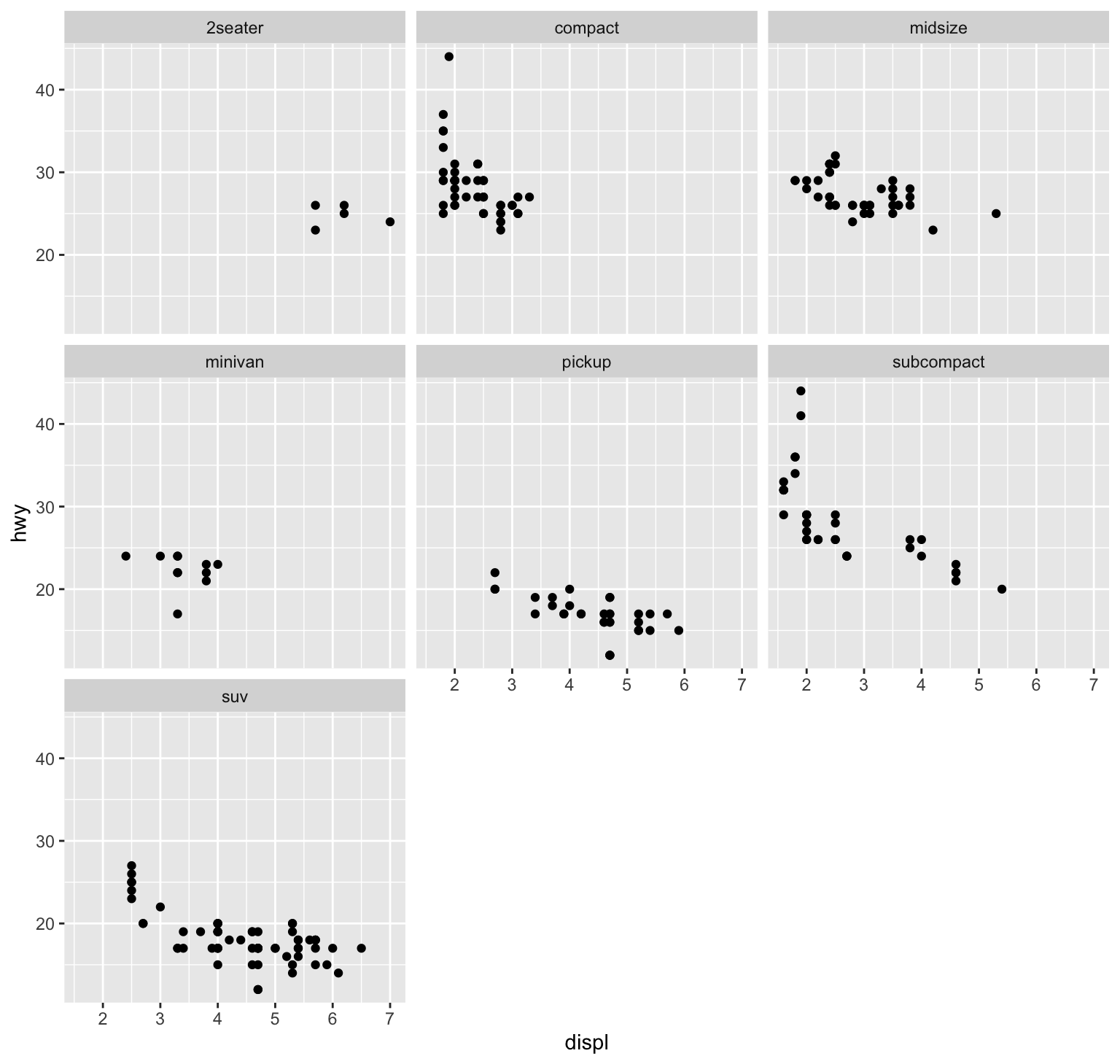
Figure 2.5: Avoiding overplotting by faceting.
Check ?facet_grid to specify a matrix of panels by 2 variables.
Adding transparency
An alternative solution to overplotting consists in a careful combination of the aesthetics for color and transparency.
Even when a plot uses multiple geoms, adding transparency (by setting the alpha aesthetic) and choosing an unobtrusive ggplot theme (e.g., ?theme_classic) allows creating quite informative and attractive plots:
ggplot(data = mpg, mapping = aes(x = displ, y = hwy)) +
  geom_smooth(color = "firebrick") +
  geom_point(shape = 21, color = "black", fill = "steelblue4", alpha = 1/4, size = 2, stroke = 1) +
  theme_classic()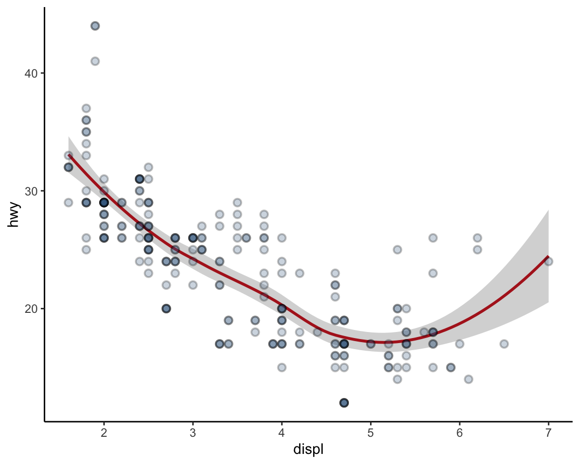
Figure 2.6: Avoiding overplotting by adding transparency.
Jittering positions
Yet another way of dealing with overplotting in the context of scatterplots consists in jittering the position of points.
This can be achieved by setting the position of points to "jitter" or by providing a more detailed
position = position_jitter() argument that allows setting specific height and width values.
The most convenient way to jitter points is replacing geom_points() with geom_jitter():
# Jittering the position of points:
ggplot(data = mpg, mapping = aes(x = displ, y = hwy)) +
  geom_point(color = "steelblue4", alpha = 1/3, size = 2,
             position = "jitter") +
  theme_classic()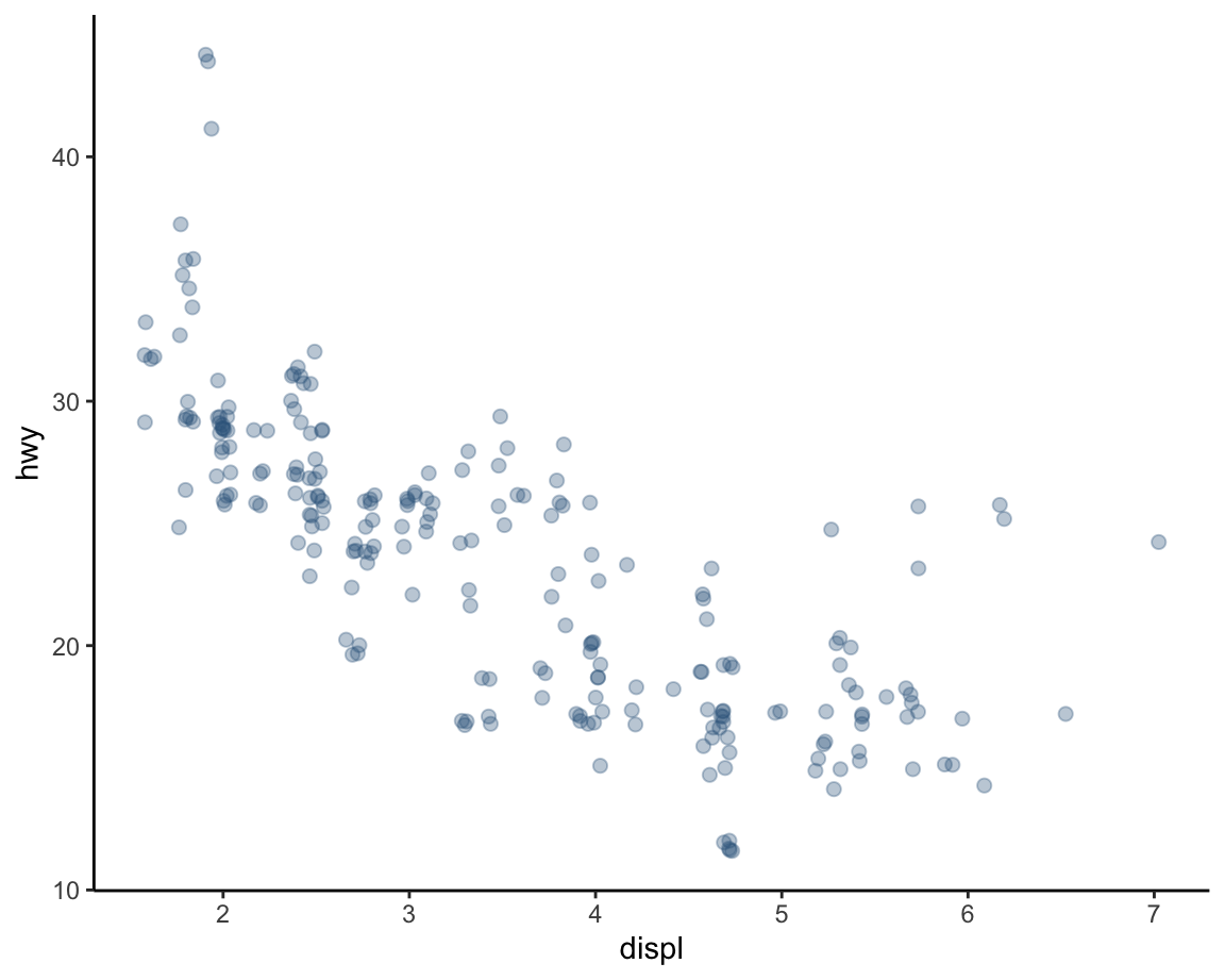
# Fine-tuning the width and height of jittering:
ggplot(data = mpg, mapping = aes(x = displ, y = hwy)) +
  geom_point(color = "steelblue4", alpha = 1/3, size = 2,
             position = position_jitter(width = 0.2, height = 0.0)) +  # jitter only horizontally
  theme_classic()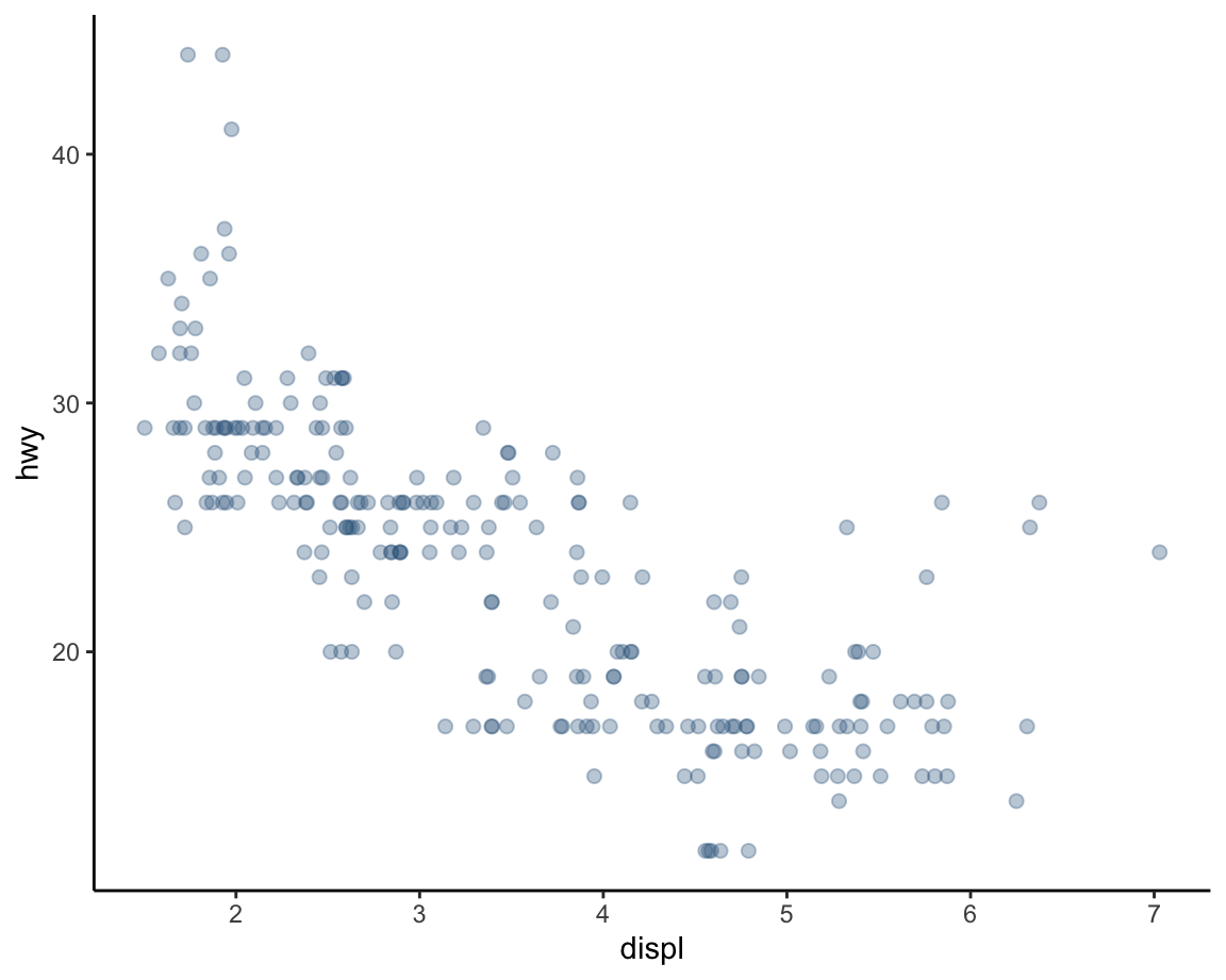
# Using geom_jitter:
ggplot(data = mpg, mapping = aes(x = displ, y = hwy)) +
  geom_jitter(color = "steelblue4", alpha = 1/3, size = 2) +
  theme_classic()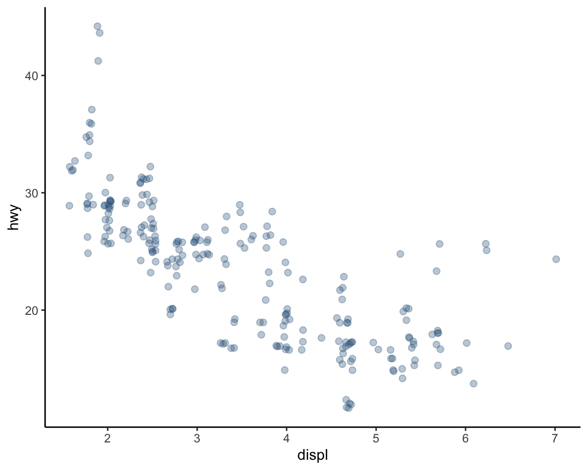
These examples show that — perhaps paradoxically — adding randomness to a graph can increase its clarity.
Nevertheless, we still used some transparency (here: alpha = 1/3) to visualize the overlap between multiple points.
2.3.5 Plot themes, titles, and labels
Adding and adjusting plot themes is the easiest way to adjust the overall appearance of a plot.
See ?theme() for the plethora of parameters than can be adjusted.
However, in most cases it is sufficient to use one of the pre-defined plots (e.g., theme_bw, theme_classic, or theme_light) or install and load a package (like cowplot or ggthemes) that provides additional ggplot2 themes.
In the following plots, we use theme_ds4psy() from the ds4psy package (which works well with the colors of the unikn package):
Adding informative titles and labels completes a plot.
The most effective way to do this is by adding the labs() function with appropriate arguments:
ggplot(data = mpg, mapping = aes(x = displ, y = hwy)) +
  geom_smooth(color = unikn::Seeblau, linetype = 1) +
  geom_point(shape = 21, color = "black", fill = "steelblue4", alpha = 1/2, size = 2) +
  labs(title = "Fuel usage by engine displacement",
       x = "Engine displacement (in liters)", y = "Miles per gallon (on highway)",
       caption = "Data from ggplot2::mpg") +
  theme_ds4psy()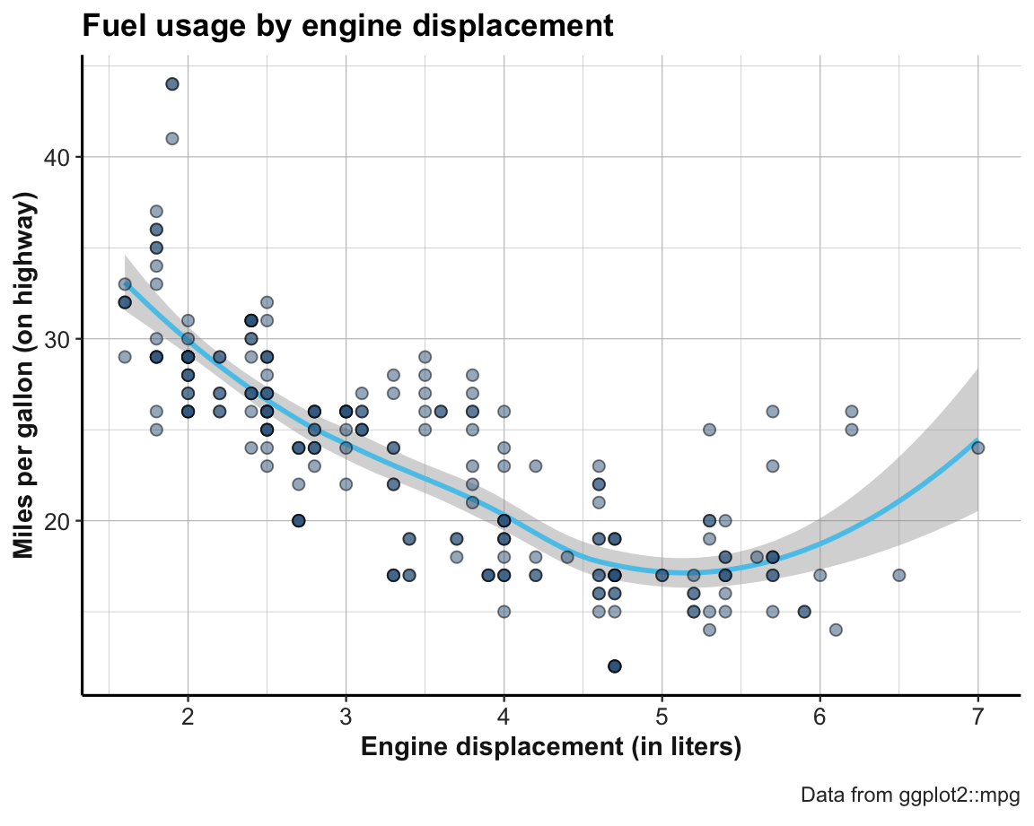
This graph can now easily be transformed into our example graph (from Figure 2.3 above).
The only element still missing is that the fill color of the points was not set to a single color (here: "steelblue4"), but represented the class of car as a further independent variable. In terms of ggplot(), we need to change the status of the fill aesthetic from a fixed value (fill = "steelblue4") to an aesthetic mapping (aes(fill = class)):
ggplot(data = mpg, mapping = aes(x = displ, y = hwy)) +
  geom_smooth(color = unikn::Seeblau, linetype = 1) +
  geom_point(mapping = aes(fill = class), shape = 21, color = "black", alpha = 1/2, size = 2) +
  labs(title = "Fuel usage by engine displacement",
       x = "Engine displacement (in liters)", y = "Miles per gallon (on highway)",
       caption = "Data from ggplot2::mpg") +
  theme_ds4psy()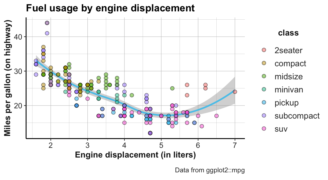
Practice
Here are some exercises to practice our new visualization skills:
Add a trendline to the jittered graphs above and play with the options for colors, jittering, and transparency.
Add transparency to the points of the faceted plot above (Figure 2.5) and choose a different plot theme.
What would happen if we added a code line
geom_smooth(color = "firebrick")to the faceted plot above (Figure 2.5)? Can you explain and fix the error?
ggplot(data = mpg) +
  geom_smooth(color = "firebrick") +
  geom_point(mapping = aes(x = displ, y = hwy)) +
  facet_wrap(~class)
Hint: What aesthetic mappings does geom_smooth require?
This completes our first exploration of ggplot2 in the context of scatterplots. We continue this chapter by considering other types of plots, but additional ways of combining aesthetics and multiple geoms in plots will be discussed in Chapter 4 (Section 4.2.11).
References
If such a relationship exists, it can be correlational or causal.↩︎
The ease of using layers in ggplot2 are another reason for adopting this package, but are also available in base R plots.↩︎
The ease of faceting in ggplot2 is probably one of the reasons why so many people have adopted this package.↩︎