2.1 Introduction
Above all else show the data.
Edward R. Tufte (2001)
Why should we visualize data? Most people intuitively assume that visualizations help our understanding of data by illustrating or emphasizing certain aspects, facilitating comparisons, or clarifying patterns that would otherwise remain hidden. Precisely justifying why visualizations may have these benefits is much harder (see Streeb, El-Assady, Keim, & Chen, 2019, for a comprehensive analysis). And it would be naive to assume that visualizations are always helpful or appropriate. Instead, we can easily think of potential problems caused by visualizations and claim that they frequently distract from important aspects, facilitate misleading comparisons, or obscure and hide patterns in data. Thus, visualizations are representations that can be good or bad on many levels. Creating effective visualizations requires a mix of knowledge and skills that include aspects of human perception, psychology, design, and technology. Being an artificial object that is designed to serve particular purposes, good questions for evaluating a given visualization include:
- What is the message and the audience for which this visualization was designed?
- How does it convey its message? Which aesthetic features does it use? Which perceptual or cognitive operations does it require or enable?
- How successful is it? Are there ways in which its functionality could be improved?
This chapter is mostly concerned with particular tools and technologies for creating visualizations. And rather than evaluating visualizations, we focus on creating some relatively simple types of graphs. But the insight that any representation can be good or bad at serving particular purposes is an important point to keep in mind throughout this chapter and book. To still provide a tentative answer to our initial question (“Why visualize data?”), the following sections will motivate our efforts with a notorious example.
2.1.1 Motivation
Consider the following example:
You have some dataset that is split into four subsets of 11 points (i.e., pair of x- and y-coordinates).
To get the data, simply evaluate the followning code (which you do not need to understand at this point — just copy and run it to follow along):
# Load data:
ans <- tibble::as_tibble(with(datasets::anscombe, data.frame(x = c(x1, x2, x3, x4),
                                                             y = c(y1, y2, y3, y4),
                                                             nr = gl(4, nrow(anscombe)))))

# Split data into 4 subsets:
a_1 <- ans[ans$nr == 1, 1:2]
a_2 <- ans[ans$nr == 2, 1:2]
a_3 <- ans[ans$nr == 3, 1:2]
a_4 <- ans[ans$nr == 4, 1:2]
This code creates a data table ans (as a “tibble”) and splits it into four separate subsets (a_1 to a_4).
We can use our basic knowledge of R to examine each subset, starting with a_1:
# Inspect a_1:
a_1         # print tibble
#> # A tibble: 11 × 2
#>        x     y
#>    <dbl> <dbl>
#>  1    10  8.04
#>  2     8  6.95
#>  3    13  7.58
#>  4     9  8.81
#>  5    11  8.33
#>  6    14  9.96
#>  7     6  7.24
#>  8     4  4.26
#>  9    12 10.8
#> 10     7  4.82
#> 11     5  5.68
dim(a_1)    # a table with 11 cases (rows) and 2 variables (columns)
#> [1] 11  2
str(a_1)    # see table structure
#> tibble [11 × 2] (S3: tbl_df/tbl/data.frame)
#>  $ x: num [1:11] 10 8 13 9 11 14 6 4 12 7 ...
#>  $ y: num [1:11] 8.04 6.95 7.58 8.81 8.33 ...
names(a_1)  # names of the 2 column (variables)
#> [1] "x" "y"
Checking a_2, a_3 and a_4 in the same way reveals that all four subsets have
the same variable names (x and y) and
the same shape (i.e., each object is a tibble with 11 rows and 2 columns).
Basic statistics
What do psychologists normally do to examine data? One possible answer is: They typically use statistics to summarize and understand data. Consequently, we could compute some basic statistical properties for each set:
- the averages of both variables (e.g., means of \(x\) and of \(y\));
- their standard deviations (\(SD\) of \(x\) and of \(y\));
- the correlations between \(x\) and \(y\);
- a linear model (predicting \(y\) by \(x\)).
For the first subset a_1, the corresponding values are as follows:
# Analyzing a_1:
mean(a_1$x)  # mean of x
#> [1] 9
mean(a_1$y)  # mean of y
#> [1] 7.500909

sd(a_1$x)    # SD of x
#> [1] 3.316625
sd(a_1$y)    # SD of y
#> [1] 2.031568

cor(x = a_1$x, y = a_2$y)  # correlation between x and y
#> [1] 0.8162365
lm(y ~ x, a_1)             # linear model/regression: y by x
#>
#> Call:
#> lm(formula = y ~ x, data = a_1)
#>
#> Coefficients:
#> (Intercept)            x
#>      3.0001       0.5001
Practice
Compute the same measures for the other three subsets (a_2 to a_4).
Do they seem similar or different?
Same stats, but…
The following Table 2.1 shows that — except for some minor discrepancies (in the 3rd decimals) — all four subsets have identical statistical properties:
| nr | n | mn_x | mn_y | sd_x | sd_y | r_xy | intercept | slope |
|---|---|---|---|---|---|---|---|---|
| 1 | 11 | 9 | 7.5 | 3.32 | 2.03 | 0.82 | 3 | 0.5 |
| 2 | 11 | 9 | 7.5 | 3.32 | 2.03 | 0.82 | 3 | 0.5 |
| 3 | 11 | 9 | 7.5 | 3.32 | 2.03 | 0.82 | 3 | 0.5 |
| 4 | 11 | 9 | 7.5 | 3.32 | 2.03 | 0.82 | 3 | 0.5 |
Does this imply that the four subsets (a_1 to a_4) are identical?
Although our evidence so far may suggest so, this impression is deceiving.
In fact, each of the four subsets contains different values.
This could be discovered by examining the actual values of all four subsets (e.g., by printing and comparing the four tables).
By contrast, visually inspecting the data makes it far easier to see what is really going on. Figure 2.2 shows four scatterplots that shows the x-y coordinates of each subset:
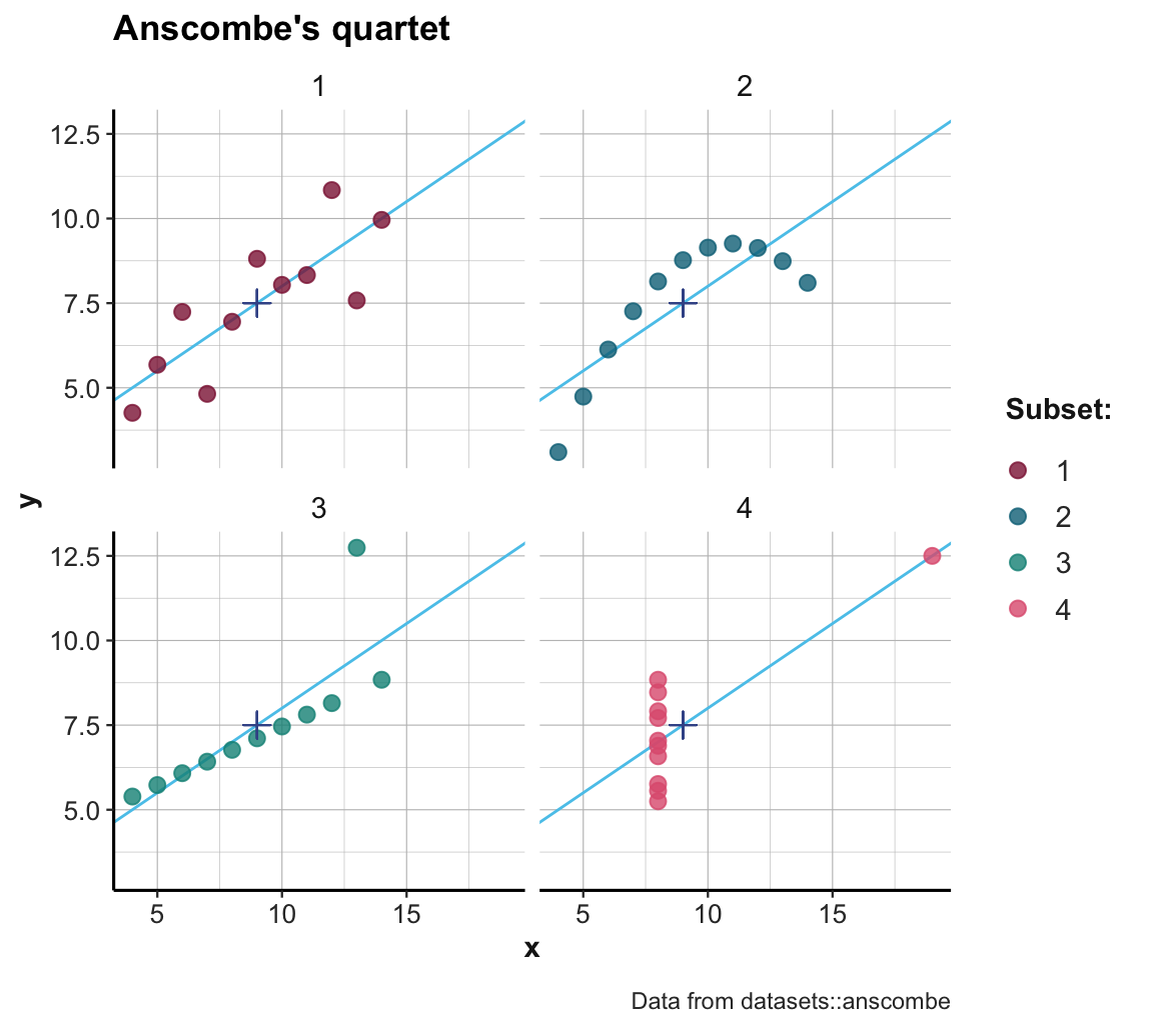
Figure 2.2: Scatterplots of the four subsets. (The \(+\)-symbol marks the mean of each set; blue lines indicate the best fitting linear regression line.)
Inspecting the scatterplots of Figure 2.2 allows us to see what is going on here: Although the datasets are constructed in a way that their summary statistics are identical, the four sets also differ in many aspects. More generally, Figure 2.2 illustrates that detecting and seeing similarities or differences crucially depends on the kinds of measures or visualization used: Whereas some ways of describing the data reveal similarities (e.g., means, or linear regression curves), others reveal differences (e.g., the distribution of raw data points).32
Overall, this example illustrates that highly similar statistics can stem from different datasets. Although statistical values can summarize and reveal trends in datasets, many properties are easier to see in scatterplots of raw data values. Consequently, we should never rely exclusively on a statistical analysis. Statistics is a useful tool for testing scientific hypotheses, but to fully understand data, we should always strive to visualize data in meaningful ways.
2.1.2 Objectives
After working through this chapter, you should be able to:
- explain why we should always aim for a transparent visualization of data;
- know the basic structure of a
ggplot()function call; - distinguish between various types of plots (e.g., scatterplots, histograms, bar plots, line graphs);
- use different geoms to create these plots;
- adjust the aesthetic properties (e.g., colors, shapes) of plots;
- adjust the axes, legends, and titles of plots.
2.1.3 Terminology
This chapter teaches how to create visualizations by using R and the ggplot2 package. As we will see, learning to visualize data is a lot like learning a language for describing visualizations. Consequently, we will introduce and use quite a bit of new terminology in this chapter. It is helpful to realize that new terms may appear on three distinct levels:
Visualization terms: By the end of the chapter, we will have encountered many terms that denote specific types of visualizations (e.g., histogram, scatterplot, boxplot), specific elements of graphs (e.g., axes, legends, and various labels), or generic aspects of visual objects (e.g., grouping objects, jittering points, and various color terms). As visualization is a long and complicated word, we will occasionally use the words graph or graphic when referring to specific images (i.e., the products of a visualization process).
R terms: Following Chapter 1, we will continue to distinguish between two types of R objects (data and functions). Similarly, we may often refer to the evaluation of R functions — like
ggplot()— as calling functions or commands.ggplot terms: Using the ggplot2 package introduces some additional terminology (e.g., aesthetic mapping, geom, facetting, or different types of scales).
While reading all these terms must be confusing at this point, they will be more familiar by the end of the chapter. A good exercise when encountering an unknown term consists in asking yourself “On which level is this term defined?”
2.1.4 Getting ready
This chapter formerly assumed that you have read and worked through Chapter 3: Data visualization of the r4ds textbook (Wickham & Grolemund, 2017). It now can be read by itself, but reading Chapter 3 of r4ds is still recommended.
Based on this background, we examine some essential commands of the ggplot2 package in the context of examples. Please do the following to get started:
Create an R script (
.R) or an R Markdown (.Rmd) document (see Appendix F and the templates linked in Section F.2) and load the R packages of the tidyverse and the ds4psy package.Structure your document by inserting headings, meaningful comments, and empty spaces between different parts. Here’s an example that shows how your initial file could look:
## Visualizing data | ds4psy
## Your Name | 2022 July 15
## ----------------------------

## Preparations: ----------

library(tidyverse)
library(ds4psy)
library(unikn)  # for uni.kn colors

## 1. Topic: ----------

# etc.

## End of file (eof). ---------- - Save your file (e.g., as
02_visualize.Ror02_visualize.Rmdin the R folder of your current project) and remember saving it regularly as you keep adding content to it.
To learn to use the ggplot2 package, we first need to understand the basic structure of ggplot() commands.
References
A deeper point made by this example is that assessments of similarity are always relative to some dimension or standard: The sets are similar or even identical with respect to their summary statistics, but different with respect to their x-y-coordinates. Whenever the dimension or standard of comparison is unknown, a statement of similarity is ill-defined.↩︎