2.4 Other plot types
Here are some examples that illustrate the use of different geoms and aesthetic features for different types of plots.
2.4.1 Histograms
A histogram counts how often specific values of one (typically continuous) variable occur in the data. This allows viewing the distribution of values for this variable (e.g., the distribution of cars’ inner-city fuel consumption values cty):
# Data: ------
# ?ggplot2::mpg
# mpg

# Histogram: ------
ggplot(mpg, aes(x = cty)) +     # set mappings for ALL geoms
geom_histogram(binwidth = 2) # set binwidth parameter 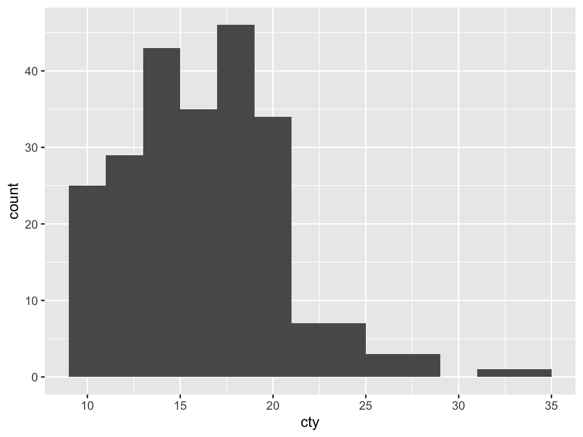
The distribution of mpg$cty shows a characteristic shape (known as “positive skew”):
The majority of items are located in the left half of the value range (here: between 10 and 20 mpg), but a few substantially higher values create a tail to the right.
The minimalist default version of a ggplot2 histogram can easily be made more recognizable by adding aesthetics, some descriptive labels, and a theme:
# Colorful version of the same plot:
ggplot(mpg, aes(x = cty)) +
  geom_histogram(binwidth = 2, fill = unikn::pal_petrol[[1]], color = "black") +
  labs(title = "Distribution of fuel economy",
       x = "Miles per gallon (in city)", y = "Frequency",
       caption = "Data from ggplot2::mpg") +
  theme_ds4psy(col_title = unikn::Petrol, col_bgrnd = "lightgrey", col_brdrs = "black")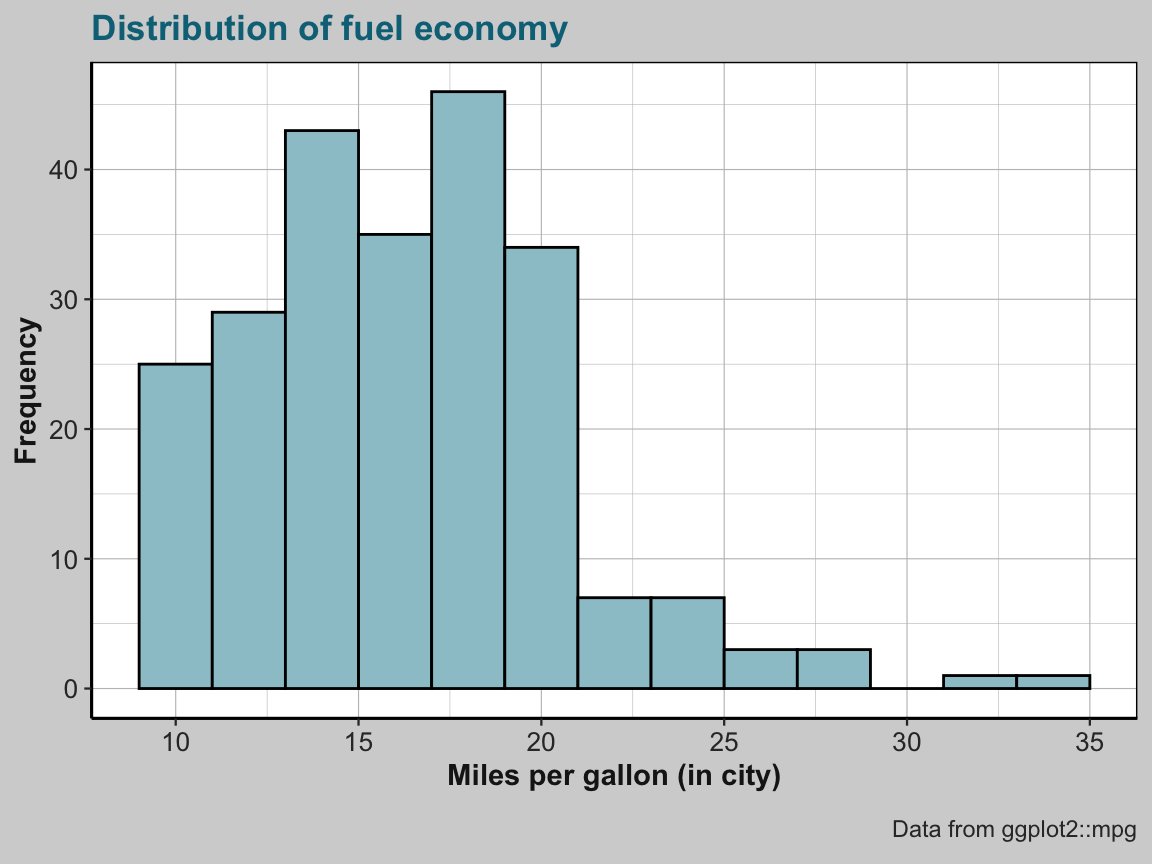
2.4.2 Bar plots
Another common type of plot shows the values (across different levels of some variable as the height of bars. As this plot type can use both categorical or continuous variables, it turns out to be surprisingly complex to create good bar charts. To us get started, here are only a few examples:
Counts of cases
By default, geom_bar computes summary statistics of the data. When nothing else is specified, geom_bar counts the number or frequency of values (i.e., stat = "count") and maps this count to the y (i.e., y = ..count..):
## Data:
# ggplot2::mpg

# (a) Count number of cases by class:
ggplot(mpg) +
  geom_bar(aes(x = class))
# (a) is the same as (b):
ggplot(mpg) +
  geom_bar(aes(x = class, y = ..count..))
# (b) is the same as (c):
ggplot(mpg) +
  geom_bar(aes(x = class), stat = "count")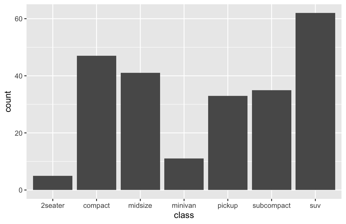
# (c) is the same as (d):
ggplot(mpg) +
  geom_bar(aes(x = class, y = ..count..), stat = "count")
# (e) prettier version:
ggplot(mpg) +
  geom_bar(aes(x = class, fill = class),
           # stat = "count",
           color = "black") +
  labs(title = "Counts of cars by class",
       x = "Class of car", y = "Frequency", fill = "Class:") +
  # scale_fill_brewer(name = "Class:", palette = "Blues") +
  scale_fill_manual(values = unikn::usecol(unikn::pal_unikn_light)) +
  theme_ds4psy()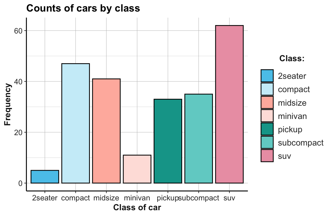
Proportions of cases
An alternative to showing the count or frequency of cases is showing the corresponding proportion of cases:
## Data:
# ggplot2::mpg

# (1) Proportion of cases by class:
ggplot(mpg) +
  geom_bar(aes(x = class, y = ..prop.., group = 1), fill = unikn::Seeblau)
# is the same as:
ggplot(mpg) +
  geom_bar(aes(x = class, y = ..count../sum(..count..)), fill = unikn::Seeblau)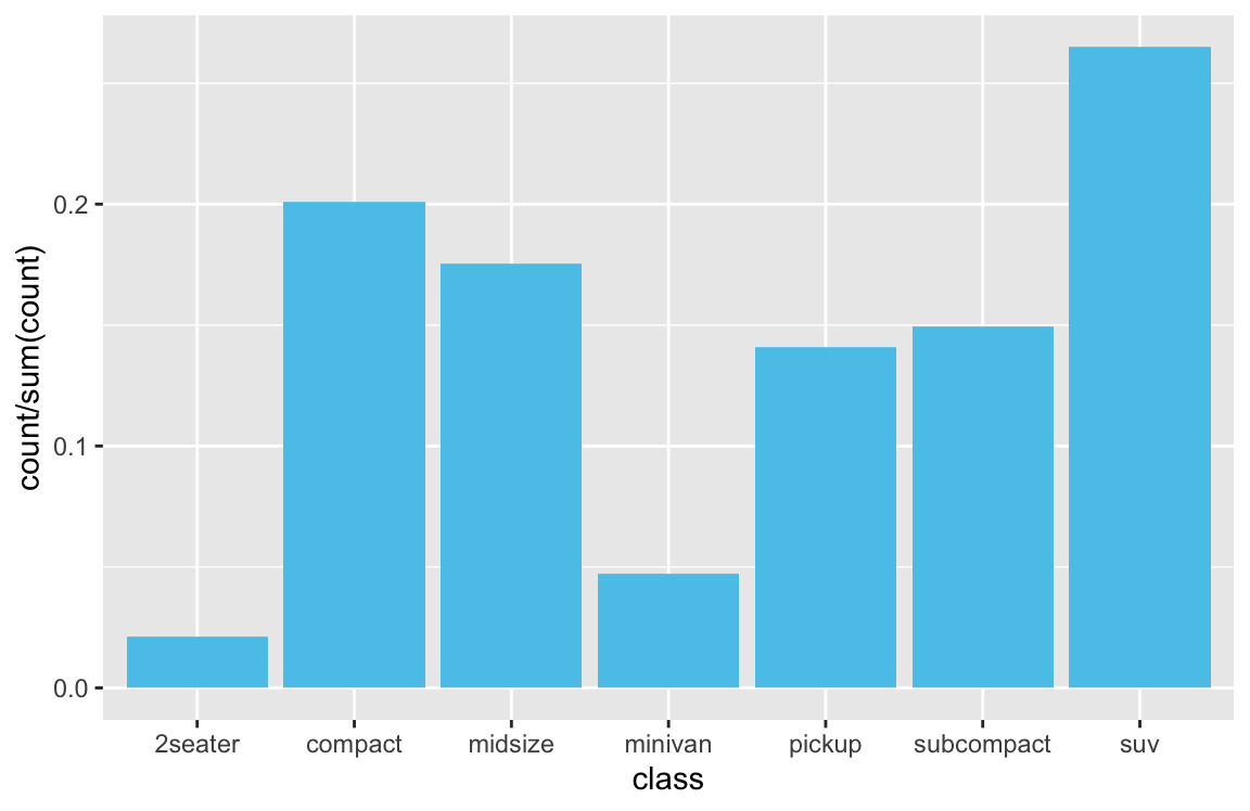
Bar plots of existing values
A common difficulty occurs when the table to plot already contains the values to be shown as bars.
As there is nothing to be computed in this case, we need to specify stat = "identity" for geom_bar (to override its default of stat = "count").
For instance, let’s plot a bar chart that shows the election data from the following tibble de (and don’t worry if you don’t understand the commands used to generate the tibble at this point):
library(tidyverse)

## (a) Create a tibble of data:
de_org <- tibble(
    party = c("CDU/CSU", "SPD", "Others"),
    share_2013 = c((.341 + .074), .257, (1 - (.341 + .074) - .257)),
    share_2017 = c((.268 + .062), .205, (1 - (.268 + .062) - .205))
  )
de_org$party <- factor(de_org$party, levels = c("CDU/CSU", "SPD", "Others"))  # optional
# de_org

## Check that columns add to 100:
# sum(de_org$share_2013)  # => 1 (qed)
# sum(de_org$share_2017)  # => 1 (qed)

## (b) Converting de into a tidy data table:
de <- de_org %>%
  gather(share_2013:share_2017, key = "election", value = "share") %>%
  separate(col = "election", into = c("dummy", "year")) %>%
  select(year, party, share)

knitr::kable(de, caption = "Election data.")| year | party | share |
|---|---|---|
| 2013 | CDU/CSU | 0.415 |
| 2013 | SPD | 0.257 |
| 2013 | Others | 0.328 |
| 2017 | CDU/CSU | 0.330 |
| 2017 | SPD | 0.205 |
| 2017 | Others | 0.465 |
- A version with 2 x 3 separate bars (using
position = "dodge"):
## Data: -----
# de  # => 6 x 3 tibble

## Note that year is of type character, which could be changed by:
# de$year <- parse_integer(de$year)

## (1) Bar chart with  side-by-side bars (dodge): -----

## (a) minimal version:
bp_1 <- ggplot(de, aes(x = year, y = share, fill = party)) +
  ## (A) 3 bars per election (position = "dodge"):
  geom_bar(stat = "identity", position = "dodge", color = "black") # 3 bars next to each other
bp_1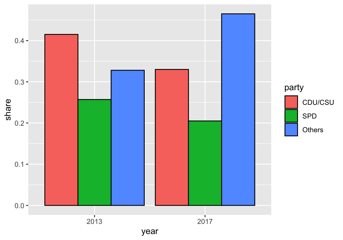
Adding meaningful colors and descriptive labels can render the plot much easier to read:
## (b) Version with text labels and customized colors:
bp_1 +
  ## prettier plot:
  geom_text(aes(label = paste0(round(share * 100, 1), "%"), y = share + .015),
            position = position_dodge(width = 1),
            fontface = 2, color = "black") +
  # Some set of high contrast colors:
  scale_fill_manual(name = "Party:", values = c("black", "red3", "gold")) +
  # Titles and labels:
  labs(title = "Partial results of the German general elections 2013 and 2017",
       x = "Year of election", y = "Share of votes",
       caption = "Data from www.bundeswahlleiter.de.") +
  # coord_flip() +
  theme_bw()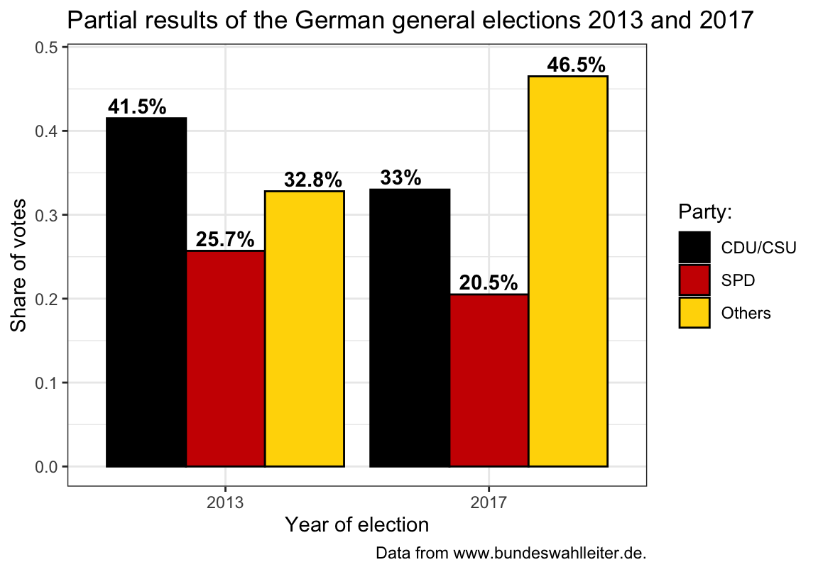
- A version with 2 bars with 3 segments (using
position = "stack"):
## Data: -----
# de  # => 6 x 3 tibble

## (2) Bar chart with stacked bars: -----

## (a) minimal version:
bp_2 <- ggplot(de, aes(x = year, y = share, fill = party)) +
  ## (B) 1 bar per election (position = "stack"):
  geom_bar(stat = "identity", position = "stack") # 1 bar per election
bp_2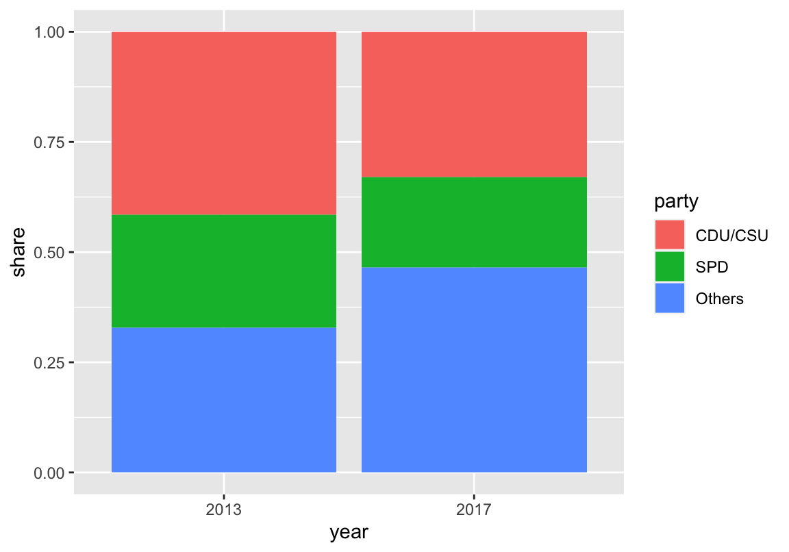
Again, the plot is easier to interpret when customizing colors and labels:
## (b) Version with text labels and customized colors:
bp_2 +
  ## prettier plot:
  geom_text(aes(label = paste0(round(share * 100, 1), "%")),
            position = position_stack(vjust = .5),
            color = rep(c("white", "white", "black"), 2), # vary text color
            fontface = 2) +
  # Some set of high contrast colors:
  scale_fill_manual(name = "Party:", values = c("black", "red3", "gold")) +
  # Titles and labels:
  labs(title = "Partial results of the German general elections 2013 and 2017",
       x = "Year of election", y = "Share of votes",
       caption = "Data from www.bundeswahlleiter.de.") +
  # coord_flip() +
  theme_classic()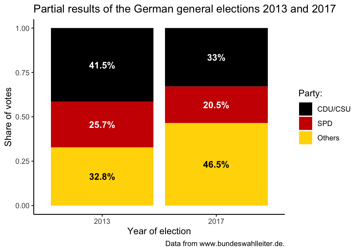
Note that plotting text labels inside the bars requires that we adjust the text color so they show a clear contrast to the color of each bar.
Bar plots with error bars
It is typically a good idea to show some measure of variability (e.g., the standard deviation, standard error, confidence interval, etc.) when using bar plots. There is an entire range of geoms that draw error bars:
## Create data to plot: -----
n_cat <- 6
set.seed(101)  # for reproducible randomness

data <- tibble(
  name = LETTERS[1:n_cat],
  value = sample(seq(25, 50), n_cat),
  sd = rnorm(n = n_cat, mean = 0, sd = 8))
# data

## Error bars: -----

## x-aesthetic only:

# (a) errorbar:
ggplot(data) +
  geom_bar(aes(x = name, y = value), stat = "identity", fill = unikn::pal_karpfenblau[[1]]) +
  geom_errorbar(aes(x = name, ymin = value - sd, ymax = value + sd),
                width = 0.3, color = unikn::Pinky, size = 1) +
  labs(title = "Bar plot with error bars") +
  theme_ds4psy()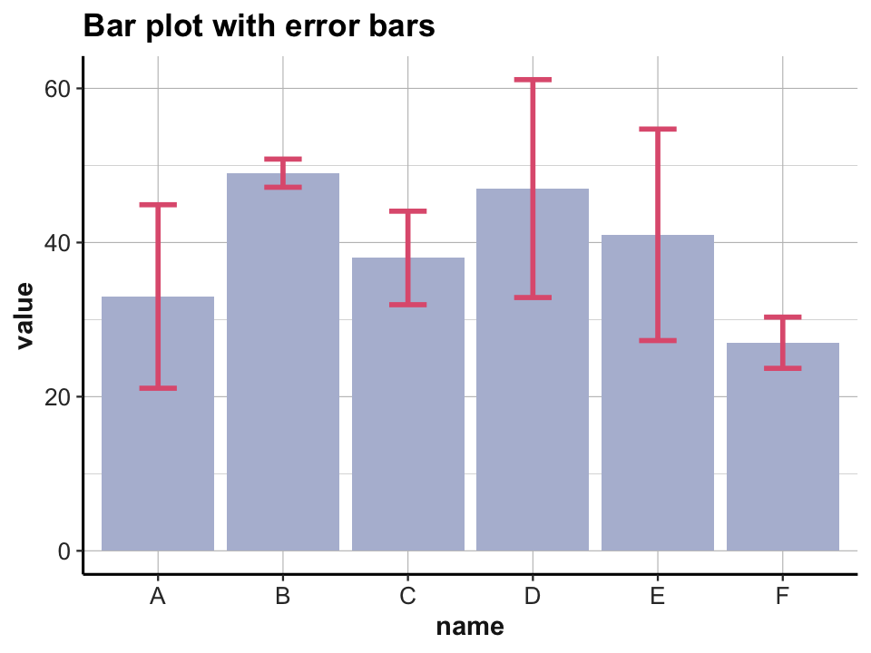
# (b) linerange:
ggplot(data) +
  geom_bar(aes(x = name, y = value), stat = "identity", fill = unikn::pal_seegruen[[1]]) +
  geom_linerange(aes(x = name, ymin = value - sd, ymax = value + sd),
                 color = unikn::Bordeaux, size = 2) +
  labs(title = "Bar plot with line range") +
  theme_ds4psy()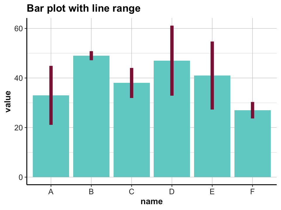
## Additional y-aesthetic:

# (c) crossbar:
ggplot(data) +
  geom_bar(aes(x = name, y = value), stat = "identity", fill = unikn::pal_petrol[[1]]) +
  geom_crossbar(aes(x = name, y = value, ymin = value - sd, ymax = value + sd),
                width = 0.2, color  = unikn::Petrol, size = 1) +
  labs(title = "Bar plot with crossbars") +
  theme_ds4psy()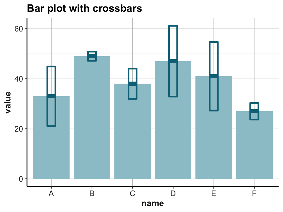
# (d) pointrange:
ggplot(data) +
  geom_bar(aes(x = name, y = value), stat = "identity", fill = unikn::pal_seeblau[[2]]) +
  geom_pointrange(aes(x = name, y = value, ymin = value - sd, ymax = value + sd),
                  color = unikn::Bordeaux, size = 1) +
  labs(title = "Bar plot with point ranges") +
  theme_ds4psy()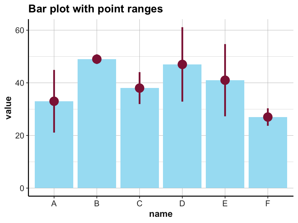
2.4.3 Line graphs
A line graph typically depicts developments of some item over time (or some other factor). To know which variable is to be plotted repeatedly, we need to specify the group property. For instance, the following plot shows the growth of orange trees by their age (using the data from datasets::Orange):
otrees <- tibble::as_tibble(datasets::Orange)
# otrees

# basic version:
ggplot(otrees) +
  geom_line(aes(x = age, y = circumference, group = Tree)) +
  labs(title = "Growth of orange trees") +
  theme_bw()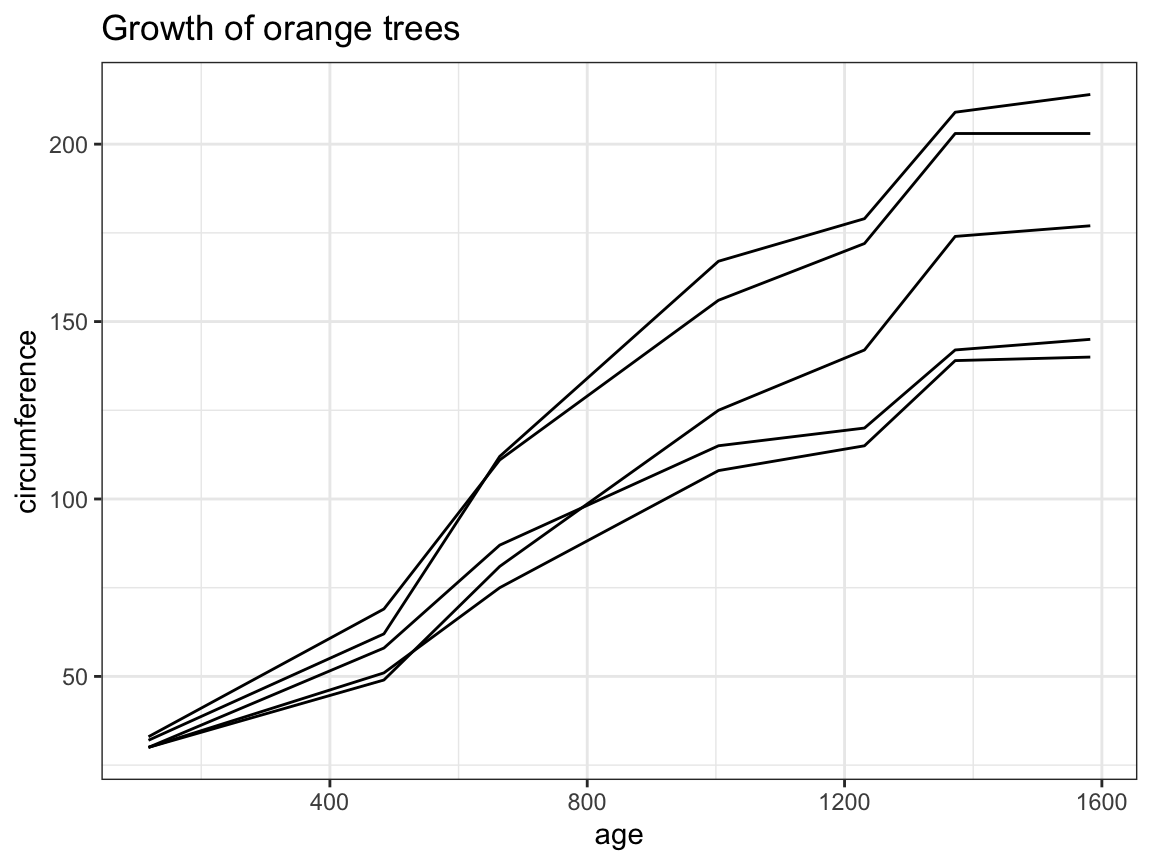
# prettier version:
ggplot(otrees, aes(x = age, y = circumference, group = Tree, color = Tree)) +
  geom_line(size = 1.5, alpha = 2/3) +
  geom_point(size = 3, alpha = 2/3) +
  labs(title = "Growth of orange trees over time",
       x = "Age (days elapsed)", y = "Circumference (in mm)") +
  theme_ds4psy()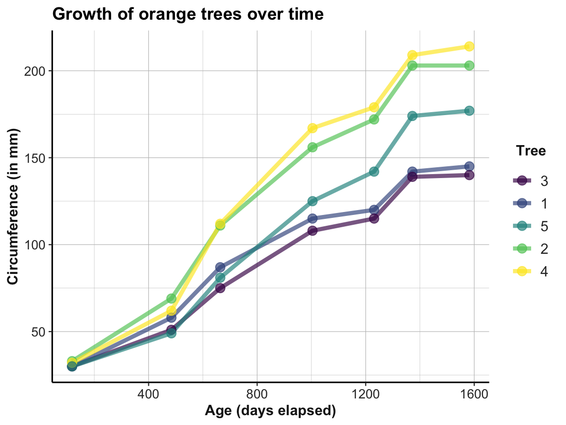
2.4.4 More plots
There are many more additional types of plots, some of which we will introduce later (e.g., in Section 4.2 of Chapter 4 on Exploring data). In addition, see the resources provided in Section 2.8 for pointers to additional plots and examples.