4.2 Essentials of EDA
If a good exploratory technique gives you more data, then maybe
good exploratory data analysis gives you more questions, or better questions.
More refined, more focused, and with a sharper point.Roger Peng (2019), Simply Statistics
Having learned what exploratory data analysis (EDA) is and wants, we are curious to learn how to do an EDA. Our characterizations of EDA as a particular attitude, a process, and a mindset has emphasized that we must not expect a fixed recipe of steps, but rather a loose set of principles and practices to help us making sense of data.
The following sections illustrate some of the principles and practices of EDA that promote the ideal of transparent data analysis and reproducible research. While such practices are indispensable when working with a team of colleagues and the wider scientific community, organizing our workflow in a clear and consistent fashion is also beneficial for our own projects and one of the most important persons in our lives — our future self.
4.2.1 Setting the stage
Before embarking on any actual analysis, we pay tribute to two principles that appear to be so simple that their benefits are easily overlooked:
- Principle 1: Start with a clean slate and explicitly load all data and all required packages.
Although the RStudio IDE provides options for saving your workspace and for loading data or packages by clicking buttons or checking boxes, doing so renders the process of your analysis intransparent for anyone not observing your actions. To make sure that others and yourself can repeat the same sequence of steps tomorrow or next year, it is advisable to always start with a clean slate and explicitly state which packages and which datasets are required for the current analysis (unless there are good reasons to deviate from them):38
Cleaning up
Clean your workspace and define some custom objects (like colors or functions):
# Housekeeping:
rm(list = ls())  # cleans ALL objects in current R environment (without asking for confirmation)!
An important caveat: Cleaning up your workspace by deleting everyting is helpful when you are starting a new file or project and want to ensure that your current file works in a self-contained fashion (i.e., without relying on any earlier or external results). However, deleting everything should be avoided if you are working on something that may become a component of another project or a part of someone else’s workflow. In these cases, deleting all objects is not just impolite and impertinent, but outright dangerous.
Loading packages and data
Different computers and people differ in the many different ways (e.g., by running different versions of R or using different packages). Being explicit which packages and data files are needed in a project makes it transparent which environment you are assuming for your current project. Similarly, explicitly loading all required data files (rather than using corresponding menu commands) reminds you and anyone else which files were actually used.
The following code chunk loads all packages required for our analysis:
# Load packages:
library(knitr)
library(rmarkdown)
library(tidyverse)
library(ds4psy)
library(here)
Similarly, lets explicitly load some data files (see Section B.1 of Appendix B for details):
# Load data files:

# 1. Participant data:
posPsy_p_info <- ds4psy::posPsy_p_info  # from ds4psy package
# posPsy_p_info_2 <- readr::read_csv(file = "http://rpository.com/ds4psy/data/posPsy_participants.csv")  # from csv file online
# all.equal(posPsy_p_info, posPsy_p_info_2)

# 2. Original DVs in long format:
AHI_CESD <- ds4psy::posPsy_AHI_CESD  # from ds4psy package
# AHI_CESD_2 <- readr::read_csv(file = "http://rpository.com/ds4psy/data/posPsy_AHI_CESD.csv")  # from csv file online
# all.equal(AHI_CESD, AHI_CESD_2)

# 3. Transformed and corrected version of all data (in wide format):
posPsy_wide <- ds4psy::posPsy_wide  # from ds4psy package
# posPsy_wide_2 <- readr::read_csv(file = "http://rpository.com/ds4psy/data/posPsy_data_wide.csv")  # from csv file online
# all.equal(posPsy_wide, posPsy_wide_2)
If you are loading inputs from or saving outputs to subfolders (e.g., loading data files from data or saving images to images), using the here package (Müller, 2017) is a good idea. It provides a function here() that defaults to the root of your current file or project.
Customizations
If you require some special commands or objects throughout your project, it is good practice to explicate them in your file (e.g., by loading other files with the source function). In projects with visualizations, it is advisable to define some colors for promoting a more uniform visual appearance (or corporate identity). For instance, we can define a color seeblau and use it in subsequent visualizations:
# Customizations:
# source(file = "my_custom_functions.R")  # load code from file

# Custom colors:
seeblau <- rgb(0, 169, 224, names = "seeblau", maxColorValue = 255)  # seeblau.4 of unikn package
Note: This color corresponds to the color Seeblau of the unikn package.
4.2.2 Clarity
Our second principle is just as innocuous as the first, but becomes crucial as our analyses get longer and more complicated:
- Principle 2: Structure, document, and comment your analysis.
While mentioning or adhering to this principle may seem superfluous at first, you and your collaborators will benefit from transparent structure and clear comments as things get longer, messier, and tougher (e.g., when analyses involve different tests or are distributed over multiple datasets and scripts). A consistent document structure, meaningful object names, and clear comments are indispensable when sharing your data or scripts with others. Using R Markdown (see Appendix F for details) encourages and facilitates structuring a document, provided that you use some consistent way of combining text and code chunks. Good comments can structure a longer sequences of text or code into parts and briefly state the content of each part (what). More importantly, however, comments should note the goals and reasons for your decisions (i.e., explain why, rather than how you do something).
When trying to be clear, even seemingly trivial and tiny things matter. Some examples include:
Your text should contain clear headings, which includes using consistent levels and lengths, as well as brief paragraphs of text that motivate code chunks and summarize intermediate results and conclusions.
Messy code often works, but is just as annoying as bad spelling: yucAnlivewith outit, but it sure makes life a lot easier. So do yourself and others a favor by writing human-readable code (e.g., putting spaces between operators and objects, putting new steps on new lines, and indenting your code according to the structure of its syntax.39 Incidentally, one of the most powerful ways to increase the clarity of code is by using space: While adding horizontal space seperates symbols and allows structuring things into levels and columns, adding vertical space structures code/text into different steps/sentences, chunks/paragraphs, or larger functional units/sections. And whereas printed media typically need to cut and save characters, space comes for free in electronic documents — so make use of this great resource!
Use clear and consistent punctuation in your comments: A heading or comment that refers to subsequent lines should end with a colon (“:”), whereas a comment or conclusion that refers to something before or above itself should end with a period (“.”).
Yes, all this sounds terribly pedantic and nitpicky, but trust me: As soon as you’re trying to read someone else’s code, you will be grateful if they tried to be clear and consistent.
4.2.3 Safety
It is only human to make occasonal errors. To make sure that errors are not too costly, a good habit is to occasionally save intermediate steps.
As we have seen, R allows us to create a copy y of some object x as simply as y <- x. This motivates:
- Principle 3: Make copies (and copies of copies) of your data.
Making copies (or spanning some similar safety net) is useful for your objects, data files, and your scripts for analyzing them. Although it also is a good idea to always keep a “current master version” of a data file, it is advisable to occasionally copy your current data and then work on the copy (e.g., before trying out some unfamiliar analysis or command). As creating copies and then working on them is so easy, it can even save you from remembering and repeatedly typing complicated object names (e.g., plotting some variables of df rather than posPsy_p_info).
Copies of objects
Most importantly, however, working on a copy of data allways allows recovering the last sound version if things go terribly wrong. Here’s an example:
df <- posPsy_wide  # copy data (and simplify name)
dim(df)            # 295 cases x 294 variables
#> [1] 295 294

sum(is.na(df))  # 37440 missing values
#> [1] 37440
df$new <- NA    # create a new column with NA values
df$new          # check the new column
#>  [1] NA NA NA NA NA NA NA NA NA NA NA NA NA NA NA NA NA NA NA NA NA NA NA NA NA
#> [26] NA NA NA NA NA NA NA NA NA NA NA NA NA NA NA NA NA NA NA NA NA NA NA NA NA
#> [51] NA NA NA NA NA NA NA NA NA NA NA NA NA NA NA NA NA NA NA NA NA NA NA NA NA
#>  [ reached getOption("max.print") -- omitted 220 entries ]
df     <- NA    # create another column with NA values

# Ooops...
df  # looks like we accidentally killed our data!
#> [1] NA

# But do not despair:
df <- posPsy_wide  # Here it is again:
dim(df)            # 295 cases x 294 variables
#> [1] 295 294
Copies of data
During a long and complicated analysis, it is advisable to save an external copy of your current data when having reached an important intermediate step.
While there are many different formats in which data files can be stored, a good option for most files is csv (comma-separated-values), which can easily be read by most humans and machines.
Importantly, always verify that the external copy preserves the key information contained in your current original:
# Write out current data (in csv-format):
readr::write_csv(df, file = "data/my_precious_data.csv")

# Re-read external data (into a different object):
df_2 <- readr::read_csv(file = "data/my_precious_data.csv")

# Verify that original and copy are identical:
all.equal(df, df_2, check.attributes = FALSE)
#> [1] TRUE
When and how often it is advisable to save an external copy is partly a matter of personal preference, but also depends on legal, institutional, and technological constraints (e.g., whether we use a version control system). Especially when cooperating with others, it is important to implement sound rules and then follow them.
Note that we will cover additional details of file paths and how to import more exotic file types when introducing the readr package (Wickham, Hester, & Bryan, 2022) in the chapter on Importing data (Chapter 6).
4.2.4 Data screening
An initial data screening process involves checking the dimensions of data, the types of variables, missing or atypical values, and the validity of observations.
Basics
What do we want to know immediately after loading a data file? Well, ideally everything, which we can set in stone as:
- Principle 4: Know your data (variables and observations).
Realistically, the principle implies that there are some essential commands that will quickly propel us from a state of complete ignorance to a position that allows for productive exploration. Directly after loading a new file, we typically want to know:
- the dimensions of the data (number of rows and columns),
- the types of variables (columns) contained, and
- the semantics of the observations (rows).
To gain an initial understanding of new data, we typically inspect its codebook (if available).
For a well-documented dataset, inspecting its R documentation provides us with a description of the variables and values.
The codebook of the table posPsy_AHI_CESD of the ds4psy package can be viewed as follows:
?ds4psy::posPsy_AHI_CESD # inspect the codebookHere, we first read this data into an object AHI_CESD, create a copy df (to simplify subsequent commands without changing the data) and inspect it with some basic R commands:
AHI_CESD <- ds4psy::posPsy_AHI_CESD  # from ds4psy package
df <- AHI_CESD  # copy the data

dim(df)  # 992 rows (cases, observations) x 50 columns (variables)
#> [1] 992  50
df <- tibble::as_tibble(df)  # (in case df isn't a tibble already)

# Get an initial overview:
df
#> # A tibble: 992 × 50
#>       id occasion elapsed.days intervention ahi01 ahi02 ahi03 ahi04 ahi05 ahi06
#>    <dbl>    <dbl>        <dbl>        <dbl> <dbl> <dbl> <dbl> <dbl> <dbl> <dbl>
#>  1     1        0         0               4     2     3     2     3     3     2
#>  2     1        1        11.8             4     3     3     4     3     3     4
#>  3     2        0         0               1     3     4     3     4     2     3
#>  4     2        1         8.02            1     3     4     4     4     3     3
#>  5     2        2        14.3             1     3     4     4     4     3     3
#>  6     2        3        32.0             1     3     4     4     4     4     4
#>  7     2        4        92.2             1     3     3     2     3     3     3
#>  8     2        5       182.              1     3     3     3     4     2     3
#>  9     3        0         0               4     3     3     2     4     2     3
#> 10     3        2        16.4             4     3     3     3     4     4     4
#> # … with 982 more rows, and 40 more variables: ahi07 <dbl>, ahi08 <dbl>,
#> #   ahi09 <dbl>, ahi10 <dbl>, ahi11 <dbl>, ahi12 <dbl>, ahi13 <dbl>,
#> #   ahi14 <dbl>, ahi15 <dbl>, ahi16 <dbl>, ahi17 <dbl>, ahi18 <dbl>,
#> #   ahi19 <dbl>, ahi20 <dbl>, ahi21 <dbl>, ahi22 <dbl>, ahi23 <dbl>,
#> #   ahi24 <dbl>, cesd01 <dbl>, cesd02 <dbl>, cesd03 <dbl>, cesd04 <dbl>,
#> #   cesd05 <dbl>, cesd06 <dbl>, cesd07 <dbl>, cesd08 <dbl>, cesd09 <dbl>,
#> #   cesd10 <dbl>, cesd11 <dbl>, cesd12 <dbl>, cesd13 <dbl>, cesd14 <dbl>, …
We note that AHI_CESD is quite large (or rather long):
The data contains 992 observations (rows) and 50 variables (columns).
Most of the variables were read in as integers and — judging from their names — many belong together (in blocks).
Their names and ranges suggest that they stem from questionnaires or scales with fixed answer categories (e.g., from 1 to 5 for ahi__, and from 1 to 4 for cesd__).
Overall, an observation (or row of data) is a measurement of one participant (characterised by its id and an intervention value) at one occasion (characterised by the value of occasion and elapsed.days) on two different scales (ahi and cesd).
As df was provided as a tibble, simply printing it yielded information on its dimensions and the types of variables it contained.
The following functions would provide similar information:
# Other quick ways to probe df:
names(df)    # Note variable names
glimpse(df)  # Note types of variables
summary(df)  # Note range of values
When inspecting our data, we should especially look out for anything unusual (i.e., both unusual variables and unusual values). This motivates another principle:
- Principle 5: Know and deal with unusual variables and unusual values.
Unusual variables
By “unusual” variables we typically mean variables that are not what we expect them to be. The two most frequent surprises in this respect are:
Non-text variables appearing as variables of type character: This can happen when a data file included variable labels or headers. If this accidentally happened, removing extra rows (e.g., by numerical indexing with negative index values, or by using the
filter()orslice()functions of dplyr) and converting the variable into the desired data type (e.g.,as.numeric()oras.logical()) may be necessary (see Section (basics:change-variable-type)).Text or numeric variables appearing as factors: Another frequent error is to accidentally convert data of type character (so-calles string variables) into factors (see Section (basics:factors)).
In the case of df, printing the tibble indicated that all variables appear to be numeric (of type double).
This seems fine for our present purposes.
For demonstration purposes, we could convert some variables from the numberic type double into integers:
# Change some variables (into simpler types):
df$id <- as.integer(df$id)
df$occasion <- as.integer(df$occasion)
df$intervention <- as.integer(df$intervention)
Unusual values
Unusual values include:
- missing values (
NAor-77, etc.),
- extreme values (outliers),
- other unexpected values (e.g., erroneous and impossible values).
Missing values
What are missing values? In R, missing values are identified by NA. Note that NA is different from NULL: NULL represents the null object (i.e., something is undefined). By contrast, NA means that some value is absent.
Both NA and NULL are yet to be distinguished from NaN values.
## Checking for NA, NULL, and NaN:

# NA:
is.na(NA)   # TRUE
#> [1] TRUE
is.na(NULL) # 0 (NULL)
#> logical(0)
is.na(NaN)  # TRUE!
#> [1] TRUE

# NULL:
is.null(NULL) # TRUE
#> [1] TRUE
is.null(NA)   # FALSE
#> [1] FALSE
is.null(NaN)  # FALSE
#> [1] FALSE

# NaN:
is.nan(NaN)  # TRUE
#> [1] TRUE
is.nan(0/0)  # TRUE
#> [1] TRUE
is.nan(1/0)  # FALSE, as it is +Inf
#> [1] FALSE
is.nan(-1/0) # FALSE, as it is -Inf
#> [1] FALSE
is.nan(0/1)  # FALSE (as it is 0)
#> [1] FALSE
is.nan(NA)   # FALSE
#> [1] FALSE
is.nan(NULL) # 0 (logical)
#> logical(0)

# Note different modes:
all.equal(NULL, NA) # Note: NULL vs. logical
#> [1] "target is NULL, current is logical"
all.equal("", NA)   # Note: character vs. logical
#> [1] "Modes: character, logical"
#> [2] "target is character, current is logical"
all.equal(NA, NaN)  # Note: logical vs. numeric
#> [1] "Modes: logical, numeric"
#> [2] "target is logical, current is numeric"
Missing data values require attention and special treatment. They should be identified, counted and/or visualized, and often removed or recoded (e.g., replaced by other values).
Counting NA values:
AHI_CESD <- ds4psy::posPsy_AHI_CESD  # from ds4psy package
df <- AHI_CESD  # copy the data

is.na(df)       # asks is.na() for every value in df
#>           id occasion elapsed.days intervention ahi01 ahi02 ahi03 ahi04 ahi05
#>   [1,] FALSE    FALSE        FALSE        FALSE FALSE FALSE FALSE FALSE FALSE
#>        ahi06 ahi07 ahi08 ahi09 ahi10 ahi11 ahi12 ahi13 ahi14 ahi15 ahi16 ahi17
#>   [1,] FALSE FALSE FALSE FALSE FALSE FALSE FALSE FALSE FALSE FALSE FALSE FALSE
#>        ahi18 ahi19 ahi20 ahi21 ahi22 ahi23 ahi24 cesd01 cesd02 cesd03 cesd04
#>   [1,] FALSE FALSE FALSE FALSE FALSE FALSE FALSE  FALSE  FALSE  FALSE  FALSE
#>        cesd05 cesd06 cesd07 cesd08 cesd09 cesd10 cesd11 cesd12 cesd13 cesd14
#>   [1,]  FALSE  FALSE  FALSE  FALSE  FALSE  FALSE  FALSE  FALSE  FALSE  FALSE
#>        cesd15 cesd16 cesd17 cesd18 cesd19 cesd20 ahiTotal cesdTotal
#>   [1,]  FALSE  FALSE  FALSE  FALSE  FALSE  FALSE    FALSE     FALSE
#>  [ reached getOption("max.print") -- omitted 991 rows ]
sum(is.na(df))  # sum of all instances of TRUE
#> [1] 0
This shows that df does not contain any missing (NA) values.
Practice
Since we just verified that df does not contain any NA values, we create a tibble tb with NA values for practice purposes:
# Create a df with NA values:
set.seed(42) # for replicability
nrows <- 6
ncols <- 6

# Make matrix:
mx <- matrix(sample(c(1:12, -66, -77), nrows * ncols, replace = TRUE), nrows, ncols)

## Make tibble (with valid column names):
# tb <- tibble::as_tibble(mx, .name_repair = "minimal")  # make tibble
tb <- tibble::as_tibble(mx, .name_repair = "unique")  # make tibble
# tb <- tibble::as_tibble(mx, .name_repair = "universal")  # make tibble
# tb <- tibble::as_tibble(mx, .name_repair = make.names)   # make tibble

tb[tb > 9] <- NA # SET certain values to NA
# tb
The following code illustrates how we can count and recode NA values:
# Count NA values:
sum(is.na(tb))  # => 10 NA values
#> [1] 7

# The function `complete.cases(x)` returns a logical vector indicating which cases in tb are complete:
complete.cases(tb)         # test every row/case for completeness
#> [1]  TRUE FALSE  TRUE FALSE FALSE  TRUE
sum(complete.cases(tb))    # count cases/rows with complete cases
#> [1] 3
which(complete.cases(tb))  # indices of case(s)/row(s) with complete cases
#> [1] 1 3 6

tb[complete.cases(tb), ]  # list all complete rows/cases in tb
#> # A tibble: 3 × 6
#>    ...1  ...2  ...3  ...4  ...5  ...6
#>   <dbl> <dbl> <dbl> <dbl> <dbl> <dbl>
#> 1     1     2     9     3   -66     3
#> 2     1     1   -77     9     4     1
#> 3     4     4     2     5     8   -77
tb[!complete.cases(tb), ] # list all rows/cases with NA values in tb
#> # A tibble: 3 × 6
#>    ...1  ...2  ...3  ...4  ...5  ...6
#>   <dbl> <dbl> <dbl> <dbl> <dbl> <dbl>
#> 1     5    NA     5     9     5    NA
#> 2     9     8     4    NA     2    NA
#> 3    NA     7    NA     4    NA     8

# Recode all instances of NA as -99:
tb
#> # A tibble: 6 × 6
#>    ...1  ...2  ...3  ...4  ...5  ...6
#>   <dbl> <dbl> <dbl> <dbl> <dbl> <dbl>
#> 1     1     2     9     3   -66     3
#> 2     5    NA     5     9     5    NA
#> 3     1     1   -77     9     4     1
#> 4     9     8     4    NA     2    NA
#> 5    NA     7    NA     4    NA     8
#> 6     4     4     2     5     8   -77
tb[is.na(tb)] <- -99  # recode NA values as - 99
tb
#> # A tibble: 6 × 6
#>    ...1  ...2  ...3  ...4  ...5  ...6
#>   <dbl> <dbl> <dbl> <dbl> <dbl> <dbl>
#> 1     1     2     9     3   -66     3
#> 2     5   -99     5     9     5   -99
#> 3     1     1   -77     9     4     1
#> 4     9     8     4   -99     2   -99
#> 5   -99     7   -99     4   -99     8
#> 6     4     4     2     5     8   -77
More frequently, special values (like -66, -77 and -99) indicate missing values.
To deal with them in R, we recode all instances of these values in tb as NA:
tb
#> # A tibble: 6 × 6
#>    ...1  ...2  ...3  ...4  ...5  ...6
#>   <dbl> <dbl> <dbl> <dbl> <dbl> <dbl>
#> 1     1     2     9     3   -66     3
#> 2     5   -99     5     9     5   -99
#> 3     1     1   -77     9     4     1
#> 4     9     8     4   -99     2   -99
#> 5   -99     7   -99     4   -99     8
#> 6     4     4     2     5     8   -77

# Recode -66, -77, and -99 as NA:
tb[tb == -66 | tb == -77 | tb == -99 ] <- NA

tb
#> # A tibble: 6 × 6
#>    ...1  ...2  ...3  ...4  ...5  ...6
#>   <dbl> <dbl> <dbl> <dbl> <dbl> <dbl>
#> 1     1     2     9     3    NA     3
#> 2     5    NA     5     9     5    NA
#> 3     1     1    NA     9     4     1
#> 4     9     8     4    NA     2    NA
#> 5    NA     7    NA     4    NA     8
#> 6     4     4     2     5     8    NA

sum(is.na(tb))  # => 10 NA values
#> [1] 10
For more sophisticated ways of dealing with (and visualising) NA values, see the R packages mice (Multivariate Imputation by Chained Equations), VIM (Visualization and Imputation of Missing Values) and Amelia II.
Other unusual values: Counting cases, dropouts, outliers, and unexpected values
While dealing with missing values is a routine task, finding other unusual values involves some effort.
However, discovering unusual values can also be fun, as it requires the state of mind of a detective who gradually uncovers facts — and aims to ultimately reveal the truth – by questioning a case’s circumstances or its suspects. In principle, we can detect atypical values and outliers (remember Exercise 3 of Chapter 3, for different definitions) by counting values, computing descriptive statistics, or by checking the distributions of raw values. To illustrate this, let’s inspect the data of AHI_CESD further. Since participants in this study were measured repeatedly over a range of several months, two good questions to start with are:
How many participants were measured at each occasion?
How many measurement occasions are there for each participant?
ad 1.: The first question (about participants per occasion) concerns a trend (i.e., development over time) that also addresses the issue of dropouts (observations present at some, but absent at other occasions). The number of participants per occaion can easily be computed by using dplyr or plotted by using ggplot2:
# How many participants are there for each occasion?

# Data:
AHI_CESD <- ds4psy::posPsy_AHI_CESD  # from ds4psy package
df <- AHI_CESD

# (1) Table of grouped counts:
# Using dplyr pipe:
id_by_occ <- df %>%
  group_by(occasion) %>%
  count()
id_by_occ
#> # A tibble: 6 × 2
#> # Groups:   occasion [6]
#>   occasion     n
#>      <dbl> <int>
#> 1        0   295
#> 2        1   147
#> 3        2   157
#> 4        3   139
#> 5        4   134
#> 6        5   120

# (2) Plot count of IDs by occasion as bar plot:

# (a) Using raw data as input:
ggplot(df, aes(x = occasion)) +
  geom_bar(fill = unikn::Seeblau) +
  labs(title = "Number of participants by occasion (from raw data)") +
  ds4psy::theme_ds4psy()
# (b) Using id_by_occ from (1) as input:
ggplot(id_by_occ, aes(x = occasion)) +
  geom_bar(aes(y = n), stat = "identity", fill = unikn::Seeblau) +
  labs(title = "Number of participants by occasion (from table)") +
  ds4psy::theme_ds4psy()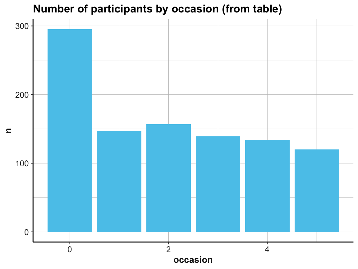
Note the similarities and differences between the 2 bar plots. Although they look almost the same (except for the automatic label on the y-axis and their title), they use completely different data as inputs. Whereas the 1st bar plot is based on the full raw data df, the 2nd one uses the summary table id_by_occ as its input data.
Practice
- Which of the 2 plot versions would make it easier to add additional information (like error bars, a line indicating mean counts of participants, or text labels showing the count values for each category)?
ad 2.: To address the 2nd question (about the number of measurements per participant), we could try to count them in a bar plot (which automatically counts the number of cases for each value on the x-axis):
# How many occasions are there for each participant?

# Data:
df <- AHI_CESD

# Graphical solution (with ggplot):
ggplot(df) +
  geom_bar(aes(x = id), fill = unikn::Seeblau) +
  labs(title = "Number of occasions by participant (raw data)") +
  ds4psy::theme_ds4psy()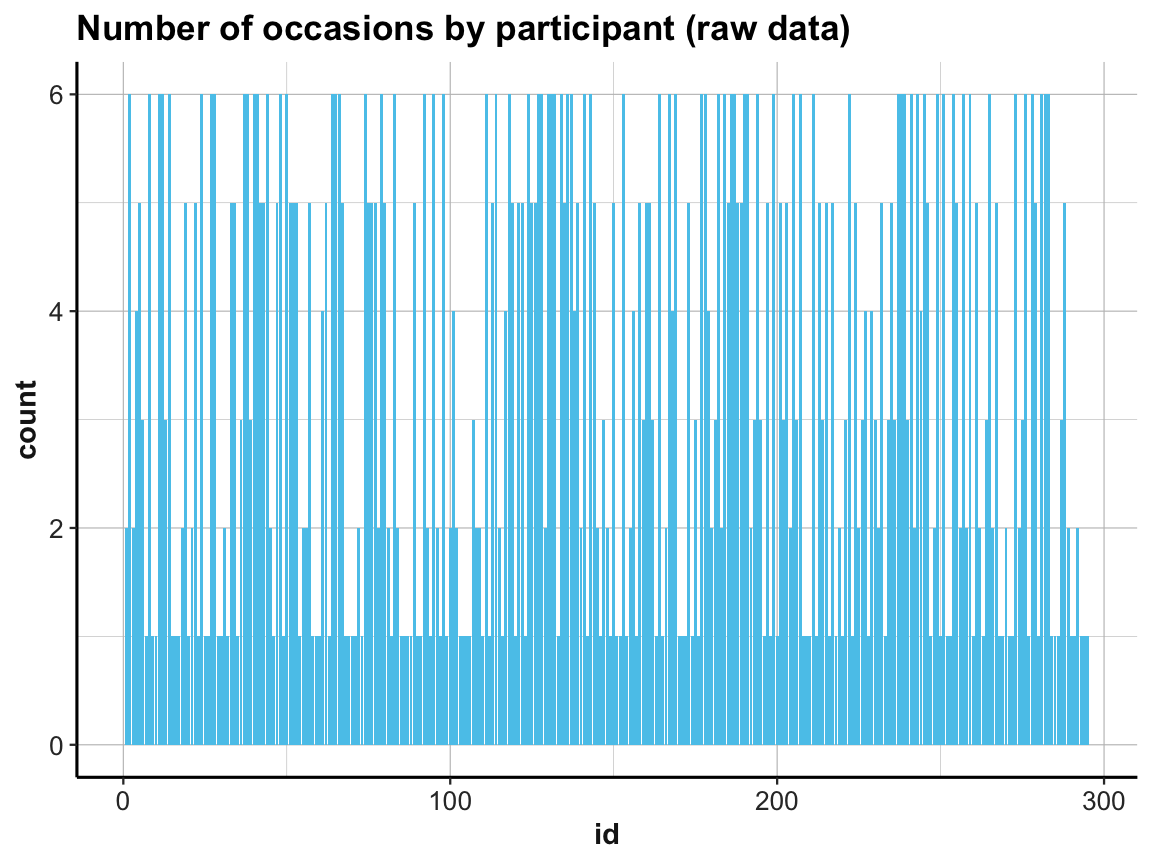
This does the trick, but the graph looks messy (as the instances on the x-axis are sorted by particpant id).
A cleaner solution could use two steps: First compute a summary table that contains the number of cases (rows) per id, and then plot this summary table:
# (1) Table of grouped counts:
occ_by_id <- df %>%
  group_by(id) %>%
  count()
occ_by_id
#> # A tibble: 295 × 2
#> # Groups:   id [295]
#>       id     n
#>    <dbl> <int>
#>  1     1     2
#>  2     2     6
#>  3     3     2
#>  4     4     4
#>  5     5     5
#>  6     6     3
#>  7     7     1
#>  8     8     6
#>  9     9     1
#> 10    10     1
#> # … with 285 more rows

# Summary of number of occasions per participant:
summary(occ_by_id$n)
#>    Min. 1st Qu.  Median    Mean 3rd Qu.    Max.
#>   1.000   1.000   3.000   3.363   5.500   6.000

# (2) Plot table:

# (2a) re-create previous plot (by now from occ_by_id):
ggplot(occ_by_id) +
  geom_bar(aes(x = id, y = n), stat = "identity", fill = unikn::Seeblau) +
  labs(title = "Number of occasions by participant (2a)") +
  ds4psy::theme_ds4psy()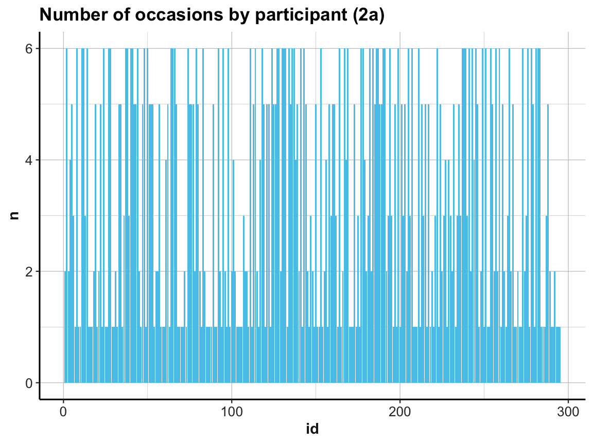
Note our use of the aesthetic y = n and stat = "identity" when using geom_bar:
As our summary table occ_by_id already contained the counts (in n), we needed to prevent the default behavior of geom_count.
If we had not done so, the resulting bar plot would have been rather boring, as it would have counted the number of n values for every id.
Practice
- Check out the graph resulting from the following command (and explain why it looks the way it does):
# (2*) boring bar plot (due to default behavior):
ggplot(occ_by_id) +
  geom_bar(aes(x = id), fill = unikn::Seeblau) +
  labs(title = "Number of occasions by participant (2*)") +
  ds4psy::theme_ds4psy()
Back to our bar plot (2a): The resulting graph was identical to the previous one (except for some labels) and looked just as messy.
We can clean it up by changing the order of id numbers on the x-axis:
# (2b) reordering id by count -n (i.e., from large to small n):
ggplot(occ_by_id) +
  geom_bar(aes(x = reorder(id, -n), y = n), stat = "identity", fill = unikn::Seeblau) +
  labs(title = "Number of occasions by participant (2b)") +
  ds4psy::theme_ds4psy(col_gridx = NA)  # no vertical grid lines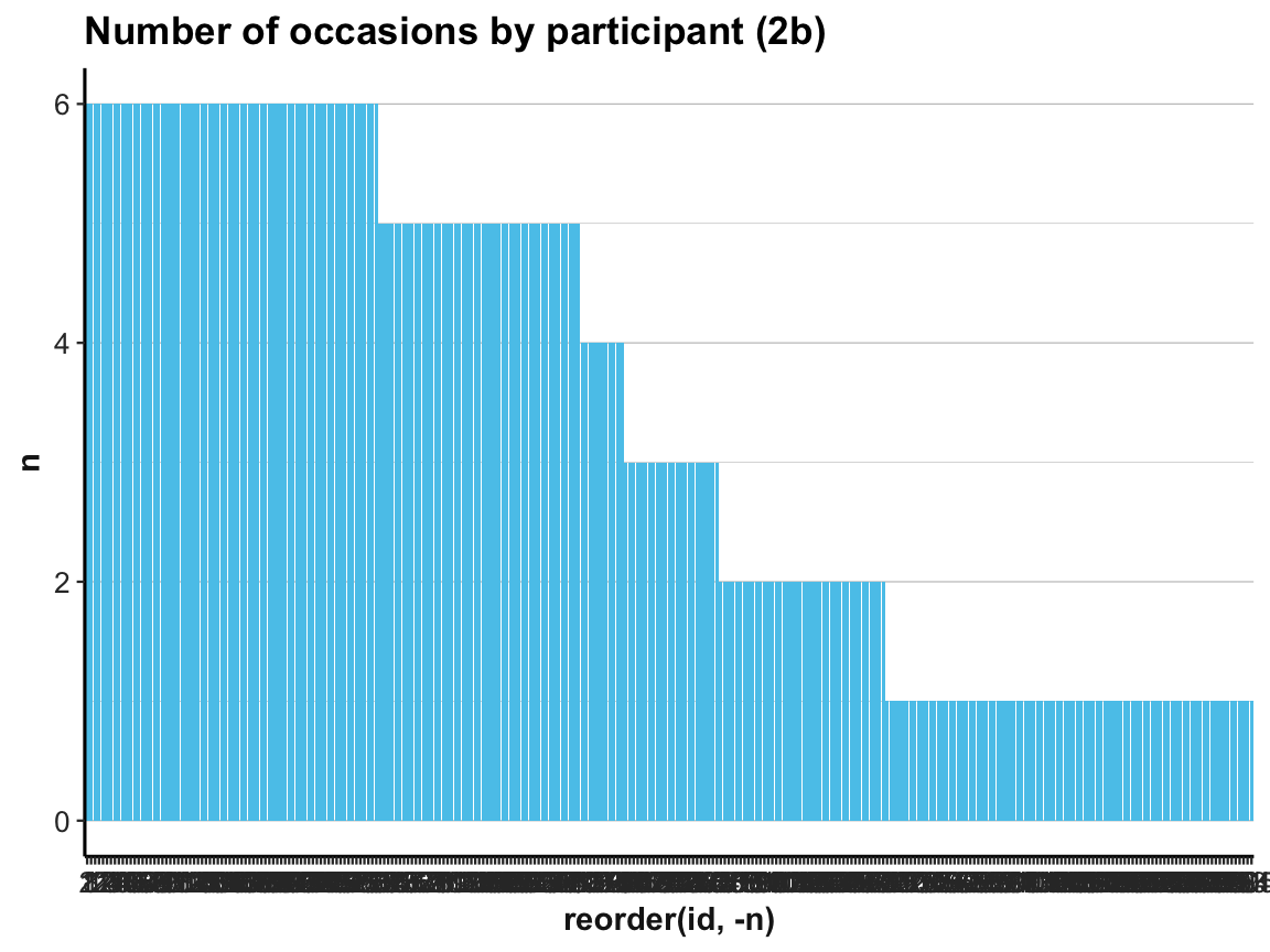
A simpler way of doing this would consist in rearranging the cases in our summary table occ_by_id and saving it as occ_by_id_2.
And as showing hundreds of id values as x-axis labels makes little sense, we add a variable that simply provides the current row number to occ_by_id_2 and then plot n by row:
# (c) more efficient solution:
occ_by_id_2 <- occ_by_id %>%
  arrange(desc(n))
occ_by_id_2
#> # A tibble: 295 × 2
#> # Groups:   id [295]
#>       id     n
#>    <dbl> <int>
#>  1     2     6
#>  2     8     6
#>  3    11     6
#>  4    12     6
#>  5    14     6
#>  6    24     6
#>  7    27     6
#>  8    28     6
#>  9    37     6
#> 10    38     6
#> # … with 285 more rows

## (+) Add rownames (1:n) as a column:
# occ_by_id_2 <- rownames_to_column(occ_by_id_2)  # rowname is character variable!

## (+) Add a variable row that contains index of current row:
occ_by_id_2$row <- 1:nrow(occ_by_id_2)
occ_by_id_2
#> # A tibble: 295 × 3
#> # Groups:   id [295]
#>       id     n   row
#>    <dbl> <int> <int>
#>  1     2     6     1
#>  2     8     6     2
#>  3    11     6     3
#>  4    12     6     4
#>  5    14     6     5
#>  6    24     6     6
#>  7    27     6     7
#>  8    28     6     8
#>  9    37     6     9
#> 10    38     6    10
#> # … with 285 more rows

ggplot(occ_by_id_2) +
  geom_bar(aes(x = row, y = n), stat = "identity", fill = unikn::Seeblau) +
  labs(title = "Number of occasions by participant (2c)") +
  ds4psy::theme_ds4psy()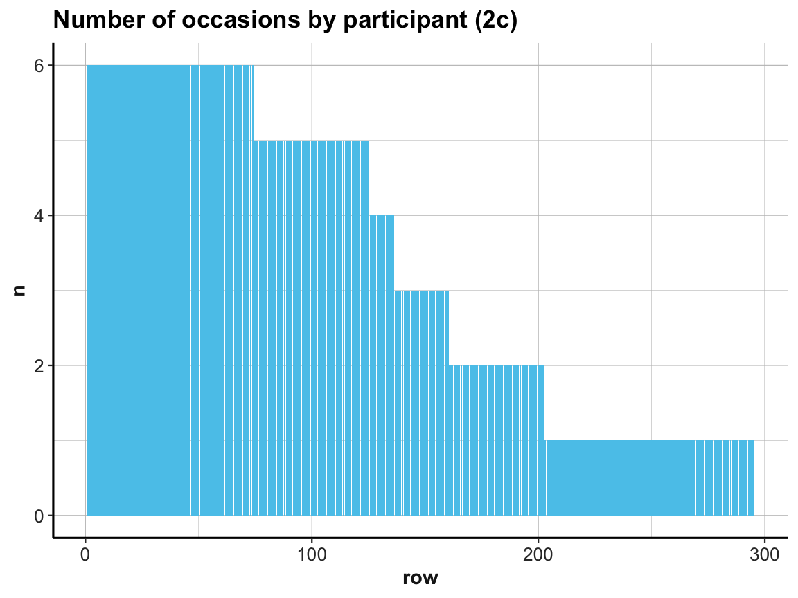
Our exploration shows that every participant was measured on at least 1 and at most 6 occasions (check range(occ_by_id$n) to verify this).
This raises two additional questions:
Was every participant measured on occasion 0 (i.e., the pre-test)?
Was every participant measured only once per occasion?
The first question may seem a bit picky, but do we really know that nobody showed up late (i.e., missed occasion 0) for the study? Actually, we do already know this, since we counted the number of participants and the number of participants per occasion above:
the study sample contains 295 participants (check
nrow(posPsy_p_info)), andthe count of participants per occasion showed a value of 295 for occasion 0 in
id_by_occ.
For the record, we testify that:
nrow(posPsy_p_info)  # 295 participants
#> [1] 295
id_by_occ$n[1]       # 295 participants counted (as n) in 1st line of id_by_occ
#> [1] 295
nrow(posPsy_p_info) == id_by_occ$n[1]  # TRUE (qed)
#> [1] TRUE
To answer the second question, we can count the number of lines in df per id and occasion and then check whether any unexpected values (different from 1, i.e., n != 1) occur:
# Table (with dplyr):
id_occ <- df %>%
  group_by(id, occasion) %>%
  count()
id_occ
#> # A tibble: 990 × 3
#> # Groups:   id, occasion [990]
#>       id occasion     n
#>    <dbl>    <dbl> <int>
#>  1     1        0     1
#>  2     1        1     1
#>  3     2        0     1
#>  4     2        1     1
#>  5     2        2     1
#>  6     2        3     1
#>  7     2        4     1
#>  8     2        5     1
#>  9     3        0     1
#> 10     3        2     1
#> # … with 980 more rows

summary(id_occ$occasion)
#>    Min. 1st Qu.  Median    Mean 3rd Qu.    Max.
#>   0.000   0.000   2.000   2.028   4.000   5.000
summary(id_occ$n)  # Max is 2 (not 1)!
#>    Min. 1st Qu.  Median    Mean 3rd Qu.    Max.
#>   1.000   1.000   1.000   1.002   1.000   2.000

# Do some occasions occur with other counts than 1?
id_occ %>%
  filter(n != 1)
#> # A tibble: 2 × 3
#> # Groups:   id, occasion [2]
#>      id occasion     n
#>   <dbl>    <dbl> <int>
#> 1     8        2     2
#> 2    64        4     2

# => Participants with id of 8 and 64:
#    2 instances of occasion 2 and 4, respectively.
Importantly, 2 participants (8 and 64) are counted twice for an occasion (2 and 4, respectively).
Compare our counts of id_by_occ with Table 1 (on p. 4, of Woodworth, O’Brien-Malone, Diamond, & Schüz, 2018), which also shows the number of participants who responded on each of the six measurement occasions): As the counts in this table correspond to ours, the repeated instances for some measurement occasions (which could indicate data entry errors, but also be due to large variability in the time inteval between measurements) were not reported in the original analysis (i.e., Table 1). This suggests that the two participants with repeated occasions were simply counted and measured twice on one occasion and missing from another one.
Our exploration so far motivates at least two related questions:
Are the dropouts (i.e., people present at first, but absent at one or more later measurements) random or systematic?
How does the number of
elapsed.dayscorrespond to the measurement occasions?
We’ll save the 1st of these questions for practice purposes (see Exercise 2 in Section 4.4.2 below). The 2nd question directs our attention to the temporal features of measurements and motivates a general principle and corresponding practice that motivates different ways of viewing the distributions of values.
4.2.5 Viewing distributions
- Principle 6: Inspect the distributions of variables.
A simple way to get an initial idea about the range of a variable x is to compute summary(x). However, plotting the distribution of individual variables (e.g., with histograms or frequency polygons) provides a more informative overview over the distributions of values present in the data (e.g., whether the assumptions of statistical tests are met) and can provide valuable hints regarding unusual or unexpected values.
Histograms
A histogram provides a cumulative overview of a variable’s values along one dimension (see our examples in Chapter 2). Here, we use a histogram of elapsed.days to address the question:
- How are the measurement times (
elapsed.days) distributed overall (and relative to the stated times of eachoccasion)?
To compare the actual measurement times with our expectations, we first use summary() to get a descriptive overview of elapsed.days and plot a corresponding histogram:
# Data:
df <- AHI_CESD

# Descriptive summary:
summary(df$elapsed.days)
#>    Min. 1st Qu.  Median    Mean 3rd Qu.    Max.
#>    0.00    0.00   14.79   44.31   90.96  223.82

# Histogram of elapsed days (only):
ggplot(df, aes(x = elapsed.days)) +
  geom_histogram(fill = unikn::Seeblau, binwidth = 1) +
  labs(title = "Distribution of the elapsed.days variable") +
  ds4psy::theme_ds4psy()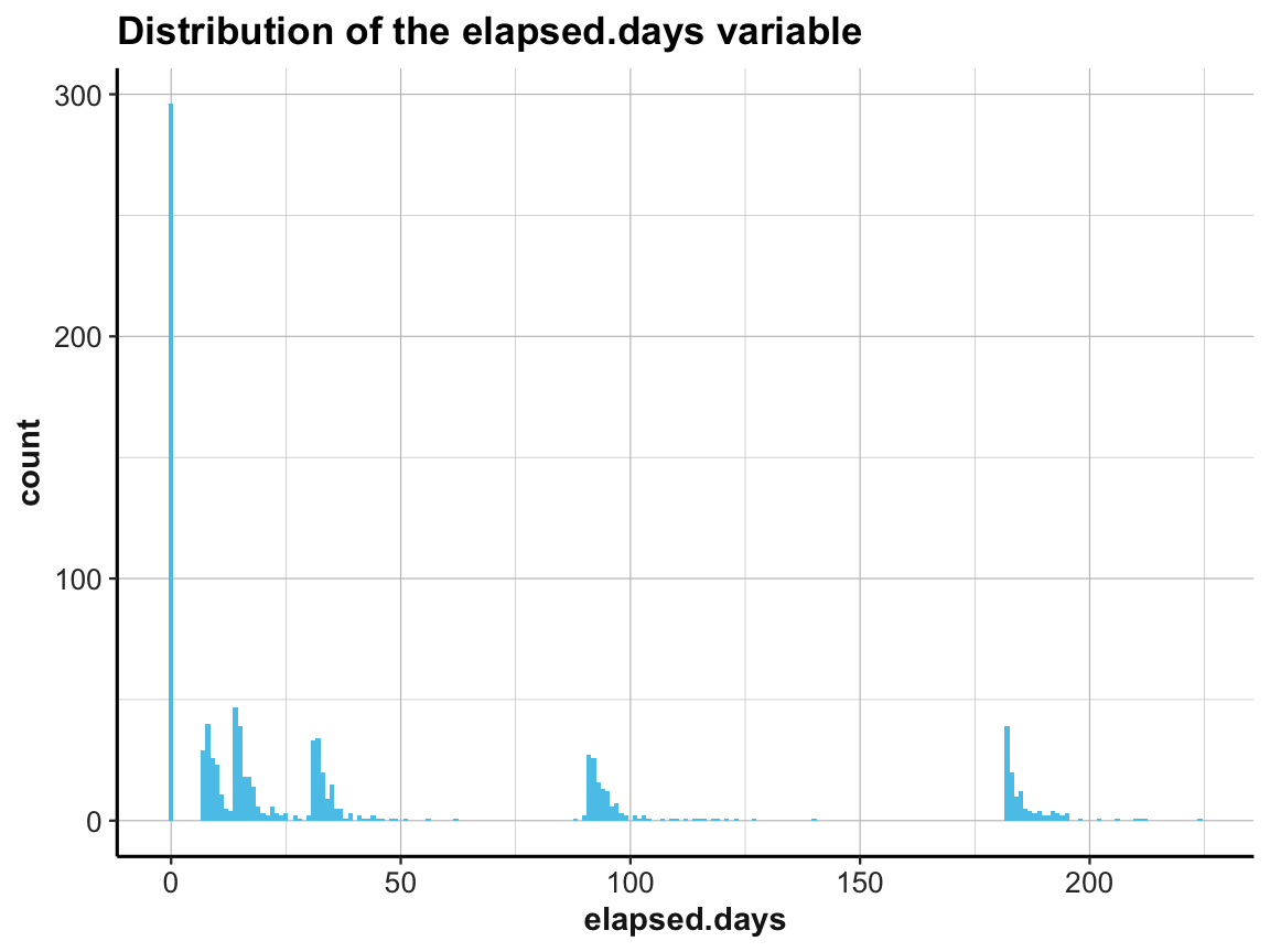
This shows that the measurement times (denoted by elapsed.days) were not distributed homogeneously, but rather clustered around certain days. It seems plausible that the clusters should be located at the stated times of each occasion.
To verify this, we create a vector occ_days that contains the values of our expectations regarding these occasions (based on Table 1 of Woodworth, O’Brien-Malone, Diamond, & Schüz, 2018):
# Vector of official measurement days [based on Table 1 (p. 4)]:
occ_days <- c(0, 7, 14, 38, 98, 189)
names(occ_days) <- c("0: pre-test", "1: post-test",  # pre/post enrolment
                     "2: 1-week",   "3: 1-month",    # 4 follow-ups
                     "4: 3-months", "5: 6-months")
occ_days
#>  0: pre-test 1: post-test    2: 1-week   3: 1-month  4: 3-months  5: 6-months
#>            0            7           14           38           98          189
Now we can plot the distribution of elapsed.days and use the additional vector occ_days to mark our corresponding expectations by vertical lines:
# (a) Histogram:
ggplot(df, aes(x = elapsed.days)) +
  geom_histogram(fill = unikn::Seeblau, binwidth = 1) +
  geom_vline(xintercept = occ_days, color = "firebrick", linetype = 2) +
  labs(title = "Distribution of occasions (a: histogram)") +
  ds4psy::theme_ds4psy()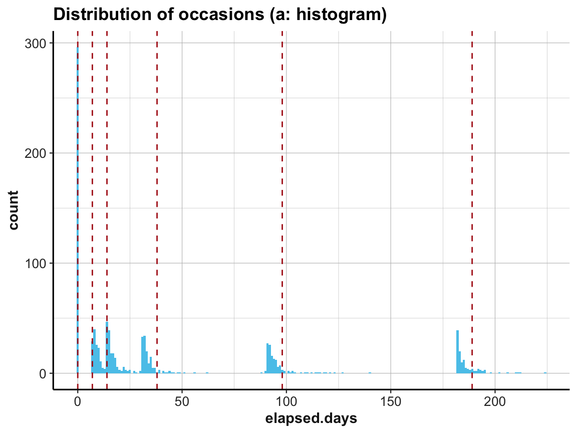
Interestingly, the first three occasions are as expected, but Occasions 4 to 6 appear to be shifted to the left. The measurements according to elapsed.days seem to have happened about seven days earlier than stated (or the values have been adjusted somehow).
Alternative ways of viewing distributions
Alternative ways to plot cumulative distributions of values include frequency polygons, density plots, and rug plots.
# (b) frequency polygon:
ggplot(df, aes(x = elapsed.days)) +
  # geom_histogram(fill = unikn::Seeblau, binwidth = 1) +
  geom_freqpoly(binwidth = 7, color = unikn::Seeblau) +
  geom_vline(xintercept = occ_days, color = "firebrick", linetype = 2) +
  labs(title = "Distribution of occasions (b: frequency polygon)") +
  ds4psy::theme_ds4psy()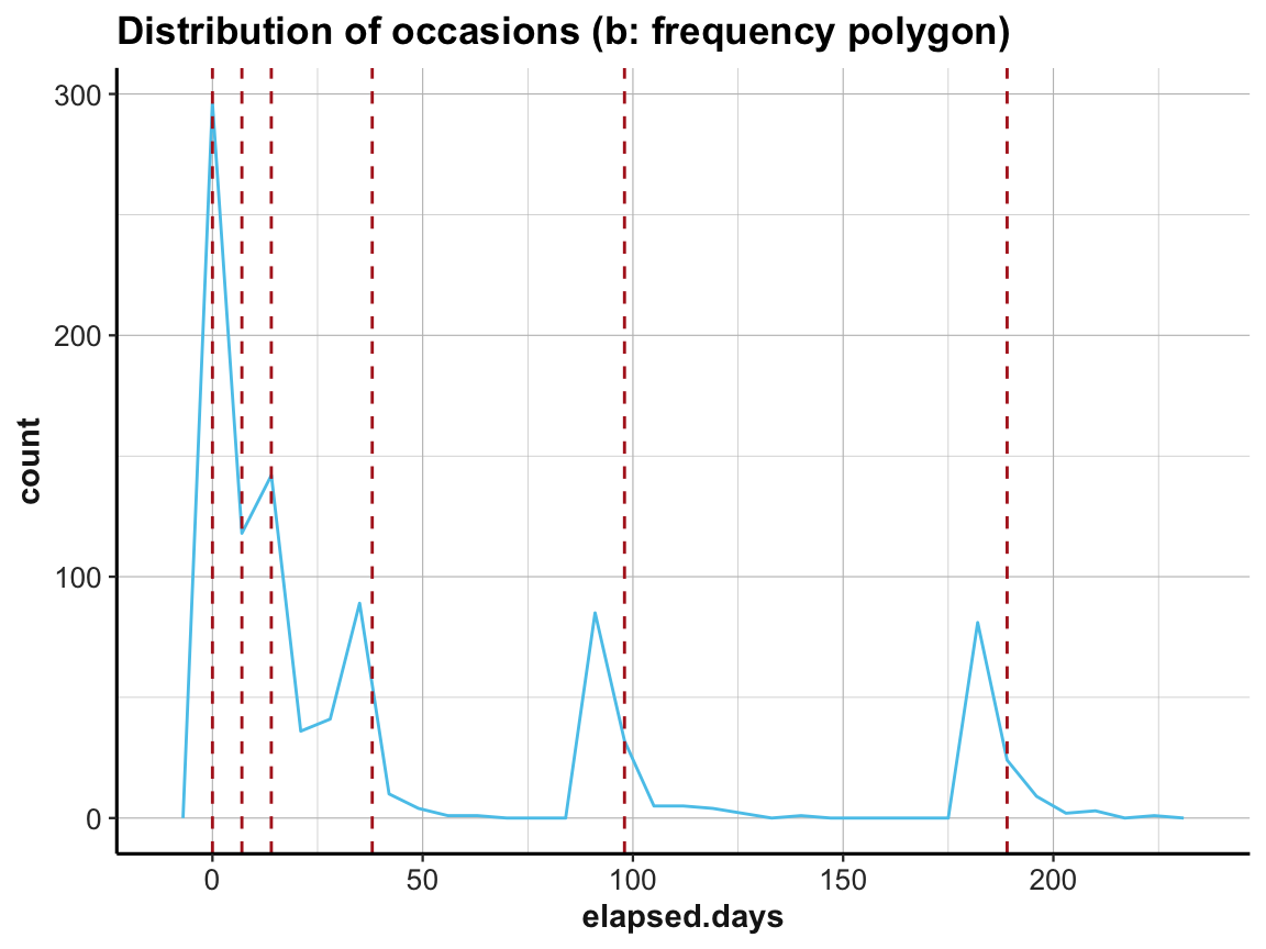
# (c) density plot:
ggplot(df, aes(x = elapsed.days)) +
  # geom_histogram(fill = unikn::Seeblau, binwidth = 1) +
  geom_density(fill = unikn::Seeblau) +
  geom_vline(xintercept = occ_days, color = "firebrick", linetype = 2) +
  labs(title = "Distribution of occasions (c: density plot)") +
  ds4psy::theme_ds4psy()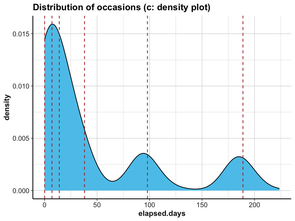
# (d) rug plot:
ggplot(df, aes(x = elapsed.days)) +
  geom_freqpoly(binwidth = 7, color = unikn::Seeblau) +
  geom_rug(size = 1, color = "black", alpha = 1/4) +
  geom_vline(xintercept = occ_days, color = "firebrick", linetype = 2) +
  labs(title = "Distribution of occasions (d: frequency polygon with rug plot)") +
  ds4psy::theme_ds4psy()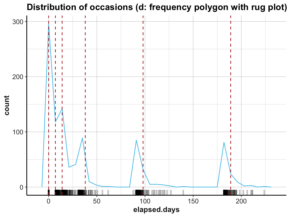
4.2.6 Filtering cases
Once we have detected something noteworthy or strange, we may want to mark or exclude some cases (rows) or variables (columns).
As we can easily select rows and filter cases (see the dplyr functions select() and filter() in Chapter 3), it is helpful to add some dedicated filter variables to our data (rather than deleting cases from the data).
Let’s use the participant data posPsy_p_info to illustrate how we can create and use filter variables:
# Data:
p_info <- ds4psy::posPsy_p_info  # from ds4psy package
dim(p_info)  # 295 x 6
#> [1] 295   6
In previous exercises —
Exercise 5 of Chapter 2) and
Exercise 5 of Chapter 3) —
we asked and answered the question:
- What is the
agerange of participants (overall and byintervention)?
by using dplyr pipes and ggplot2 calls.
For instance, we can visualize the distribution of age values by plotting histograms:
# Age range:
range(p_info$age)
#> [1] 18 83
summary(p_info$age)
#>    Min. 1st Qu.  Median    Mean 3rd Qu.    Max.
#>   18.00   34.00   44.00   43.76   52.00   83.00

# Histogramm showing the overall distribution of age
ggplot(p_info) +
  geom_histogram(mapping = aes(age), binwidth = 2, fill = "gold", col = "black") +
  labs(title = "Distribution of age values (overall)") +
  ds4psy::theme_ds4psy()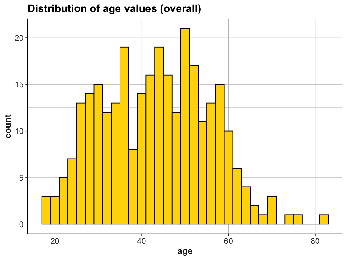
# Create 4 histogramms showing the distribution of age by intervention:
ggplot(p_info) +
  geom_histogram(mapping = aes(age), binwidth = 5, fill = unikn::Seeblau, col = "black") +
  labs(title = "Distribution of age values by intervention (all data)") +
  facet_grid(.~intervention) +
  ds4psy::theme_ds4psy()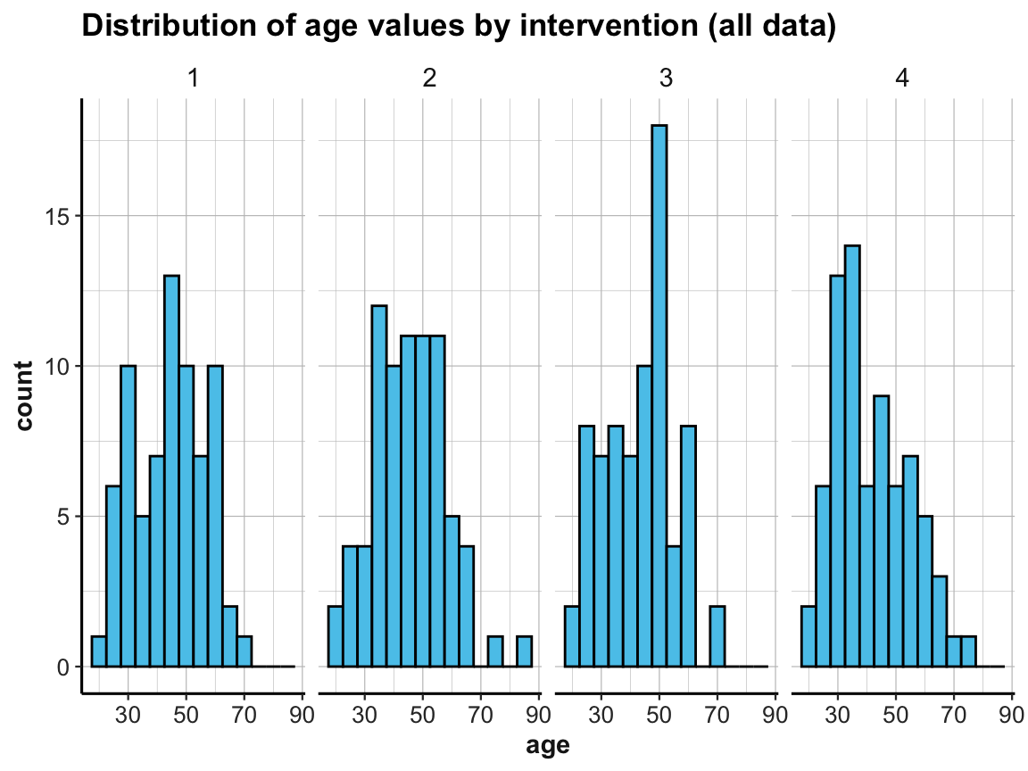
For practice purposes, suppose we only wanted to include participants up to an age of 70 years in some analysis.
Rather than dropping these participants from the file, we can introduce a filter variable that is TRUE when some criterion (here: age > 70) is satisfied, and otherwise FALSE:
- Principle 7: Use filter variables to identify and select sub-sets of observations.
The above histograms showed that our data contained cases of people whose age is over 70.
We can use base R commands to count and identify those people in p_info:
# How many participants are over 70?
sum(p_info$age > 70)  # 6 people with age > 70
#> [1] 6

# Which ones?
which(p_info$age > 70)  #  51  83 114 155 215 244
#> [1]  51  83 114 155 215 244
Alternatively, we can use dplyr to filter the data by this criterion age > 70:
# Show details of subset (using dplyr):
p_info %>%
  filter(age > 70)
#> # A tibble: 6 × 6
#>      id intervention   sex   age  educ income
#>   <dbl>        <dbl> <dbl> <dbl> <dbl>  <dbl>
#> 1    51            2     1    83     2      2
#> 2    83            4     1    71     2      1
#> 3   114            1     1    71     4      1
#> 4   155            3     2    71     4      1
#> 5   215            4     1    75     3      2
#> 6   244            2     1    77     3      2
If this age criterion is important for future analyses, we could create a dedicated filter variable and add it to p_info:
# Add a corresponding filter variable to df:
p_info <- p_info %>%
  mutate(over_70 = (age > 70))

dim(p_info) # => now 7 variables (including a logical variable over_70)
#> [1] 295   7
head(p_info)
#> # A tibble: 6 × 7
#>      id intervention   sex   age  educ income over_70
#>   <dbl>        <dbl> <dbl> <dbl> <dbl>  <dbl> <lgl>
#> 1     1            4     2    35     5      3 FALSE
#> 2     2            1     1    59     1      1 FALSE
#> 3     3            4     1    51     4      3 FALSE
#> 4     4            3     1    50     5      2 FALSE
#> 5     5            2     2    58     5      2 FALSE
#> 6     6            1     1    31     5      1 FALSE

# Show details of subset (filtering by over_70 variable):
p_info %>%
  filter(over_70)
#> # A tibble: 6 × 7
#>      id intervention   sex   age  educ income over_70
#>   <dbl>        <dbl> <dbl> <dbl> <dbl>  <dbl> <lgl>
#> 1    51            2     1    83     2      2 TRUE
#> 2    83            4     1    71     2      1 TRUE
#> 3   114            1     1    71     4      1 TRUE
#> 4   155            3     2    71     4      1 TRUE
#> 5   215            4     1    75     3      2 TRUE
#> 6   244            2     1    77     3      2 TRUE
In the present case, filter(over_70) is about as long and complicated as filter(age > 70) and thus not really necessary. However, defining explicit filter variables can pay off when constructing more complex filter conditions or when needing several sub-sets of the data (e.g., for cross-validation purposes). Given an explicit filter variable, we can later filter any analysis (or plot) on the fly. For instance, if we wanted to check the age distribution of participants up to 70 years:
# Age distribution of participants up to 70 (i.e., not over 70):
p_info %>%
  filter(!over_70) %>%
  ggplot() +
  geom_histogram(mapping = aes(age), binwidth = 5, fill = unikn::Pinky, col = "black") +
  labs(title = "Distribution of age values by intervention (without participants over 70)") +
  facet_grid(.~intervention) +
ds4psy::theme_ds4psy() 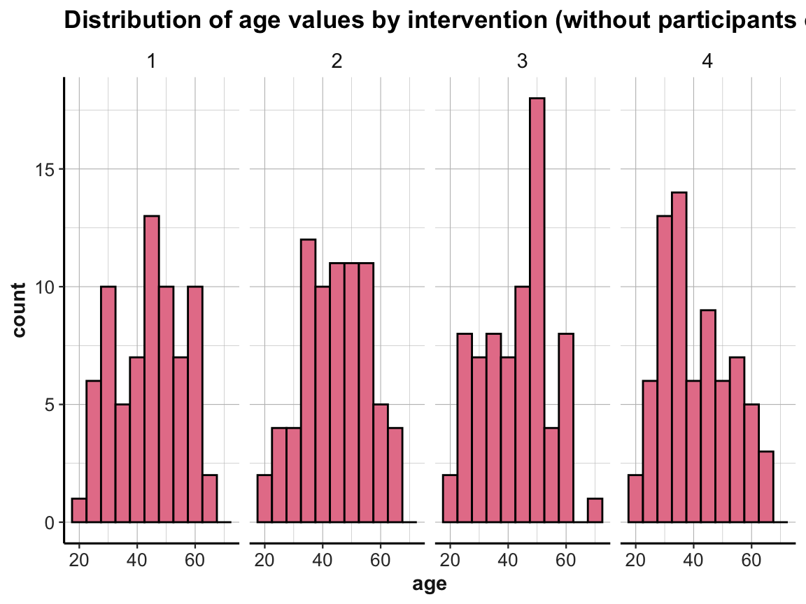
Filter variables also allow us to quickly create sub-sets of the data:
# Alternatively, we can quickly create sub-sets of the data:
p_info_young <- p_info %>%
  filter(!over_70)

p_info_old <- p_info %>%
  filter(over_70)

dim(p_info_young)  # 289 participants (295 - 6) x 7 variables
#> [1] 289   7
dim(p_info_old)    #   6 participants           x 7 variables
#> [1] 6 7
Overall, the convenience of using filter() in a dplyr pipe often renders it unnecessary to create dedicated filter variables.
However, if a dataset is reduced to some subset of cases (e.g., by excluding some survey participants from an analysis, as they failed attention checks or stated that their data cannot be trusted) it is good practice to explicitly distinguish between valid and invalid cases, rather than just deleting the invalid ones.
An important reason for explicitly creating and adding filter variables to the data is to document the process of data analysis. Rather than filtering a subset of data on the fly, adding key filter variables to the dataset makes it easier to comprehend and replicate all analysis steps in the future.
4.2.7 Viewing relationships
Relationships are inherently interesting, even when just considering those between variables. Actually, most research hypotheses involve relationships or measures of correspondence between two or more (continuous or categorical) variables. This motivates another principle:
- Principle 8: Inspect relationships between variables.
In practice, we can inspect relationships between variables by various types of plots that show the values of some variable(s) as a function of values or levels of others. Our choice of plots depend on the point we intend to make, but also on the types of variables that are being considered.
Scatterplots
A scatterplot shows the relationship between two (typically continuous) variables:
# Data:
df <- AHI_CESD
dim(df)  # 992 50
#> [1] 992  50
# df

# Scatterplot (overall):
ggplot(df) +
  geom_point(aes(x = ahiTotal, y = cesdTotal), size = 2, alpha = 1/4) +
  geom_abline(intercept = 100, slope = -1, col = unikn::Seeblau) +
  labs(title = "Relationship between ahiTotal and cesdTotal (overall)",
       x = "ahiTotal", y = "cesdTotal") +
  ds4psy::theme_ds4psy()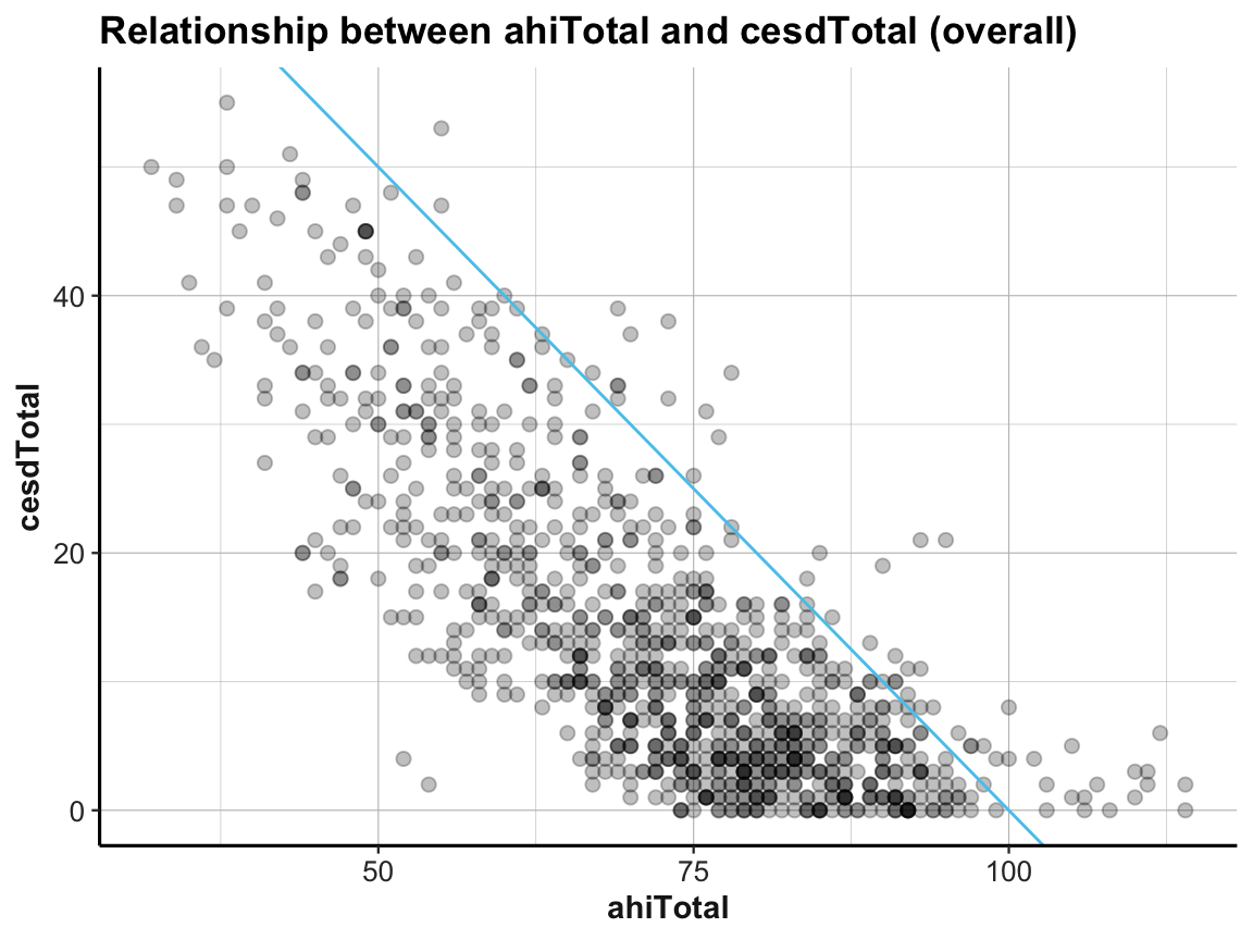
# Scatterplot (with facets):
ggplot(df) +
  geom_point(aes(x = ahiTotal, y = cesdTotal), size = 1, alpha = 1/3) +
  geom_abline(intercept = 100, slope = -1, col = unikn::Seeblau) +
  labs(title = "Relationship between ahiTotal and cesdTotal (by intervention)",
       x = "ahiTotal", y = "cesdTotal") +
  facet_wrap(~intervention) +
  ds4psy::theme_ds4psy()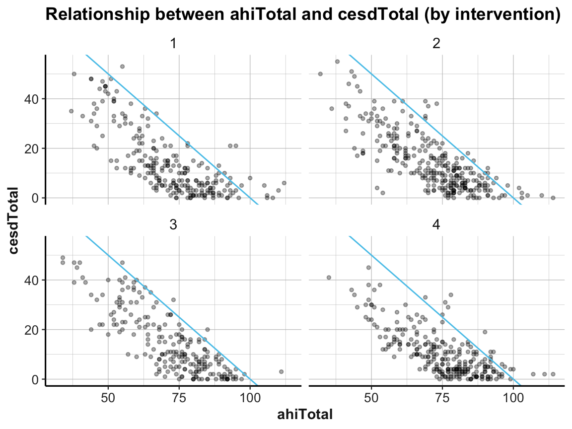
4.2.8 Trends and developments
A special relationship often of interest in psychology and other sciences are trends or developments: A trend shows how some variable changes over time. When studying trends or developments, the time variable is not always explicitly expressed in units of time (e.g., days, weeks, months), but often encoded implicitly (e.g., as repeated measurements).
- Principle 9: Inspect trends over time or repeated measurements.
Trends can be assessed and expressed in many ways. Any data that measures some variable more than once and uses some unit of time (e.g., in AHI_CESD we have a choice between occasion vs. elapsed.days) can be used to address the question:
- How do the values of a variable (or scores on some scale) change over time?
Trends as tables, bar plots, or line graphs
To visualize trends, we typically map the temporal variable (in units of time or the counts of repeated measurements) to the x-axis of a plot. If this is the case, many different types of plots can express developments over time.
In our chapter on visualizing data (see Chapter 2), we have already encountered
bar plots (Section 2.4.2) and
line graphs (Section 2.4.3), which are well-suited to plot trends.
Actually, our bar plots above (using either the raw data of AHI_CESD or our summary table id_by_occ to show the number of participants by occasion) expressed a trend: How many participants dropped out of the study from occasion 0 to 6. A table showing this trend as a column of summary values was computed (and saved as id_by_occ) above:
id_by_occ
#> # A tibble: 6 × 2
#> # Groups:   occasion [6]
#>   occasion     n
#>      <dbl> <int>
#> 1        0   295
#> 2        1   147
#> 3        2   157
#> 4        3   139
#> 5        4   134
#> 6        5   120
We can visualize the number of participants by occasion by expressing our summary table id_by_occ in a line graph:
# Line plot: Using id_by_occ (from above) as input:
line_dropouts <- ggplot(id_by_occ, aes(x = occasion)) +
  geom_line(aes(y = n), size = 1.5, color = "gold") +
  geom_point(aes(y = n), shape = 21, size = 4, stroke = 1, color = "black", fill = "gold") +
  labs(title = "Number of participants per occasion (line)") +
  ds4psy::theme_ds4psy()
line_dropouts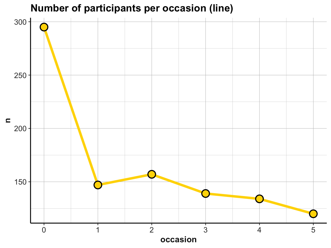
When comparing this plot with our corresponding bar plot above, we note that ggplot2 has automatically scaled the y-axis to a range around our frequency values n (here: values from about 110 to 300). As a consequence, the number of dropouts over occasions looks more dramatic in the line graph than it did in the bar plot. We can correct for this difference by explicitly scaling the y-axis of the line graph or by plotting both geoms in one plot. And whenever combining multiple geoms in the same plot, we can move common aesthetic elements (e.g., y = n) to the 1st line of our ggplot() command, so that we don’t have to repeat them and can only list the specific aesthetics of each geom later:
## Data:
# knitr::kable(id_by_occ)

# Line plot (from above) with corrected y-scale:
line_dropouts +
  scale_y_continuous(limits = c(0, 300))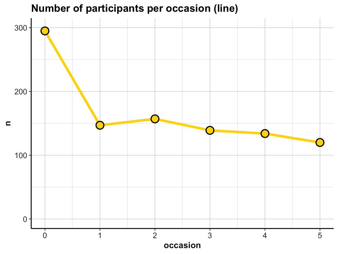
# Multiple geoms:
# Bar + line plot: Using id_by_occ (from above) as input:
ggplot(id_by_occ, aes(x = occasion, y = n)) +
  geom_bar(stat = "identity", fill = unikn::Seeblau) +
  geom_line(size = 1.5, color = "gold") +
  geom_point(shape = 21, size = 4, stroke = 1, color = "black", fill = "gold") +
  labs(title = "Number of participants per occasion (bar + line)") +
  ds4psy::theme_ds4psy()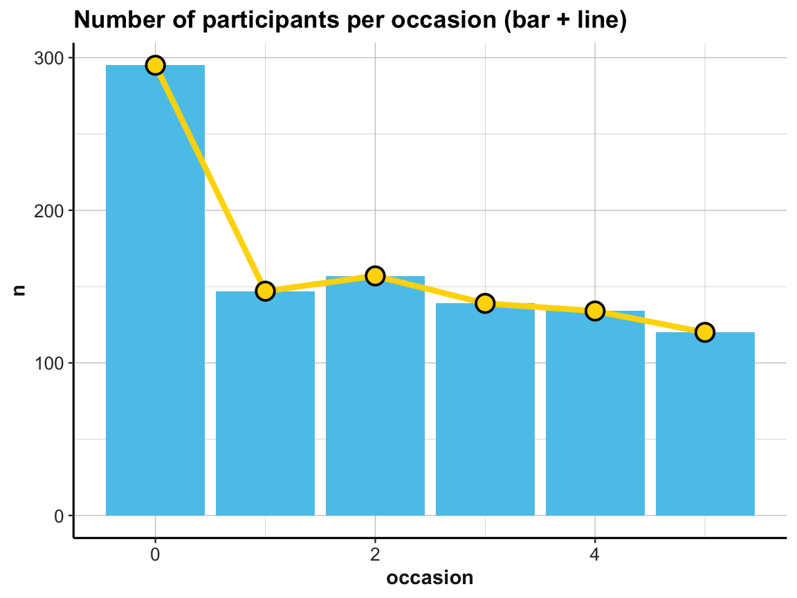
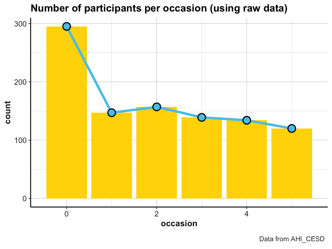
Practice
The line graph just shown used a tiny summary table (id_by_occ) as its data input.
- Can you draw the same line plot from the
AHI_CESDraw data? If yes, try imitating the following look (but note that — irrespective of appearances — these plots are not sponsored by Ikea):
- Visit the section Know when to include 0 (of Rafael A. Irizarry’s Introduction to Data Science) and explain how and why scaling the y-axis can create confusing or misleading representations.
4.2.9 Viewing more trends
Two key questions in the context of our study are:
How do participants’ scores of happiness (
ahiTotal) and depression (cesdTotal) change over time?Do these trends over time vary by a participant’s type of
intervention?
Visualizing these trends will bring us quite close towards drawing potential conclusions, except for a few statistical tests.
Trends over time
To answer the first question for the happiness scores (ahiTotal), we compute our desired values with dplyr:
# Data:
df <- AHI_CESD
dim(df)  # 992 50
#> [1] 992  50
# df

# Table 1:
# Frequency n, mean ahiTotal, and mean cesdTotal by occasion:
tab_scores_by_occ <- df %>%
  group_by(occasion) %>%
  summarise(n = n(),
            ahiTotal_mn = mean(ahiTotal),
            cesdTotal_mn = mean(cesdTotal)
            )
knitr::kable(head(tab_scores_by_occ))| occasion | n | ahiTotal_mn | cesdTotal_mn |
|---|---|---|---|
| 0 | 295 | 69.70508 | 15.06441 |
| 1 | 147 | 72.35374 | 12.96599 |
| 2 | 157 | 73.04459 | 12.36943 |
| 3 | 139 | 74.55396 | 11.74101 |
| 4 | 134 | 75.19403 | 11.70896 |
| 5 | 120 | 75.83333 | 12.83333 |
Our table tab_scores_by_occ summarizes the trends of the mean ahiTotal and cesdTotal values in numeric form.
To visualize the trend in ahiTotal_mn scores, we could plot the corresponding column in table tab_scores_by_occ as a line graph:
# Line graph of scores over occasions:
plot_ahi_trend <- ggplot(tab_scores_by_occ, aes(x = occasion, y = ahiTotal_mn)) +
  # geom_bar(aes(y = n), stat = "identity", fill = unikn::Seeblau) +
  geom_line(size = 1.5, color = unikn::Seegruen) +
  geom_point(shape = 21, size = 4, stroke = 1, color = "black", fill = unikn::Seegruen) +
  labs(title = "ahiTotal_mn by occasion (line)") +
  ds4psy::theme_ds4psy()
plot_ahi_trend
Note that ggplot2 automatically restricted the range of y-values, which emphasizes the increase in ahiTotal_mn over measurement occasions.
The increase in happiness looks less dramatic when forcing a full y-scale (with values from 0 to 80):
# Line graph with corrected y-scale:
plot_ahi_trend +
  scale_y_continuous(limits = c(0, 80))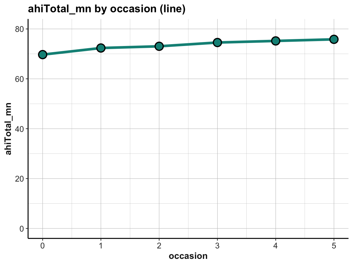
Practice
- Create the same plots for mean depression scores
cesdTotal. Can you plot both lines in the same plot? What do you see?
Answer: Here is the result of a possible solution:
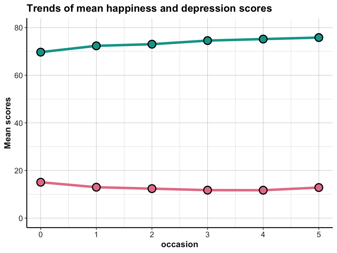
The effects are small, but it appears that the average happiness scores are increasing and the average depression scores are (mostly) decreasing over time. This is what we would expect, if the interventions were successful in increasing happiness and decreasing depression.
Trends by intervention
To study the trends of scores by participant’s type of intervention, we need to slightly adjust our workflow by adding the intervention variable to our initial summary table, so that we can later use it in our plotting commands:
# Data:
df <- AHI_CESD
# dim(df)  # 992 50

# Table 2:
# Scores (n, ahiTotal_mn, and cesdTotal_mn) by occasion AND intervention:
tab_scores_by_occ_iv <- df %>%
  group_by(occasion, intervention) %>%
  summarise(n = n(),
            ahiTotal_mn = mean(ahiTotal),
            cesdTotal_mn = mean(cesdTotal)
            )
# dim(tab_scores_by_occ_iv)  # 24 x 5

knitr::kable(head(tab_scores_by_occ_iv)) # print table| occasion | intervention | n | ahiTotal_mn | cesdTotal_mn |
|---|---|---|---|---|
| 0 | 1 | 72 | 68.38889 | 15.05556 |
| 0 | 2 | 76 | 68.75000 | 16.21053 |
| 0 | 3 | 74 | 70.18919 | 16.08108 |
| 0 | 4 | 73 | 71.50685 | 12.84932 |
| 1 | 1 | 30 | 69.53333 | 15.30000 |
| 1 | 2 | 48 | 71.58333 | 14.58333 |
In our new summary table tab_scores_by_occ_iv, the mean total scores of happiness and depression are grouped by two independent variables (occasion and intervention). This calls for a 2-dimensional arrangement of the corresponding means.
As before, we will take care of happiness (ahiTotal) and leave it to you to practice on depression (cesdTotal):
# Line graph of scores over occasions AND interventions:
ggplot(tab_scores_by_occ_iv, aes(x = occasion, y = ahiTotal_mn,
                                 group = intervention)) +
  geom_line(size = 1.5, color = unikn::Seegruen) +
  geom_point(shape = 21, size = 4, stroke = 1, color = "black", fill = unikn::Seegruen) +
  labs(title = "ahiTotal_mn by occasion and intervention (a: lines + points)") +
  ds4psy::theme_ds4psy()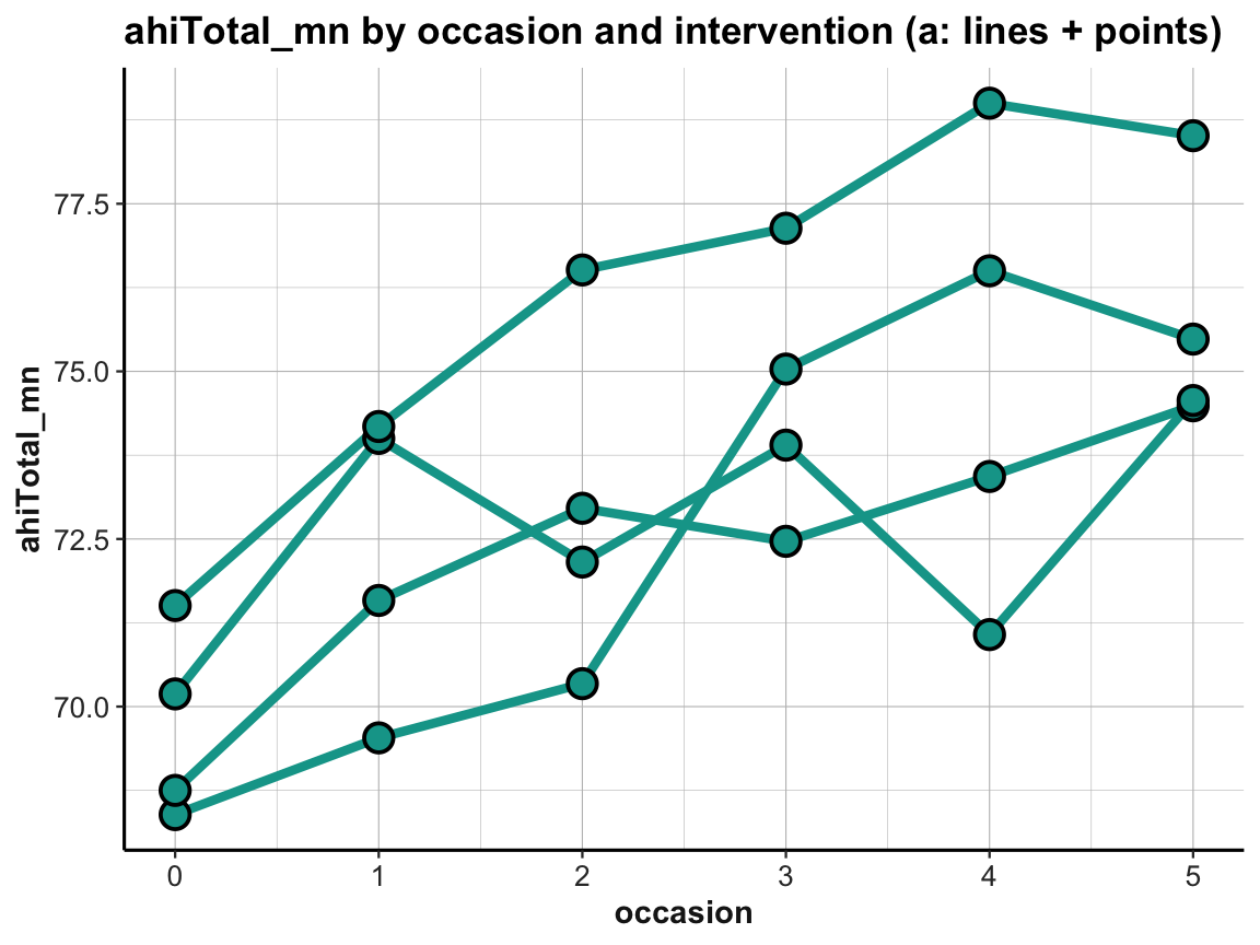
Note that we added group = intervention to the general aesthetics to instruct geom_line to interpret instances of the same intervention but different occasions as belonging together (i.e., to the same line).
When using multiple lines, our previous color settings (in geom_line and geom_point) no longer make sense. Instead, we would like to vary the color of our lines and points by intervention. We can achieve this by also moving these aesthetics to the general aes() of the plot:
# Line graph of scores over occasions AND interventions:
ggplot(tab_scores_by_occ_iv, aes(x = occasion, y = ahiTotal_mn,
                                 group = intervention,
                                 color = intervention,
                                 fill = intervention)) +
  geom_line(size = 1.5) +
  geom_point(shape = 21, size = 4, stroke = 1, color = "black") +
  labs(title = "ahiTotal_mn by occasion and intervention (b: lines + points)") +
  ds4psy::theme_ds4psy()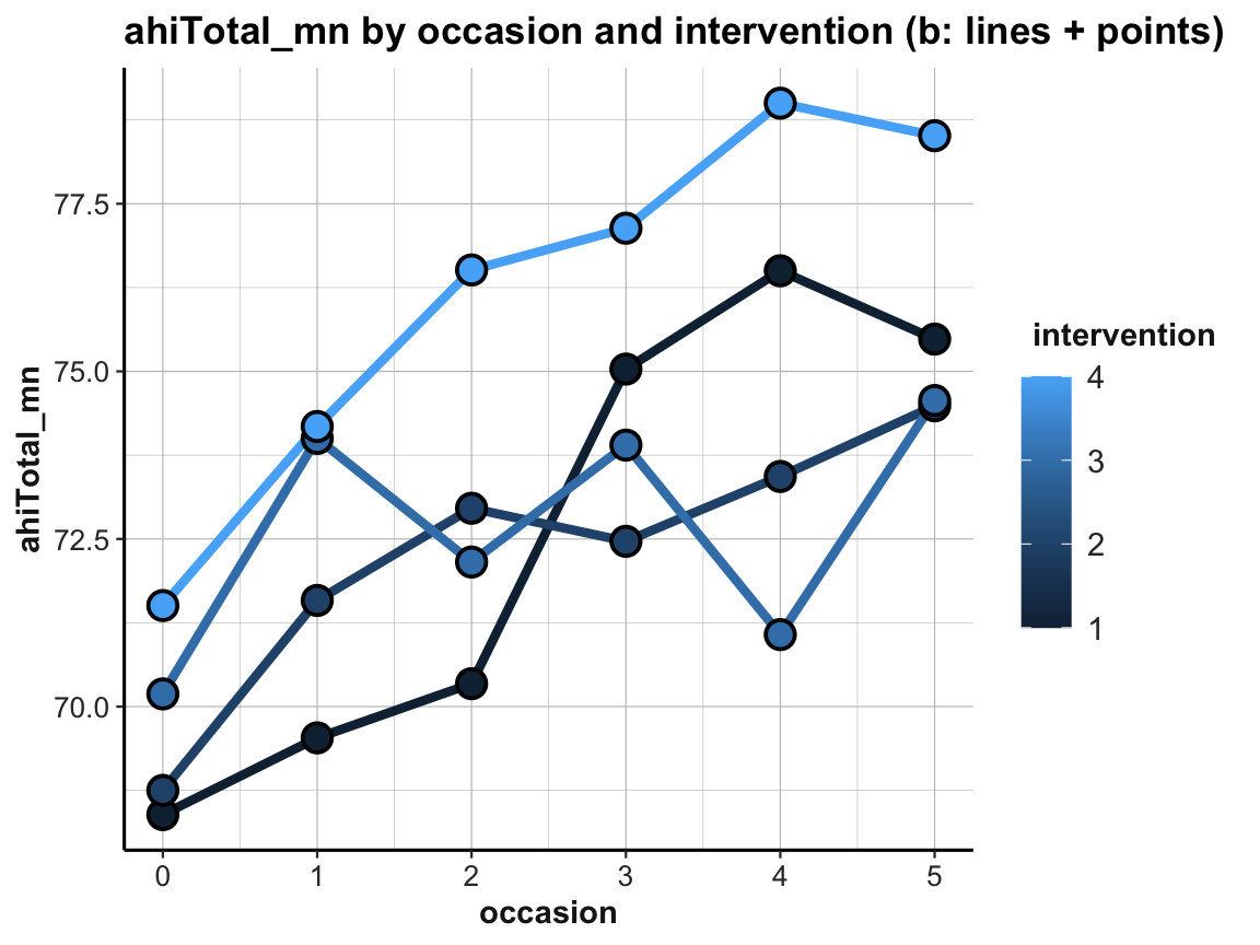
The resulting plot is still suboptimal. The automatic choice of a color scale (in “shades of blue”) and the corresponding legend (on the right) indicates that intervention (i.e., a variable of type integer in df and tab_scores_by_occ_iv) was interpreted as a continuous variable. To turn it into a discrete variable, we can use factor(intervention) for both the color and the fill aesthetics:
# Line graph of scores over occasions AND interventions:
plot_ahi_by_occ_iv <- ggplot(tab_scores_by_occ_iv,
                             aes(x = occasion, y = ahiTotal_mn,
                                 group = intervention,
                                 color = factor(intervention),
                                 fill = factor(intervention))) +
  geom_line(size = 1.5) +
  geom_point(shape = 21, size = 4, stroke = 1, color = "black") +
  labs(title = "ahiTotal_mn by occasion and intervention (c: lines + points, IVs by color)") +
  ds4psy::theme_ds4psy()
plot_ahi_by_occ_iv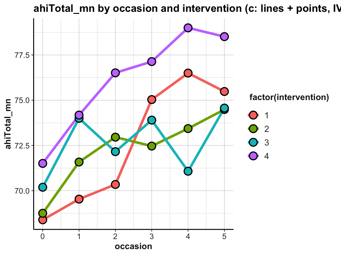
The plot shows that the mean happiness scores increase over occasions in all groups. This is interesting, but also a bit puzzling, given that participants in the control condition (i.e., intervention 4) shows similar improvements as the 3 treatment conditions (interventions 1 to 3). Also, keep in mind that a positive trend is not the same as a statistically significant or practically meaningful effect. In order to establish the latter, we would need to do statistics and discuss the scope and relevance of effect sizes. So before we get too excited, let’s remind ourselves that a more honest version of the same plot would look a lot more sobering (despite manually choosing a new color scheme):
# Line graph of scores over occasions AND interventions:
plot_ahi_by_occ_iv +
  scale_y_continuous(limits = c(0, 80)) +
  scale_color_brewer(palette = "Set1") +
  scale_fill_brewer(palette = "Set1") +
  labs(title = "Mean ahiTotal scores by occasion and intervention (d)",
       x = "Occasion", y = "Happiness (mean ahiTotal)",
       color = "Intervention:", fill = "Intervention:")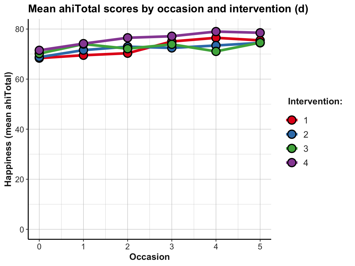
Practice
- Create the same plots for mean depression scores
cesdTotal. What do you see?
Trends of individuals
Whenever viewing and contrasting the trends of groups, we could decide to zoom in further:
- How do these trends look for individual participants?
Well, how nice of you to ask — so let’s see: We can plot individual trends by occasion or by elapsed days. As there are 295 participants, we use transparency and different facets (by intervention) to help de-cluttering the plot:
# Data:
df <- AHI_CESD
dim(df)  # 992 50
#> [1] 992  50
# df

# Individual trends of ahiTotal by occasion and intervention:
ggplot(df, aes(x = occasion, y = ahiTotal, group = id, color = factor(intervention))) +
  geom_line(size = 1, alpha = 1/2) +
  facet_wrap(~intervention) +
  labs(title = "Individual's happiness by occasion for each intervention",
       color = "Intervention:") +
  # scale_color_brewer(palette = "Set1") +
  scale_color_manual(values = usecol(c(Seeblau, Pinky, Peach, Seegruen))) +
  ds4psy::theme_ds4psy()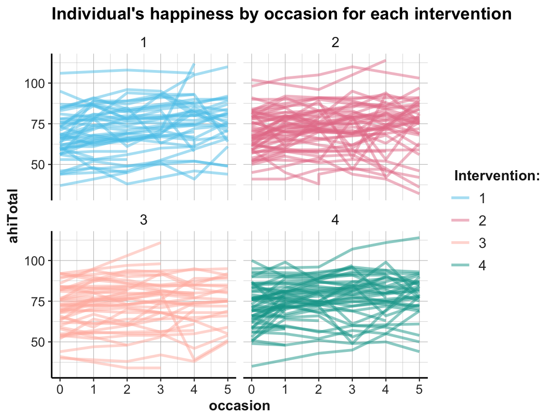
# Individual trends of ahiTotal by elapsed.days and intervention:
ggplot(df, aes(x = elapsed.days, y = ahiTotal, group = id, color = factor(intervention))) +
  geom_line(size = 1, alpha = 1/2) +
  facet_wrap(~intervention) +
  labs(title = "Individual's happiness by elapsed.days for each intervention",
       color = "Intervention:") +
  scale_color_manual(values = usecol(c(Seeblau, Pinky, Peach, Seegruen))) +
    ds4psy::theme_ds4psy()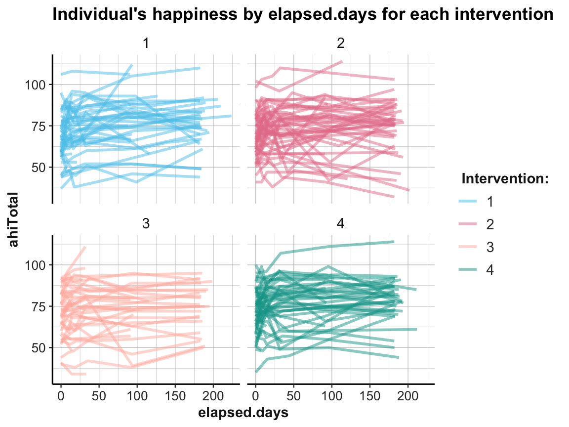
While it is difficult to detect any clear pattern in these plots, it is possible to see some interesting cases that may require closer scrutiny.
Practice
- Create the same plots for the individual trends in depression scores
cesdTotal. What do you see?
4.2.10 Values by category
A measure of correspondence that is common in psychology asks whether the values of some continuous variable vary as a function of the levels of a categorical variable.
With regard to our data in AHI_CESD we may wonder:
- Do the happiness scores (
ahiTotal) vary byintervention?
To visualize the relationship, we cannot use a scatterplot with the mapping x = intervention and y = ahiTotal, as there would only be 4 distinct values for x (go ahead plotting it, if you want to see it). Fortunately, there’s a range of alternatives that allow plotting the raw values and distributions of a continuous variable as a function of a categorical one:
Jitter plot
## Data:
# df <- AHI_CESD
# dim(df)  # 992 50
# df

# (a) Jitterplot:
ggplot(df) +
  geom_jitter(aes(x = intervention, y = ahiTotal), width = .1, size = 2, alpha = 1/4) +
  labs(title = "Happiness values by intervention (a: jitter)",
       x = "intervention", y = "ahiTotal") +
    ds4psy::theme_ds4psy()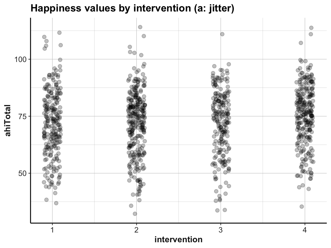
Box plot
# (b) Box plot:
ggplot(df) +
  geom_boxplot(aes(x = factor(intervention), y = ahiTotal), color = unikn::Seeblau, fill = "grey95") +
  labs(title = "Values of ahiTotal by intervention (b: boxplot)",
       x = "intervention", y = "ahiTotal") +
  ds4psy::theme_ds4psy()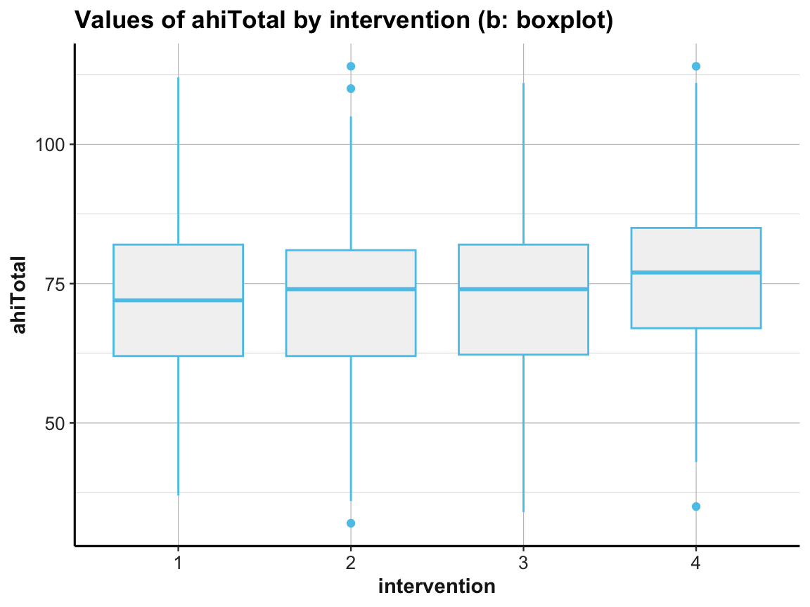
Note that we used factor(intervention) to create a discrete variable, as intervention was an integer (i.e., contiuous) variable.
Violin plot
# (c) Violin plot:
ggplot(df) +
  geom_violin(aes(x = factor(intervention), y = ahiTotal), size = 1.5, color = unikn::Seeblau, fill = "whitesmoke") +
  labs(title = "Values of ahiTotal by intervention (c: violin)",
       x = "intervention", y = "ahiTotal") +
  ds4psy::theme_ds4psy()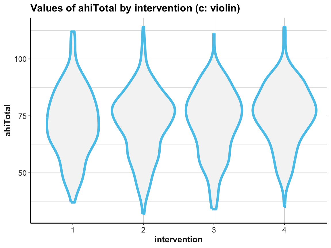
Combinations
Sometimes combining 2 or more geoms can be more informative than just using one:
# (d) Combining jitter with boxplot:
ggplot(df) +
  geom_boxplot(aes(x = factor(intervention), y = ahiTotal), color = unikn::Seeblau, fill = "grey95", alpha = 1) +
  geom_jitter(aes(x = intervention, y = ahiTotal), width = .1, size = 2, alpha = 1/4) +
  labs(title = "Values of ahiTotal by intervention (d: jittered boxes)",
       x = "intervention", y = "ahiTotal") +
    ds4psy::theme_ds4psy()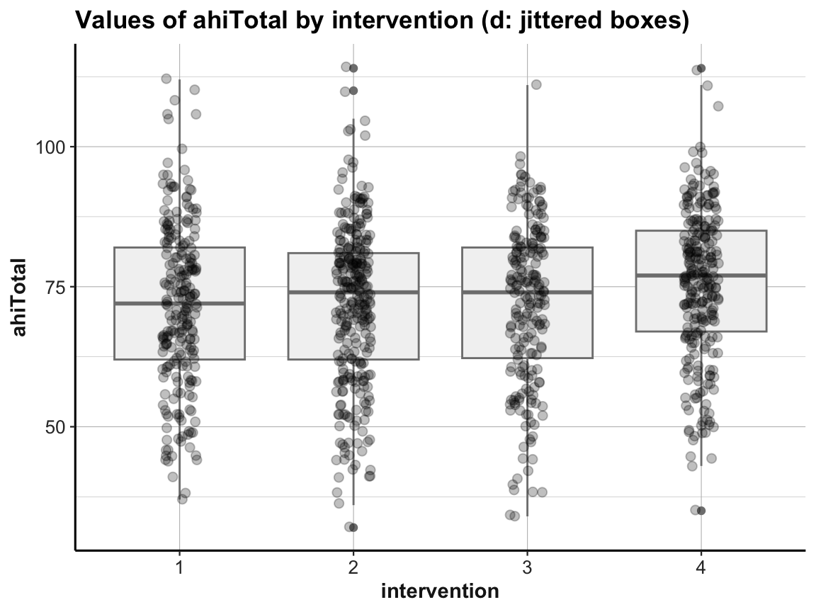
# (e) Combining violin plot with jitter:
ggplot(df) +
  geom_violin(aes(x = factor(intervention), y = ahiTotal), size = 1.5, color = unikn::Seeblau) +
  geom_jitter(aes(x = intervention, y = ahiTotal), width = .1, size = 2, alpha = 1/4) +
  labs(title = "Values of ahiTotal by intervention (e: jittered violins)",
       x = "intervention", y = "ahiTotal") +
  ds4psy::theme_ds4psy()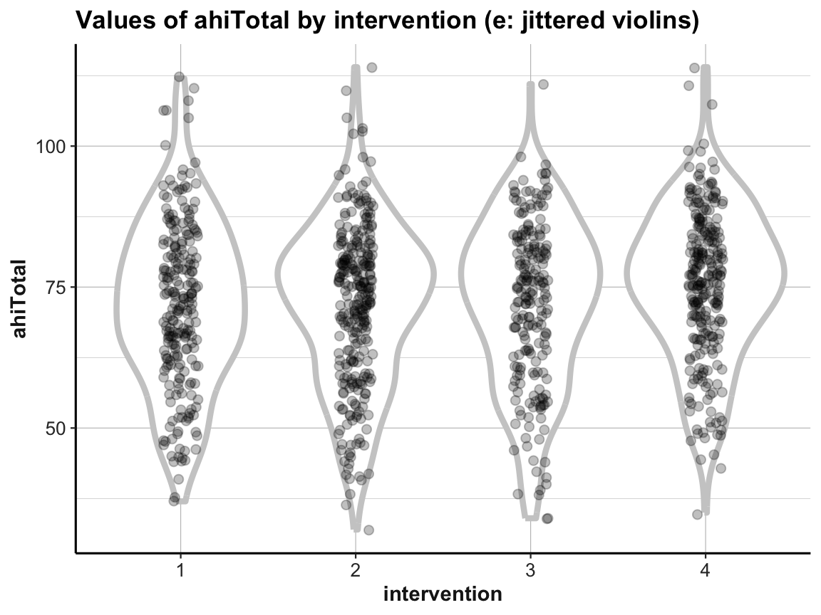
# (f) Combining violin plot with boxplot and jitter:
ggplot(df, aes(x = factor(intervention), y = ahiTotal, color = factor(intervention))) +
  geom_violin(size = 1.5, color = unikn::Seeblau) +
  geom_boxplot(width = .30, color = "grey20", fill = "grey90") +
  geom_jitter(width = .05, size = 2, alpha = 1/3) +
  labs(title = "Values of ahiTotal by intervention (f: jittered violins with boxes)",
       x = "intervention", y = "ahiTotal", color = "Intervention:") +
  # scale_color_brewer(palette = "Set1") +
  scale_color_manual(values = usecol(c(Pinky, Karpfenblau, Petrol, Bordeaux))) +
  ds4psy::theme_ds4psy()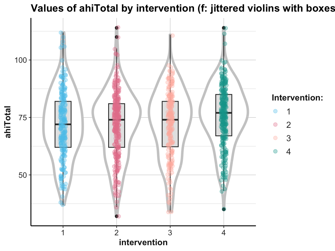
When using multiple geoms in one plot, their order matters, as later geoms are printed on top of earlier ones.
In addition, combining geoms typically requires playing with aesthetics. Incidentally, note how the last plot moved some redundant aesthetic mappings (i.e., x, y, and color) from the geoms to the 1st line of the command (i.e., from the mapping argument of the geoms to the general mapping argument).
Tile plots
We already discovered that bar plots can either count cases or show some pre-computed values (when using stat = "identity", see Section 2.4.2). In the following, we show that we can also compute summary tables and then map their values to the color fill gradient of tiles, or to the size of points:
# Frequency of observations by occasion (x) and intervention (y):

# Data:
df <- AHI_CESD
# dim(df)  # 992 50
# df

# Table 1:
# Frequency n, mean ahiTotal, and mean cesdTotal by occasion:
# Use tab_scores_by_occ (from above):
knitr::kable(head(tab_scores_by_occ))| occasion | n | ahiTotal_mn | cesdTotal_mn |
|---|---|---|---|
| 0 | 295 | 69.70508 | 15.06441 |
| 1 | 147 | 72.35374 | 12.96599 |
| 2 | 157 | 73.04459 | 12.36943 |
| 3 | 139 | 74.55396 | 11.74101 |
| 4 | 134 | 75.19403 | 11.70896 |
| 5 | 120 | 75.83333 | 12.83333 |
# Table 2:
# Scores (n, ahiTotal_mn, and cesdTotal_mn) by occasion AND intervention:
# Use tab_scores_by_occ_iv (from above):
knitr::kable(head(tab_scores_by_occ_iv))| occasion | intervention | n | ahiTotal_mn | cesdTotal_mn |
|---|---|---|---|---|
| 0 | 1 | 72 | 68.38889 | 15.05556 |
| 0 | 2 | 76 | 68.75000 | 16.21053 |
| 0 | 3 | 74 | 70.18919 | 16.08108 |
| 0 | 4 | 73 | 71.50685 | 12.84932 |
| 1 | 1 | 30 | 69.53333 | 15.30000 |
| 1 | 2 | 48 | 71.58333 | 14.58333 |
# Tile plot 1:
# Frequency (n) of each interventin by occasion:
ggplot(tab_scores_by_occ_iv, aes(x = occasion, y = intervention)) +
  geom_tile(aes(fill = n), color = "black") +
  geom_text(aes(label = n), color = "white") +
  labs(title = "Frequency of interventions by occasion (tile)",
       x = "Occasion", y = "Intervention", fill = "Frequency:") +
  theme_ds4psy(col_brdrs = "grey")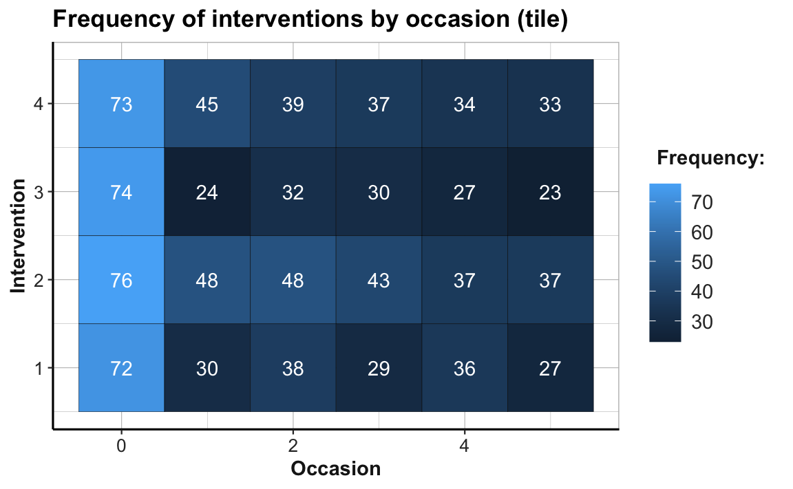
# Note the sharp drop in participants from Occasion 0 to 1:
24/74  # Intervention 3: Only 32.4% of original participants are present at Occasion 1.
#> [1] 0.3243243
The abrupt color change from Occasion 0 to Occasion 1 (from a brighter to darker hue of blue) illustrates the sharp drop of participant numbers in all four treatment conditions. The proportion of dropouts is particularly high in Intervention 3, where only 24 of 74 participants (32.4%) are present at Occasion 1. By contrast, the participant numbers per group from Occasions 1 to 5 appear to be fairly stable. (Exercise 2 — in Section 4.4.2 — addresses the issue of potentially selective dropouts.)
Let’s create a corresponding plot that maps a dependent measure (here: mean happiness scores ahiTotal_mn) to the fill color of tiles:
# Tile plot 2:
# ahiTotal_mn of each interventin by occasion:
ggplot(tab_scores_by_occ_iv, aes(x = occasion, y = intervention)) +
  geom_tile(aes(fill = ahiTotal_mn), color = "black") +
  labs(title = "Mean ahiTotal score of each intervention by occasion (tile)",
       x = "Occasion", y = "Intervention", fill = "ahiTotal_mn:") +
  scale_fill_gradient(low = unikn::Bordeaux, high = "gold") +
  theme_ds4psy(col_brdrs = "grey")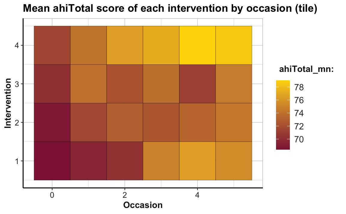
To facilitate the interpretation of this plot, we changed the color gradient (by using scale_fill_gradient() with two colors for low and high): The lowest average scores of happiness (or ahiTotal_mn) are shown in the color Bordeaux, the highest ones in "gold". As the scores vary on a continuous scale, using a continuous color scale is appropriate here. And assigning high happiness to “gold” hopefully makes the plot easier to interpret. The plot shows that all intervention conditions score higher happiness values as the number of occasions increase. Whereas Interventions 2 to 4 show a marked increase from Occasion 0 to 1, Intervention 1 makes its biggest step from Occasion 2 to 3.
Note that our previous line plot (called plot_ahi_by_occ_iv above) showed the same trends as this tile plot. But whereas the line plot (by mapping happiness to height y) makes it easy to see differences in the upward trends between groups, the tile plot (by mapping happiness to fill) facilitates row- and column-wise comparisons on the same dimension (color hue). Thus, informationally equivalent plots can suggest and support different interpretations and it is important to choose the right plot from a variety of options.
Practice
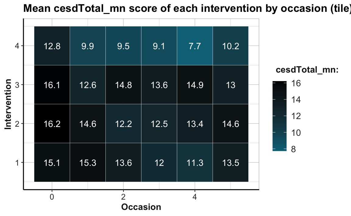
Create a tile plot that shows the developments of mean depression scores cesdTotal by measurement occasion and intervention. Choose a color scale that you find appropriate and easy to interpret. What do you see?
Hint: Your result could look like the following plot:
Point size plots
Another way of expressing the value of a continuous variable — like a frequency n or an average score ahiTotal_mn — as a function of two categorical variables is by mapping it to the size dimension of a point.
In the following, we illustrate this by creating the same plot twice. First, we use the raw data (AHI_CESD) in combination with geom_count() to show the frequency of cases by occasion for each intervention:
# Data:
df <- AHI_CESD  # copy
# dim(df)  # 992 50
# df

# Point size plot 1a:
# Count frequency of values for each interventin by occasion:
ggplot(df, aes(x = occasion, y = intervention)) +
  geom_count(color = unikn::Seeblau) +
  labs(title = "Frequency of interventions by occasion (count)",
       x = "Occasion", y = "Intervention", size = "Count:") +
  scale_size_area(max_size = 12) +
  scale_y_continuous(limits = c(.5, 4.5)) +
  unikn::theme_unikn()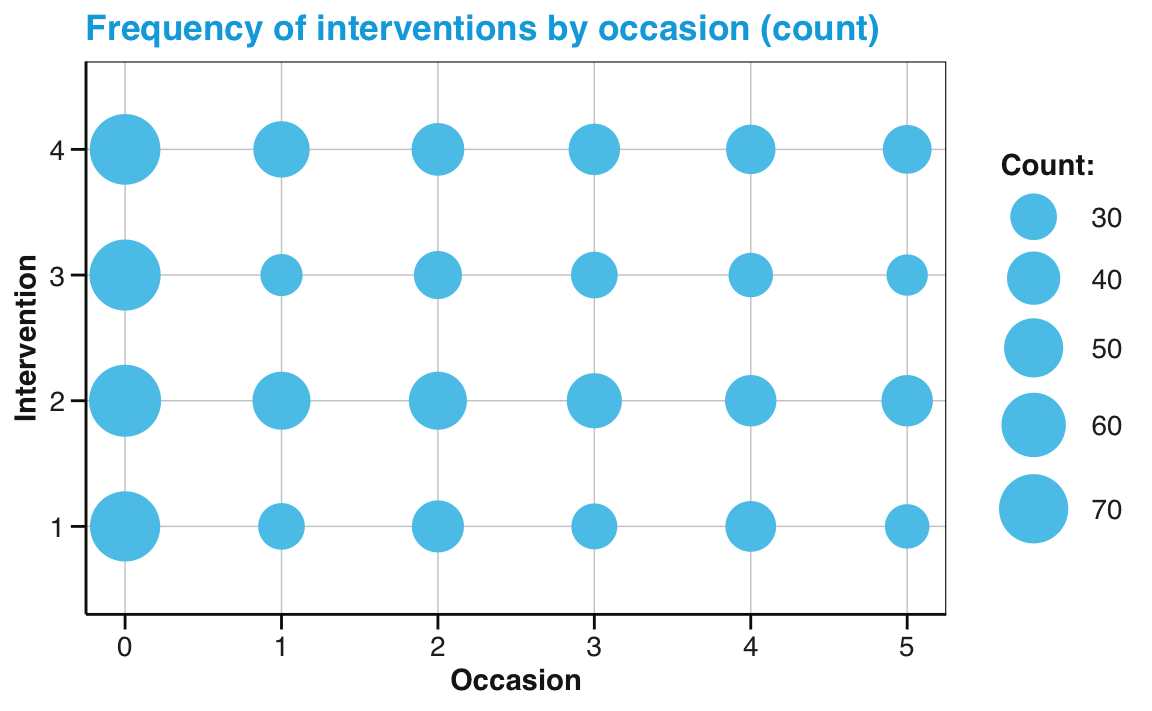
Alternatively, we could use the data from our summary table (tab_scores_by_occ_iv, created above), and geom_point with its size aesthetic mapped to our frequency count n:
# Point size plot 1b:
# Frequency (n mapped to size) of each interventin by occasion:
ggplot(tab_scores_by_occ_iv, aes(x = occasion, y = intervention)) +
  geom_point(aes(size = n), color = unikn::Seeblau) +
  labs(title = "Frequency of interventions by occasion (point size)",
       x = "Occasion", y = "Intervention", size = "Frequency:") +
  scale_size_area(max_size = 12) +
  scale_y_continuous(limits = c(.5, 4.5)) +
  unikn::theme_unikn()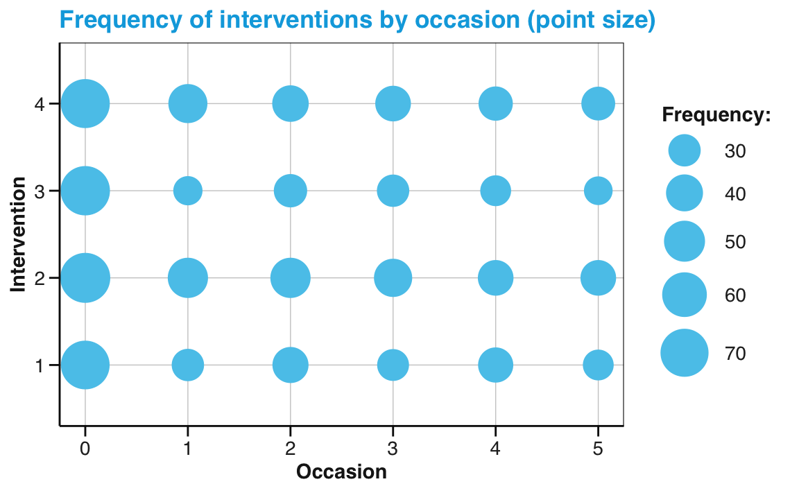
Note that — in both versions — we added two scale functions to adjust features that ggplot2 would otherwise set automatically. Specifically, we used the scale_size_area function of ggplot2 to increase the maximal size of points and the scale_y_continuous function to slightly increase the range of y-axis values.
Practice
- Visit the section Do not distort quantities (or its source Pitfalls to avoid) and explain why confusing the area of a circle with its radius can create confusion and misleading representations.
4.2.11 Tuning plots
As the examples above have shown, most default plots can be modified — and ideally improved — by fine-tuning their visual appearance.
In ggplot2, this means setting different aesthetics (or aes() arguments) and scale options (which take different arguments, depending on the type of aesthetic involved). Popular levers for prettifying your plots include:
colors: can be set by the
colororfillarguments of geoms (variable when insideaes(...), fixed outside), or by choosing or designing specific color scales (withscale_color);labels:
labs(...)allows setting titles, captions, axis and legend labels, etc.;legends: can be (re-)moved or edited;
themes: can be selected or modified.
Mixing geoms and aesthetics
In Chapter 2 (Section 2.3), we have learned that ggplot2 allows combining multiple geoms into the layers of one plot. Importantly, different geoms can use different aesthetic mappings. For instance, if we wanted to express two different dependent variables in one plot, we could use common mappings for the general layout of the plot (i.e., its x- and y-dimensions), but set other aesthetics (like fill colors or text labels) of two geoms to different variables.
For instance, we could add text labels to the geom_tile() and geom_point() plots from above. By adding geom_text() and setting its label aesthetic to a different variable (e.g., the frequency count n) we could simultaneously express two different continuous variables on two different dimensions (here fill color or size vs. the value shown by a label of text):
# Combo plot 1:
# ahiTotal_mn of each intervention by occasion:
ggplot(tab_scores_by_occ_iv, aes(x = occasion, y = intervention)) +
  geom_tile(aes(fill = ahiTotal_mn), color = "white") +
  geom_text(aes(label = n), color = "white", size = 5, fontface = 2) +
  labs(title = "Mean happiness score of each intervention by occasion (tile)",
       x = "Occasion", y = "Intervention", fill = "Happiness:",
       caption = "Tile labels denote number of participants.") +
  scale_fill_gradient(low = "black", high = Seegruen) +
  theme_ds4psy(col_brdrs = "grey")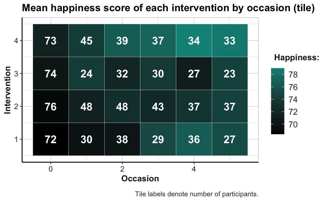
Similarly, adding geom_text() with the aesthetic label = n to our previous point size plot would allow expressing mean happiness scores (ahiTotal_mn) by point size and the frequency of corresponding data points (n) as text labels on the points:
# Combo plot 2b:
# ahiTotal_mn (mapped to point size) and n (text label) for each intervention x occasion:
ggplot(tab_scores_by_occ_iv, aes(x = occasion, y = intervention)) +
  geom_point(aes(size = ahiTotal_mn), color = unikn::Seegruen) +
  geom_text(aes(label = n), color = "white", size = 3, fontface = 2) +
  labs(title = "Happiness and n by intervention x occasion (point size + text label)",
       x = "Occasion", y = "Intervention", size = "Happiness:",
       caption = "Point labels denote number of participants.") +
  scale_size_continuous(range = c(5, 11)) +
  scale_y_continuous(limits = c(.5, 4.5)) +
  theme_ds4psy(col_brdrs = "grey")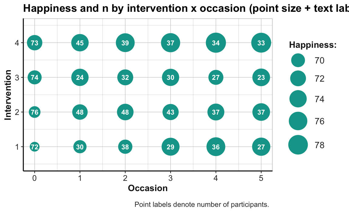
Beware that mixing multiple dimensions on different geoms can quickly get confusing, even for ggplot enthusiasts.
Realizing this motivates another principle and lets us conclude on a cautionary note.
Plotting with a purpose
Our last examples have shown that we should create 2 separate graphics when making multiple points or expressing more than a single relationship in a plot. This brings us to:
- Principle 10: Create graphs that convey their messages as clearly as possible.
So go ahead and use the awesome ggplot2 machine to combine multiple geoms and adjust their aesthetics for as long as this makes your plot prettier. However, rather than getting carried away by the plethora of options, always keep in mind the message that you want to convey. If additional fiddling with aesthetics does not help to clarify your point, you are probably wasting your time by trying to do too much.
References
Actually, listing everything required to execute a file can get quite excessive (check out
sessionInfo()or thesession_infoandpackage_infofunctions of devtools, in case you’re interested, and consider using the packrat package in case you want to preserve or share your current setup). Hence, most people only explicitly list and load non-standard packages (in their currently installed version).↩︎RStudio helps with writing well-structured and clean code by providing foldable sections (by typing repeated characters, like
----) or automatic shortcuts (e.g., see the keyboard shortcuts for automatic indenting and un-/commenting).↩︎