2.7 Exercises

The following exercises allow you to apply the ggplot() commands introduced in this chapter.
2.7.1 Exercise 1
Scattered highways
A scatterplot shows a data point (observation) as a function of 2 (typically continuous) variables x and y. This allows judging the relationship between x and y in the data.
Use the
mpgdata of ggplot2 to create a scatterplot that shows a car’s fuel economy on the highway (on the y-axis) as a function of its fuel economy in the city (on the x-axis). How would you describe this relationship?Does your plot suffer from overplotting? If so, create at least 2 different versions that address this problem.
Add informative titles, labels, and a theme to the plot.
Group the points in your scatterplot by the
classof vehicles (in at least 2 different ways).
2.7.2 Exercise 2
Strange histograms
The following plot repeats the histogram code from above (to plot the distribution of fuel economy in city environments), but adds a frequency polygon as a 2nd geom (see ?geom_freqpoly).
# Plot from above with an additional geom:
ggplot(mpg, aes(x = cty)) +    # set mappings for ALL geoms
  geom_histogram(aes(x = cty), binwidth = 2, fill = "gold", color = "black") +
  geom_freqpoly(color = "steelblue", size = 2) +
  labs(title = "Distribution of fuel economy",
       x = "Miles per gallon (in city)",
       caption = "Data from ggplot2::mpg") +
  theme_light()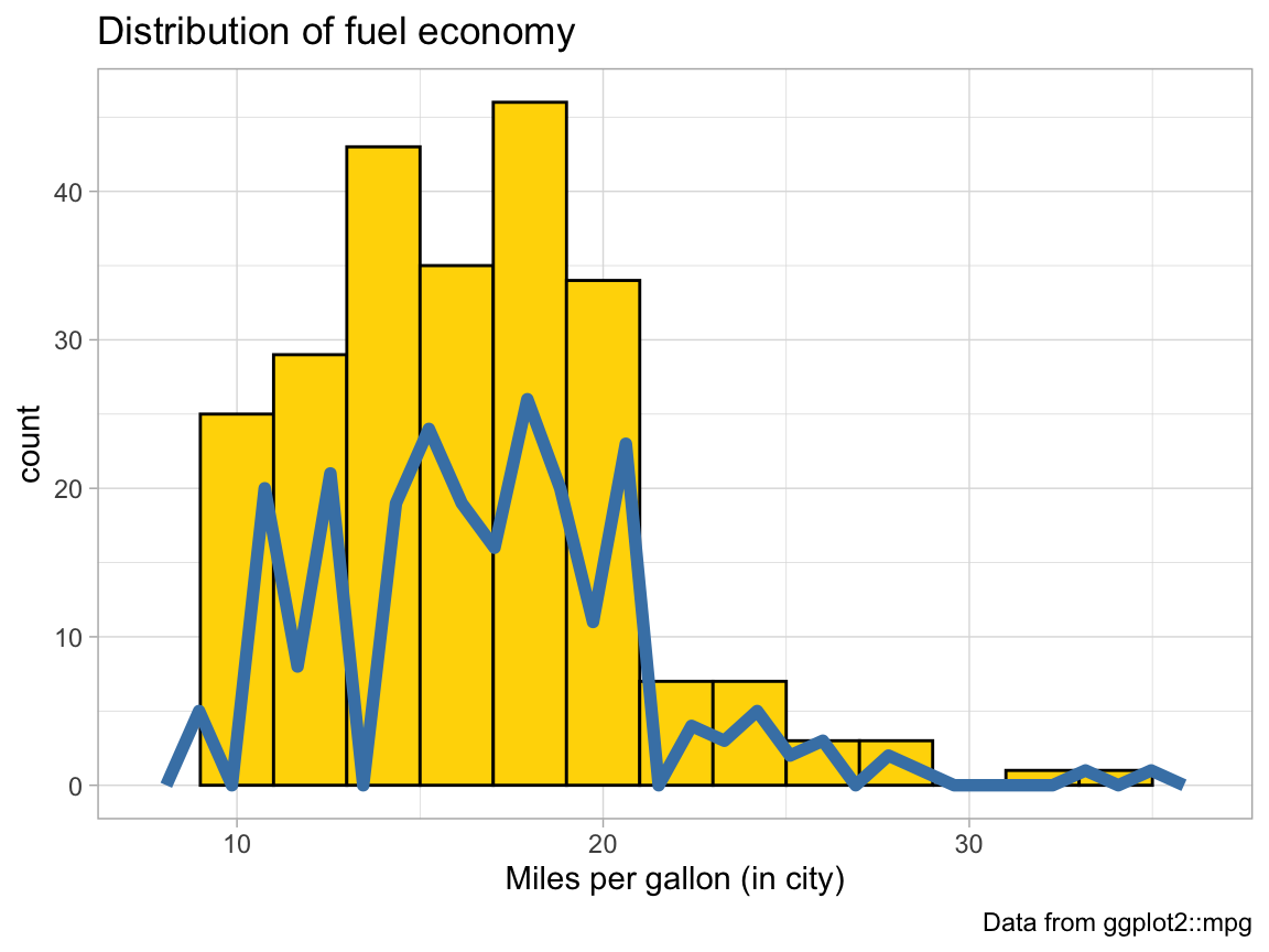
Why is the (blue) line of the polygon lower than the (yellow) bars of the histogram?
Change 1 value in the code so that both (lines and bars) have the same heights.
The code above repeats the aesthetic mapping
aes(x = cty)in 2 locations. Which of these can be deleted without changing the resulting graph? Why?Why can’t we simply replace
geom_freqpolybygeom_lineorgeom_smoothto get a similar line?
2.7.3 Exercise 3
Cylinder bars
Let’s create some bar plots with the ggplot2::mpg data.
Plot the number or frequency of cases by
cylas a bar plot (in at least 2 different ways).Plot the proportion of cases in the
mpgdata bycyl(in at least 2 different ways).Create a better and prettier version by adding different colors, appropriate labels, and a suitable theme to your plot.
See Appendix D for additional color options in R.
2.7.4 Exercise 4
Chick diets
The ChickWeight data (contained in the datasets package of R) contains the results of an experiment that measures the effects of Diet on the early growth of chicks.
- Save the
ChickWeightdata as a tibblecwand inspect its dimensions and variables.
# ?datasets::ChickWeight

# (a) Save data as tibble and inspect:
cw <- as_tibble(ChickWeight)
# cw  # 578 observations (rows) x 4 variables (columns)
Create a line plot showing the
weightdevelopment of each indivdual chick (on the y-axis) overTime(on the x-axis) for eachDiet(in 4 different facets).The following bar chart shows the number of chicks per
DietoverTime.
We see that the initialDietgroups contain a different numbers of chicks and some chicks drop out overTime:
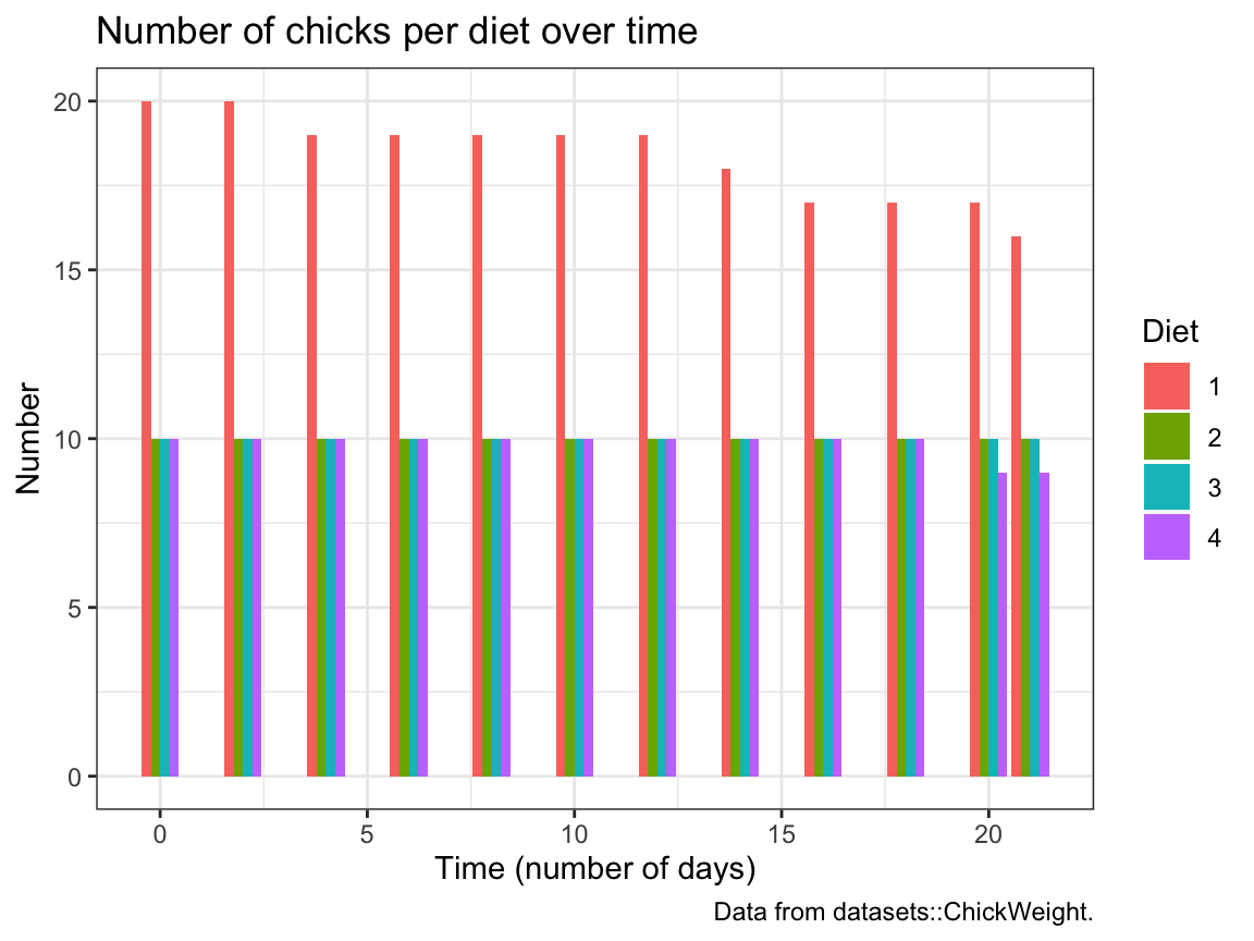
Try re-creating this plot (with geom_bar and dodged bar positions).
2.7.5 Exercise 5
Participant plots
Use the p_info data from Exercise 6 of Chapter 1 (available as posPsy_p_info in the ds4psy package) to create some plots that descripte the sample of participants:
# Load data:
p_info <- ds4psy::posPsy_p_info  # from ds4psy package
# p_info_2 <- readr::read_csv("http://rpository.com/ds4psy/data/posPsy_participants.csv")  # from online server
# all.equal(p_info, p_info_2)

# dim(p_info)      # 295 rows, 6 columns
# p_info           # prints a summary of the table/tibble
# glimpse(p_info)  # shows the first values for 6 variables (columns)

# Turn some categorial values into factors:
p_info$sex <- as.factor(p_info$sex)
p_info$intervention <- as.factor(p_info$intervention)

# p_info # Note that the variables intervention and sex are now listed as <fct>.- A histogram that shows the distribution of participant
agein 3 ways:- overall,
- separately for each
sex, and
- separately for each
intervention.
- overall,
- A bar plot that
- shows how many participants took part in each
intervention; or
- shows how many participants of each
sextook part in eachintervention.
- shows how many participants took part in each
2.7.6 Exercise 6
Visual illusions
Not all visualizations need to depict data. For instance, visual illusions reveal something about the mechanisms of our visual system.
- Look up the term grid illusion (e.g., on Wikipedia) and re-create the so-called Hermann grid illusion using ggplot2.
Hints:
We can call
ggplot()without any data and aesthetics arguments and then explicitly provide the positions of desired lines (ingeom_hline()andgeom_vline()commands).Creating a dark background in ggplot2 requires a combination of
theme,plot.backgroundandpanel.backgroundcommands. A decent compromise is usingtheme_dark().
Making visual illusions disappear: Adjust the
alphaparameter of the (horizontal and vertical) grid lines until you have the impression that the dark dots disappear.Use the function
make_grid()(with two optionsxandy) to create a data objectdots.
# Make a nx-by-ny grid of x-y coordinates:
make_grid <- function(x = 5, y = 5){

  xs <- -x:x
  ys <- -y:y

  dots <- tibble::tibble(x = rep(xs, times = length(ys)),
                         y = rep(ys, each = length(xs)))

  return(dots)
}
Then use dots as data input to a ggplot() call to create a Scintillating grid illusion.
Hint:
The code is almost identical to the Hermann grid illusion above, but we need to add geom_point() to create x by y points.
The dots dataset contains the coordinates of these points.
This concludes our first set of exercises on visualizing data — but ggplot2 will still feature prominently in the following chapters of this book.