10.3 Visualizing the model
To get our version of the values in Table 10.2, we’ll first recreate columns for \(D_{1}\) through \(W\) (SEXISM) and save then as a tibble, nd.
(
  nd <-
  tibble(D1 = rep(c(0, 1, 0), each = 3),
         D2 = rep(c(0, 0, 1), each = 3),
         sexism = rep(quantile(protest$sexism, probs = c(.16, .5, .84)),
                      times = 3))
  )
## # A tibble: 9 x 3
## D1 D2 sexism
## <dbl> <dbl> <dbl>
## 1 0 0 4.31
## 2 0 0 5.12
## 3 0 0 5.87
## 4 1 0 4.31
## 5 1 0 5.12
## 6 1 0 5.87
## 7 0 1 4.31
## 8 0 1 5.12
## 9 0 1 5.87With nd in hand, we’ll feed the predictor values into fitted() for the typical posterior summaries.
fitted(model2, newdata = nd) %>% round(digits = 3)## Estimate Est.Error Q2.5 Q97.5
## [1,] 5.673 0.221 5.245 6.106
## [2,] 5.289 0.159 4.974 5.606
## [3,] 4.934 0.231 4.474 5.390
## [4,] 5.428 0.246 4.959 5.914
## [5,] 5.772 0.155 5.474 6.072
## [6,] 6.091 0.198 5.697 6.487
## [7,] 5.528 0.198 5.148 5.930
## [8,] 5.776 0.149 5.484 6.065
## [9,] 6.005 0.213 5.593 6.427But is we want to make a decent line plot, we’ll need many more values for sexism, which will appear on the x-axis.
nd <-
  tibble(sexism = rep(seq(from = 3.5, to = 6.5, length.out = 30),
                      times = 9),
         D1 = rep(rep(c(0, 1, 0), each = 3),
                  each = 30),
         D2 = rep(rep(c(0, 0, 1), each = 3),
                  each = 30))
This time we’ll save the results from fitted() as a tlbble and wrangle a bit to get ready for Figure 10.3.
model2_fitted <-
  fitted(model2, newdata = nd, probs = c(.025, .25, .75, .975)) %>%
  as_tibble() %>%
  bind_cols(nd) %>%
  mutate(condition = rep(c("No Protest", "Individual Protest", "Collective Protest"),
                         each = 3*30)) %>%
  # This line is not necessary, but it will help order the facets of the plot
  mutate(condition = factor(condition, levels = c("No Protest", "Individual Protest", "Collective Protest")))

glimpse(model2_fitted)
## Observations: 270
## Variables: 10
## $ Estimate <dbl> 6.054450, 6.005548, 5.956646, 5.907744, 5.858842, 5.809940, 5.761038, 5.71213...
## $ Est.Error <dbl> 0.3576588, 0.3386639, 0.3199649, 0.3016169, 0.2836879, 0.2662626, 0.2494467, ...
## $ Q2.5 <dbl> 5.366049, 5.352536, 5.338721, 5.324167, 5.308774, 5.295117, 5.279485, 5.26047...
## $ Q25 <dbl> 5.812538, 5.778561, 5.743566, 5.707137, 5.670806, 5.634155, 5.595954, 5.55770...
## $ Q75 <dbl> 6.290437, 6.231015, 6.170806, 6.110722, 6.052133, 5.991066, 5.932566, 5.87289...
## $ Q97.5 <dbl> 6.758325, 6.675455, 6.589070, 6.505128, 6.419579, 6.333093, 6.251963, 6.17586...
## $ sexism <dbl> 3.500000, 3.603448, 3.706897, 3.810345, 3.913793, 4.017241, 4.120690, 4.22413...
## $ D1 <dbl> 0, 0, 0, 0, 0, 0, 0, 0, 0, 0, 0, 0, 0, 0, 0, 0, 0, 0, 0, 0, 0, 0, 0, 0, 0, 0,...
## $ D2 <dbl> 0, 0, 0, 0, 0, 0, 0, 0, 0, 0, 0, 0, 0, 0, 0, 0, 0, 0, 0, 0, 0, 0, 0, 0, 0, 0,...
## $ condition <fct> No Protest, No Protest, No Protest, No Protest, No Protest, No Protest, No Pr...For Figure 10.3 and many to follow for this chapter, we’ll superimpose 50% intervals on top of 95% intervals.
# This will help us add the original data points to the plot
protest <-
  protest %>%
  mutate(condition = ifelse(protest == 0, "No Protest",
                            ifelse(protest == 1, "Individual Protest",
                                   "Collective Protest"))) %>%
  mutate(condition = factor(condition, levels = c("No Protest", "Individual Protest", "Collective Protest")))


# This will help us with the x-axis
breaks <-
  tibble(values = quantile(protest$sexism, probs = c(.16, .5, .84))) %>%
  mutate(labels = values %>% round(2) %>% as.character())

# Here we plot
model2_fitted %>%
  ggplot(aes(x = sexism)) +
  geom_ribbon(aes(ymin = Q2.5, ymax = Q97.5),
              alpha = 1/3) +
  geom_ribbon(aes(ymin = Q25, ymax = Q75),
              alpha = 1/3) +
  geom_line(aes(y = Estimate)) +
  geom_point(data = protest,
             aes(y = liking),
             size = 2/3) +
  scale_x_continuous(breaks = breaks$values,
                     labels = breaks$labels) +
  coord_cartesian(xlim = 4:6,
                  ylim = c(2.5, 7.2)) +
  labs(x = expression(paste("Perceived Pervasiveness of Sex Discrimination in Society (", italic(W), ")")),
       y = "Evaluation of the Attorney") +
  facet_wrap(~condition) +
  theme_minimal()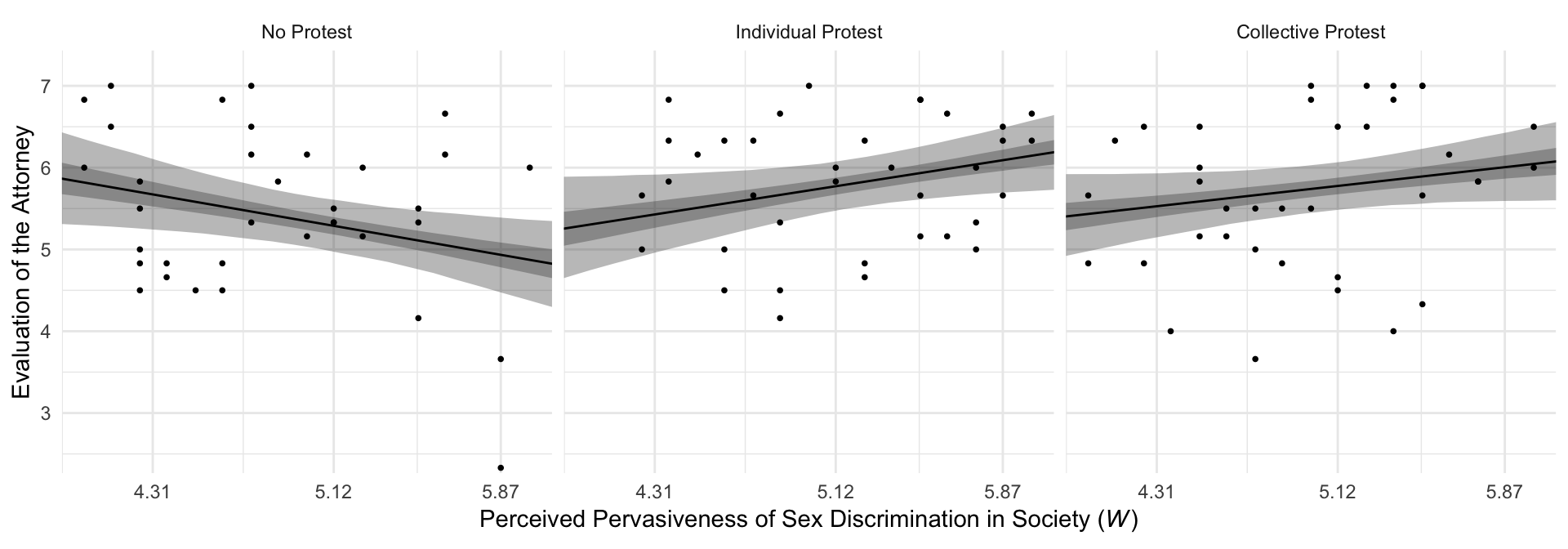
By adding the data to the plots, they are both more informative and now serve as a posterior predictive check.