7.5 The difference between testing for moderation and probing it
This is another section where the NHST-type paradigm contrasts with many within the contemporary Bayesian paradigm. E.g., Hayes opened the section with: “We test for evidence of moderation when we want to know whether the relationship between \(X\) and \(Y\) varies systematically as a function of a proposed moderator \(W\)”. His use of “whether” suggests we are talking about a binary answer–either there is an effect or there isn’t. But, as Gelman argued, the default presumption in social science [and warning, I’m a psychologist and thus biased towards thinking in terms of social science] is that treatment effects–and more generally, causal effects–vary across contexts. As such, asking “whether” there’s a difference or an interaction effect isn’t really the right question. Rather, we should presume variation at the outset and ask instead what the magnitude of that variation is and how much accounting for it matters for our given purposes. If the variation–read interaction effect–is tiny and of little theoretical interest, perhaps we might just ignore it and not include it in the model. Alternatively, if the variation is large or of theoretical interest, we might should include it in the model regardless of statistical significance.
Another way into this topic is posterior predictive checking. We’ve already done a bit of this in previous chapters. The basic idea, recall, is that better models should give us a better sense of the patterns in the data. In the plot below, we continue to show the interaction effect with two regression lines, but this time we separate them into their own panels by frame. In addition, we add the original data which we also separate and color code by frame.
nd <-
  tibble(frame = rep(0:1, times = 30),
         skeptic = rep(seq(from = 0, to = 10, length.out = 30),
                       each = 2))

fitted(model3, newdata = nd) %>%
  as_tibble() %>%
  bind_cols(nd) %>%

  ggplot(aes(x = skeptic, y = Estimate)) +
  geom_ribbon(aes(ymin = Q2.5, ymax = Q97.5, fill = frame %>% as.character()),
              alpha = 1/3) +
  geom_line(aes(color = frame %>% as.character())) +
  geom_point(data = disaster,
             aes(x = skeptic, y = justify, color = frame %>% as.character()),
             alpha = 3/4) +
  scale_fill_manual("frame",
                    values = dutchmasters$little_street[c(10, 5)] %>% as.character()) +
  scale_color_manual("frame",
                     values = dutchmasters$little_street[c(10, 5)] %>% as.character()) +
  scale_x_continuous(breaks = 1:9) +
  coord_cartesian(xlim = 1:9) +
  labs(title = "model3, the interaction model",
       x = expression(paste("Climate Change Skepticism (", italic("W"), ")")),
       y = "Strength of Justification\nfor Withholding Aid") +
  theme_07 +
  theme(legend.position = "top") +
  facet_wrap(~frame)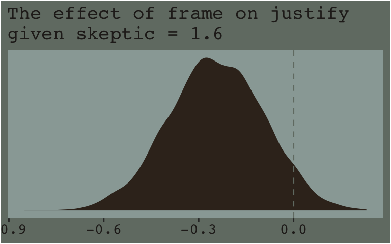
When we separate out the data this way, it really does appear that when frame == 1, the justify values do increase as the skeptic values increase, but not so much when frame == 0. We can use the same plotting approach, but this time with the results from the non-interaction multivariable model, model2.
fitted(model2, newdata = nd) %>%
  as_tibble() %>%
  bind_cols(nd) %>%

  ggplot(aes(x = skeptic, y = Estimate)) +
  geom_ribbon(aes(ymin = Q2.5, ymax = Q97.5, fill = frame %>% as.character()),
              alpha = 1/3) +
  geom_line(aes(color = frame %>% as.character())) +
  geom_point(data = disaster,
             aes(x = skeptic, y = justify, color = frame %>% as.character()),
             alpha = 3/4) +
  scale_fill_manual("frame",
                    values = dutchmasters$little_street[c(10, 5)] %>% as.character()) +
  scale_color_manual("frame",
                     values = dutchmasters$little_street[c(10, 5)] %>% as.character()) +
  scale_x_continuous(breaks = 1:9) +
  coord_cartesian(xlim = 1:9) +
  labs(title = "model2, the multivariable model",
       x = expression(paste("Climate Change Skepticism (", italic("W"), ")")),
       y = "Strength of Justification\nfor Withholding Aid") +
  theme_07 +
  theme(legend.position = "top") +
  facet_wrap(~frame)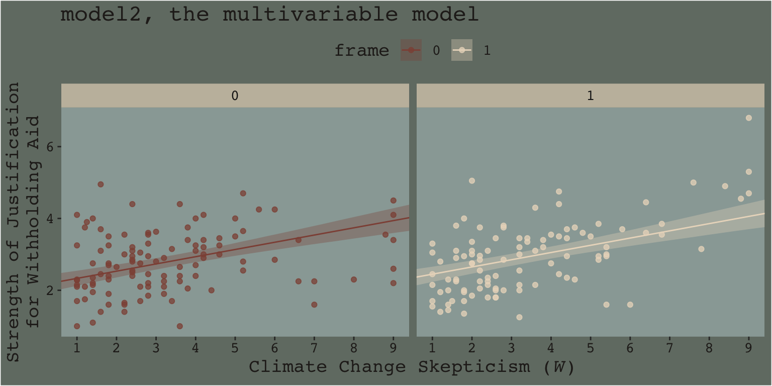
This time when we allow the intercept but not the slope to vary by frame, it appears the regression lines are missing part of the story. They look okay, but it appears that the red line on the left is sloping up to quickly and that the cream line on the right isn’t sloping steeply enough. We have missed an insight.
Now imagine scenarios in which the differences by frame are more or less pronounced. Imagine those scenarios fall along a continuum. It’s not so much that you can say with certainty where on such a continuous an interaction effect would exist or not, but rather, such a continuum suggests it would appear more or less important, of greater or smaller magnitude. It’s not that the effect exists or is non-zero. It’s that it’s orderly enough and of a large enough magnitude, and perhaps of theoretical interest, that it appears to matter in terms of explaining the data.
And none of this is to serve as a harsh criticism of Andrew Hayes. His text is a fine effort to teach mediation and moderation from a frequentist OLS perspective. I’ve benefited tremendously from his work. Yet I’d also like to connect his work to some other sensibilities.
Building further, consider this sentence from the text (pp. 259–260):
Rather, probing moderation involves ascertaining whether the conditional effect of \(X\) on \(Y\) is different from zero at certain specified values of \(W\) (if using the pick-a-point approach) or exploring where in the distribution of \(W\) the conditional effect of \(X\) on \(Y\) transitions between statistically significant and non-significant (if using the Johnson-Neyman technique).
From an NHST/frequentist perspective, this makes clear sense. But we’re dealing with an entire posterior distribution. Consider again a figure from above.
nd <-
  tibble(frame = rep(0:1, times = 3),
         skeptic = rep(quantile(disaster$skeptic,
                                probs = c(.16, .5, .84)),
                       each = 2)) %>%
  arrange(frame)

fitted(model3, newdata = nd, summary = F) %>%
  as_tibble() %>%
  gather() %>%
  select(-key) %>%
  mutate(frame = rep(0:1, each = 4000*3),
         skeptic = rep(rep(quantile(disaster$skeptic, probs = c(.16, .5, .84)),
                           each = 4000),
                       times = 2),
         iter = rep(1:4000, times = 6)) %>%
  spread(key = frame, value = value) %>%
  mutate(difference = `1` - `0`,
         skeptic = str_c("skeptic = ", skeptic)) %>%

  ggplot(aes(x = difference)) +
  geom_density(color = "transparent",
               fill = dutchmasters$little_street[9]) +
  scale_y_continuous(NULL, breaks = NULL) +
  labs(subtitle = "The effect of frame on justify given three different values of skeptic",
       x = NULL) +
  theme_07 +
  facet_wrap(~skeptic)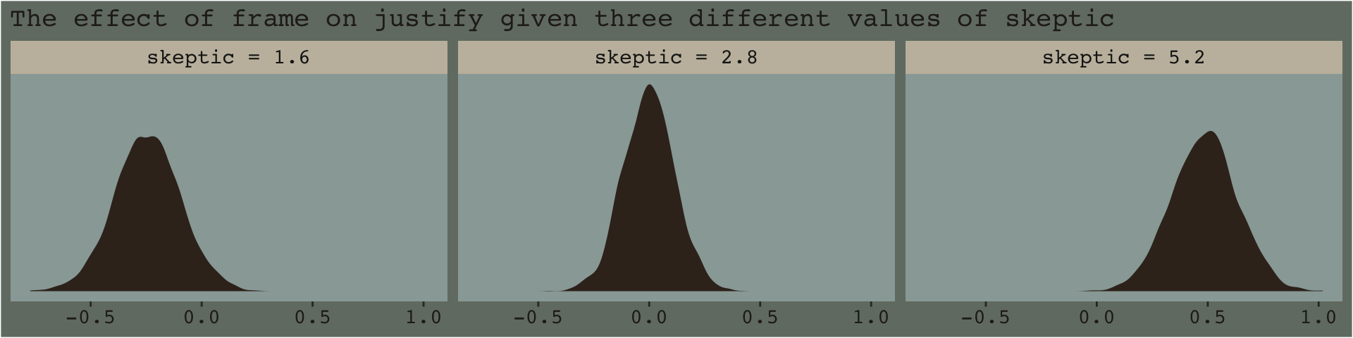
With the pick pick-a-point approach one could fixate on whether zero was a credible value within the posterior, given a particular skeptic value. And yet zero is just one point in the parameter space. One might also focus on the whole shapes of the posteriors of these three skeptic values. You could focus on where the most credible values (i.e., those at and around their peaks) are on the number line (i.e., the effect sizes) and you could also focus on the relative widths of the distributions (i.e., the precision with which the effect sizes are estimated). These sensibilities can apply to the JN technique, as well. Sure, we might be interested in how credible zero is. But there’s a lot more to notice, too.
Now consider a modified version of our JN technique plot, from above.
f_model3 %>%
  group_by(skeptic) %>%
  # There are more elegant ways to do this. Hopefully this gives some pedagogical insights
  summarize(median = median(difference),
            ll_10 = quantile(difference, probs = .45),
            ul_10 = quantile(difference, probs = .55),
            ll_20 = quantile(difference, probs = .40),
            ul_20 = quantile(difference, probs = .60),
            ll_30 = quantile(difference, probs = .35),
            ul_30 = quantile(difference, probs = .65),
            ll_40 = quantile(difference, probs = .30),
            ul_40 = quantile(difference, probs = .70),
            ll_50 = quantile(difference, probs = .25),
            ul_50 = quantile(difference, probs = .75),
            ll_60 = quantile(difference, probs = .20),
            ul_60 = quantile(difference, probs = .80),
            ll_70 = quantile(difference, probs = .15),
            ul_70 = quantile(difference, probs = .85),
            ll_80 = quantile(difference, probs = .10),
            ul_80 = quantile(difference, probs = .90),
            ll_90 = quantile(difference, probs = .05),
            ul_90 = quantile(difference, probs = .95),
            ll_99 = quantile(difference, probs = .005),
            ul_99 = quantile(difference, probs = .995)) %>%

  ggplot(aes(x = skeptic)) +
  geom_ribbon(aes(ymin = ll_10, ymax = ul_10),
              fill = dutchmasters$little_street[5],
              alpha = 1/4) +
  geom_ribbon(aes(ymin = ll_20, ymax = ul_20),
              fill = dutchmasters$little_street[5],
              alpha = 1/4) +
  geom_ribbon(aes(ymin = ll_30, ymax = ul_30),
              fill = dutchmasters$little_street[5],
              alpha = 1/4) +
  geom_ribbon(aes(ymin = ll_40, ymax = ul_40),
              fill = dutchmasters$little_street[5],
              alpha = 1/4) +
  geom_ribbon(aes(ymin = ll_50, ymax = ul_50),
              fill = dutchmasters$little_street[5],
              alpha = 1/4) +
  geom_ribbon(aes(ymin = ll_60, ymax = ul_60),
              fill = dutchmasters$little_street[5],
              alpha = 1/4) +
  geom_ribbon(aes(ymin = ll_70, ymax = ul_70),
              fill = dutchmasters$little_street[5],
              alpha = 1/4) +
  geom_ribbon(aes(ymin = ll_80, ymax = ul_80),
              fill = dutchmasters$little_street[5],
              alpha = 1/4) +
  geom_ribbon(aes(ymin = ll_90, ymax = ul_90),
              fill = dutchmasters$little_street[5],
              alpha = 1/4) +
  geom_ribbon(aes(ymin = ll_99, ymax = ul_99),
              fill = dutchmasters$little_street[5],
              alpha = 1/4) +
  scale_x_continuous(breaks = 1:6) +
  coord_cartesian(xlim = c(1, 6),
                  ylim = c(-1, 1.5)) +
  labs(x = expression(paste("Climate Change Skepticism (", italic(W), ")")),
       y = expression(atop(theta[paste(italic(X), " on ", italic(Y))], paste("Conditional Effect of Disaster Frame")))) +
  theme_07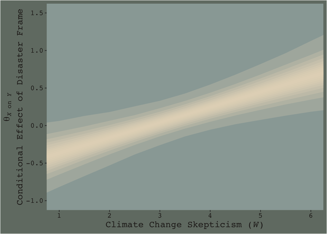
This time we emphasized the shape of the posterior with stacked semitransparent 10, 20, 30, 40, 50, 60, 70, 80, 90, and 99% intervals. We also deemphasized the central tendency–our analogue to the OLS point estimate–by removing the median line. Yes, one could focus on where the 95% intervals cross zero. And yes one could request we emphasize central tendency. But such focuses miss a lot of information about the shape–the entire smooth, seamless distribution of credible values.
I suppose you could consider this our version of Figure 7.10.