11.5 Quantifying and visualizing (conditional) indirect and direct effects.
11.5.0.1 The conditional indirect effect of \(X\).
Here’s how to get the posterior summaries corresponding to the last two columns in Table 11.2.
post <-
  posterior_samples(model1) %>%
  mutate(`Conditional effect of M when W is -0.531` = b_perform_negtone + `b_perform_negtone:negexp`*-0.531,
            `Conditional effect of M when W is -0.006` = b_perform_negtone + `b_perform_negtone:negexp`*-0.060,
            `Conditional effect of M when W is 0.600` = b_perform_negtone + `b_perform_negtone:negexp`*0.600,

            `Conditional indirect effect when W is -0.531` = b_negtone_dysfunc*(b_perform_negtone + `b_perform_negtone:negexp`*-0.531),
            `Conditional indirect effect when W is -0.006` = b_negtone_dysfunc*(b_perform_negtone + `b_perform_negtone:negexp`*-0.060),
            `Conditional indirect effect when W is 0.600` = b_negtone_dysfunc*(b_perform_negtone + `b_perform_negtone:negexp`*0.600))

post %>%
  select(starts_with("Conditional")) %>%
  gather() %>%
  mutate(key = factor(key, levels = c("Conditional effect of M when W is -0.531",
                                      "Conditional effect of M when W is -0.006",
                                      "Conditional effect of M when W is 0.600",

                                      "Conditional indirect effect when W is -0.531",
                                      "Conditional indirect effect when W is -0.006",
                                      "Conditional indirect effect when W is 0.600"))) %>%
  group_by(key) %>%
  summarize(mean = mean(value),
            sd = sd(value),
            ll = quantile(value, probs = .025),
            ul = quantile(value, probs = .975)) %>%
  mutate_if(is.double, round, digits = 3)
## # A tibble: 6 x 5
## key mean sd ll ul
## <fct> <dbl> <dbl> <dbl> <dbl>
## 1 Conditional effect of M when W is -0.531 -0.168 0.212 -0.573 0.26
## 2 Conditional effect of M when W is -0.006 -0.409 0.139 -0.687 -0.14
## 3 Conditional effect of M when W is 0.600 -0.747 0.169 -1.08 -0.429
## 4 Conditional indirect effect when W is -0.531 -0.104 0.141 -0.407 0.165
## 5 Conditional indirect effect when W is -0.006 -0.254 0.114 -0.51 -0.066
## 6 Conditional indirect effect when W is 0.600 -0.464 0.167 -0.824 -0.17711.5.0.2 The direct effect.
The direct effect for his model is b_perform_dysfunc in brms. Here’s how to get its summary values from posterior_summary().
posterior_summary(model1)["b_perform_dysfunc", ] %>% round(digits = 3)## Estimate Est.Error Q2.5 Q97.5
## 0.369 0.184 0.006 0.73011.5.1 Visualizing the direct and indirect effects.
For Figure 11.7 we’ll use the first 400 HMC iterations.
post <-
  post %>%
  mutate(`-0.7` = b_negtone_dysfunc*(b_perform_negtone + `b_perform_negtone:negexp`*-0.7),
         `0.7` = b_negtone_dysfunc*(b_perform_negtone + `b_perform_negtone:negexp`*0.7))

post %>%
  select(b_perform_dysfunc, `-0.7`:`0.7`) %>%
  gather(key, value, -b_perform_dysfunc) %>%
  mutate(negexp = key %>% as.double(),
         iter = rep(1:4000, times = 2)) %>%
  filter(iter < 401) %>%

  ggplot(aes(x = negexp, group = iter)) +
  geom_hline(aes(yintercept = b_perform_dysfunc),
             color = "skyblue3",
             size = .3, alpha = .3) +
  geom_line(aes(y = value),
            color = "skyblue3",
            size = .3, alpha = .3) +
  coord_cartesian(xlim = c(-.5, .6),
                  ylim = c(-1.25, .75)) +
  labs(x = expression(paste("Nonverbal Negative Expressivity (", italic(W), ")")),
       y = "Effect of Dysfunctional Behavior on Team Performance") +
  theme_bw() +
  theme(panel.grid = element_blank())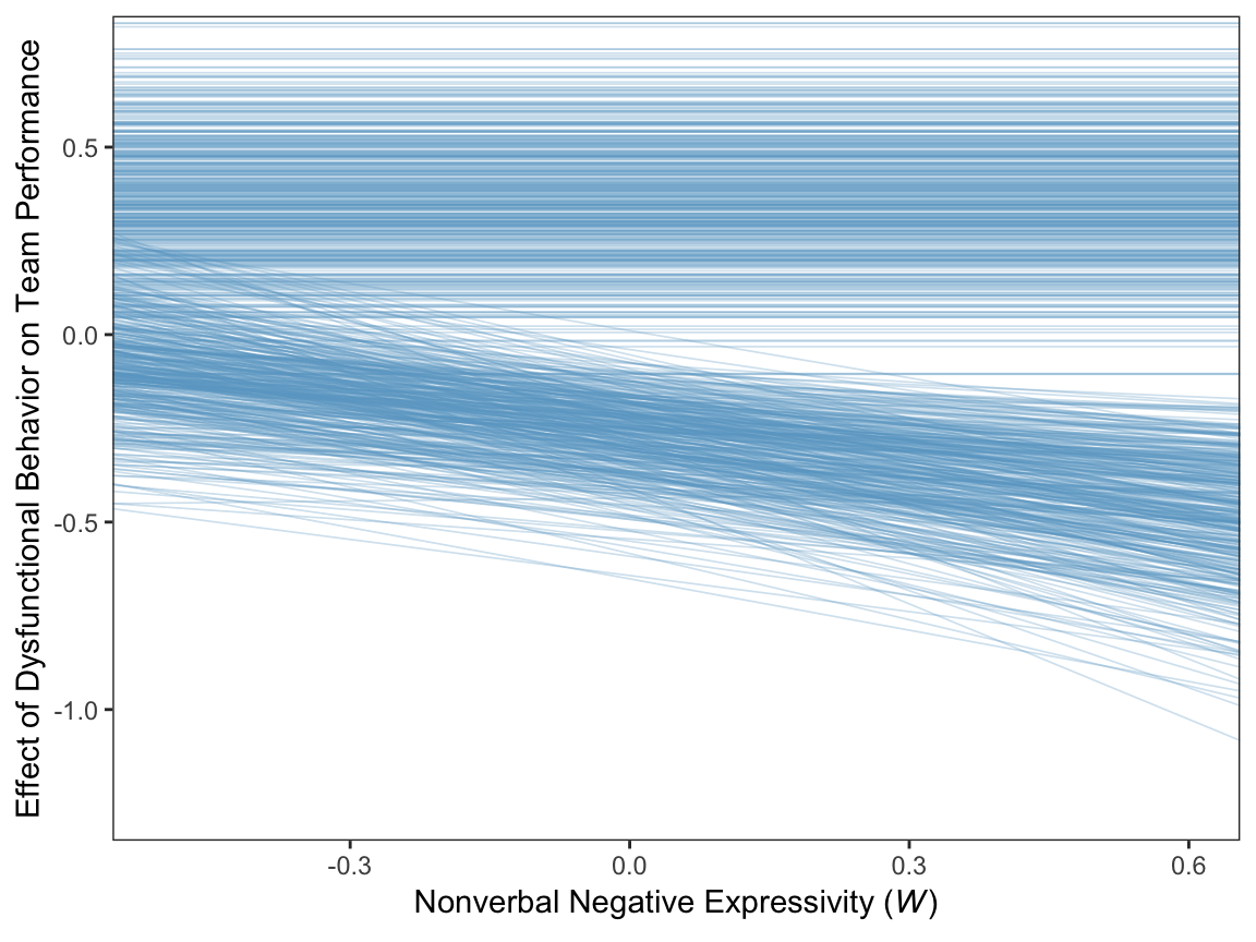
Since the b_perform_dysfunc values are constant across \(W\), the individual HMC iterations end up perfectly parallel in the spaghetti plot. This is an example of a visualization I’d avoid making with a spaghetti plot for a professional presentation. But hopefully it has some pedagogical value, here.