7.3 Visualizing moderation
To get quick plots for the interaction effect in brms, you might use the marginal_effects() function.
marginal_effects(model3)
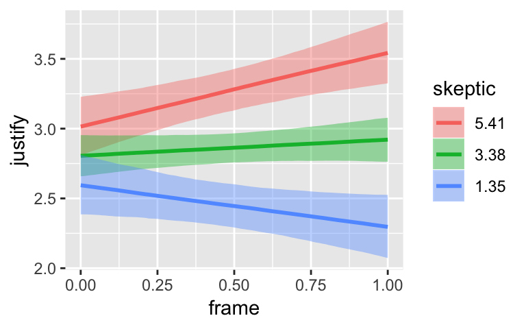
By default, margional_effects() will show three levels of the variable on the right side of the interaction term. The formula in model3 was justify ~ frame + skeptic + frame:skeptic, with frame:skeptic as the interaction term and skeptic making up the right hand side of the term. The three levels of skeptic in the plot, above, are the mean \(\pm\) 1 \(SD\). See the brms reference manual for details on marginal_effects().
On page 244, Hayes discussed using the 16th, 50th, and 84th percentiles for the moderator variable. We can compute those with quantile().
quantile(disaster$skeptic, probs = c(.16, .5, .84))## 16% 50% 84%
## 1.6 2.8 5.2The first two columns in Hayes’s Table 7.5 contain the values he combined with the point estimates of his model to get the \(\hat{Y}\) column. The way we’ll push those values through model3’s posterior is with brms::fitted(). As a preparatory step, we’ll put the predictor values in a data object, nd.
(
  nd <-
  tibble(frame = rep(0:1, times = 3),
         skeptic = rep(quantile(disaster$skeptic,
                                probs = c(.16, .5, .84)),
                       each = 2))
  )
## # A tibble: 6 x 2
## frame skeptic
## <int> <dbl>
## 1 0 1.6
## 2 1 1.6
## 3 0 2.8
## 4 1 2.8
## 5 0 5.2
## 6 1 5.2Now we’ve go our nd, we’ll get our posterior estimates for \(Y\) with fitted().
fitted(model3, newdata = nd)## Estimate Est.Error Q2.5 Q97.5
## [1,] 2.619724 0.10157731 2.425936 2.825434
## [2,] 2.375357 0.10853064 2.160738 2.588415
## [3,] 2.744880 0.07909575 2.591680 2.902951
## [4,] 2.743771 0.08389303 2.576498 2.910688
## [5,] 2.995192 0.10263407 2.799500 3.194292
## [6,] 3.480598 0.10513794 3.271800 3.689514When using the default summary = TRUE settings in fitted(), the function returns posterior means, \(SD\)s and 95% intervals for \(Y\) based on each row in the nd data we specified in the newdata = nd argument. You don’t have to name your newdata nd or anything like that; it’s just my convention.
Here’ a quick plot of what those values imply.
fitted(model3, newdata = nd) %>%
  as_tibble() %>%
  bind_cols(nd) %>%

  ggplot(aes(x = skeptic, y = Estimate)) +
  geom_ribbon(aes(ymin = Q2.5, ymax = Q97.5, fill = frame %>% as.character()),
              alpha = 1/3) +
  geom_line(aes(color = frame %>% as.character())) +
  scale_fill_manual("frame",
                    values = dutchmasters$little_street[c(10, 5)] %>% as.character()) +
  scale_color_manual("frame",
                     values = dutchmasters$little_street[c(10, 5)] %>% as.character()) +
  theme_07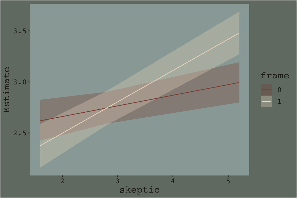
That plot is okay, but we can do better.
In order to plot the model-implied effects across the full range of skeptic values presented in Figure 7.7, you need to change the range of those values in the nd data. Also, although the effect is subtle in the above example, 95% intervals often follow a bowtie shape. In order to insure the contours of that shape are smooth, it’s often helpful to specify 30 or so evenly-spaced values in the variable on the x-axis, skeptic in this case. We’ll employ the seq() function for that and specify length.out = 30. And in order to use those 30 values for both levels of frame, we’ll nest the seq() function within rep(). In addition, we add a few other flourishes to make our plot more closely resemble the one in the text.
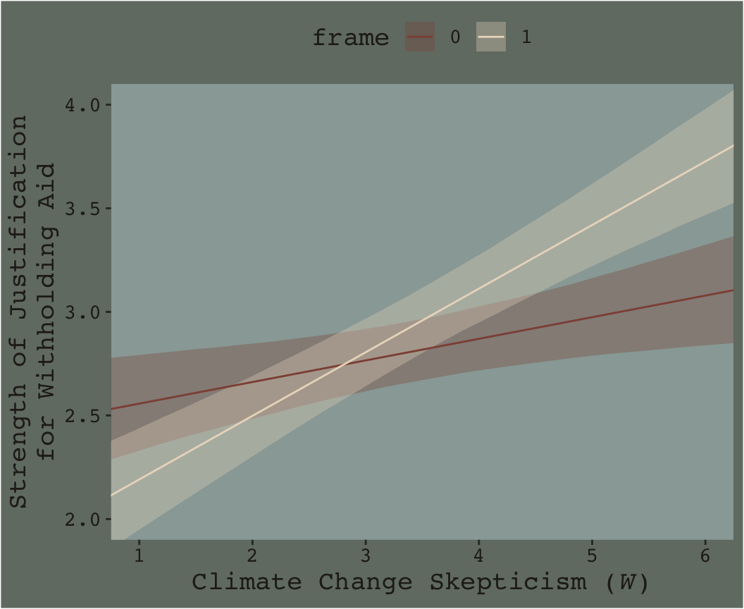
Here’s our Figure 7.7.
nd <-
  tibble(frame = rep(0:1, times = 30),
         skeptic = rep(seq(from = 0, to = 7, length.out = 30),
                       each = 2))

fitted(model3, newdata = nd) %>%
  as_tibble() %>%
  bind_cols(nd) %>%

  ggplot(aes(x = skeptic, y = Estimate)) +
  geom_ribbon(aes(ymin = Q2.5, ymax = Q97.5, fill = frame %>% as.character()),
              alpha = 1/3) +
  geom_line(aes(color = frame %>% as.character())) +
  scale_fill_manual("frame",
                    values = dutchmasters$little_street[c(10, 5)] %>% as.character()) +
  scale_color_manual("frame",
                     values = dutchmasters$little_street[c(10, 5)] %>% as.character()) +
  scale_x_continuous(breaks = 1:6) +
  coord_cartesian(xlim = 1:6,
                  ylim = 2:4) +
  labs(x = expression(paste("Climate Change Skepticism (", italic("W"), ")")),
       y = "Strength of Justification\nfor Withholding Aid") +
  theme_07 +
  theme(legend.position = "top")