9.4 More than one moderator
None of this is a problem for brms. But instead of using the model=i syntax in Hayes’s PROCESS, you just have to specify your model formula in brm().
9.4.1 Additive multiple moderation.
It’s trivial to add sex, its interaction with negemot, and the two covariates (i.e., posemot and ideology) to the model. We can even do it within update().
model7 <-
  update(model1, newdata = glbwarm,
         govact ~ 1 + negemot + sex + age + posemot + ideology + negemot:sex + negemot:age,
         chains = 4, cores = 4)
Our output matches nicely with the formula at the bottom of page 232 and the PROCESS output in Figure 9.2.
print(model7, digits = 3)## Family: gaussian
## Links: mu = identity; sigma = identity
## Formula: govact ~ negemot + sex + age + posemot + ideology + negemot:sex + negemot:age
## Data: glbwarm (Number of observations: 815)
## Samples: 4 chains, each with iter = 2000; warmup = 1000; thin = 1;
## total post-warmup samples = 4000
##
## Population-Level Effects:
## Estimate Est.Error l-95% CI u-95% CI Eff.Sample Rhat
## Intercept 5.274 0.341 4.614 5.946 2315 0.999
## negemot 0.091 0.084 -0.074 0.252 2051 0.999
## sex -0.747 0.194 -1.129 -0.365 2176 1.001
## age -0.018 0.006 -0.030 -0.006 2068 0.999
## posemot -0.023 0.027 -0.075 0.031 3936 0.999
## ideology -0.207 0.027 -0.261 -0.156 3764 1.001
## negemot:sex 0.206 0.050 0.103 0.305 2148 1.001
## negemot:age 0.005 0.002 0.002 0.008 1947 1.000
##
## Family Specific Parameters:
## Estimate Est.Error l-95% CI u-95% CI Eff.Sample Rhat
## sigma 1.048 0.027 0.997 1.101 3812 1.000
##
## Samples were drawn using sampling(NUTS). For each parameter, Eff.Sample
## is a crude measure of effective sample size, and Rhat is the potential
## scale reduction factor on split chains (at convergence, Rhat = 1).On page 325, Hayes discussed the unique variance each of the two moderation terms accounted for after controlling for the other covariates. In order to get our Bayesian version of these, we’ll have to fit two additional models, one after removing each of the interaction terms.
model8 <-
  update(model7, newdata = glbwarm,
         govact ~ 1 + negemot + sex + age + posemot + ideology + negemot:sex,
         chains = 4, cores = 4)

model9 <-
  update(model7, newdata = glbwarm,
         govact ~ 1 + negemot + sex + age + posemot + ideology + negemot:age,
         chains = 4, cores = 4)
Here we’ll extract the bayes_R2() iterations for each of the three models, place them all in a single tibble, and then do a little arithmetic to get the difference scores. After all that data wrangling, we’ll summarize() as usual.
r2_without_age_interaction <- bayes_R2(model8, summary = F) %>% as_tibble()
r2_without_sex_interaction <- bayes_R2(model9, summary = F) %>% as_tibble()
r2_with_both_interactions  <- bayes_R2(model7, summary = F) %>% as_tibble()

r2s <-
  tibble(r2_without_age_interaction = r2_without_age_interaction$R2,
         r2_without_sex_interaction = r2_without_sex_interaction$R2,
         r2_with_both_interactions  = r2_with_both_interactions$R2) %>%
  mutate(`delta R2 due to age interaction` = r2_with_both_interactions - r2_without_age_interaction,
         `delta R2 due to sex interaction` = r2_with_both_interactions - r2_without_sex_interaction)

r2s %>%
  select(`delta R2 due to age interaction`:`delta R2 due to sex interaction`) %>%
  gather() %>%
  group_by(key) %>%
  summarize(mean = mean(value),
            ll = quantile(value, probs = .025),
            ul = quantile(value, probs = .975)) %>%
  mutate_if(is.double, round, digits = 3)
## # A tibble: 2 x 4
## key mean ll ul
## <chr> <dbl> <dbl> <dbl>
## 1 delta R2 due to age interaction 0.007 -0.049 0.062
## 2 delta R2 due to sex interaction 0.012 -0.041 0.068Recall that \(R^2\) is in a 0-to-1 metric. It’s a proportion. If you want to convert that to a percentage, as in percent of variance explained, you’d just multiply by 100. To make it explicit, let’s do that.
r2s %>%
  select(`delta R2 due to age interaction`:`delta R2 due to sex interaction`) %>%
  gather() %>%
  group_by(key) %>%
  summarize(mean = mean(value)*100,
            ll = quantile(value, probs = .025)*100,
            ul = quantile(value, probs = .975)*100) %>%
  mutate_if(is.double, round, digits = 3)
## # A tibble: 2 x 4
## key mean ll ul
## <chr> <dbl> <dbl> <dbl>
## 1 delta R2 due to age interaction 0.665 -4.88 6.19
## 2 delta R2 due to sex interaction 1.23 -4.12 6.84Hopefully it’s clear how our proportions turned percentages correspond to the figures on page 325. However, note how our 95% credible intervals do not cohere with the \(p\)-values from Hayes’s \(F\)-tests.
If we want to prep for our version of Figure 9.3, we’ll need to carefully specify the predictor values we’ll pass through the fitted() function. Here we do so and save them in nd.
nd <-
  tibble(negemot = rep(seq(from = .5, to = 6.5, length.out = 30),
                       times = 6),
         sex = rep(rep(0:1, each = 30),
                   times = 3),
         age = rep(c(30, 50, 70), each = 60),
         posemot = mean(glbwarm$posemot),
         ideology = mean(glbwarm$ideology))

head(nd)
## # A tibble: 6 x 5
## negemot sex age posemot ideology
## <dbl> <int> <dbl> <dbl> <dbl>
## 1 0.5 0 30 3.13 4.08
## 2 0.707 0 30 3.13 4.08
## 3 0.914 0 30 3.13 4.08
## 4 1.12 0 30 3.13 4.08
## 5 1.33 0 30 3.13 4.08
## 6 1.53 0 30 3.13 4.08With our nd values in hand, we’re ready to make our version of Figure 9.3.
fitted(model7, newdata = nd) %>%
  as_tibble() %>%
  bind_cols(nd) %>%
  # These lines will make the strip text match with those with Hayes's Figure
  mutate(sex = ifelse(sex == 0, str_c("Females, W = ", sex),
                      str_c("Males, W = ", sex)),
         age = str_c("Age, Z, = ", age)) %>%

  # finally, the plot!
  ggplot(aes(x = negemot, group = sex)) +
  geom_ribbon(aes(ymin = Q2.5, ymax = Q97.5, fill = sex),
              alpha = 1/3, color = "transparent") +
  geom_line(aes(y = Estimate, color = sex),
            size = 1) +
  scale_x_continuous(breaks = 1:6) +
  coord_cartesian(xlim = 1:6,
                  ylim = 3:6) +
  labs(x = expression(paste("Negative Emotions about Climate Change, ", italic(X))),
       y = expression(paste("Support for Government Action to Mitigate Climate Change, ", italic(Y)))) +
  theme_xkcd() +
  theme(legend.position = "top",
        legend.title = element_blank()) +
  facet_grid(age ~ .)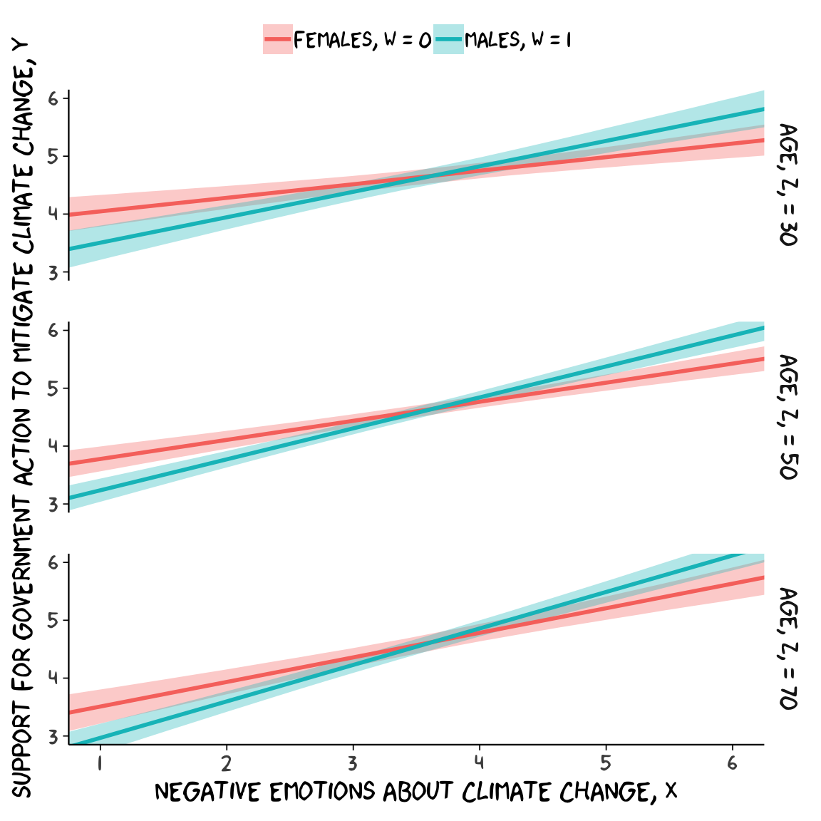
9.4.2 Moderated moderation.
To fit the moderated moderation model in brms, just add to two new interaction terms to the formula.
model10 <-
  update(model7, newdata = glbwarm,
         govact ~ 1 + negemot + sex + age + posemot + ideology +
           negemot:sex + negemot:age + sex:age +
           negemot:sex:age,
chains = 4, cores = 4)print(model10, digits = 3)## Family: gaussian
## Links: mu = identity; sigma = identity
## Formula: govact ~ negemot + sex + age + posemot + ideology + negemot:sex + negemot:age + sex:age + negemot:sex:age
## Data: glbwarm (Number of observations: 815)
## Samples: 4 chains, each with iter = 2000; warmup = 1000; thin = 1;
## total post-warmup samples = 4000
##
## Population-Level Effects:
## Estimate Est.Error l-95% CI u-95% CI Eff.Sample Rhat
## Intercept 4.558 0.477 3.638 5.446 1084 1.001
## negemot 0.272 0.116 0.056 0.500 1088 1.001
## sex 0.517 0.631 -0.713 1.745 957 1.001
## age -0.003 0.009 -0.021 0.015 1062 1.001
## posemot -0.020 0.028 -0.078 0.035 3262 0.999
## ideology -0.205 0.026 -0.257 -0.154 3391 1.001
## negemot:sex -0.127 0.164 -0.452 0.189 999 1.000
## negemot:age 0.001 0.002 -0.004 0.005 1109 1.000
## sex:age -0.025 0.012 -0.048 -0.002 922 1.001
## negemot:sex:age 0.007 0.003 0.001 0.013 969 1.000
##
## Family Specific Parameters:
## Estimate Est.Error l-95% CI u-95% CI Eff.Sample Rhat
## sigma 1.047 0.026 0.997 1.098 3661 0.999
##
## Samples were drawn using sampling(NUTS). For each parameter, Eff.Sample
## is a crude measure of effective sample size, and Rhat is the potential
## scale reduction factor on split chains (at convergence, Rhat = 1).Our print() output matches fairly well with the OLS results on pages 332 and 333. Our new Bayesian \(R^2\) is:
bayes_R2(model10) %>% round(digits = 3)## Estimate Est.Error Q2.5 Q97.5
## R2 0.417 0.02 0.375 0.457Because we haven’t changed the predictor variables in the model–just added interactions among them–there’s no need to redo our nd values. Rather, all we need to do is pass them through fitted() based on our new model10 and plot. Without further ado, here’s our Figure 9.6.
fitted(model10, newdata = nd) %>%
  as_tibble() %>%
  bind_cols(nd) %>%
  # These lines will make the strip text match with those with Hayes's Figure
  mutate(sex = ifelse(sex == 0, str_c("Females, W = ", sex),
                      str_c("Males, W = ", sex)),
         age = str_c("Age, Z, = ", age)) %>%

  # behold, Figure 9.6!
  ggplot(aes(x = negemot, group = sex)) +
  geom_ribbon(aes(ymin = Q2.5, ymax = Q97.5, fill = sex),
              alpha = 1/3, color = "transparent") +
  geom_line(aes(y = Estimate, color = sex),
            size = 1) +
  scale_x_continuous(breaks = 1:6) +
  coord_cartesian(xlim = 1:6,
                  ylim = 3:6) +
  labs(x = expression(paste("Negative Emotions about Climate Change, ", italic(X))),
       y = expression(paste("Support for Government Action to Mitigate Climate Change, ", italic(Y)))) +
  theme_xkcd() +
  theme(legend.position = "top",
        legend.title = element_blank()) +
  facet_grid(age ~ .)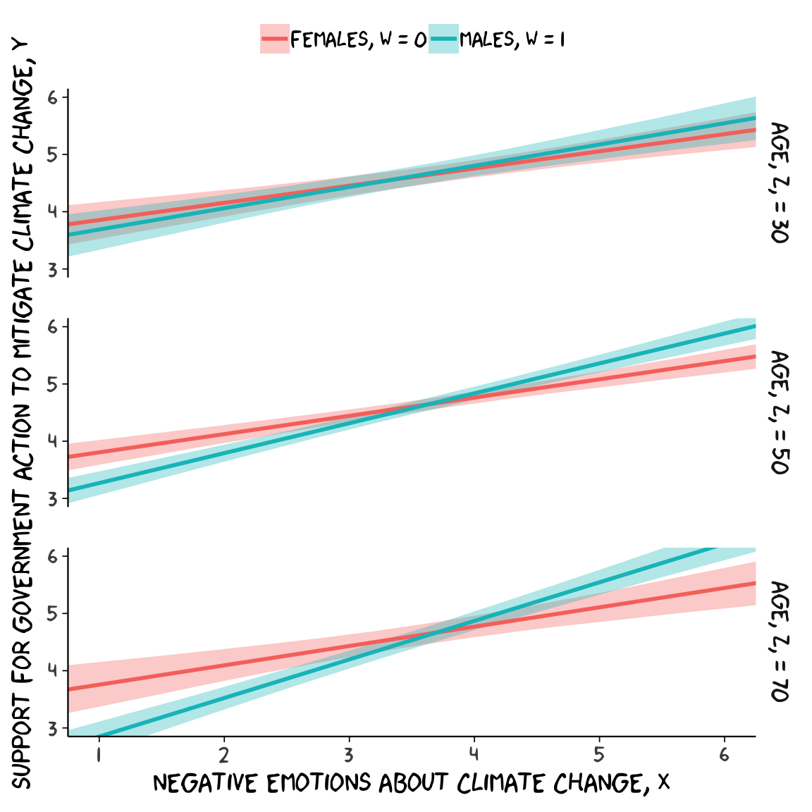
For the pick-a-point values Hayes covered on page 338, recall that when using posterior_sample(), our \(b_{4}\) is b_negemot:sex and our \(b_{7}\) is b_negemot:sex:age.
post <- posterior_samples(model10)

post %>%
  transmute(`age = 30` = `b_negemot:sex` + `b_negemot:sex:age`*30,
            `age = 50` = `b_negemot:sex` + `b_negemot:sex:age`*50,
            `age = 70` = `b_negemot:sex` + `b_negemot:sex:age`*70) %>%
  gather(theta_XW_on_Y_given, value) %>%
  group_by(theta_XW_on_Y_given) %>%
  summarize(mean = mean(value),
            ll = quantile(value, probs = .025),
            ul = quantile(value, probs = .975)) %>%
  mutate_if(is.double, round, digits = 3)
## # A tibble: 3 x 4
## theta_XW_on_Y_given mean ll ul
## <chr> <dbl> <dbl> <dbl>
## 1 age = 30 0.071 -0.085 0.227
## 2 age = 50 0.204 0.109 0.3
## 3 age = 70 0.336 0.183 0.496Our method for making a JN technique plot with fitted() way back in chapter 7 isn’t going to work, here. At least not as far as I can see. Rather, we’re going to have to skillfully manipulate our post object. For those new to R, this might be a little confusing at first. So I’m going to make a crude attempt first and then get more sophisticated.
Crude attempt:
post %>%
  transmute(`age = 30` = `b_negemot:sex` + `b_negemot:sex:age`*30,
            `age = 50` = `b_negemot:sex` + `b_negemot:sex:age`*50,
            `age = 70` = `b_negemot:sex` + `b_negemot:sex:age`*70) %>%
  gather(theta_XW_on_Y_given, value) %>%
  mutate(`theta XW on Y given` = str_extract(theta_XW_on_Y_given, "\\d+") %>% as.double()) %>%
  group_by(`theta XW on Y given`) %>%
  summarize(mean = mean(value),
            ll = quantile(value, probs = .025),
            ul = quantile(value, probs = .975)) %>%

  # the plot
  ggplot(aes(x = `theta XW on Y given`)) +
  geom_hline(yintercept = 0) +
  geom_vline(xintercept = 38.114) +
  geom_ribbon(aes(ymin = ll, ymax = ul),
              alpha = 1/2) +
  geom_line(aes(y = mean),
            size = 1) +
  coord_cartesian(xlim = 20:85,
                  ylim = c(-.25, .75)) +
  theme_xkcd()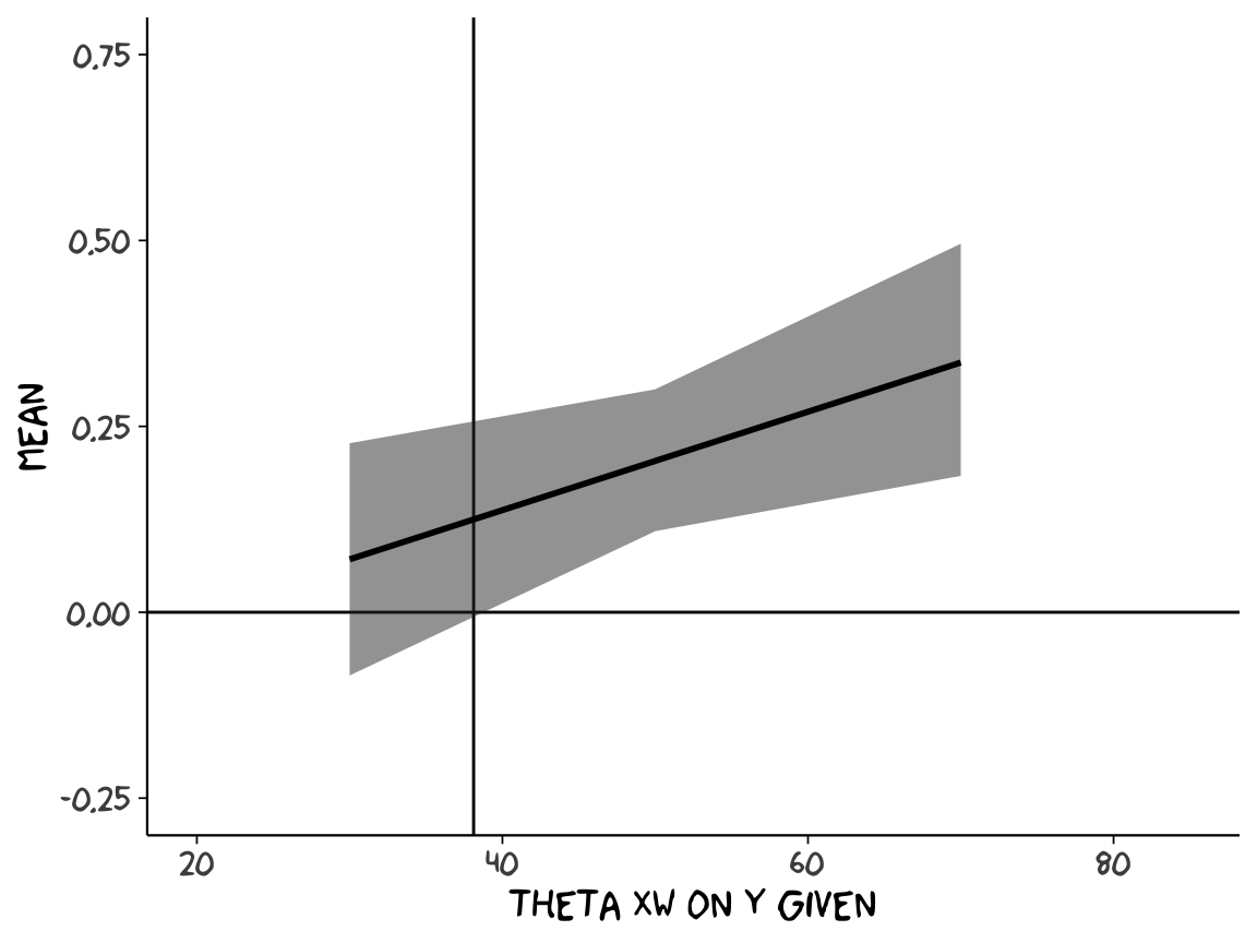
Notice how we just took the code from our pick-a-point analysis, left out the mutate_if() rounding part, and dumped it into a plot. So one obvious approach would be to pick like 30 or 50 age values to plug into transmute() and just do the same thing. If you’re super afraid of coding, that’d be one intuitive but extremely verbose attempt. And I’ve done stuff like that earlier in my R career. There’s no shame in being extremely verbose and redundant if that’s what makes sense. Another way is to think in terms of functions. When we made age = 30 within transmute(), we took a specific age value (i.e., 30) and plugged it into the formula b_negemot:sex + b_negemot:sex:age*i where \(i\) = 30. And when we made age = 50 we did exactly the same thing but switched out the 30 for a 50. So what we need is a function that will take a range of values for \(i\), plug them into our b_negemot:sex + b_negemot:sex:age*i formula, and then neatly return the output. A nice base R function for that is sapply().
sapply(15:90, function(i){
  post$`b_negemot:sex` + post$`b_negemot:sex:age`*i
}) %>%
  as_tibble() %>%
  str()
## Classes 'tbl_df', 'tbl' and 'data.frame': 4000 obs. of 76 variables:
## $ V1 : num -0.0712 -0.0131 0.0422 0.0194 -0.1911 ...
## $ V2 : num -0.0651 -0.0047 0.0481 0.0248 -0.1783 ...
## $ V3 : num -0.05887 0.00366 0.05405 0.03022 -0.16561 ...
## $ V4 : num -0.0527 0.012 0.06 0.0356 -0.1529 ...
## $ V5 : num -0.0465 0.0204 0.0659 0.041 -0.1402 ...
## $ V6 : num -0.0403 0.0287 0.0718 0.0464 -0.1274 ...
## $ V7 : num -0.0341 0.0371 0.0777 0.0518 -0.1147 ...
## $ V8 : num -0.0279 0.0455 0.0837 0.0572 -0.102 ...
## $ V9 : num -0.0218 0.0538 0.0896 0.0626 -0.0893 ...
## $ V10: num -0.0156 0.0622 0.0955 0.068 -0.0765 ...
## $ V11: num -0.0094 0.0705 0.1014 0.0734 -0.0638 ...
## $ V12: num -0.00321 0.07889 0.10737 0.07876 -0.05107 ...
## $ V13: num 0.00297 0.08725 0.11329 0.08416 -0.03835 ...
## $ V14: num 0.00915 0.09561 0.11921 0.08955 -0.02562 ...
## $ V15: num 0.0153 0.104 0.1251 0.0949 -0.0129 ...
## $ V16: num 0.021523 0.112324 0.131062 0.100336 -0.000164 ...
## $ V17: num 0.0277 0.1207 0.137 0.1057 0.0126 ...
## $ V18: num 0.0339 0.129 0.1429 0.1111 0.0253 ...
## $ V19: num 0.0401 0.1374 0.1488 0.1165 0.038 ...
## $ V20: num 0.0463 0.1458 0.1548 0.1219 0.0507 ...
## $ V21: num 0.0524 0.1541 0.1607 0.1273 0.0635 ...
## $ V22: num 0.0586 0.1625 0.1666 0.1327 0.0762 ...
## $ V23: num 0.0648 0.1708 0.1725 0.1381 0.0889 ...
## $ V24: num 0.071 0.179 0.178 0.143 0.102 ...
## $ V25: num 0.0772 0.1876 0.1844 0.1489 0.1144 ...
## $ V26: num 0.0834 0.1959 0.1903 0.1543 0.1271 ...
## $ V27: num 0.0895 0.2043 0.1962 0.1597 0.1398 ...
## $ V28: num 0.0957 0.2126 0.2022 0.1651 0.1526 ...
## $ V29: num 0.102 0.221 0.208 0.17 0.165 ...
## $ V30: num 0.108 0.229 0.214 0.176 0.178 ...
## $ V31: num 0.114 0.238 0.22 0.181 0.191 ...
## $ V32: num 0.12 0.246 0.226 0.187 0.203 ...
## $ V33: num 0.127 0.254 0.232 0.192 0.216 ...
## $ V34: num 0.133 0.263 0.238 0.197 0.229 ...
## $ V35: num 0.139 0.271 0.244 0.203 0.242 ...
## $ V36: num 0.145 0.279 0.25 0.208 0.254 ...
## $ V37: num 0.151 0.288 0.255 0.214 0.267 ...
## $ V38: num 0.158 0.296 0.261 0.219 0.28 ...
## $ V39: num 0.164 0.305 0.267 0.224 0.293 ...
## $ V40: num 0.17 0.313 0.273 0.23 0.305 ...
## $ V41: num 0.176 0.321 0.279 0.235 0.318 ...
## $ V42: num 0.182 0.33 0.285 0.241 0.331 ...
## $ V43: num 0.188 0.338 0.291 0.246 0.343 ...
## $ V44: num 0.195 0.346 0.297 0.251 0.356 ...
## $ V45: num 0.201 0.355 0.303 0.257 0.369 ...
## $ V46: num 0.207 0.363 0.309 0.262 0.382 ...
## $ V47: num 0.213 0.371 0.315 0.268 0.394 ...
## $ V48: num 0.219 0.38 0.321 0.273 0.407 ...
## $ V49: num 0.226 0.388 0.327 0.278 0.42 ...
## $ V50: num 0.232 0.397 0.332 0.284 0.433 ...
## $ V51: num 0.238 0.405 0.338 0.289 0.445 ...
## $ V52: num 0.244 0.413 0.344 0.295 0.458 ...
## $ V53: num 0.25 0.422 0.35 0.3 0.471 ...
## $ V54: num 0.257 0.43 0.356 0.305 0.483 ...
## $ V55: num 0.263 0.438 0.362 0.311 0.496 ...
## $ V56: num 0.269 0.447 0.368 0.316 0.509 ...
## $ V57: num 0.275 0.455 0.374 0.321 0.522 ...
## $ V58: num 0.281 0.463 0.38 0.327 0.534 ...
## $ V59: num 0.287 0.472 0.386 0.332 0.547 ...
## $ V60: num 0.294 0.48 0.392 0.338 0.56 ...
## $ V61: num 0.3 0.488 0.398 0.343 0.573 ...
## $ V62: num 0.306 0.497 0.404 0.348 0.585 ...
## $ V63: num 0.312 0.505 0.409 0.354 0.598 ...
## $ V64: num 0.318 0.514 0.415 0.359 0.611 ...
## $ V65: num 0.325 0.522 0.421 0.365 0.623 ...
## $ V66: num 0.331 0.53 0.427 0.37 0.636 ...
## $ V67: num 0.337 0.539 0.433 0.375 0.649 ...
## $ V68: num 0.343 0.547 0.439 0.381 0.662 ...
## $ V69: num 0.349 0.555 0.445 0.386 0.674 ...
## $ V70: num 0.355 0.564 0.451 0.392 0.687 ...
## $ V71: num 0.362 0.572 0.457 0.397 0.7 ...
## $ V72: num 0.368 0.58 0.463 0.402 0.713 ...
## $ V73: num 0.374 0.589 0.469 0.408 0.725 ...
## $ V74: num 0.38 0.597 0.475 0.413 0.738 ...
## $ V75: num 0.386 0.605 0.481 0.419 0.751 ...
## $ V76: num 0.393 0.614 0.487 0.424 0.763 ...Okay, to that looks a little monstrous. But what we did in the first argument was tell sapply() which values we’d like to use in some function. We chose each integer ranging from 15 to 90–which, if you do the math, is 76 values. We then told sapply() to plug those values into a custom function, which we defined as function(i){post$b_negemot:sex + post$b_negemot:sex:age*i}. In our custom function, i was a placeholder for each of those 76 integers. But remember that post has 4000 rows, each one corresponding to one of the 4000 posterior iterations. Thus, for each of our 76 i-values, we got 4000 results. After all that sapply() returned a matrix. Since we like to work within the tidyverse and use ggplot2, we just went ahead and put those results in a tibble.
With our sapply() output in hand, all we need to do is a little more indexing and summarizing and we’re ready to plot. The result is our very own version of Figure 9.7.
sapply(15:90, function(i){
  post$`b_negemot:sex` + post$`b_negemot:sex:age`*i
}) %>%
  as_tibble() %>%
  gather() %>%
  mutate(age = rep(15:90, each = 4000)) %>%
  group_by(age) %>%
  summarize(mean = mean(value),
            ll = quantile(value, probs = .025),
            ul = quantile(value, probs = .975)) %>%

  ggplot(aes(x = age)) +
  geom_hline(yintercept = 0, color = "grey75") +
  geom_vline(xintercept = 38.114, color = "grey75") +
  geom_ribbon(aes(ymin = ll, ymax = ul),
              alpha = 1/2) +
  geom_line(aes(y = mean),
            size = 1) +
  coord_cartesian(xlim = 20:85,
                  ylim = c(-.25, .75)) +
  labs(x = expression(paste("Age, ", italic(Z))),
       y = "Conditional Two-way Interaction Between\nNegative Emotions and Sex") +
  theme_xkcd()
Or for kicks and giggles, another way to get a clearer sense of how our data informed the shape of the plot, here we replace our geom_ribbon() + geom_line() code with geom_pointrange().
sapply(15:90, function(i){
  post$`b_negemot:sex` + post$`b_negemot:sex:age`*i
}) %>%
  as_tibble() %>%
  gather() %>%
  mutate(age = rep(15:90, each = 4000)) %>%
  group_by(age) %>%
  summarize(mean = mean(value),
            ll = quantile(value, probs = .025),
            ul = quantile(value, probs = .975)) %>%

  ggplot(aes(x = age)) +
  geom_hline(yintercept = 0, color = "grey75") +
  geom_vline(xintercept = 38.114, color = "grey75") +
  geom_pointrange(aes(y = mean, ymin = ll, ymax = ul),
                  shape = 16, size = 1/3) +
  coord_cartesian(xlim = 20:85,
                  ylim = c(-.25, .75)) +
  labs(x = expression(paste("Age, ", italic(Z))),
       y = "Conditional Two-way Interaction Between\nNegative Emotions and Sex") +
  theme_xkcd()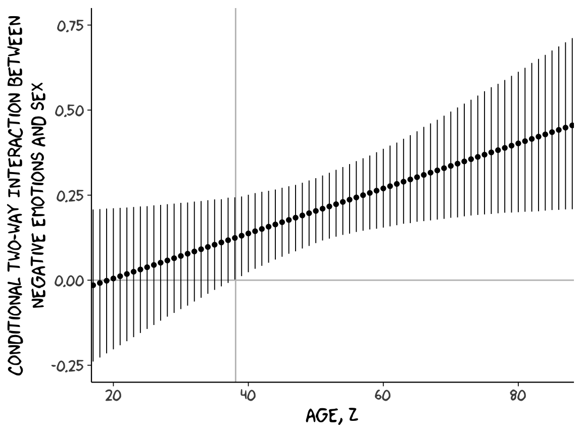
Although I probably wouldn’t try to use a plot like this in a manuscript, I hope it makes clear how the way we’ve been implementing the JN technique is just the pick-a-point approach in bulk. No magic.
For all you tidyverse fanatics out there, don’t worry. There are more tidyverse-centric ways to get the plot values than with sapply(). We’ll get to them soon enough. It’s advantageous to have good old base R sapply() up your sleeve, too. And new R users, it’s helpful to know that sapply() is one part of the apply() family of base R functions, which you might learn more about here or here or here.