8.2 Interaction between two quantitative variables
Here’s the glbwarm data.
glbwarm <- read_csv("data/glbwarm/glbwarm.csv")

glimpse(glbwarm)
## Observations: 815
## Variables: 7
## $ govact <dbl> 3.6, 5.0, 6.6, 1.0, 4.0, 7.0, 6.8, 5.6, 6.0, 2.6, 1.4, 5.6, 7.0, 3.8, 3.4, 4.2...
## $ posemot <dbl> 3.67, 2.00, 2.33, 5.00, 2.33, 1.00, 2.33, 4.00, 5.00, 5.00, 1.00, 4.00, 1.00, ...
## $ negemot <dbl> 4.67, 2.33, 3.67, 5.00, 1.67, 6.00, 4.00, 5.33, 6.00, 2.00, 1.00, 4.00, 5.00, ...
## $ ideology <int> 6, 2, 1, 1, 4, 3, 4, 5, 4, 7, 6, 4, 2, 4, 5, 2, 6, 4, 2, 4, 4, 2, 6, 4, 4, 3, ...
## $ age <int> 61, 55, 85, 59, 22, 34, 47, 65, 50, 60, 71, 60, 71, 59, 32, 36, 69, 70, 41, 48...
## $ sex <int> 0, 0, 1, 0, 1, 0, 1, 1, 1, 1, 1, 0, 1, 0, 1, 1, 1, 0, 0, 0, 0, 1, 1, 1, 1, 1, ...
## $ partyid <int> 2, 1, 1, 1, 1, 2, 1, 1, 2, 3, 2, 1, 1, 1, 1, 1, 2, 3, 1, 3, 2, 1, 3, 2, 1, 1, ...Although Hayes made a distinction between the \(X\), \(M\), and \(C\) variables in the text, that distinction is conceptual and doesn’t impact the way we enter them into brm(). Rather, the brm() formula clarifies they’re all just predictors.
model3 <-
  brm(data = glbwarm, family = gaussian,
      govact ~ 1 + negemot + age + negemot:age + posemot + ideology + sex,
      chains = 4, cores = 4)
Our results cohere nicely with the Hayes’s formula in the middle of page 278 or in Table 8.2.
print(model3, digits = 3)## Family: gaussian
## Links: mu = identity; sigma = identity
## Formula: govact ~ 1 + negemot + age + negemot:age + posemot + ideology + sex
## Data: glbwarm (Number of observations: 815)
## Samples: 4 chains, each with iter = 2000; warmup = 1000; thin = 1;
## total post-warmup samples = 4000
##
## Population-Level Effects:
## Estimate Est.Error l-95% CI u-95% CI Eff.Sample Rhat
## Intercept 5.188 0.335 4.540 5.844 2221 1.002
## negemot 0.116 0.082 -0.046 0.272 2031 1.003
## age -0.024 0.006 -0.036 -0.013 1958 1.004
## posemot -0.021 0.029 -0.078 0.036 4000 1.000
## ideology -0.212 0.026 -0.263 -0.160 4000 1.001
## sex -0.011 0.076 -0.155 0.138 3782 1.000
## negemot:age 0.006 0.002 0.003 0.009 2020 1.004
##
## Family Specific Parameters:
## Estimate Est.Error l-95% CI u-95% CI Eff.Sample Rhat
## sigma 1.059 0.027 1.009 1.113 4000 1.000
##
## Samples were drawn using sampling(NUTS). For each parameter, Eff.Sample
## is a crude measure of effective sample size, and Rhat is the potential
## scale reduction factor on split chains (at convergence, Rhat = 1).Here’s the \(R^2\) summary.
bayes_R2(model3) %>% round(digits = 3)## Estimate Est.Error Q2.5 Q97.5
## R2 0.401 0.02 0.359 0.439As the \(R^2\) is a good bit away from the boundaries, it’s nicely Gaussian.
bayes_R2(model3, summary = F) %>%
  as_tibble() %>%

  ggplot(aes(x = R2)) +
  geom_density(size = 0, fill = ochre_palettes[["olsen_qual"]][(1)]) +
  scale_y_continuous(NULL, breaks = NULL) +
  coord_cartesian(xlim = 0:1) +
  labs(title = expression(paste("Loot at how Gaussian our ", italic(R)^2, " is!")),
       subtitle = expression(paste("No need to put a ", italic(p), "-value on that sucker.")),
       x = NULL) +
  theme_08
8.2.1 Visualizing and probing the interaction.
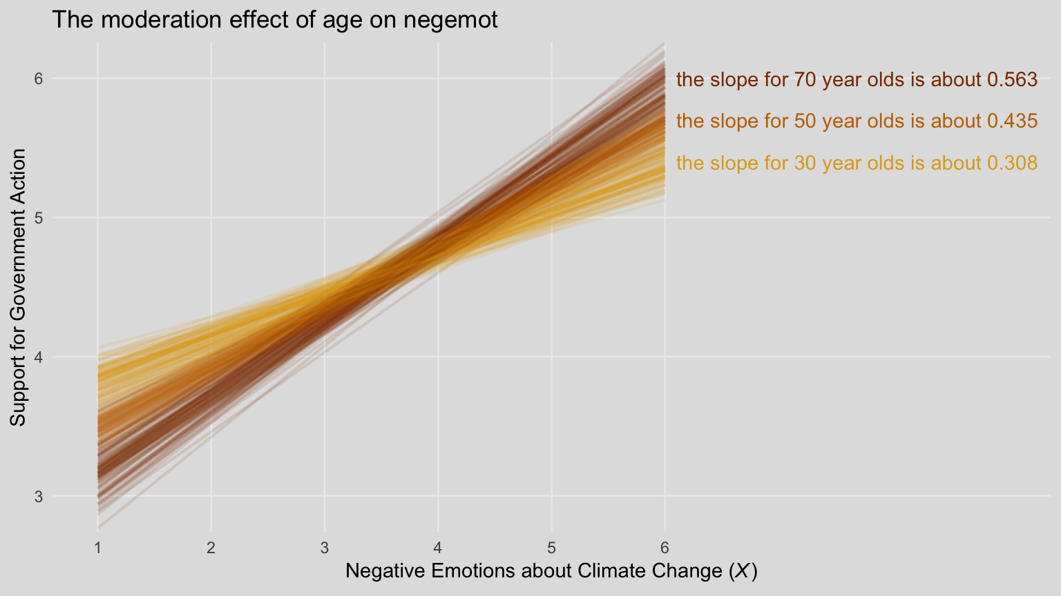
For our version of Figure 8.5, we’ll need to adjust our nd data for fitted().
(
  nd <-
  tibble(negemot  = rep(c(1, 6), each = 3),
         age      = rep(c(30, 50, 70), times = 2),
         posemot  = mean(glbwarm$posemot),
         ideology = mean(glbwarm$ideology),
         sex      = mean(glbwarm$sex))
  )
## # A tibble: 6 x 5
## negemot age posemot ideology sex
## <dbl> <dbl> <dbl> <dbl> <dbl>
## 1 1 30 3.13 4.08 0.488
## 2 1 50 3.13 4.08 0.488
## 3 1 70 3.13 4.08 0.488
## 4 6 30 3.13 4.08 0.488
## 5 6 50 3.13 4.08 0.488
## 6 6 70 3.13 4.08 0.488Our fitted() and ggplot2 code will be quite similar to the last spaghetti plot. Only this time we’ll use filter() to reduce the number of posterior draws we show in the plot.
# these will come in handy with `geom_text()`, below
slope_30 <- (fixef(model3)["negemot", 1] + fixef(model3)["negemot:age", 1]*30) %>% round(digits = 3)
slope_50 <- (fixef(model3)["negemot", 1] + fixef(model3)["negemot:age", 1]*50) %>% round(digits = 3)
slope_70 <- (fixef(model3)["negemot", 1] + fixef(model3)["negemot:age", 1]*70) %>% round(digits = 3)

fitted(model3, newdata = nd,
       summary = F) %>%
  as_tibble() %>%
  gather() %>%
  mutate(iter = rep(1:4000, times = 6),
         negemot = rep(rep(c(1, 6), each = 3),
                       each = 4000),
         age = rep(rep(c(30, 50, 70), times = 2),
                   each = 4000)) %>%
  # here we'll reduce our spaghetti plot lines to 100 per age category
  filter(iter <= 100) %>%

  ggplot(aes(x = negemot, y = value,
             group = interaction(age, iter),
             color = age %>% as.character())) +
  geom_line(aes(color = age %>% as.character()),
            size = 3/4, alpha = 1/8) +
  geom_text(data = tibble(negemot = 6.1,
                          value   = c(5.4, 5.7, 6),
                          age     = c(30, 50, 70),
                          iter    = 0,
                          label   = c(paste("the slope for 30 year olds is about", slope_30),
                                      paste("the slope for 50 year olds is about", slope_50),
                                      paste("the slope for 70 year olds is about", slope_70))),
            aes(label = label),
            hjust = 0) +
  scale_color_manual(NULL, values = ochre_palettes[["olsen_qual"]][c(4, 1, 3)]) +
  scale_x_continuous(breaks = 1:6) +
  coord_cartesian(xlim = 1:9,
                  ylim = c(2.9, 6.1)) +
  labs(title = "The moderation effect of age on negemot",
       x = expression(paste("Negative Emotions about Climate Change (", italic("X"), ")")),
       y = "Support for Government Action") +
  theme_08 +
  theme(legend.position = "none")
When we reduce the number of lines depicted in the plot, we lose some of the three-dimensional illusion. It’s nice, however, to get a closer look to each individual line. To each their own.
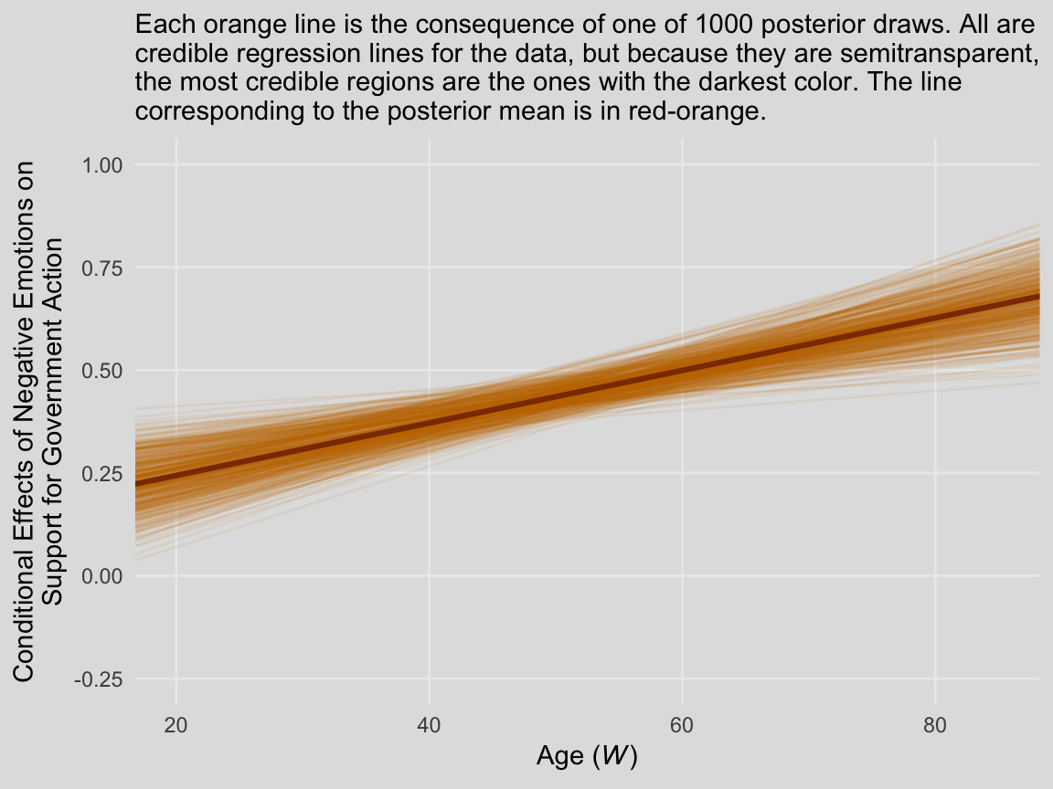
We’ll continue with our spaghetti plot approach for Figure 8.7. Again, when we made the JN technique plot for Chapter 7, we computed values for the posterior mean and the 95% intervals. Because the intervals follow a bowtie shape, we had to compute the \(Y\)-values for many values across the x-axis in order to make the curve look smooth. But as long as we stick with the spaghetti plot approach, all we need are the values at the endpoints of each iteration. Although each line is straight, the combination of many lines is what produces the bowtie effect.
# here is our primary data object
post <-
  posterior_samples(model3) %>%
  transmute(at_15 = b_negemot + `b_negemot:age`*15,
            at_90 = b_negemot + `b_negemot:age`*90,
            iter = 1:n()) %>%
  gather(key, value, -iter) %>%
  rename(age = key) %>%
  mutate(age = str_remove(age, "at_") %>% as.double())

# Here we compute the points for the posterior mean
post_means <-
  post %>%
  group_by(age) %>%
  summarize(value = mean(value)) %>%
  mutate(iter = 0)

# the plot
post %>%
  filter(iter < 501) %>%

  ggplot(aes(x = age, y = value, group = iter)) +
  geom_line(color = ochre_palettes[["olsen_qual"]][1],
            alpha = 1/12) +
  geom_line(data = post_means,
            color = ochre_palettes[["olsen_qual"]][3],
            size = 1.1) +
  scale_y_continuous(breaks = seq(from = -.25, to = 1, by = .25)) +
  coord_cartesian(xlim = c(20, 85),
                  ylim = c(-.25, 1)) +
  labs(subtitle = "Each orange line is the consequence of one of 1000 posterior draws. All are\ncredible regression lines for the data, but because they are semitransparent,\nthe most credible regions are the ones with the darkest color. The line\ncorresponding to the posterior mean is in red-orange.",
       x = expression(paste("Age (", italic("W"), ")")),
       y = "Conditional Effects of Negative Emotions on\nSupport for Government Action") +
  theme_08