7.9 Visualizing hazard ratios
In addition to reporting the numeric results of a Cox regression, it is helpful to create a forest plot to visualize the AHRs and their 95% CIs. You can easily create a forest plot using sjPlot::plot_model() (Lüdecke 2024b). See ?plot_model for customization options.
Example 7.6 (continued): Create a forest plot displaying the AHRs for the model. To put the AHR for age on a similar scale as the categorical predictors, use the AHR and 95% CI for a 8-year difference in age (the interquartile range).
By way of reminder, the following code was used to fit the model.
cox.ex7.6 <- coxph(Surv(gestage37, preterm01) ~ RF_PPTERM + MAGER +
                     MRACEHISP + DMAR, data = natality.complete)
For the purpose of creating a forest plot, changing the age scale must be made via the method that transforms age prior to fitting the model (see Section 6.6.1). Using the interquartile range results in an AHR that compares the adjusted hazard of the outcome between individuals at the 75th and 25th percentiles of the predictor distribution.
## [1] 8# Rescale age by dividing by the IQR
fpdat <- natality.complete %>%
mutate(MAGER8 = MAGER/8)
# Re-fit the model replacing age with the rescaled age variable
fit.fp <- coxph(Surv(gestage37, preterm01) ~ RF_PPTERM + MAGER8 +
MRACEHISP + DMAR, data = fpdat)
# Store the CIs for use in setting the axis limits
CI <- exp(confint(fit.fp))The forest plot is shown in Figure 7.12.
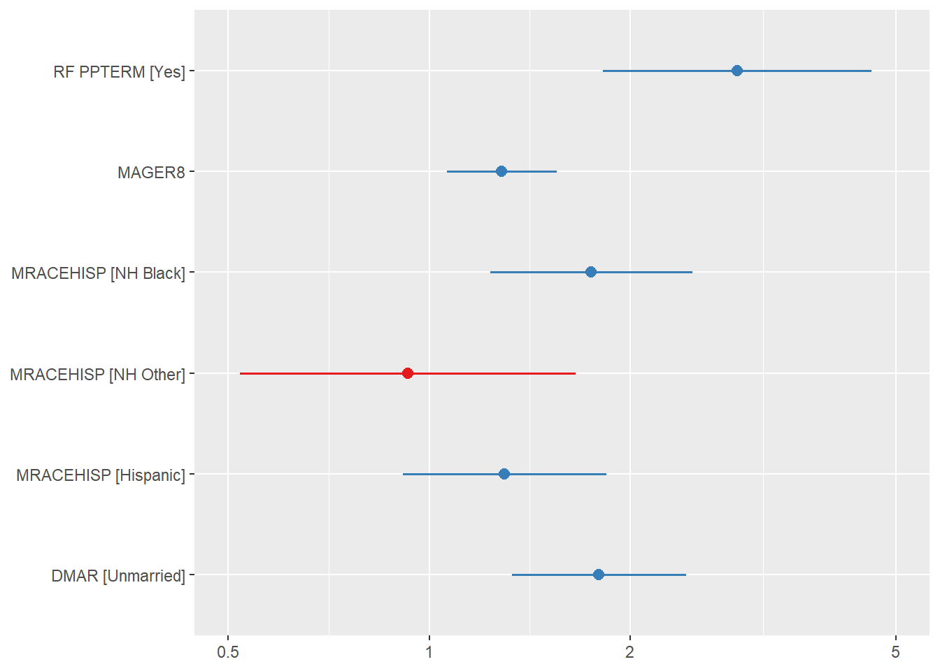
Figure 7.12: Forest plot of AHRs and their 95% CIs for the Cox regression analysis of preterm birth