5.4 Examine the data
In Chapter 3, we learned how to numerically and visually summarize variables one at a time. Here, we will apply those methods to examine the variables for a specific analysis. At this stage of the analysis, we are only looking for very obvious problems, such as values that are highly unusual, extremely skewed variables, or categorical variables with sparse levels. We also want to check that all categorical variables are coded as factors. At later stages, when we examine regression diagnostics, we may make modifications to variables in order to resolve lack of fit of the model.
5.4.1 Outcome
We need to make sure the outcome variable is appropriate for a linear regression. It should be continuous (not just a few unique values) and, ideally, normally distributed (or at least symmetric), although we will learn that normality is not essential if the sample size is large.
To be sure the outcome really is continuous, count the number of unique values. If there are only a few, then linear regression may not be appropriate; consider instead ordinal logistic regression (Section 6.22) or binary logistic regression (after dichotomizing the outcome) (Chapter 6). Next, create a numeric summary and plot a histogram of the outcome. Later, after you have learned more about regression diagnostics, you will be able to identify skew and outliers in these plots and may immediately realize that a transformation is needed. You will investigate these potential problems more closely when checking the model assumptions in Sections 5.15 to 5.18, but sometimes you can save time by noticing the need for a transformation before fitting the model.
Example 5.1 (continued): Examine a numeric summary and histogram of the outcome, fasting glucose.
## [1] 96## Min. 1st Qu. Median Mean 3rd Qu. Max.
## 2.61 5.33 5.72 6.11 6.22 19.00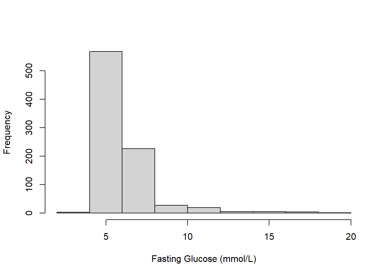
Figure 5.1: Histogram of fasting glucose (mmol/L)
The summary indicates that the outcome has many (96) unique values, so it is appropriate to treat it as continuous. While there are no strange values, Figure 5.1 shows that the outcome is skewed.
5.4.2 Continuous predictors
Count the number of unique values – if there are only a few, then you should consider treating the predictor as categorical instead. Create a numeric summary and plot a histogram for each continuous predictor. There is no requirement that continuous predictors be normally distributed; however, skewed distributions and extreme values can lead to a problem with influential observations (discussed in Section 5.23). What we are primarily looking for at this point are strange values and to be sure each predictor is coded as expected. For example, if what you thought should be a continuous predictor has only a few unique values, then perhaps the variable should be coded as categorical instead.
Example 5.1 (continued):
## [1] 375## [1] 61## Min. 1st Qu. Median Mean 3rd Qu. Max.
## 63.2 88.3 98.3 100.8 112.2 169.5## Min. 1st Qu. Median Mean 3rd Qu. Max.
## 20.0 34.0 47.0 47.8 61.0 80.0# Histograms
par(mfrow=c(1,2))
hist(nhanesf.complete$BMXWAIST, main = "", xlab = "Waist Circumference (cm)")
hist(nhanesf.complete$RIDAGEYR, main = "", xlab = "Age (years)")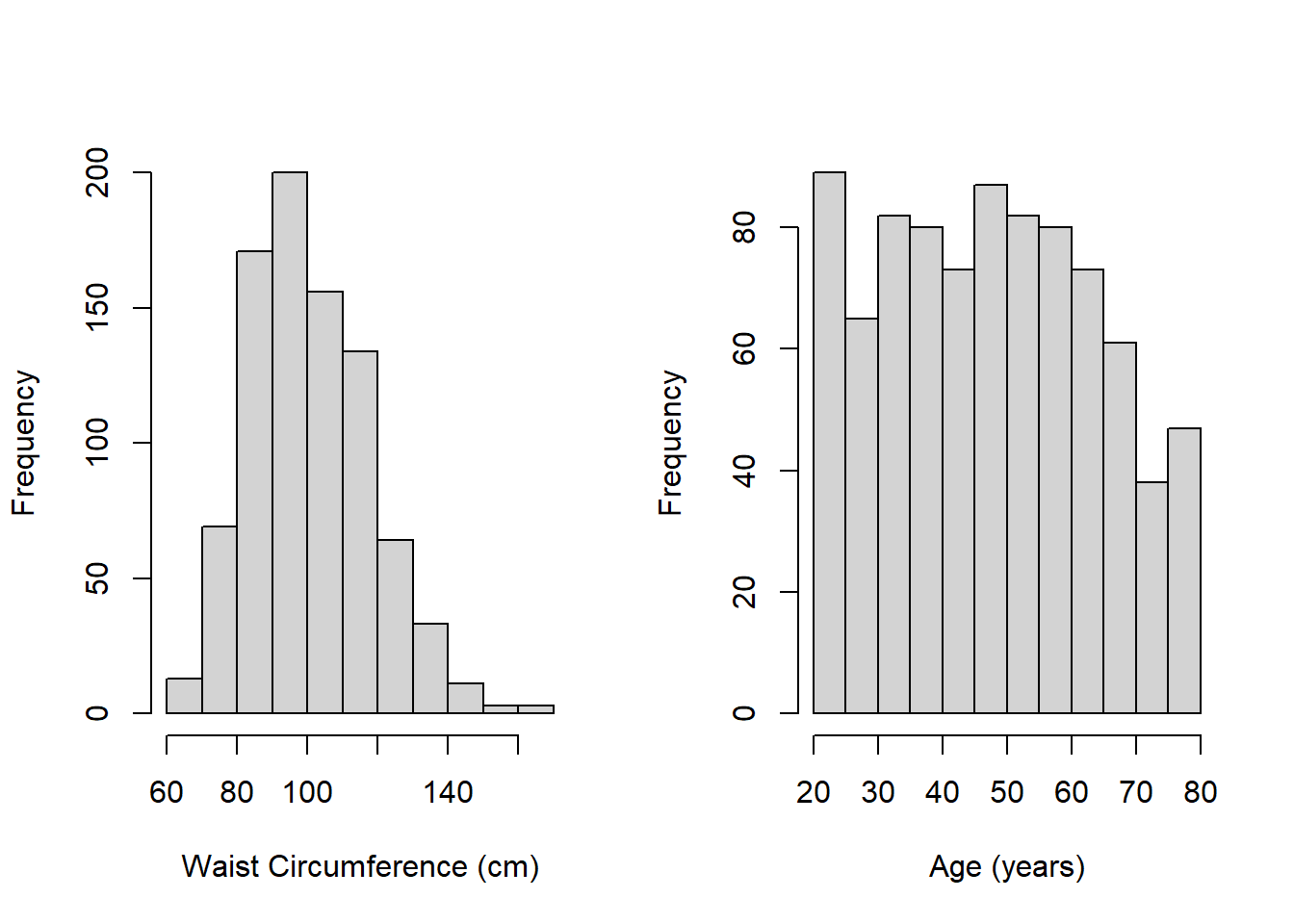
Figure 5.2: Histograms of continuous predictors
The summaries indicate the following:
- Each predictor has many unique values indicating that each should indeed be treated as continuous.
- Figure 5.2 shows that waist circumference is slightly skewed, but neither waist circumference nor age have very extreme values. We will still, however, check for influential observations in Section 5.23 since these histograms can only show extreme values one-variable-at a time – what matters for MLR is how different a case is from the others when considering all the predictors simultaneously.
- Neither variable has any strange values
What if there were strange values? For example, if there were age values of, say, 142 or -5, then we should investigate further. Are these data entry errors that can be corrected? If they cannot be corrected with certainty, then it is reasonable to set these values to missing. Additionally, what if there were only a few unique values so you would like to code the variable as a factor instead? R code to accomplish these tasks can be found in Chapter 3 in An Introduction to R for Research (Nahhas 2024) and “Transform” in R for Data Science (H. Wickham, Çetinkaya-Rundel, and Grolemund 2023).
5.4.3 Categorical predictors
The main issue to watch out for with categorical predictors is sparse levels (levels that have a small sample size) since the estimated mean within a small group of cases will be very imprecise. Create a frequency table for each categorical predictor (optionally, also plot a bar chart). Look for levels that have only a few observations, as these may need to be collapsed with other levels. You could use, for example, 30, 50, or 100 as a cutoff, but any cutoff is subjective. If you are concerned that your regression results may depend too much on the choice of how to collapse categorical predictors, carry out a sensitivity analysis to compare the results under different scenarios (see Section 5.26). Finally, check that each categorical predictor is coded as a factor, recoding as a factor if not (see Section 4.4.1).
Example 5.1 (continued):
##
##   Never    Past Current
## 500 222 135##
## Male Female
## 388 469# table(nhanesf.complete$RIDRETH3, useNA = "ifany")
# Use count so the display is vertical
# (easier to read when there are many levels)
nhanesf.complete %>%
count(RIDRETH3)## RIDRETH3 n
## 1 Mexican American 97
## 2 Other Hispanic 55
## 3 Non-Hispanic White 534
## 4 Non-Hispanic Black 98
## 5 Non-Hispanic Asian 36
## 6 Other/Multi 37##
## <$25,000 $25,000 to <$55,000 $55,000+
## 157 221 479c(is.factor(nhanesf.complete$smoker),
is.factor(nhanesf.complete$RIAGENDR),
is.factor(nhanesf.complete$RIDRETH3),
is.factor(nhanesf.complete$income))## [1] TRUE TRUE TRUE TRUEFrom the output we conclude the following:
- Each predictor has only a few levels, so treating each as categorical is appropriate.
- The race/ethnicity variable may have a few sparse levels.
- Each is coded as a factor.
5.4.4 Overall description of the data
As a partial alternative to the steps described above, you can use Hmisc::describe() (see Section 3.1.1) to get a detailed description of all the variables with one command. It does not provide all the information we need (e.g., whether or not a categorical variable is coded as a factor), but it is useful.
5.4.5 Collapsing sparse levels
This section demonstrates how to collapse a categorical predictor that has sparse levels. Here, we combine race/ethnicity levels that have 55 cases or fewer with other levels to create a new variable. By this definition, the “Mexican American” group is sparse and it makes sense to combine it with the “Hispanic” group. Additionally, “Non-Hispanic Asian” and “Other/Multi” are both small groups, so we combine them. Remember to always check any derivation by comparing observations before and after.
nhanesf.complete <- nhanesf.complete %>%
  mutate(race_eth = fct_collapse(RIDRETH3,
   "Hispanic"           = c("Mexican American", "Other Hispanic"),
   "Non-Hispanic Other" = c("Non-Hispanic Asian", "Other/Multi")))

# Check derivation
TAB <- table(nhanesf.complete$RIDRETH3, nhanesf.complete$race_eth,
             useNA = "ifany")
addmargins(TAB, 1) # Adds a row of column totals
##
## Hispanic Non-Hispanic White Non-Hispanic Black Non-Hispanic Other
## Mexican American 97 0 0 0
## Other Hispanic 55 0 0 0
## Non-Hispanic White 0 534 0 0
## Non-Hispanic Black 0 0 98 0
## Non-Hispanic Asian 0 0 0 36
## Other/Multi 0 0 0 37
## Sum 152 534 98 73The two-way frequency table shows that the derivation code did what we intended (“Mexican American” and “Other Hispanic” were combined into “Hispanic”; “Non-Hispanic Asian” and “Other/Multi” were combined into “Non-Hispanic Other”). The “Sum” row provides the sample sizes in the new levels.
NOTE: This example is provided to illustrate how to go about collapsing a sparse predictor. In practice, think carefully about the context. By collapsing the way we did, we are assuming that the mean outcome (fasting glucose) is not meaningfully different between the groups of individuals in the levels that were combined. An alternative would be to exclude individuals in sparse levels from an analysis entirely, which would result in altering the scope of the analysis. For example, if we excluded those in the “Other/Multi” group, the results would not be generalizable to that group.