6.7 Visualizing ORs
In addition to reporting the numeric results of a logistic regression, it is helpful to create a forest plot to visualize the AORs and their 95% CIs. You can easily create a forest plot using plot_model() from the sjPlot library (Lüdecke 2024b). See ?plot_model for customization options.
Example 6.3 (continued): Create a forest plot displaying the AORs for the model. To put the AOR for age of first alcohol use on a similar scale as the categorical predictors, use the AOR and 95% CI for a 4-year difference in age (the interquartile range).
For the purpose of creating a forest plot, changing the age scale must be made via the method that transforms age prior to fitting the model (see Section 6.6.1). Using the interquartile range results in an AOR that compares the adjusted odds of the outcome between individuals at the 75th and 25th percentiles of the predictor distribution.
## [1] 4fpdat <- nsduh %>%
mutate(alc_agefirst4 = alc_agefirst/4)
fit.fp <- glm(mj_lifetime ~ alc_agefirst4 + demog_age_cat6 + demog_sex +
demog_income, family = binomial, data = fpdat)
# Use [-1,] to exclude the intercept since exp(intercept) is not an OR
CI <- exp(confint(fit.fp))[-1,]The forest plot is shown in Figure 6.3.
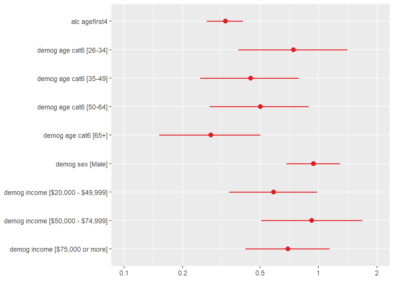
Figure 6.3: Forest plot of AORs and their 95% CIs for the logistic regression analysis of lifetime marijuana use