3.3 Plotting
Cool stuff, now let’s make a plot! We’ll plot the relationship between pirate’s height and weight using the plot() function
# Create scatterplot
plot(x = pirates$height,        # X coordinates
     y = pirates$weight)        # y-coordinates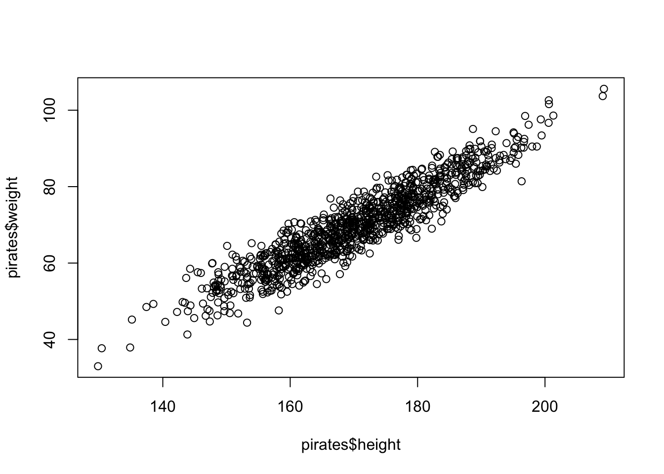
Now let’s make a fancier version of the same plot by adding some customization
# Create scatterplot
plot(x = pirates$height,        # X coordinates
     y = pirates$weight,        # y-coordinates
     main = 'My first scatterplot of pirate data!',
     xlab = 'Height (in cm)',   # x-axis label
     ylab = 'Weight (in kg)',   # y-axis label
     pch = 16,                  # Filled circles
     col = gray(.0, .1))        # Transparent gray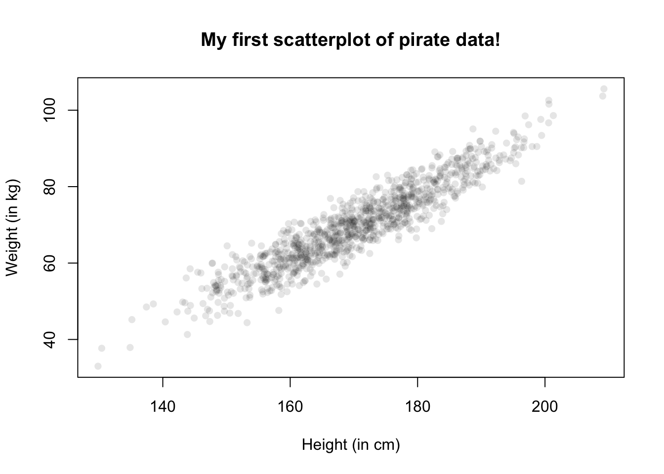
Now let’s make it even better by adding gridlines and a blue regression line to measure the strength of the relationship.
# Create scatterplot
plot(x = pirates$height,        # X coordinates
     y = pirates$weight,        # y-coordinates
     main = 'My first scatterplot of pirate data!',
     xlab = 'Height (in cm)',   # x-axis label
     ylab = 'Weight (in kg)',   # y-axis label
     pch = 16,                  # Filled circles
     col = gray(.0, .1))        # Transparent gray

grid()        # Add gridlines

# Create a linear regression model
model <- lm(formula = weight ~ height,
            data = pirates)

abline(model, col = 'blue')      # Add regression to plot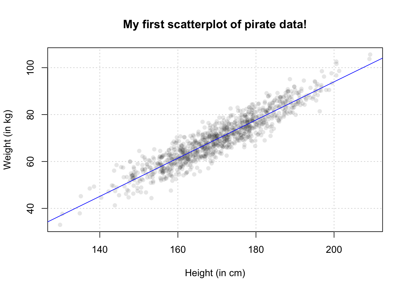
Scatterplots are great for showing the relationship between two continuous variables, but what if your independent variable is not continuous? In this case, pirateplots are a good option. Let’s create a pirateplot using the pirateplot() function to show the distribution of pirate’s age based on their favorite sword:
pirateplot(formula = age ~ sword.type,
           data = pirates,
           main = "Pirateplot of ages by favorite sword")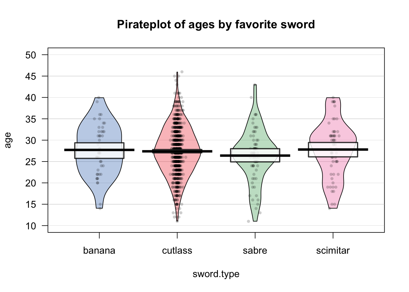
Now let’s make another pirateplot showing the relationship between sex and height using a different plotting theme and the "pony" color palette:
pirateplot(formula = height ~ sex,               # Plot weight as a function of sex
           data = pirates,
           main = "Pirateplot of height by sex",
           pal = "pony",                         # Use the info color palette
           theme = 3)                            # Use theme 3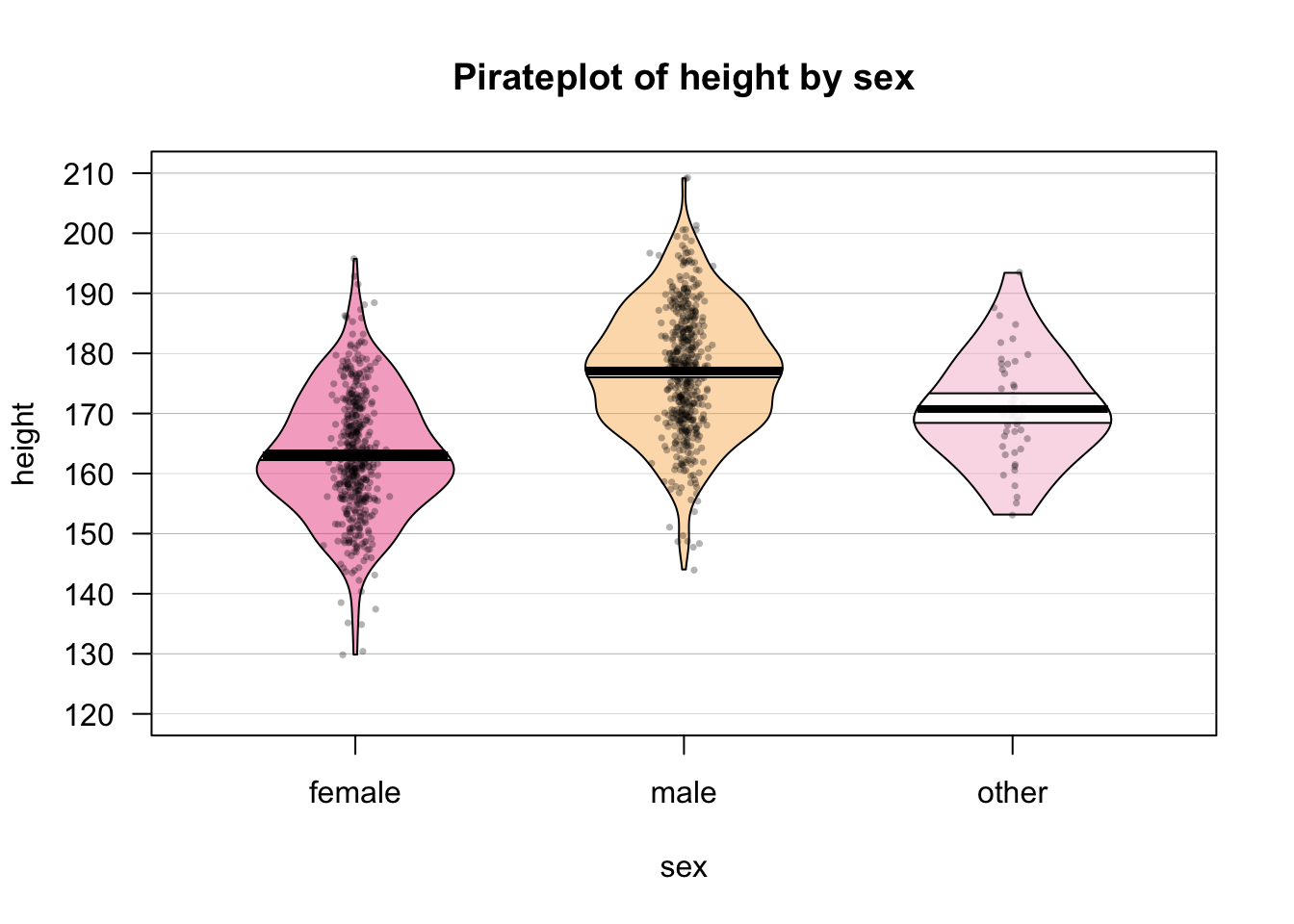
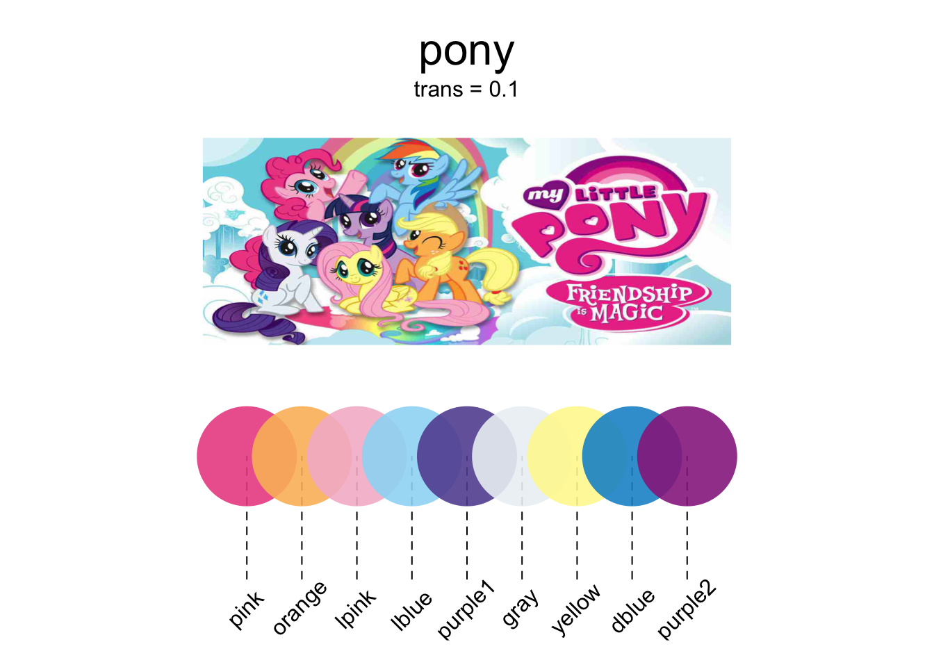
The "pony" palette is contained in the piratepal() function. Let’s see where the "pony" palette comes from…
# Show me the pony palette!
piratepal(palette = "pony",
          plot.result = TRUE,   # Plot the result
          trans = .1)           # Slightly transparent