Chapter 11 Plotting (I)

Figure 11.1: The great Sammy Davis Jr. Do yourself a favor and spend an evening watching videos of him performing on YouTube. Image used entirely without permission.
Sammy Davis Jr. was one of the greatest American performers of all time. If you don’t know him already, Sammy was an American entertainer who lived from 1925 to 1990. The range of his talents was just incredible. He could sing, dance, act, and play multiple instruments with ease. So how is R like Sammy Davis Jr? Like Sammy Davis Jr., R is incredibly good at doing many different things. R does data analysis like Sammy dances, and creates plot like Sammy sings. If Sammy and R did just one of these things, they’d be great. The fact that they can do both is pretty amazing.
When you evaluate plotting functions in R, R can build the plot in different locations. The default location for plots is in a temporary plotting window within your R programming environment. In RStudio, plots will show up in the Plot window (typically on the bottom right hand window pane). In Base R, plots will show up in a Quartz window.
You can think of these plotting locations as canvases. You only have one canvas active at any given time, and any plotting command you run will put more plotting elements on your active canvas. Certain high–level plotting functions like plot() and hist() create brand new canvases, while other low–level plotting functions like points() and segments() place elements on top of existing canvases.
Don’t worry if that’s confusing for now – we’ll go over all the details soon.
Let’s start by looking at a basic scatterplot in R using the plot() function. When you execute the following code, you should see a plot open in a new window:
# A basic scatterplot
plot(x = 1:10,
     y = 1:10,
     xlab = "X Axis label",
     ylab = "Y Axis label",
     main = "Main Title")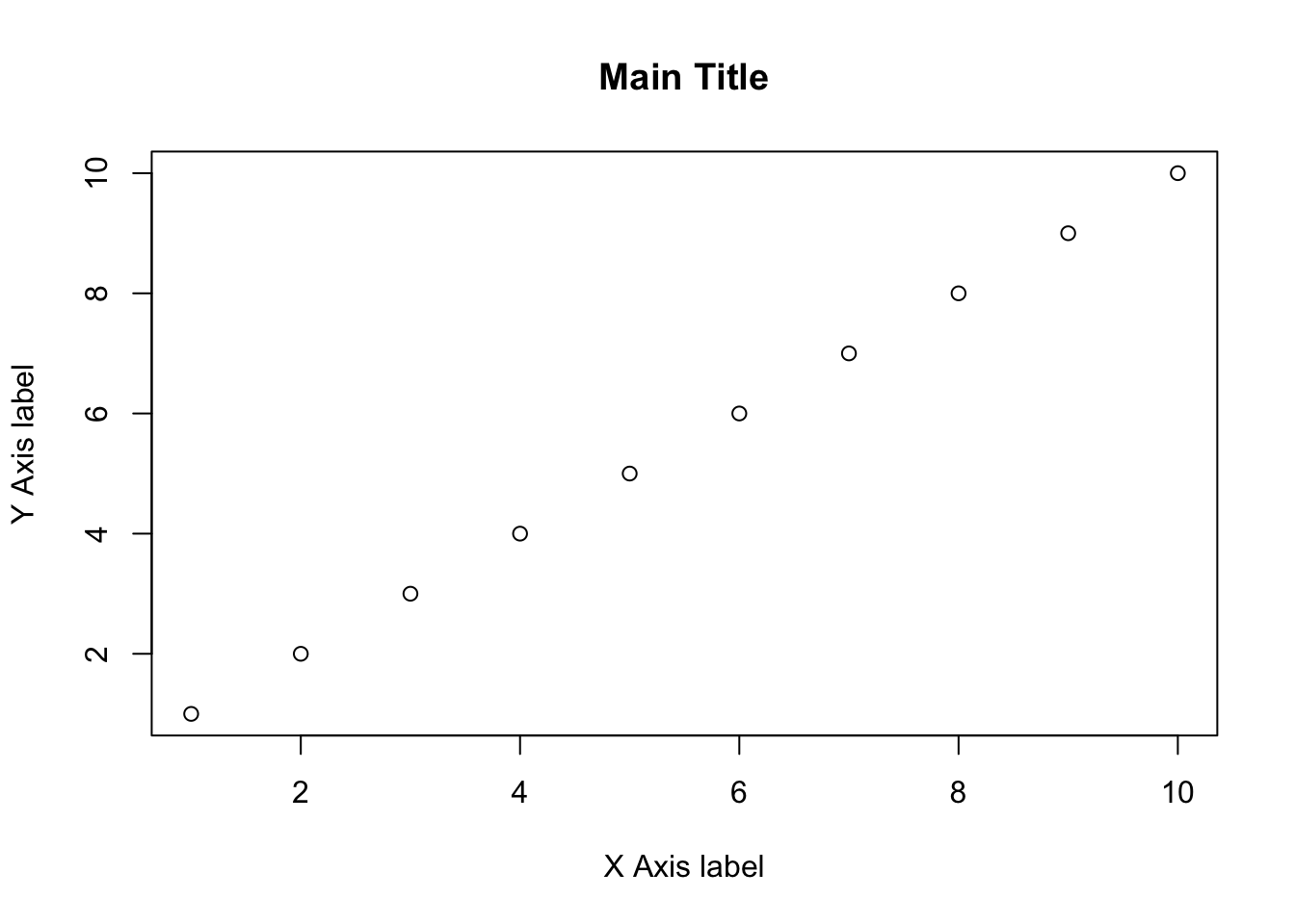
Let’s take a look at the result. We see an x–axis, a y–axis, 10 data points, an x–axis label, a y–axis label, and a main plot title. Some of these items, like the labels and data points, were entered as arguments to the function. For example, the main arguments x and y are vectors indicating the x and y coordinates of the (in this case, 10) data points. The arguments xlab, ylab, and main set the labels to the plot. However, there were many elements that I did not specify – from the x and y axis limits, to the color of the plotting points. As you’ll discover later, you can change all of these elements (and many, many more) by specifying additional arguments to the plot() function. However, because I did not specify them, R used default values – values that R uses unless you tell it to use something else.
For the rest of this chapter, we’ll go over the main plotting functions, along with the most common arguments you can use to customize the look of your plot.