15.5 Logistic regression with glm(family = "binomial"
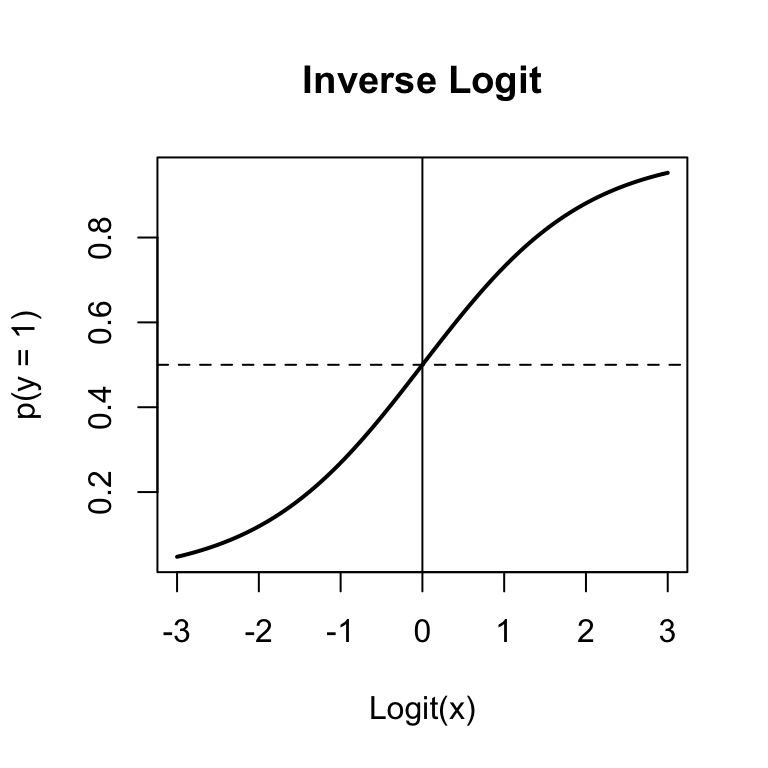
Figure 15.3: The inverse logit function used in binary logistic regression to convert logits to probabilities.
The most common non-normal regression analysis is logistic regression, where your dependent variable is just 0s and 1. To do a logistic regression analysis with glm(), use the family = binomial argument.
Let’s run a logistic regression on the diamonds dataset. First, I’ll create a binary variable called value.g190 indicating whether the value of a diamond is greater than 190 or not. Then, I’ll conduct a logistic regression with our new binary variable as the dependent variable. We’ll set family = "binomial" to tell glm() that the dependent variable is binary.
# Create a binary variable indicating whether or not
#   a diamond's value is greater than 190
diamonds$value.g190 <- diamonds$value > 190

# Conduct a logistic regression on the new binary variable
diamond.glm <- glm(formula = value.g190 ~ weight + clarity + color,
                   data = diamonds,
                   family = binomial)
Here are the resulting coefficients:
# Print coefficients from logistic regression
summary(diamond.glm)$coefficients
##             Estimate Std. Error z value  Pr(>|z|)
## (Intercept) -18.8009     3.4634  -5.428 5.686e-08
## weight        1.1251     0.1968   5.716 1.088e-08
## clarity       9.2910     1.9629   4.733 2.209e-06
## color        -0.3836     0.2481  -1.547 1.220e-01
Just like with regular regression with lm(), we can get the fitted values from the model and put them back into our dataset to see how well the model fit the data:
# Add logistic fitted values back to dataframe as
#  new column pred.g190
diamonds$pred.g190 <- diamond.glm$fitted.values

# Look at the first few rows (of the named columns)
head(diamonds[c("weight", "clarity", "color", "value", "pred.g190")])
##   weight clarity color value pred.g190
## 1   9.35    0.88     4 182.5   0.16252
## 2  11.10    1.05     5 191.2   0.82130
## 3   8.65    0.85     6 175.7   0.03008
## 4  10.43    1.15     5 195.2   0.84559
## 5  10.62    0.92     5 181.6   0.44455
## 6  12.35    0.44     4 182.9   0.08688
Looking at the first few observations, it looks like the probabilities match the data pretty well. For example, the first diamond with a value of 182.5 had a fitted probability of just 0.16 of being valued greater than 190. In contrast, the second diamond, which had a value of 191.2 had a much higher fitted probability of 0.82.
Just like we did with regular regression, you can use the predict() function along with the results of a glm() object to predict new data. Let’s use the diamond.glm object to predict the probability that the new diamonds will have a value greater than 190:
# Predict the 'probability' that the 3 new diamonds
#  will have a value greater than 190

predict(object = diamond.glm,
        newdata = diamonds.new)
##       1       2       3
##  4.8605 -3.5265 -0.3898
What the heck, these don’t look like probabilities! True, they’re not. They are logit-transformed probabilities. To turn them back into probabilities, we need to invert them by applying the inverse logit function:
# Get logit predictions of new diamonds
logit.predictions <- predict(object = diamond.glm,
                             newdata = diamonds.new
                             )

# Apply inverse logit to transform to probabilities
#  (See Equation in the margin)
prob.predictions <- 1 / (1 + exp(-logit.predictions))

# Print final predictions!
prob.predictions
##       1       2       3
## 0.99231 0.02857 0.40376
So, the model predicts that the probability that the three new diamonds will be valued over 190 is 99.23%, 2.86%, and 40.38% respectively.
15.5.1 Adding a regression line to a plot
You can easily add a regression line to a scatterplot. To do this, just put the regression object you created with as the main argument to . For example, the following code will create the scatterplot on the right (Figure~) showing the relationship between a diamond’s weight and its value including a red regression line:
# Scatterplot of diamond weight and value
plot(x = diamonds$weight,
     y = diamonds$value,
     xlab = "Weight",
     ylab = "Value",
     main = "Adding a regression line with abline()"
     )

# Calculate regression model
diamonds.lm <- lm(formula = value ~ weight,
                  data = diamonds)

# Add regression line
abline(diamonds.lm,
       col = "red", lwd = 2)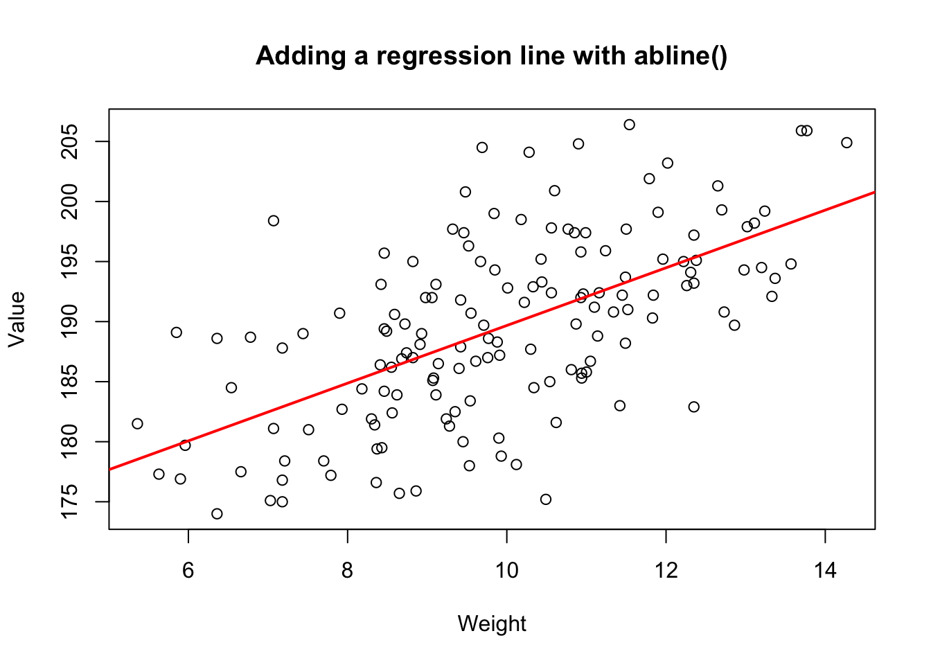
Figure 15.4: Adding a regression line to a scatterplot using abline()
15.5.2 Transforming skewed variables prior to standard regression
# The distribution of movie revenus is highly
#  skewed.
hist(movies$revenue.all,
     main = "Movie revenue\nBefore log-transformation")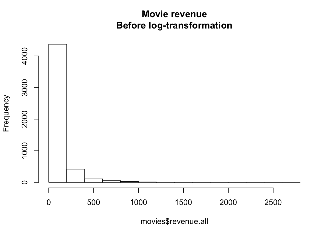
Figure 15.5: Distribution of movie revenues without a log-transformation
If you have a highly skewed variable that you want to include in a regression analysis, you can do one of two things. Option 1 is to use the general linear model glm() with an appropriate family (like family = "gamma"). Option 2 is to do a standard regression analysis with lm(), but before doing so, transforming the variable into something less skewed. For highly skewed data, the most common transformation is a log-transformation.
For example, look at the distribution of movie revenues in the movies dataset in the margin Figure 15.5:
As you can see, these data don’t look Normally distributed at all. There are a few movies (like Avatar) that just an obscene amount of money, and many movies that made much less. If we want to conduct a standard regression analysis on these data, we need to create a new log-transformed version of the variable. In the following code, I’ll create a new variable called revenue.all.log defined as the logarithm of revenue.all
# Create a new log-transformed version of movie revenue
movies$revenue.all.log <- log(movies$revenue.all)
In Figure 15.6 you can see a histogram of the new log-transformed variable. It’s still skewed, but not nearly as badly as before, so I would be feel much better using this variable in a standard regression analysis with lm().
# Distribution of log-transformed
#  revenue is much less skewed

hist(movies$revenue.all.log,
     main = "Log-transformed Movie revenue")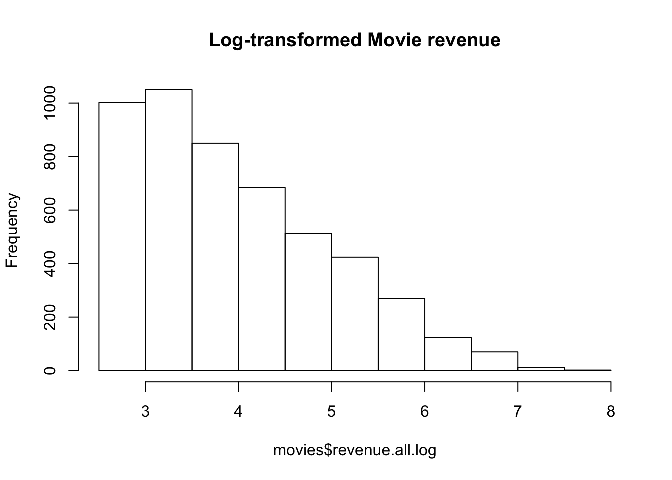
Figure 15.6: Distribution of log-transformed movie revenues. It’s still skewed, but not nearly as badly as before.