12.1 More colors
12.1.1 piratepal()
The yarrr package comes with several color palettes ready for you to use. The palettes are contained in the piratepal() function. To see all the palettes, run piratepal("all")
yarrr::piratepal("all")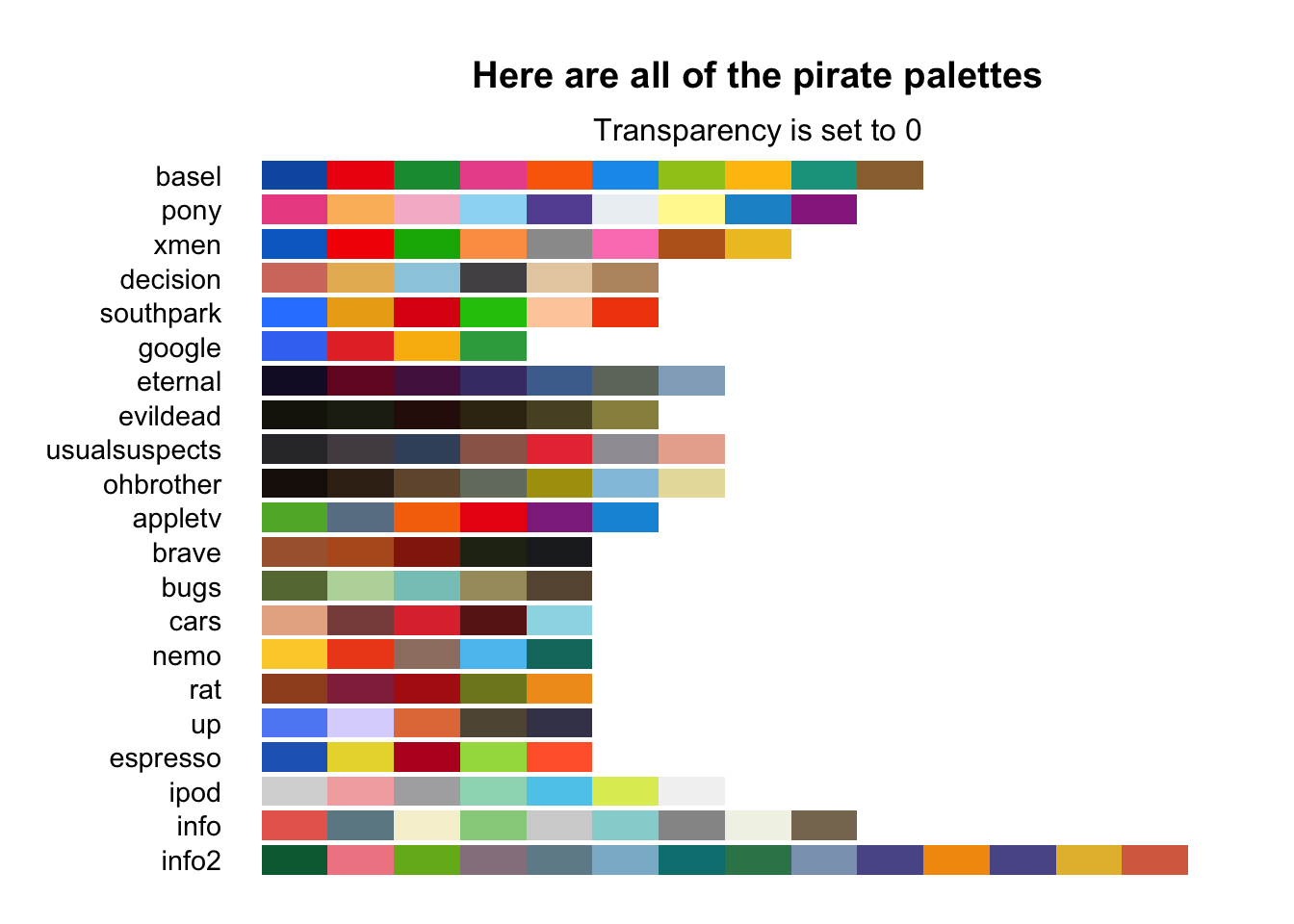
To see a palette in detail, including a picture of what inspired the palette, include the name of the palette in the first argument, (e.g.; "basel") and then specify the argument plot.result = TRUE. Here are a few of my personal favorite palettes:
# Show me the basel palette
yarrr::piratepal("basel",
                 plot.result = TRUE,
                 trans = .1)          # Slightly transparent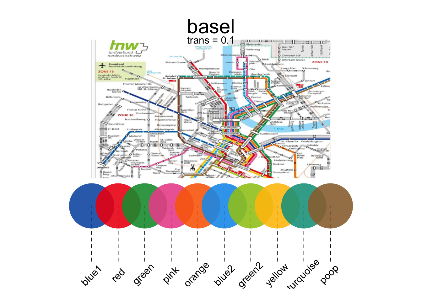
# Show me the pony palette
yarrr::piratepal("pony",
                 plot.result = TRUE,
                 trans = .1)          # Slightly transparent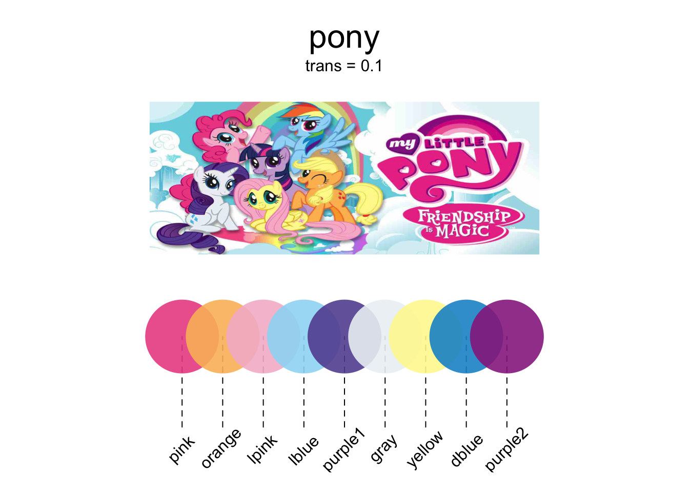
# Show me the evildead palette
yarrr::piratepal("evildead",
                 plot.result = TRUE,
                 trans = .1)          # Slightly transparent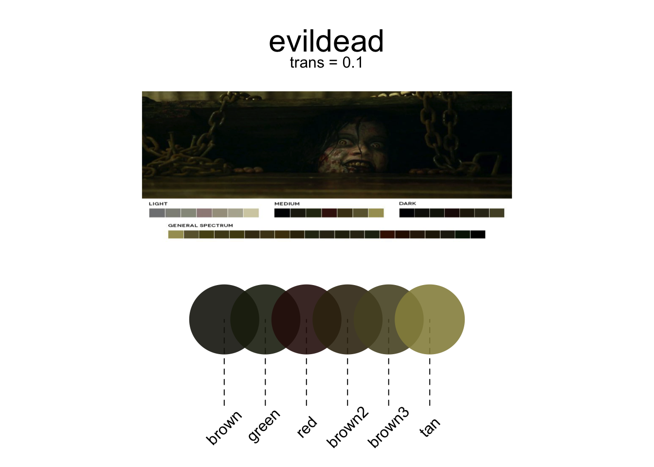
Once you find a color palette you like, you can save the colors as a vector and assigning the result to an object. For example, if I want to use the "google" palette and use them in a barplot, I would do the following:
# Save the South Park palette to a vector
google.cols <- piratepal(palette = "google",
                         trans = .2)

# Create a barplot with the google colors
barplot(height = 1:5,
       col = google.cols,
       border = "white",
       main = "Barplot with the google palette")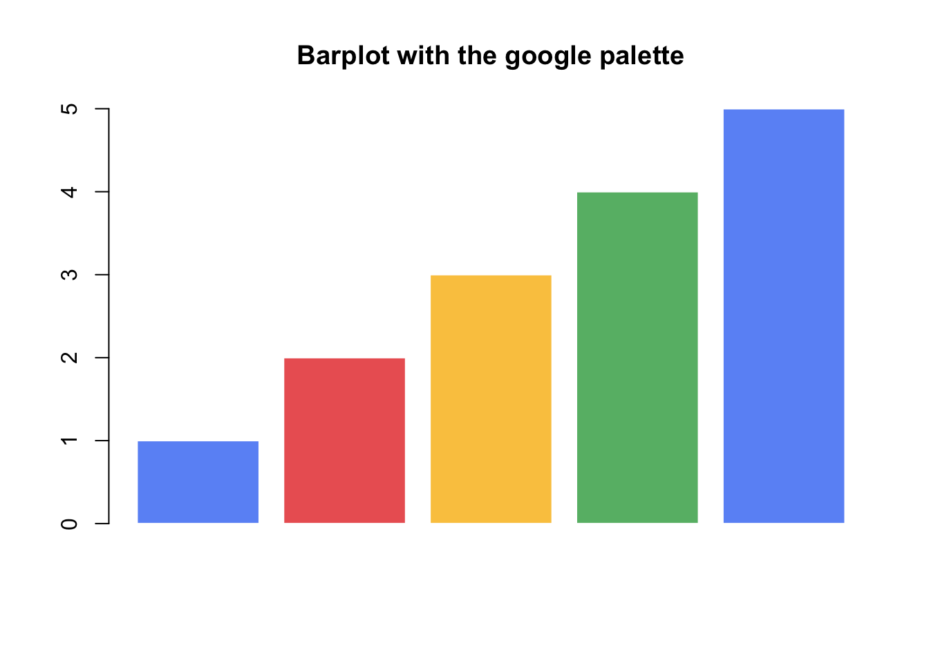
12.1.2 RColorBrewer
One package that is great for getting (and even creating) palettes is RColorBrewer. Here are some of the palettes in the package. The name of each palette is in the first column, and the colors in each palette are in each row:
library("RColorBrewer")
display.brewer.all()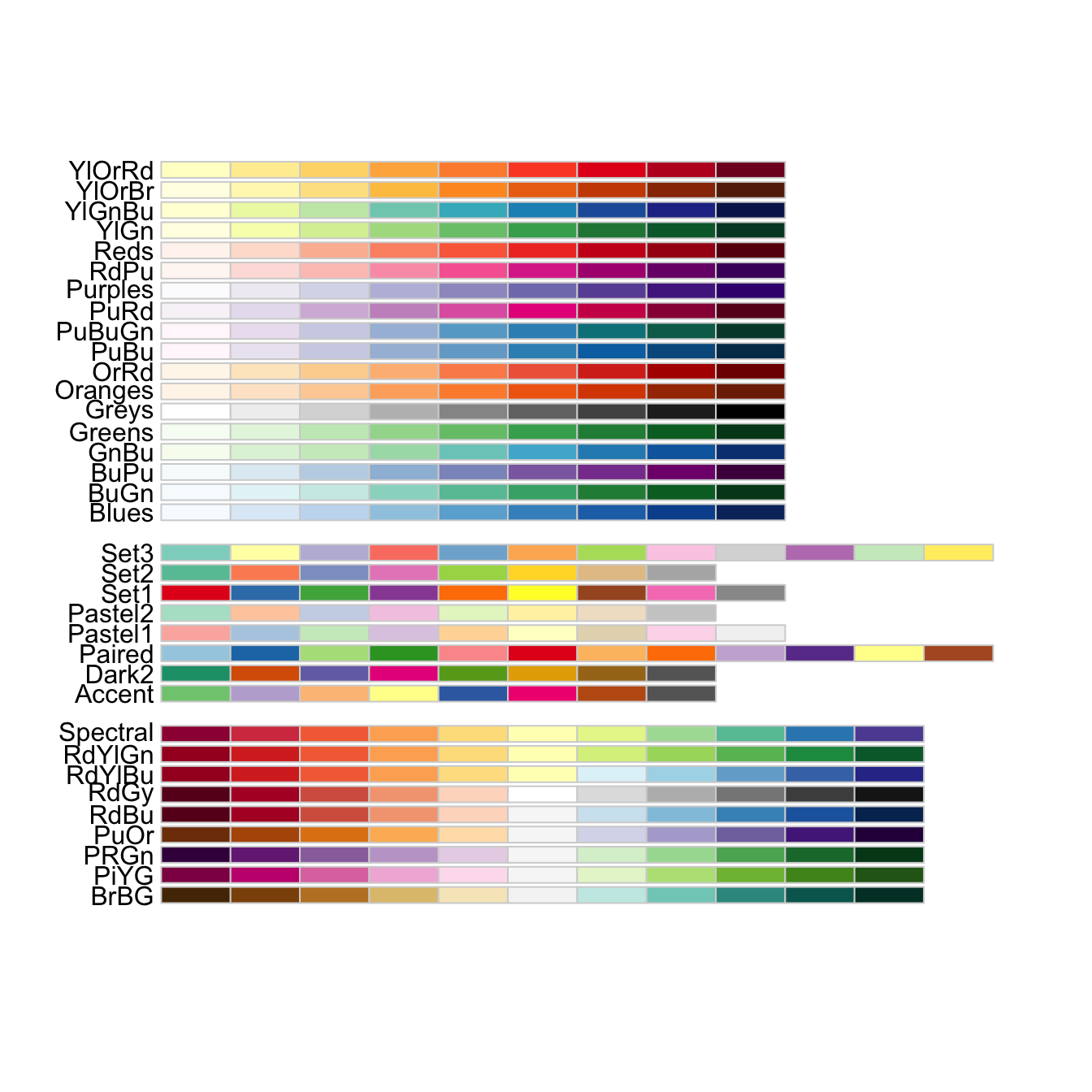
12.1.3 colorRamp2
My favorite way to generate colors that represent numerical data is with the function colorRamp2 in the circlize package (the same package that creates that really cool chordDiagram from Chapter 1). The colorRamp2 function allows you to easily generate shades of colors based on numerical data.
The best way to explain how colorRamp2 works is by giving you an example. Let’s say that you want to want to plot data showing the relationship between the number of drinks someone has on average per week and the resulting risk of some adverse health effect. Further, let’s say you want to color the points as a function of the number of packs of cigarettes per week that person smokes, where a value of 0 packs is colored Blue, 10 packs is Orange, and 30 packs is Red. Moreover, you want the values in between these break points of 0, 10 and 30 to be a mix of the colors. For example, the value of 5 (half way between 0 and 10) should be an equal mix of Blue and Orange.
When you run the function, the function will actually return another function that you can then use to generate colors. Once you store the resulting function as an object (something like my.color.fun You can then apply this new function on numerical data (in our example, the number of cigarettes someone smokes) to obtain the correct color for each data point.
For example, let’s create the color ramp function for our smoking data points. I’ll use colorRamp2 to create a function that I’ll call smoking.colors which takes a number as an argument, and returns the corresponding color:
# Create color function from colorRamp2
smoking.colors <- circlize::colorRamp2(breaks = c(0, 15, 25),
                  colors = c("blue", "green", "red"),
                  transparency = .2)


plot(1, xlim = c(-.5, 31.5), ylim = c(0, .3),
     type = "n", xlab = "Cigarette Packs",
     yaxt = "n", ylab = "", bty = "n",
     main = "colorRamp2 Example")

segments(x0 = c(0, 15, 30),
         y0 = rep(0, 3),
         x1 = c(0, 15, 30),
         y1 = rep(.1, 3),
         lty = 2)

points(x = 0:30,
       y = rep(.1, 31), pch = 16,
       col = smoking.colors(0:30))

text(x = c(0, 15, 30), y = rep(.2, 3),
     labels = c("Blue", "Green", "Red"))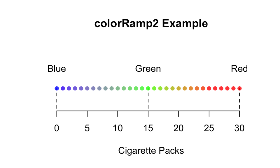
To see this function in action, check out the the margin Figure~ for an example, and check out the help menu for more information and examples.
# Create Data
drinks <- round(rnorm(100, mean = 10, sd = 4), 2)
smokes <- drinks + rnorm(100, mean = 5, sd = 2)
risk <- 1 / (1 + exp(-(drinks + smokes) / 20 + rnorm(100, mean = 0, sd = 1)))

# Create color function from colorRamp2
smoking.colors <- circlize::colorRamp2(breaks = c(0, 15, 30),
                  colors = c("blue", "green", "red"),
                  transparency = .3)

# Bottom Plot
par(mar = c(4, 4, 5, 1))
plot(x = drinks,
     y = risk,
     col = smoking.colors(smokes),
     pch = 16, cex = 1.2, main = "Plot of (Made-up) Data",
     xlab = "Drinks", ylab = "Risk")

mtext(text = "Point color indicates smoking rate", line = .5, side = 3)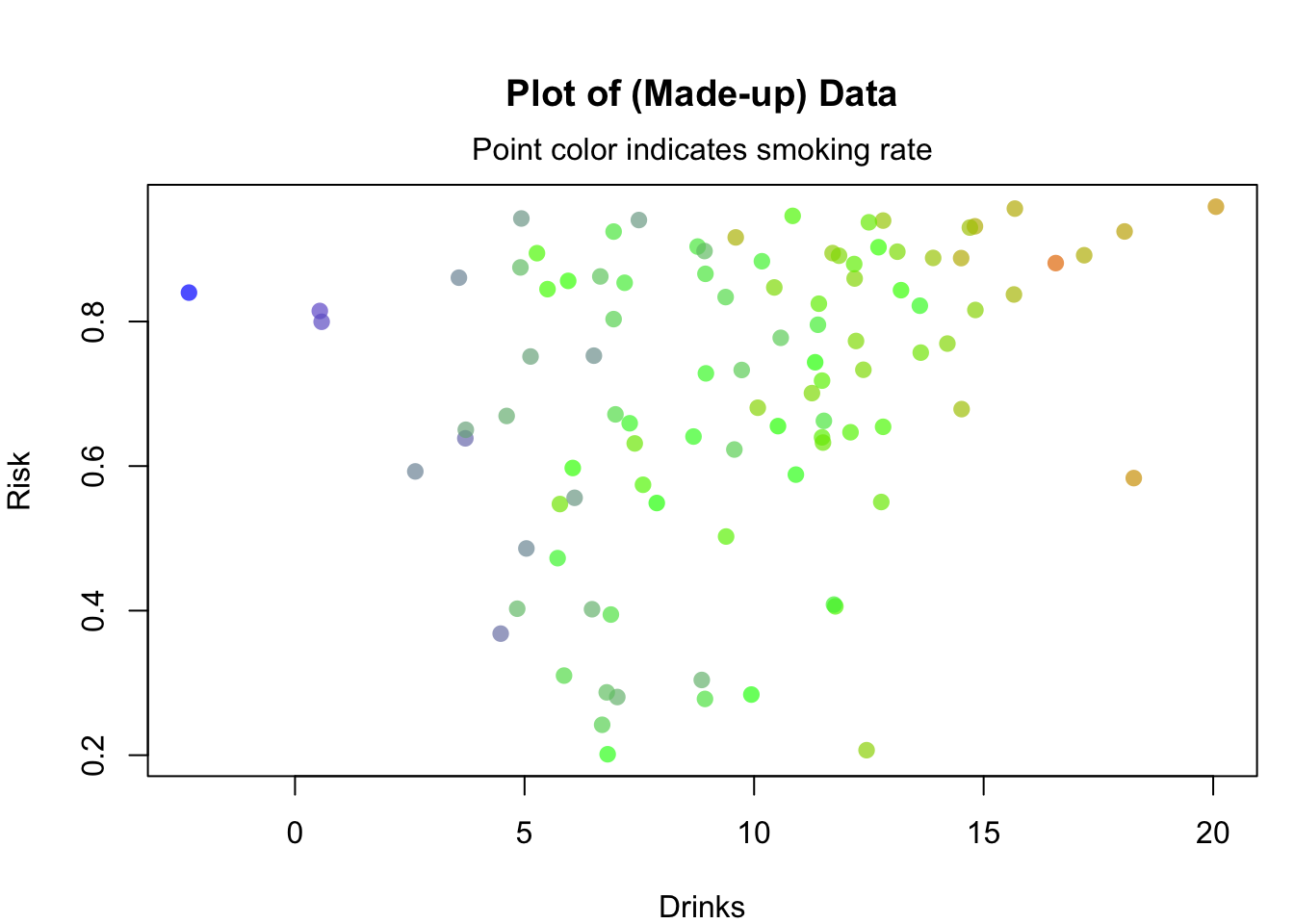
12.1.4 Getting colors with a kuler
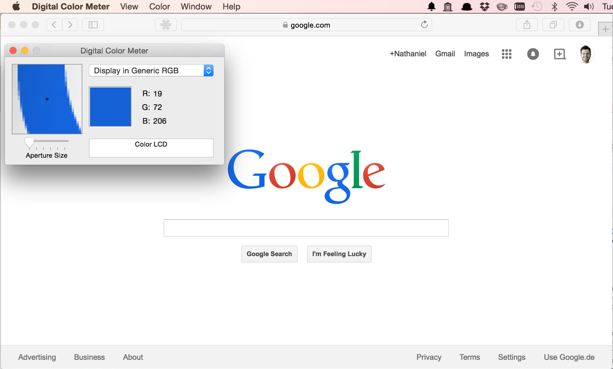
Figure 11.19: Stealing colors from the internet. Not illegal (yet).
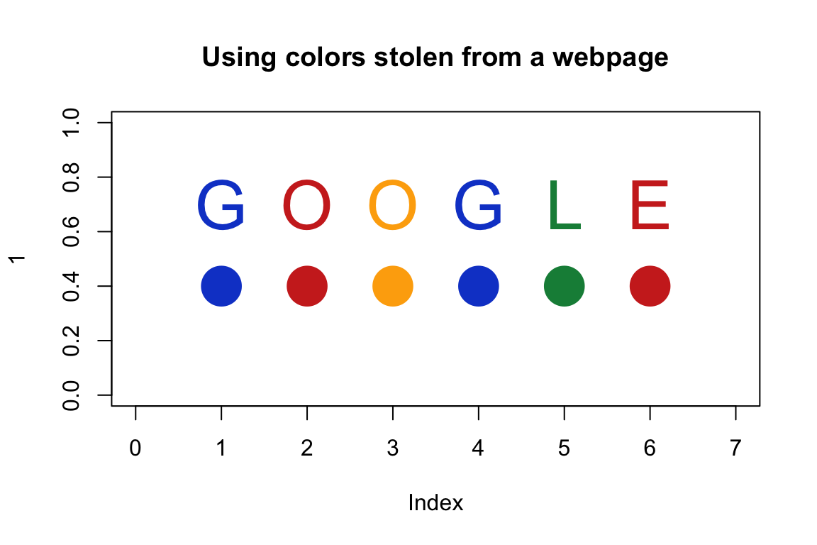
One of my favorite tricks for getting great colors in R is to use a color kuler. A color kuler is a tool that allows you to determine the exact RGB values for a color on a screen. For example, let’s say that you wanted to use the exact colors used in the Google logo. To do this, you need to use an app that allows you to pick colors off your computer screen. On a Mac, you can use the program called “Digital Color Meter.” If you then move your mouse over the color you want, the software will tell you the exact RGB values of that color. In the image below, you can see me figuring out that the RGB value of the G in Google is R: 19, G: 72, B: 206. Using the rgb() function, I can convert these RGB values to colors in R. Using this method, I figured out the four colors of Google!
# Store the colors of google as a vector:
google.col <- c(
  rgb(19, 72, 206, maxColorValue = 255),    # Google blue
  rgb(206, 45, 35, maxColorValue = 255),    # Google red
  rgb(253, 172, 10, maxColorValue = 255),   # Google yellow
  rgb(18, 140, 70, maxColorValue = 255))    # Google green

# Print the result
google.col
## [1] "#1348CE" "#CE2D23" "#FDAC0A" "#128C46"
The vector google.col now contains the values #1348CE, #CE2D23, #FDAC0A, #128C46. These are string values that represent colors in a way R understands. Now I can use these colors in a plot by specifying col = google.col!
plot(1,
     xlim = c(0, 7),
     ylim = c(0, 1),
     type = "n",
     main = "Using colors stolen from a webpage")

points(x = 1:6,
       y = rep(.4, 6),
       pch = 16,
       col = google.col[c(1, 2, 3, 1, 4, 2)],
       cex = 4)

text(x = 1:6,
     y = rep(.7, 6),
     labels = c("G", "O", "O", "G", "L", "E"),
     col = google.col[c(1, 2, 3, 1, 4, 2)],
     cex = 3)