11.4 Histogram: hist()
| Argument | Description |
|---|---|
x |
Vector of values |
breaks |
How should the bin sizes be calculated? Can be specified in many ways (see ?hist for details) |
freq |
Should frequencies or probabilities be plotted? freq = TRUE shows frequencies, freq = FALSE shows probabilities. |
col, border |
Colors of the bin filling (col) and border (border) |
Histograms are the most common way to plot a vector of numeric data. To create a histogram we’ll use the hist() function. The main argument to hist() is a x, a vector of numeric data. If you want to specify how the histogram bins are created, you can use the breaks argument. To change the color of the border or background of the bins, use col and border:
Let’s create a histogram of the weights in the ChickWeight dataset:
hist(x = ChickWeight$weight,
     main = "Chicken Weights",
     xlab = "Weight",
     xlim = c(0, 500))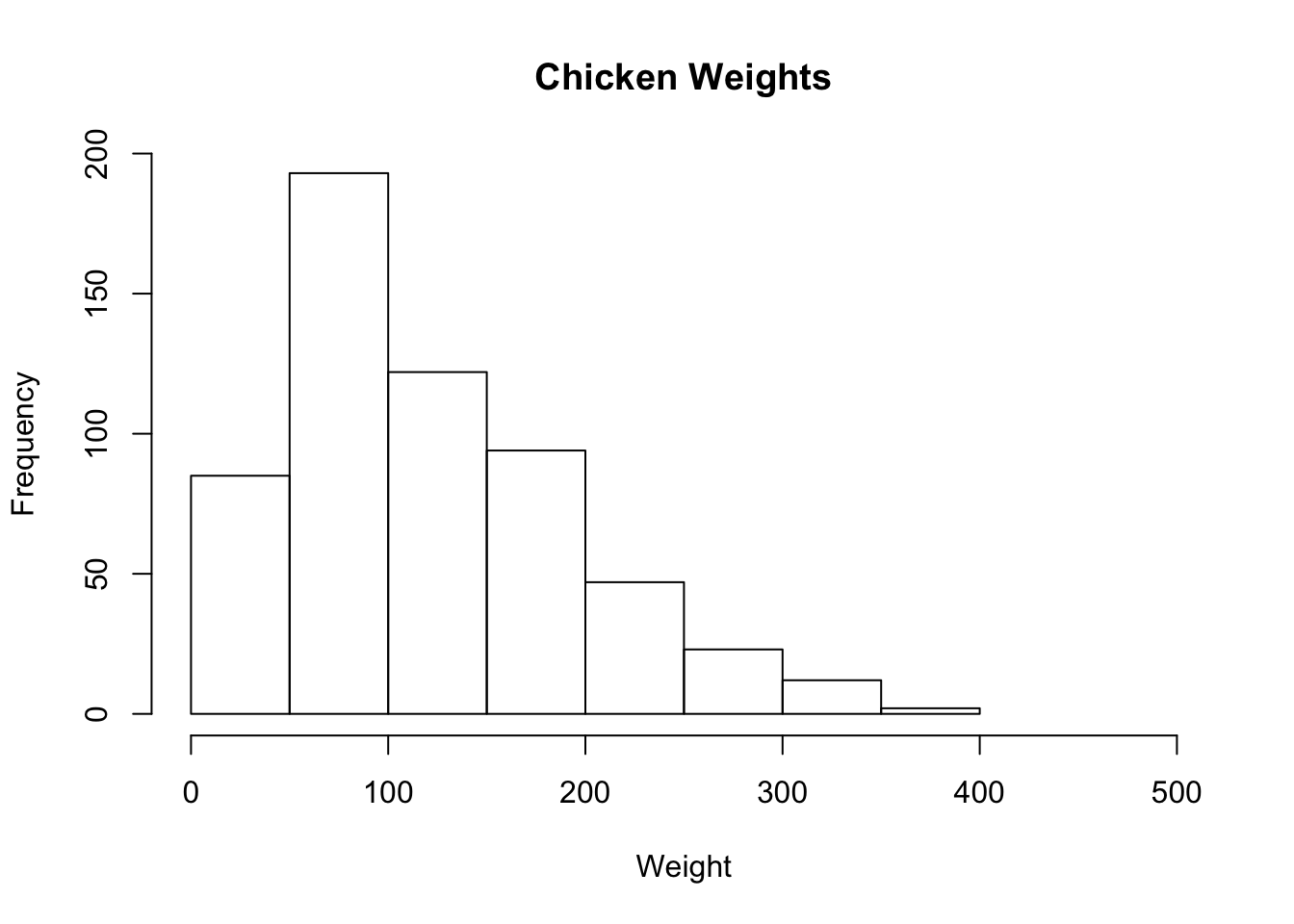
We can get more fancy by adding additional arguments like breaks = 20 to force there to be 20 bins, and col = "papayawhip" and bg = "hotpink" to make it a bit more colorful:
hist(x = ChickWeight$weight,
     main = "Fancy Chicken Weight Histogram",
     xlab = "Weight",
     ylab = "Frequency",
     breaks = 20, # 20 Bins
     xlim = c(0, 500),
     col = "papayawhip", # Filling Color
     border = "hotpink") # Border Color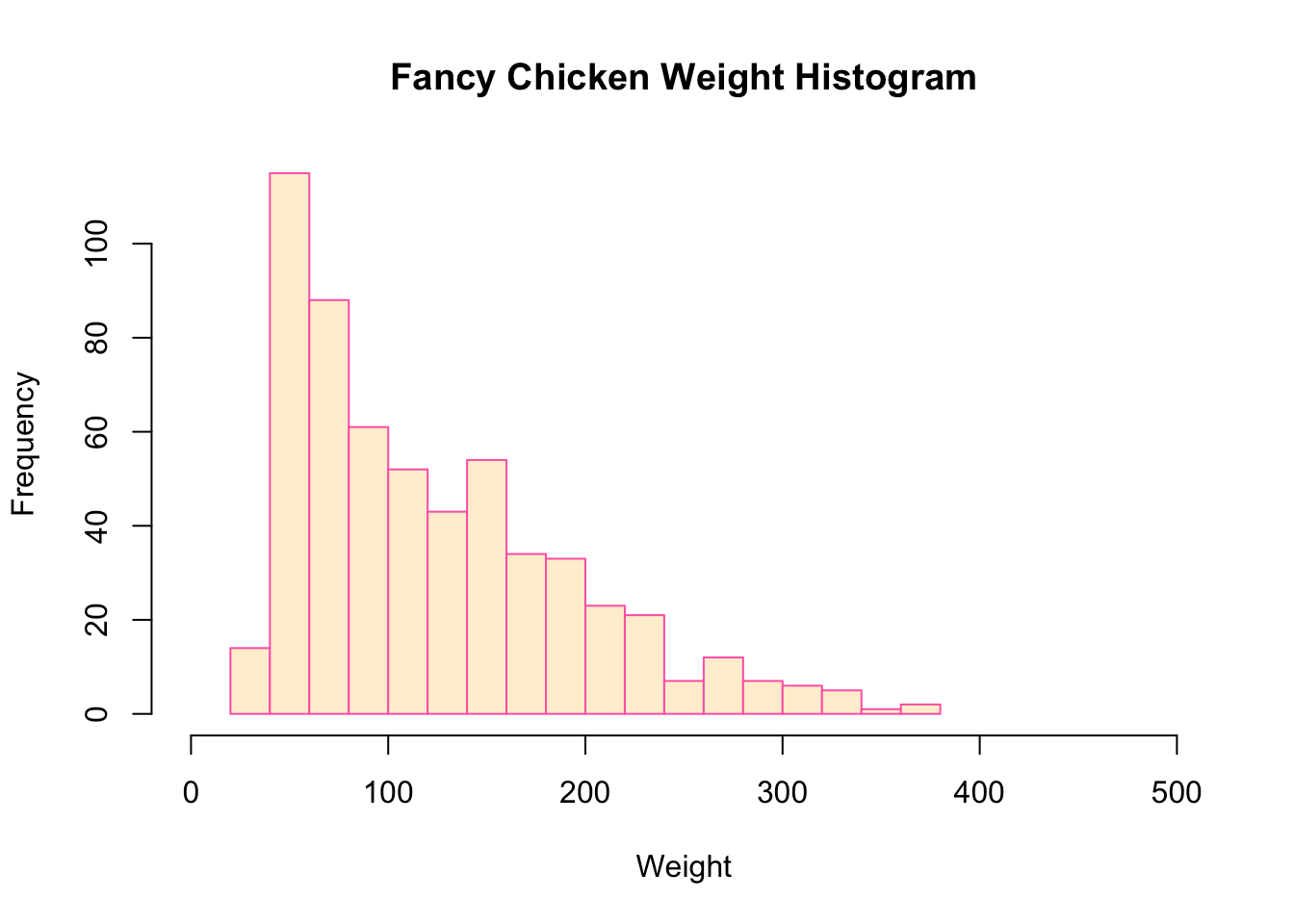
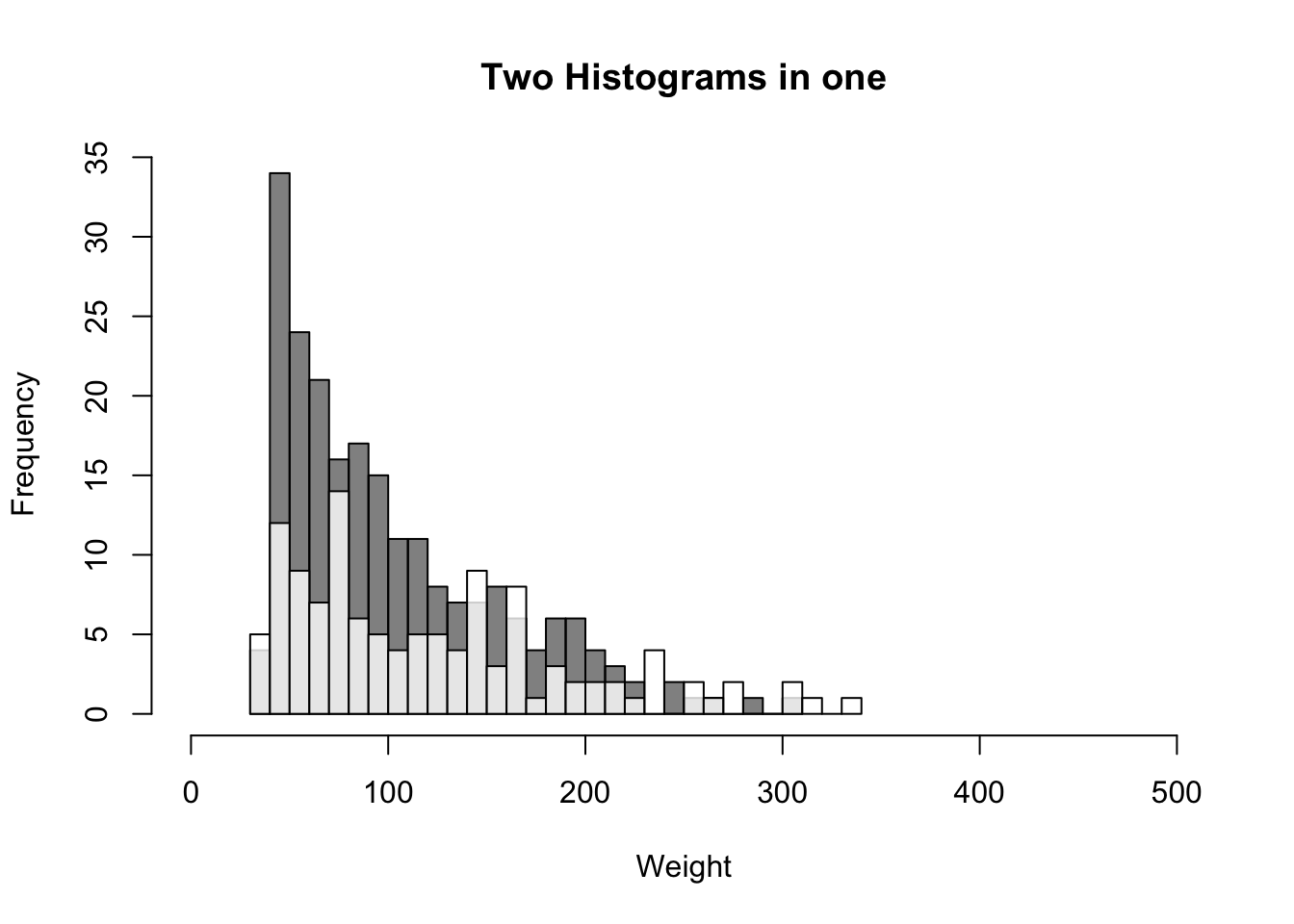
If you want to plot two histograms on the same plot, for example, to show the distributions of two different groups, you can use the argument to the second plot.
hist(x = ChickWeight$weight[ChickWeight$Diet == 1],
     main = "Two Histograms in one",
     xlab = "Weight",
     ylab = "Frequency",
     breaks = 20,
     xlim = c(0, 500),
     col = gray(0, .5))

hist(x = ChickWeight$weight[ChickWeight$Diet == 2],
     breaks = 30,
     add = TRUE, # Add plot to previous one!
     col = gray(1, .8))