3.5 Model diagnostics
As we saw in Section 2.3, checking the assumptions of the multiple linear model through the visualization of the data becomes tricky even when \(p=2.\) To solve this issue, a series of diagnostic tools have been designed in order to evaluate graphically and systematically the validity of the assumptions of the linear model.
We will illustrate them in the wine dataset, which is available in the wine.RData workspace:
load("wine.RData")
mod <- lm(Price ~ Age + AGST + HarvestRain + WinterRain, data = wine)
summary(mod)
Before going into specifics, recall the following general comment on performing model diagnostics.
When one assumption fails, it is likely that this failure will affect to other assumptions. For example, if linearity fails, then most likely homoscedasticity and normality will fail also. Therefore, identifying the root cause of the assumptions failure is key in order to try to find a patch.
3.5.1 Linearity
Linearity between the response \(Y\) and the predictors \(X_1,\ldots,X_p\) is the building block of the linear model. If this assumption fails, i.e., if there is a nonlinear trend linking \(Y\) and at least one of the predictors \(X_1,\ldots,X_p\) in a significant way, then the linear fit will yield flawed conclusions, with varying degrees of severity, about the explanation of \(Y.\) Therefore, linearity is a crucial assumption.
How to check it
The so-called residuals vs. fitted values plot is the scatterplot of \(\{(\hat Y_i,\hat\varepsilon_i)\}_{i=1}^n\) and is a very useful tool for detecting linearity departures using a single69 graphical device. Figure 3.15 illustrates how the residuals vs. fitted values plots behave for situations in which the linearity is known to be respected or violated.
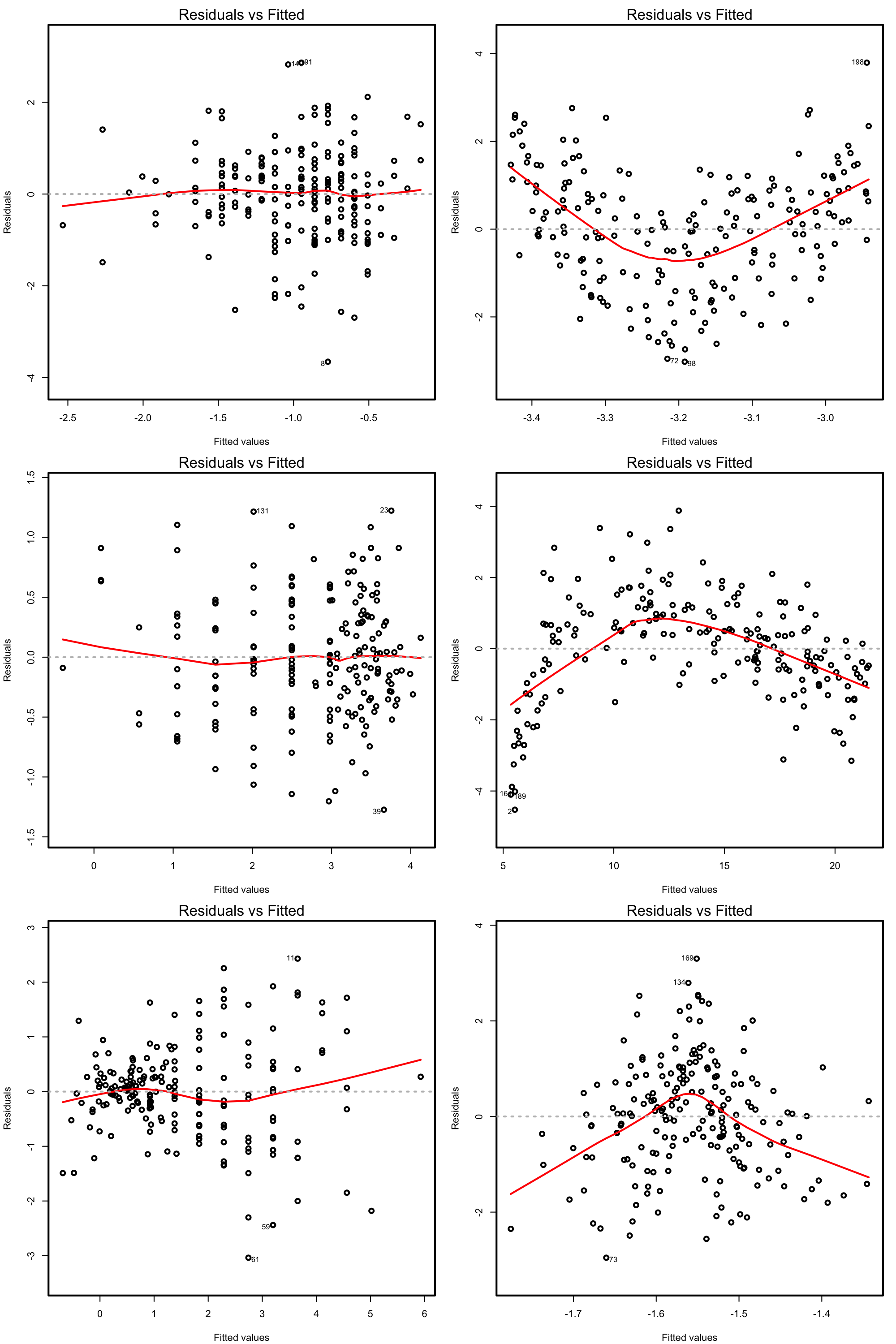
Figure 3.15: Residuals vs. fitted values plots for datasets respecting (left column) and violating (right column) the linearity assumption.
Under linearity, we expect that there is no significant trend in the residuals \(\hat\varepsilon_i\) with respect to \(\hat Y_i.\) This can be assessed by checking if a flexible fit of the mean of the residuals is constant. Such fit is given by the red line produced by:
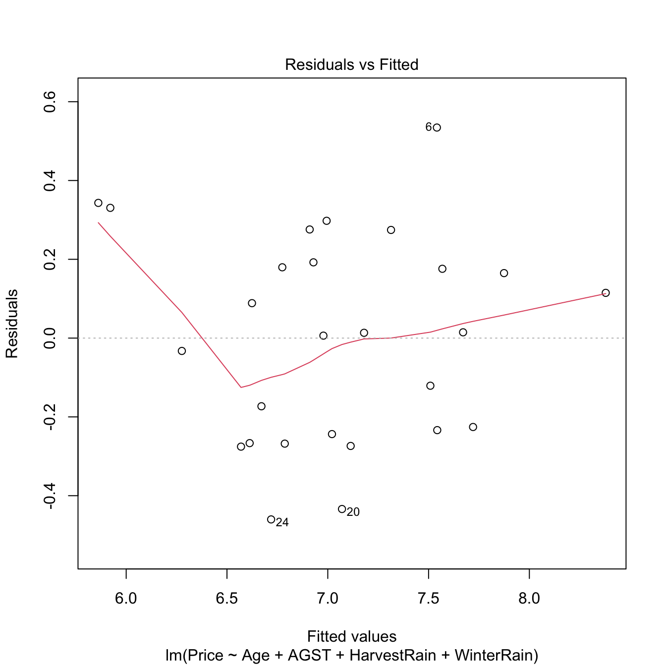
Figure 3.16: Residuals vs. fitted values for the Price ~ Age + AGST + HarvestRain + WinterRain model for the wine dataset.
If nonlinearities are observed, it is worth to plot the regression terms of the model. These are the \(p\) scatterplots of \(\{(X_{ij},Y_i)\}_{i=1}^n,\) for \(j=1,\ldots,p,\) that are accompanied by the regression lines \(y=\hat\beta_0+\hat\beta_jx_j,\) where \((\hat{\beta}_0,\hat{\beta}_1,\ldots,\hat{\beta}_p)'\) come from the multiple linear fit, not from individual simple linear regressions. The regression terms help identifying which predictors have nonlinear effects on \(Y.\)
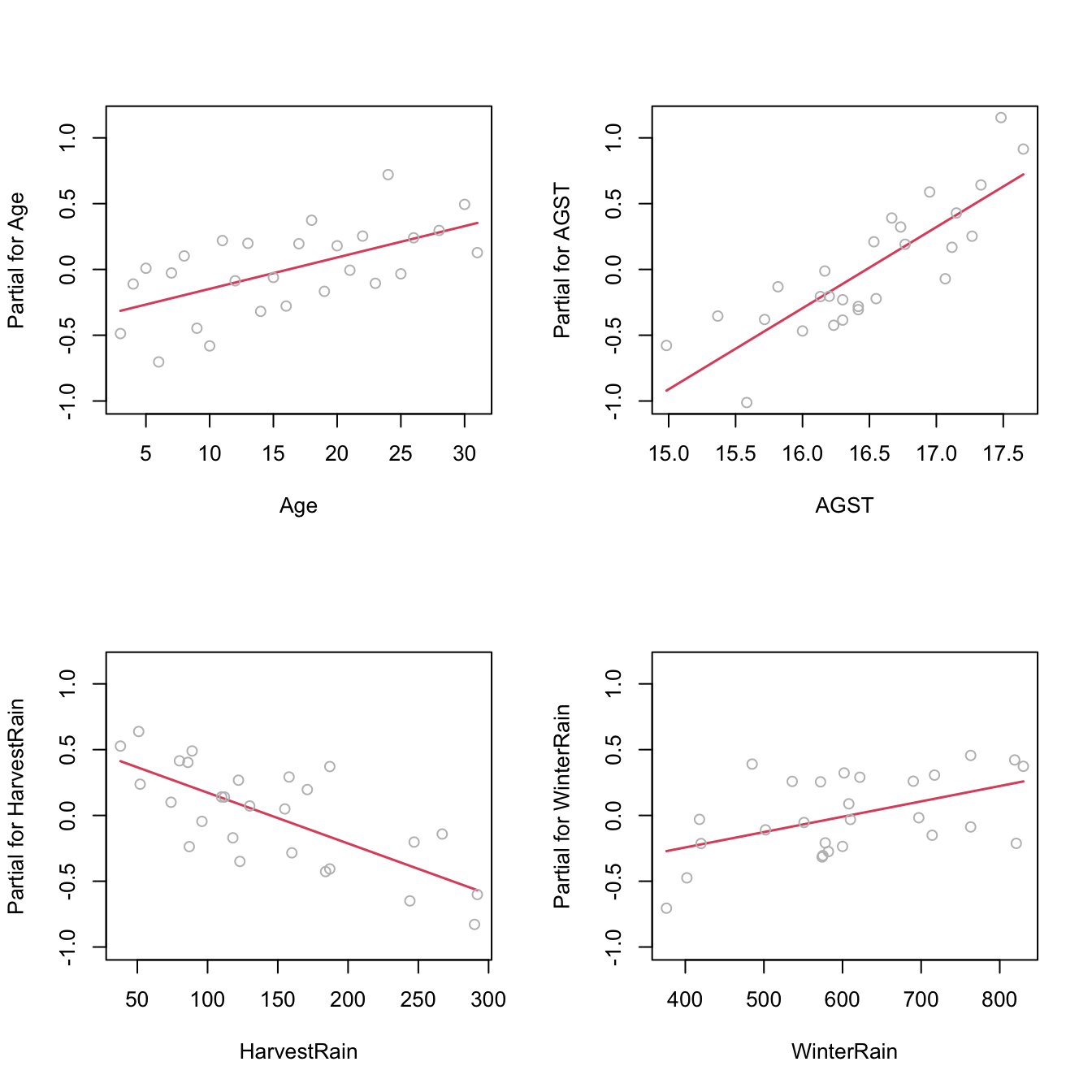
Figure 3.17: Regression terms for Price ~ Age + AGST + HarvestRain + WinterRain in the wine dataset.
What to do if it fails
Using an adequate nonlinear transformation for the problematic predictors or adding interaction terms, as we saw in Section 3.4, might be helpful in linearizing the relation between \(Y\) and \(X_1,\ldots,X_p.\) Alternatively, one can consider a nonlinear transformation \(f\) for the response \(Y,\) at the expenses of:
- Modeling \(W:=f(Y)\) rather than \(Y,\) thus slightly changing the setting of the original modeling problem.
- Alternatively, untransforming the linear prediction \(\hat{W}\) as \(\hat{Y}_f:=f^{-1}(\hat{W})\) and performing biased predictions70 \(\!\!^,\)71 for \(Y.\)
Transformations of \(Y\) are explored in Section 3.5.7. Chapter 5 is devoted to replacing the untransformed approach with a more principled one.72
Let’s see the transformation of predictors in the example that motivated Section 3.4.
par(mfrow = c(1, 2))
plot(lm(y ~ x, data = nonLinear), 1) # Nonlinear
plot(lm(y ~ I(x^2), data = nonLinear), 1) # Linear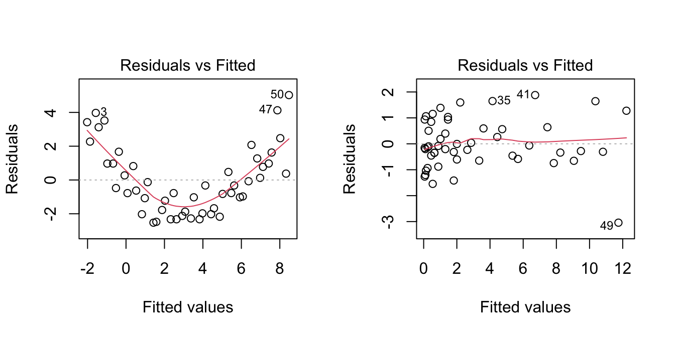
3.5.2 Normality
The assumed normality of the errors \(\varepsilon_1,\ldots,\varepsilon_n\) allows us to make exact inference in the linear model, in the sense that the distribution of \(\hat{\boldsymbol{\beta}}\) given in (2.11) is exact for any \(n,\) and not asymptotic with \(n\to\infty.\) If normality does not hold, then the inference we did (CIs for \(\beta_j,\) hypothesis testing, CIs for prediction) is to be somehow suspected. Why just somehow? Roughly speaking, the reason is that the central limit theorem will make \(\hat{\boldsymbol{\beta}}\) asymptotically normal73, even if the errors are not. However, the speed of this asymptotic convergence greatly depends on how non-normal is the distribution of the errors. Hence the next rule of thumb:
Non-severe74 departures from normality yield valid (asymptotic) inference for relatively large sample sizes \(n.\)
Therefore, the failure of normality is typically less problematic than other assumptions.
How to check it
The QQ-plot (theoretical quantile vs. empirical quantile plot) allows to check if the standardized residuals follow a \(\mathcal{N}(0,1).\) What it does is to compare the theoretical quantiles of a \(\mathcal{N}(0,1)\) with the quantiles of the sample of standardized residuals.

Figure 3.18: QQ-plot for the residuals of the Price ~ Age + AGST + HarvestRain + WinterRain model for the wine dataset.
Under normality, we expect the points to align with the diagonal line, which represents the expected position of the points if they were sampled from a \(\mathcal{N}(0,1).\) It is usual to have larger departures from the diagonal in the extremes75 than in the center, even under normality, although these departures are more evident if the data is non-normal.
There are formal tests to check the null hypothesis of normality in our residuals. Two popular ones are the Shapiro–Wilk test, implemented by the shapiro.test function, and the Lilliefors test,76 implemented by the nortest::lillie.test function:
# Shapiro-Wilk test of normality
shapiro.test(mod$residuals)
##
##  Shapiro-Wilk normality test
##
## data:  mod$residuals
## W = 0.95903, p-value = 0.3512
# We do not reject normality
# shapiro.test allows up to 5000 observations -- if dealing with more data
# points, randomization of the input is a possibility

# Lilliefors test -- the Kolmogorov-Smirnov adaptation for testing normality
nortest::lillie.test(mod$residuals)
##
##  Lilliefors (Kolmogorov-Smirnov) normality test
##
## data:  mod$residuals
## D = 0.13739, p-value = 0.2125
# We do not reject normality
Figure 3.19: QQ-plots for datasets respecting (left column) and violating (right column) the normality assumption.
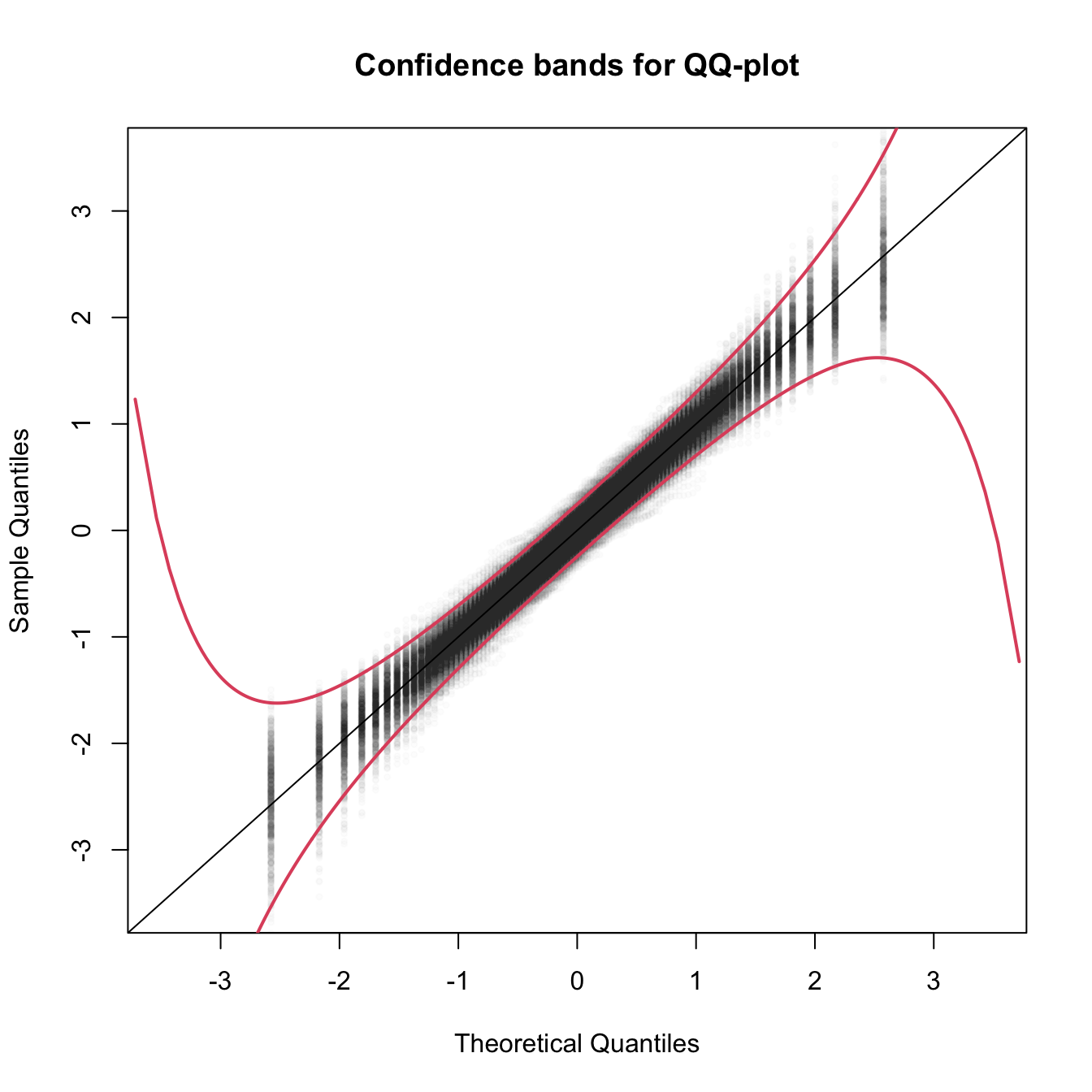
Figure 3.20: The uncertainty behind the QQ-plot. The figure aggregates \(M=1000\) different QQ-plots of \(\mathcal{N}(0,1)\) data with \(n=100,\) displaying for each of them the pairs \((x_p,\hat x_p)\) evaluated at \(p=\frac{i-1/2}{n},\) \(i=1,\ldots,n\) (as they result from ppoints(n)). The uncertainty is measured by the asymptotic \(100(1-\alpha)\%\) CIs for \(\hat x_p,\) given by \(\left(x_p\pm\frac{z_{1-\alpha/2}}{\sqrt{n}}\frac{\sqrt{p(1-p)}}{\phi(x_p)}\right).\) These curves are displayed in red for \(\alpha=0.05.\) Observe that the vertical strips arise since the \(x_p\) coordinate is deterministic.
What to do if it fails
Patching non-normality is not easy and most of the time requires the consideration of other models, like the ones seen in Chapter 5. If \(Y\) is nonnegative, one possibility is to transform \(Y\) by means of the Box–Cox (Box and Cox 1964) transformation:
\[\begin{align} y^{(\lambda)}:=\begin{cases} \frac{y^\lambda-1}{\lambda},& \lambda\neq0,\\ \log(y),& \lambda=0. \end{cases}\tag{3.6} \end{align}\]
This transformation alleviates the skewness77 of the data, therefore making it more symmetric and hence normal-like. The optimal data-dependent \(\hat\lambda\) that makes the data most normal-like can be found through maximum likelihood78 on the transformed sample \(\{Y^{(\lambda)}_{i}\}_{i=1}^n.\) If \(Y\) is not nonnegative, (3.6) cannot be applied. A possible patch is to shift the data by a positive constant \(m=-\min(Y_1,\ldots,Y_n)+\delta,\) \(\delta>0,\) such that transformation (3.6) becomes
\[\begin{align*} y^{(\lambda,m)}:=\begin{cases} \frac{(y+m)^\lambda-1}{\lambda},& \lambda\neq0,\\ \log(y+m),& \lambda=0. \end{cases} \end{align*}\]
A neat alternative to this shifting is to rely on a transformation that is already designed for real \(Y,\) such as the Yeo–Johnson (Yeo and Johnson 2000) transformation:
\[\begin{align} y^{(\lambda)}:=\begin{cases} \frac{(y+1)^\lambda-1}{\lambda},& \lambda\neq0,y\geq 0,\\ \log(y+1),& \lambda=0,y\geq 0,\\ -\frac{(-y+1)^{2-\lambda}-1}{2-\lambda},& \lambda\neq2,y<0,\\ -\log(-y+1),& \lambda=2,y<0. \end{cases}\tag{3.7} \end{align}\]
The beauty of the Yeo–Johnson transformation is that it extends neatly the Box–Cox transformation, which appears as a particular case when \(Y\) is nonnegative and after performing a shift of \(1\) units (see Figure 3.21). As with the Box–Cox transformation, the optimal \(\hat\lambda\) is estimated through maximum likelihood on the transformed sample \(\{Y^{(\lambda)}_{i}\}_{i=1}^n.\)
N <- 200
y <- seq(-4, 4, length.out = N)
lambda <- c(0, 0.5, 1, 2, -0.5, -1, -2)
l <- length(lambda)
psi <- sapply(lambda, function(la) car::yjPower(U = y, lambda = la))
matplot(y, psi, type = "l", ylim = c(-4, 4), lwd = 2, lty = 1:l,
        ylab = latex2exp::TeX("$y^{(\\lambda)}$"), col = 1:l, las = 1,
        main = "Yeo-Johnson transformation")
abline(v = 0, h = 0)
abline(v = -1, h = 0, lty = 2)
legend("bottomright", lty = 1:l, lwd = 2, col = 1:l,
       legend = latex2exp::TeX(paste0("$\\lambda = ", lambda, "$")))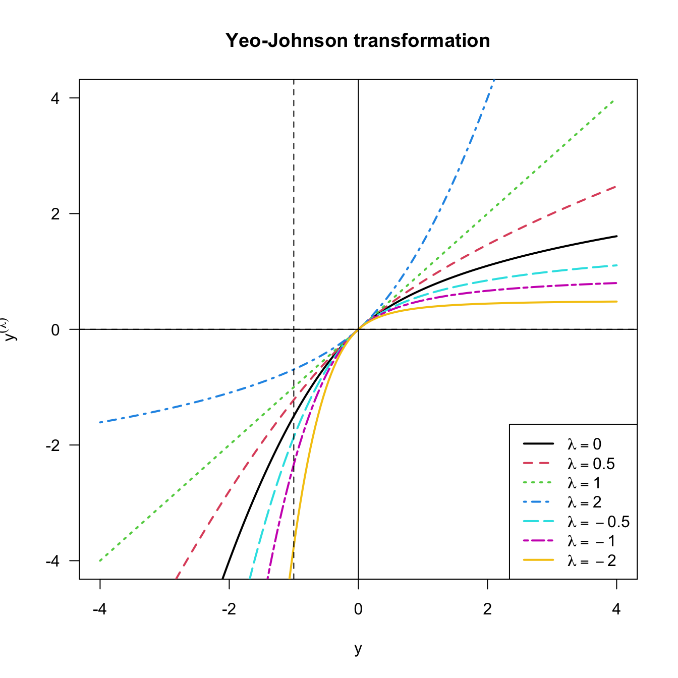
Figure 3.21: Yeo–Johnson transformation for some values of \(\lambda.\) The Box–Cox transformation for \(\lambda,\) and shifted by \(-1\) units, corresponds to the part \(y\geq -1\) of the plot.
Let’s see how to implement both transformations using the car::powerTransform, car::bcPower, and car::yjPower functions.
# Test data

# Predictors
n <- 200
set.seed(121938)
X1 <- rexp(n, rate = 1 / 5) # Nonnegative
X2 <- rchisq(n, df = 5) - 3 # Real

# Response of a linear model
epsilon <- rchisq(n, df = 10) - 10 # Centered error, but not normal
Y <- 10 - 0.5 * X1 + X2 + epsilon

# Transformation of non-normal data to achieve normal-like data (no model)

# Optimal lambda for Box-Cox
BC <- car::powerTransform(lm(X1 ~ 1), family = "bcPower") # Maximum-likelihood fit
# Note we use a regression model with no predictors
(lambdaBC <- BC$lambda) # The optimal lambda
##        Y1
## 0.2412419
# lambda < 1, so positive skewness is corrected

# Box-Cox transformation
X1Transf <- car::bcPower(U = X1, lambda = lambdaBC)

# Comparison
par(mfrow = c(1, 2))
hist(X1, freq = FALSE, breaks = 10, ylim = c(0, 0.3))
hist(X1Transf, freq = FALSE, breaks = 10, ylim = c(0, 0.3))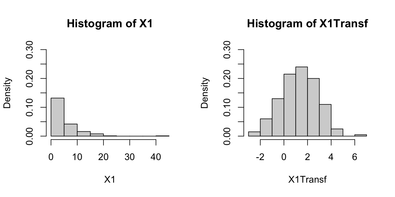
# Optimal lambda for Yeo-Johnson
YJ <- car::powerTransform(lm(X2 ~ 1), family = "yjPower")
(lambdaYJ <- YJ$lambda)
##        Y1
## 0.5850791

# Yeo-Johnson transformation
X2Transf <- car::yjPower(U = X2, lambda = lambdaYJ)

# Comparison
par(mfrow = c(1, 2))
hist(X2, freq = FALSE, breaks = 10, ylim = c(0, 0.3))
hist(X2Transf, freq = FALSE, breaks = 10, ylim = c(0, 0.3))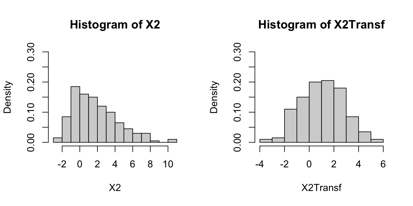
# Transformation of non-normal response in a linear model

# Optimal lambda for Yeo-Johnson
YJ <- car::powerTransform(lm(Y ~ X1 + X2), family = "yjPower")
(lambdaYJ <- YJ$lambda)
##        Y1
## 0.9160924

# Yeo-Johnson transformation
YTransf <- car::yjPower(U = Y, lambda = lambdaYJ)

# Comparison for the residuals
par(mfrow = c(1, 2))
plot(lm(Y ~ X1 + X2), 2)
plot(lm(YTransf ~ X1 + X2), 2) # Slightly better
Be aware that using the previous transformations implies modeling the transformed response rather than \(Y.\) Normality is also possible to patch if it is a consequence of the failure of linearity or homoscedasticity, which translates the problem into fixing those assumptions.
3.5.3 Homoscedasticity
The constant-variance assumption of the errors is also key for obtaining the inferential results we saw. For example, if the assumption does not hold, then the CIs for prediction will not respect the confidence for which they were built.
How to check it
Heteroscedasticity can be detected by looking into irregular vertical dispersion patterns in the residuals vs. fitted values plot. However, it is simpler to use the scale-location plot, where the standardized residuals are transformed by a square root of its absolute value, and inspect the deviations in the positive axis.
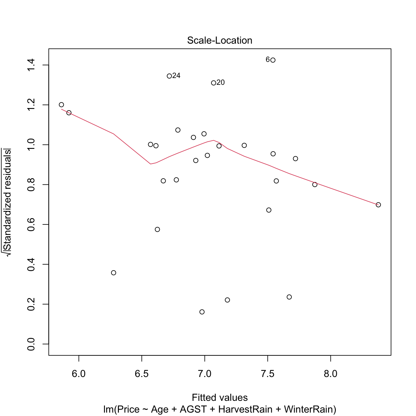
Figure 3.22: Scale-location plot for the Price ~ Age + AGST + HarvestRain + WinterRain model for the wine dataset.
Under homoscedasticity, we expect the red line, a flexible fit of the mean of the transformed residuals, to be almost constant about \(1\). If there are clear non-constant patterns, then there is evidence of heteroscedasticity.
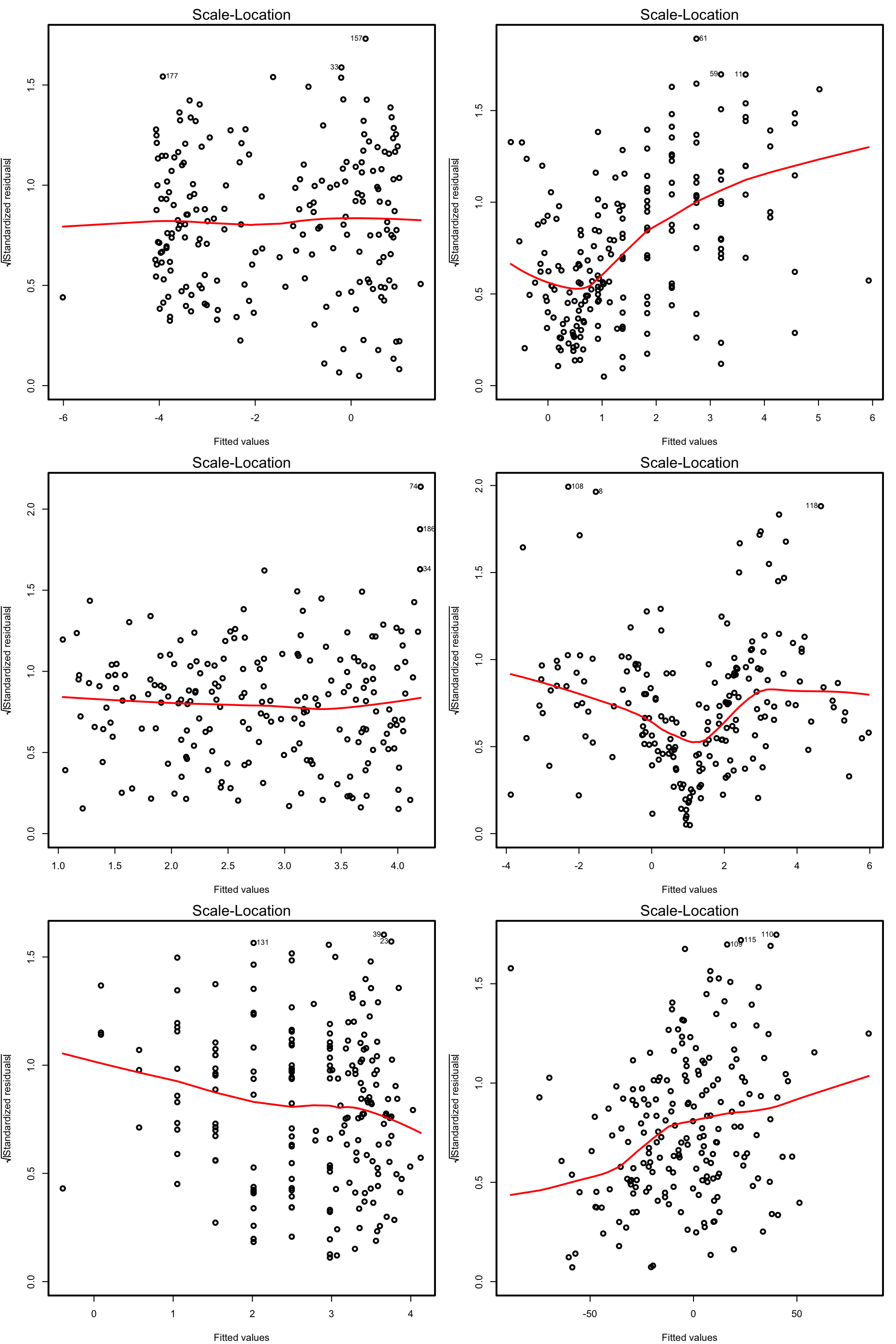
Figure 3.23: Scale-location plots for datasets respecting (left column) and violating (right column) the homoscedasticity assumption.
There are formal tests to check the null hypothesis of homoscedasticity in our residuals. For example, the Breusch–Pagan test implemented in car::ncvTest:
# Breusch-Pagan test
car::ncvTest(mod)
## Non-constant Variance Score Test
## Variance formula: ~ fitted.values
## Chisquare = 0.3254683, Df = 1, p = 0.56834
# We do not reject homoscedasticity
The next code illustrates the previous warning with two examples.
# Heteroscedastic models
set.seed(123456)
x <- rnorm(100)
y1 <- 1 + 2 * x + rnorm(100, sd = x^2)
y2 <- 1 + 2 * x + rnorm(100, sd = 1 + x * (x > 0))
modHet1 <- lm(y1 ~ x)
modHet2 <- lm(y2 ~ x)

# Heteroscedasticity not detected
car::ncvTest(modHet1)
## Non-constant Variance Score Test
## Variance formula: ~ fitted.values
## Chisquare = 2.938652e-05, Df = 1, p = 0.99567
plot(modHet1, 3)

# Heteroscedasticity correctly detected
car::ncvTest(modHet2)
## Non-constant Variance Score Test
## Variance formula: ~ fitted.values
## Chisquare = 41.03562, Df = 1, p = 1.4948e-10
plot(modHet2, 3)
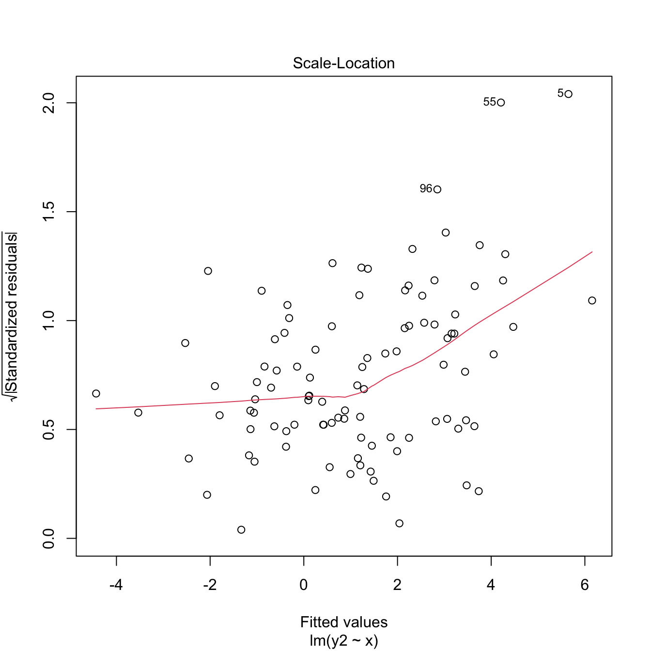
Figure 3.24: Two heteroscedasticity patterns that are undetected and detected, respectively, by the Breusch–Pagan test.
What to do if it fails
Using a nonlinear transformation for the response \(Y\) may help to control the variance. Typical choices are \(\log(Y)\) and \(\sqrt{Y},\) which reduce the scale of the larger responses and leads to a reduction of heteroscedasticity. Keep in mind that these transformations, as the Box–Cox transformations, are designed for nonnegative \(Y.\) The Yeo–Johnson transformation can be used instead if \(Y\) is real.
Let’s see some examples.
# Artificial data with heteroscedasticity
set.seed(12345)
X <- rchisq(500, df = 3)
e <- rnorm(500, sd = sqrt(0.1 + 2 * X))
Y <- 1 + X + e

# Original
plot(lm(Y ~ X), 3) # Very heteroscedastic

# Transformed
plot(lm(I(log(abs(Y))) ~ X), 3) # Much less hereroskedastic, but at the price
# of losing the signs in Y...

# Shifted and transformed
delta <- 1 # This is tunable
m <- -min(Y) + delta
plot(lm(I(log(Y + m)) ~ X), 3) # No signs loss

# Transformed by Yeo-Johnson

# Optimal lambda for Yeo-Johnson
YJ <- car::powerTransform(lm(Y ~ X), family = "yjPower")
(lambdaYJ <- YJ$lambda)
##        Y1
## 0.6932053

# Yeo-Johnson transformation
YTransf <- car::yjPower(U = Y, lambda = lambdaYJ)
plot(lm(YTransf ~ X), 3) # Slightly less hereroskedastic

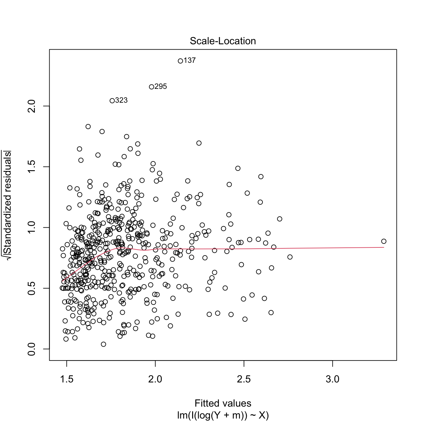
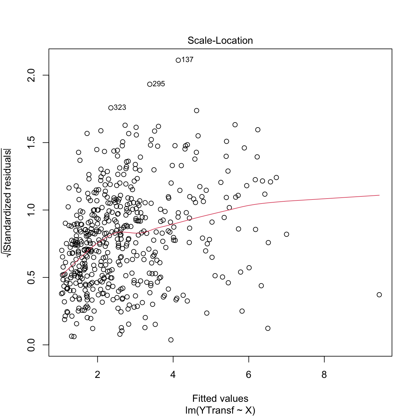
Figure 3.25: Patching of heteroscedasticity for an artificial dataset.
3.5.4 Independence
Independence is also a key assumption: it guarantees that the amount of information that we have on the relationship between \(Y\) and \(X_1,\ldots,X_p,\) from \(n\) observations, is maximal. If there is dependence, then information is repeated, and as a consequence the variability of the estimates will be larger. For example, \(95\%\) CIs built under the assumption of independence will be shorter than the adequate, meaning that they will not contain with a \(95\%\) confidence the unknown parameter, but with a lower confidence (say \(80\%\)).
An extreme case is the following: suppose we have two samples of sizes \(n\) and \(2n,\) where the \(2n\)-sample contains the elements of the \(n\)-sample twice. The information in both samples is the same, and so are the estimates for the coefficients \(\boldsymbol{\beta}.\) Yet, in the \(2n\)-sample the length of the confidence intervals is \(C(2n)^{-1/2},\) whereas in the \(n\)-sample they have length \(Cn^{-1/2}.\) A reduction by a factor of \(\sqrt{2}\) in the confidence interval has happened, but we have the same information! This will give us a wrong sense of confidence in our model, and the root of the evil is that the information that is actually in the sample is smaller due to dependence.
How to check it
The set of possible dependence structures on the residuals is immense, and there is no straightforward way of checking all of them. Usually what it is examined is the presence of autocorrelation, which appears when there is some kind of serial dependence in the measurement of observations. The serial plot of the residuals allows to detect time trends in them:

Figure 3.26: Serial plot of the residuals of the Price ~ Age + AGST + HarvestRain + WinterRain model for the wine dataset.
Under uncorrelation, we expect the series to show no tracking of the residuals. That is, that the closer observations do not take similar values, but rather change without any kind of distinguishable pattern. Tracking is associated to positive autocorrelation, but negative autocorrelation, manifested as alternating small-large or positive-negative residuals, is also possible. The lagged plots of \((\hat\varepsilon_{i-\ell},\hat\varepsilon_i),\) \(i=\ell+1,\ldots,n,\) obtained through lag.plot, allow us to detect both kinds of autocorrelations for a given lag \(\ell.\) Under independence, we expect no trend in such plot. Here is an example:

# No serious serial trend, but some negative autocorrelation is appreciated
cor(mod$residuals[-1], mod$residuals[-length(mod$residuals)])
## [1] -0.4267776
There are also formal tests for testing for the absence of autocorrelation, such as the Durbin–Watson test implemented in car::durbinWatsonTest:
# Durbin-Watson test
car::durbinWatsonTest(mod)
##  lag Autocorrelation D-W Statistic p-value
##    1      -0.4160168      2.787261   0.054
##  Alternative hypothesis: rho != 0
# Does not reject at alpha = 0.05
Figure 3.27: Serial plots of the residuals for datasets respecting (left column) and violating (right column) the independence assumption.
What to do if it fails
Little can be done if there is dependence in the data, once this has been collected. If the dependence is temporal, we must rely on the family of statistical models meant to deal with serial dependence: time series. Other kinds of dependence such as spatial dependence, spatio-temporal dependence, geometrically-driven dependencies, censorship, truncation, etc. need to be analyzed with a different set of tools to the ones covered in these notes.
However, there is a simple trick worth mentioning to deal with serial dependence. If the observations of the response \(Y,\) say \(Y_1,Y_2,\ldots,Y_n,\) present serial dependence, a differentiation of the sample that yields \(Y_1-Y_2,Y_2-Y_3,\ldots,Y_{n-1}-Y_n\) may lead to independent observations. These are called the innovations of the series of \(Y.\)
Load the dataset assumptions3D.RData
and compute the regressions y.3 ~ x1.3 + x2.3,
y.4 ~ x1.4 + x2.4, y.5 ~ x1.5 + x2.5, and
y.8 ~ x1.8 + x2.8. Use the presented diagnostic tools to
test the assumptions of the linear model and look out for possible
problems.
3.5.5 Multicollinearity
A common problem that arises in multiple linear regression is multicollinearity. This is the situation when two or more predictors are highly linearly related between them. Multicollinearitiy has important effects on the fit of the model:
- It reduces the precision of the estimates. As a consequence, the signs of fitted coefficients may be even reversed and valuable predictors may appear as non-significant. In limit cases, numerical instabilities may appear since \(\mathbf{X}'\mathbf{X}\) will be almost singular.
- It is difficult to determine how each of the highly-related predictors affects the response, since one masks the other.
Intuitively, multicollinearity can be visualized as a card (fitting plane) that is hold on its opposite corners and that spins on its diagonal, where the data is concentrated. Then, very different planes will fit the data almost equally well, which results in a large variability of the optimal plane.
An approach to detect multicollinearity is to inspect the correlation matrix between the predictors.
# Numerically
round(cor(wine), 2)
##              Year Price WinterRain  AGST HarvestRain   Age FrancePop
## Year         1.00 -0.46       0.05 -0.29       -0.06 -1.00      0.99
## Price       -0.46  1.00       0.13  0.67       -0.51  0.46     -0.48
## WinterRain   0.05  0.13       1.00 -0.32       -0.27 -0.05      0.03
## AGST        -0.29  0.67      -0.32  1.00       -0.03  0.29     -0.30
## HarvestRain -0.06 -0.51      -0.27 -0.03        1.00  0.06     -0.03
## Age         -1.00  0.46      -0.05  0.29        0.06  1.00     -0.99
## FrancePop    0.99 -0.48       0.03 -0.30       -0.03 -0.99      1.00

# Graphically
corrplot::corrplot(cor(wine), addCoef.col = "grey")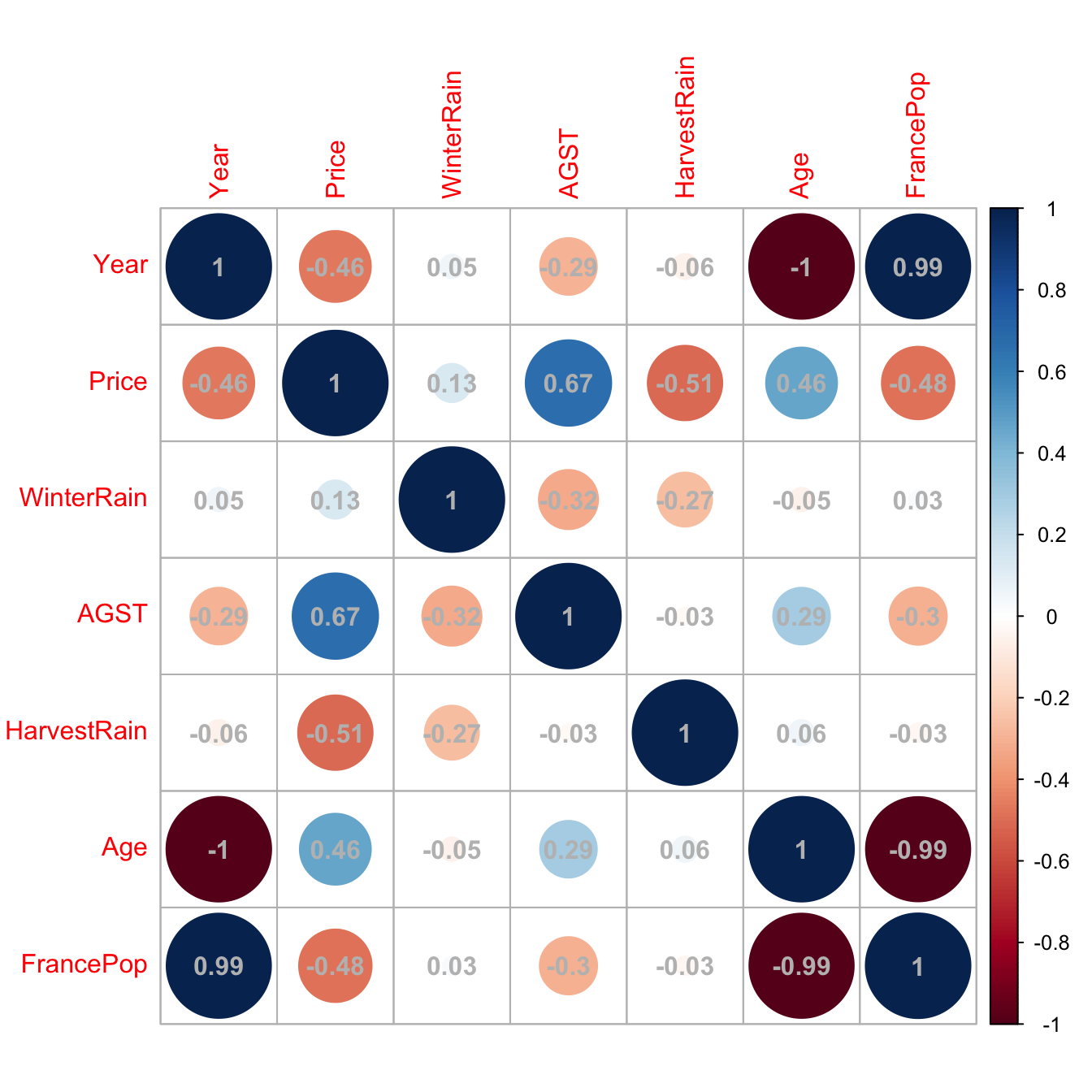
Figure 3.28: Graphical visualization of the correlation matrix.
Here we can see what we already knew from Section 2.1: Age and Year are perfectly linearly related and Age and FrancePop are highly linearly related. Then one approach will be to directly remove one of the highly-correlated predictors.
However, it is not enough to inspect pairwise correlations in order to get rid of multicollinearity. Indeed, it is possible to build counterexamples that show non-suspicious pairwise correlations but problematic complex linear relations that remain hidden. For the sake of illustration, here is one:
# Create predictors with multicollinearity: x4 depends on the rest
set.seed(45678)
x1 <- rnorm(100)
x2 <- 0.5 * x1 + rnorm(100)
x3 <- 0.5 * x2 + rnorm(100)
x4 <- -x1 + x2 + rnorm(100, sd = 0.25)

# Response
y <- 1 + 0.5 * x1 + 2 * x2 - 3 * x3 - x4 + rnorm(100)
data <- data.frame(x1 = x1, x2 = x2, x3 = x3, x4 = x4, y = y)

# Correlations -- none seems suspicious
corrplot::corrplot(cor(data), addCoef.col = "grey")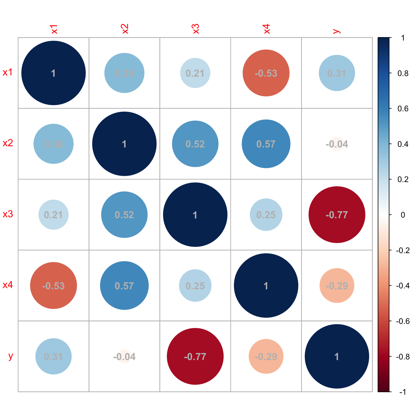
Figure 3.29: Unsuspicious correlation matrix with hidden multicollinearity.
A better approach to detect multicollinearity is to compute the Variance Inflation Factor (VIF) of each fitted coefficient \(\hat\beta_j.\) This is a measure of how linearly dependent is \(X_j\) on the rest of the predictors79 and it is defined as
\[\begin{align*} \text{VIF}(\hat\beta_j)=\frac{1}{1-R^2_{X_j|X_{-j}}}, \end{align*}\]
where \(R^2_{X_j|X_{-j}}\) represents the \(R^2\) from the regression of \(X_j\) onto the remaining predictors \(X_1,\ldots,X_{j-1},X_{j+1}\ldots,X_p.\) Clearly, \(\text{VIF}(\hat\beta_j)\geq 1.\) The next simple rule of thumb gives direct insight into which predictors are multicollinear:
- VIF close to \(1\): absence of multicollinearity.
- VIF larger than \(5\) or \(10\): problematic amount of multicollinearity. Advised to remove the predictor with largest VIF.
VIF is computed with the car::vif function, which takes as an argument a linear model. Let’s see how it works in the previous example with hidden multicollinearity.
# Abnormal variance inflation factors: largest for x4, we remove it
modMultiCo <- lm(y ~ x1 + x2 + x3 + x4)
car::vif(modMultiCo)
##        x1        x2        x3        x4
## 26.361444 29.726498  1.416156 33.293983

# Without x4
modClean <- lm(y ~ x1 + x2 + x3)

# Comparison
car::compareCoefs(modMultiCo, modClean)
## Calls:
## 1: lm(formula = y ~ x1 + x2 + x3 + x4)
## 2: lm(formula = y ~ x1 + x2 + x3)
##
##             Model 1 Model 2
## (Intercept)   1.062   1.058
## SE            0.103   0.103
##
## x1            0.922   1.450
## SE            0.551   0.116
##
## x2            1.640   1.119
## SE            0.546   0.124
##
## x3           -3.165  -3.145
## SE            0.109   0.107
##
## x4           -0.529
## SE            0.541
##
confint(modMultiCo)
##                  2.5 %     97.5 %
## (Intercept)  0.8568419  1.2674705
## x1          -0.1719777  2.0167093
## x2           0.5556394  2.7240952
## x3          -3.3806727 -2.9496676
## x4          -1.6030032  0.5446479
confint(modClean)
##                  2.5 %    97.5 %
## (Intercept)  0.8526681  1.262753
## x1           1.2188737  1.680188
## x2           0.8739264  1.364981
## x3          -3.3564513 -2.933473

# Summaries
summary(modMultiCo)
##
## Call:
## lm(formula = y ~ x1 + x2 + x3 + x4)
##
## Residuals:
##     Min      1Q  Median      3Q     Max
## -1.9762 -0.6663  0.1195  0.6217  2.5568
##
## Coefficients:
##             Estimate Std. Error t value Pr(>|t|)
## (Intercept)   1.0622     0.1034  10.270  < 2e-16 ***
## x1            0.9224     0.5512   1.673  0.09756 .
## x2            1.6399     0.5461   3.003  0.00342 **
## x3           -3.1652     0.1086 -29.158  < 2e-16 ***
## x4           -0.5292     0.5409  -0.978  0.33040
## ---
## Signif. codes:  0 '***' 0.001 '**' 0.01 '*' 0.05 '.' 0.1 ' ' 1
##
## Residual standard error: 1.028 on 95 degrees of freedom
## Multiple R-squared:  0.9144, Adjusted R-squared:  0.9108
## F-statistic: 253.7 on 4 and 95 DF,  p-value: < 2.2e-16
summary(modClean)
##
## Call:
## lm(formula = y ~ x1 + x2 + x3)
##
## Residuals:
##      Min       1Q   Median       3Q      Max
## -1.91297 -0.66622  0.07889  0.65819  2.62737
##
## Coefficients:
##             Estimate Std. Error t value Pr(>|t|)
## (Intercept)   1.0577     0.1033   10.24  < 2e-16 ***
## x1            1.4495     0.1162   12.47  < 2e-16 ***
## x2            1.1195     0.1237    9.05 1.63e-14 ***
## x3           -3.1450     0.1065  -29.52  < 2e-16 ***
## ---
## Signif. codes:  0 '***' 0.001 '**' 0.01 '*' 0.05 '.' 0.1 ' ' 1
##
## Residual standard error: 1.028 on 96 degrees of freedom
## Multiple R-squared:  0.9135, Adjusted R-squared:  0.9108
## F-statistic:   338 on 3 and 96 DF,  p-value: < 2.2e-16

# Variance inflation factors are normal
car::vif(modClean)
##       x1       x2       x3
## 1.171942 1.525501 1.364878The next simulation study illustrates how the non-indentifiability of \(\boldsymbol\beta\) worsens with increasing multicollinearity, and therefore so does the error on estimating \(\boldsymbol\beta.\) We consider the linear model \[\begin{align*} Y=X_1+X_2+X_3+\varepsilon,\quad \varepsilon\sim\mathcal{N}(0, 1), \end{align*}\] where \[\begin{align*} X_1,X_2\sim\mathcal{N}(0,1),\quad X_3=b(X_1+X_2)+\delta,\quad \delta\sim \mathcal{N}(0, 0.25) \end{align*}\] and \(b\geq0\) controls the degree of multicollinearity of \(X_3\) with \(X_1\) and \(X_2\) (if \(b=0,\) \(X_3\) is uncorrelated with \(X_1\) and \(X_2\)). We aim to study how \(\mathbb{E}[\|\hat{\boldsymbol{\beta}}-\boldsymbol{\beta}\|]\) behaves when \(n\) grows, for different values of \(b.\) To do so, we consider \(n=2^\ell,\) \(\ell=3,\ldots,12,\) \(b=0,0.5,1,5,10,\) and approximate the expected error by Monte Carlo using \(M=500\) replicates. The results of the simulation study are shown in Figure 3.30, which illustrates that multicollinearity notably decreases the accuracy of \(\hat{\boldsymbol{\beta}},\) at all sample sizes \(n.\)
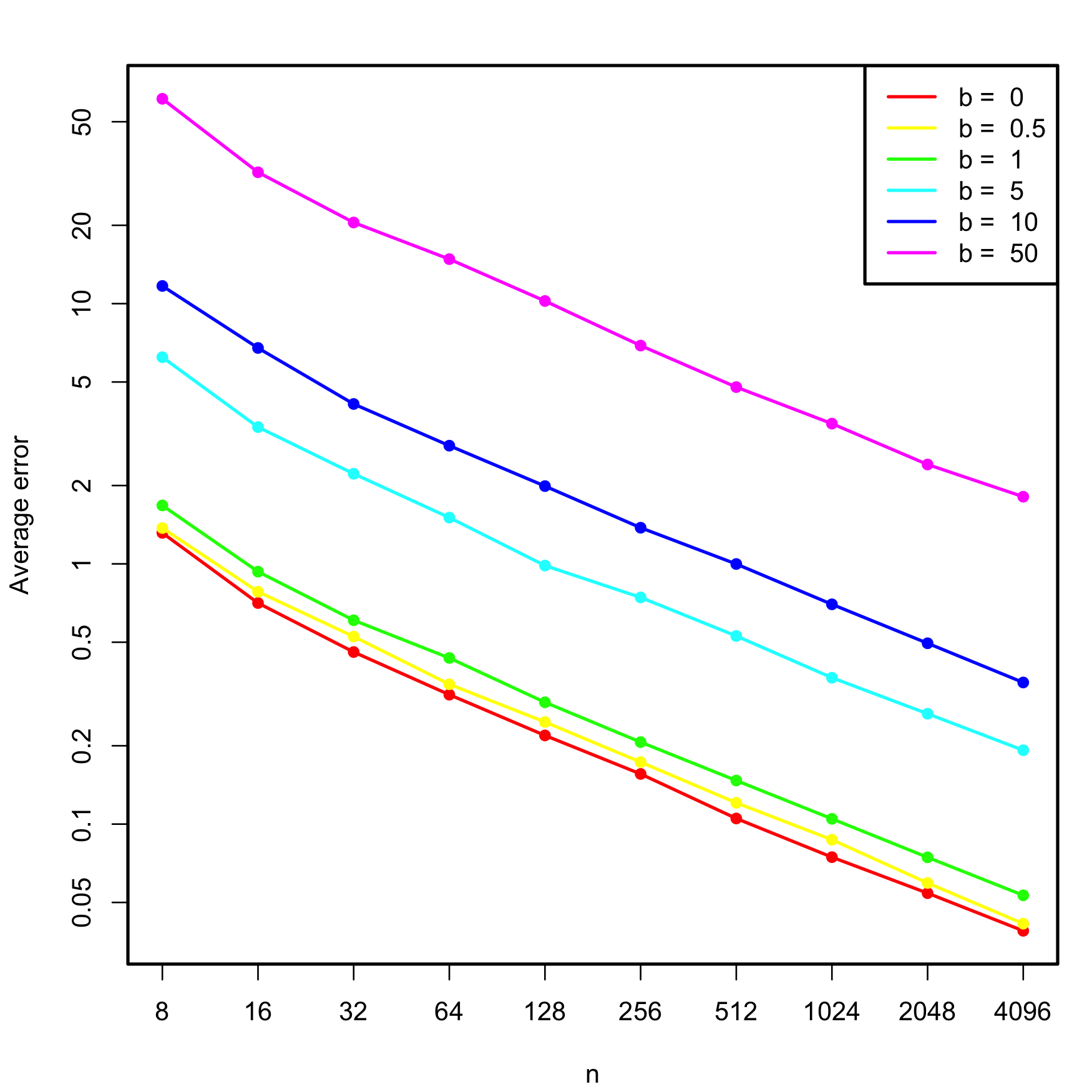
Figure 3.30: Estimated average error \(\mathbb{E}\lbrack\|\hat{\boldsymbol{\beta}}-\boldsymbol{\beta}\|\rbrack,\) for varying \(n\) and degrees of multicollinearity, indexed by \(b.\) The horizontal and vertical axes are in logarithmic scales.
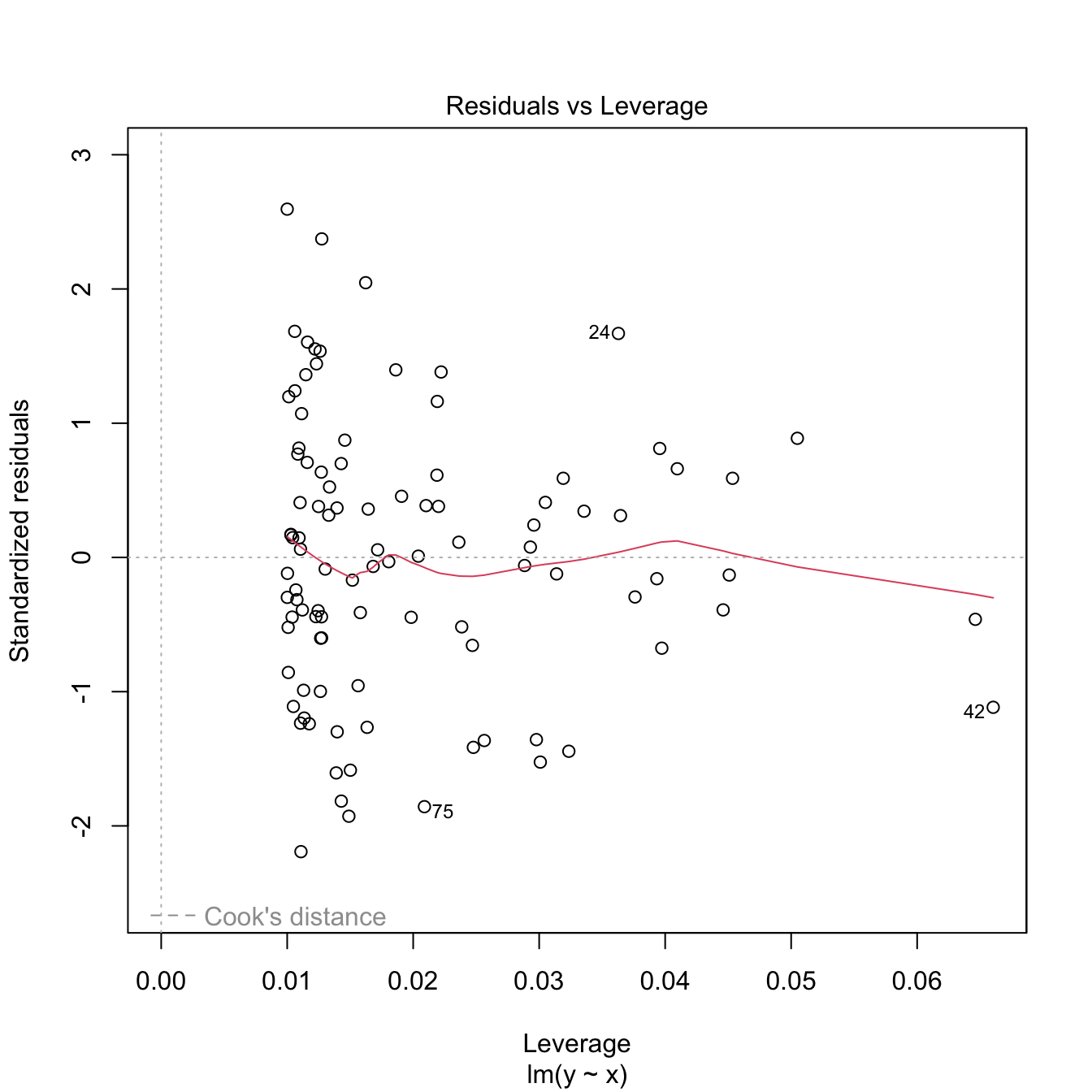
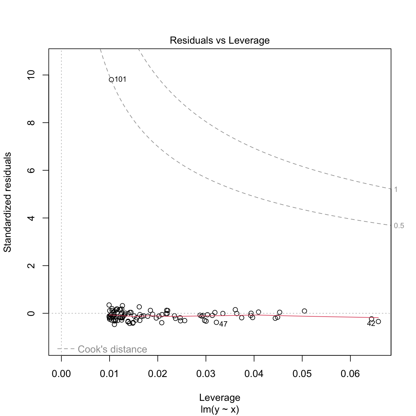
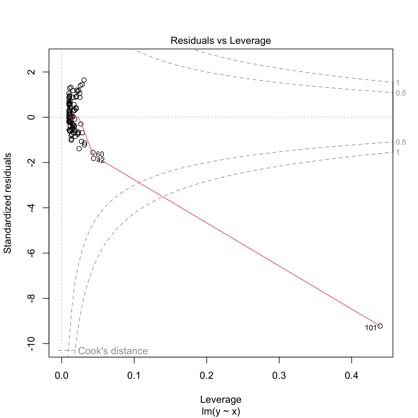
3.5.6 Outliers and high-leverage points
Outliers and high-leverage points are particular observations that have an important impact in the final linear model, either on the estimates or on the properties of the model. They are defined as follows:
- Outliers are the observations with a response \(Y_i\) far away from the regression plane. They typically do not affect the estimate of the plane, unless one of the predictors is also extreme (see next point). But they inflate \(\hat\sigma\) and, as a consequence, they draw down the \(R^2\) of the model and expand the CIs.
- High-leverage points are observations with an extreme predictor \(X_{ij}\) located far away from the rest of points. These observations are highly influential and may drive the linear model fit. The reason is the squared distance in the RSS: an individual extreme point may represent a large portion of the RSS.
Both outliers and high-leverage points can be identified with the residuals vs. leverage plot:
Figure 3.31: Residuals vs. leverage plot for the Price ~ Age + AGST + HarvestRain + WinterRain model for the wine dataset.
The rules of thumb for declaring outliers and high-leverage points are:
- If the standardized residual of an observation is larger than \(3\) in absolute value, then it may be an outlier.
- If the leverage statistic \(h_i\) is greatly exceeding \((p+1)/n\;\)80 (see below), then the \(i\)-th observation may be suspected of having a high leverage.
Let’s see an artificial example.
# Create data
set.seed(12345)
x <- rnorm(100)
e <- rnorm(100, sd = 0.5)
y <- 1 + 2 * x + e

# Leverage expected value
2 / 101 # (p + 1) / n
## [1] 0.01980198

# Base model
m0 <- lm(y ~ x)
plot(x, y)
abline(coef = m0$coefficients, col = 2)
summary(m0)
##
## Call:
## lm(formula = y ~ x)
##
## Residuals:
##      Min       1Q   Median       3Q      Max
## -1.10174 -0.30139 -0.00557  0.30949  1.30485
##
## Coefficients:
##             Estimate Std. Error t value Pr(>|t|)
## (Intercept)  1.01103    0.05176   19.53   <2e-16 ***
## x            2.04727    0.04557   44.93   <2e-16 ***
## ---
## Signif. codes:  0 '***' 0.001 '**' 0.01 '*' 0.05 '.' 0.1 ' ' 1
##
## Residual standard error: 0.5054 on 98 degrees of freedom
## Multiple R-squared:  0.9537, Adjusted R-squared:  0.9532
## F-statistic:  2018 on 1 and 98 DF,  p-value: < 2.2e-16

# Make an outlier
x[101] <- 0; y[101] <- 30
m1 <- lm(y ~ x)
plot(x, y)
abline(coef = m1$coefficients, col = 2)
summary(m1)
##
## Call:
## lm(formula = y ~ x)
##
## Residuals:
##     Min      1Q  Median      3Q     Max
## -1.3676 -0.5730 -0.2955  0.0941 28.6881
##
## Coefficients:
##             Estimate Std. Error t value Pr(>|t|)
## (Intercept)   1.3119     0.2997   4.377 2.98e-05 ***
## x             1.9901     0.2652   7.505 2.71e-11 ***
## ---
## Signif. codes:  0 '***' 0.001 '**' 0.01 '*' 0.05 '.' 0.1 ' ' 1
##
## Residual standard error: 2.942 on 99 degrees of freedom
## Multiple R-squared:  0.3627, Adjusted R-squared:  0.3562
## F-statistic: 56.33 on 1 and 99 DF,  p-value: 2.708e-11

# Make a high-leverage point
x[101] <- 10; y[101] <- 5
m2 <- lm(y ~ x)
plot(x, y)
abline(coef = m2$coefficients, col = 2)
summary(m2)
##
## Call:
## lm(formula = y ~ x)
##
## Residuals:
##     Min      1Q  Median      3Q     Max
## -9.2423 -0.6126  0.0373  0.7864  2.1652
##
## Coefficients:
##             Estimate Std. Error t value Pr(>|t|)
## (Intercept)  1.09830    0.13676   8.031 2.06e-12 ***
## x            1.31440    0.09082  14.473  < 2e-16 ***
## ---
## Signif. codes:  0 '***' 0.001 '**' 0.01 '*' 0.05 '.' 0.1 ' ' 1
##
## Residual standard error: 1.339 on 99 degrees of freedom
## Multiple R-squared:  0.6791, Adjusted R-squared:  0.6758
## F-statistic: 209.5 on 1 and 99 DF,  p-value: < 2.2e-16
The leverage statistic associated to the \(i\)-th datum corresponds to the \(i\)-th diagonal entry of the hat matrix \(\mathbf{H}\):
\[\begin{align*} h_{i}:=\mathbf{H}_{ii}=(\mathbf{X}(\mathbf{X}'\mathbf{X})^{-1}\mathbf{X}')_{ii}. \end{align*}\]
It can be seen that \(\frac{1}{n}\leq h_i\leq 1\) and that the mean \(\bar{h}=\frac{1}{n}\sum_{i=1}^nh_i=\frac{p+1}{n}.\) This can be clearly seen in the case of simple linear regression, where the leverage statistic has the explicit form
\[\begin{align*} h_{i}=\frac{1}{n}+\frac{(X_i-\bar{X})^2}{\sum_{j=1}^n(X_j-\bar{X})^2}. \end{align*}\]
Interestingly, this expression shows that the leverage statistic is directly dependent on the distance to the center of the predictor. A precise threshold for determining when \(h_i\) is greatly exceeding measure its expected value \(\bar{h}\) can be given if the predictors are assumed to be jointly normal. In this case, \(nh_i-1\sim\chi^2_p\) (Peña 2002) and hence the \(i\)-th point is declared as a potential high-leverage point if \(h_i>\frac{\chi^2_{p;\alpha}+1}{n},\) where \(\chi^2_{p;\alpha}\) is the \(\alpha\)-upper quantile of the \(\chi^2_p\) distribution (\(\alpha\) can be taken as \(0.05\) or \(0.01\)).
The functions influence, hat, and rstandard allow performing a finer inspection of the leverage statistics.
# Access leverage statistics
head(influence(model = m2, do.coef = FALSE)$hat)
##          1          2          3          4          5          6
## 0.01017449 0.01052333 0.01083766 0.01281244 0.01022209 0.03137304

# Another option
h <- hat(x = x)

# 1% most influential points
n <- length(x)
p <- 1
hist(h, breaks = 20)
abline(v = (qchisq(0.99, df = p) + 1) / n, col = 2)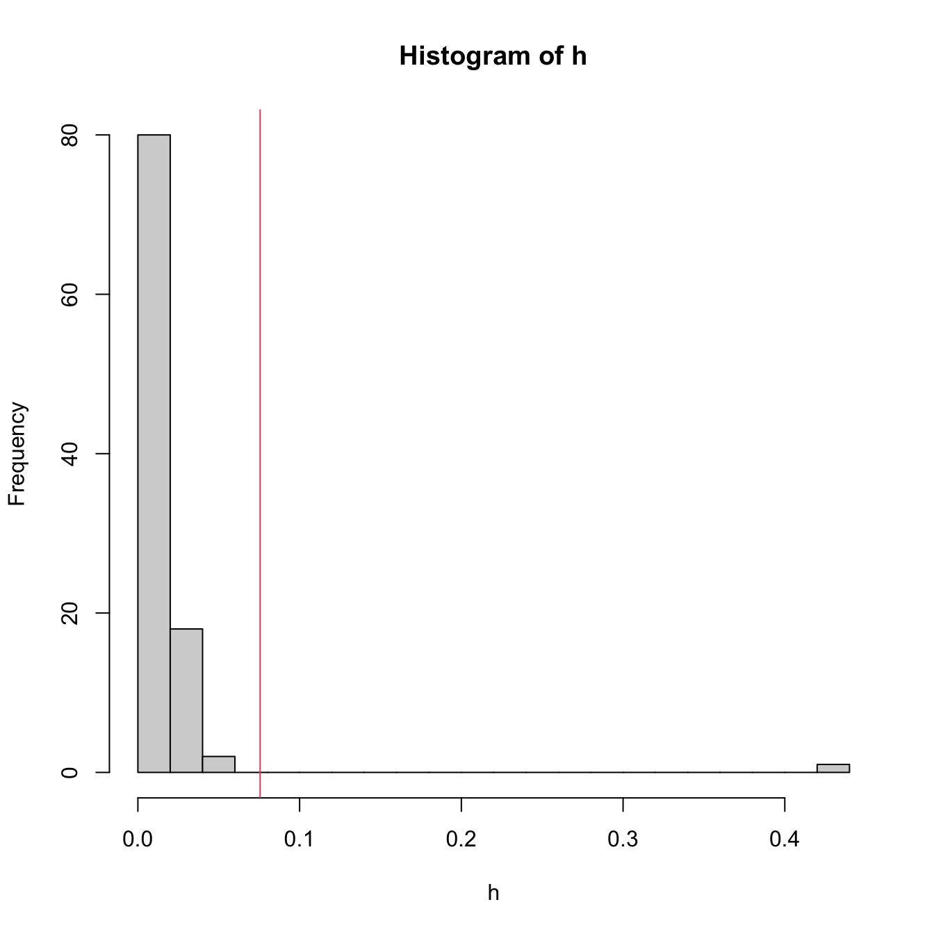
# Standardized residuals
rs <- rstandard(m2)
plot(m2, 2) # QQ-plot
points(qnorm(ppoints(n = n)), sort(rs), col = 2, pch = '+') # Manually computed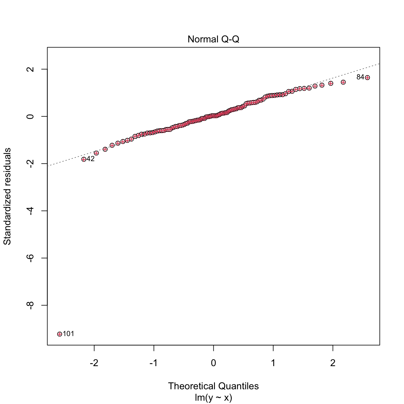
3.5.7 Case study application
Moore’s law (Moore 1965) is an empirical law that states that the power of a computer doubles approximately every two years. Translated into a mathematical formula, Moore’s law is
\[\begin{align*} \text{transistors}\approx 2^{\text{years}/2}. \end{align*}\]
Applying logarithms to both sides gives
\[\begin{align*} \log(\text{transistors})\approx \frac{\log(2)}{2}\text{years}. \end{align*}\]
We can write the above formula more generally as
\[\begin{align*} \log(\text{transistors})=\beta_0+\beta_1 \text{years}+\varepsilon, \end{align*}\]
where \(\varepsilon\) is a random error. This is a linear model!
The dataset cpus.txt (source, retrieved in September 2016) contains the transistor counts for the CPUs appeared in the time range 1971–2015. For this data, do the following:
- Import conveniently the data and name it as
cpus. - Show a scatterplot of
Transistor.countvs.Date.of.introductionwith a linear regression. - Are the assumptions verified in
Transistor.count ~ Date.of.introduction? Which ones are more “problematic”? - Create a new variable, named
Log.Transistor.count, containing the logarithm ofTransistor.count. - Show a scatterplot of
Log.Transistor.countvs.Date.of.introductionwith a linear regression. - Are the assumptions verified in
Log.Transistor.count ~ Date.of.introduction? Which ones are which are more “problematic”? - Regress
Log.Transistor.count ~ Date.of.introduction. - Summarize the fit. What are the estimates \(\hat\beta_0\) and \(\hat\beta_1\)? Is \(\hat\beta_1\) close to \(\frac{\log(2)}{2}\)?
- Compute the CI for \(\beta_1\) at \(\alpha=0.05.\) Is \(\frac{\log(2)}{2}\) inside it? What happens at levels \(\alpha=0.10,0.01\)?
- We want to forecast the average log-number of transistors for the CPUs to be released in 2024. Compute the adequate prediction and CI.
- A new CPU design is expected for 2025. What is the range of log-number of transistors expected for it, at a \(95\%\) level of confidence?
- Compute the ANOVA table for
Log.Transistor.count ~ Date.of.introduction. Is \(\beta_1\) significant?
The dataset gpus.txt
(source,
retrieved in September 2016) contains the transistor counts for the GPUs
appeared in the period 1997–2016. Repeat the previous analysis for this
dataset.
Analyze the bias induced by transforming the response, fitting a linear model, and then untransforming. For that, consider the relation \[\begin{align} Y=\exp(\beta_0+\beta_1X+\varepsilon),\tag{3.8} \end{align}\] where \(X\sim\mathcal{N}(0,0.5)\) and \(\varepsilon\sim\mathcal{N}(0,1)\). Set \(\beta_0=-1\) and \(\beta_1=1.\) Then, follow these steps:
- Compute the exact conditional distribution \(Y|X=x.\) Hint: use the lognormal distribution.
- Based on Step 1, compute the true regression function \(m(x)=\mathbb{E}[Y|X=x]\) exactly and plot it.
- Simulate a sample \(\{(X_i,Y_i)\}_{i=1}^n\) from (3.8), with \(n=200.\)
- Define \(W:=\log(Y)\) and fit the linear model \(W=\beta_0+\) \(\beta_1X+\varepsilon\) from the previous sample. Are \((\beta_0,\beta_1)\) properly estimated?
- Estimate \(\mathbb{E}[W|X=0]\) and \(\mathbb{E}[W|X=1]\) by \(\hat w_0=\hat\beta_0\) and \(\hat w_1=\hat\beta_0+\hat\beta_1,\) respectively.
- Compute \(\hat y_0=\exp(\hat w_0)\) and \(\hat y_1=\exp(\hat w_1),\) the predictions with the transformed model of \(\mathbb{E}[Y|X=0]\) and \(\mathbb{E}[Y|X=1].\) Compare the estimates with \(m(0)\) and \(m(1).\)
- Plot the fitted curve \(\hat y = \exp(\hat\beta_0+\hat\beta_1x)\) and compare with \(m\) in Step 2.
- If \(n\) is increased in Step 3, does the estimation in Step 6 improve? Summarize your takeaways from the exercise.
References
If \(p=1,\) then it is possible to inspect the scatterplot of the \(\{(X_{i1},Y_i)\}_{i=1}^n\) in order to determine whether linearity is plausible. But the usefulness of this graphical check quickly decays with the dimension \(p,\) as \(p\) scatterplots need to be investigated. That is precisely the key point for relying in the residuals vs. fitted values plot.↩︎
Assume that \(f(Y)=\beta_0+\beta_1X+\varepsilon,\) with \(f\) nonlinear and invertible. Clearly, \(W=f(Y)\) satisfies \(W=\beta_0+\beta_1X+\varepsilon,\) and we can estimate \(\mathbb{E}[W|X=x]\) with \(\hat{w}=\hat{\beta}_0+\hat{\beta}_1x\) unbiasedly, i.e., \(\mathbb{E}[\hat{w}|X_1,\ldots,X_n]=\mathbb{E}[W|X=x].\) Define \(\hat{y}_f:=f^{-1}(\hat{w}).\) Because of the delta method (see next footnote), \(\mathbb{E}[\hat{y}_f|X_1,\ldots,X_n]\) is asymptotically equal to \(f^{-1}(\mathbb{E}[W|X=x]).\) However, \(f^{-1}(\mathbb{E}[W|X=x])\neq (\mathbb{E}[f^{-1}(W)|X=x])=\mathbb{E}[Y|X=x],\) so \(\hat{y}_f\) is a biased estimator of \(\mathbb{E}[Y|X=x].\) Indeed, if \(f\) is strictly convex (e.g., \(f=\log\)), then \(f^{-1}\) is strictly concave, and Jensen’s inequality guarantees that \(f^{-1}(\mathbb{E}[W|X=x])\geq \mathbb{E}[f^{-1}(W)|X=x],\) that is, \(\hat{y}_f\) underestimates \(\mathbb{E}[Y|X=x].\)↩︎
Delta method. Let \(\hat{\theta}\) be an estimator of \(\theta\) such that \(\sqrt{n}(\hat{\theta}-\theta)\) is asymptotically a \(\mathcal{N}(0,\sigma^2)\) when \(n\to\infty.\) If \(g\) is a real-valued function such that \(g'(\theta)\neq0\) exists, then \(\sqrt{n}(g(\hat{\theta})-g(\theta))\) is asymptotically a \(\mathcal{N}(0,\sigma^2(g'(\theta))^2).\)↩︎
Given that removing the bias introduced by considering \(\hat{Y}_f=f^{-1}(\hat{W})\) is challenging.↩︎
Recall that \(\hat\beta_j=\mathbf{e}_j'(\mathbf{X}'\mathbf{X})^{-1}\mathbf{X}'\mathbf{Y}=:\sum_{i=1}^nw_{ij}Y_i,\) where \(\mathbf{e}_j\) is the canonical vector of \(\mathbb{R}^{p+1}\) with \(1\) in the \(j\)-th position and \(0\) elsewhere. Therefore, \(\hat\beta_j\) is a weighted sum of the random variables \(Y_1,\ldots,Y_n\) (recall that we assume that \(\mathbf{X}\) is given and therefore is deterministic). Even if \(Y_1,\ldots,Y_n\) are not normal, the central limit theorem entails that \(\sqrt{n}(\hat\beta_j-\beta_j)\) is asymptotically normally distributed when \(n\to\infty,\) provided that linearity holds.↩︎
Distributions that are not heavy tailed, not heavily multimodal, and not heavily skewed.↩︎
For \(X\sim F,\) the \(p\)-th quantile \(x_p=F^{-1}(p)\) of \(X\) is estimated through the sample quantile \(\hat{x}_p:=F_n^{(-1)}(p),\) where \(F_n(x)=\frac{1}{n}\sum_{i=1}^n1_{\{X_i\leq x\}}\) is the empirical cdf of \(X_1,\ldots,X_n\) and \(F_n^{(-1)}\) is the generalized inverse function of \(F_n.\) If \(X\sim f\) is continuous, then \(\sqrt{n}(\hat{x}_p-x_p)\) is asymptotically a \(\mathcal{N}\left(0,\frac{p(1-p)}{f(x_p)^2}\right).\) Therefore, the variance of \(\hat x_p\) grows if \(p\to0\) or \(p\to1,\) hence more variability is expected on the extremes of the QQ-plot (see Figure 3.20).↩︎
This is the Kolmogorov–Smirnov test shown in Section A.1 but adapted to testing the normality of the data with unknown mean and variance. More precisely, the test tests the composite null hypothesis \(H_0:F=\Phi(\cdot;\mu,\sigma^2)\) with \(\mu\) and \(\sigma^2\) unknown. Note that this is different from the simple null hypothesis \(H_0:F=F_0\) of the Kolmogorov–Smirnov test in which \(F_0\) is completely specified. Further tests of normality can be derived by adapting other tests for the simple null hypothesis \(H_0:F=F_0,\) such as the Cramér–von Mises and the Anderson–Darling tests, and these are implemented in the functions
nortest::cvm.testandnortest::ad.test.↩︎Precisely, if \(\lambda<1,\) positive skewness (or skewness to the right) is palliated (large values of \(Y\) shrink, small values grow), whereas if \(\lambda>1\) negative skewness (or skewness to the left) is corrected (large values of \(Y\) grow, small values shrink).↩︎
Maximum likelihood for a \(\mathcal{N}(\mu,\sigma^2)\) and potentially using the linear model structure if we are performing the transformation to achieve normality in errors of the linear model. Recall that optimally transforming \(Y\) such that \(Y\) is normal-like or \(Y|(X_1,\ldots,X_p)\) is normal-like (the assumption in the linear model) are very different goals!↩︎
And therefore more informative on the linear dependence of the predictors than the correlations of \(X_j\) with each of the remaining predictors.↩︎
This is the expected value for the leverage statistic \(h_i\) if the linear model holds. However, the distribution of \(h_i\) depends on the joint distribution of the predictors \((X_1,\ldots,X_p).\)↩︎