Chapter 32 Simple linear regression
Linear regression focuses on the association between two or more quantitative variables. In the case of simple linear regression, which is the focus of this chapter, there are only two variables to consider. At first, this might sound similar to correlation, which was introduced in Chapter 30. Simple linear regression and correlation are indeed similar, both conceptually and mathematically, and the two are frequently confused. Both methods focus on two quantitative variables, but the general aim of regression is different from correlation. The aim of correlation is to describe how the variance of one variable is associated with the variance of another variable. In other words, the correlation measures the intensity of covariance between variables (Sokal & Rohlf, 1995). But there is no attempt to predict what the value of one variable will be based on the other.
Linear regression, in contrast to correlation, focuses on prediction. The aim is to predict the value of one quantitative variable \(Y\) given the value of another quantitative variable \(X\). In other words, regression focuses on an association of dependence in which the value of \(Y\) depends on the value of \(X\) (Rahman, 1968). The \(Y\) variable is therefore called the dependent variable; it is also sometimes called the response variable or the output variable (Box et al., 1978; Sokal & Rohlf, 1995). The \(X\) variable is called the independent variable; it is also sometimes called the predictor variable or the regressor (Box et al., 1978; Sokal & Rohlf, 1995). Unlike correlation, the distinction between the two variable types matters because the aim is to understand how a change in the independent variable will affect the dependent variable. For example, if we increase \(X\) by 1, how much will \(Y\) change?
32.1 Visual interpretation of regression
A visual example using a scatterplot can illustrate one way to think about regression. Suppose that we have sampled fig fruits from various latitudes (Figure 32.1), and we want to use latitude to predict fruit volume (Duthie & Nason, 2016).
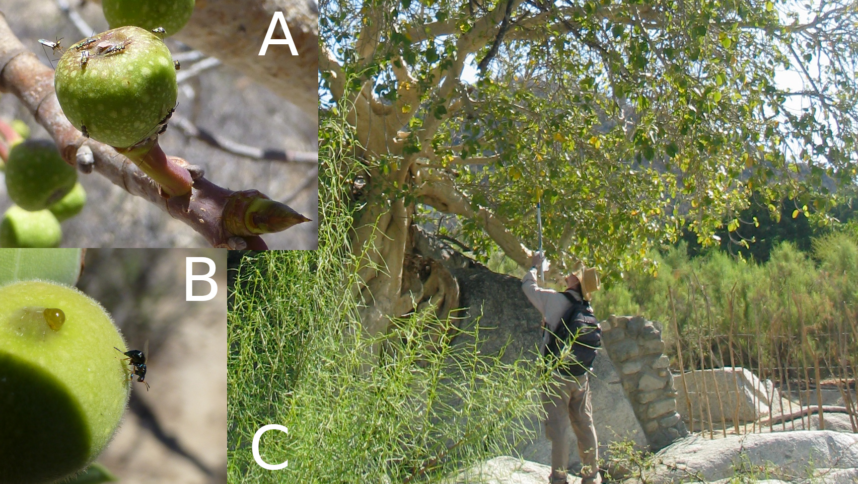
Figure 32.1: Fruits of the Sonoran Desert Rock Fig in the desert of Baja, Mexico with different fig wasps on the surface (A and B). A full fig tree is shown to the right (C) with the author attempting to collect fig fruits from a branch of the tree.
A sample of fig fruits from different latitudes is shown in Table 32.1.
| Latitude | 23.7 | 24.0 | 27.6 | 27.2 | 29.3 | 28.2 | 28.3 |
| Volume | 2399.0 | 2941.7 | 2167.2 | 2051.3 | 1686.2 | 937.3 | 1328.2 |
How much does fruit volume change with latitude? To start answering this question, we can plot the relationship between the two variables. We want to predict fruit volume from latitude, meaning that fruit volume depends on latitude. Fruit volume is therefore the dependent variable, and we should plot it on the y-axis. Latitude is our independent variable, and we should plot it on the x-axis (Figure 32.2).
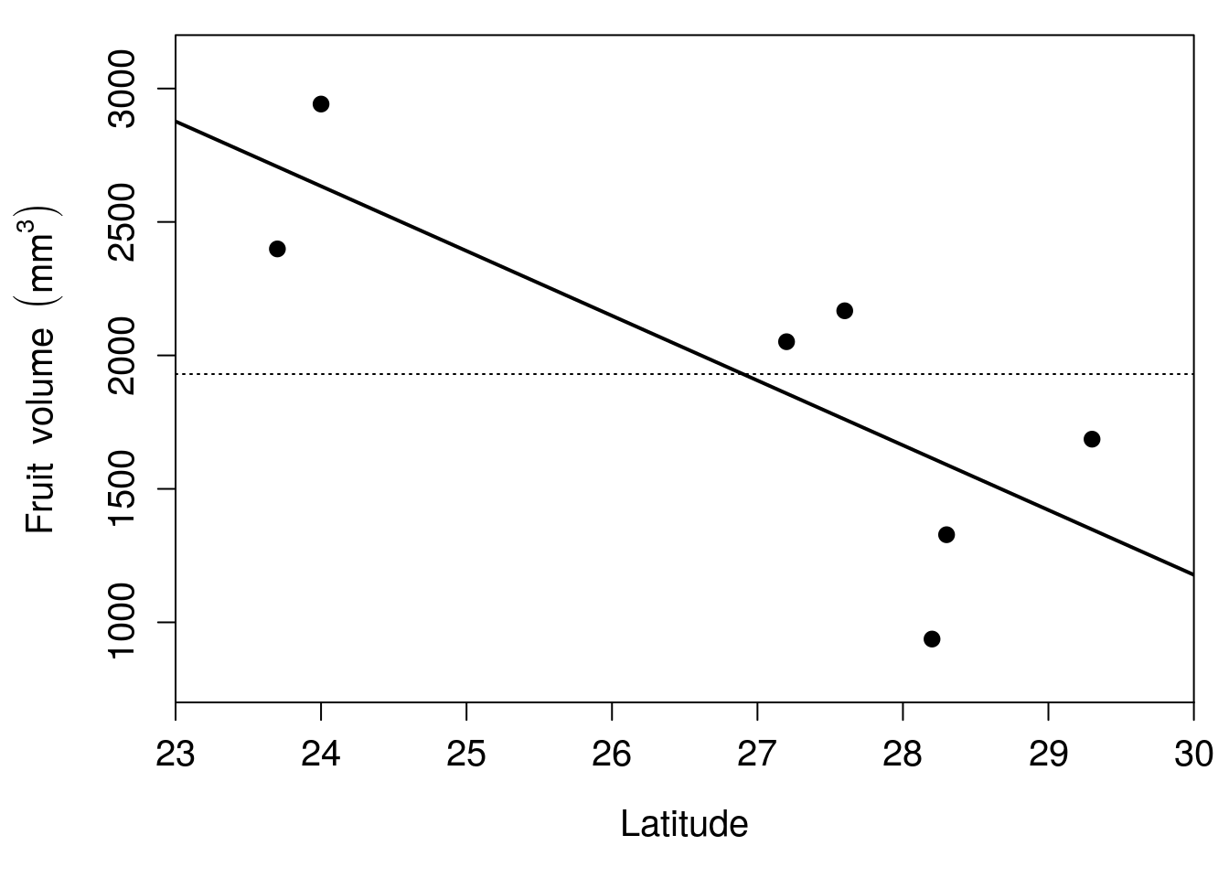
Figure 32.2: Relationship between latitude and fruit volume for seven fig fruits collected from Baja, Mexico in 2010. The solid line shows the regression line of best fit, and the thin dotted line shows the mean of fruit volume.
In Figure 32.2, each of the seven points is a different fig fruit. The x-axis shows the latitude from which the fruit was collected, and the y-axis shows the volume of the fruit in \(\mathrm{mm}^{3}\). The thin dotted line shows the mean fruit volume for the seven fruits, \(\bar{y} =\) 1930.1. The thick black line trending downwards in Figure 32.2 is the regression line, also called the line of best fit. How this line is calculated will be explained later, but for now there are two important concepts to take away from Figure 32.2. First, the regression line gives us the best prediction of what fruit volume will be for any given latitude. For example, if we wanted to predict what fruit volume would be for a fruit collected at 28 degrees north latitude, we could find the value 28 on the x-axis, then find what fruit value this corresponds to on the y-axis using the regression line. At an x-axis value of 28, the regression line has a y-axis value of approximately 1660, so we would predict that a fig fruit collected at 28 degrees north latitude would have a volume of 1660 \(\mathrm{mm}^{3}\).
This leads to the second important concept to take away from Figure 32.2. In the absence of any other information (including latitude), our best guess of what any given fruit’s volume will be is just the mean (\(\bar{y} =\) 1930.1). A key aim of regression is to test if the regression line can do a significantly better job of predicting what fruit volume will be. In other words, is the solid line of Figure 32.2 really doing that much better than the horizontal dotted line? Before answering this question, a few new terms are needed.
32.2 Intercepts, slopes, and residuals
Given the latitude of each fruit (i.e., each point in Figure 32.2), we can predict its volume from three numbers. These three numbers are the intercept (\(b_{0}\)), the slope (\(b_{1}\)), and the residual (\(\epsilon_{i}\)). The intercept is the point on the regression line where \(x = 0\), i.e., where latitude is 0 in the example of fig fruit volumes. This point is not actually visible in Figure 32.2 because the lowest latitude on the x-axis is 23. At a latitude of 23, we can see that the regression line predicts a fruit volume of approximately 2900 \(\mathrm{mm}^{3}\). If we were to extend this regression line all the way back to a latitude of 0, then we would predict a fruit volume of 8458.3. This is our intercept75 in Figure 32.2.
The slope is the direction and steepness of the regression line. It describes how much our dependent variable changes if we increase the independent variable by 1. For example, how do we predict fruit volume to change if we increase latitude by 1 degree? From the regression line in Figure 32.2, whenever latitude increases by 1, we predict a decrease in fruit volume of 242.7. Consequently, the slope is -242.7. Since we are predicting using a straight line, this decrease is the same at every latitude. This means that we can use the slope to predict how much our dependent variable will change given any amount of units of change in our independent variable. For example, we can predict how fruit volume will change for any amount of change in degrees latitude. If latitude increases by 2 degrees, then we would predict a 2 \(\times\) -242.7 \(=\) -485.4 \(\mathrm{mm}^{3}\) change in fruit volume (i.e., a decrease of 485.4). If latitude decreases by 3 degrees, then we would predict a -3 \(\times\) -242.7 \(=\) 728.1 \(\mathrm{mm}^{3}\) change in fruit volume (i.e., an increase of 728.1).
We can describe the regression line using just the intercept and the slope. For the example in Figure 31.2, this means that we can predict fruit volume for any given latitude with just these two numbers. But prediction almost always comes with some degree of uncertainty. For example, if we could perfectly predict fruit volume from latitude, then all of the points in Figure 32.2 would fall exactly on the regression line. But this is not the case. None of the seven points in Figure 32.2 fall exactly on the line, so there is some unexplained variation (i.e., some error) in predicting fruit volume from latitude. To map each fruit’s latitude to its corresponding volume, we therefore need one more number. This number is the residual, and it describes how far away a point is from the regression line (Figure 32.3).
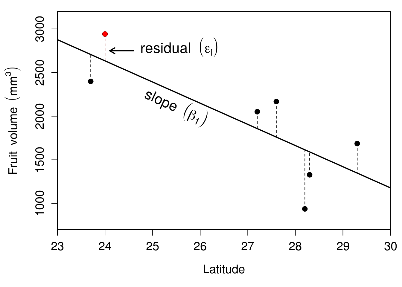
Figure 32.3: Relationship between latitude and fruit volume for seven fig fruits collected from Baja, Mexico in 2010. The solid line shows the regression line of best fit, and the vertical dashed lines show the residuals for each point.
The residual of each of the seven points is shown with a dashed line in Figure 32.3. Residual values are positive when they are higher than the value predicted by the regression line, and they are negative when they are lower than the value predicted by the regression line. In the example of Figure 32.3, the residual indicated by the arrow, at a latitude of 24, is 307.8 because the volume of the fig fruit collected from this latitude deviates from the predicted volume on the regression line by 307.8. For the point just to the left where the latitude from which the fruit was sampled is 23.7 degrees, the residual is -307.7. For any fig fruit \(i\), we can therefore find its volume using the intercept (\(b_{0}\)), the slope (\(b_{1}\)), and the residual value (\(\epsilon_{i}\)). Next, we will see how these different values relate to one another mathematically.
32.3 Regression coefficients
Simple linear regression predicts the dependent variable (\(y\)) from the independent variable (\(x\)) using the intercept (\(b_{0}\)) and the slope (\(b_{1}\)),
\[y = b_{0} + b_{1}x.\]
The equation for \(y\) mathematically describes the regression line in Figures 32.2 and 32.3. This gives us the expected value of \(y\) for any value of \(x\). In other words, the equation tells us what \(y\) will be on average for any given \(x\). Sometimes different letters are used to represent the same mathematical relationship, such as \(y = a + bx\) or \(y = mx + b\), but the symbols used are not really important76. Here, \(b_{0}\) and \(b_{1}\) are used to make the transition to multiple regression in Chapter 33 clearer.
For any specific value of \(x_{i}\), the corresponding \(y_{i}\) can be described more generally,
\[y_{i} = b_{0} + b_{1}x_{i} + \epsilon_{i}.\]
For example, for any fig fruit \(i\), we can find its exact volume (\(y_{i}\)) from its latitude (\(x_{i}\)) using the intercept (\(b_{0}\)), the slope (\(b_{1}\)), and the residual (\(\epsilon_{i}\)). We can do this for the residual indicated by the arrow in Figure 32.3. The latitude at which this fruit was sampled was \(x_{i} =\) 24, its volume is \(y_{i} =\) 2941.7, and its residual value is 307.8. From the previous section, we know that \(b_{0} =\) 8458.3 and \(b_{1} =\) -242.7. If we substitute all of these values,
\[2941.7 = 8458.3 - 242.68(24) + 307.84.\]
Note that if we remove the residual 307.84, then we get the predicted volume for our fig fruit at 24 degrees latitude,
\[2633.98 = 8458.3 - 242.68(24).\]
Visually, this is where the dotted residual line meets the solid regression line in Figure 32.3.
This explains the relationship between the independent and dependent variables using the intercept, slope, and residuals. But how do we actually define the line of best fit? In other words, what makes the regression line in this example better than some other line that we might use instead? The next section explains how the regression line is actually calculated.
32.4 Regression line calculation
The regression line is defined by its relationship to the residual values. Figure 32.4 shows the same regression as in Figures 32.2 and 32.3, but with the values of the residuals written next to each point.
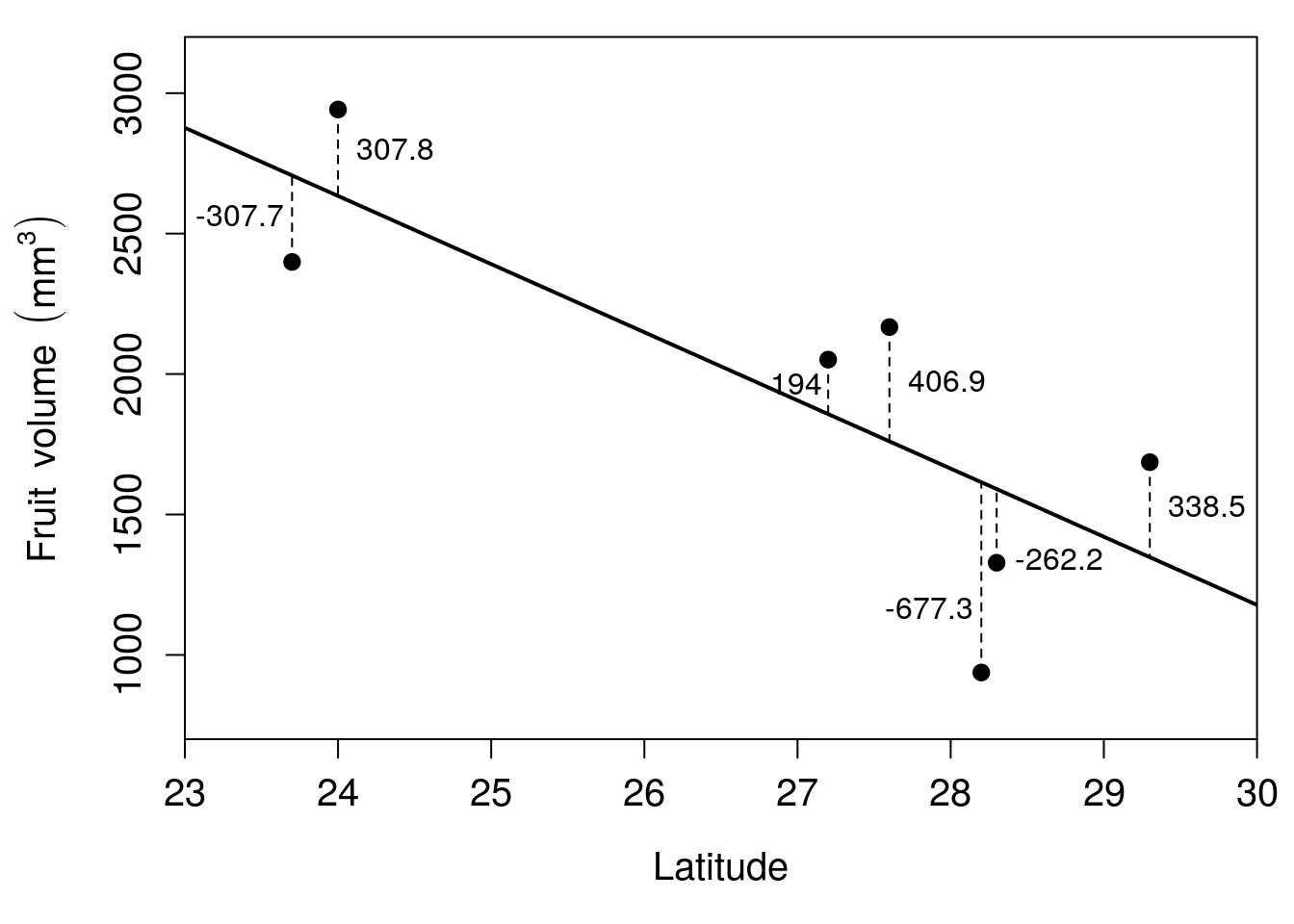
Figure 32.4: Relationship between latitude and fruit volume for seven fig fruits collected from Baja, Mexico in 2010. The solid black line shows the regression line of best fit, and the vertical dashed lines show the residuals for each point. Residuals are rounded to one decimal place.
Some of the values are positive, and some are negative. An intuitive reason the line in Figure 32.4 is the line of best fit is the positive and negative values exactly balance each other out. In other words, the sum of all the residual values in Figure 32.4 is 0,
\[0 = -307.715 + 307.790 + 193.976 + 406.950 - 677.340 - 262.172 + 338.511.\]
If we were to move the regression line, then the sum of residuals would no longer be 0. There is only one line that fits.
More technically, the line of best fit minimises the sum of squared residuals (\(SS_{\mathrm{residual}}\)). In other words, when we take all of the residual values, square them, then add up the squares, the sum should be lower than any other line we could draw,
\[SS_{\mathrm{residual}} = (-307.715)^{2} + (307.790)^2 + ... + (338.511)^{2}.\]
For the regression in Figure 32.4, \(SS_{\mathrm{residual}} =\) 1034772. Any line other than the regression line shown in Figure 32.4 would result in a higher \(SS_{\mathrm{residual}}\) (to get a better intuition for how this works, we can use an interactive application77 in which a random set of points are placed on a scatterplot and the intercept and slope are changed until the residual sum of squares is minimised).
We have seen how key terms in regression are defined, what regression coefficients are, and how the line of best fit is calculated. The next section focuses on the coefficient of determination, which describes how well data points fit around the regression line.
32.5 Coefficient of determination
We often want to know how well a regression line fits the data. In other words, are most of the data near the regression line (indicating a good fit), or are most far away from the regression line? How closely the data fit to the regression line is described by the coefficient of determination (\(R^{2}\)). More formally, the \(R^{2}\) tells us how much of the total variation in \(y\) is explained by the regression line78,
\[R^{2} = 1 - \frac{SS_{\mathrm{residual}}}{SS_{\mathrm{total}}}.\]
Mathematically, the coefficient of determination compares the sum of squared residuals from the linear model (\(SS_{\mathrm{residual}}\)) to what the sum of squared residuals would be had we just used the mean value of \(y\) (\(SS_{\mathrm{total}}\)). If \(SS_{\mathrm{residual}}\) is very small compared to \(SS_{\mathrm{total}}\), then subtracting \(SS_{\mathrm{residual}}/SS_{\mathrm{total}}\) from 1 will give a large \(R^{2}\) value. This large \(R^{2}\) means that the model is doing a good job of explaining variation in the data. Figure 32.5 shows some examples of scatterplots with different \(R^{2}\) values.
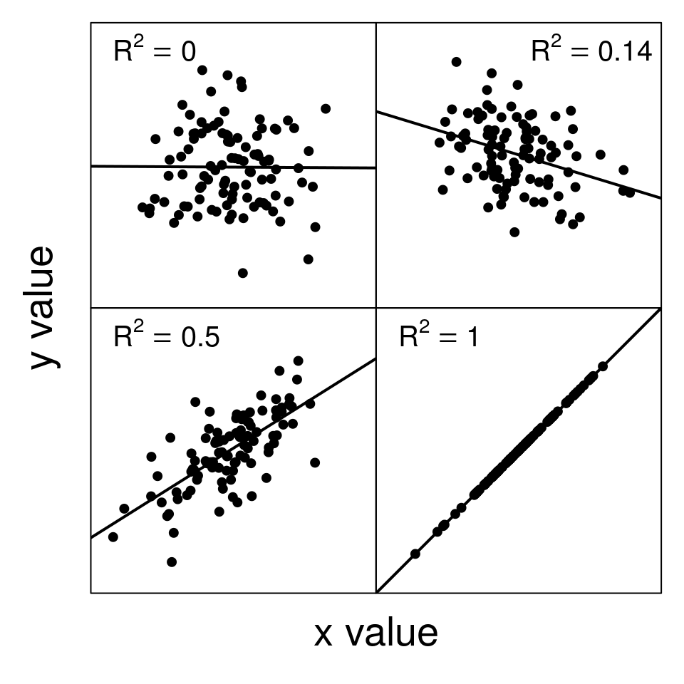
Figure 32.5: Examples of scatterplots with different coefficients of determination (R-squared).
We can calculate the \(R^{2}\) value for our example of fig fruit volumes over a latitudinal gradient. To do this, we need to calculate the sum of the squared residual values (\(SS_{\mathrm{residual}}\)) and the total sum of squared deviations of \(y_{i}\) from the mean \(\bar{y}\) (\(SS_{\mathrm{total}}\)). From the previous section, we have already found that \(SS_{\mathrm{residual}} = 1034772\). Now, to get \(SS_{\mathrm{total}}\), we just need to get the sum of squares for fruit volume (see Section 12.3). We can visualise this as the sum of squared deviations from the mean fruit volume of \(\bar{y} =\) 1930.1 instead of the value predicted by the regression line (Figure 32.6).
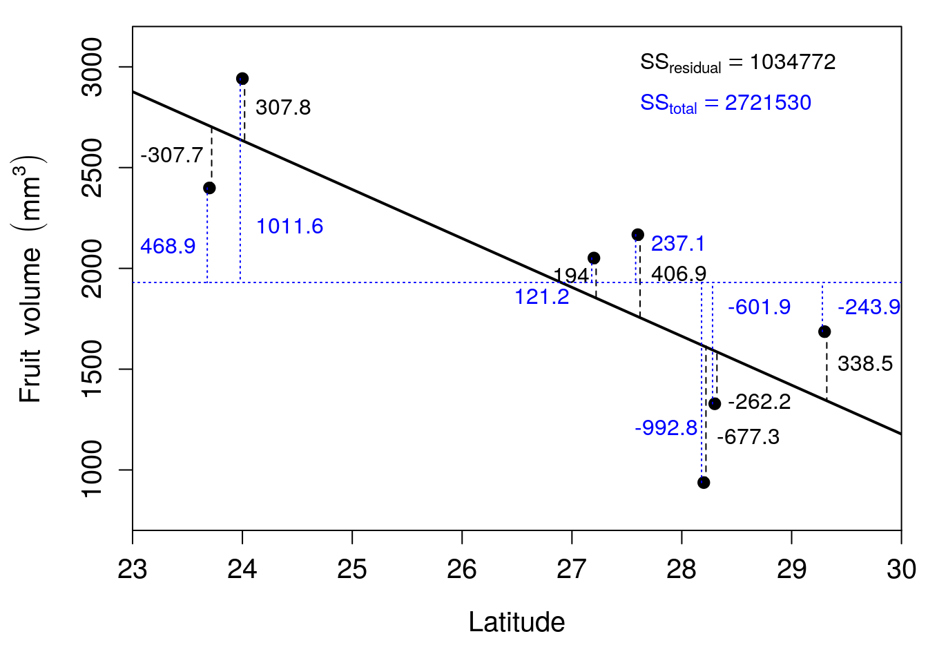
Figure 32.6: Relationship between latitude and fruit volume for seven fig fruits collected from Baja, Mexico in 2010. The solid black line shows the regression line of best fit, and the horizontal dotted line shows the mean of fruit volume. Vertical dashed lines show the model residuals (dashed) and deviations from the mean (dotted). Residuals are rounded to one decimal place.
The numbers in Figure 32.6 show the deviations of each point from the regression line, just like in Figure 32.4. New numbers have been added to Figure 32.6 to show the deviation of each point from the mean fruit volume. Summing the squared values of residuals from the regression line gives a value of 1034772. Summing the squared deviations of values from the mean \(\bar{y} =\) 1930.1 gives a value of 2721530. To calculate \(R^{2}\),
\[R^{2} = 1 - \frac{1034772}{2721530}.\]
The above gives us a value of \(R^{2} = 0.619783\). In other words, about 62% of the variation in fruit volume is explained by latitude.
32.6 Regression assumptions
It is important to be aware of the assumptions underlying linear regression. There are four key assumptions underlying the simple linear regression models described in this chapter (Sokal & Rohlf, 1995):
Measurement of the independent variable (\(x\)) is completely accurate. In other words, there is no measurement error for the independent variable. Of course, this assumption is almost certainly violated to some degree because every measurement has some associated error (see Section 6.1 and Chapter 7).
The relationship between the independent and dependent variables is linear. In other words, we assume that the relationship between \(x\) and \(y\) can be defined by a straight line satisfying the equation \(y = b_{0} + b_{1}x\). If this is not the case (e.g., because the relationship between \(x\) and \(y\) is described by some sort of curved line), then a simple linear regression might not be appropriate.
For any value of \(x_{i}\), \(y_{i}\) values are independent and normally distributed. In other words, the residual values (\(\epsilon_{i}\)) should be normally distributed around the regression line, and they should not have any kind of pattern (such as, e.g., \(\epsilon_{i}\) values being negative for low \(x\) but positive for high \(x\)). If we were to go out and resample the same values of \(x_{i}\), the corresponding \(y_{i}\) values should be normally distributed around the predicted \(y\).
For all values of \(x\), the variance of residuals is identical. In other words, the variance of \(y_{i}\) values around the predicted \(y\) should not change over the range of \(x\). The term for this is ‘homoscedasticity’, meaning that the variance is constant. This is in contrast to heteroscedasticity, which means that the variance is not constant.
Figure 32.7 shows a classic example of heteroscedasticity. Notice that the variance of \(y_{i}\) values increases with increasing \(x\).
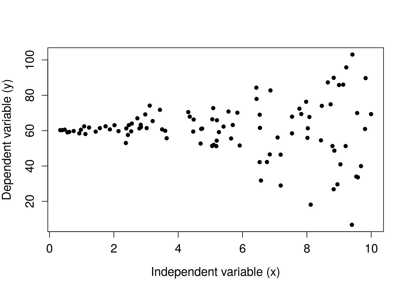
Figure 32.7: Hypothetical dataset in which data show heteroscedasticity, thereby violating an assumption of simple linear regression.
Note that even if our assumptions are not perfectly met, this does not completely invalidate the method of linear regression. In reality, linear regression is often robust to minor deviations from the above assumptions (as are other statistical tools), but large violations of one or more of these assumptions might indeed invalidate the use of linear regression.
32.7 Regression hypothesis testing
We typically want to know if our regression model is useful for predicting the dependent variable given the independent variable. There are three specific null hypotheses that we can test, which tell us the significance of (1) the overall model, (2) the intercept, and (3) the slope. We will go through each of these null hypotheses.
32.7.1 Overall model significance
As mentioned in Section 32.1, in the absence of any other information, the best prediction of our dependent variable is the mean. For example, if we did not have any information about latitude in the previous sections, then the best prediction of fruit volume would just be the mean fruit volume, \(\bar{y} =\) 1930.1 (Figure 32.2). Does including the independent variable latitude result in a significantly better prediction than just using the mean? In other words, does a simple linear regression model with latitude as the independent variable explain significantly more variation in fruit volume than just the mean fruit volume? We can state this more formally as null and alternative hypotheses.
- \(H_{0}\): A model with no independent variables fits the data as well as the linear model.
- \(H_{A}\): The linear model fits the data better than the model with no independent variables.
The null hypothesis can be tested using an F-test of overall significance. This test makes use of the F-distribution (see Section 24.1) to calculate a p-value that we can use to reject or not reject \(H_{0}\). Recall that the F-distribution describes the null distribution for a ratio of variances. In this case, the F-distribution is used to test for the overall significance of a linear regression model by comparing the variation explained by the model to its residual (i.e., unexplained) variation79. If the ratio of explained to unexplained variation is sufficiently high, then we will get a low p-value and reject the null hypothesis.
32.7.2 Significance of the intercept
Just like we test the significance of the overall linear model, we can test the significance of individual model coefficients, \(b_{0}\) and \(b_{1}\). Recall that \(b_{0}\) is the coefficient for the intercept. We can test the null hypothesis that \(b_{0} = 0\) against the alternative hypothesis that it is different from 0.
- \(H_{0}\): The intercept equals 0.
- \(H_{A}\): The intercept does not equal 0.
The estimate of \(b_{0}\) is t-distributed (see Chapter 19) around the true parameter value \(\beta_{0}\). Jamovi will therefore report a t-value for the intercept, along with a p-value that we can use to reject or not reject \(H_{0}\) (The jamovi project, 2024).
32.7.3 Significance of the slope
Testing the significance of the slope (\(b_{1}\)) works in the same way as testing the significance of the intercept. We can test the null hypothesis that \(b_{1} = 0\) against the alternative hypothesis that it is different from 0. Visually, this is testing whether the regression line shown in Figures 32.2-32.5 is flat, or if it is trending either upwards or downwards.
- \(H_{0}\): The slope equals 0.
- \(H_{A}\): The slope does not equal 0.
Like \(b_{0}\), the estimate of \(b_{1}\) is t-distributed (see Chapter 19) around the true parameter value \(\beta_{1}\). We can therefore use the t-distribution to calculate a p-value and either reject or not reject \(H_{0}\). Note that this is often the hypothesis that we are most interested in testing. For example, we often do not care if the intercept of our model is significantly different from 0 (in the case of our fig fruit volumes, this would not even make sense; fig fruits obviously do not have zero volume at the equator). But we often do care if our dependent variable is increasing or decreasing with an increase in the independent variable.
32.7.4 Simple regression output
If we run the simple regression of fig fruit latitude against fruit volume, we can find output statistics \(R^{2} = 0.6198\), and \(P = 0.03562\) for the overall model in jamovi. This means that the model explains about 61.98% of the total variation in fruit volume, and the overall model does a significantly better job of predicting fruit volume than the mean. We therefore reject the null hypothesis and conclude that the model with latitude as an independent variables fits the data significantly better than a model with just the mean of fruit volume (Figure 32.8).
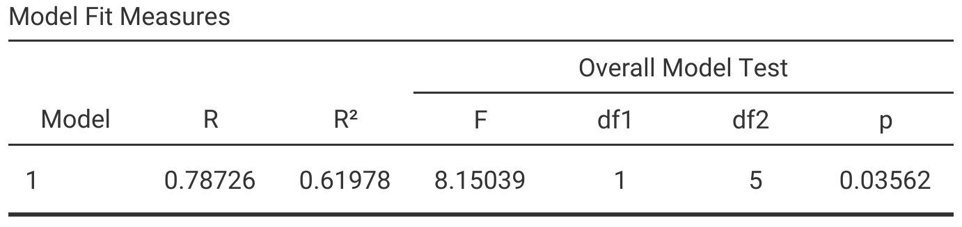
Figure 32.8: Jamovi output table for a simple linear regression in which latitude is an independent variable and fig fruit volume is a dependent variable.
Figure 32.8 reports the \(R^{2}\) value along with \(F\) statistic, degrees of freedom, and the resulting p-value for the overall model. We can also see a table of model coefficients, the intercept (\(b_{0}\)) and slope (\(b_{1}\)) associated with latitude (Figure 32.9).
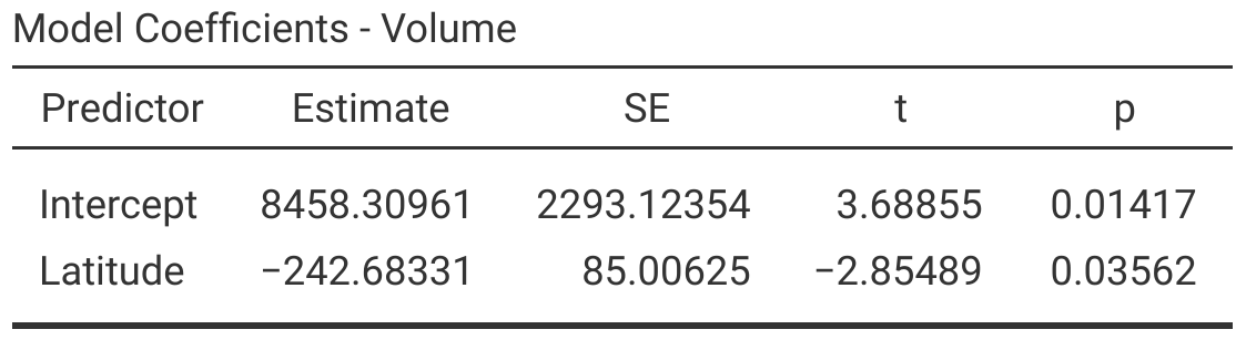
Figure 32.9: Jamovi output table for a simple linear regression showing model coefficients and their statistical significance.
From the jamovi output shown in Figure 32.9, we can see that the intercept is significant (\(P < 0.05\)), so we reject the null hypothesis that \(b_{0} = 0\). Fruit volume decreases with increasing latitude (\(b_{1} = -242.68\)), and this decrease is also significant (\(P < 0.05\)), so we reject the null hypothesis that \(b_{1} = 0\). We therefore conclude that fig fruit volume changes with latitude.
32.8 Prediction with linear models
We can use our linear model to predict a given value of \(y\) from \(x\). In other words, given a value for the independent variable, we can use the regression equation (\(y = b_{0} + b_{1}x\)) to predict the dependent variable. This is possible because our model provides values for the coefficients \(b_{0}\) and \(b_{1}\). For the example of predicting fruit volume from latitude, the linear model estimates \(b_{0} = 8458.3\) and \(b_{1} = -242.68\). We could therefore write our regression equation,
\[Volume = 8458.3 - 242.68(Latitude).\]
Now, for any given latitude, we can predict fig fruit volume. For example, Figure 32.2 shows that there is a gap in fruit collection between 24 and 27 degrees north latitude. If we wanted to predict how large a fig fruit would be at a volume of 25, then we could set \(Latitude = 25\) in our regression equation,
\[Volume = 8458.3 - 242.68(25).\]
Our predicted fig fruit volume at 25 degrees north latitude would be 2391.3 \(\mathrm{mm}^{3}\). Note that this is a point on the regression line in Figure 32.2. To find it visually in Figure 32.2, we just need to find 25 on the x-axis, then scan upwards until we see where this position on the x-axis hits the regression line.
There is an important caveat to consider when making a prediction using regression equations. Predictions might not be valid outside the range of independent variable values on which the regression model was built. In the case of the fig fruit example, the lowest latitude from which a fruit was sampled was 23.7, and the highest latitude was 29.3. We should be very cautious about predicting what volume will be for fruits outside of this latitudinal range because we cannot be confident that the linear relationship between latitude and fruit volume will persist. It is possible that at latitudes greater than 30, fruit volume will no longer decrease. It could even be that fruit volume starts to increase with increasing latitudes greater than 30. Since we do not have any data for such latitudes, we cannot know with much confidence what will happen. It is therefore best to avoid extrapolation, i.e., predicting outside of the range of values collected for the independent variable. In contrast, interpolation, i.e., predicting within the range of values collected for the independent variable, is generally safe.
32.9 Conclusion
There are several new concepts introduced in this chapter with simple linear regression. It is important to understand the intercept, slope, and residuals both visually and in terms of the regression equation. It is also important to be able to interpret the coefficient of determination (\(R^{2}\)), and to understand the hypotheses that simple linear regression can test and the assumptions underlying these tests. In the next chapter, we move on to multiple regression, in which regression models include multiple independent variables.
References
Biologically, a fruit volume of 8458.3 might be entirely unrealistic, which is why we need to be careful when extrapolating beyond the range of our independent variable (more on this later).↩︎
Another common way to represent the above is, \(y = \hat{\beta}_{0} + \hat{\beta}_{1}x\), where \(\hat{\beta}_{0}\) and \(\hat{\beta}_{1}\) are sample estimates of the true parameters \({\beta}_{0}\) and \({\beta}_{1}\).↩︎
Note that, mathematically, \(R^{2}\) is in fact the square of the correlation coefficient. Intuitively this should make some sense; when two variables are more strongly correlated (i.e., \(r\) is near -1 or 1), data are also more tightly distributed around the regression line. But it is also important to understand \(R^{2}\) conceptually in terms of variation explained by the regression model.↩︎
For the fig fruit volume example, the total variation is the sum of squared deviations of fruit volume from the mean is \(SS_{\mathrm{deviation}} = 2721530\). The amount of variation explained by the model is \(SS_{\mathrm{model}} = 1686758\) with 1 degree of freedom. The remaining residual variation is \(SS_{\mathrm{residual}} = 1034772\) with 5 degrees of freedom. To get an \(F\) value, we can use the same approach as with the ANOVA in Chapter 24. We calculate the mean squared errors as \(MS_{\mathrm{model}} = 1686758/1 = 1686758\) and \(MS_{\mathrm{residual}} = 1034772/5 = 206954.4\), then take the ratio to get the value \(F = 1686758 / 206954.4 = 8.150385\).↩︎