Chapter 16 Central Limit Theorem
The previous chapter finished by introducing the normal distribution. This chapter focuses on the normal distribution in more detail and explains why it is so important in statistics.
16.1 The distribution of means is normal
The central limit theorem (CLT) is one of the most important theorems in statistics. It states that if we sample values from any distribution and calculate the mean, as we increase our sample size \(N\), the distribution of the mean gets closer and closer to a normal distribution (Miller & Miller, 2004; Sokal & Rohlf, 1995; Spiegelhalter, 2019).21 This statement is busy and potentially confusing at first, partly because it refers to two separate distributions: the sampling distribution and the distribution of the sample mean. We can take this step by step, starting with the sampling distribution.
The sampling distribution could be any of the four distributions introduced in Chapter 15 (binomial, Poisson, uniform, or normal). Suppose that we sample the binomial distribution from Figure 15.6, the one showing the number of people out of 6 who would test positive for COVID-19 if the probability of testing positive was 0.025. Assume that we sample a value from this distribution (i.e., a number from 0 to 6) 100 times (i.e., \(N = 100\)). If it helps, we can imagine going to 100 different shops, all of which are occupied by 6 people. From these 100 samples, we can calculate the sample mean \(\bar{x}\). This would be the mean number of people in a shop who would test positive for COVID-19. If we were just collecting data to try to estimate the mean number of people with COVID-19 in shops of 6, this is where our calculations might stop. But here is where the second distribution becomes relevant.
Suppose that we could somehow go back out to collect another 100 samples from 100 completely different shops. We could then get the mean of this new sample of \(N = 100\) shops. To differentiate, we can call the first sample mean \(\bar{x}_{1}\) and this new sample mean \(\bar{x}_{2}\). Will \(\bar{x}_{1}\) and \(\bar{x}_{2}\) be the exact same value? Probably not! Since our samples are independent and random from the binomial distribution (Figure 15.6), it is almost certain that the two sample means will be at least a bit different. We can therefore ask about the distribution of sample means. That is, what if we kept going back out to get more samples of 100, calculating additional sample means \(\bar{x}_{3}\), \(\bar{x}_{4}\), \(\bar{x}_{5}\), and so forth? What would this distribution look like? It turns out, it would be a normal distribution!
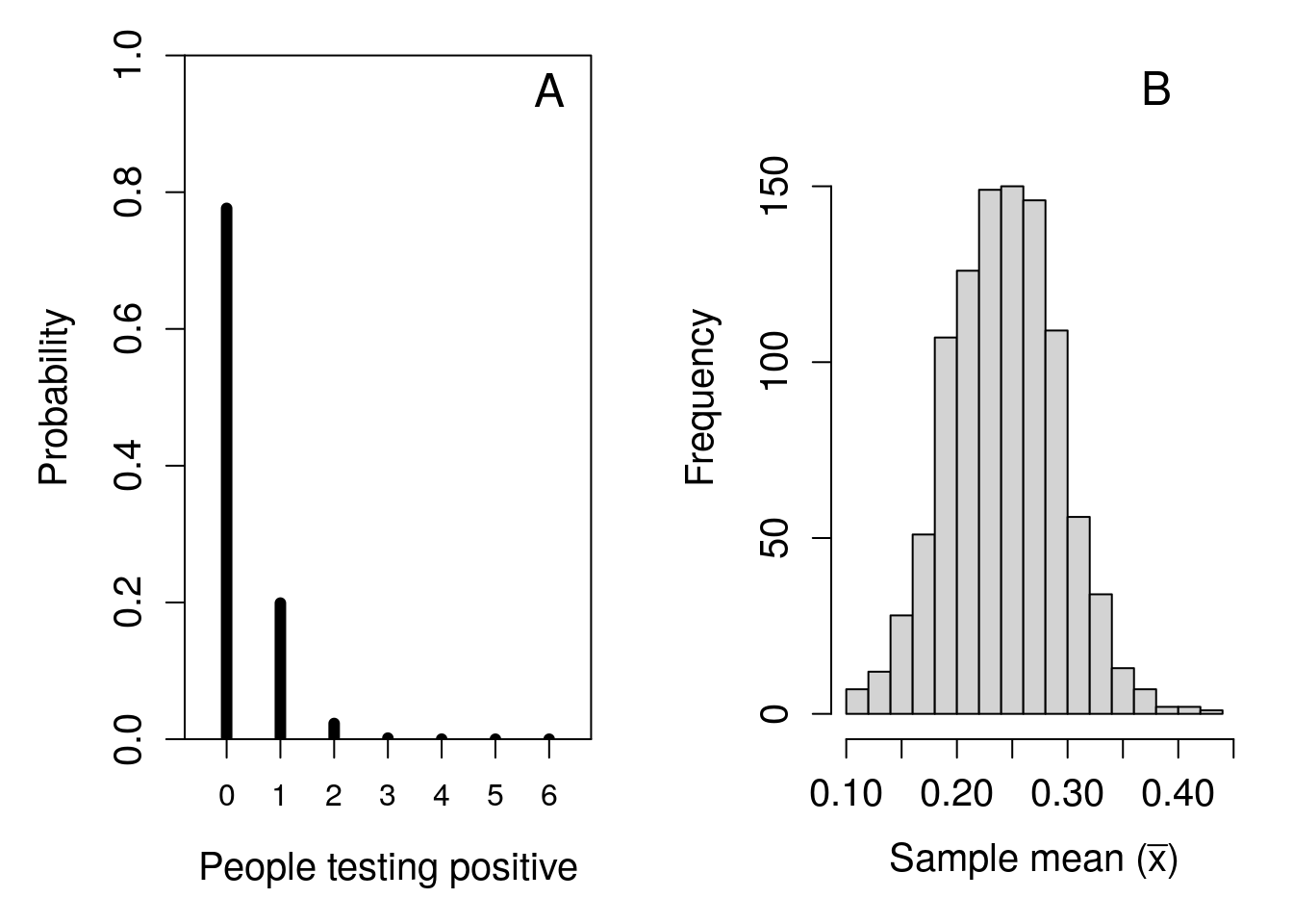
Figure 16.1: Simulated demonstration of the central limit theorem. (A) Recreation of Figure 15.6 showing the probability distribution for the number of people who have COVID-19 in a shop of 6 when the probability of testing positive is 0.025. (B) The distribution of 1000 means sampled from panel (A), where the sample size is 100.
To demonstrate the CLT in action, Figure 16.1 shows the two distributions side by side. The first (Figure 16.1A) shows the original distribution from Figure 15.6, from which samples are collected and sample means are calculated. The second (Figure 16.1B) shows the distribution of 1000 sample means (i.e., \(\bar{x}_{1}, \bar{x}_{2}, ..., \bar{x}_{999}, \bar{x}_{1000}\)). Each mean \(\bar{x}_{i}\) is calculated from a sample of \(N = 100\) from the distribution in Figure 16.1A. Sampling is simulated using a random number generator on a computer (Chapter 17 shows an example of how to do this in jamovi).
The distribution of sample means shown in Figure 16.1B is not perfectly normal. We can try again with an even bigger sample size of \(N = 1000\), this time with a Poisson distribution where \(\lambda = 1\) in Figure 15.7. Figure 16.2 shows this result, with the original Poisson distribution shown in Figure 16.2A, and the corresponding distribution built from 1000 sample means shown in Figure 16.2B.
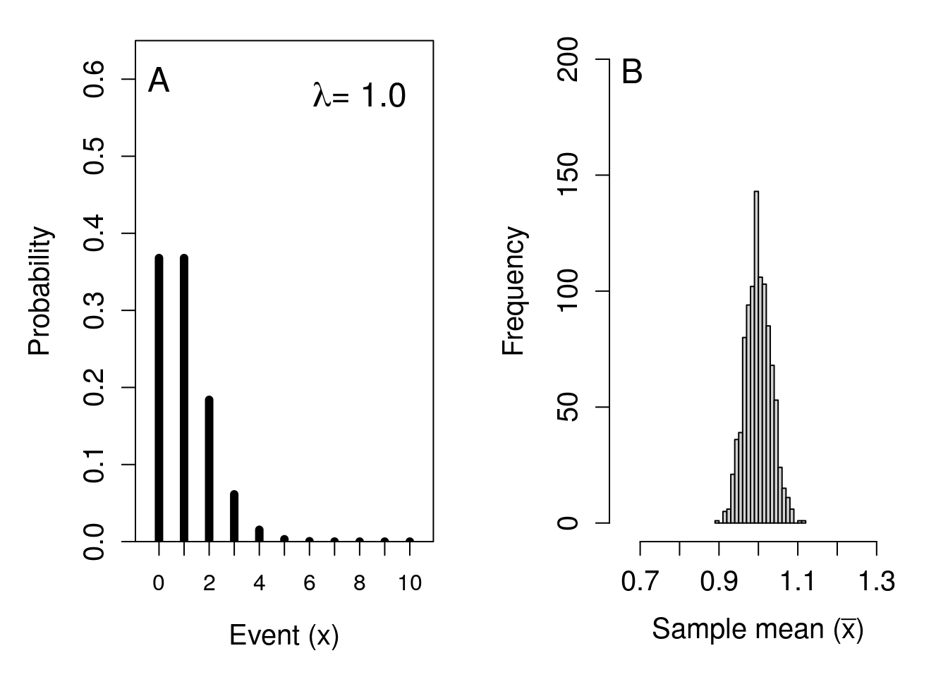
Figure 16.2: Simulated demonstration of the central limit theorem. (A) Recreation of Figure 15.7 showing the probability distribution for the number of events occurring in a Poisson distribution with a rate parameter of 1. (B) The distribution of 1000 means sampled from panel (A), where the sample size is 1000.
We can try the same approach with the continuous uniform distribution shown in Figure 15.8. This time, we will use an even larger sample size of \(N = 10000\) to get our 1000 sample means. The simulated result is shown in Figure 16.3.
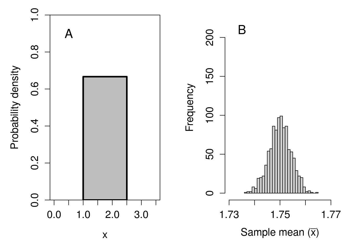
Figure 16.3: Simulated demonstration of the central limit theorem. (A) Recreation of Figure 15.8 showing a continuous uniform distribution with a minimum of 1 and a maximum of 2.5. (B) The distribution of 1000 means sampled from panel (A), where the sample size is 10000.
In all cases, regardless of the original sampling distribution (binomial, Poisson, or uniform), the distribution of sample means has the shape of a normal distribution. This normal distribution of sample means has important implications for statistical hypothesis testing. The CLT allows us to make inferences about the means of non-normally distributed distributions (Sokal & Rohlf, 1995), to create confidence intervals around sample means, and to apply statistical hypothesis tests that would otherwise not be possible. We will look at these statistical tools in future chapters.
16.2 Probability and z-scores
We can calculate the probability of sampling some range of values from the normal distribution if we know the distribution’s mean (\(\mu\)) and standard deviation (\(\sigma\)). For example, because the normal distribution is symmetric around the mean, the probability of sampling a value greater than the mean will be 0.5 (i.e., \(P(x > \mu) = 0.5\)), and so will the probability of sampling a value less than the mean (i.e., \(P(x < \mu) = 0.5\)). Similarly, about 68.2% of the normal distribution’s probability density lies within 1 standard deviation of the mean (shaded region of Figure 16.4), which means that the probability of randomly sampling a value \(x\) that is greater than \(\mu - \sigma\) but less than \(\mu + \sigma\) is \(P(\mu - \sigma < x < \mu + \sigma) = 0.682\).
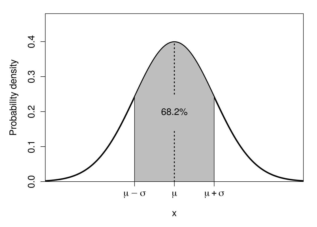
Figure 16.4: Normal distribution in which the shaded region shows the area within one standard deviation of the mean (dotted line), that is, the shaded region starts on the left at the mean minus one standard deviation, then ends at the right at the mean plus one standard deviation. This shaded area encompasses 68.2% of the total area under the curve.
Remember that total probability always needs to equal 1. This remains true whether it is the binomial distribution that we saw with the coin flipping example in Chapter 15, or any other distribution. Consequently, the area under the curve of the normal distribution (i.e., under the curved line of Figure 16.4) must equal 1. When we say that the probability of sampling a value within 1 standard deviation of the mean is 0.682, this also means that the area of this region under the curve equals 0.682 (i.e., the shaded area in Figure 16.4). And, again, because the whole area under the curve sums to 1, that must mean that the unshaded area of Figure 16.4 (where \(x < \mu -\sigma\) or \(x > \mu + \sigma\)) has an area equal to \(1 - 0.682 = 0.318\). That is, the probability of randomly sampling a value \(x\) in this region is \(P(x < \mu - \sigma \: \cup \: x > \mu + \sigma) = 0.318\), or 31.8% (note that the \(\cup\), is just a fancy way of saying ‘or’, in this case; technically, the union of two sets).
We can calculate other percentages using standard deviations too (Sokal & Rohlf, 1995). For example, about 95.4% of the probability density in a normal distribution lies between 2 standard deviations of the mean, i.e., \(P(\mu - 2\sigma < x < \mu + 2\sigma) = 0.954\). And about 99.6% of the probability density in a normal distribution lies between 3 standard deviations of the mean, i.e., \(P(\mu - 3\sigma < x < \mu + 3\sigma) = 0.996\). We could go on mapping percentages to standard deviations like this; for example, about 93.3% of the probability density in a normal distribution is less than \(\mu + 1.5\sigma\) (i.e., less than 1.5 standard deviations greater than the mean; see Figure 16.5).
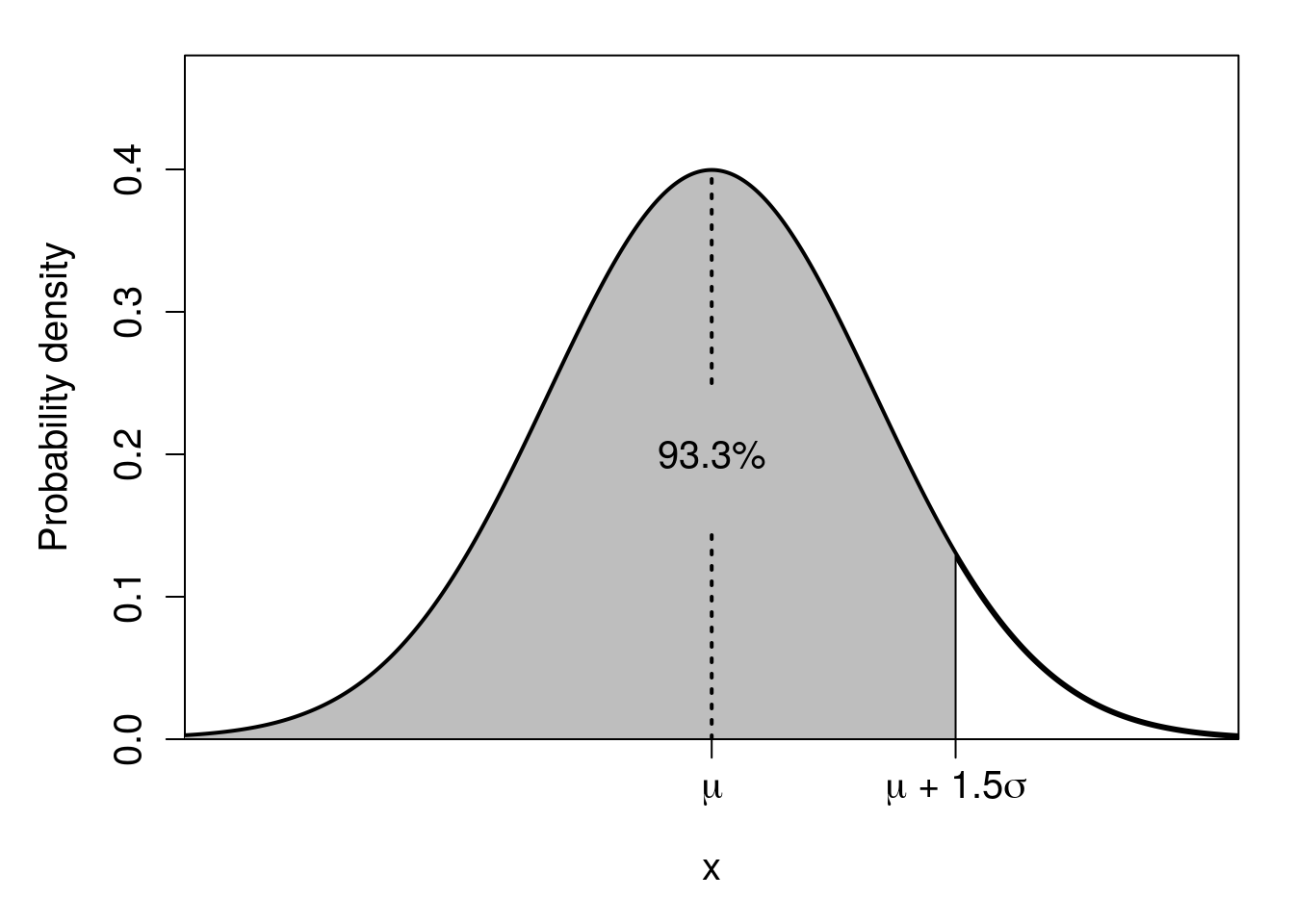
Figure 16.5: Normal distribution in which the shaded region shows the area under 1.5 standard deviations of the mean (dotted line). This shaded area encompasses about 93.3% of the total area under the curve.
Notice that there are no numbers on the x-axes of Figure 16.4 or 16.5. This is deliberate; the relationship between standard deviations and probability density applies regardless of the scale. We could have a mean of \(\mu = 100\) and standard deviation of \(\sigma = 4\), or \(\mu = -12\) and \(\sigma = 0.34\). It does not matter. Nevertheless, it would be very useful if we could work with some standard values of \(x\) when working out probabilities. This is where the standard normal distribution, first introduced in Chapter 15, becomes relevant. Recall that the standard normal distribution has a mean of \(\mu = 0\) and a standard deviation (and variance) of \(\sigma = 1\). With these standard values of \(\mu\) and \(\sigma\), we can start actually putting numbers on the x-axis and relating them to probabilities. We call these numbers standard normal deviates, or z-scores (Figure 16.6).
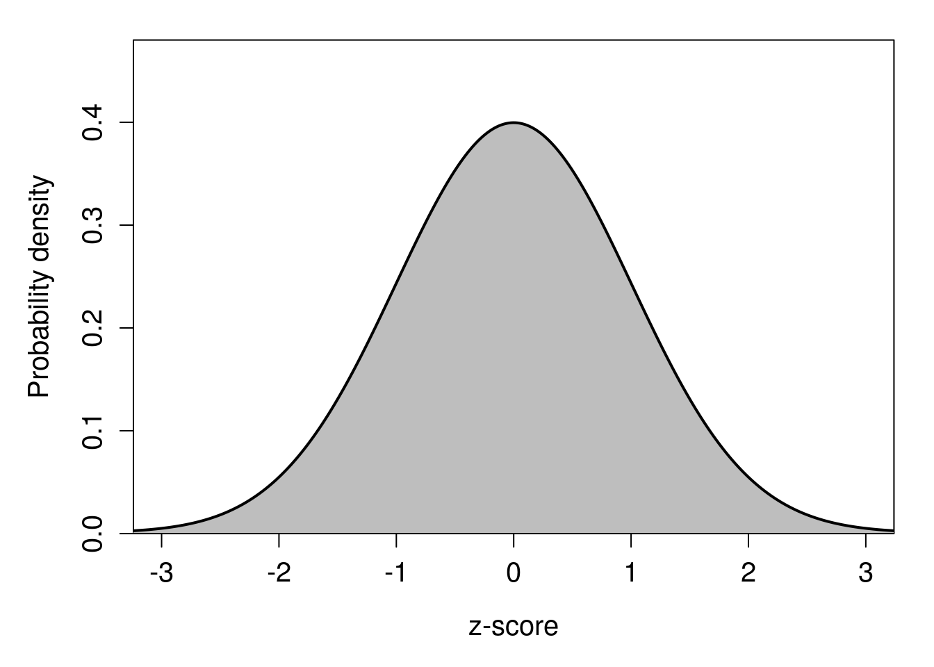
Figure 16.6: Standard normal probability distribution with z-scores shown on the x-axis.
What z-scores allow us to do is map probabilities to deviations from the mean of a standard normal distribution (hence ‘standard normal deviates’). We can say, e.g., that about 95% of the probability density lies between \(z = -1.96\) and \(z = 1.96\), or that about 99% lies between \(z = -2.58\) and \(z = 2.58\) (this will become relevant later). An interactive application22 can help show how probability density changes with changing z-score.
Of course, most variables that we measure in the biological and environmental sciences will not fit the standard normal distribution. Almost all variables will have a different mean and standard deviation, even if they are normally distributed. Nevertheless, we can translate any normally distributed variable into a standard normal distribution by subtracting its mean and dividing by its standard deviation. We can see what this looks like visually in Figure 16.7.
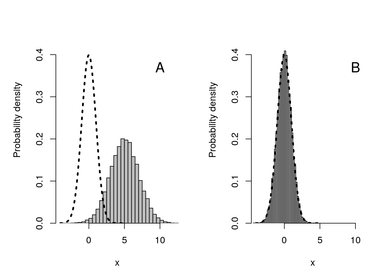
Figure 16.7: Visual representation of what happens when we subtract the sample mean from a dataset, then divide by its standard deviation. (A) Histogram (grey bars) show 10000 normally distributed values with a mean of 5 and a standard deviation of 2; the curved dotted line shows the standard normal distribution with a mean of 0 and standard deviation of 1. (B) Histogram after subtracting 5, then dividing by 2, from all values shown in panel (A).
In Figure 16.7A, we see the standard normal distribution curve represented by the dotted line at \(\mu = 0\) and with a standard deviation of \(\sigma = 1\). To the right of this normal distribution we have 10000 values randomly sampled from a normal distribution with a mean of 5 and a standard deviation of 2 (note that the histogram peaks around 5 and is wider than the standard normal distribution because the standard deviation is higher). After subtracting 5 from all of the values in the histogram of Figure 16.7A, then dividing by 2, the data fit nicely within the standard normal curve, as shown in Figure 16.7B. By doing this transformation on the original dataset, z-scores can now be used with the data. Mathematically, here is how the calculation is made,
\[z = \frac{x - \mu}{\sigma}.\]
For example, if we had a value of \(x = 9.1\) in our simulated dataset, in which \(\mu = 5\) and \(\sigma = 2\), then we would calculate \(z = (9.1 - 5) / 2 = 2.05\). Since we almost never know what the true population mean (\(\mu\)) and standard deviation (\(\sigma\)) are, we usually need to use the estimates made from our sample,
\[z = \frac{x - \bar{x}}{s}.\]
We could then use jamovi (The jamovi project, 2024), an interactive application, or an old-fashioned z-table23 to find that only about 2% of values are expected to be higher than \(x = 9.1\) in our original dataset. These z-scores will become especially useful for calculating confidence intervals in Chapter 18. They can also be useful for comparing values from variables or statistics measured on different scales (Adams & Collyer, 2016; Cheadle et al., 2003; Sokal & Rohlf, 1995).
References
For those interested, a mathematical proof of the CLT can be found in Miller & Miller (2004). Here we will demonstrate the CLT by simulation. As an aside, the CLT also applies to the sum of sample values, which will also have a distribution that approaches normality as \(N \to \infty\).↩︎
Before the widespread availability of computers, which can easily be used to calculate probability densities on a normal distribution, the way to map z-scores to probabilities was using a z-table (https://www.z-table.com/). The table would have rows and columns mapping to different z-values, which could be used to find the appropriate probability densities. Such tables would be used for many different distributions, not just the normal distribution. The textbook by Sokal & Rohlf (1995) comes with a nearly 200-page supplemental book that is just statistical tables. These tables are more or less obsolete nowadays, but some people still use them.↩︎