Chapter 31 Practical. Analysis of counts and correlations
This chapter focuses on applying the concepts from Chapter 29 and Chapter 30 in jamovi (The jamovi project, 2024). Exercises in this chapter will use the Chi-square goodness of fit test, the Chi-square test of association, and the correlation coefficient. For all of these examples, this chapter will use a dataset inspired by Burrows et al. (2022). This experimental work tested the effects of radiation on bumblebee nectar consumption, carbon dioxide output, and body mass in different bee colonies.
The chapter will use the bumblebee dataset74. This dataset includes variables for the radiation level experienced by the bee (radiation), the colony from which the bee came (colony), whether or not the bee survived to the end of the 30-day experiment (survived), the mass of the bee in grams at the beginning of the experiment (mass), the output of carbon dioxide put out by the bee (CO2) in micromoles per minute, and the daily volume of nectar consumed by the bee in millilitres (nectar).
31.1 Survival goodness of fit
Suppose that we want to run a simple goodness of fit test to determine whether or not bees are equally likely to survive versus die in the experiment. If this is the case, then we would expect to see the same number of living and dead bees in the dataset. We can use a Chi-square goodness of fit test to answer this question. What are the null and alternative hypotheses for this \(\chi^{2}\) goodness of fit test?
\(H_{0}\): _________________
\(H_{A}\): _________________
What is the sample size (\(N\)) of the dataset?
\(N =\) __________________
Based on this sample size, what are the expected counts for bees that survived and died?
Survived (\(E_{\mathrm{surv}}\)): _________________
Died (\(E_{\mathrm{died}}\)): ______________
Next, we can find the observed counts of bees that survived and died. To do this, we need to use the Frequency tables option in jamovi. We did this once in Chapter 17 for calculating probabilities. As a reminder, to find the counts of bumblebees that survived (Yes) or did not survive (No), we need to go to the Exploration toolbar in jamovi, then choose ‘Descriptives’. Place ‘Survival’ in the Variables box, then check the box for ‘Frequency tables’ below. A Frequencies table will appear in the panel on the right. Write down the observed counts of bees that survived and died.
Survived (\(O_{\mathrm{surv}}\)): _________________
Died (\(O_{\mathrm{died}}\)): ______________
Try to use the formula in Section 29.2 to calculate the \(\chi^{2}\) test statistic. Here is what it should look like for the two counts in this dataset,
\[\chi^{2} = \frac{(O_{\mathrm{surv}} - E_{\mathrm{surv}})^{2}}{E_{\mathrm{surv}}} + \frac{(O_{\mathrm{died}} - E_{\mathrm{died}})^{2}}{E_{\mathrm{died}}}.\] What is the \(\chi^{2}\) value?
\(\chi^{2} =\) _____________
There are two categories for survival (Yes and No). How many degrees of freedom are there?
\(df =\) ________________
Now we can try to use jamovi to replicate the analysis above and find a p-value. In the jamovi Analyses tab, select ‘Frequencies’ from the toolbar, then select ‘N Outcomes: \(\chi^{2}\) Goodness of fit’ from the pull-down menu. A new window will open up.
After selecting the option ‘N Outcomes: \(\chi^{2}\) Goodness of fit’, a new window will appear called ‘Proportion Test (N Outcomes)’. To run a \(\chi^{2}\) goodness of fit test on bee survival, move the ‘survived’ variable into the ‘Variable’ box. Leave the Counts box empty (Figure 31.1).
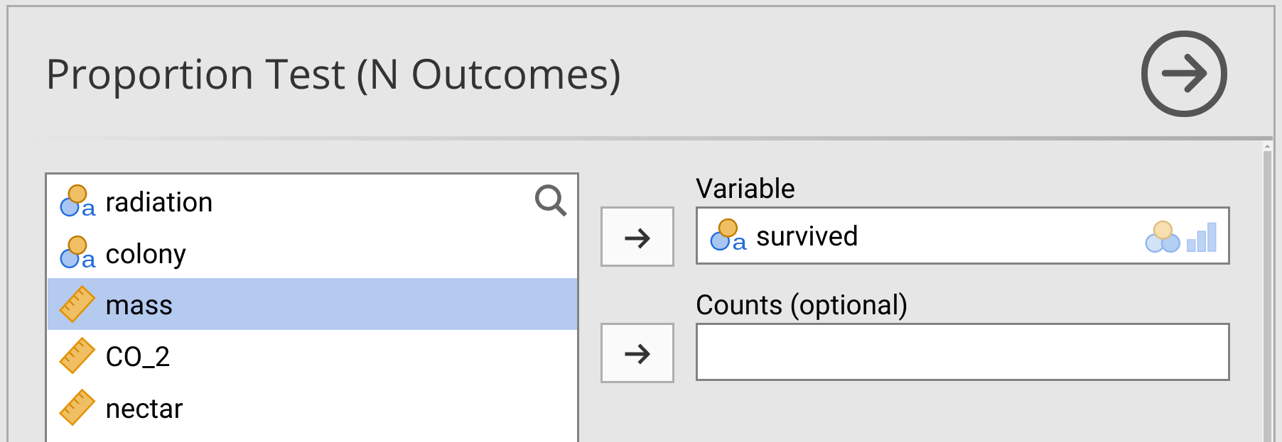
Figure 31.1: Jamovi interface for running a Chi-square goodness of fit test on bumblebee survival in a dataset.
The \(\chi^{2}\) Goodness of Fit table will appear in the panel to the right. From this table, we can see the \(\chi^{2}\) test statistic, degrees of freedom (df), and the p-value (p). Write these values below, and check to see if the \(\chi^{2}\) and \(df\) match the values you calculated above by hand.
\(\chi^{2} =\) _____________
\(df =\) ________________
\(P =\) ________________
Next, we will try another goodness of fit test, but this time to test whether or not bees were taken from all colonies with the same probability.
31.2 Colony goodness of fit
Next, suppose that we want to know if bees were sampled from the colonies with the same expected frequencies. What are the null and alternative hypotheses in this scenario?
\(H_{0}\): _________________
\(H_{A}\): _________________
How many colonies are there in this dataset?
Colonies: ________________
Run the \(\chi^{2}\) goodness of fit test using the same procedure in jamovi that you used in the previous exercise. What is the output from the Goodness of Fit table?
\(\chi^{2} =\) ____________
\(df =\) _____________
\(P =\) ____________
From this output, what can you conclude about how bees were taken from the colonies?
Note that the distrACTION module in jamovi includes a \(\chi^{2}\) distribution (called ‘x2-Distribution’), which you can use to compute probabilities and quantiles in the same way we did for previous distributions in the book. Next, we will move on to a \(\chi^{2}\) test of association between colony and survival.
31.3 Chi-Square test of association
Suppose we want to know if there is an association between bee colony and bee survival. We can use a \(\chi^{2}\) test of association to investigate this question. What are the null and alternative hypotheses for this test of association?
\(H_{0}\): _________________
\(H_{A}\): _________________
To run the \(\chi^{2}\) test of association, choose ‘Frequencies’ from the jamovi toolbar, but this time select ‘Independent Samples: \(\chi^{2}\) test of association’ from the pull-down menu. To test for an association between bee colony and survival, place ‘colony’ in the ‘Rows’ box and ‘survived’ in the ‘Columns’ box. Leave the rest of the boxes blank (Figure 31.2).
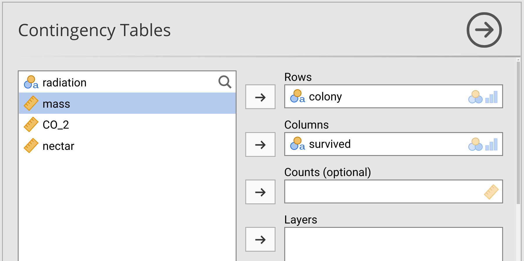
Figure 31.2: Jamovi interface for running a Chi-square test of association on bumblebee survival versus colony in a dataset.
There is a pull-down called ‘Statistics’ below the Contingency Tables input. Make sure that the \(\chi^{2}\) checkbox is selected. Output from the \(\chi^{2}\) test of association will appear in the panel to the right. Report the key statistics in the output table below.
\(\chi^{2} =\) ______________
\(df =\) _____________
\(P =\) _____________
From these statistics, should you reject or not reject the null hypothesis?
\(H_{0}\): ______________
Note that scrolling down further in the left panel (Contingency Tables) reveals an option for plotting. Have a look at this and create a barplot by checking ‘Bar Plot’ under Plots. Note that there are various options for changing bar types (side by side or stacked), y-axis limits (counts versus percentages), and bar groupings (by rows or columns).
Now try running a \(\chi^{2}\) test of association to see if there is an association between radiation and bee survival (hint, you just need to swap ‘colony’ for ‘radiation’ in the Rows box). What can you conclude from this test? Explain your conclusion as if you were reporting the results of the test to someone who was unfamiliar with statistical hypothesis testing.
Lastly, did the order in which you placed the two variables matter? What if you switched Rows and Columns? In other words, put ‘survived’ in the Rows box and ‘radiation’ in the Columns box. Does this give you the same answer?
Next, we will look at correlations between variables.
31.4 Pearson product moment correlation test
Suppose that we want to test if bumblebee mass at the start of the experiment (mass) is associated with carbon dioxide output (CO2). Specifically, we want to know if more massive bees also output less carbon dioxide. Before running any test, it is a good idea to plot the two variables using a scatterplot. To do this, select the ‘Exploration’ button from the toolbar in jamovi, but instead of choosing ‘Descriptives’ as usual from the pull-down menu, select ‘Scatterplot’. A new window will open up that allows you to build a scatterplot by selecting the variables that you place on the x-axis and the y-axis. Put mass on the x-axis and CO2 on the y-axis, as shown in Figure 31.3.
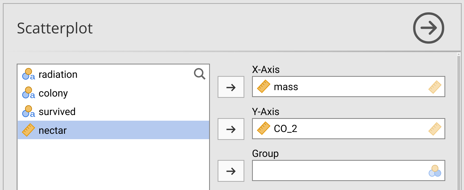
Figure 31.3: Jamovi interface for building a scatterplot with bumblebee mass on the x-axis and carbon dioxide output on the y-axis.
Notice that the scatterplot appears in the panel on the right. Each point in the scatterplot is a different bee (i.e., row). Just looking at the scatterplot, does it appear as though bee mass and CO2 output are correlated? Why or why not?
Note that it is possible to separate points in the scatterplot by group., Try placing ‘survived’ in the box ‘Group’.
Now we can test whether or not bee mass and CO2 output are negatively correlated. What are the null and alternative hypotheses of this test?
\(H_{0}\): _________________
\(H_{A}\): _________________
Before we test whether or not the correlation coefficient (\(r\)) is significant, we need to know which correlation coefficient to use. Remember from Section 30.3 that a test of the Pearson product moment correlation assumes that the sample \(r\) is normally distributed around the true correlation coefficient. If both of our variables (mass and CO2) are normally distributed, then we can be confident that this assumption will not be violated. But if one or both variables are not normally distributed, then we should consider using Spearman’s rank correlation coefficient instead. To test if mass and CO2 are normally distributed, navigate to the Descriptives panel in jamovi (where we usually find the summary statistics of variables). Place mass and CO2 in the ‘Variables’ box, then scroll down and notice that there is a checkbox under Normality for ‘Shapiro-Wilk’. Check this box, then find the p-values for the Shapiro-Wilk test of normality in the panel to the right. Write these p-values down below.
Mass: \(P =\) _____________
CO2: \(P =\) ___________
Based on these p-values, which type of correlation coefficient should we use to test \(H_{0}\), and why?
To run the correlation coefficient test, choose the button in the jamovi toolbar called ‘Regression’, then select the first option ‘Correlation Matrix’ from the pull-down menu. The Correlation Matrix option will pull up a new window in jamovi (Figure 31.4).
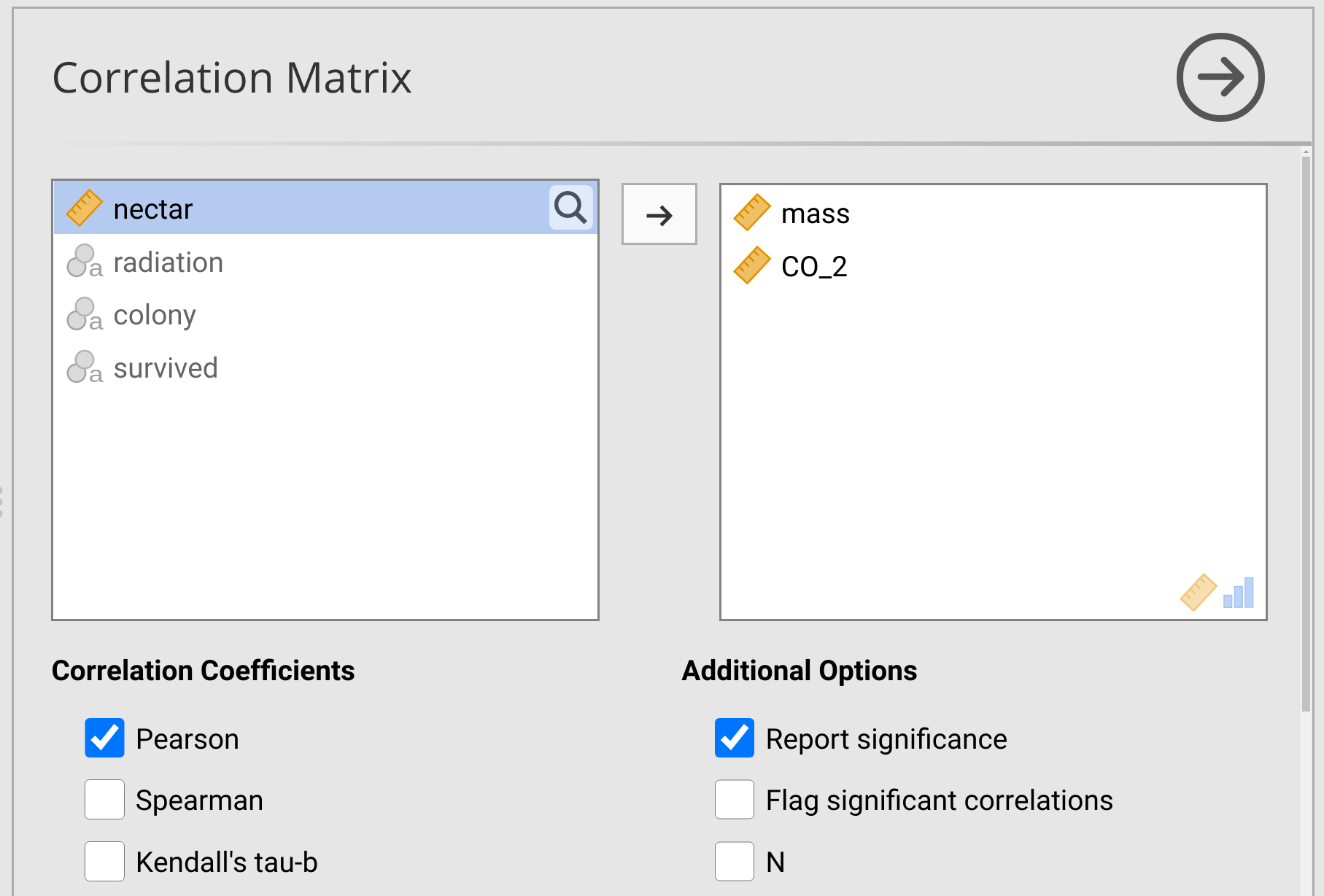
Figure 31.4: Jamovi interface for testing correlation coefficients.
Notice that the Pearson product moment correlation is selected in the checkbox of Figure 31.4 (‘Pearson’). Immediately below this checkbox is a box called ‘Spearman’, which would report Spearman’s rank correlation coefficient test. Below the Correlation Coefficients options, there are options for Hypothesis. Remember that we are interested in the alternative hypothesis that mass and CO2 are negatively correlated, so we should select the radio button ‘Correlated negatively’.
The output of the correlation test appears in the panel on the right in the form of a table called ‘Correlation Matrix’. This table reports both the correlation coefficient (here called ‘Pearson’s r’) and the p-value. Write these values below.
\(r =\) ______________
\(P =\) _____________
Based on this output, what should we conclude about the association between bumblebee mass and carbon dioxide output?
Next, we will test whether or not bee mass is associated with nectar consumption.
31.5 Spearman’s rank correlation test
Next, we will test whether or not bee mass and nectar consumption are correlated. What are the null and alternative hypotheses of this test?
\(H_{0}\): _________________
\(H_{A}\): _________________
Run a Shapiro-Wilk test of normality on each of the two variables, as was done in the previous exercise. Based on the output of these tests, what kind of correlation coefficient should we use for testing the null hypothesis?
Correlation coefficient: _______________
Test whether or not bee mass and nectar consumption are correlated. What is the correlation coefficient and p-value from this test?
\(r =\) ______________
\(P =\) _____________
Based on these results, should we reject or not reject the null hypothesis?
\(H_{0}\): ____________
Suppose that we had used the Pearson product moment correlation coefficient instead of Spearman’s rank correlation coefficient. Would we have made the same conclusion about the correlation (or lack thereof) between bee mass and nectar consumption? Why or why not?
31.6 Untidy goodness of fit
In Exercise 31.1, we ran a \(\chi^{2}\) test using data in a tidy format, in which each row corresponded to a single observation, and categorical data were listed over \(N = 256\) rows. For the ‘survived’ variable, this meant 256 rows of ‘Yes’ or ‘No’. But there is a shortcut in jamovi if we do not have a full tidy dataset. If you know that the dataset included 139 ‘Yes’ counts and 117 ‘No’ counts, you could set up the data as a table of counts (Table 31.1).
| Survived | Count |
|---|---|
| No | 117 |
| Yes | 139 |
Open a new data frame in jamovi, then recreate the small dataset in Table 31.1. Column names should be ‘Survived’ and ‘Count’, as shown in Figure 31.5.
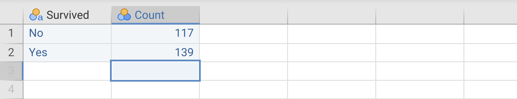
Figure 31.5: Jamovi data frame with a simple organisation of count data.
Next, navigate to the ‘Analyses’ tab and choose ‘N Outcomes’ to do a goodness of fit test. Place ‘Survived’ in the Variable box, then place ‘Count’ in the Counts (optional) box. Notice that you will get the same \(\chi^{2}\), \(df\), and p-values in the output table as you did in Exercise 31.1.
We could do the same for a \(\chi^{2}\) test of association, although it would be a bit more complicated. To test for an association between radiation and survival, as we did at the end of Exercise 31.3, we would need three columns and eight rows of data (Table 31.2).
| Survived | Radiation | Count |
|---|---|---|
| No | None | 12 |
| Yes | Low | 52 |
| No | Medium | 29 |
| Yes | High | 35 |
| No | None | 39 |
| Yes | Low | 25 |
| No | Medium | 37 |
| Yes | High | 27 |
If we put Table 31.2 into jamovi, we can run a \(\chi^{2}\) test of association by navigating to the ‘Frequencies’ button in the jamovi toolbar and selecting ‘Independent Samples: \(\chi^{2}\) test of association’ from the pull-down. In the Contingency Tables input panel, we can put ‘Survived’ in the Rows box, ‘Radiation’ in the Columns box, then place ‘Count’ in the Counts (optional) box. The panel on the right will give us the output of the \(\chi^{2}\) test of association.