Chapter 10 Graphs
Graphs are useful tools for visualising and communicating data. Graphs come in many different types, and different types of graphs are effective for different types of data. This chapter focuses on four types of graphs: (1) histograms, (2) pie charts, (3) barplots, and (4) box-whisker plots.
After collecting or obtaining a new dataset, it is almost always a good idea to plot the data in some way. Visualisation can often highlight important and obvious properties of a dataset more efficiently than inspecting raw data, calculating summary statistics, or running statistical tests. When making graphs to communicate data visually, it is important to ensure that the person reading the graph has a clear understanding of what is being presented. In practice, this means clearly labelling axes with meaningful descriptions and appropriate units, including a descriptive caption, and indicating what any graph symbols mean. In general, it is also best to make the simplest graph possible for visualising the data, which means avoiding unnecessary colour, three-dimensional display, or distractions from the information being conveyed (Dytham, 2011; Kelleher & Wagener, 2011). It is also important to ensure that graphs are as accessible as possible, e.g., by providing strong colour contrast and appropriate colour combinations (Elavsky et al., 2022), and alternative text for images where possible. As a guide, the histogram, pie chart, barplot, and box-whisker plot below illustrate good practice when making graphs.
10.1 Histograms
Histograms illustrate the distribution of continuous data. They are especially useful visualisation tools because it is often important to assess data at a glance and make a decision about how to proceed with a statistical analysis. The histogram shown in Figure 10.1 provides an example using the fig fruits dataset from the practical in Chapter 8 (an interactive application6 shows a step-by-step demonstration of how a histogram is built).
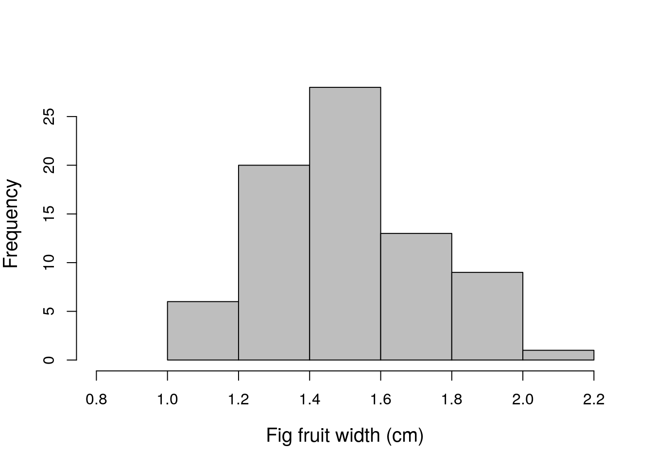
Figure 10.1: Example histogram fig fruit width (cm) using data from 78 fig fruits collected in 2010 from Baja, Mexico.
The histogram in Figure 10.1 shows how many fruits there are for different intervals of width, i.e., the frequency with which fruits within some width interval occur in the data. For example, there are 6 fruits with a width between 1.0 and 1.2, so for this interval on the x-axis, the bar is 6 units in height on the y-axis. In contrast, there is only 1 fig fruit that has a width greater than 2.0 cm (the biggest is 2.1 cm), so we see that the height of the bar for the interval between 2.0 and 2.2 is only 1 unit in frequency. The bars of the histogram touch each other, which reinforces the idea that the data are continuous (Dytham, 2011; Sokal & Rohlf, 1995).
It is especially important to be able to read and understand information from a histogram, because it is often necessary to determine if the data are consistent with the assumptions of a statistical test. For example, the shape of the distribution of fig fruit widths might be important for performing a particular test. For the purposes of this book, the shape of the distribution just means what the data look like when plotted like this in a histogram. In this case, there is a peak toward the centre of the distribution, with fewer low and high values (this kind of distribution is quite common). Different distribution shapes will be discussed more in Chapter 15.
10.2 Barplots and pie charts
While histograms are an effective way of visualising continuous data, barplots (also known as ‘bar charts’ or ‘bar graphs’) and pie charts can be used to visualise categorical data. For example, in the fig fruits dataset from Chapter 8, 78 fig fruits were collected from four different trees (A, B, C, and D). A barplot could be used to show how many samples were collected from each tree (see Figure 10.2).
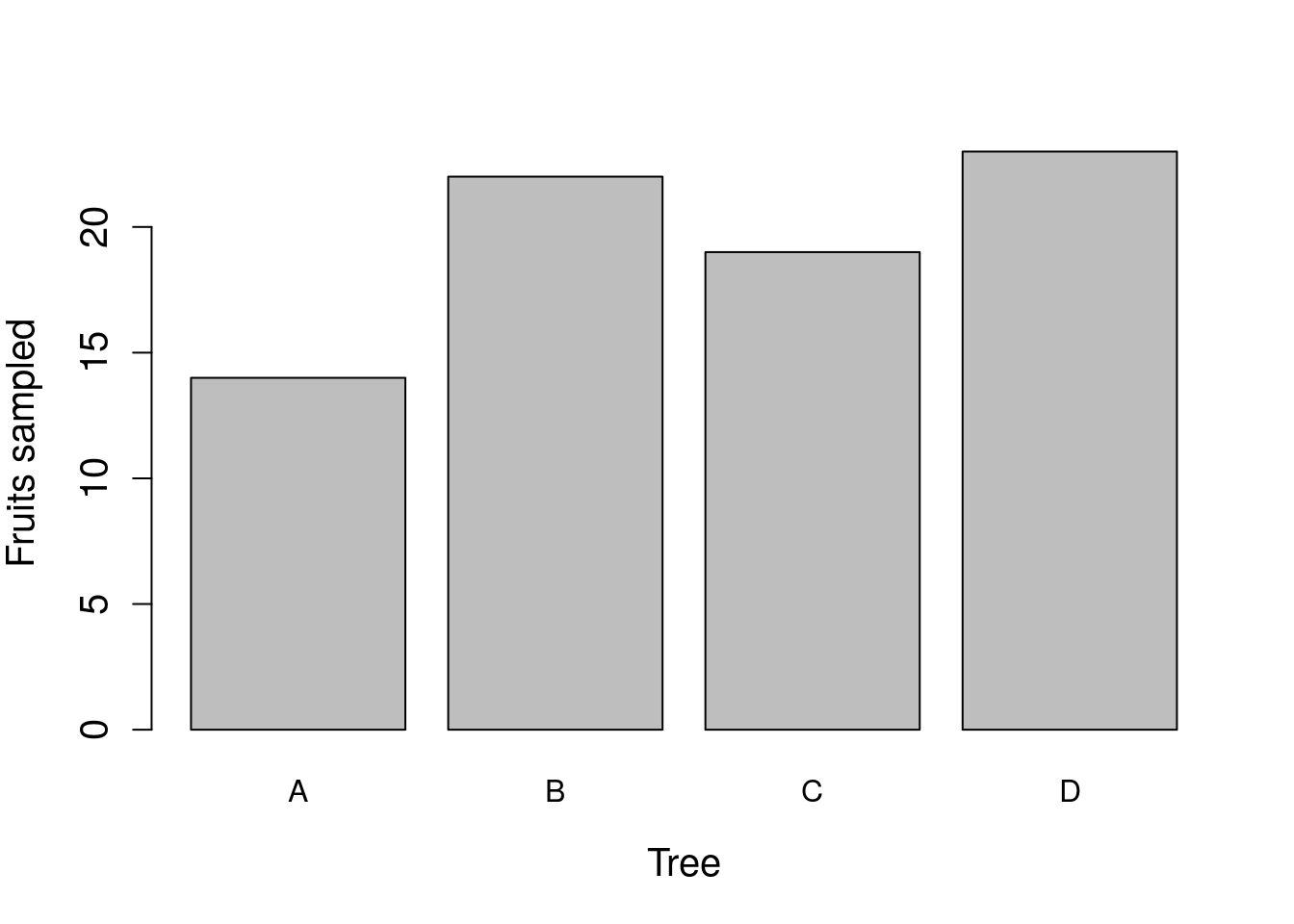
Figure 10.2: Example barplot showing how many fruits were collected from each of four trees (78 collected in total) in 2010 from Baja, Mexico.
In Figure 10.2, each tree is represented by a separate bar on the x-axis. Unlike a histogram, the bars do not touch each other, which reinforces the idea that different categories of data are being shown (in this case, different trees). The height of a bar indicates how many fruits were sampled from each tree. For example, 14 fruits were sampled from tree A, and 22 fruits were sampled from tree B. At a glance, it is therefore possible to compare different trees and make inferences about how they differ in sampled fruits.
Pie charts are similar to barplots in that both present categorical data, but pie charts are more effective for visualising the relative quantity for each category. That is, pie charts illustrate the percentage of measurements for each category. For example, in the case of the fig fruits, it might be useful to visualise what percentage of fruits were sampled from each tree. A pie chart could be used to evaluate this, with pie slices corresponding to different trees and the size of each slice reflecting the percentage of the total sampled fruits that came from each tree (Figure 10.3).
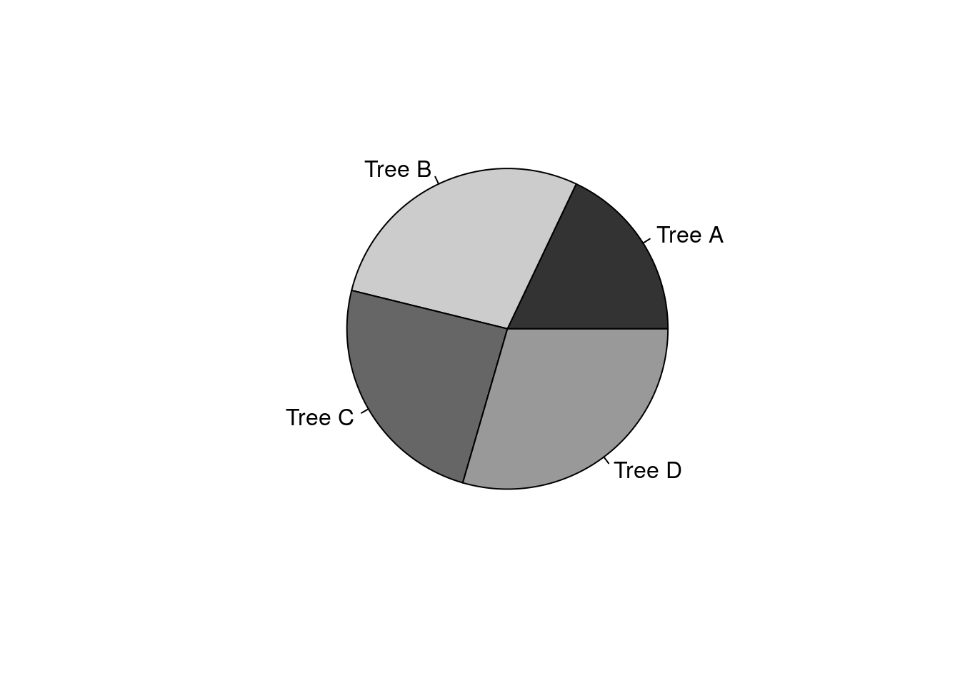
Figure 10.3: Example pie chart showing the percentage of fruits that were collected from each of four trees (78 collected in total) in 2010 from Baja, Mexico.
Pie charts can be useful in some situations, but in the biological and environmental sciences, they are not used as often as barplots. In contrast to pie charts, barplots present absolute quantities (in Figure 10.2, e.g., the actual number of fruits sampled per tree), and it is still possible with barplots to infer the percentage each category contributes to the total from the relative sizes of the bars. Pie charts, in contrast, only illustrate relative percentages unless numbers are used to indicate absolute quantities. Unless percentage alone is important, barplots are often the preferred way to communicate categorical data.
10.3 Box-whisker plots
Box-whisker plots (also called boxplots) can be used to visualise distributions in a different way than histograms. Instead of presenting the full distribution, as in a histogram, a box-whisker plot shows where summary statistics are located (summary statistics are explained in Chapter 11 and Chapter 12). This allows the distribution of data to be represented in a more compact way, but does not show the full shape of a distribution. Figure 10.4 compares a box-whisker plot of fig fruit widths (10.4A) with a histogram of fig fruit widths (10.4B). In other words, both of the panels (A and B) in Figure 10.4 show the same information in two different ways (note that these are the same data as presented in Figure 10.1).
To show how the panels of Figure 10.4 correspond to one another more clearly, points indicate where the summary statistics shown in the boxplot (Figure 10.4A) are located in the histogram (Figure 10.4B). These summary statistics include the median (circles), quartiles (squares), and the limits of the distribution (i.e., minimum and maximum values; triangles). Note that in boxplots, if outliers exist, they are presented as separate points.
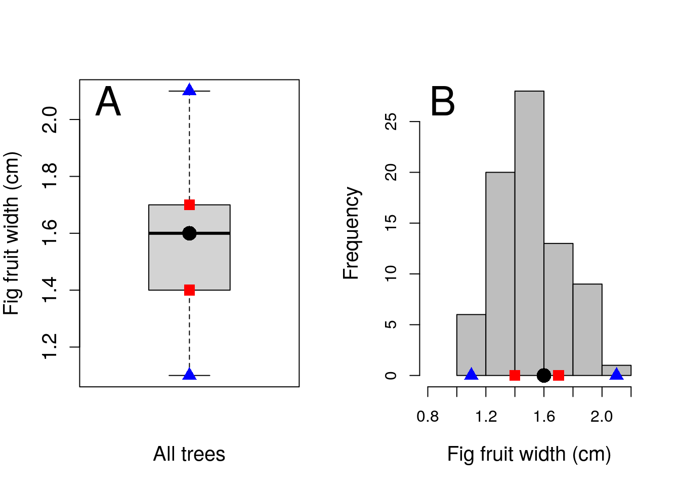
Figure 10.4: Boxplot (A) of fig fruit widths (cm) for 78 fig fruits collected in 2010 in Baja, Mexico. Panel A presents the same data as a histogram. Points in the boxplot indicate the median (circle), first and third quartiles (squares), and the limits of the distribution (triangles). Corresponding locations are shown on the histogram in panel B.
One benefit of a boxplot is that it is possible to show the distribution of multiple variables simultaneously. For example, the distribution of fig fruit width can be shown for each of the four trees side by side on the same x-axis of a boxplot (Figure 10.5). While it is possible to show histograms side by side, it will quickly take up a lot of space.
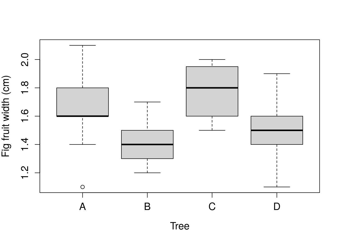
Figure 10.5: Boxplot of fig fruit widths (cm) collected from four separate trees sampled in 2010 from Baja, Mexico.
The boxplot in Figure 10.5 can be used to quickly compare the distribution of Trees A-D. The point at the bottom of the distribution of Tree A shows an outlier. This outlier is an especially low value of fig fruit width compared to the other fruits of Tree A.