Chapter 14 Practical. Plotting and statistical summaries in jamovi
This chapter focuses on applying the concepts from Chapters 9–13 in jamovi (The jamovi project, 2024). The data that we will work with in this chapter were inspired by Law et al. (2014). Law et al. (2014) focused on beaver reintroduction in Scottish habitats and investigated its consequences for the white water lily, Nymphaea alba, which beavers regularly consume.
This chapter will analyse data on the petiole diameter (mm) from N. alba collected from seven different sites on the west coast of Scotland (the petiole is the structure that attaches the plant stem to the blade of the leaf). The N. alba dataset is available online15. The data are not in a tidy format, so it is important to first reorganise the data so that they can be analysed in jamovi. Once the data are properly organised, we will use jamovi to plot them, calculate summary statistics, apply appropriate decimals, significant figures, and rounding, and compare petiole diameters across sites.
14.1 Reorganise the dataset into a tidy format
The N. alba dataset is not in a tidy format. All of the numbers from this dataset are measurements of petiole diameter in millimetres from N. alba, but each row contains seven samples because each column shows a different site.
Remember that to make these data tidy and usable in jamovi, we need each row to be a unique observation. What we really want then is a dataset with two columns of data. The first column should indicate the site, and the second column should indicate the petiole diameter. This can be done in two ways. First, we could use a spreadsheet programme like LibreOffice or MS Excel to create a new dataset with two columns, one column with the site information and the other column with the petiole diameters. Second, we could use the ‘Data’ tab in jamovi to create two new columns of data (one for site and the other for petiole diameter). Either way, we need to copy and paste site names into the first column and petiole diameters in the second column. This is a bit tedious, but it is an important step in the process of data analysis. See Figure 14.1 for how this would look in jamovi.
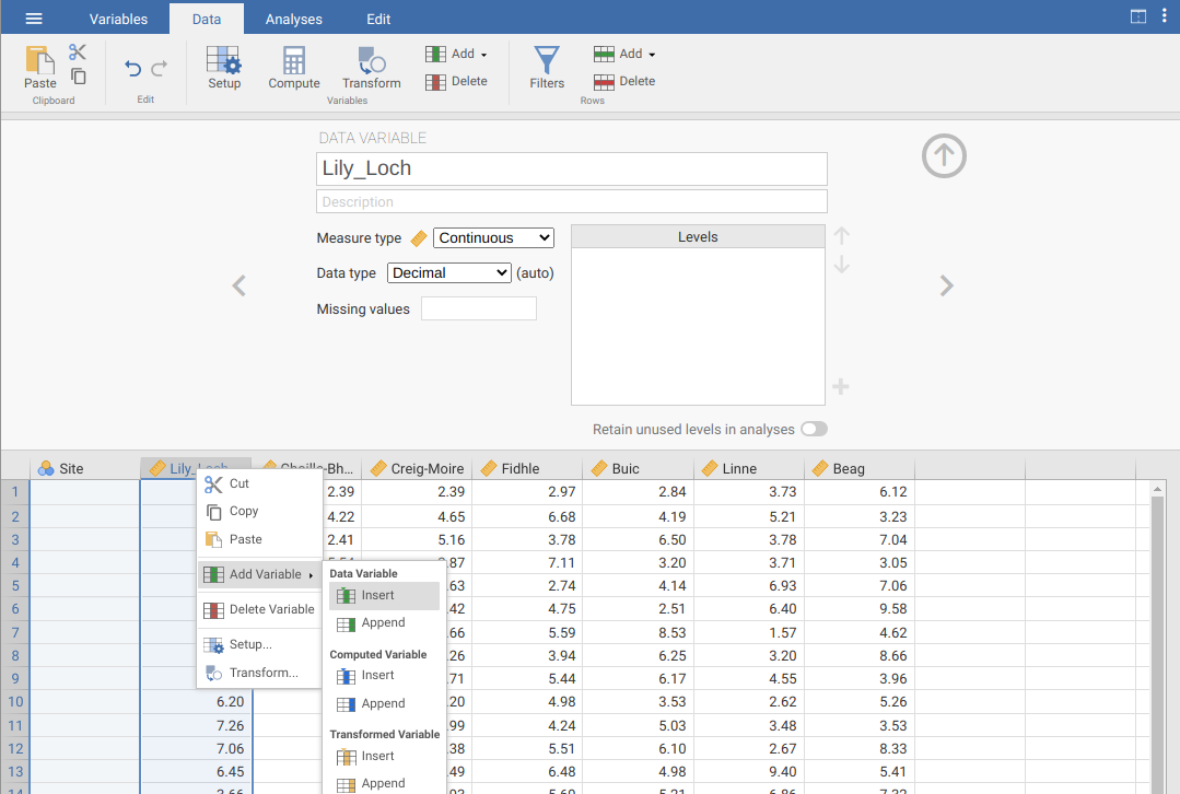
Figure 14.1: Tidying the raw data of petiole diameters from lily pad measurements across seven sites in Scotland. A new column of data is created by right-clicking on an existing column and choosing ‘Add Variable’.
Note that to insert a new column in jamovi, we need to right-click on an existing column and select ‘Add Variable’ \(\to\) ‘Insert’. A new column will then pop up in jamovi, and we can give this an informative name. Make sure to specify that the ‘Site’ column should be a nominal measure type, and the ‘petiole_diameter_mm’ column should be a continuous measure type. The first six rows of the dataset should look like the below.
       Site petiole_diameter_mm
1 Lily_Loch                7.42
2 Lily_Loch                3.58
3 Lily_Loch                7.47
4 Lily_Loch                6.07
5 Lily_Loch                6.81
6 Lily_Loch                8.05
With the reorganised dataset, we are now ready to do some analysis in jamovi. We will start with some plotting.
14.2 Histograms and box-whisker plots
We will start by making a histogram of the full dataset of petiole diameter. To do this, we need to go to the ‘Analyses’ tab of the jamovi toolbar, then select the ‘Exploration’ button. Next, select the ‘Descriptives’ option (Figure 14.2). This will open a new window where it is possible to create plots and calculate summary statistics. The white box on the left of the Descriptive interface lists all of the variables in the dataset. Below this box, there are options for selecting different summary statistics (‘Statistics’) and building different graphs (‘Plots’). To get started, select the petiole diameter variable in the box to the left, then move it to the ‘Variables’ box (top right) using the \(\to\) arrow. Next, open the Plots option at the bottom of the interface. Choose the ‘Histogram’ option by clicking the checkbox. A histogram will open up in the window on the right (you might need to scroll down).
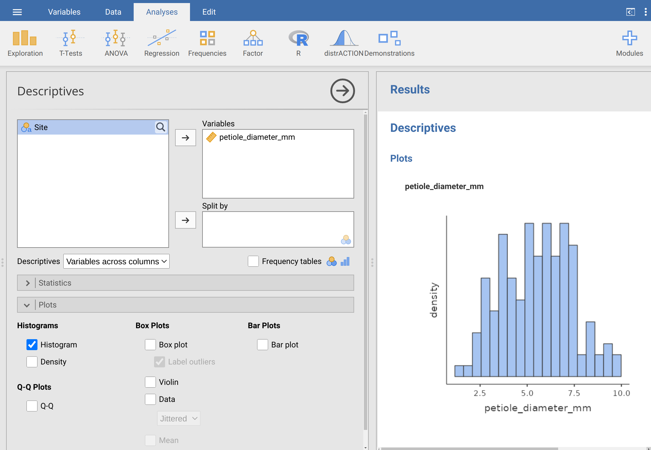
Figure 14.2: Jamovi Descriptives toolbar with petiole diameter selected and a histogram produced in the plotting window.
Take a look at the histogram to the right (Figure 14.2). Just looking at the histogram, write down what you think the following summary statistics will be.
Mean: ____________________________
Median: ____________________________
Standard deviation: ____________________________
Based on the histogram, do you think that the mean and median are the same? Why or why not?
The histogram needs better-labelled axes and an informative caption. To label the axes better, go back to the data tab and double-click on the column heading ‘petiole_diameter_mm’. Change the name of the data variable to ‘Petiole diameter (mm)’. The newly named variable will then appear when a new histogram of the petiole diameter data is made. To write a caption in jamovi, click on the ‘Edit’ tab at the very top of the toolbar. You will see some blue boxes above and below the histogram, and you can write your caption by clicking on the box immediately below the histogram. Write a caption for the histogram below.
If you want to save the histogram, then you can right-click on it. A pop-up box will give you several options; select ‘Image \(\to\) Export’ to save the histogram. You can save it as a PDF, PNG, SVG, or EPS (if in doubt, PNG is probably the easiest to use).
In the first example, we looked at petiole diameters across the entire dataset, but suppose that we want to see how the data are distributed for each site individually. To do this, we just need to go back to the Descriptives box (Figure 14.2) and put the ‘Site’ variable into the box on the lower right called ‘Split by’. Do this by selecting ‘Site’ then using the lower \(\to\) arrow to bring it to the ‘Split by’ box. Instead of one histogram of petiole diameters, you will now see seven different histograms, one for each site, all stacked on top of each other. This might be useful, but all of these histograms together is a bit busy. Instead, we can use a box-whisker plot to compare the distributions of petiole diameters across different sites.
To create a boxplot, simply check ‘Box plot’ from the Plots options (you might want to uncheck ‘Histogram’, but it is not necessary). You should now see all of the different sites on the x-axis of the newly created boxplot and a summary of the petiole diameters on the y-axis. Based on the boxplot, which site appears to have the highest and lowest median petiole diameter?
Highest: ____________________________
Lowest: ____________________________
There is one more trick that is useful with box-whisker plots in jamovi. The current plots show a summary of each site, but it might also be useful to plot the actual data points to give some more information about the distribution of petiole diameters. You can do this by checking the option ‘Data’, which places the petiole diameter of each sample over the box and whiskers for each site. The y-axis shows the petiole diameter of each data point. By default, the points are jittered on the x-axis, which just means that they are placed randomly on the x-axis within a site. This is just to ensure that points will not be placed directly on top of each other if they are the same value. If you prefer, you can use the pull-down menu right below the Data checkbox to select ‘Stacked’ instead of ‘Jittered’. The stacked option will place points side by side. Think about where the points are in relation to the box and whiskers of the plot; this should help you develop an intuitive understanding of how to read box-whisker plots.
14.3 Calculate summary statistics
We can calculate the summary statistics using the ‘Descriptives’ option in jamovi, just as we did with the histogram and box-whisker plots. Before doing anything else, again place the petiole diameter variable in the box of variables, but do not split the dataset by site just yet because we first want summary statistics across the entire dataset. Below the box of variables, but above the ‘Plots’ options, there are options for selecting different summary statistics. Open up this new box and have a look at the different summary statistics that can be calculated. To calculate all of the variables explained in Chapter 11 and Chapter 12, check the following 11 boxes:
- N: _______________________
- Std. deviation: _______________________
- Variance: _______________________
- Minimum: _______________________
- Maximum: _______________________
- Range: _______________________
- IQR: _______________________
- Mean: _______________________
- Median: _______________________
- Mode: _______________________
- Std. error of mean: _______________________
When you do this, the Statistics option in jamovi should look like it does in Figure 14.3.
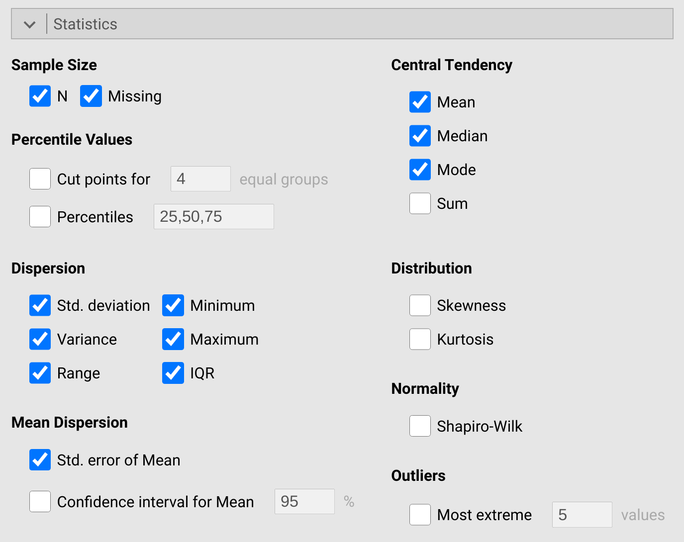
Figure 14.3: Jamovi Descriptives toolbar showing the summary statistics available to report.
Once you check these boxes, you will see a ‘Descriptives’ table open on the right-hand side of jamovi. This table will report all of the summary statistics that you have checked. Write down the values for the summary statistics next to the corresponding bullet points above.
Next split these summary statistics up by site. Notice the very large table that is now produced on the right-hand side of jamovi. Which of the seven sites in the dataset has the highest mean petiole diameter, and what is its mean?
Site: ______________________________
Mean: ______________________________
Which of the seven sites has the lowest variance in petiole diameter, and what is its variance?
Site: ______________________________
Variance: ______________________________
Make sure that you are able to find and interpret these summary statistics in jamovi. Explore different options to get more comfortable using jamovi for building plots and reporting summary statistics. Can you find the first and third quartiles for each site? Report the third quartiles for each site below.
Beag: ______________________________
Buic: ______________________________
Choille-Bharr: ______________________________
Creig-Moire: ______________________________
Fidhle: ______________________________
Lily_Loch: ______________________________
Linne: ______________________________
Next, we will look at reporting summary statistics to different significant figures.
14.4 Reporting decimals and significant figures
Using the same values that you reported above for the whole dataset (i.e., not broken down by site), report each summary statistic to two significant figures. Remember to round accurately if you need to reduce the number of significant figures from the original values to the new values below.
- N: _______________________
- Std. deviation: _______________________
- Variance: _______________________
- Minimum: _______________________
- Maximum: _______________________
- Range: _______________________
- IQR: _______________________
- Mean: _______________________
- Median: _______________________
- Mode: _______________________
- Std. error of mean: _______________________
Remember from Section 14.2 that you were asked to write down what you thought the mean, median, and standard deviation were just by inspecting the histogram. Compare your answers in that section with the rounded statistics listed above. Were you able to get a similar value from the histogram as calculated in jamovi from the data? What can you learn from the histogram that you cannot from the summary statistics, and what can you learn from the summary statistics that you cannot from the histogram? Write your reflections in the space below.
Next, we will produce barplots to show the mean petiole diameter for each site.
14.5 Comparing across sites
To make a barplot that compares the mean petiole diameters across sites, we again use the Descriptives option in jamovi. Place petiole diameter as the variable, and split this by site. Next, go down to the plotting options and check ‘Bar plot’. You will see a barplot produced in the window to the right with different sites on the x-axis. Bar heights show the mean petiole diameter for each site. Notice the intervals shown for each bar (i.e., the vertical lines in the centre of the bars that go up and down different lengths). These error bars are centred on the mean petiole diameter (bar height) and show one standard error above and below the site mean. Recall back from Chapter 12; what information do these error bars convey about the estimated mean petiole diameter?
What can you say about the mean petiole diameters across the different sites? Do these sites appear to have very different mean petiole diameters?
There were 20 total petiole diameters sampled from each site. If we were to go back out to these seven sites and sample another 20 petiole diameters, could we really expect to get the exact same site means? Assuming the site means would be at least a bit different for our new sample, is it possible that the sites with the highest or lowest petiole diameters might also differ in our new sample? If so, then what does this say about our ability to make conclusions about the differences in petiole diameter among sites?