16 Modeling
16.1 Objectives: Modeling
Understand the utility of a regression model
Demonstrate a basic understanding of the input components and model outputs of a regression model
Demonstrate the ability to write the code to create a regression model in R
16.2 Reading & resources: Modeling
Please refer to
R for Data Science, “Model Basics” for more information about this section. The chapters that follow this go deeper into modeling than we will in this course.
The chapter R Cookbook, 2nd ed., “Linear Regression and ANOVA” gives additional background on linear regression functions in R.
For information on the statistics of regression models, see the following:
James P. Curley & Tyler M. Milewski, PSY317L Guidebook, chapters 12 & 13 has a good explanation of correlation and linear regression, including R code
Danielle Navarro, Learning statistics with R, Chapter 15 Linear regression (Navarro 2019)
Chester Ismay & Albert Y. Kim, Modern Dive: Statistical Inference via Data Science, Chapter 5 Basic Regression (Ismay and Kim 2019)
-
An interactive tool that visualizes different regression models can be found at Bivariate Correlation Simulation and Bivariate Scatter Plotting.
- The sheet allows users to explore different patterns. Note that in this tool, the statistics being reported are “Rho” (looks like a lower-case P), which is the correlation between X and Y in the population (i.e. all of the possible points from which our sample could have been drawn), and “r”, which is the correlation coefficient (to get the R-squared, we [you guessed it] can multiply the “r” value by itself).
16.3 Relationship between variables
When we talk about a “model” in the context of data analysis, we usually mean that we are summarizing the relationship between two or more variables. The question we are asking is “What’s the pattern in the data?”
One real world example comes from forecasting energy use. As it gets colder outside, we use more energy to heat our homes—it is in the interest of the energy company (such as the folks responsible for BC Hydro’s electricity generation) to predict or forecast energy consumption based on temperature. And because there are other factors that drive energy use, we could create a more complex model; for example, we could see if adding relative humidity along with temperature gives us a better estimate of energy consumption.
When we create a regression model, the three outputs that we are most interested in are:
| Model Output | What It Measures | Explanation |
|---|---|---|
| R-squared (coefficient of determination) | The strength of the relationship between the variables | How well does knowing X allow us to predict the value of Y? |
| Coefficients | The equation that defines the line of best fit | The equation that allows us to calculate our predicted value of Y, given a known value of X |
| P value | The statistical significance | This shows whether the degree of association found in the model is likely to be a matter of chance |
16.3.1 R and R-squared
Before we get to the R-squared value, it’s helpful to understand the correlation coefficient, R. This is the measure of the strength and direction of a linear relationship between the two variables. It varies from 1 (a perfect positive relationship) to -1 (a perfect negative relationship).
In the examples in the plot below, the mean value of both X and Y is 100. The R score is shown in the title of each individual subplot.
We can see that in the plot where the R value is 0.9 (top left), the value of Y increases quite closely with the increase in X…the points are scattered closely, and it’s easy to visualize a line running through them to show the trend. In the R value of -0.9 (bottom left), there’s the same degree of scatter of the points but it’s a negative relationship…as X increases, Y decreases.
At the opposite side (top right), we have an R value of 0. As X increases, there is no pattern to Y.
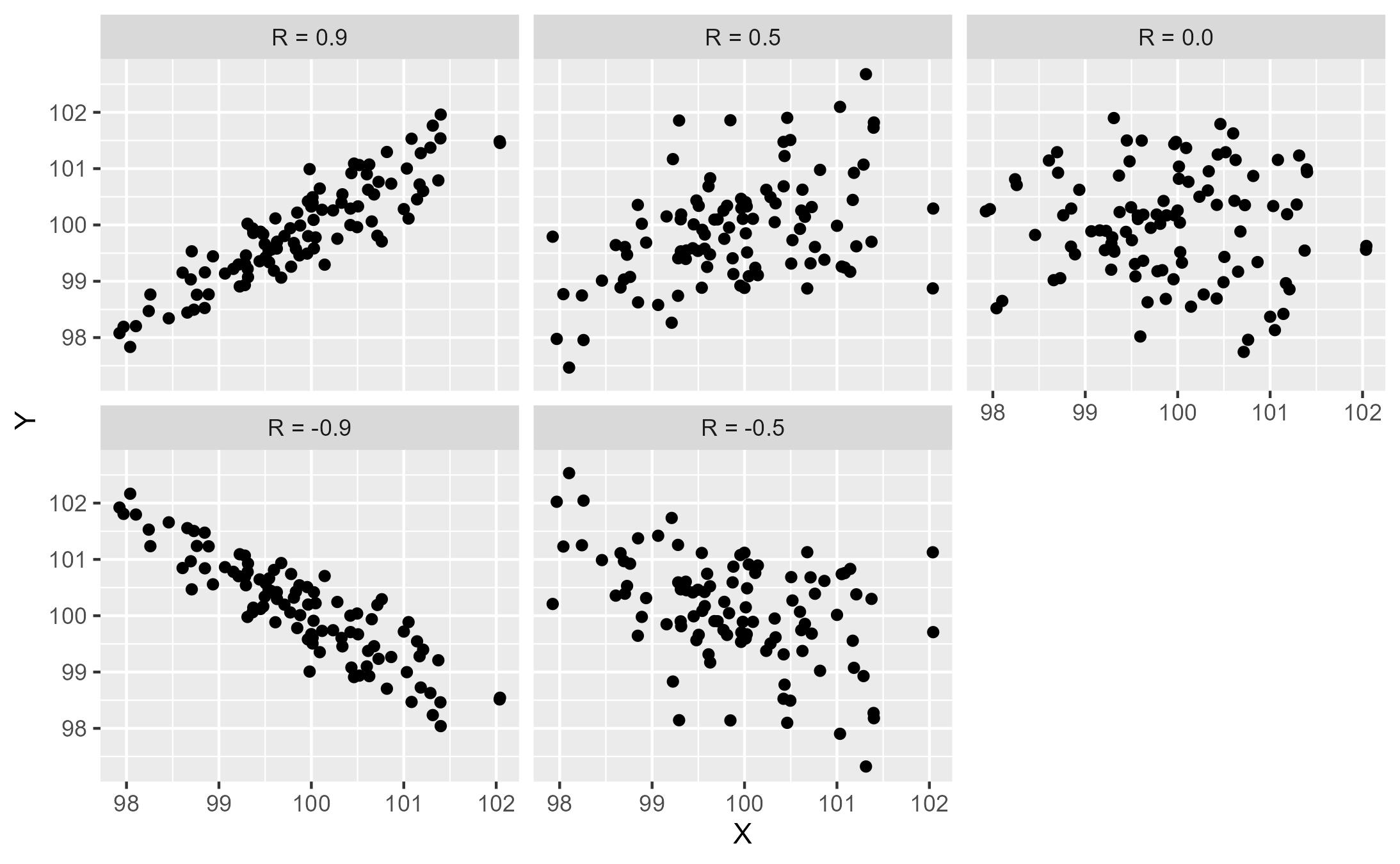
The R-squared value is (you guessed it) the R value multiplied by itself (squared). As a result, the value is between 1 and 0. The R-squared tells us the amount of variation in Y that is explained by X. An R-squared value of 1 tells us that 100% of the variation in Y can be explained by X.
In the first of our examples, the R of both 0.9 and -0.9 become an R-squared (or “R^2”) of 0.81. This tells us that 81% of the variation in the value of Y can be explained by the value of X. In this case, knowing X will allows to be quite accurate with our prediction of Y. For example, if we know X is 98, the model is going to give us an estimate of Y that is somewhere close to 98.
At the opposite end of the scale, the R-squared value of 0 tells us that none of the variation in Y can be explained by X. If we are trying to predict Y, knowing X is no help at all. In this case, no matter what value of X we have, our best estimate of Y remains the mean value of 100.
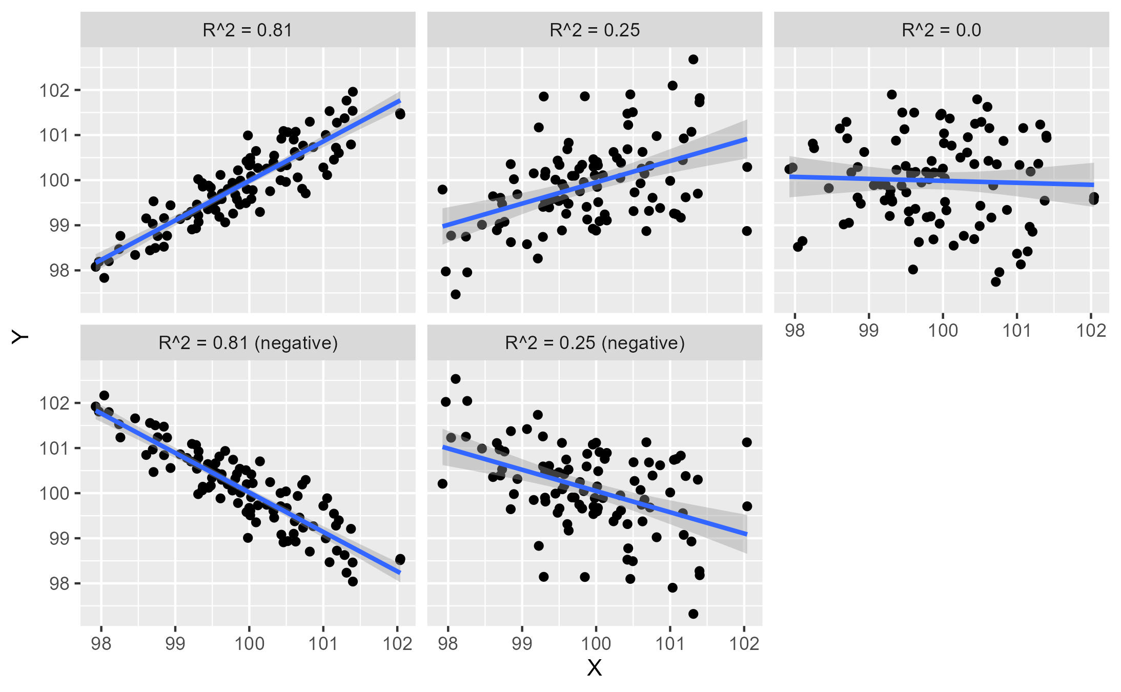
These plots also show the line of best fit in blue. This line is discussed below.
16.4 A simple example
The pair of plots below shows how a simple linear model works: first we have the X-Y scatter plot.
In this example, the trend is fairly clear: as the value of “x” increases, so does “y”. We say that “x” is the independent variable, and “y” is the dependent variable. In a predictive model, we are estimating (or predicting) a value of “y” based on a known value of “x”. In the earlier home heating example, energy consumption depends on temperature; we are trying to predict energy consumption based on the temperature outside.
(Note that the data set sim1 comes from the package {modelr}, and is slightly altered11.)
ggplot(sim1, aes(x = x, y = y)) +
  geom_point()
We can calculate the R value (the correlation coefficient) of the variables in the sim1 data using the function cor():
cor(sim1$x, sim1$y)## [1] 0.939079816.4.1 Line of best fit
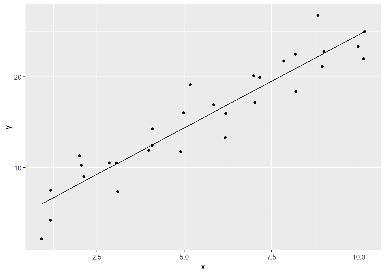
Then we can add the line of best fit that shows the trend, using the geom_smooth() function, where method = lm. This line shows the predicted values of “y”, based on the value of “x”.
ggplot(sim1, aes(x = x, y = y)) +
  geom_point() +
  geom_smooth(method = lm)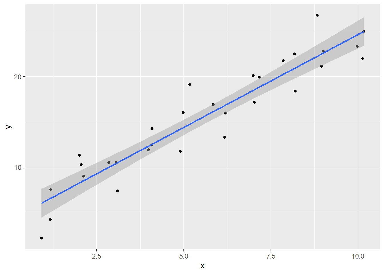
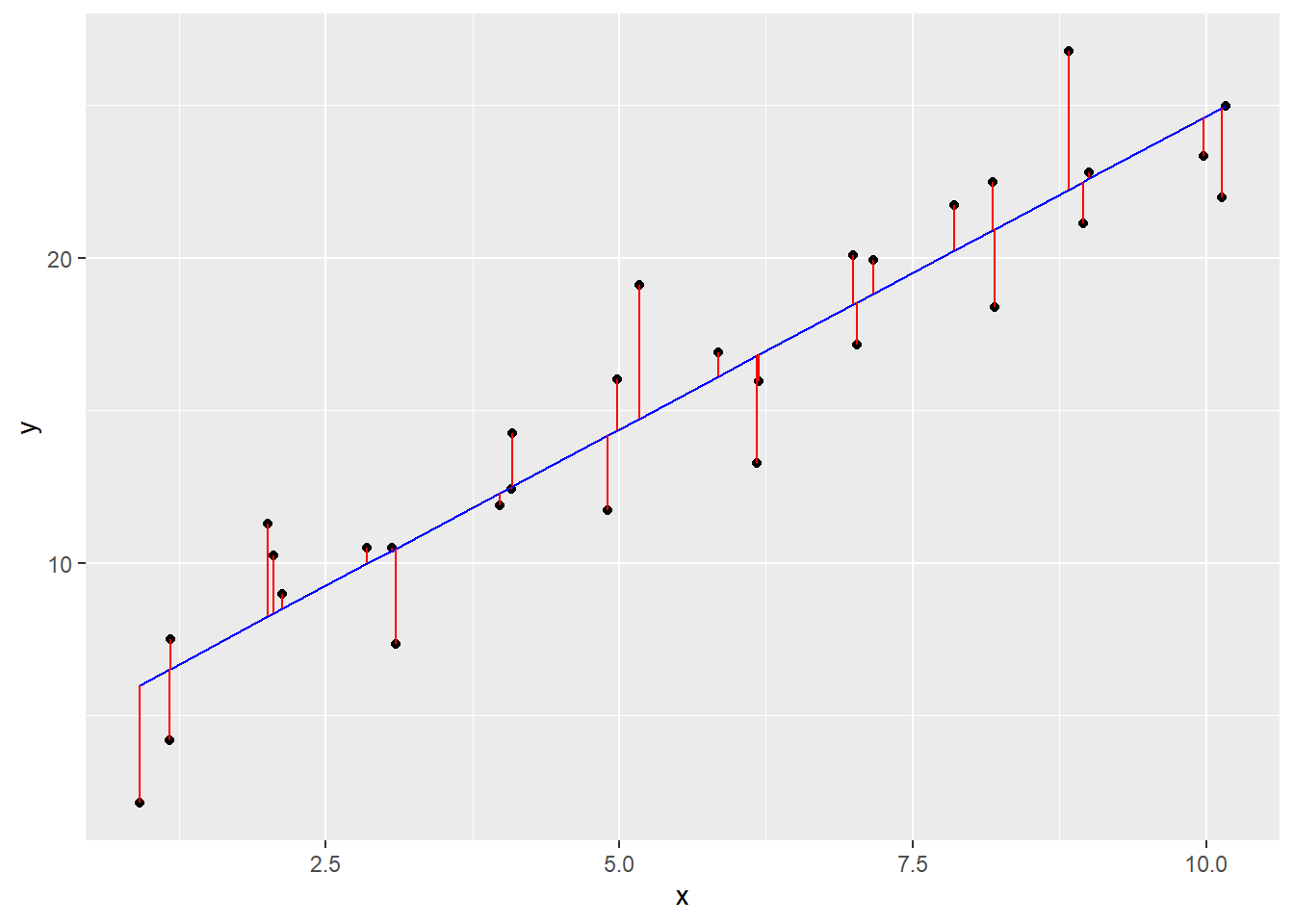
The line minimizes the distance between all of the points (more precisely, it’s the minimum squared distance). If we were to change the angle of the line in any way, it would increase the total distance. The plot below shows the distance between the measured points and the prediction line.
Being a statistics-based program, linear regression is a function in base R…it’s lm(), for “linear model”.
The syntax of the lm() function may look a bit different than what we’re used to.
lm(y ~ x, data)
This code creates a regression model, which we will assign to the object mod_sim1
mod_sim1 <- lm(y ~ x, data = sim1)

mod_sim1
##
## Call:
## lm(formula = y ~ x, data = sim1)
##
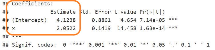
## Coefficients:
## (Intercept) x
## 4.124 2.052Creating the linear model calculates the coefficients that are used to describe the line of best fit.
The regression equation is the same as an equation for defining a line in geometry:
\(y = b_{0} + b_{1}x_{1} + e\)
How to read this:
the value of
y(i.e. the point on theyaxis) can be predicted bythe intercept value \(b_{0}\), plus
the coefficient \(b_{1}\) times the value of
x
The distance between that predicted point and the actual point is the error term.
The equation calculated by the lm() function, to create the model model_mlb_pay_wl, is:
\[ \operatorname{\widehat{y}} = 4.1238 + 2.0522(\operatorname{x}) \]
The equation calculated by the lm() function above means that any predicted value of y (that is, a point on the line) is equal to 4.124 + 2.052 * the value of x.
The equation calculated by the lm() function above means that any predicted value of y (that is, the y-axis value of any point on the line) is equal to
4.12 +
2.0522 * the value of x.
If x = 2.5, then y = 4.12 + (2.0522 * 2.5), which is 9.2505.
Look back at the line of best fit in our plot—if x = 2.5, the y point on the line is just below 10.
The equation predicts a value of Y, based on what we know about X.
This has enormous practical applications.
16.4.2 The Model Summary
We can examine the summary statistics of the model with the summary() function:
summary(mod_sim1)##
## Call:
## lm(formula = y ~ x, data = sim1)
##
## Residuals:
## Min 1Q Median 3Q Max
## -3.8750 -1.3729 0.1512 1.5461 4.5264
##
## Coefficients:
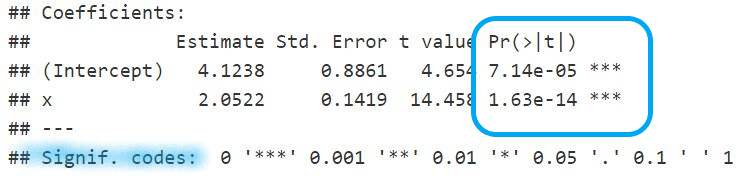
## Estimate Std. Error t value Pr(>|t|)
## (Intercept) 4.1238 0.8861 4.654 7.14e-05 ***
## x 2.0522 0.1419 14.458 1.63e-14 ***
## ---
## Signif. codes: 0 '***' 0.001 '**' 0.01 '*' 0.05 '.' 0.1 ' ' 1
##
## Residual standard error: 2.229 on 28 degrees of freedom
## Multiple R-squared: 0.8819, Adjusted R-squared: 0.8777
## F-statistic: 209 on 1 and 28 DF, p-value: 1.633e-14This isn’t a statistics class, so we won’t go into all the details … but we will seek out some of the key pieces of information that the summary table shows.
(For interpreting the regression model summary, see The R Cookbook, 2nd edition, “11.4 Understanding the Regression Summary”)
First of all: can you find the coefficients for the equation?
These are the same values that we saw earlier, but in a slightly different layout.
16.4.3 R-squared
The Multiple and Adjusted R-squared statistics tells us how well the line fits the points…this number ranges between 0 (no fit at all) and 1 (where all the X and Y values fall on the line). In this case, it’s 0.88, which is a very good fit.
In general we use the “Adjusted R-squared” value, because it accounts for the number of data points and variables in the model.
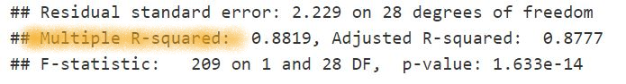
16.4.4 Statistical significance
The P value (the measure of statistical significance) is found in the column marked “Pr(>|t|)”.
When dealing with any data, we have to keep in mind that we don’t usually have every possible case. One example is survey data, where some respondents may not have answered some (or all) of the questions. Another is warehouse sales data, where the time frame you have chosen will have excluded orders before and after the time period in your data.
This measure of statistical significance “helps quantify whether a result is likely due to chance or to some factor of interest” (Thomas Redman, quoted in (Gallo 2018)).
When a finding is significant, it simply means you can feel confident that it’s real, not that you just got lucky (or unlucky) in choosing the sample. (Gallo 2018)
16.5 A deeper dive
In the following example, we will use some data from another package, {datarium}. In this example, there are three types of advertising: youtube, facebook, and newspaper. What we are interested in predicting is sales—how much do they go up for each dollar spent on each of the three media?
Here’s what the first 6 rows of the 200 rows in the marketing table look like:
- note that
salesis measured in units of 1000 (a 5 means 5,000)
##   youtube facebook newspaper sales
## 1  276.12    45.36     83.04 26.52
## 2   53.40    47.16     54.12 12.48
## 3   20.64    55.08     83.16 11.16
## 4  181.80    49.56     70.20 22.20
## 5  216.96    12.96     70.08 15.48
## 6   10.44    58.68     90.00  8.64
Let’s start with just the youtube and see how well it predicts sales. First, we will plot the relationship:
# solution
ggplot(df_marketing, aes(x = youtube, y = sales)) +
  geom_point() +
  geom_smooth(method = lm)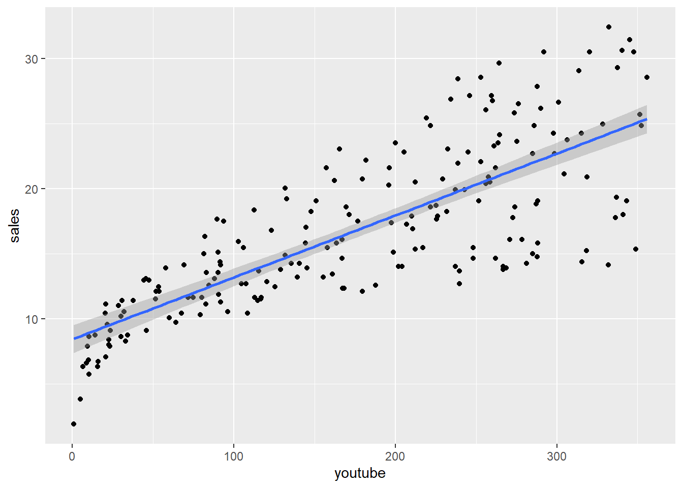
Then, run the regression model to create a new model object, and use summary() to get the model statistics:
##
## Call:
## lm(formula = sales ~ youtube, data = df_marketing)
##
## Residuals:
##      Min       1Q   Median       3Q      Max
## -10.0632  -2.3454  -0.2295   2.4805   8.6548
##
## Coefficients:
##             Estimate Std. Error t value Pr(>|t|)
## (Intercept) 8.439112   0.549412   15.36   <2e-16 ***
## youtube     0.047537   0.002691   17.67   <2e-16 ***
## ---
## Signif. codes:  0 '***' 0.001 '**' 0.01 '*' 0.05 '.' 0.1 ' ' 1
##
## Residual standard error: 3.91 on 198 degrees of freedom
## Multiple R-squared:  0.6119, Adjusted R-squared:  0.6099
## F-statistic: 312.1 on 1 and 198 DF,  p-value: < 2.2e-16
Y = 8.44 + (0.048 * X)
The way to read this is that we will get 8.44 units sold with zero youtube advertising, but with every dollar of youtube spending we would expect an increase of 0.048 in sales. So if we spent $1,000, we would see a total of 56.4 units sold (sales = 8.44 + 0.048 * 1000)
We can use our skills in writing functions. We can write one called ad_impact that takes a value called youtube that represents the amount spent on youtube advertising, and then calculates the predicted sales, using the values from the model.
# solution

ad_impact <- function(youtube) {
  8.439 + (0.048 * youtube)
}
Let’s test our function, seeing the sales impact of spending $1000 on youtube advertising.
ad_impact(1000)## [1] 56.43916.6 Multiple predictors
Regression equations also allow us to use multiple variables to predict our outcome. In this sales example, there’s not just youtube, but facebook and newspaper advertising happening at the same time.
A full regression equation looks like this:
\(y = b_{0} + b_{1}x_{1} + b_{2}x_{2} + \cdots + b_{n}x_{n} + e\)
In R syntax, it is quite simple:
##
## Call:
## lm(formula = sales ~ youtube + facebook + newspaper, data = df_marketing)
##
## Residuals:
##      Min       1Q   Median       3Q      Max
## -10.5932  -1.0690   0.2902   1.4272   3.3951
##
## Coefficients:
##              Estimate Std. Error t value Pr(>|t|)
## (Intercept)  3.526667   0.374290   9.422   <2e-16 ***
## youtube      0.045765   0.001395  32.809   <2e-16 ***
## facebook     0.188530   0.008611  21.893   <2e-16 ***
## newspaper   -0.001037   0.005871  -0.177     0.86
## ---
## Signif. codes:  0 '***' 0.001 '**' 0.01 '*' 0.05 '.' 0.1 ' ' 1
##
## Residual standard error: 2.023 on 196 degrees of freedom
## Multiple R-squared:  0.8972, Adjusted R-squared:  0.8956
## F-statistic: 570.3 on 3 and 196 DF,  p-value: < 2.2e-16
Note that the value for newspaper is very small (and less important, negative). With such a small number, it’s time to introduce the statistical significance measure, shown on the right with the handy asterix column. The “P value” is the probability that the estimate is not significant, so the smaller the better. There’s no asterix associated with the newspaper line, so it’s not signficant, but the other two variables get the full 3-star rating.
This means that we can re-run the model, but without newspaper as a predictive variable:
##
## Call:
## lm(formula = sales ~ youtube + facebook, data = df_marketing)
##
## Residuals:
##      Min       1Q   Median       3Q      Max
## -10.5572  -1.0502   0.2906   1.4049   3.3994
##
## Coefficients:
##             Estimate Std. Error t value Pr(>|t|)
## (Intercept)  3.50532    0.35339   9.919   <2e-16 ***
## youtube      0.04575    0.00139  32.909   <2e-16 ***
## facebook     0.18799    0.00804  23.382   <2e-16 ***
## ---
## Signif. codes:  0 '***' 0.001 '**' 0.01 '*' 0.05 '.' 0.1 ' ' 1
##
## Residual standard error: 2.018 on 197 degrees of freedom
## Multiple R-squared:  0.8972, Adjusted R-squared:  0.8962
## F-statistic: 859.6 on 2 and 197 DF,  p-value: < 2.2e-16
Interpretation:
Y = 3.52 + 0.046 (youtube) + 0.188 (facebook)
For a given predictor (youtube or facebook), the coefficient is the effect on Y of a one unit increase in that predictor, holding the other predictors constant.
So to see the impact of a $1,000 increase in facebook advertising, we’d evaluate the equation as
3.52 + (0.046 * 1) + (0.188 * 1000) = 191.57
We would expect to see an increase of sales of 191.57 units, for each additional expenditure of $1000 of facebook adverstising.
Rather than calculating this long-hand, we can write a short function to calculate this for us:
# solution

ad_impact2 <- function(youtube, facebook) {
  3.52 + (0.046 * youtube) + (0.188 * facebook)
}
Let’s test: calculate the impact of a $1000 spend on facebook
# solution

ad_impact2(1, 1000)
## [1] 191.566What if we split our spending? What’s the impact of a $500 spend on youtube and a $500 spend on facebook?
# solution

ad_impact2(500, 500)
## [1] 120.5216.7 Supplement: Working with model data
As you get deeper into this, you’ll quickly realize that you may want to extract the various model values programmatically, rather than reading the numbers on the screen and typing them in to our code.
For these examples, we will use the data set sim1 (from the package {modelr}) that we saw earlier in this chapter.
mod_sim1 <- lm(y ~ x, data = sim1)16.7.1 Extracting the coefficients
The first thing we might want to do is extract the coefficients that are calculated by the lm() function.
Earlier, we used the summary() function to show the coefficients and other aspects of the model:
summary(mod_sim1)##
## Call:
## lm(formula = y ~ x, data = sim1)
##
## Residuals:
## Min 1Q Median 3Q Max
## -3.8750 -1.3729 0.1512 1.5461 4.5264
##
## Coefficients:
## Estimate Std. Error t value Pr(>|t|)
## (Intercept) 4.1238 0.8861 4.654 7.14e-05 ***
## x 2.0522 0.1419 14.458 1.63e-14 ***
## ---
## Signif. codes: 0 '***' 0.001 '**' 0.01 '*' 0.05 '.' 0.1 ' ' 1
##
## Residual standard error: 2.229 on 28 degrees of freedom
## Multiple R-squared: 0.8819, Adjusted R-squared: 0.8777
## F-statistic: 209 on 1 and 28 DF, p-value: 1.633e-14We can also see the values by accessing the coefficients that are within the mod_sim1 object.
mod_sim1$coefficients## (Intercept) x
## 4.123849 2.052166To access them, we need our square brackets:
# the Y intercept
mod_sim1$coefficients[1]
## (Intercept)
## 4.123849
# the X coefficient
mod_sim1$coefficients[2]
## x
## 2.052166These can be included in an equation, if we want to estimate a specific predicted Y value. In this code, our value of X is set to 7.5, and the regression equation evaluated to return the estimated value of Y.
our_value_of_x <- 7.5

estimated_y <- mod_sim1$coefficients[1] + # the Y intercept
  mod_sim1$coefficients[2] * our_value_of_x

estimated_y
## (Intercept)
## 19.51509We can also use inline R code to write a sentence with these values. For this purpose, I’ve rounded the values; here is the example of what the code looks like for the Y intercept, rounded to 2 decimal places.
round(mod_sim1$coefficients[1], 2)
The regression equation from the sim1 data is Y = 4.12 + 2.0522 * the value of
x.
16.7.2 Using {broom} to tidy (and then plot) the predicted values
To “tidy” the data, you can use the package {broom}.

In this example, we will
run the
lm()modelextract the predicted values
plot those predicted values as a line on our scatter plot
(These are the steps that the geom_smooth(method = lm) function in {ggplot2} is doing behind the scenes.)
Using the {broom} package, we use the augment() function to create a new dataframe with the fitted values (also known as the predicted values) and residuals for each of the original points in the data:
mod_sim1_table <- broom::augment(mod_sim1)

mod_sim1_table
## # A tibble: 30 × 8
## y x .fitted .resid .hat .sigma .cooksd .std.resid
## <dbl> <dbl> <dbl> <dbl> <dbl> <dbl> <dbl> <dbl>
## 1 4.20 1.17 6.52 -2.32 0.111 2.22 0.0760 -1.10
## 2 7.51 1.17 6.53 0.976 0.111 2.26 0.0134 0.464
## 3 2.13 0.914 6.00 -3.87 0.120 2.13 0.235 -1.85
## 4 8.99 2.13 8.50 0.489 0.0806 2.27 0.00230 0.229
## 5 10.2 2.06 8.34 1.90 0.0827 2.24 0.0357 0.889
## 6 11.3 2.01 8.24 3.05 0.0841 2.19 0.0940 1.43
## 7 7.36 3.09 10.5 -3.12 0.0577 2.18 0.0636 -1.44
## 8 10.5 2.85 9.98 0.525 0.0627 2.27 0.00198 0.243
## 9 10.5 3.06 10.4 0.102 0.0583 2.27 0.0000694 0.0473
## 10 12.4 4.08 12.5 -0.0663 0.0420 2.27 0.0000202 -0.0304
## # ℹ 20 more rowsThe variable we want to plot as the line is “.fitted”.
The code to create our original scatterplot is as follows:
pl_sim1 <- ggplot(sim1, aes(x = x, y = y)) +
  geom_point()

pl_sim1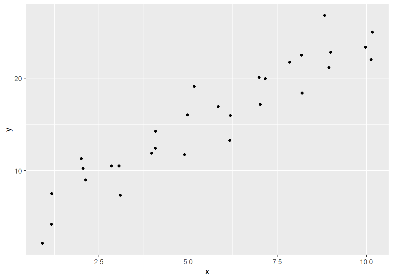
To our object “pl_sim1” (for “plot_sim1”) we can add the line using the geom_line() function. This is pulling data from a second dataframe—{ggplot2} gives you the power to plot data points from multiple data frames.
Note that in the first solution, the data is specified using the df$var syntax.
# syntax that specifies the data
pl_sim1 +
  geom_line(data = mod_sim1_table, aes(x = x, y = .fitted))
Here’s another version of the syntax that skips the creation of an object.
# embedding the data and aes in the `geom_` functions
# note that `data = ` has to be specified`
ggplot() +
  geom_point(data = sim1, aes(x = x, y = y)) +
  geom_line(data = mod_sim1_table, aes(x = x, y = .fitted))
-30-