13 Factors
13.1 Objectives
Understand how factor type variables differ from character strings.
Understand how to manipulate factors.
Produce bar charts and other categorical plots using {ggplot2}.
Set universal plot settings.
Extend learning of {ggplot2} functions.
13.3 Categorical variables: factors
We love factors. We hate factors.
Factors make working with categorical variables a breeze: you can sort them or arrange them arbitrarily (think days of the week),
But there are some traps that you might fall into, if you’re not careful.
The package {forcats} is very helpful.
13.3.1 Factor functions
Base R functions for working with factors
| function | purpose |
|---|---|
str |
display structure of object |
class |
returns the class of an object |
levels |
returns the values of the levels |
nlevels |
return the number of levels |
13.3.1.1 Your turn
Use the functions in the table above to examine the continent variable in the gapminder dataset.
13.3.1.2 Your turn
Use the count() function in a pipe to get a frequency table of each level in the factors in the continent variable
Solution
# solution
gapminder |>
  count(continent)
## # A tibble: 5 × 2
## continent n
## <fct> <int>
## 1 Africa 624
## 2 Americas 300
## 3 Asia 396
## 4 Europe 360
## 5 Oceania 2413.3.2 Dropping levels
A key thing to remember is that the factor levels exist separate from your data … even if you filter the data, the factor levels stay the same unless you drop the extras.
In this example, we see that there are 142 countries in gapminder – and if you filter the gapminder data down to 4, there are still 142 levels associated with country.
Leaving them in can cause problems, for instance when you try to plot them all.
nlevels(gapminder$country)## [1] 142
h_countries <- c("Denmark", "Albania", "Mexico", "Spain")  # see what I did there?

h_gap <- gapminder |>
  filter(country %in% h_countries)

nlevels(h_gap$country)
## [1] 142The function we need here is droplevels().
13.3.2.1 Your turn
Use the droplevels() function to delete the levels that are unused.
Solution
h_gap <- gapminder |>
  filter(country %in% h_countries) |>
  droplevels()
After you filter the gapminder data table to include just the 4 countries in the h_countries list, the droplevels() function can be run next in the pipe–the other 138 levels are dropped.
We can then use levels() and nlevels() to check the results.
levels(h_gap$country)## [1] "Albania" "Denmark" "Mexico" "Spain"
nlevels(h_gap$country)## [1] 413.3.3 Changing the order of the factors
As you can see with our country names above, the default arrangement is alphabetical. This is fine in some applications, but as we will see when we plot the data, we might want to sort them by another variable.
13.3.3.1 Arranging levels
We might want to sort levels in an arbitrary way.
For example, our short country list would be more entertaining if it spelled out “DAMS”.
Here’s the way the levels are arranged:
h_gap$country |>
  levels()
## [1] "Albania" "Denmark" "Mexico" "Spain"We can use fct_relevel() to change some or all of the levels.
h_gap$country |>
  fct_relevel("Denmark", "Albania", "Mexico", "Spain") |>
  levels()
## [1] "Denmark" "Albania" "Mexico" "Spain"What if we want to sort by the number of countries in each continent, that is, the number of times each factor occurs?
fct_infreq() is what we need, or fct_infreq() |> fct_rev() for backwards.
13.3.3.2 Your turn
Give fct_infreq() a try on continent in gapminder.
Solution
# solutions
gapminder$continent |>
  fct_infreq() |>
  levels()
## [1] "Africa" "Asia" "Europe" "Americas" "Oceania"
gapminder$continent |>
  fct_infreq() |>
  fct_rev() |>
  levels()
## [1] "Oceania" "Americas" "Europe" "Asia" "Africa"In a pipe where we are using the entire data frame, it would look like this:
gmind <- gapminder |>
  # sort the factors
  mutate(continent = continent |>
           fct_infreq() |>
           fct_rev())

levels(gmind$continent)
## [1] "Oceania" "Americas" "Europe" "Asia" "Africa"You can also sort by another variable in the data frame. In this example, the countries are sorted by minimum life expectancy.
You can find other ways to sort in STAT545, “Reorder factors”
fct_reorder(gapminder$country, gapminder$lifeExp, min) |>
  levels() |>
  head()
## [1] "Rwanda" "Afghanistan" "Gambia" "Angola" "Sierra Leone" "Cambodia"Recoding levels is similar to the renaming that’s possible in dplyr::select()
i_gap <- gapminder |>
  filter(country %in% c("United States", "Sweden", "Australia")) |>
  droplevels()

i_gap$country |>
  levels()
## [1] "Australia" "Sweden" "United States"
i_gap$country |>
  fct_recode("USA" = "United States", "Oz" = "Australia") |>
  levels()
## [1] "Oz" "Sweden" "USA"13.4 Plotting categorical variables
Create a dataframe object with the name “gapminder_2007” by filtering the gapminder data.
gapminder_2007 <- filter(gapminder, year == 2007)13.4.1 Bar plot: countries in each continent
Bar plots are often used to visualize the distribution of a discrete variable. In this case, we will show how many countries there are in each continent.
the geom is
geom_barmap the
xvariable tocontinentthere is no
yvariable! {ggplot} will count the number of observations in each category
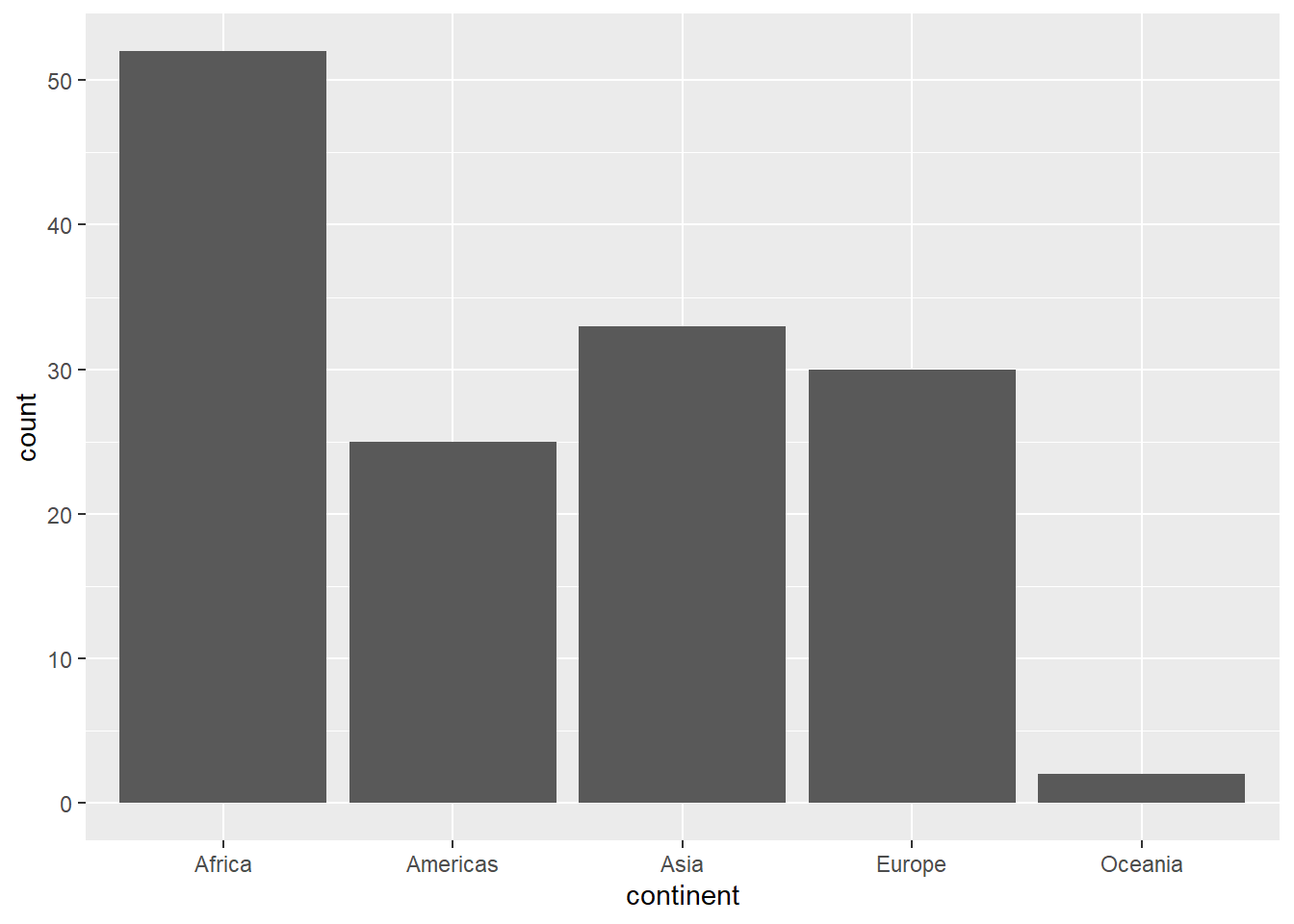
Note that colour (or color) won’t work on a bar! That’s for points and lines.
For something that occupies a block of space–such as a bar or pie chart–you need to use fill.
Add the fill attribute to continent to the code you wrote above. (Yes, you’ll be specifying continent twice!)
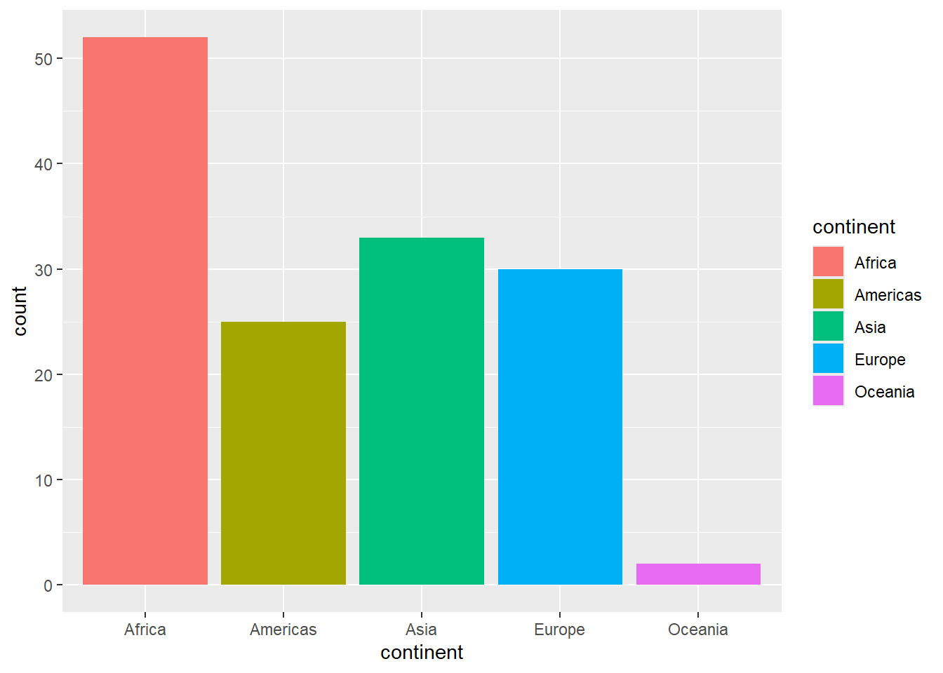
This is the default palette. It might be a bit too vibrant for your eyes…don’t worry, we will learn to fix that later.
Another {ggplot2} feature is that every plot is an object. If you want to save a basic version of your plot and continue to tinker with it, you can assign that basic version to an object name, and just add to it.
It would look something like:
mybar <- ggplot() + geom_()
Followed by
mybar +
It’s possible to turn this on its side, so that the country labels are on the left, and the bars run left-to-right instead of up-and-down.
To do this, add the coord_flip() function to the chart object you assigned above (you might have called it mybar).
# solution
mybar + coord_flip()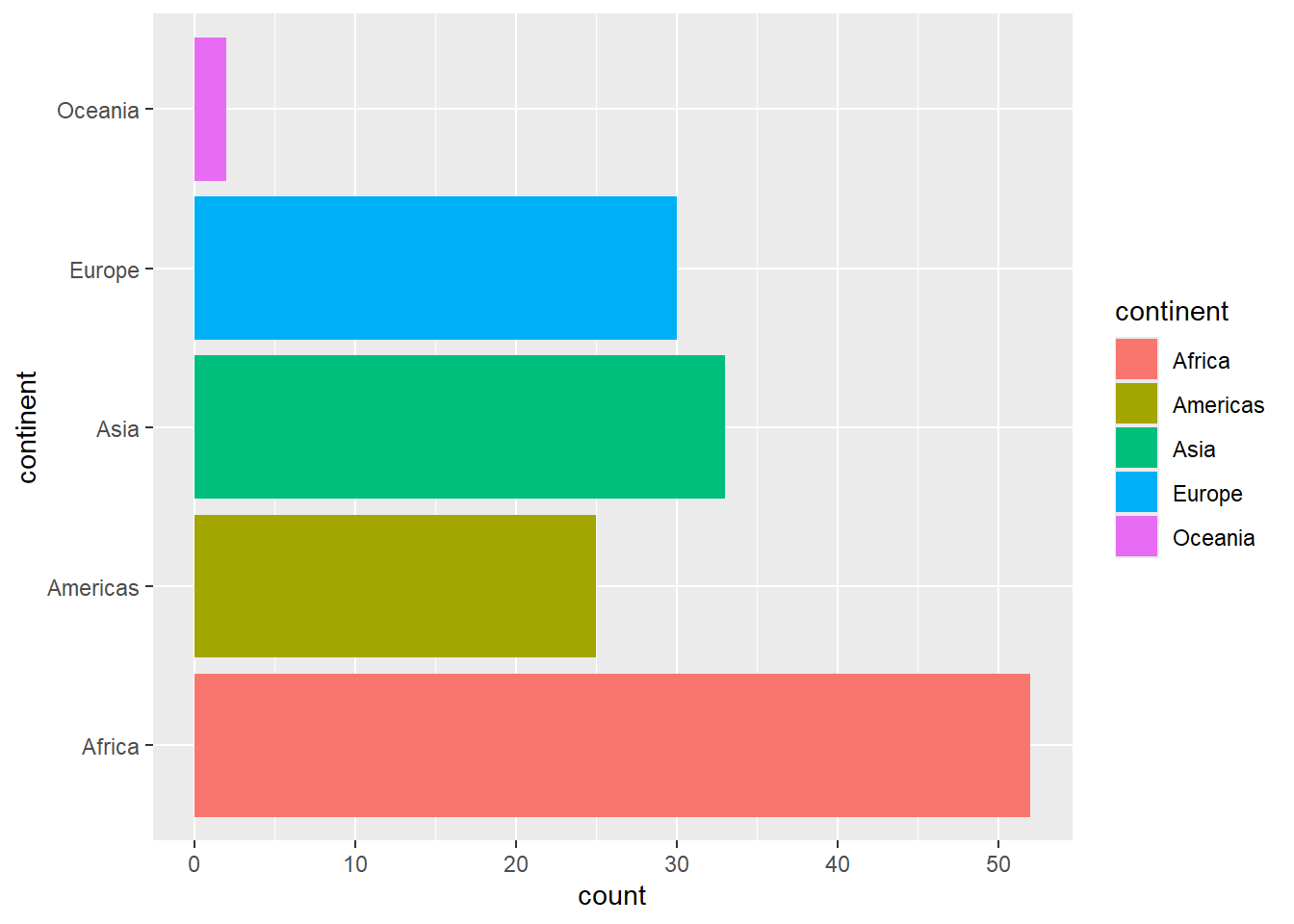
13.4.2 Sorting factors in a plot
To sort the factors in a plot, we first mutate the variable that contains the factor variable that will plot.
In this example, we use the same code that we saw in hands-on 3.3, Your Turn 3.2. Other sort functions (such as fct_relevel) could also be used.
gapminder |>
  # sort the factors
  mutate(continent = continent |>
           fct_infreq() |>
           fct_rev()) |>
  # then plot
  ggplot(aes(x = continent)) +
    geom_bar() +
  coord_flip()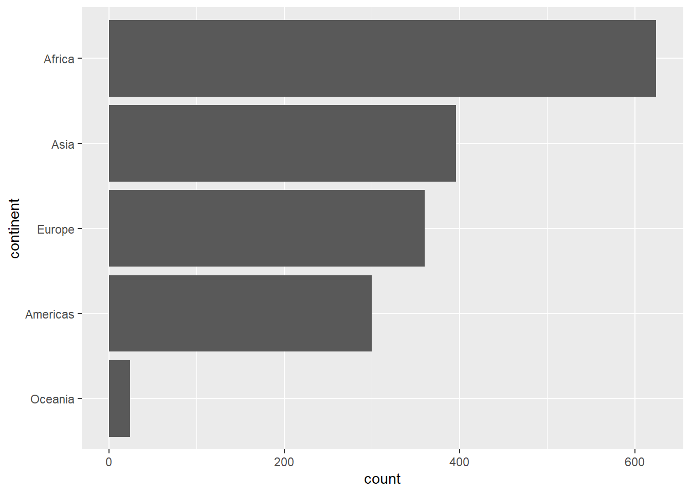
A generic version of the sorting using fct_rev() to put them in reverse order is here:
df |> mutate(my_fct = fct_rev(my_fct) |> ggplot(…)
In this example, we will plot the four countries in our DAMS group by life expectancy.
h_countries <- c("Denmark", "Albania", "Mexico", "Spain")  # see what I did there?

h_gap <- gapminder |>
  filter(country %in% h_countries) |>
  mutate(country = country |>
  fct_relevel("Denmark", "Albania", "Mexico", "Spain"))

h_gap |>
  filter(year == 2007) |>
  ggplot(mapping = aes(x = country, y = lifeExp)) +
  geom_point(size = 6)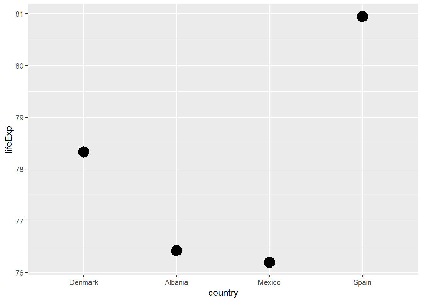
13.4.2.1 Your turn
Now it’s your turn: plot the four countries in our DAMS group by life expectancy.
Solution
# solution
h_gap |>
  filter(year == 2007) |>
  mutate(country = country |>
           fct_reorder(lifeExp) |>
           fct_rev()) |>
  # now plot
  ggplot(mapping = aes(x = country, y = lifeExp)) +
  geom_point(size = 6)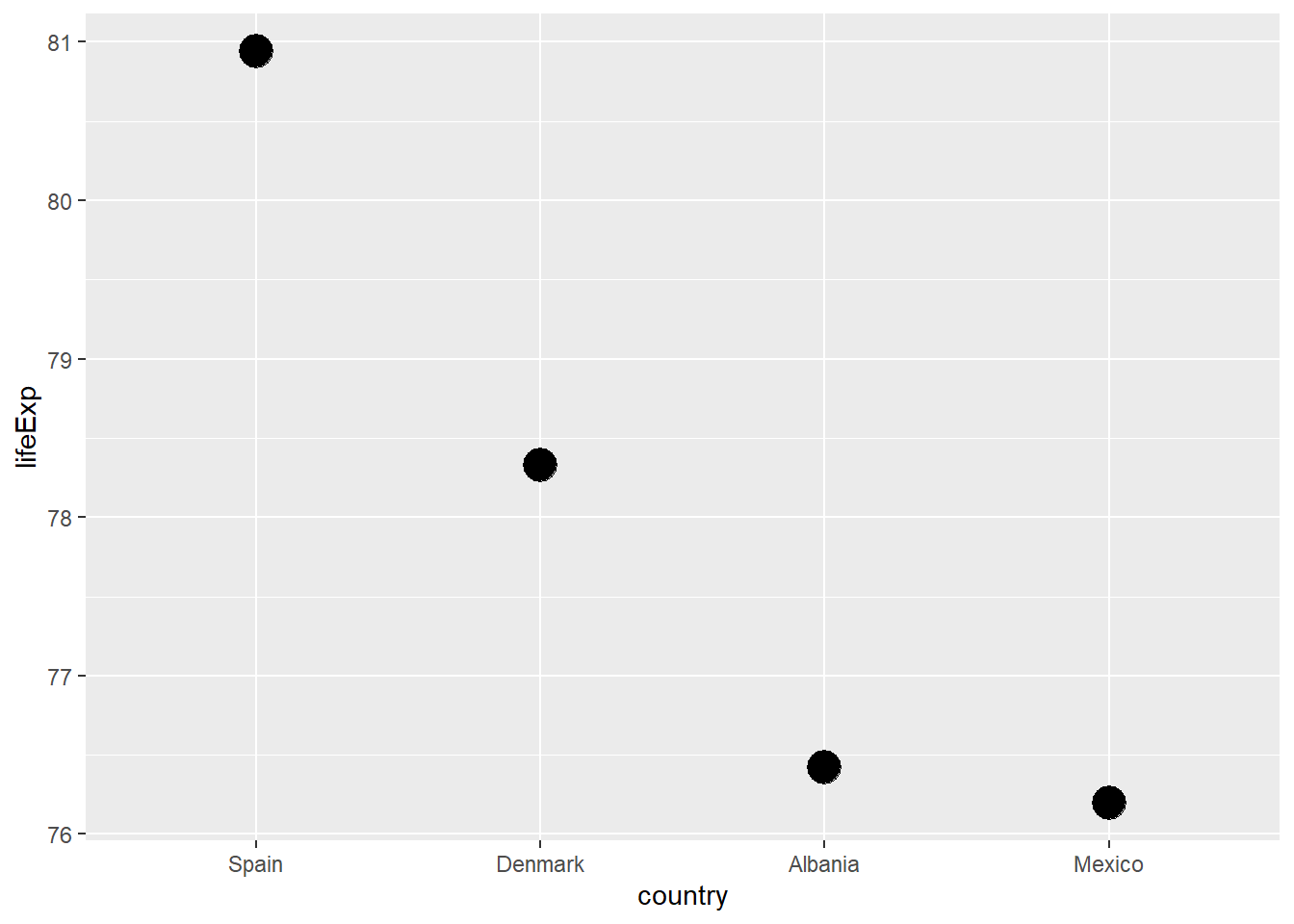
13.5 Exercise - factors and plotting
- an introduction to factor variables in the context of making plots
13.6 Reference
This hands-on exercise draws heavily on material at the following
“Factors” in R for Data Science, 2nd ed. by Hadley Wickham, Mine Çetinkaya-Rundel, and Garrett Grolemund
Some of these plotting examples are lifted directly from http://euclid.psych.yorku.ca/www/psy6135/tutorials/gapminder.html
See also Yan Holtz, “Reorder a variable with ggplot2” at the R Graph Gallery
-30-