27 Gapminder: 200 Countries, 200 Years
27.1 Introduction
In this project, you will recreate single year versions of the chart Hans Rosling shows in the videos here:
Gapminder, 200 years that changed the world
The plots in both have the same information shown: income, life expectancy, population, and the continent.
27.2 Data files
The four files that you will need, downloaded from https://www.gapminder.org/data/, can be found in the “data” folder of this project.
There are CSV files for the following:
Income: “income_per_person_gdppercapita_ppp_inflation_adjusted.csv”
Life expectancy (years): “life_expectancy_years.csv”
Population: “population_total.csv”
In addition, there is an Excel file that you’ll need to use to get the region (continent) that each country is in. Use the variable “four_regions” for the continents.
- “Data Geographies - v1 - by Gapminder.xlsx”, sheet = “list-of-countries-etc”
27.4 Other gapminder data visualizations
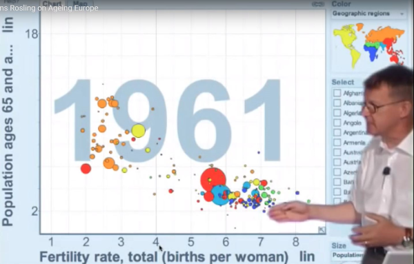
Hans Rosling has used the same visualization structure to show other variables, and how those have also changed over time. In this presentation, he shows how the population of European countries has aged since 1961, compared to the fertility rate of those countries.
An additional description of this presentation can be fount at Presentation Zen, Hans Rosling: the zen master of presenting data, 2010-07-11
27.4.1 Animation of plots
Part of what makes Hans Rosling’s presentations so compelling is the animation of the data visualization. Here are some links to resources for you to create an animated plot in R, using the package {gganimate}.
{gganimate} package reference page – note that the “Getting Started” page has a good guide to the basics of the package
GGANIMATE: HOW TO CREATE PLOTS WITH BEAUTIFUL ANIMATION IN R – includes some more advanced methods
Tristan Ganry, How to build Animated Charts like Hans Rosling — doing it all in R (2018-05-19)
-30-