11 Introduction to data visualization
11.2 Anscombe’s Quartet
“Anscombe’s Quartet” comprises four data sets that each have eleven rows, each with two variables (x and y). The quartet was constructed by Francis Anscombe, and published in a 1973 paper titled “Graphs in Statistical Analysis” in the journal American Statistician(Anscombe 1973).
The quartet is included in base R, but in an untidy format:
anscombe## x1 x2 x3 x4 y1 y2 y3 y4
## 1 10 10 10 8 8.04 9.14 7.46 6.58
## 2 8 8 8 8 6.95 8.14 6.77 5.76
## 3 13 13 13 8 7.58 8.74 12.74 7.71
## 4 9 9 9 8 8.81 8.77 7.11 8.84
## 5 11 11 11 8 8.33 9.26 7.81 8.47
## 6 14 14 14 8 9.96 8.10 8.84 7.04
## 7 6 6 6 8 7.24 6.13 6.08 5.25
## 8 4 4 4 19 4.26 3.10 5.39 12.50
## 9 12 12 12 8 10.84 9.13 8.15 5.56
## 10 7 7 7 8 4.82 7.26 6.42 7.91
## 11 5 5 5 8 5.68 4.74 5.73 6.89Read the quartet data in a tidy form.6 Note that the variables have been renamed “ex” and “why”.
anscombe_tidy <- read_csv("data/anscombe_tidy.csv")

anscombe_tidy
## # A tibble: 44 × 4
## observation set ex why
## <dbl> <chr> <dbl> <dbl>
## 1 1 I 10 8.04
## 2 2 I 8 6.95
## 3 3 I 13 7.58
## 4 4 I 9 8.81
## 5 5 I 11 8.33
## 6 6 I 14 9.96
## 7 7 I 6 7.24
## 8 8 I 4 4.26
## 9 9 I 12 10.8
## 10 10 I 7 4.82
## # ℹ 34 more rows11.2.1 Summary statistics
Each of the four sets in Anscombe’s Quartet has the same summary statistics. Let’s calculate the mean of ex for each of the four sets:
## # A tibble: 4 × 2
##   set   mean_ex
##   <chr>   <dbl>
## 1 I           9
## 2 II          9
## 3 III         9
## 4 IV          9
11.2.1.1 Exercise
Using the following functions, calculate the summary statistics of ex and why, and the correlation coefficient between ex and why, for all four of the sets in the quartet:
| statistic | function |
|---|---|
| mean | mean() |
| standard deviation | sd() |
| correlation coefficient | cor() |
Solution
To create a table with these statistics by the four sets, we first group_by() and then summarize() (or summarise()). Notice that we include all of the calculations within a single summarize() function.
# solution
anscombe_tidy |>
  group_by(set) |>
  summarize(mean(ex),
            sd(ex),
            mean(why),
            sd(why),
            cor(ex, why))
## # A tibble: 4 × 6
## set `mean(ex)` `sd(ex)` `mean(why)` `sd(why)` `cor(ex, why)`
## <chr> <dbl> <dbl> <dbl> <dbl> <dbl>
## 1 I 9 3.32 7.50 2.03 0.816
## 2 II 9 3.32 7.50 2.03 0.816
## 3 III 9 3.32 7.5 2.03 0.816
## 4 IV 9 3.32 7.50 2.03 0.81711.3 Visualizing the quartet
Using the R visualization package {ggplot2}.
The template of a ggplot() function call looks like this:
ggplot(data = <DATA>) + <GEOM_FUNCTION>(mapping = aes(<MAPPINGS>))
We use:
the
data =argument to name the dataframe we are using.the
<GEOM_FUNCTION>to define how we want the data represented (as points, or lines, or bars, or…).the
mapping =is where we define which variables we want plotted, andthe
aes()(for “aesthetic”) includes how we want those plotted.
11.3.1 Scatter plot
With this example, the dataframe we’re using is anscombe_tidy and we are plotting ex and why as points in a scatter plot.
# example
ggplot(anscombe_tidy) +
geom_point(mapping = aes(x = ex, y = why)) 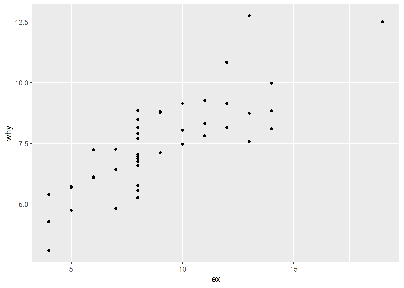
Now we will add another variable to those in our aes list. We will add the variable “set”, and use colour to differentiate each value within “set”. You will notice that the colour = specification goes inside the aes()—we are using colour to represent the variable “set”.
# example
ggplot(anscombe_tidy) +
geom_point(aes(x = ex, y = why, colour = set)) 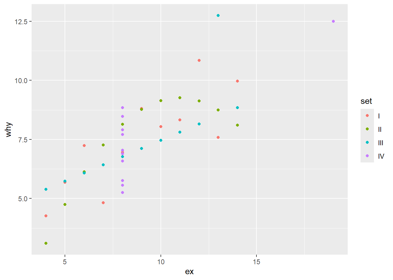
For the example below, we plot only set “I”. We start with our anscombe_tidy dataframe, and then using the pipe symbol, first filter() and then pass the results of the filter to our ggplot() function. Note that because the filtered dataframe is being passed, there is no specified data = in the ggplot() function: the data to be plotted is what is passed after the previous step in the pipe.
You will notice that the arguments aes() and x = etc are not specified. As we saw in earlier examples, if the arguments are in the order that the function expects, they are interpreted correctly.
In this example, the code increases the size of the points and colours them purple. These arguments are outside the aes() argument, so they apply to all of the points.
# solution
anscombe_tidy |>
  filter(set == "I") |>
ggplot() +
  geom_point(aes(ex, why), size = 3, colour = "purple")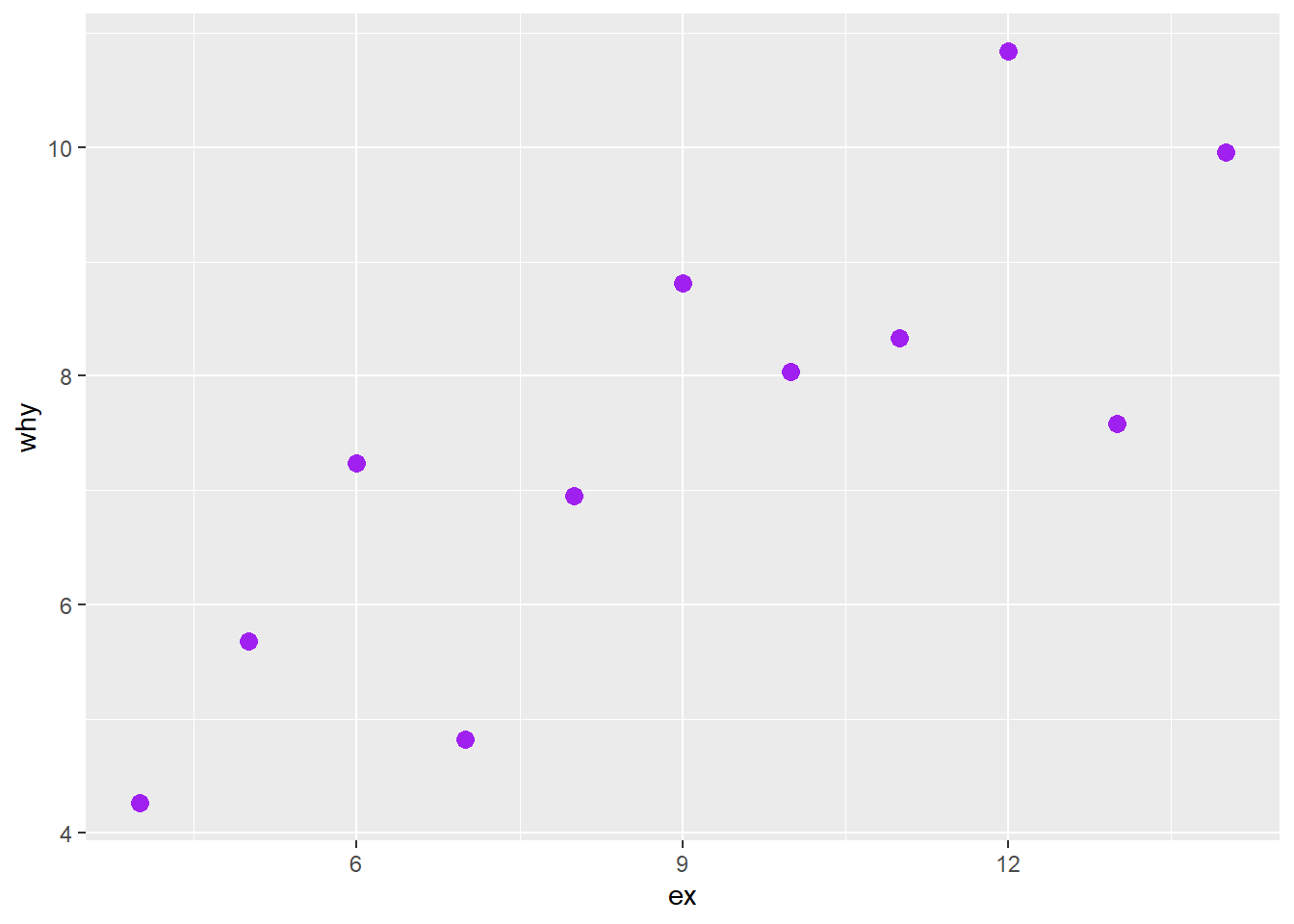
11.3.2 Facet plot
Another way to differentiate the sets is to use a facet plot. In this example, we use the function facet_wrap.
ggplot(anscombe_tidy) +
  geom_point(aes(ex, why)) +
  facet_wrap(~set)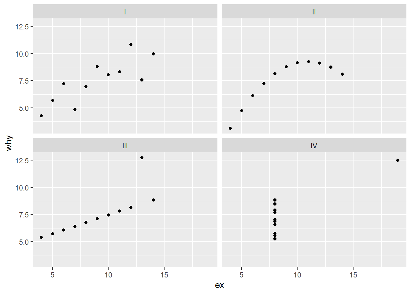
Now we will add a trend line using the geom_smooth function.
the
method = lmindicates a “linear model”, i.e. a standard regression line. (We will come back to the statistics that underlie this function in Modeling.) {ggplot2} provides access to other smoothing algorithms.the
se = FALSEturns off the “standard error” (a measure of uncertainty in the data)
ggplot(anscombe_tidy) +
  geom_point(aes(ex, why)) +
  geom_smooth(aes(ex, why), method = lm) +
  facet_wrap(~set)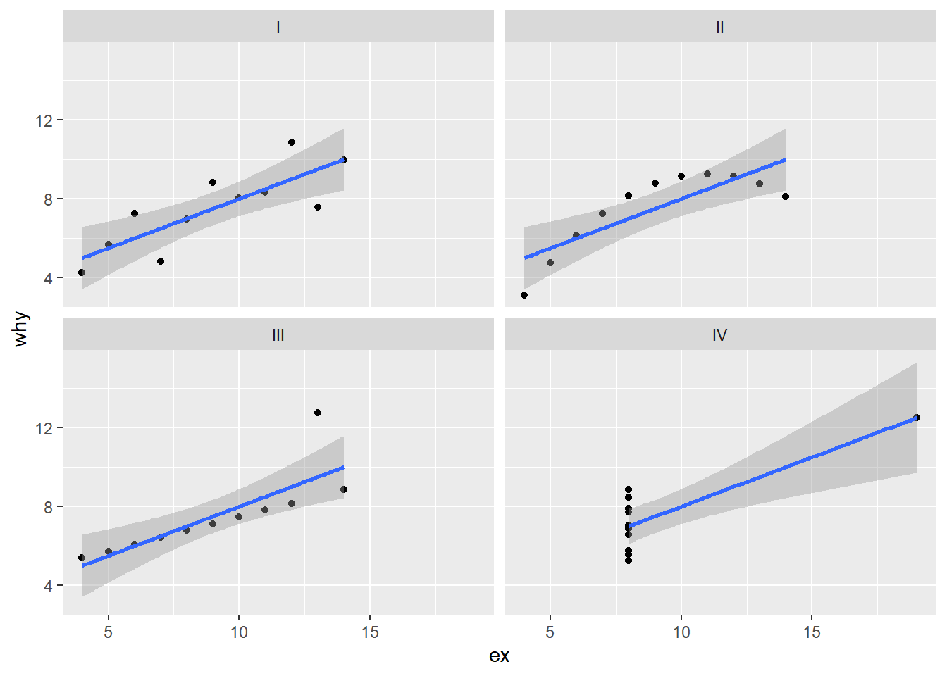
But that duplicates the aes(ex, why) text…so we can move that into the ggplot() function. That way, the aesthetics apply to each of the geom_ calls.
p <- ggplot(anscombe_tidy, aes(ex, why)) +
  geom_point() +
  geom_smooth(method = lm, se = FALSE) +
  facet_wrap(~set)
p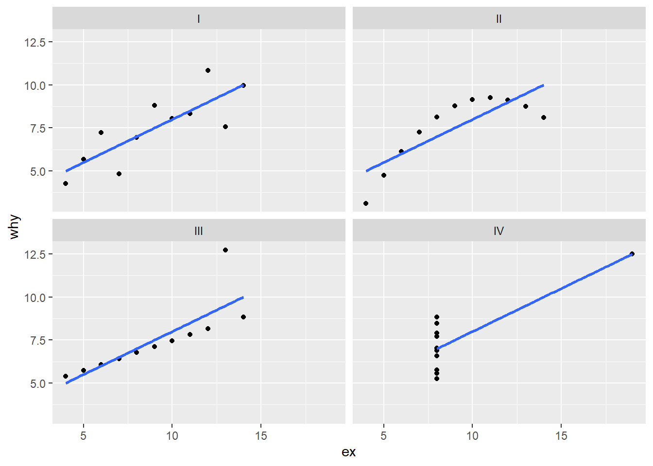
-30-