20 Communication: plot formatting
20.2 Introduction
In the chapters Introduction to data visualization and More data visualization, we started to explore some ways to format our plots.
Cole Nussbaumer Knaflic’s book Storytelling with Data: A Data Visualization Guide for Business Professionals is a good introduction to the principles of data visualization, which is a key part of data analytics. In the book, the point is made that data visualization is always in the service of making a point about what the data tell us. In the context of business, this then translates into influencing decisions.
The book lists six principles (see the Storytelling with Data: quick reference guide):
Understand the context
Choose the right type of display
Eliminate clutter
Draw attention to where you want it
Tell a visual story
Practice makes perfect
The Storytelling with Data: quick reference guide also includes the pre-attentive attributes of a visualization, and the Gestalt principles of visual perception:
proximity
similarity
enclosure
closure
continuity
connection
One of the great things about the {ggplot2} package is that it provides virtually infinite ways to make our already-good plots even better. Here are some ways to start to incorporate formatting and design elements that improve our plots.
20.3 Text labels
Another type of annotation is to use text. For the example below, the names of the top teams are added to the 2002 season data (the year in which the Moneyball story is set). First, filter for 2002.
The next step is to identify the teams at the extremes of each quadrant—top winners and biggest losers in the above- and below-average spending teams. For this, we will use the mutate() function to add a new variable, based on the other values, using the case_when() function.
mlb_2002 <- mlb_pay_wl |>
  filter(year_num == 2002)

# add salary group
mlb_2002 <- mlb_2002 |>
  mutate(salary_grp = case_when(
    pay_index >= 100 ~ "above",
    pay_index < 100 ~ "below"
  ))


# add quadrant
mlb_2002 <- mlb_2002 |>
  mutate(team_quad = case_when(
    pay_index >= 100 & w_l_percent >= 0.5 ~ "I",
    pay_index < 100 & w_l_percent >= 0.5 ~ "II",
    pay_index < 100 & w_l_percent < 0.5 ~ "III",
    pay_index >= 100 & w_l_percent < 0.5 ~ "IV"
  ))

team_for_label <- mlb_2002 |>
  group_by(salary_grp) |>
  filter(w_l_percent == max(w_l_percent) |
         w_l_percent == min(w_l_percent))

team_for_label
## # A tibble: 5 × 10
## # Groups: salary_grp [2]
## year_num tm attend_g est_payroll pay_index w l w_l_percent salary_grp team_quad
## <dbl> <chr> <dbl> <dbl> <dbl> <dbl> <dbl> <dbl> <chr> <chr>
## 1 2002 CHC 33248 75690833 112. 67 95 0.414 above IV
## 2 2002 DET 18795 55048000 81.4 55 106 0.342 below III
## 3 2002 NYY 43323 125928583 186. 103 58 0.64 above I
## 4 2002 OAK 26788 40004167 59.2 103 59 0.636 below II
## 5 2002 TBD 13157 34380000 50.8 55 106 0.342 below IIINote that we end up with five teams in the list, since Detroit (“DET”) and Tampa Bay (“TBD”) ended up with identical win-loss records.
We can now use the team names from that table as annotations, using geom_text.
# the same plot as before, but with just the 2002 teams
ggplot(mlb_2002, aes(x = pay_index, y = w_l_percent)) +
  geom_point() +
  # add the names from the "team_for_label" table
  geom_text(data = team_for_label, aes(label = tm))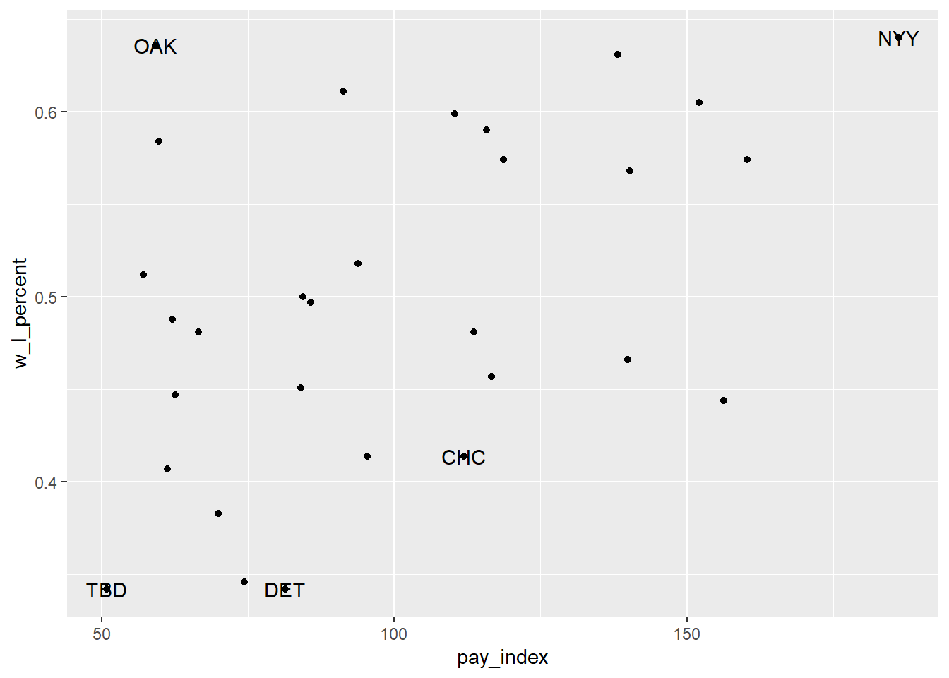
This isn’t entirely satisfactory, since the labels overlie the points. In the version below, the geom_label() is used instead, along with the nudge_x argument to move the label slightly to the left of the point (that is, -6 units on the x-axis—and yes, I experimented a bit to find the right nudge!).
# the same plot as before, but with just the 2002 teams
ggplot(mlb_2002, aes(x = pay_index, y = w_l_percent)) +
  geom_point() +
  # add horizontal and vertical lines
  geom_vline(xintercept  = 100, colour = "grey") +
  geom_hline(yintercept = 0.5, colour = "grey") +
  # add the names from the "team_for_label" table
  geom_label(data = team_for_label, aes(label = tm),
             nudge_x = -6)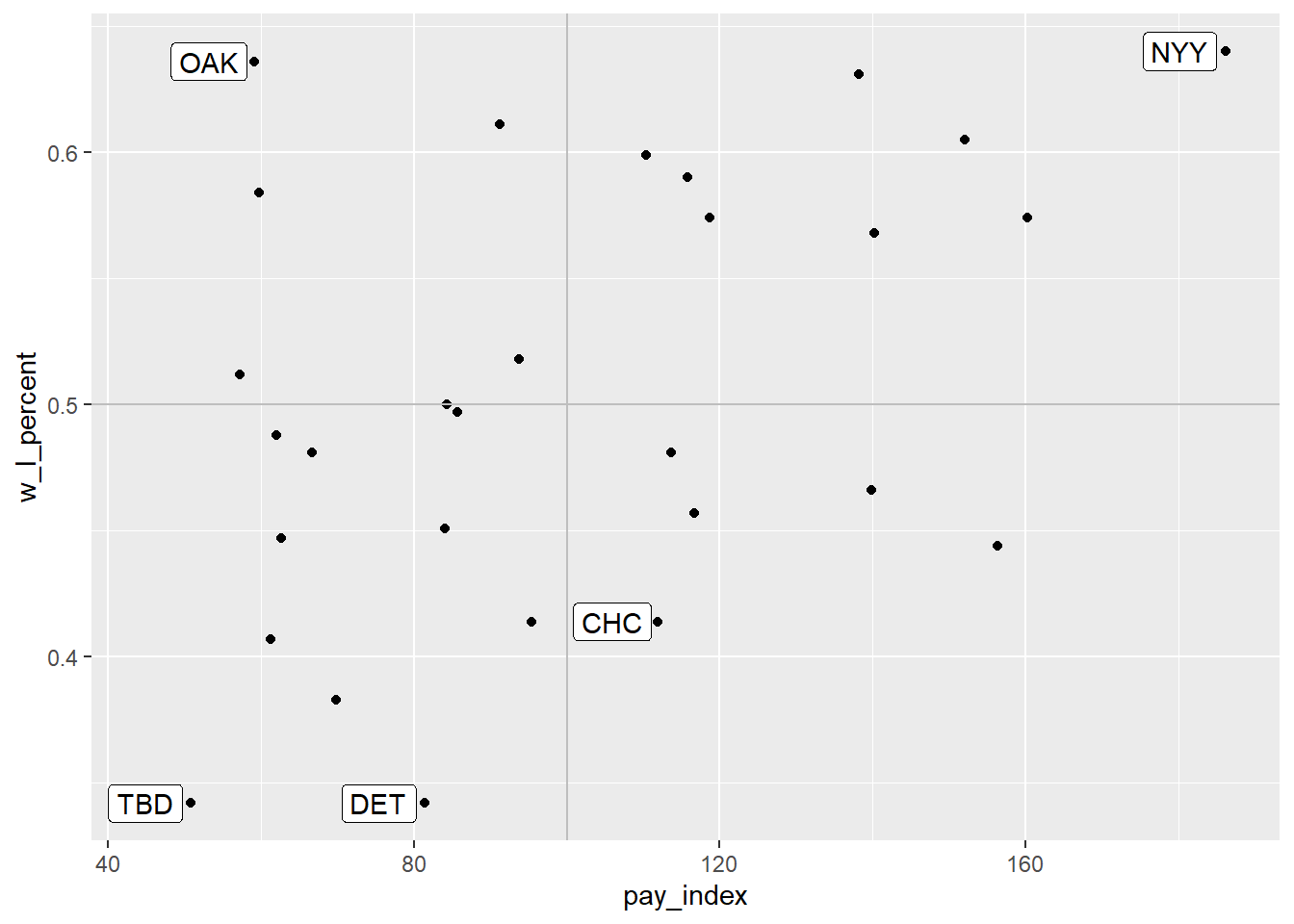
Another approach would be to omit the points altogether, and have the team abbreviations represent the location of each team on the plot:
ggplot(mlb_2002, aes(x = pay_index, y = w_l_percent)) +
  # add horizontal and vertical lines
  geom_vline(xintercept  = 100, colour = "grey") +
  geom_hline(yintercept = 0.5, colour = "grey") +
  # plot the team names
  geom_text(aes(label = tm))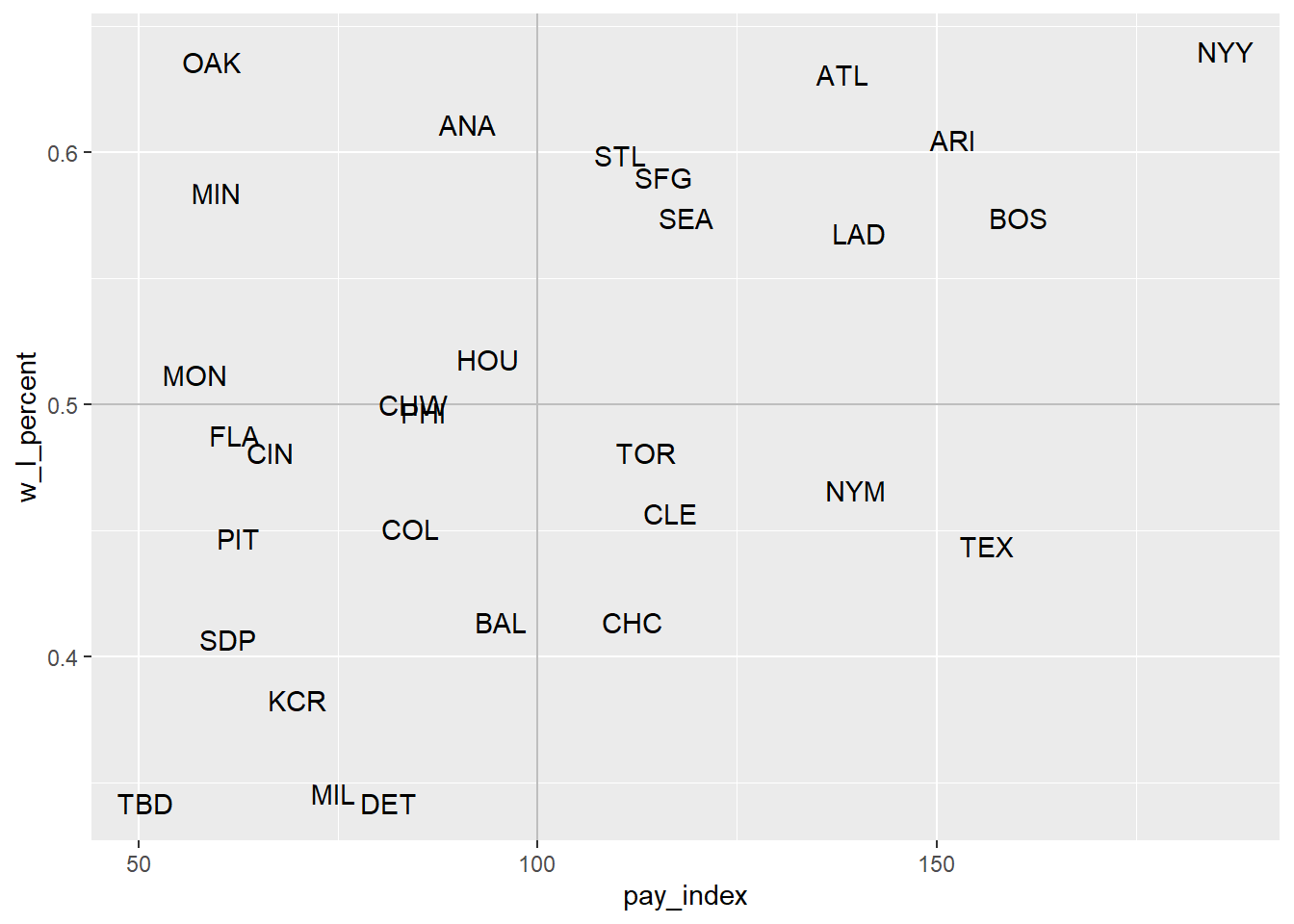
For another example of this sort of labeling, see Hadley Wickham, Mine Çetinkaya-Rundel, and Garrett Grolemund, R for Data Science (2nd ed.), “Graphics for Communication: Annotations”.
20.4 Annotations
The scatterplot we made in [moneyball] is interesting in and of itself. But with some annotations, some of the details can be made explicit.
One way to do that is to add lines to a plot that create sections to the plot. In the example in the previous chapter, vertical line and horizontal lines were added by using geom_vline() and geom_hline().
As you will recall, the red line runs vertically at the “1” point on the X axis. The teams to the left of the line spent below the league average for that season; the teams to the right spent more. As you can see, there have been cases when some teams spent twice as much as the league average. The blue line runs horizontally at the “0.5” point on the Y axis. Above this line, the teams won more games than they lost. Below the line, they lost more games than they won.
mlb_pay_wl <- read_csv("data/mlb_pay_wl.csv",
                       col_types =
                         cols(year_num = col_character()))

# create plot object for repeated use
moneyball_plot <- ggplot(mlb_pay_wl, aes(x = pay_index, y = w_l_percent)) +
  geom_point()

moneyball_plot +
  geom_vline(xintercept  = 100, colour = "red", size = 2) +
  geom_hline(yintercept = 0.5, colour = "blue", size = 2)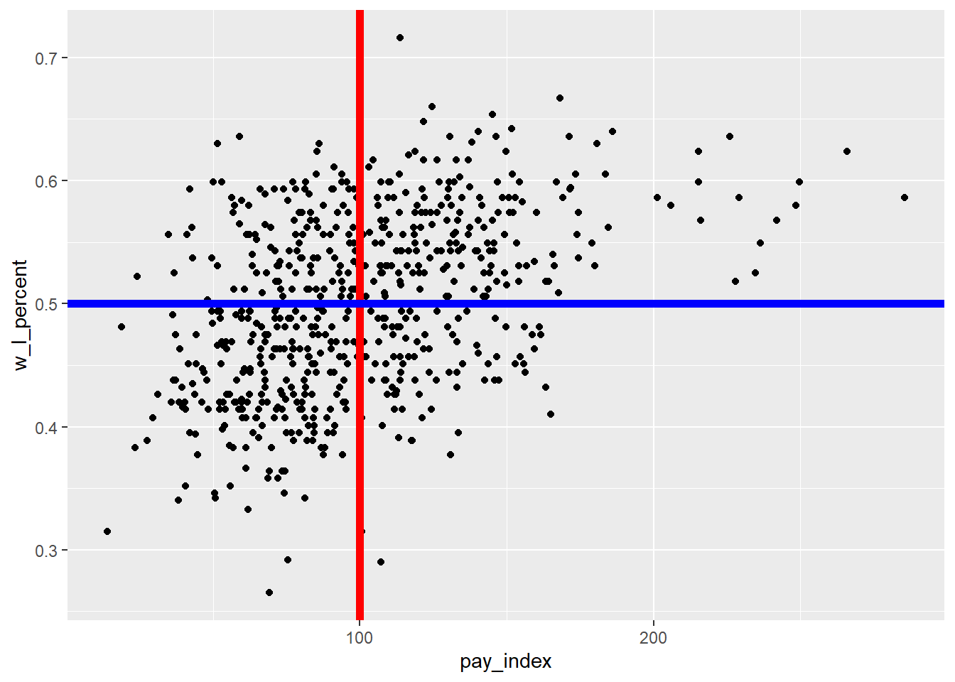
In the chart above, the vertical and horizontal lines are plotted on top of the points, obscuring some from view. Here are a couple of approaches that resolve that.
First, it’s useful to understand that the layers are plotted in order…so if we plot the lines first and then the points, the points will be in front of the lines.
ggplot(mlb_pay_wl, aes(x = pay_index, y = w_l_percent)) +
  # plot the lines first
  geom_vline(xintercept  = 100, colour = "red", size = 2) +
  geom_hline(yintercept = 0.5, colour = "blue", size = 2) +
  # then the points
geom_point() 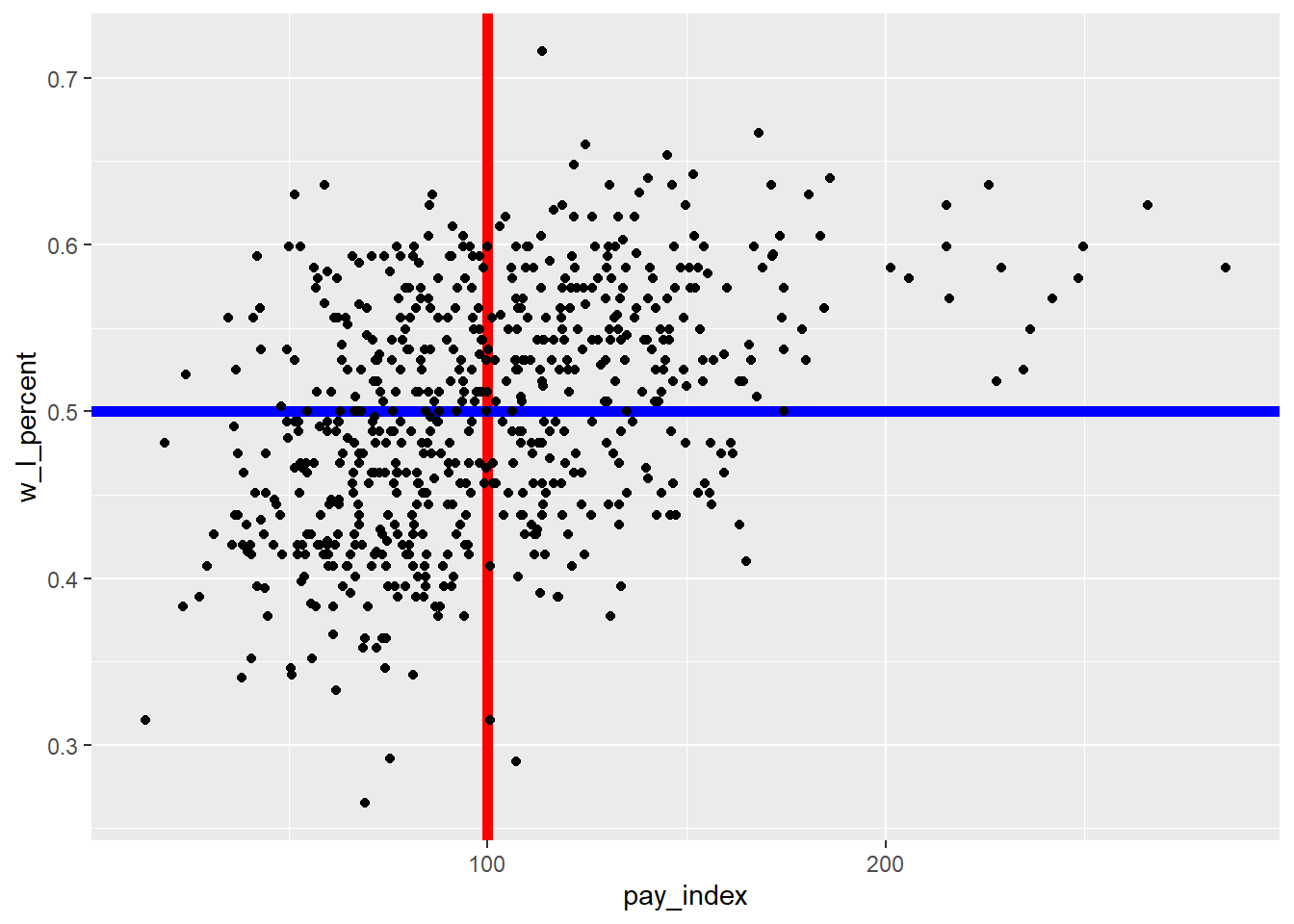
A second approach is to use the alpha parameter when describing the lines. “Alpha refers to the opacity of a geom. Values of alpha range from 0 to 1, with lower values corresponding to more transparent colors.” (From the {ggplot2} reference on “Colour related aesthetics: colour, fill, and alpha”)
For our plot, we will set alpha = 0.5 for both lines.
moneyball_plot +
  geom_vline(xintercept  = 100, colour = "red", size = 2, alpha = 0.5) +
  geom_hline(yintercept = 0.5, colour = "blue", size = 2, alpha = 0.5)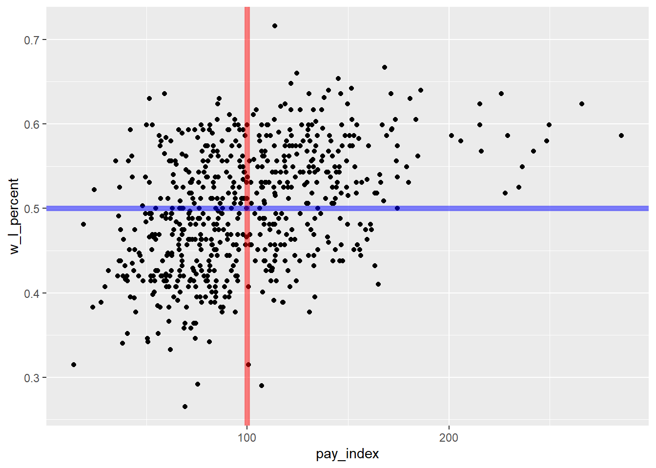
Another option would have been to add a block of shading for the “Moneyball” teams that spent below the league average, but had winning seasons. For this, the annotate("rect") is used. The fill colour is hex code for the specific shade of green used by the Oakland Athletics, as found at usteamcolors.com. (See R Graphics Cookbook, 2nd ed. for applications of this in a line plot.)
moneyball_plot +
  annotate("rect", xmin = 0, xmax = 100, ymin = 0.5, ymax = 0.8,
           alpha = .3, fill = "#003831")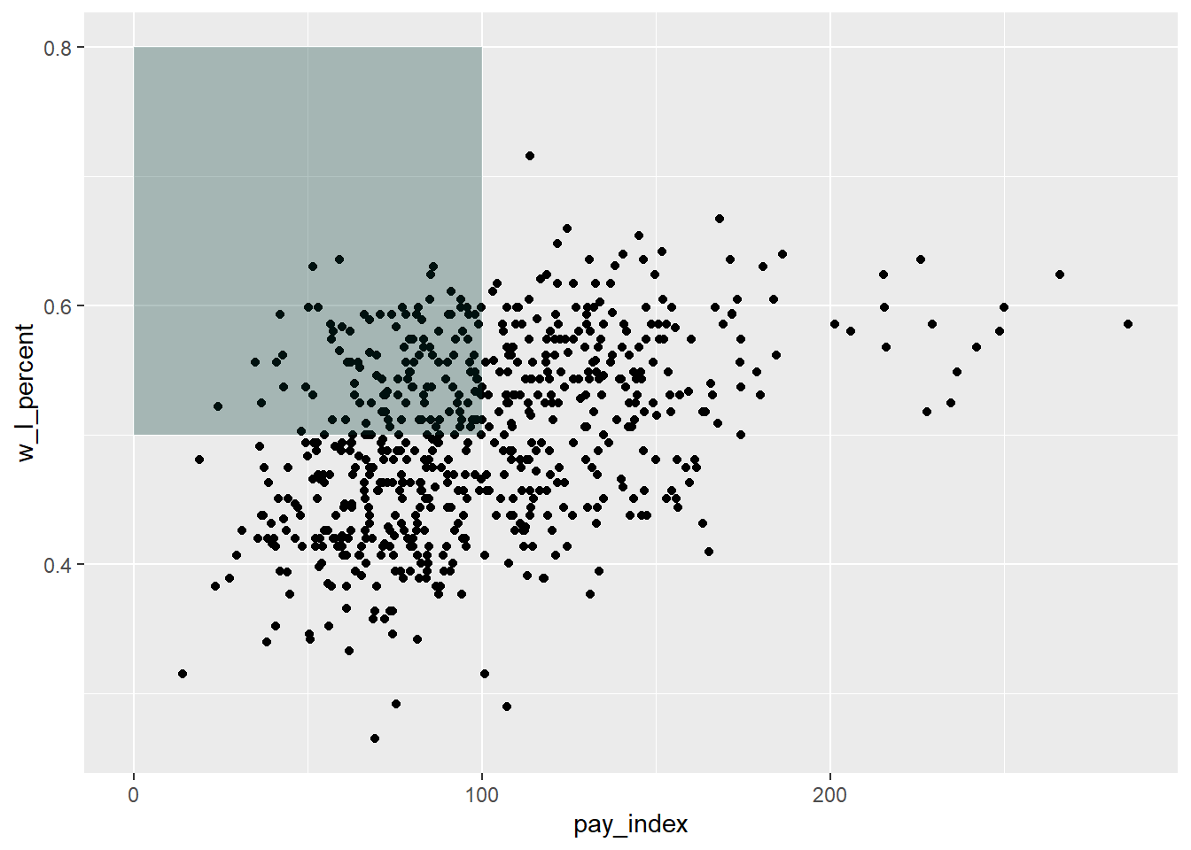
To that plot we might want to add a description of the quadrant that is shaded.
Note that in the label, the backslash-n is used to force a line break in the text string.
# as previously plotted
moneyball_plot +
  annotate("rect", xmin = 0, xmax = 100, ymin = 0.5, ymax = 0.8,
           alpha = .3, fill = "#003831") +
  # text annotation
  annotate("text",             # annotation type
           label = "Teams with\nbelow-average payroll\n& winning records",
           x = 5, y = 0.75,    # location of annotation
           hjust = 0,
           fontface = "bold",  # text formatting
           colour = "#ffffff")
20.5 Colour
Another way to tell the “Moneyball” story would be to identify the Oakland Athletics in the mass of dots shown, by using color. The code is in two steps:
first, create a subset of the main table that is only the Oakland data points
redraw the plot, adding a new
geom_point()layer. Note that the colour used is now the yellow-gold in the Athletic’s colour scheme, and the size of the points is specified to be slightly larger than the others.
oakland <- mlb_pay_wl |>
  filter(tm == "OAK")

moneyball_plot +
  geom_point(data = oakland, aes(x = pay_index, y = w_l_percent),
             colour = "#efb21e", size = 2)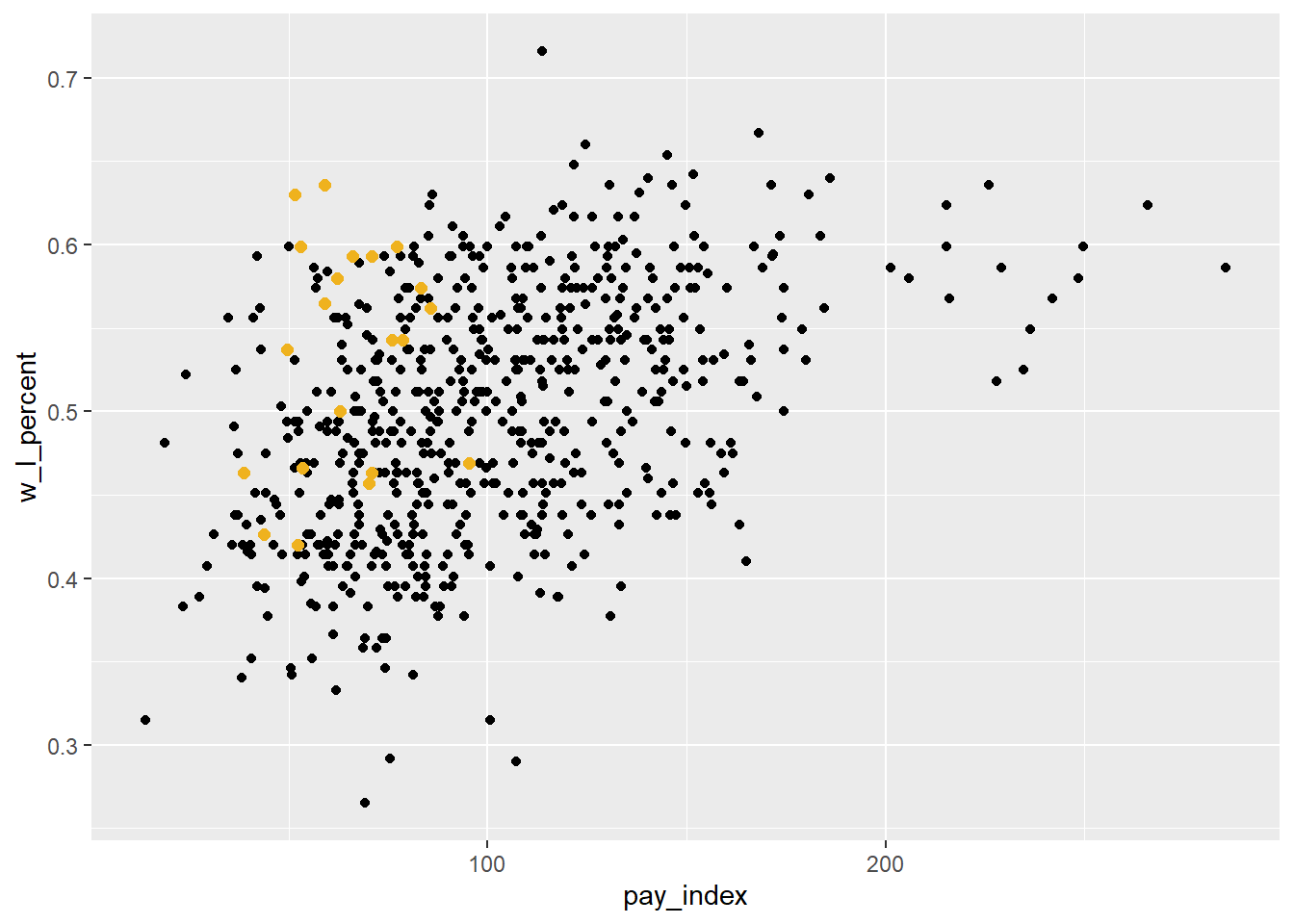
We might want to make other changes in this plot before including it in our publication.
In this version, the plot has a number of variations:
a light theme, using
theme_bw()pale gray points for all of the team points
green points for Oakland, using a named colour (“seagreen”)
adding the vertical and horizontal lines, but gray and lighter than the default
# create new version of plot with
# gray points on white background
ggplot(mlb_pay_wl, aes(x = pay_index, y = w_l_percent)) +
  geom_point(colour = "gray75") +
  theme_bw() +
  # Oakland points
  geom_point(data = oakland, aes(x = pay_index, y = w_l_percent),
             colour = "seagreen", size = 2) +
  geom_vline(xintercept  = 100, colour = "grey50", size = 0.75) +
  geom_hline(yintercept = 0.5, colour = "grey50", size = 0.75)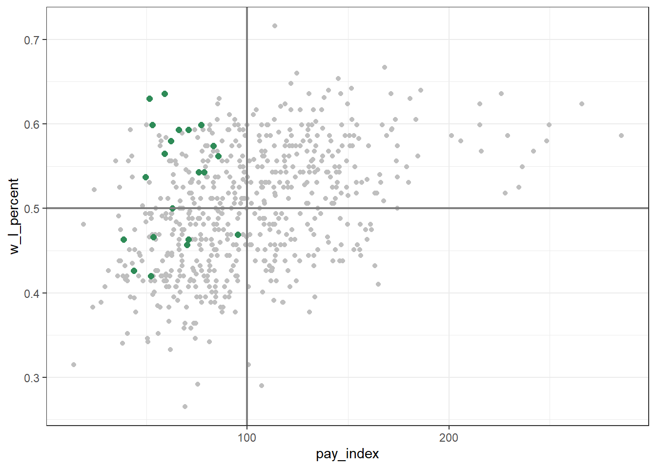
20.5.1 Colour palettes
There are many pre-defined colour palettes available when plotting in {ggplot2}.
(The {ggplot2} reference page that covers this is under “Scales” https://ggplot2.tidyverse.org/reference/index.html#section-scales))
An important thing to recognize (and this took me a long time to figure out!) is that how you specify the palette needs to match the type of variable that’s being represented by the colour. In general, they are either discrete (categories, such as factors or character strings) or continuous (a range of numbers).
First, let’s add “year_num” as a colour variable to a subset of our Moneyball plot.
Important: In this example, “year_num” is a specified as a “character” variable, it is therefore a discrete variable—but beware: if it had been read as a numeric variable, it would be continuous!
mlb_pay_wl |>
  filter(year_num > "2014") |>
  ggplot(aes(x = pay_index, y = w_l_percent, color = year_num)) +
  geom_point()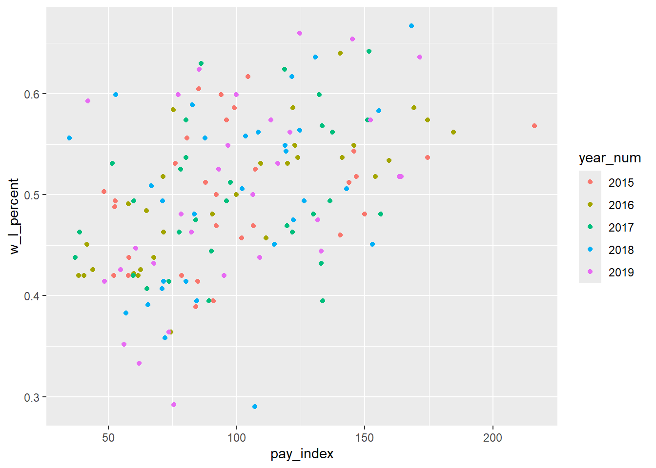
We can change the default palette in a number of ways. Below, we use one of the “ColorBrewer” palettes. These palettes are designed for discrete scales on maps14, but they translate well to data plotting. There are palettes for sequential, diverging, and qualitative colour scales.
A valuable reference is at R Graphics Cookbook, 2nd ed., “Using a Different Palette for a Discrete Variable”, which includes the names and images of a variety of palettes.
(See also http://colorbrewer2.org.)
And for even more information about the use of colorbrewer.org scales, see this page at the {ggplot} reference: https://ggplot2.tidyverse.org/reference/scale_brewer.html
mlb_pay_wl |>
  filter(year_num > "2014") |>
  ggplot(aes(x = pay_index, y = w_l_percent, colour = year_num)) +
  geom_point() +
  # add ColorBrewer palette
  scale_colour_brewer(palette = "Set1")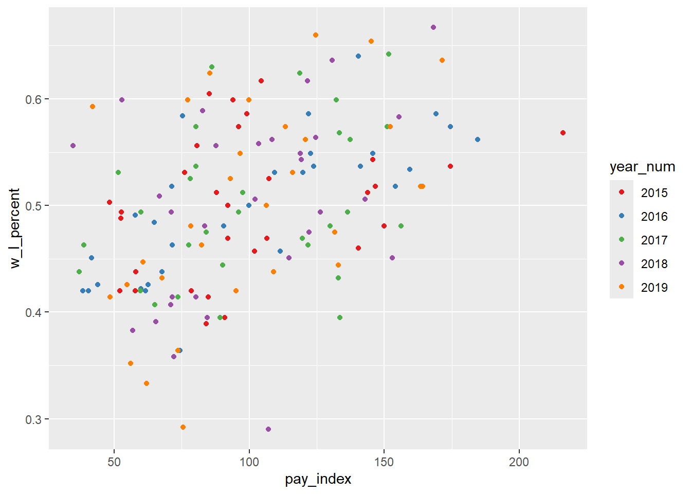
In the plots below, the average attendance is plotted as a colour aesthetic. Average attendance is a continuous variable, so we need to make sure our palette can represent that type.
The “ColorBrewer” palettes, while designed for discrete scales, can be adapted to a continuous scale (as we have here) by using one of the distiller scales, which interpolate the values between the discrete colours in the original scale.
ggplot(mlb_pay_wl, aes(x = pay_index, y = w_l_percent, color = attend_g)) +
  geom_point() +
  scale_color_distiller(palette = "Greens")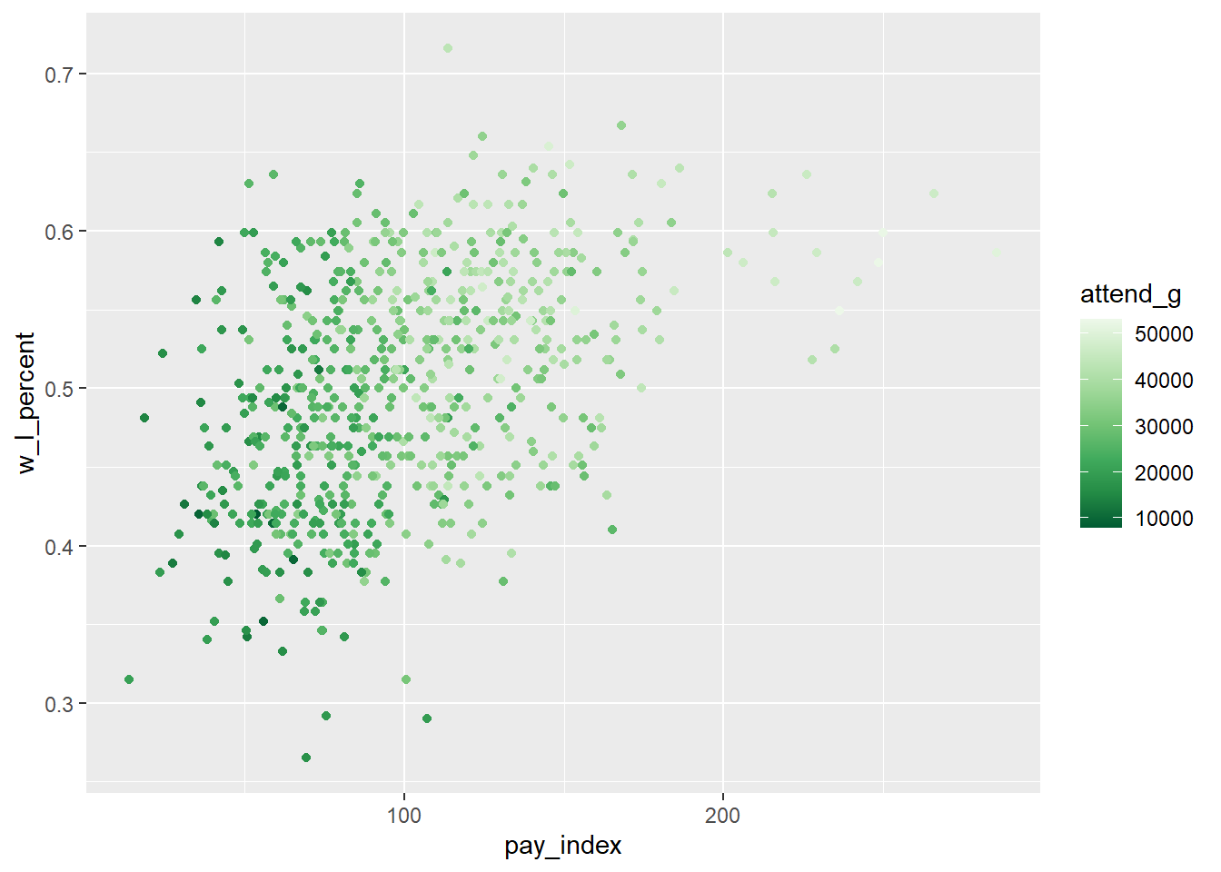
Another option is to use one of the viridis palettes. Note that in this case, the default scale has the largest value plotted as the lightest colour, which seems counter-intuitive to me, so I have added the direction = -1 argument to the scale_color_viridis_c() function.
ggplot(mlb_pay_wl, aes(x = pay_index, y = w_l_percent, color = attend_g)) +
  geom_point() +
  scale_color_viridis_c(direction = -1)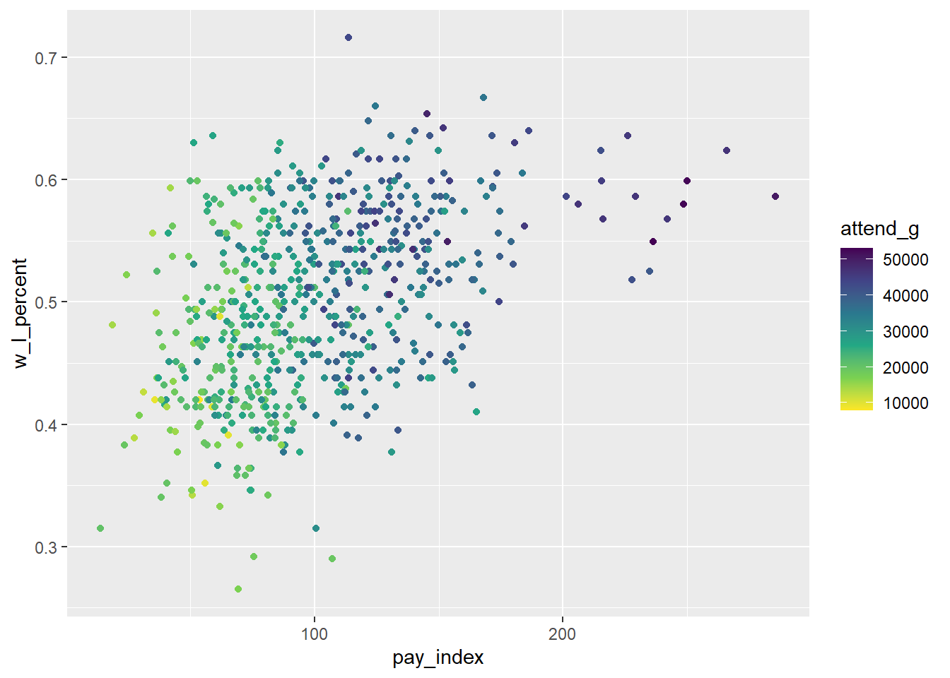
For more information about the viridis palettes, see R Graphics Cookbook, 2nd ed, “Using Colors in Plots: Using a Colorblind-Friendly Palette”
20.6 Axis modification
Fairly often when we are creating plots, we will want to modify the axes, and related to that, the grid lines.
For this examples, we will use the penguins data table from the {palmerpenguins} package. This plot is a step-by-step recreation of the “Flipper length vs. bill length” plot at the {palmerpenguins} reference page, with a couple of small tweaks.
First, we load the package and take a quick peak at the data. For this plot, the length of the bird’s flipper will be on the X axis, and the length of the bill on the Y.
library(palmerpenguins)

penguins
## # A tibble: 344 × 8
## species island bill_length_mm bill_depth_mm flipper_length_mm body_mass_g sex year
## <fct> <fct> <dbl> <dbl> <int> <int> <fct> <int>
## 1 Adelie Torgersen 39.1 18.7 181 3750 male 2007
## 2 Adelie Torgersen 39.5 17.4 186 3800 female 2007
## 3 Adelie Torgersen 40.3 18 195 3250 female 2007
## 4 Adelie Torgersen NA NA NA NA <NA> 2007
## 5 Adelie Torgersen 36.7 19.3 193 3450 female 2007
## 6 Adelie Torgersen 39.3 20.6 190 3650 male 2007
## 7 Adelie Torgersen 38.9 17.8 181 3625 female 2007
## 8 Adelie Torgersen 39.2 19.6 195 4675 male 2007
## 9 Adelie Torgersen 34.1 18.1 193 3475 <NA> 2007
## 10 Adelie Torgersen 42 20.2 190 4250 <NA> 2007
## # ℹ 334 more rows20.6.1 setup
We will plot the penguin’s flipper length on the X axis, and the bill length on the Y. We will also differentiate the three species of penguin using the colour and point shape. For the point, we will make them bigger than the default with size = 3 and slightly transparent with alpha = 0.8 (the default alpha is 1, and 0 is fully transparent).
Note that for this example, the theme is set to theme_minimal(). In the {palmerpenguins} package example, the function ggplot2::theme_set(ggplot2::theme_minimal()) is at the top of the page, and all the plots created after that have that them applied…this is a useful technique if you are making multiple plots in a document, because it allows you to apply a consistent theme to all of them.
flipper_bill <- ggplot(data = penguins,
                         aes(x = flipper_length_mm,
                             y = bill_length_mm)) +
  geom_point(aes(color = species,
                 shape = species),
             size = 3,
             alpha = 0.8) +
  theme_minimal()

flipper_bill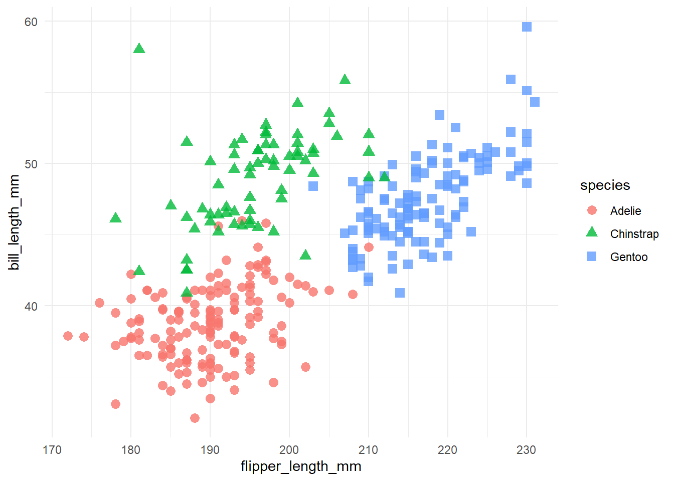
flipper_bill +
  theme(
    panel.background = element_rect(fill = "black")
  )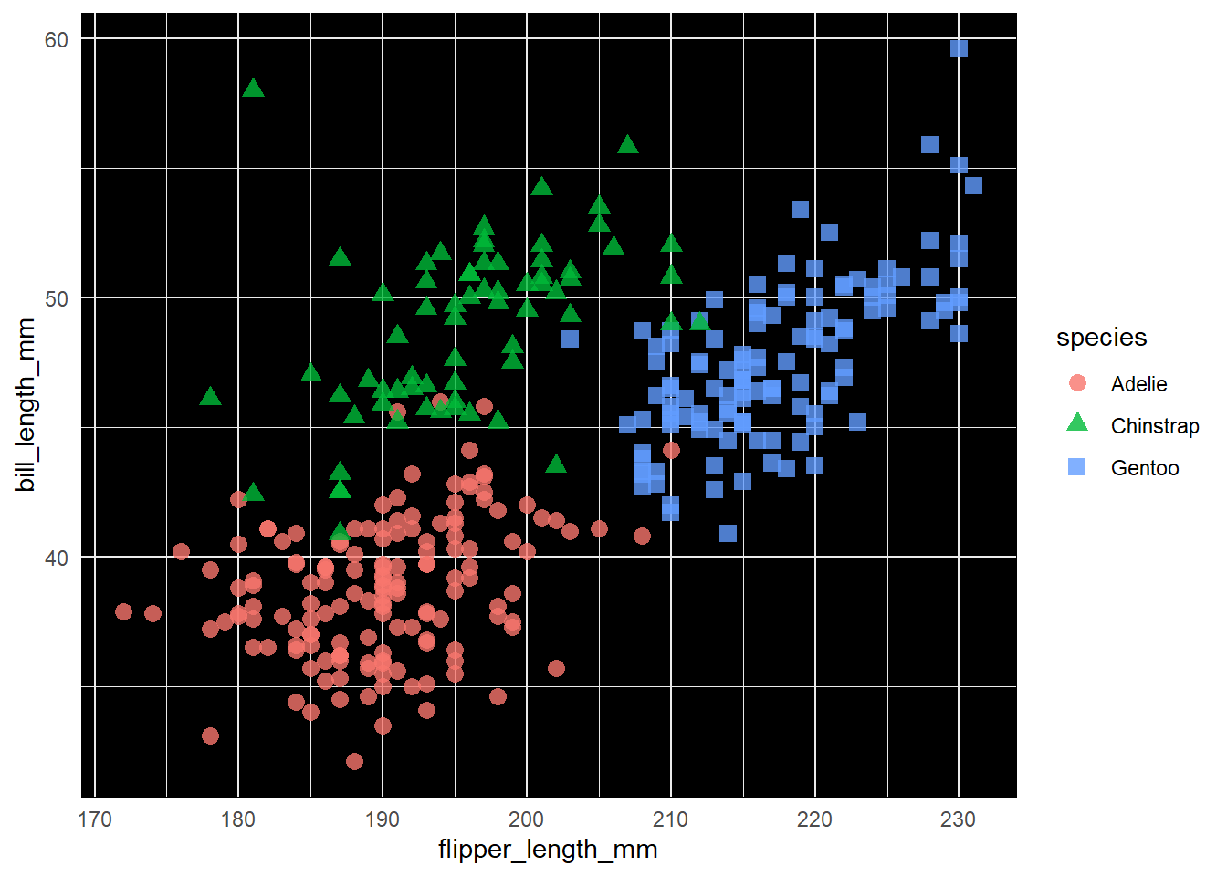
flipper_bill +
  theme(
    panel.background = element_rect(fill = "black"),
    panel.grid.minor = element_blank()
  )
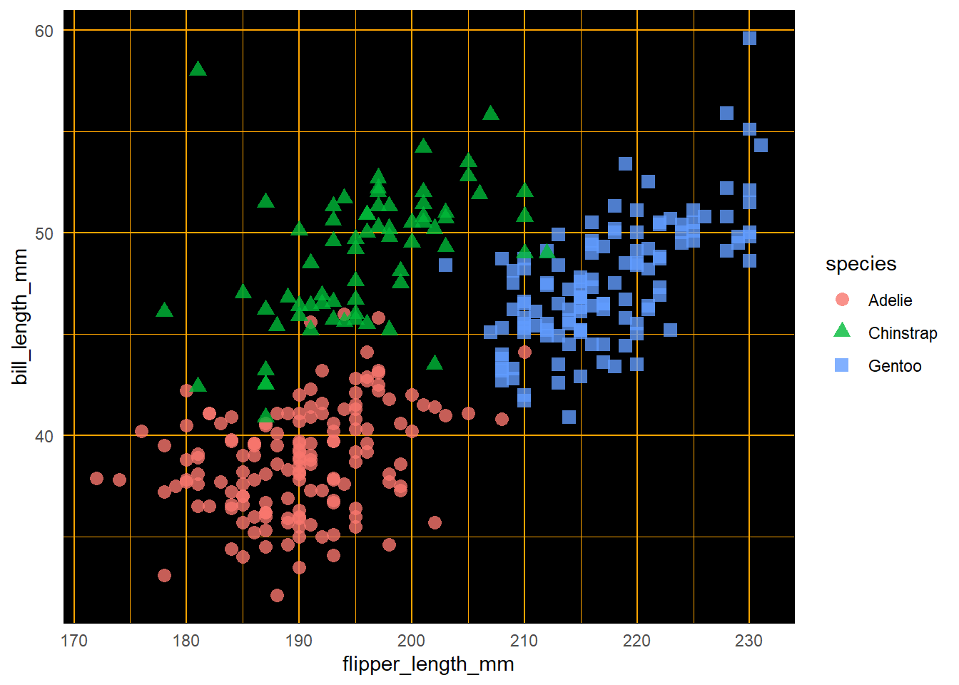
flipper_bill +
  theme(
    panel.background = element_rect(fill = "black"),
    panel.grid = element_line(colour = "orange")
  )
For the next step we will change the colour palette, using scale_colour_manual().
Remember that in the scale functions, the type of data matters—here we are working with a continuous variable, but if it’s a categorical variable, a “discrete” function will be required.
flipper_bill_2 <- flipper_bill +
  scale_color_manual(values = c("darkorange","purple","cyan4"))

flipper_bill_2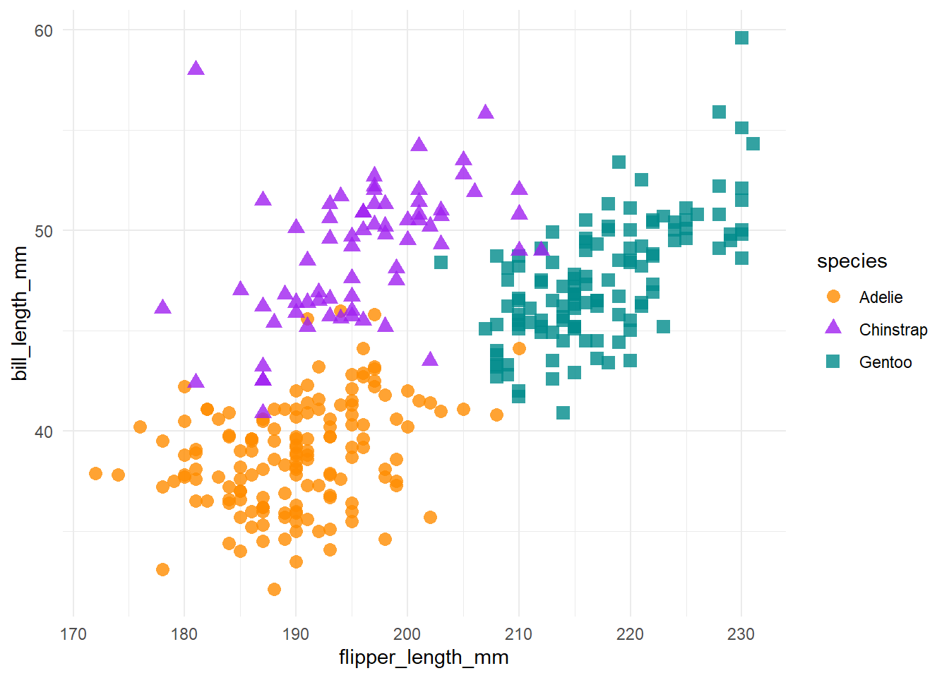
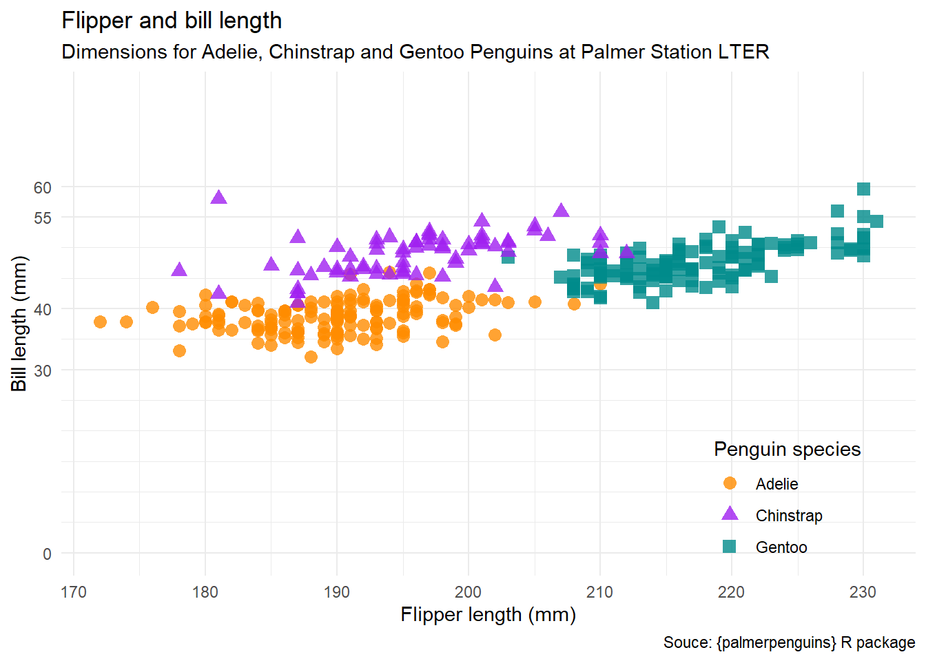
To that chart we will add a variety of titles with the labs() function.
In addition to the chart title and subtitle, the function also adds a caption at the bottom with the data source, and changes the text that appears on the axis and legend labels.
flipper_bill_3 <- flipper_bill_2 +
  labs(title = "Flipper and bill length",
       subtitle = "Dimensions for Adelie, Chinstrap and Gentoo Penguins at Palmer Station LTER",
       caption = "Souce: {palmerpenguins} R package",
       x = "Flipper length (mm)",
       y = "Bill length (mm)",
       color = "Penguin species",
       shape = "Penguin species")

flipper_bill_3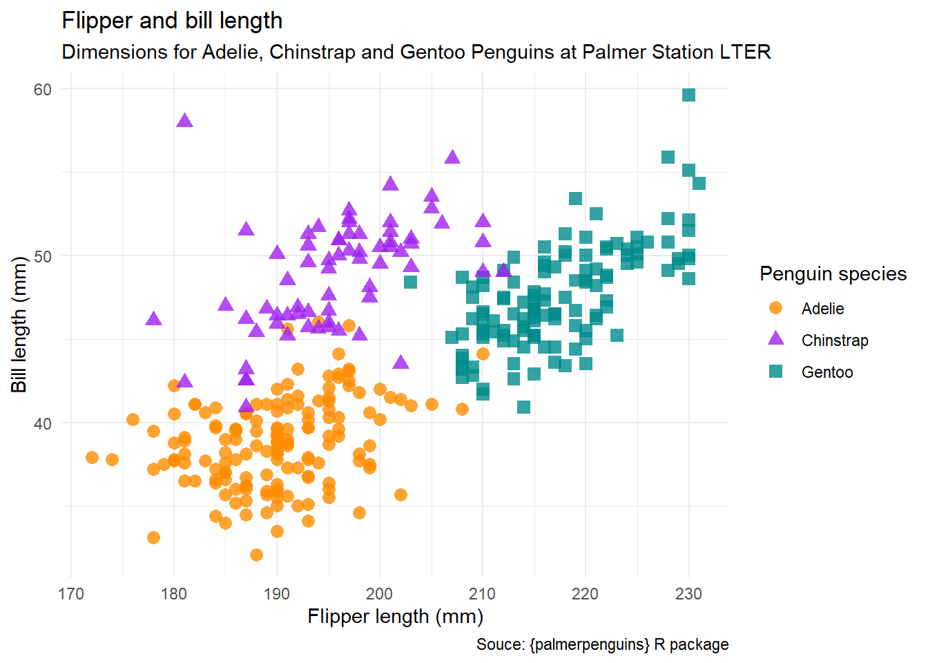
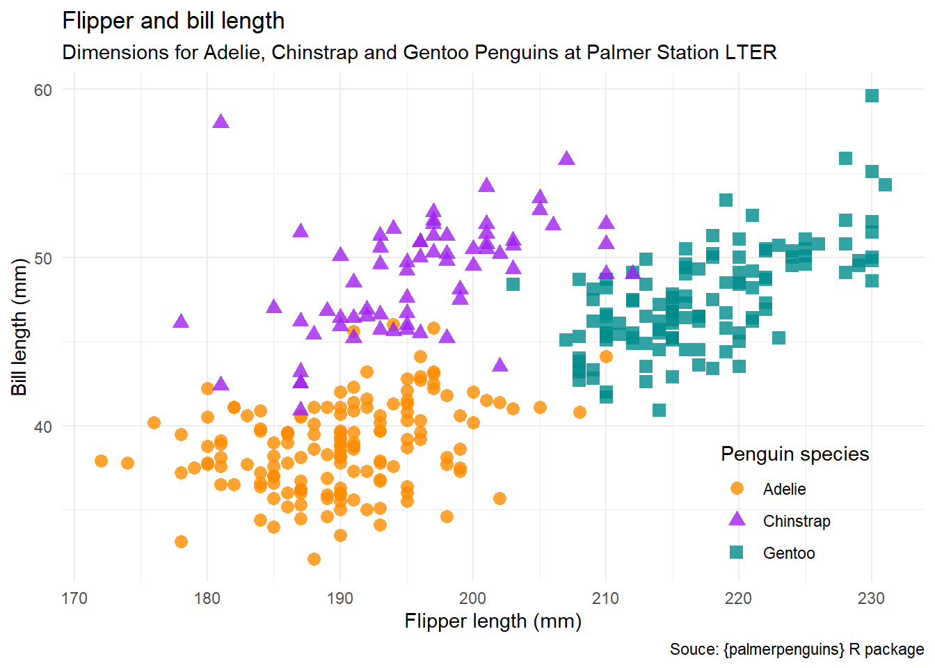
In this step, the legend is moved inside the plot, with the legend.position = argument, which provides the top left-hand corner of the legend will be located.. These coordinates are as a percentage of the axis range…“0.85” is 85% of the X axis length, and “0.15” is the height on the Y axis.
20.6.2 setting the range
One way to set the range (or limits) of an axes is to use the xlim() and ylim() functions, and specify what values we want to have for the starting and end points.
Note that in this example, the maximum value of the Y axis uses the max() function to get the largest value of the variable.
flipper_bill_4 +
  # set the range of the X axis from 100 to 250
  xlim(100, 250) +
  # set the range of the Y axis from 0 to the maximum value
  ylim(0, max(penguins$bill_length_mm))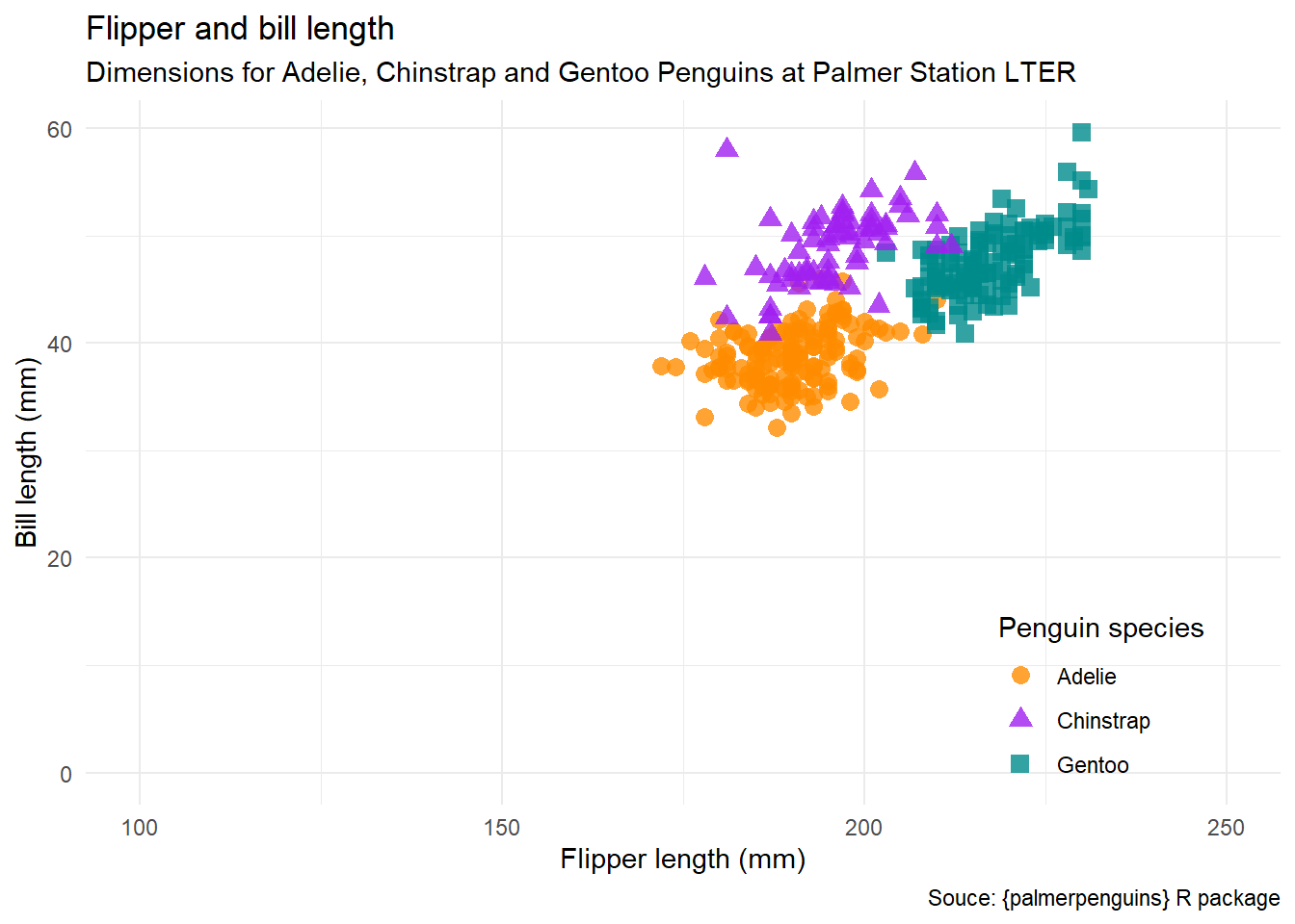
Another example: https://r-graphics.org/recipe-axes-range
ggplot reference page: https://ggplot2.tidyverse.org/reference/lims.html
We have much more control over the axes if we use the appropriate scale_() function.
ggplot reference: https://ggplot2.tidyverse.org/reference/index.html#scales
see also Andrew Heiss, “How to use natural and base 10 log scales in ggplot2”
In this plot, both of our axes are continuous variables, so we need scale_y_continuous() (as opposed to scale_y_discrete()). In this example, we will modify only the Y axis.
The
limits =argument sets the limits in the same way asylim().The
breaks =sets the points for the major gridlines and axis numbering. In this example, the values are stated explicitly.The
minor_breaks =sets the minor gridlines. Note the use of theseq()function to create a sequence that runs from 0 to 60 in steps of 5.
flipper_bill_4 +
  scale_y_continuous(
    limits = c(0, 75),
    breaks = c(0, 30, 40, 55, 60),
    minor_breaks = seq(0, 60, 5)
) 
To remove the minor breaks, we can set minor_breaks = NULL.
flipper_bill_4 +
  scale_y_continuous(
    limits = c(0, 75),
    breaks = c(0, 30, 40, 55, 60),
    minor_breaks = NULL
  )
The scale_() functions have even more options, including adding things like commas to your big numbers or percentage symbols, all using the labels = argument. See this example: https://ggplot2.tidyverse.org/articles/faq-axes.html
20.6.3 transform the scales of the axis
When we have scales with both small and large numbers, we may wish to incorporate a transformation of the values in our plots.
One type of transformation is a logrithmic scale, which is useful if you are dealing with a scale where there is a very large range of numbers. You can see this in the Hans Rosling Gapminder presentation “200 Countries, 200 Years”, where the equally-spaced breaks in the income variable (on the X axis) are shown as 0, 400, 4,000, and 40,000.
Here we will read a data file containing the population centres in British Columbia.
(Source: Wikipedia, “List of population centres in British Columbia” via Statistics Canada, Census of Population)
ggplot(population_centres_bc, aes(x = population_2021, y = population_density_2021)) +
  geom_point()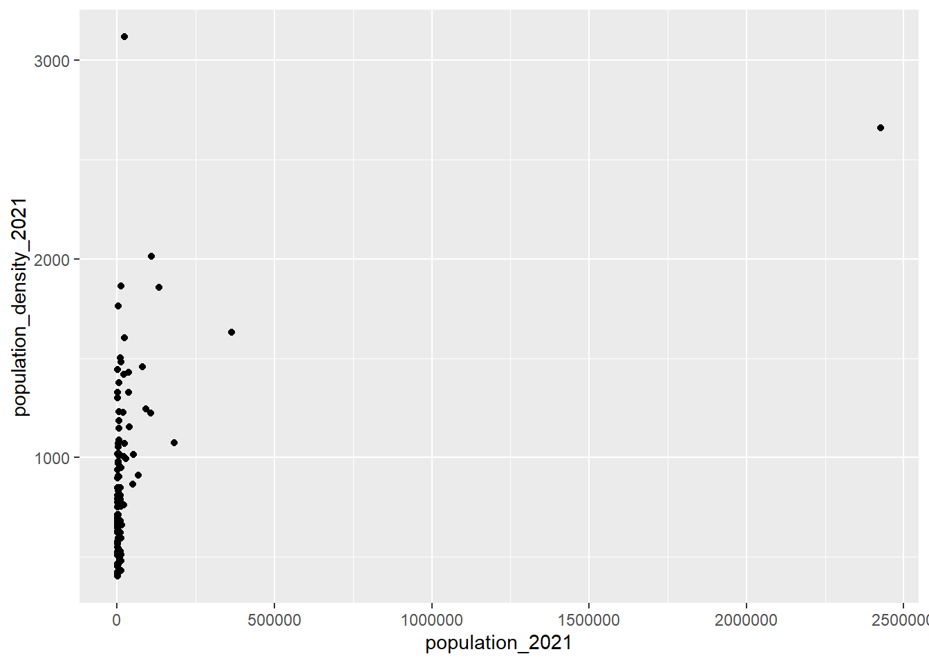
By adding scale_x_log10(), how the values on the X axis are displayed is transformed. Now there is an equal distance between 1,000 (the smallest community) and 10,000 as there is between 100,000 and 1,000,000.
ggplot(population_centres_bc, aes(x = population_2021, y = population_density_2021)) +
  geom_point() +
  scale_x_log10()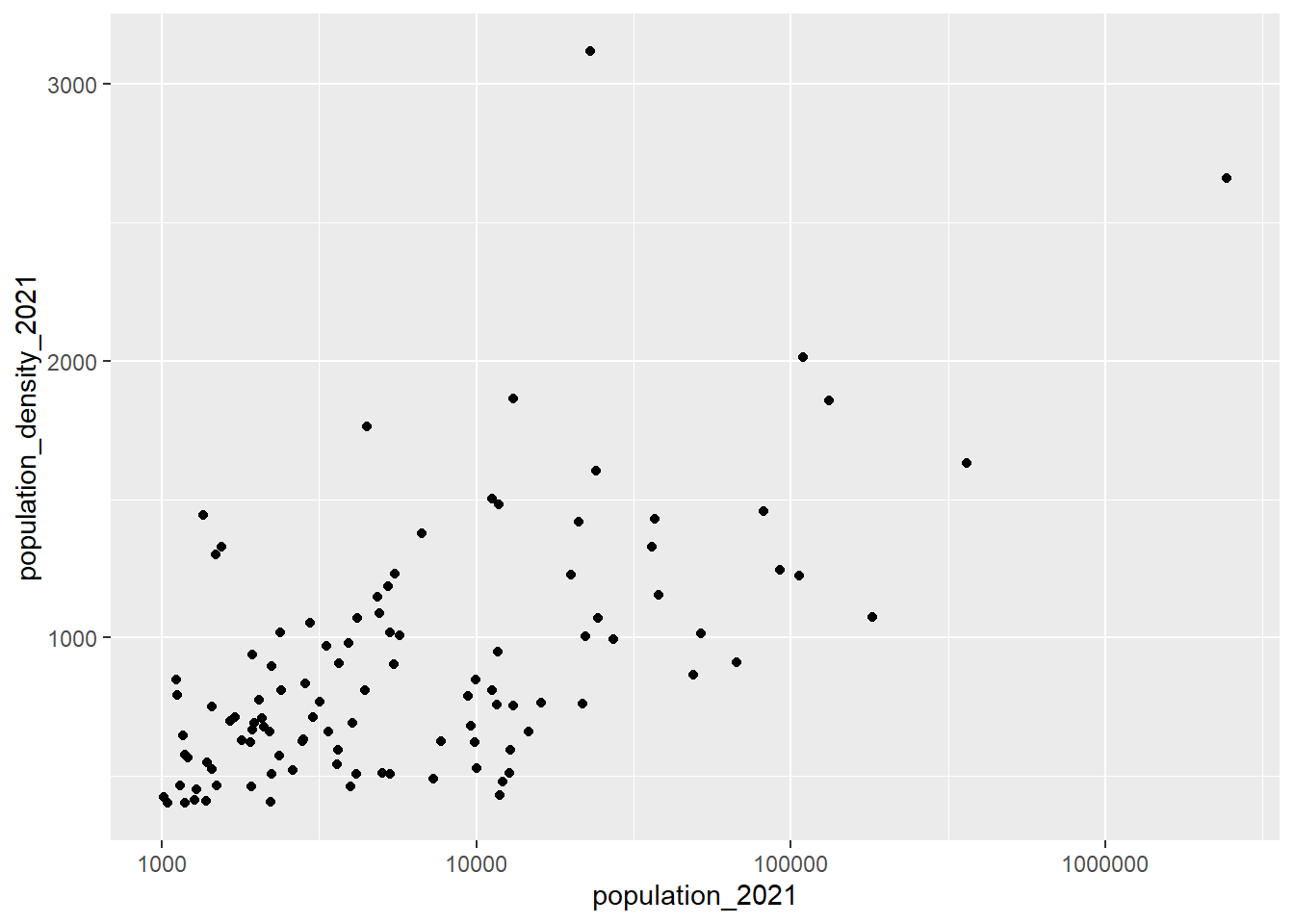
For more information about modifying the axes, see
The ggplot FAQ: https://ggplot2.tidyverse.org/articles/faq-axes.html
Andrew Heiss, 2022-12-08, “How to use natural and base 10 log scales in ggplot2”
20.7 Reading & reference
Hadley Wickham, Mine Çetinkaya-Rundel, and Garrett Grolemund, R for Data Science
20.7.1 {ggplot2} extensions
Depending on the type of plot you want to make, {ggplot2} by itself might not have the functionality to do everything. Developers around the world have been creating extensions that add even more functions that integrate with the plot created using the ggplot() function.
A full list of {ggplot2} extensions can be found here: https://exts.ggplot2.tidyverse.org/
The {ggforce} package is one that adds some powerful extensions, notably in the area of annotations:
{ggforce} reference page: https://ggforce.data-imaginist.com/
{ggforce} examples: Edgar Ruiz, (“Accelerate your plots with ggforce”)[https://rviews.rstudio.com/2019/09/19/intro-to-ggforce/]
Thomas Lin Pedersen, (“ggforce: Visual Guide”)[https://cran.microsoft.com/snapshot/2019-03-14/web/packages/ggforce/vignettes/Visual_Guide.html]
20.7.2 Animated plots
If you are interested in exploring animated plots (similar to Hans Rosling’s gapminder visualizations), here are some resources for using the {gganimate} package:
-
{gganimate} reference page
Gina Reynolds, “Racing Barchart with gganimate”
Emily E. Kuehler, “Barchart Races With gganimate”
Animated line chart transition with R at the R Graph Gallery
Alboukadel, “gganimate: How to Create Plots With Beautiful Animation in R”
20.7.3 More ggplot2 plotting resources
Paul Teetor & JD Long, R Cookbook, 2nd ed.: Graphics
Winston Chang, R Graphics Cookbook, 2nd ed., 2021 is a great resource with examples and explanations as to how to get the result you’re looking for. (Chang 2018)
Kieran Healy, Data Visualization: A Practical Introduction combines both the “why” of good data visualization with the “how” in R, primarily using {ggplot2}. If I was teaching a longer course dedicated to data visualization using R, this would be the text book. (Healy 2019)
Isabella Benabaye, ggplot2 Theme Elements Reference Sheet (2020-05-19)—note that there’s a PDF version of the annotated plot.
R-charts—“code examples of R graphs made with base R graphics, ggplot2 and other packages.”
R Graph Gallery—“a collection of charts made with the R programming language. Hundreds of charts are displayed in several sections, always with their reproducible code available. The gallery makes a focus on the tidyverse and ggplot2.”
-
BBC Visual and Data Journalism cookbook for R graphics—the BBC uses R and {ggplot2} to make publication-ready data visualizations. This cookbook gives examples and the code behind some different chart types.
- Many other organizations are using R and {ggplot2} to create plots for their publications, including the Financial Times.
20.7.4 More general plotting resources
Note: this exercise does not delve into the question of how to design your plot. The structure, use of colour, annotations, and other plot elements can significantly improve the impact of a plot. See Kieran Healy’s book above, as well as
-
Claus O. Wilke, (Fundamentals of Data Visualization)(Wilke 2019)
-
Cole Nussbaumer Knaflic, Storytelling with Data: A Data Visualization Guide for Business Professionals (Knaflic 2015)
-
Jim Stikeleather’s series of three articles in the Harvard Business Review make a good summary of effective data visualizations:
“When Data Visualization Works — And When It Doesn’t”, Harvard Business Review, 2013-03-27
“The Three Elements of Successful Data Visualizations”, Harvard Business Review, 2013-04-19
“How to Tell a Story with Data”, Harvard Business Review, 2013-04-24
-
For a deeper dive, you might want to read Matthew Ström’s blog post “How to pick the least wrong colors: An algorithm for creating color palettes for data visualization” (2022-05-31)
- “The problem boiled down to this: how do I pick nice-looking colors that cover a broad set of use cases for categorical data while meeting accessibility goals?”
20.7.5 Data visualization books
Unfortunately these don’t have a free online version, but are worth finding your local library or bookstore:
Stephanie Evergreen, Presenting Data Effectively: Communicating Your Findings for Maximum Impact (Evergreen 2014)
Scott Berinato, Good Charts: The HBR Guide to Making Smarter, More Persuasive Data Visualizations (Berinato 2023)
-30-