12 More data visualization
12.1 Setup
This chunk of R code loads the packages that we will be using.
Graphs and charts let you explore and learn about the structure of the information you collect. Good data visualizations also make it easier to communicate your ideas and findings to other people. - Kieran Healy, Data Visualization: A Practical Introduction (2019)
What’s covered in this short exercise barely scratches the surface of what’s possible in the {ggplot2} package. We will delve deeper into plotting in [communication-plot].
12.2 Plot types
When we seek to visualize our data, we are confronted with the realization that there are many different ways to do that—there are many different plot types. How can we go about deciding what sort of plot to choose?
Your decision should be based on the answer to the question “What is the chart going to show?”
In this exercise, we will look at four common plot types.
scatterplots (as we used with the Anscombe’s Quartet data) show correlations between two continuous variables
bar charts (and the type that is known as a dot plot or a Cleveland dot plot) are good for showing the difference between categories
histograms show the distribution of cases that are measured on a continuous scale and are then categorized by bins of the same size
line plots are good for showing the change of a value over time
After we have explored how to build those, we move on to some basic plot formatting.
12.3 Scatterplot
(See Creating a Scatter Plot) in the R Graphics Cookbook
We’ve seen scatterplots in Anscombe’s Quartet, but here’s another example using the {palmerpenguins} data, which has a variety of measurements from some penguins near the Palmer Research Station in Antartica.
penguins## # A tibble: 344 × 8
## species island bill_length_mm bill_depth_mm flipper_length_mm body_mass_g sex year
## <fct> <fct> <dbl> <dbl> <int> <int> <fct> <int>
## 1 Adelie Torgersen 39.1 18.7 181 3750 male 2007
## 2 Adelie Torgersen 39.5 17.4 186 3800 female 2007
## 3 Adelie Torgersen 40.3 18 195 3250 female 2007
## 4 Adelie Torgersen NA NA NA NA <NA> 2007
## 5 Adelie Torgersen 36.7 19.3 193 3450 female 2007
## 6 Adelie Torgersen 39.3 20.6 190 3650 male 2007
## 7 Adelie Torgersen 38.9 17.8 181 3625 female 2007
## 8 Adelie Torgersen 39.2 19.6 195 4675 male 2007
## 9 Adelie Torgersen 34.1 18.1 193 3475 <NA> 2007
## 10 Adelie Torgersen 42 20.2 190 4250 <NA> 2007
## # ℹ 334 more rowsThe question we are asking might be “Is there a relationship between the length of a bird’s flipper and their weight?” In our data, flipper length (in millimeters) is reported in the variable flipper_length_mm. For weight, we use body_mass_g, which is measured in grams.
A visualization of the relationship (the correlation) between these two variables would be shown using a scatterplot.
The {ggplot2} code for this is below:
ggplot(data = penguins,
       aes(x = flipper_length_mm, y = body_mass_g)) +
  geom_point()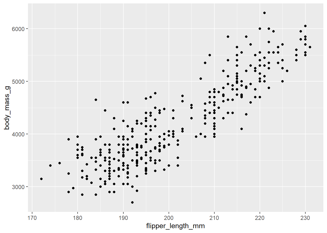
With this plot, we can overlay a straight line (the line of best fit calculated through a regression equation).
ggplot(data = penguins,
       aes(x = flipper_length_mm, y = body_mass_g)) +
  geom_point() +
  geom_smooth(method = "lm")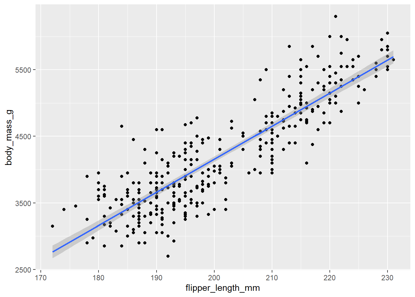
This plot show that birds with longer flippers do indeed weigh more.
12.4 Bar chart
(See Creating a Bar Graph) in the R Graphics Cookbook
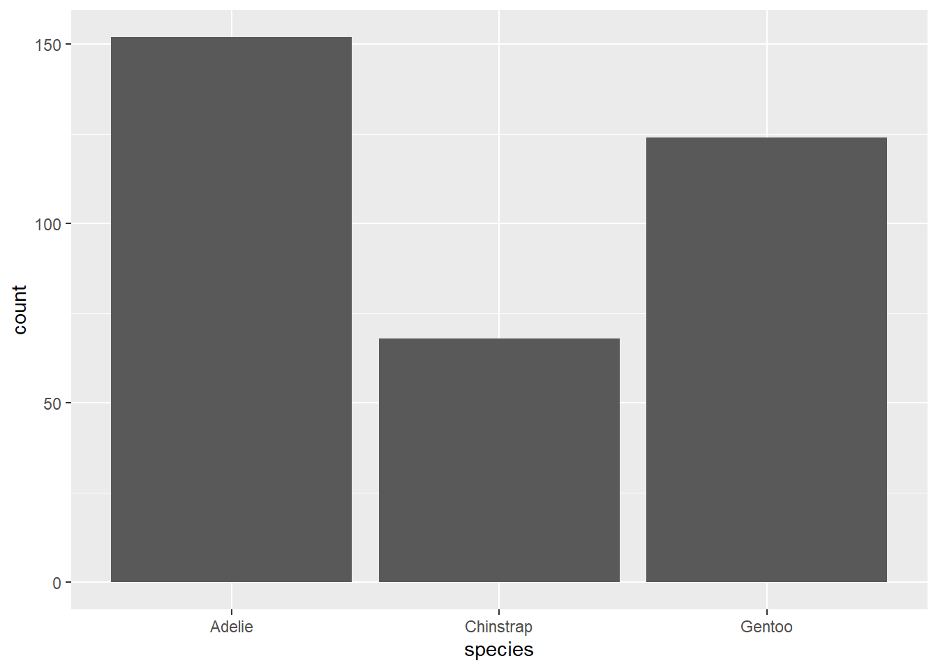
Bar charts are good for showing the difference between categories.
The first bar will show the number of birds (that is, rows) of each species. Note that there is only an x = variable: the value shown on the y axis, “count”, is calculated for us.
12.4.1 Bar by another variable
In bar plots, we sometimes want to show a value other than the count of cases.
In this example, we first calculate the average length of the bird’s bill by species and then plot those values. The n value calculated in the summarise() function is the count of the number of cases in each class, which is to say, the same values shown in the bar chart above.
(Note that we have to use na.rm = TRUE in the calculation of mean bill length, in order to remove the NA values that appear in the variable bill_length_mm.)
# the summary data table
penguin_species_bill <- penguins |>
  group_by(species) |>
  summarise(n = n(),
            bill_length_mean = mean(bill_length_mm, na.rm = TRUE))

penguin_species_bill
## # A tibble: 3 × 3
## species n bill_length_mean
## <fct> <int> <dbl>
## 1 Adelie 152 38.8
## 2 Chinstrap 68 48.8
## 3 Gentoo 124 47.5To show the bill_length_mean value as the height of the bars, we use the geom_col() function:
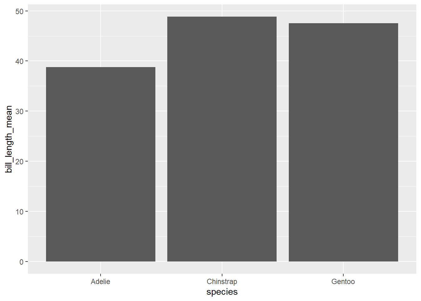
Note that the bars are arranged alphabetically, starting with Adelie.
Sorting categorical visualizations is often a useful way to demonstrate the differences between the categories. Here we add a reorder() argument to the x variable. You could read this as “reorder the variable”species” by the values in “bill length”.
ggplot(penguin_species_bill,
       aes(x = reorder(species, bill_length_mean),
           y = bill_length_mean)) +
    geom_col()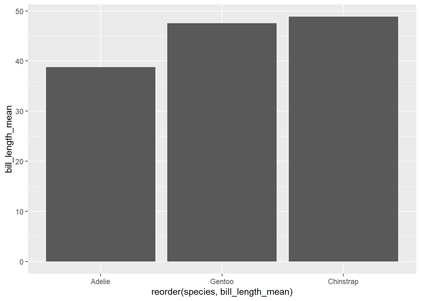
12.4.1.1 Exercise
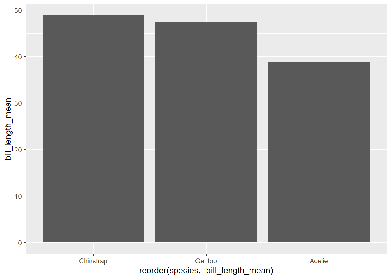
What happens if you were to add a minus sign (hyphen) in front of the bill_length_mean of the reorder() function?
12.4.2 Cleveland dot plot
(See Making a Cleveland Dot Plot) in the R Graphics Cookbook
Another way to show the same values as above is the “Cleveland dot plot”, which uses a point for the top of the column and a line to show its length. These plots are less cluttered, and particularly when there are many variables are easier to read.
In {ggplot2}, the code to visualize the same data with a point as the geom would be:
ggplot(penguin_species_bill,
       aes(x = reorder(species, -bill_length_mean),
           y = bill_length_mean)) +
  geom_point() +
  # add the line
  geom_segment(aes(xend = species), yend = 0) +
  # extend the limits of the Y axis from zero to 50
  ylim(0, 50)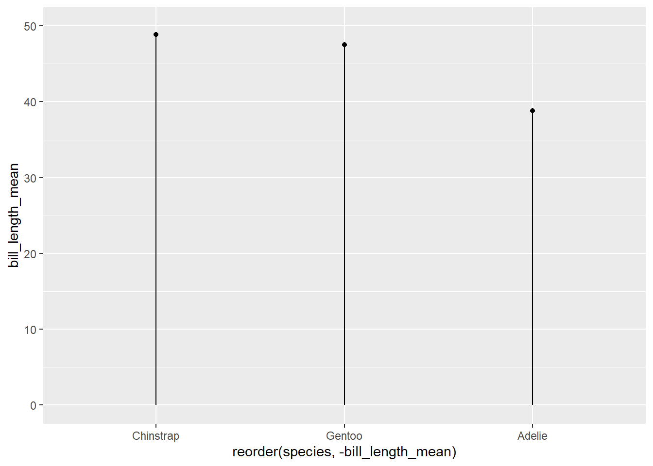
A variation on the Cleveland dotplot is the dumbell chart, which can be an effective way to show a change. The “Make a dumbbell chart” entry at the BBC Visual and Data Journalism cookbook for R graphics gives an example using {gapminder} data.
12.5 Histogram
(See Creating a Histogram) in the R Graphics Cookbook
Histograms show the distribution of cases that are measured on a continuous scale and are categorized by bins of the same size
In this example, we want to see the number of penguins by their weight.
ggplot(penguins, aes(x = body_mass_g)) +
  geom_histogram()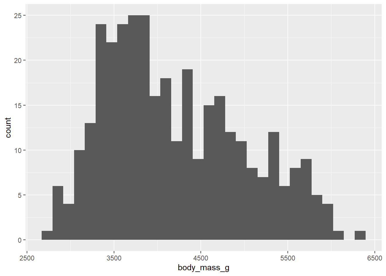
In that version, we end with 30 thin categories—what are called “bins”.
When you create a histogram without specifying the bin width, ggplot() prints out a message telling you that it’s defaulting to 30 bins, and to pick a better bin width. This is because it’s important to explore your data using different bin widths; the default of 30 may or may not show you something useful about your data. (_R)
We might adjust the number of bins, using the bins = argument within the geom_histogram() function:
ggplot(penguins, aes(x = body_mass_g)) +
  geom_histogram(bins = 16)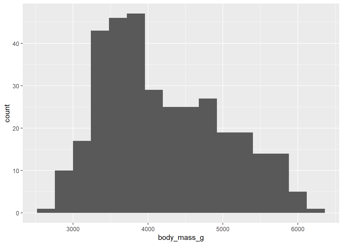
We can also specify the width of the bins in the geom_histogram() function, using the units of the variable to be plotted. Let’s check the appearance of bins that are 500 units (in this case, 500 grams from body_mass_g) wide.
ggplot(penguins, aes(x = body_mass_g)) +
  geom_histogram(binwidth = 500)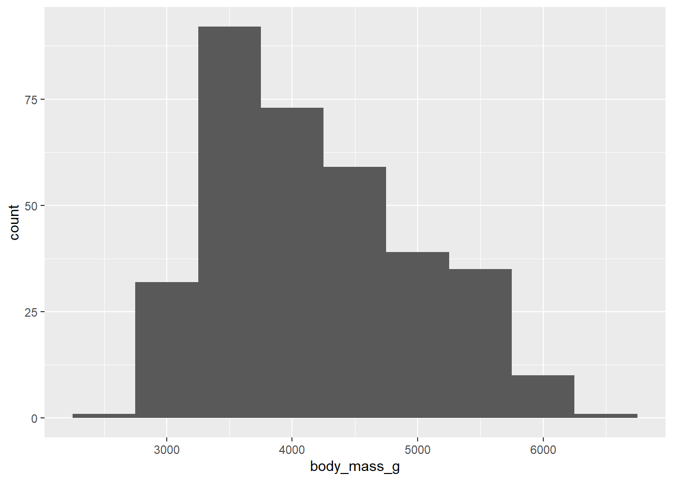
12.5.1 Stacked histogram
The histogram above shows the distribution of weights of all of the penguins. We can also show the species as different colours, by adding “species” to the aes() mappings.
Note that what we want is fill =. As we saw in the scatterplot example, colour = works for points (and below we will see it used for lines), but not the interior of bars.
ggplot(penguins, aes(x = body_mass_g, fill = species)) +
  geom_histogram(binwidth = 500)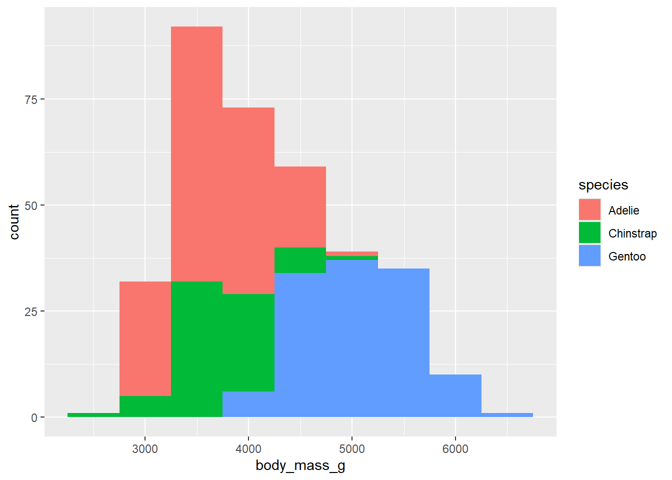
The same approach could be used for bar and column plots.
12.6 Line graph
- (See Line Graphs) in the R Graphics Cookbook
Line plots are good for showing the change of a value of a variable (shown on the Y axis) over time (which is shown on the X axis).
In this example, we will use the gapminder data to show the increase in life expectancy in Canada.
# first, filter the data to have just the records from Canada
gapminder |>
  filter(country == "Canada") |>
  # now plot
  ggplot(aes(x = year, y = lifeExp)) +
    geom_line()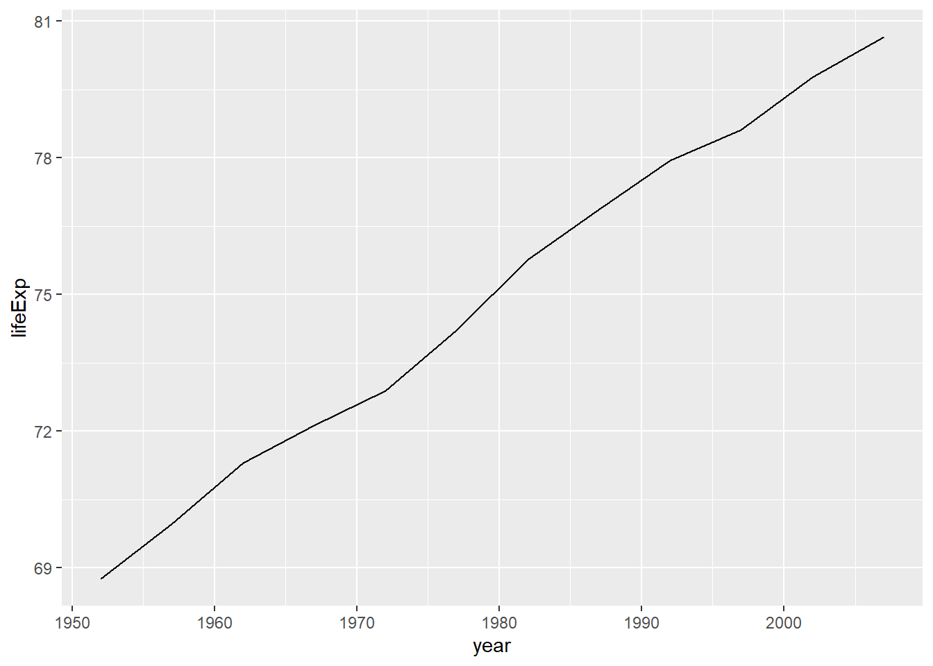
A more complex version of the plot could compare three separate countries.
# first, filter the data to have just the records from Canada
gapminder |>
  filter(country %in% c("Canada", "Japan", "China")) |>
  # now plot
  ggplot(aes(x = year, y = lifeExp, colour = country)) +
    geom_line()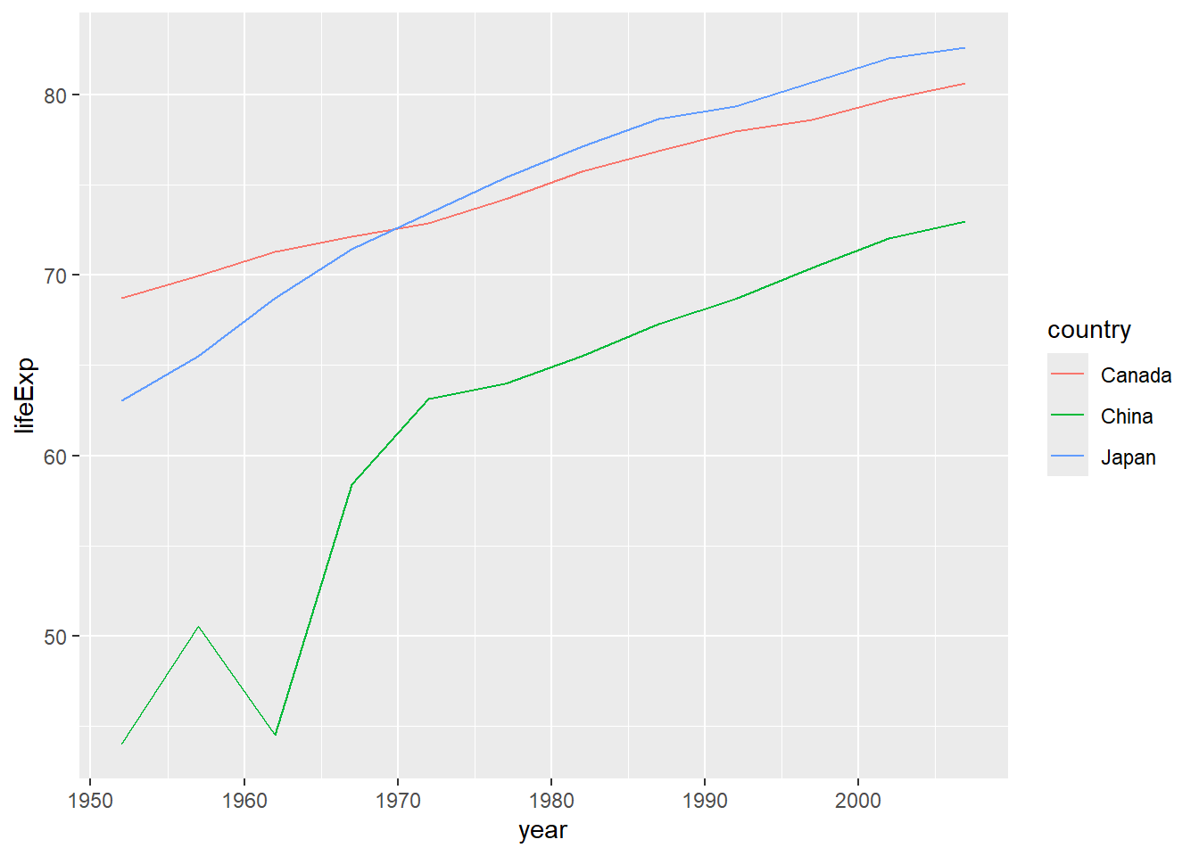
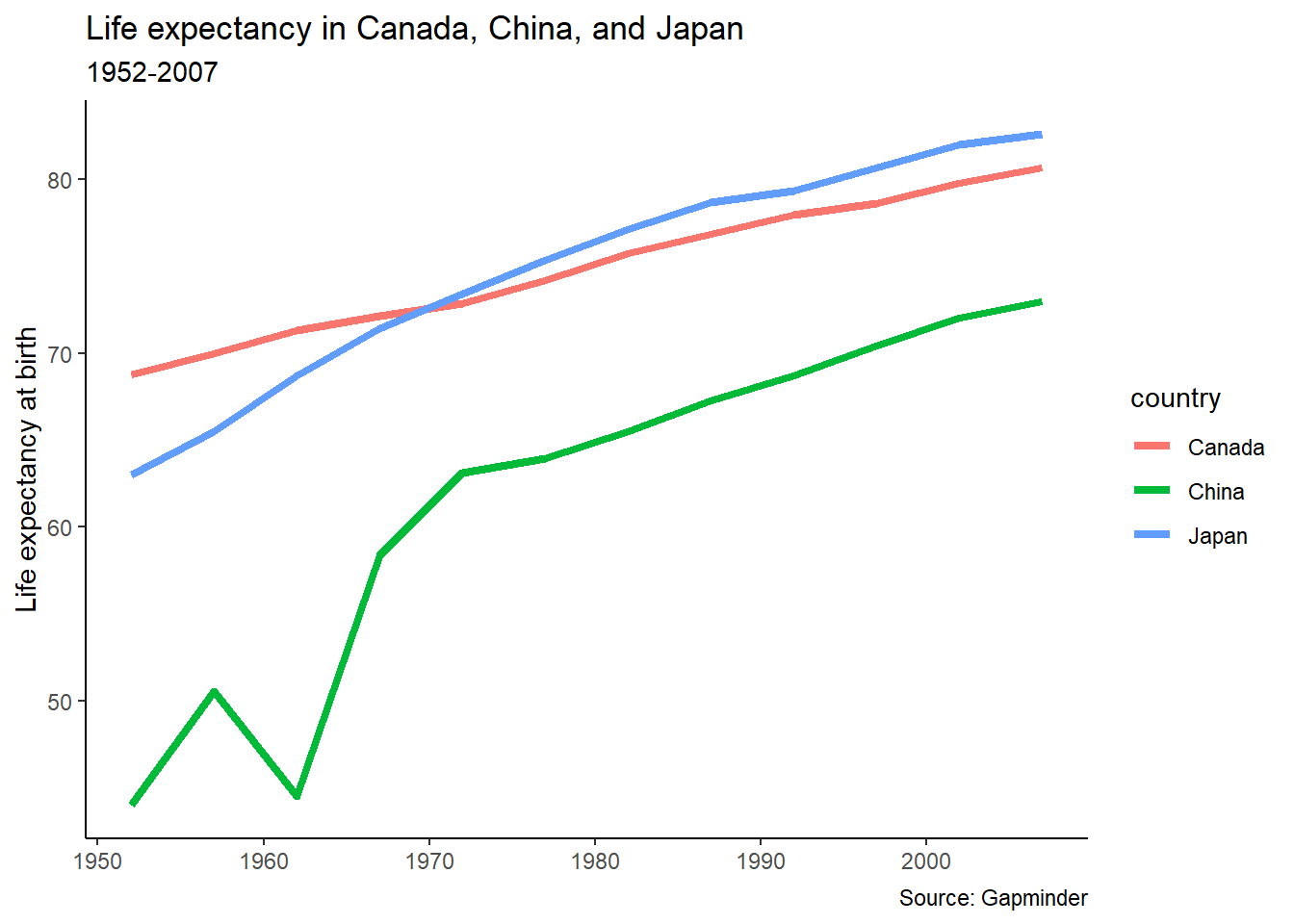
In this plot, we see that in 1950, life expectancy was higher in Canada than the other two countries, but by the early 1970s Japanese people had longer life expectancy. Now, Japanese people have the longest life expectancy of any country in the world.7
While China still has a lower life expectancy than both, “China’s growth in life expectancy between 1950 and 1980 ranks as among the most rapid sustained increases in documented global history.”8
12.7 Formatting our plot
The plot of life expectancy shown above uses the default formatting of {ggplot2}. While the default is not terrible, there are some things we can do to get the plot ready for presentation.
In R, one of the things we can do is assign things to an object—and we can do the same with our plots. Here, the output of our plotting call will be assigned to an object called pl_lifeexp (my shorthand for “plot: life expectancy”). This code will create the object and store it in the environment, but not display it.
This code has one change from what’s above—the line size is defined as “1.5” to make it a bit heavier and therefore more visible.
pl_lifeexp <-
# first, filter the data to have just the records from Canada
gapminder |>
  filter(country %in% c("Canada", "Japan", "China")) |>
  # now plot
  ggplot(aes(x = year,
             y = lifeExp,
             colour = country)) +
    geom_line(size = 1.5)
12.7.1 Labels: titles etc
We can now use that plot object and add some formatting. The first thing the plot needs is some text to tell us what it is. For that, we use the labs() function.
The labs() also allows us to change the labels on the x and y axis. For this chart, the year is self-evident, so there’s no need to label it. We us “NULL” to remove it.
- See the {ggplot2} reference page “Modify axis, legend, and plot labels”
pl_lifeexp +
  labs(title = "Life expectancy in Canada, China, and Japan",
       subtitle = "1952-2007",
       caption = "Source: Gapminder",
       y = "Life expectancy at birth",
       x = NULL)
Nice. We could have/should have assigned that to an object, since there’s still more we can do.
pl_lifeexp <- pl_lifeexp +
  labs(title = "Life expectancy in Canada, China, and Japan",
       subtitle = "1952-2007",
       caption = "Source: Gapminder",
       y = "Life expectancy at birth",
       x = NULL)

pl_lifeexp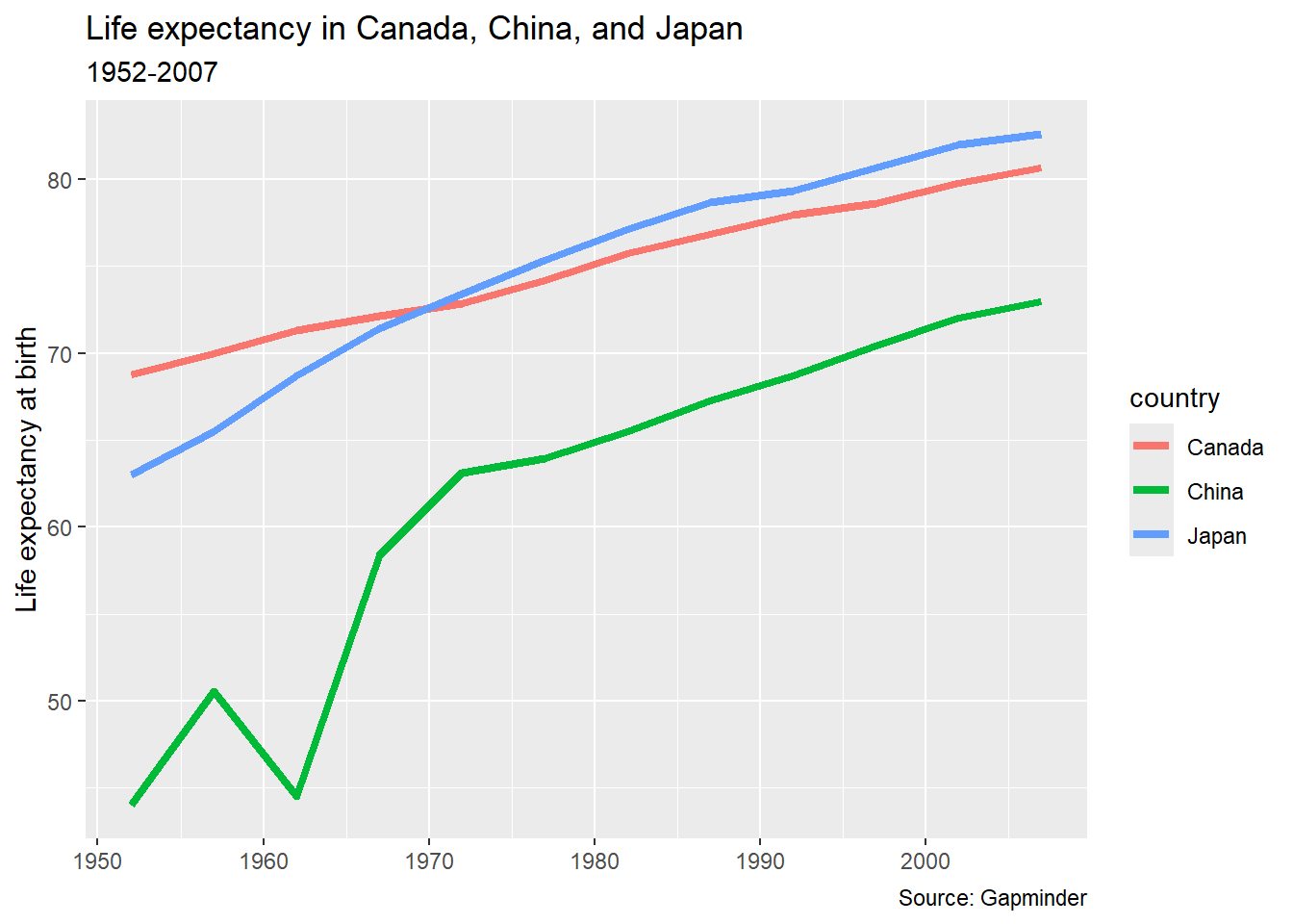
12.7.2 Themes
The theme() function controls “the display of all non-data elements of the plot.” Everything from the axis ticks to the background of the legend can all be modified within this theme.
{ggplot2} has some built-in themes, controlling all of those things, which can be very useful in formatting.
The default theme is called theme_gray() (or theme_grey()). Here’s theme_bw() (for “black and white”) applied to our chart:
pl_lifeexp +
  theme_bw()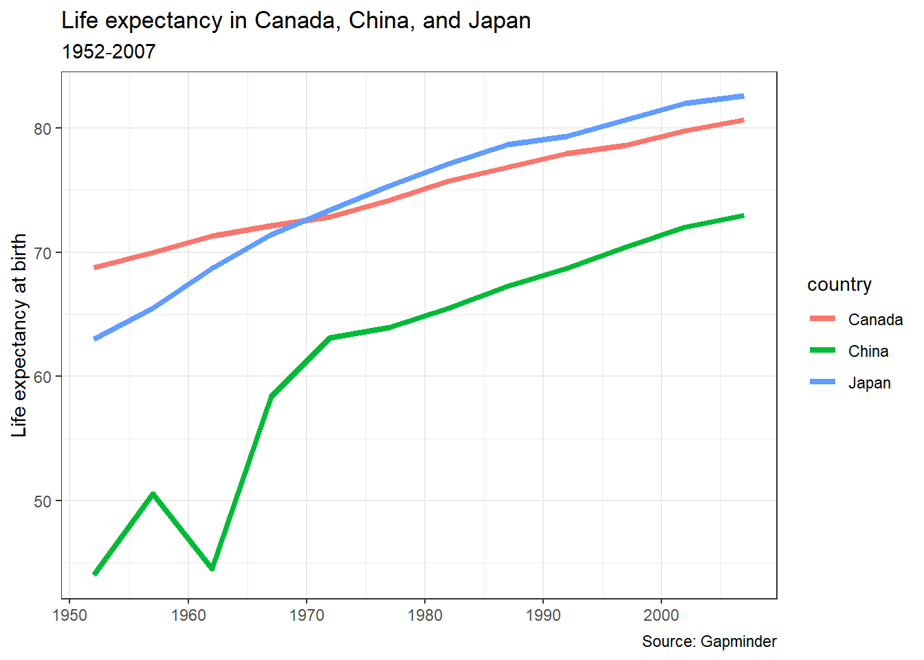
12.7.2.1 Your turn
What does your chart look like with theme_classic()?
You may want to investigate some of the other complete themes: https://ggplot2.tidyverse.org/reference/index.html#themes
12.7.3 Theme elements
Individual theme elements can be changed with the theme() function. Below is a single example. For a full list of all of the elements that can be changed and the terms used to change them, see the {ggplot2} reference page Modify components of a theme. The R Graphics Cookbook, 2nd ed. is another valuable resource for understanding how to alter individual elements of your plot.
To move the legend, we add a legend.position = argument to the theme() function.
- (See Changing the Position of a Legend) in the R Graphics Cookbook
pl_lifeexp +
  theme(legend.position = "bottom")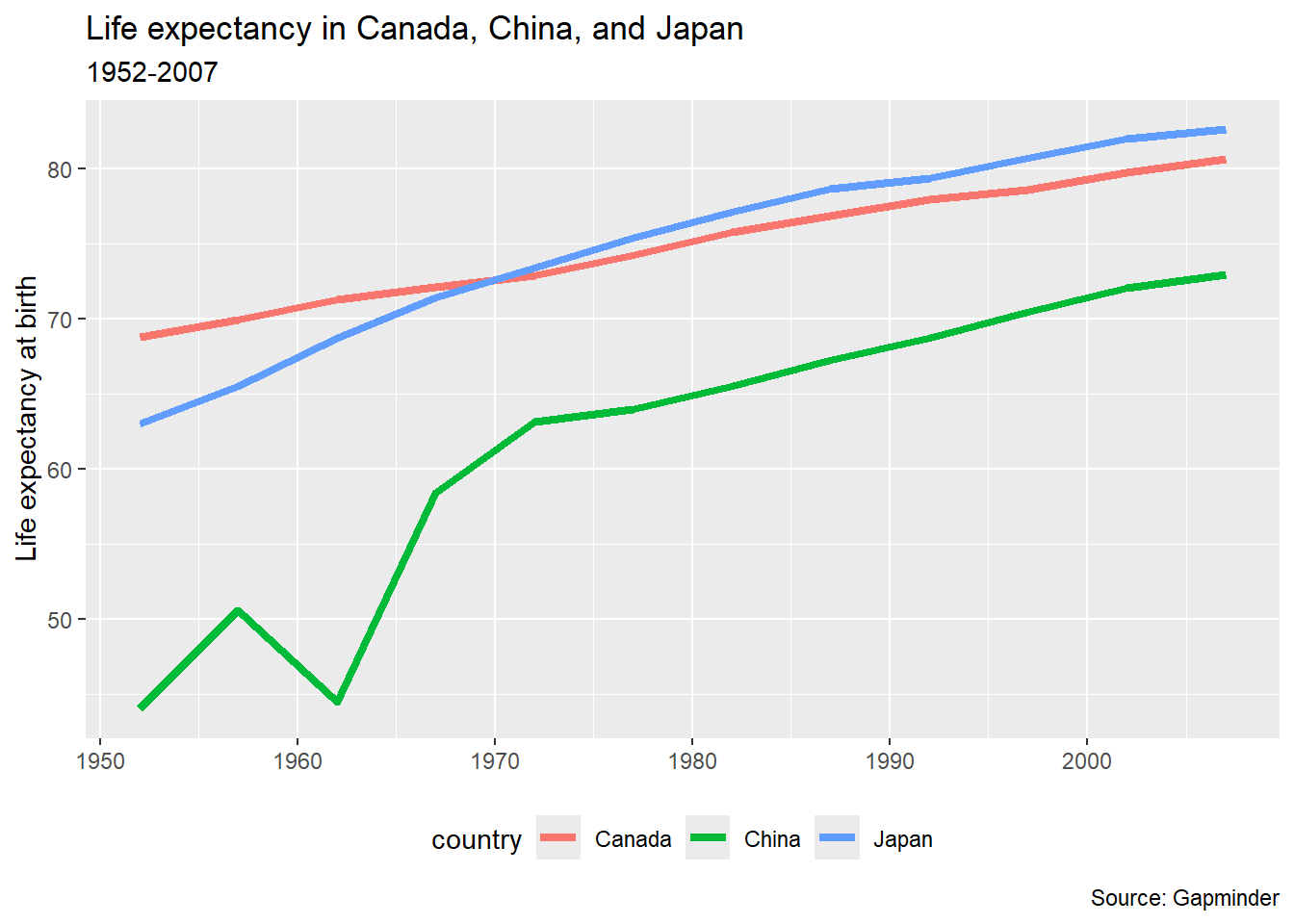
Based on the article “A background color that works with black and white elements”, I decided to try #E5E5E3 as background colour. The idea behind the very neutral grey is that it provides contrast for both black and white elements.
pl_lifeexp +
  theme(panel.background = element_rect(fill = "#E5E5E3"))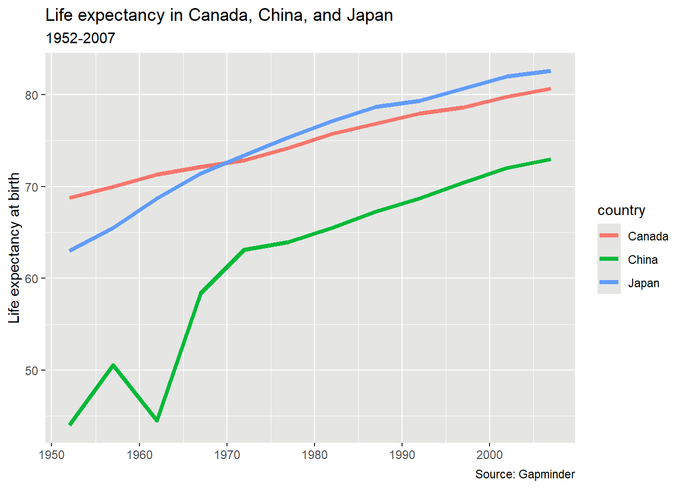
I’m not sure it’s all that different from the default {ggplot2} colour!
12.8 Reading and reference
Gina Reynolds, the ggplot flipbook has some great examples of different types of plots made using {ggplot2}. Like an animation flipbook, you have the opportunity to “flip” through the code one line at a time, to see what changes with the addition of a line of code (or backwards, as things are removed).
This article shows many more examples of {ggplot2} charts made using the {palmerpenguins} data: https://allisonhorst.github.io/palmerpenguins/articles/examples.html
Winston Chang, R Graphics Cookbook, 2nd edition (2020-11-06)
Kieran Healy, Data Visualization: A Practical Introduction (2018-04-25)
David Smith, The Financial Times and BBC use R for publication graphics - Revolutions, 2018/06-27
Why The Urban Institute Visualizes Data with ggplot2, 2018-05-01
-30-