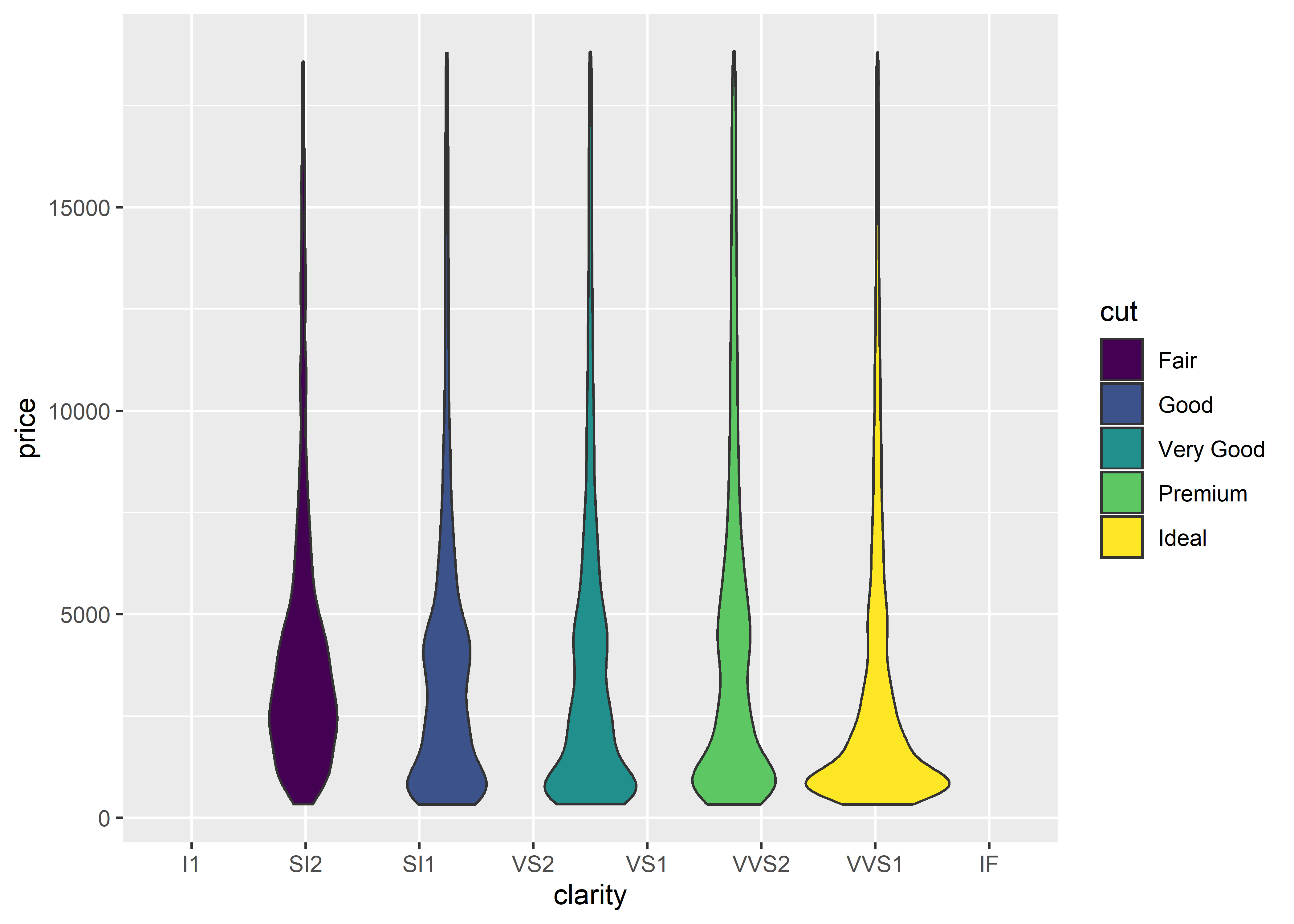
11.4 Violin Plot
A violin plot graphs data similarly to a box plot. However, violin plots have the added bonus of visualizing the distribution of the data/observations. We can create a violin plot similar to a box plot by replacing geom_boxplot with geom_violin:
diamonds %>%
  group_by(clarity, cut) %>%
  ggplot(aes(x = clarity, y = price, group = cut, fill = cut)) +
  geom_violin()