10.6 Manual Changes
Don’t forget to make sure the sem function is defined in your environment before following along the examples in this section!
sem <- function(x, na.rm = FALSE) {
  out <- sd(x, na.rm = na.rm)/sqrt(length(x))
  return(out)}
10.6.1 Coloring Individual Values
So far, we’ve seen how we can change the aesthetics of the graph in terms of color, shape, and linetype. We’ve also seen that you can specifically color each geom element individually (i.e., point, line, and error bars). However, R has has a default color scheme. So far, we have not specified the exact color for each value. That is, R has picked the color purple for “Fair” diamonds, dark blue for “Good” diamonds, light blue for “Very Good”, etc. What if we wanted to specify each cut’s color on our own?
In order to do this, we first have to create a new object that holds the designated colors for each cut category. The label for the object in the example is pointcolor. This name was chosen for descriptiveness, but you can choose to name it however you’d like (remember that objects can be labeled however you want, but it’s important that it is descriptive and concise).
pointcolor <- c("Fair" = "yellow",
                "Good" = "red",
                "Very Good" = "pink",
                "Premium" = "blue",
                "Ideal" = "black")
Then, we must execute the graphing code:
diamonds %>%
  group_by(clarity, cut) %>%
  summarize(m = mean(price),
            se = sem(price)) %>%
  ggplot(aes(x = clarity,
             y = m,
             group = cut,
             color = cut)) +
  geom_point() +
  geom_errorbar(aes(ymin = m - se,
                    ymax = m + se)) +
  geom_line() +
  scale_color_manual(values = pointcolor) # manual color change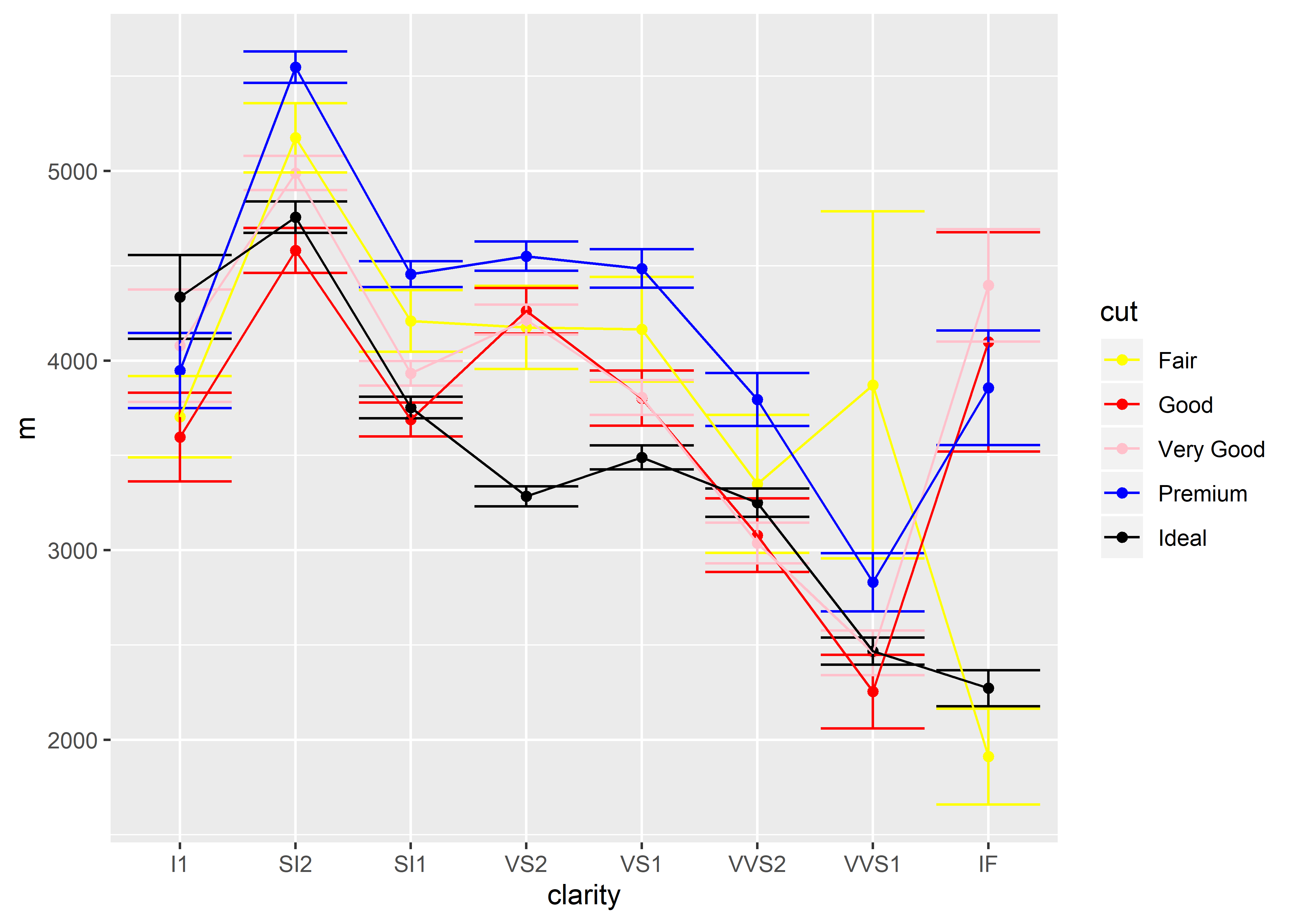
Having trouble running the code? Refer back to the troubleshooting section (3.6)!
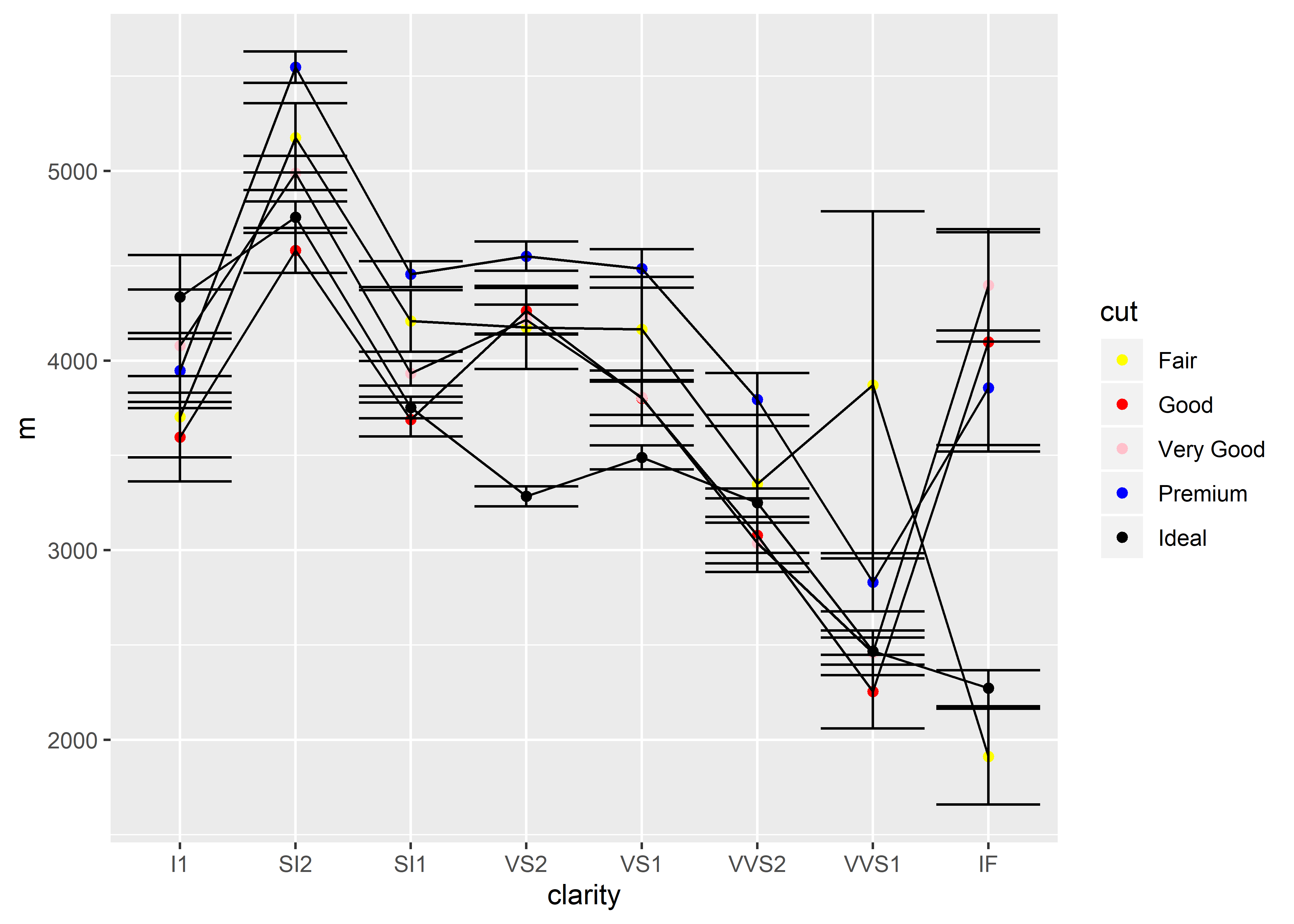
Play around with moving the aesthetics. See what happens when you move color = cut inside the geom_point():
You could also have chosen to exclude the names for each cut category as follows:
pointcolor2 <- c("yellow",
                 "red",
                 "pink",
                 "blue",
                 "black")
However, the order in which you list the colors will determine how each cut category is colored. For example, the following will not produce the same colored graph despite containing the same colors:
pointcolor3 <- c("black",
                 "red",
                 "yellow",
                 "blue",
                 "pink")
Instead, pointcolor3 would be the equivalent to:
pointcolor <- c("Fair" = "black",
                "Good" = "red",
                "Very Good" = "yellow",
                "Premium" = "blue",
                "Ideal" = "pink")
Remember, if you were to use pointcolor3 to color your graph, you must update the object name in your graphing code (again, this code relies on the sem function to be available in the global environment beforehand):
diamonds %>%
  group_by(clarity, cut) %>%
  summarize(m = mean(price),
            se = sem(price)) %>%
  ggplot(aes(x = clarity,
             y = m,
             group = cut)) +
  geom_point(aes(color = cut)) +
  geom_errorbar(aes(ymin = m - se,
                    ymax = m + se)) +
  geom_line() +
  scale_color_manual(values = pointcolor3)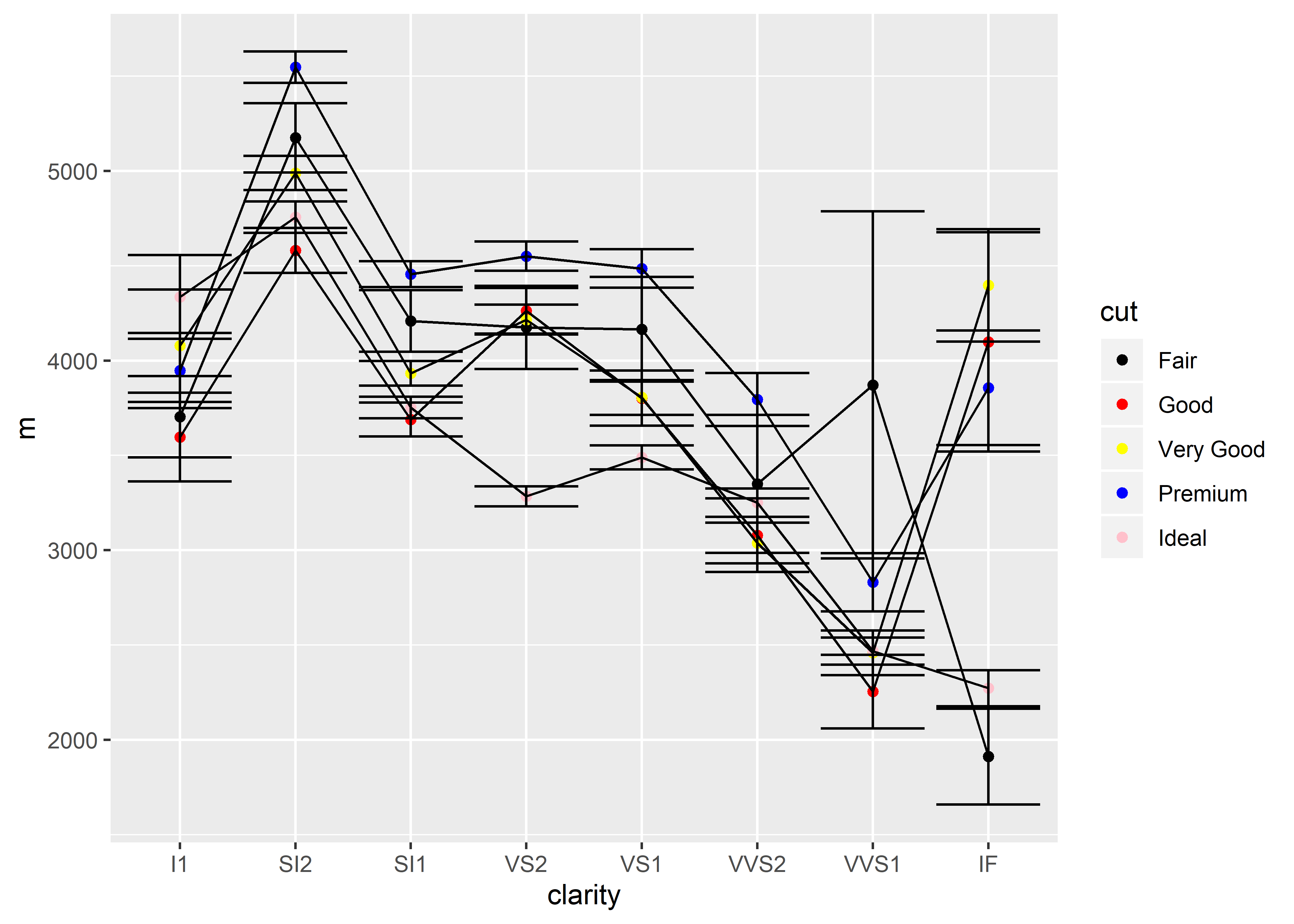
10.6.2 Order of the X-axis
It is possible to also change the order in which the categorical values are arranged on the x-axis. There are two main ways of doing this:
Change the individual graph only
Change the dataset
Changing the x-axis Order for the Individual Graph
Let’s say that I want to change the order of the x-axis so that the clarity is out of order. Changing how the graph is arranged is the simplest and the most localized. Simply alter the dataset’s variable via mutate():
diamonds %>%
  group_by(clarity, cut) %>%
  summarize(m = mean(price)) %>%
  ungroup() %>%
  mutate(clarity = factor(clarity, levels = c("VVS1", "IF", "VVS2",
                                              "I1", "VS2", "SI1", "SI2", "VS1"))) %>%
  ggplot(aes(x = clarity, y = m, group = cut, color = cut)) +
  geom_point()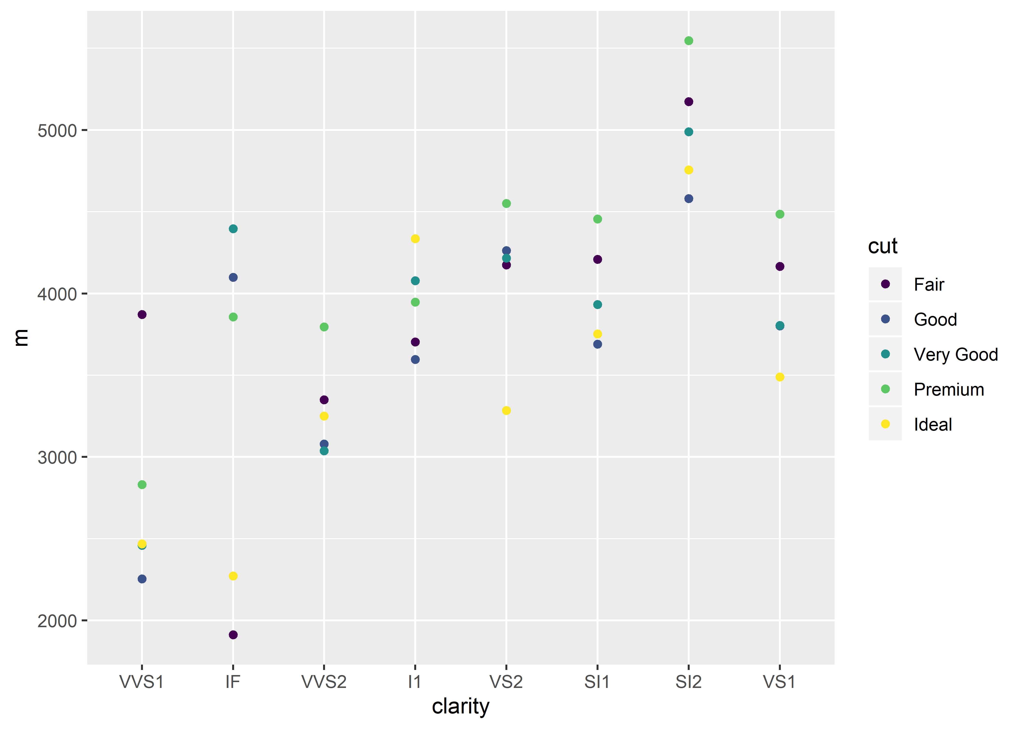
Changing the x-axis Order for the Entire Dataset
This is very similar to the above method. The difference is that you save the changes from mutate() to the data object. Here, diamonds_edit1 is the name of a new object that is defined with the new changes we made to clarity.
diamonds_edit1 <-
  diamonds %>%
  mutate(clarity = factor(clarity,
                          levels = c("VVS1", "IF", "VVS2",
                                     "I1", "VS2", "SI1", "SI2", "VS1")))
THEN
diamonds_edit1 %>% # take notice of the new object here
  group_by(clarity, cut) %>%
  summarize(m = mean(price)) %>%
  ungroup() %>%
  ggplot(aes(x = clarity, y = m, group = cut, color = cut)) +
  geom_point()
Remember to be wary of saving over objects. For beginners at R, I recommend creating new objects (as in the above example) when making permanent changes to a dataset. This avoids mass confusion and error messages that arise from renaming an object with the same name (i.e., saving over another object).