10.1 Plotting Structural Elements
10.1.1 Mean Values
Data can be complex (to say the least). In the behavioral neurosciences, we often care about how the average subject performed. We may want to know: How did the treatment group perform in comparison to the control group? We may want to look into the individual differences eventually (especially if individual data varies a lot), but we typically want to know if the treatment group did better/worse/the same as the control group on average. In this kind of example, we need our data to tell us:
- the average (mean) performance for subjects in the control group
- the average (mean) performance for subjects in the treatment group
Of course, we need to know more information about the dataset before we can draw conclusions. How is performance measured? Are higher scores better or worse (scoring high on a depression scale may be a bad thing, but scoring high on a test is usually a good thing)? Here, we’re not going to make any assumptions.
## # A tibble: 2 x 2
##   Group           `Average Performance`
##   <chr>                           <dbl>
## 1 Treatment Group                     8
## 2 Control Group                      10
Sometimes we may even want to know the standard deviation or the standard error. In that case, our dataset at minimum must look like this:
## # A tibble: 2 x 4
##   Group           `Average Performance` Std.Dev Std.Err
##   <chr>                           <dbl>   <dbl>   <dbl>
## 1 Treatment Group                     8     1.5     0.2
## 2 Control Group                      10     7       4
Recall that the diamonds data doesn’t show us the means or standard deviations/errors. It shows us the raw, unaltered individual data points. Therefore, we must manually calculate the means before we can graph it.
First, we need to arrange the data so that it shows us the average price for each clarity using some tidyverse techniques. We will use the group_by() and summarize() functions in addition to pipes (%>%; Ctrl + Shift + M) to accomplish this. We will delve more into data management and how these functions work in later sections. For now, we will primarily focus on how these tools help us graph.
To properly organize our data so that a mean price is calculated for each diamond clarity category, we first need to group the data by our clarity variable in the diamonds dataset. The tidyverse style of coding organizes the code in a (generally) user-friendly format. That is, it is written and read from left to right and top to bottom (like that of Western cultures). Executing the following code will calculate the means for each clarity category of diamonds:
diamonds %>%
  group_by(clarity) %>%
  summarize(m = mean(price)) %>% # m is defined as the mean price of diamonds grouped by clarity categories
  ungroup()
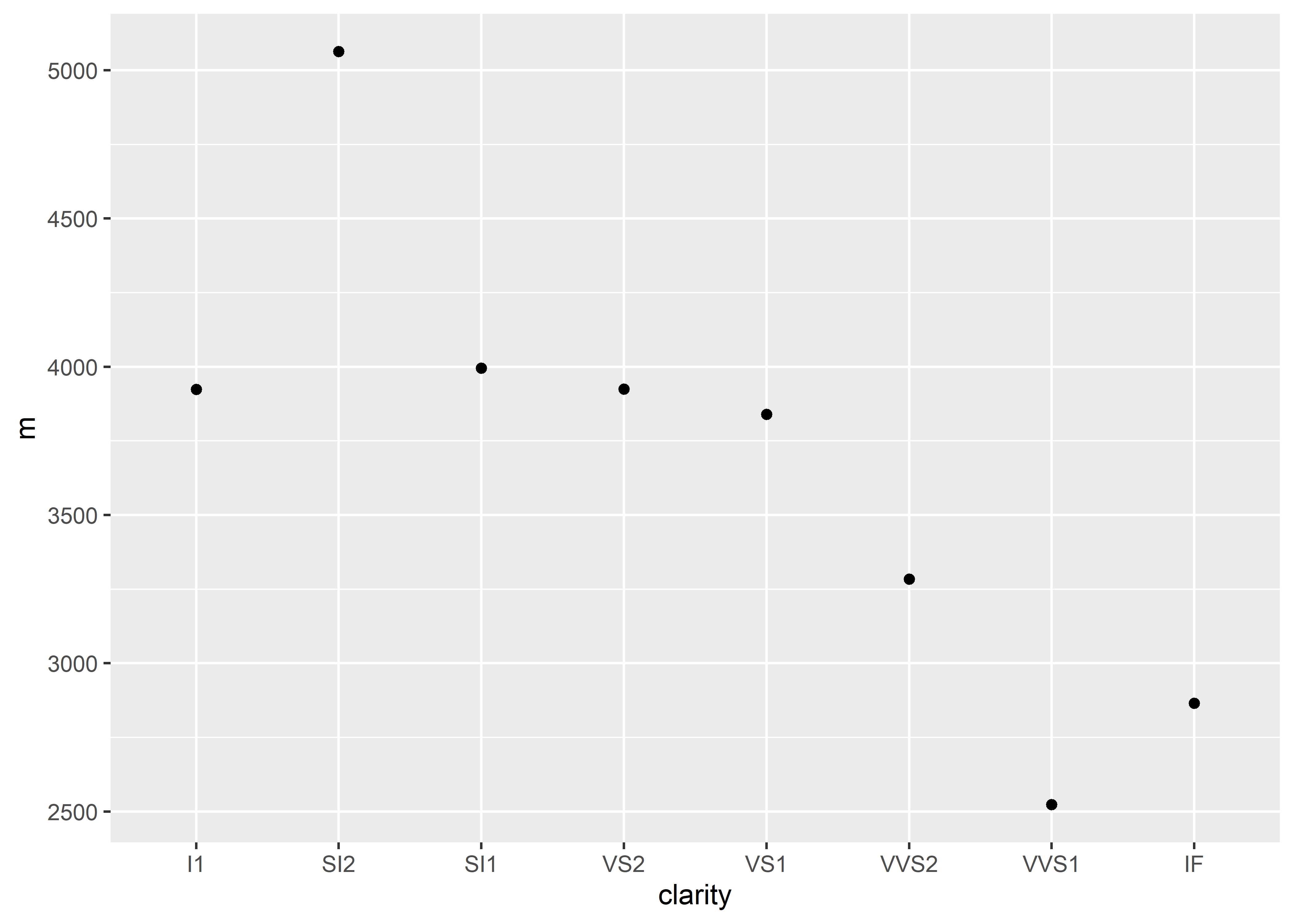
## # A tibble: 8 x 2
## clarity m
## <ord> <dbl>
## 1 I1 3924.
## 2 SI2 5063.
## 3 SI1 3996.
## 4 VS2 3925.
## 5 VS1 3839.
## 6 VVS2 3284.
## 7 VVS1 2523.
## 8 IF 2865.Remember that it can be useful to conceptualize the pipes (%>%) as the phrase “and then”. The above code can be read as:
“I want to use the diamonds dataset and then group the data by clarity and then summarize the data by calculating the average price (for each clarity category) and then ungroup the data.”
Now that we have our values, we can begin to graph. The next step is to add our graphing functions:
diamonds %>%
  group_by(clarity) %>% # sets up the grouping variable
  summarize(m = mean(price)) %>% # calculates the mean price for each diamond clarity
  ungroup() %>% # make sure to ungroup the data after summarizing
  ggplot(aes(x = clarity, y = m)) + # setting up x and y values for graphing
  geom_point() # plotting data points on the graph
10.1.2 Error Bars
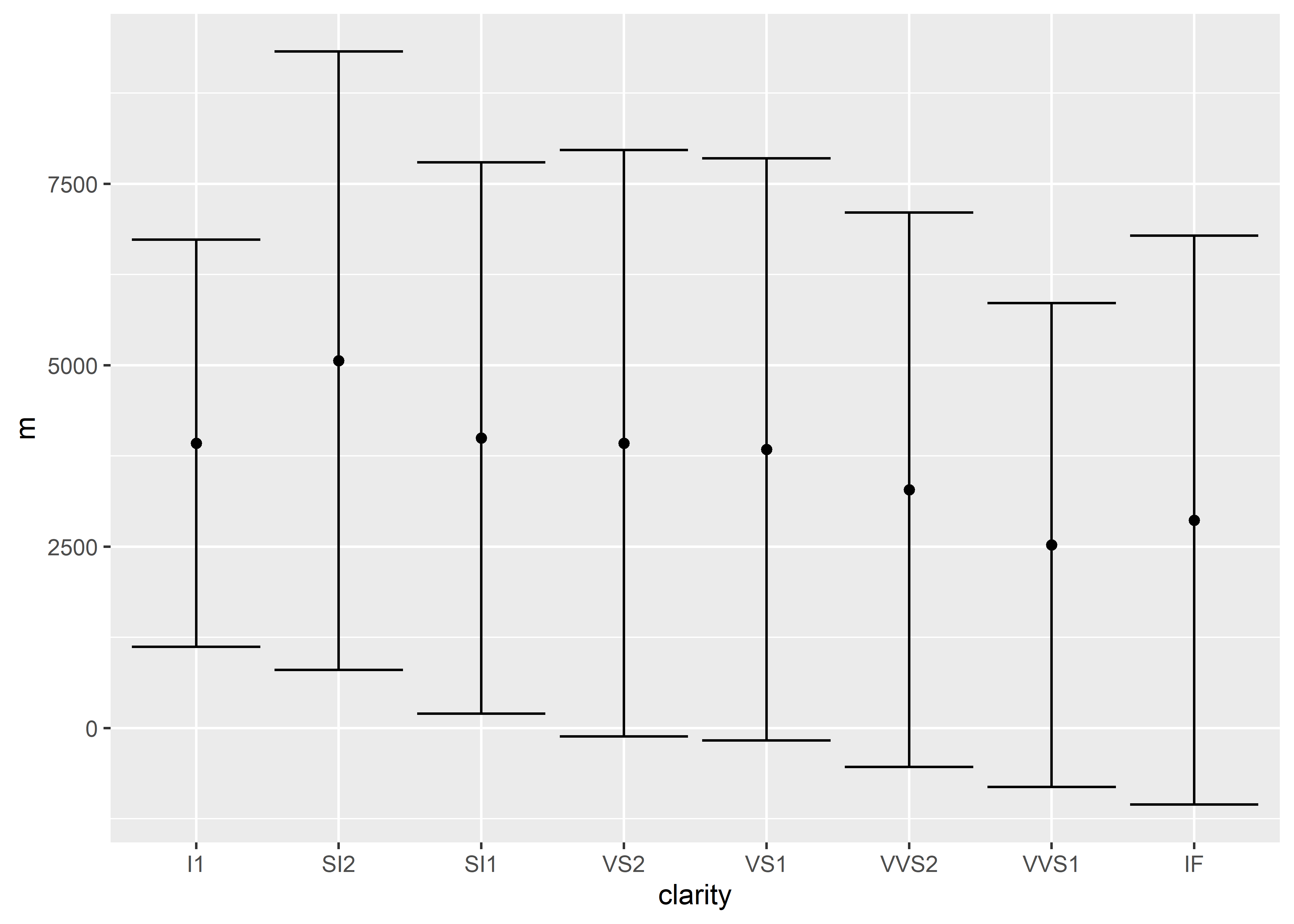
Let’s add onto the code we’ve already built so far. The following code adds error bars using standard deviation:
diamonds %>%
  group_by(clarity) %>%
  summarize(m = mean(price),
            sd = sd(price)) %>%
  ungroup() %>%
  ggplot(aes(x = clarity, y = m)) +
  geom_point() +
  geom_errorbar(aes(ymin = m - sd, ymax = m + sd))
Having trouble running the code? Refer back to the troubleshooting section (3.6)!
In order to add error bars that represent the standard error of the mean (SEM), we must first use a self-defined function. R does not currently have an accessible, built-in function at the time of writing this guide, so in order to use calculate the SEM, you must execute the following code (type this out in your script):
sem <- function(x, na.rm = FALSE) {
  out <- sd(x, na.rm = na.rm)/sqrt(length(x))
  return(out)}
I highly recommend keeping this code pasted somewhere (e.g., in your notes) if you frequently use SEM. After executing the code, sem will now be a usable function so long as it is available globally. This means that each time you begin an R session, this sem function must be redefined and loaded to the global environment, but once it is located in the environment, you can repeatedly use it for the session duration (similar to loading libraries):

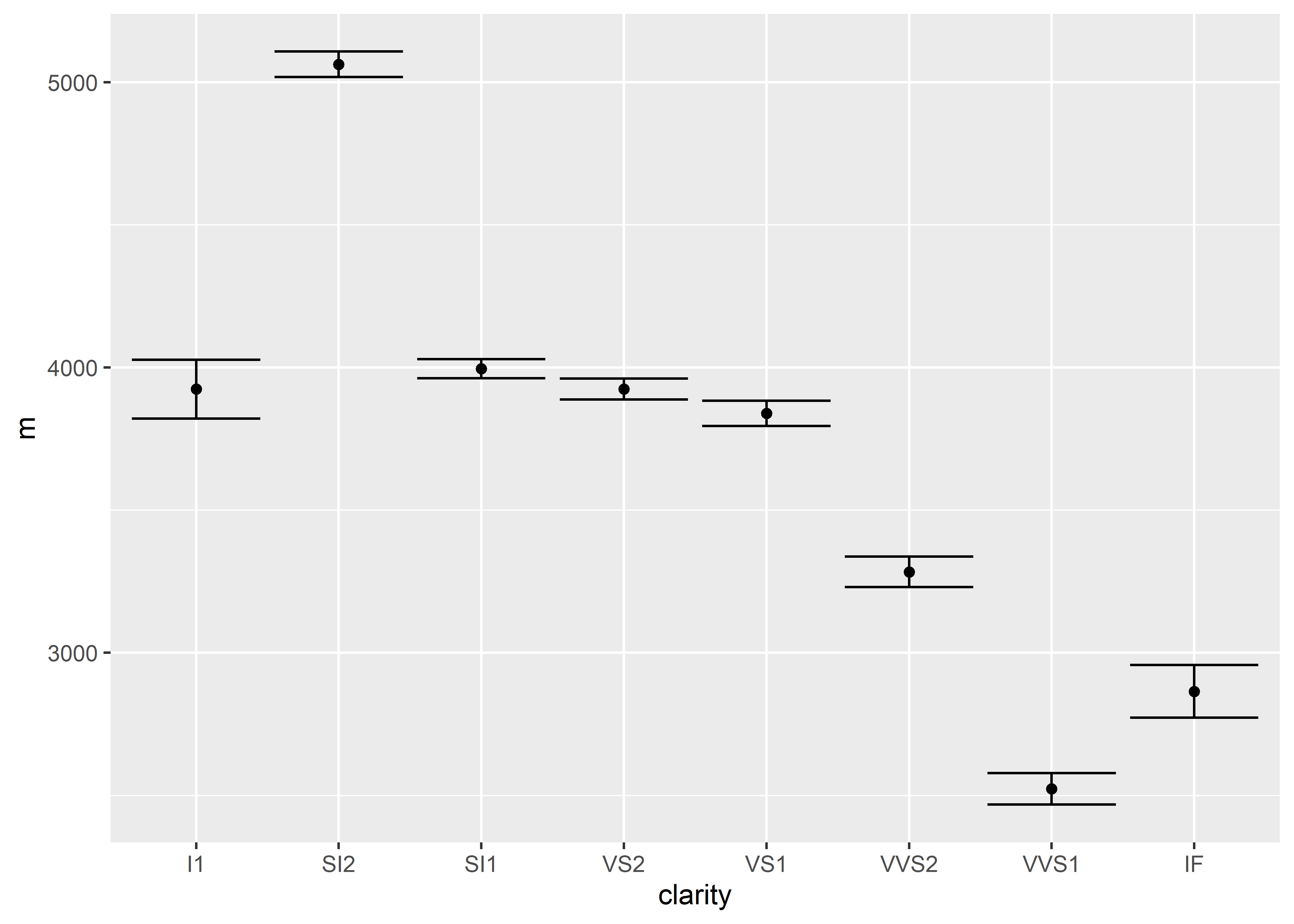
After executing the sem function, run the following edited code to obtain a plot with standard errors represented:
diamonds %>%
  group_by(clarity) %>%
  summarize(m = mean(price),
            se = sem(price)) %>%
  ungroup() %>%
  ggplot(aes(x = clarity, y = m)) +
  geom_point() +
  geom_errorbar(aes(ymin = m - se, ymax = m + se))
10.1.3 Connecting Lines
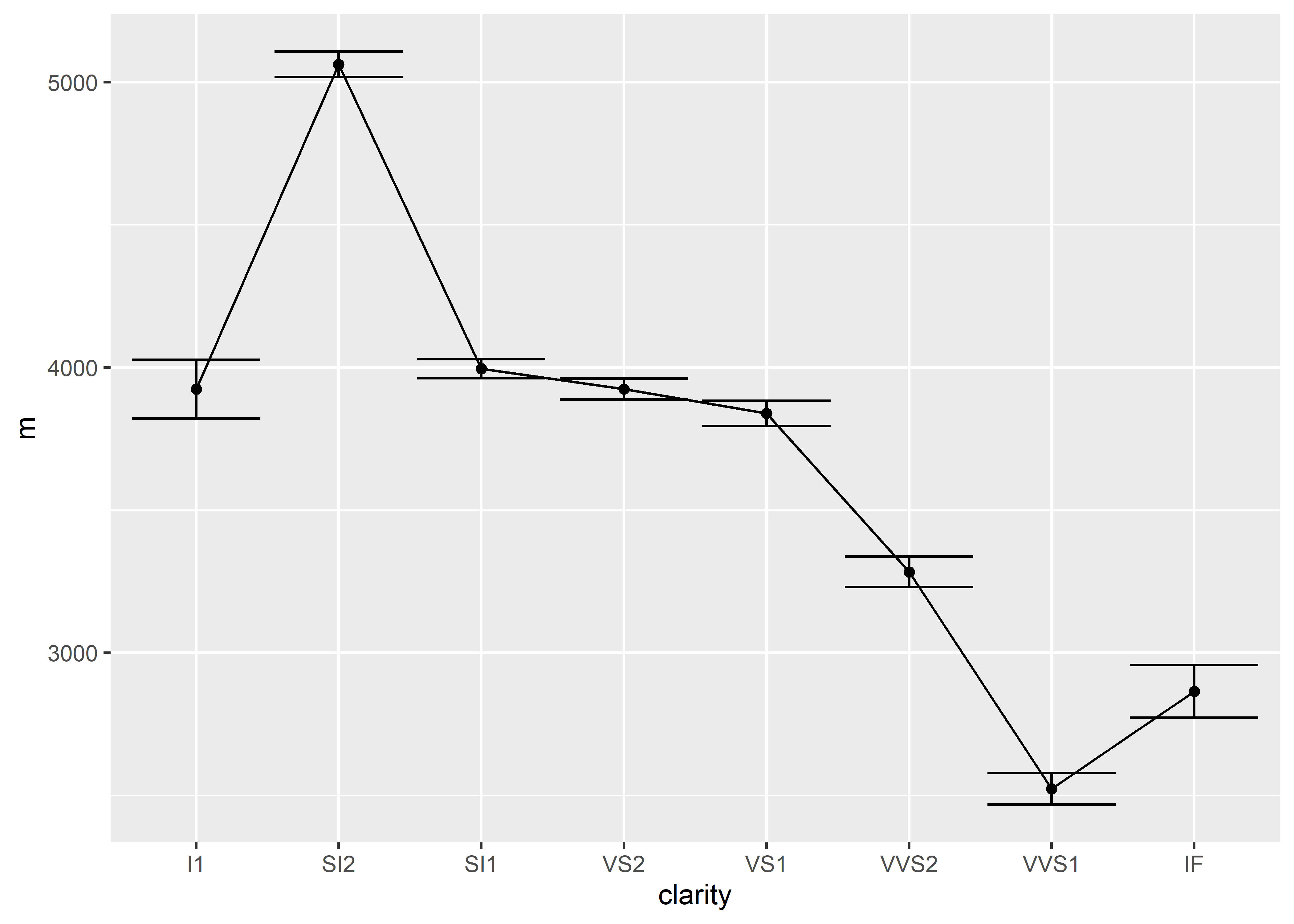
Just like all of the other geom elements, in order to display a connecting line on our graph, we must specify that there should be a connecting line with geom_line().
diamonds %>%
  group_by(clarity) %>%
  summarize(m = mean(price),
            se = sem(price)) %>%
  ggplot(aes(x = clarity, y = m, group = 1)) +
  geom_point() +
  geom_errorbar(aes(ymin = m - se, ymax = m + se)) +
  geom_line()
Notice that in ggplot(), we also added a group argument nested inside aes(). The group argument is required so that R knows which points to connect. Setting group = 1 indicates that all points should be connected.