9.1 Exercises
(Tip: recall that %>% is a pipe symbol defined in the Vocabulary Terms section)
Execute
diamonds %>% ggplot(aes(depth, price)) + geom_point()Execute
diamonds %>% ggplot(aes(price, depth)) + geom_point()Execute
diamonds %>% ggplot(aes(y = price, x = depth)) + geom_point()Execute
diamonds %>% ggplot(aes(x = x, y = z)) + geom_point()
It’s important to remember that graph building in R requires layering of code. That is, each piece of the graph must be explicitly stated. The ggplot() function starts building the skeleton of an R graph.
If you were to run the above code without + geom_point(), the plot is blank:
diamonds %>% ggplot(aes(x = depth, y = price))
In order for there to be data points, you must specify them with the geom_point() function.
What if we wanted to use a categorical variable like diamond clarity for the x-axis?
diamonds %>%
  ggplot(aes(x = clarity, y = price, group = cut, color = cut)) +
  geom_point()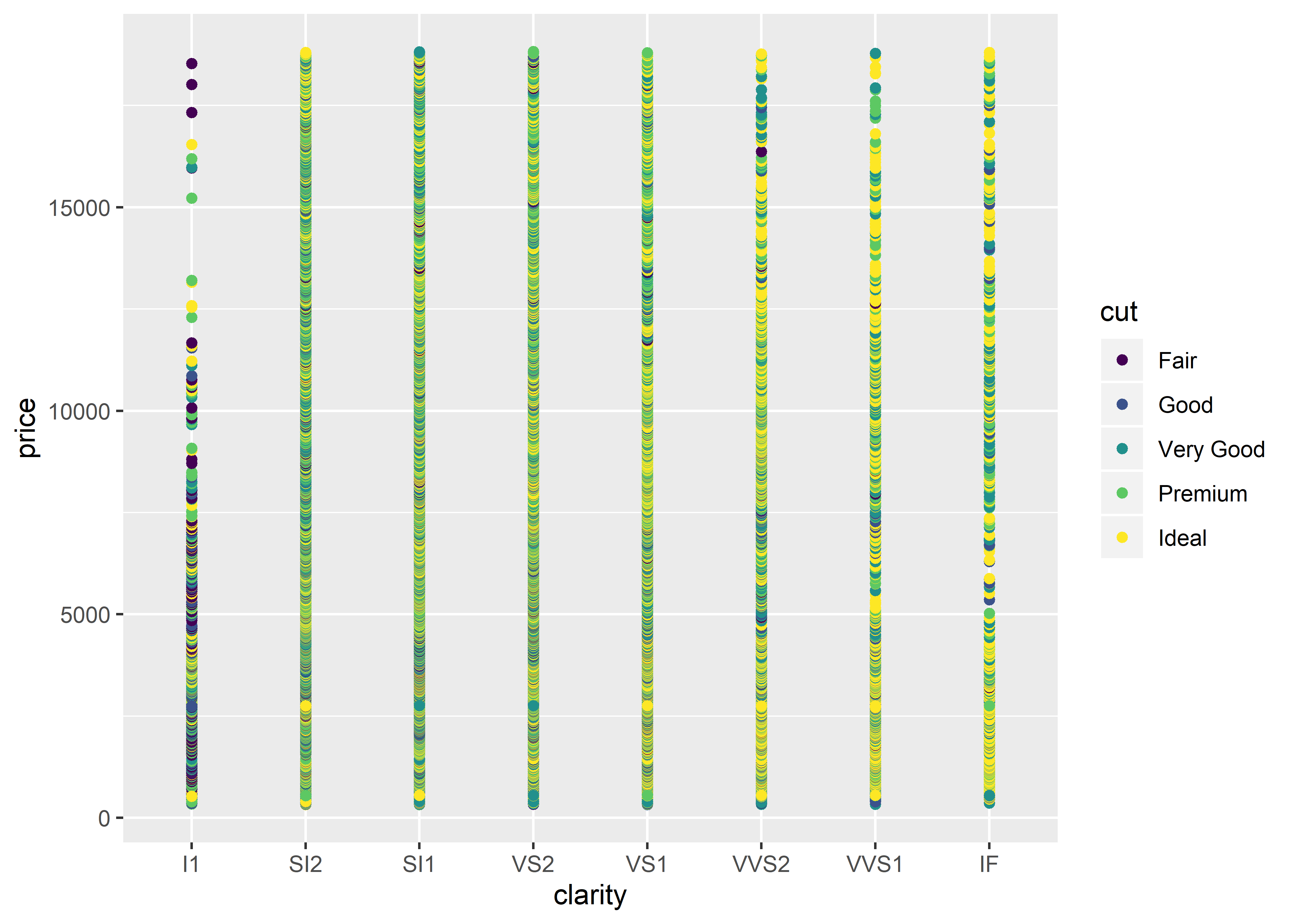
I think most of us would agree that this isn’t the best looking graph. Why?
Scatter plots are generally used to graph two continuous variables, not categorical variables.
There is overplotting in both of the scatter plots seen in this chapter (i.e., there are too many data points on the graph, creating visual noise).
In Figure 9.1, we could improve the data representation by altering the transparency of the data points. What this does is show us where the majority of the data points sit. The more data points that sit in a particular location (the darker the area), the more observations there are.
# to alter the transparency of the data points, we must utilize
# the alpha argument within the geom_point() function
diamonds %>%
  ggplot(aes(x = depth, y = price)) +
  geom_point(alpha = 0.1) # lower alpha values increase transparency of points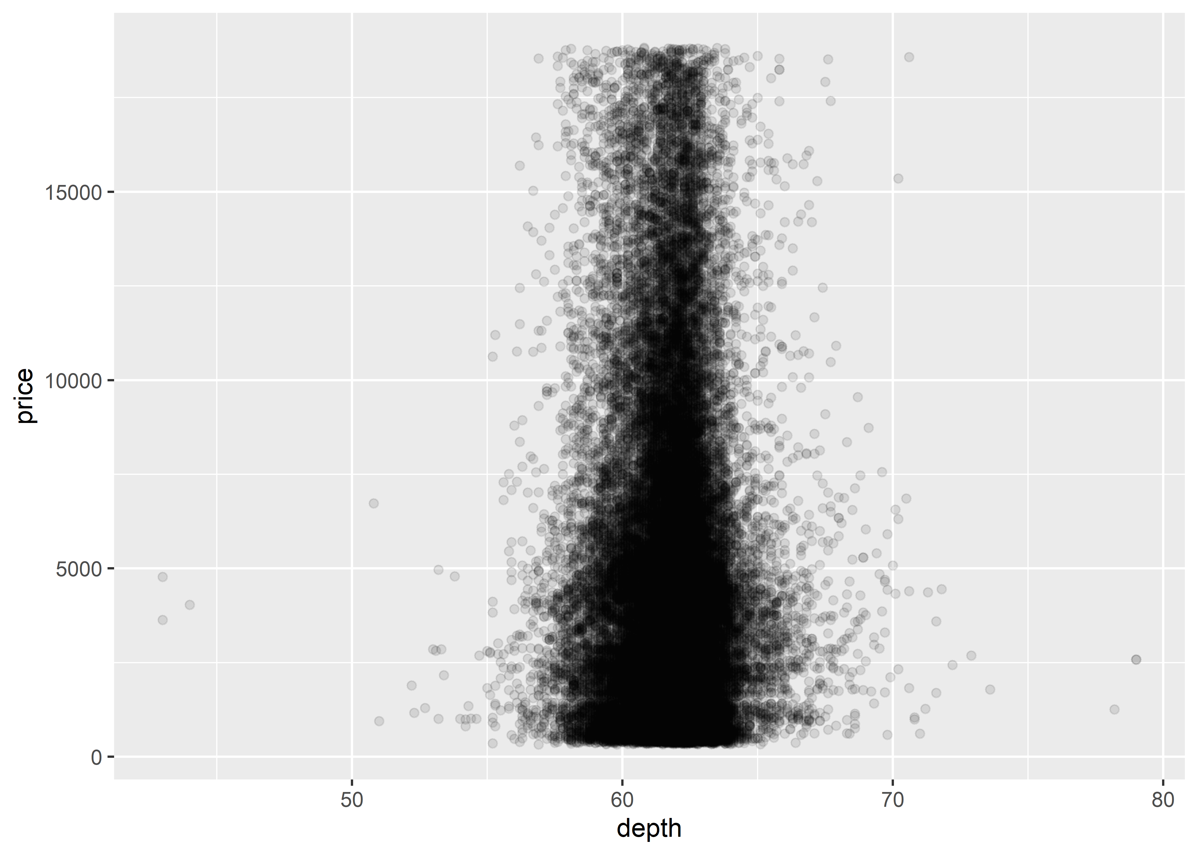
Figure 9.2: Basic scatterplot with transparency settings
Although increasing the transparency of the data points (via alpha) marginally helps with the data visualization, it’s probably not what we want to present to the public given that it still looks noisy. To reduce the number of data points, we may want to subset the data into categories. For example, we may want to subset the data by including diamonds from the dataset that have a clarity of VVS1.
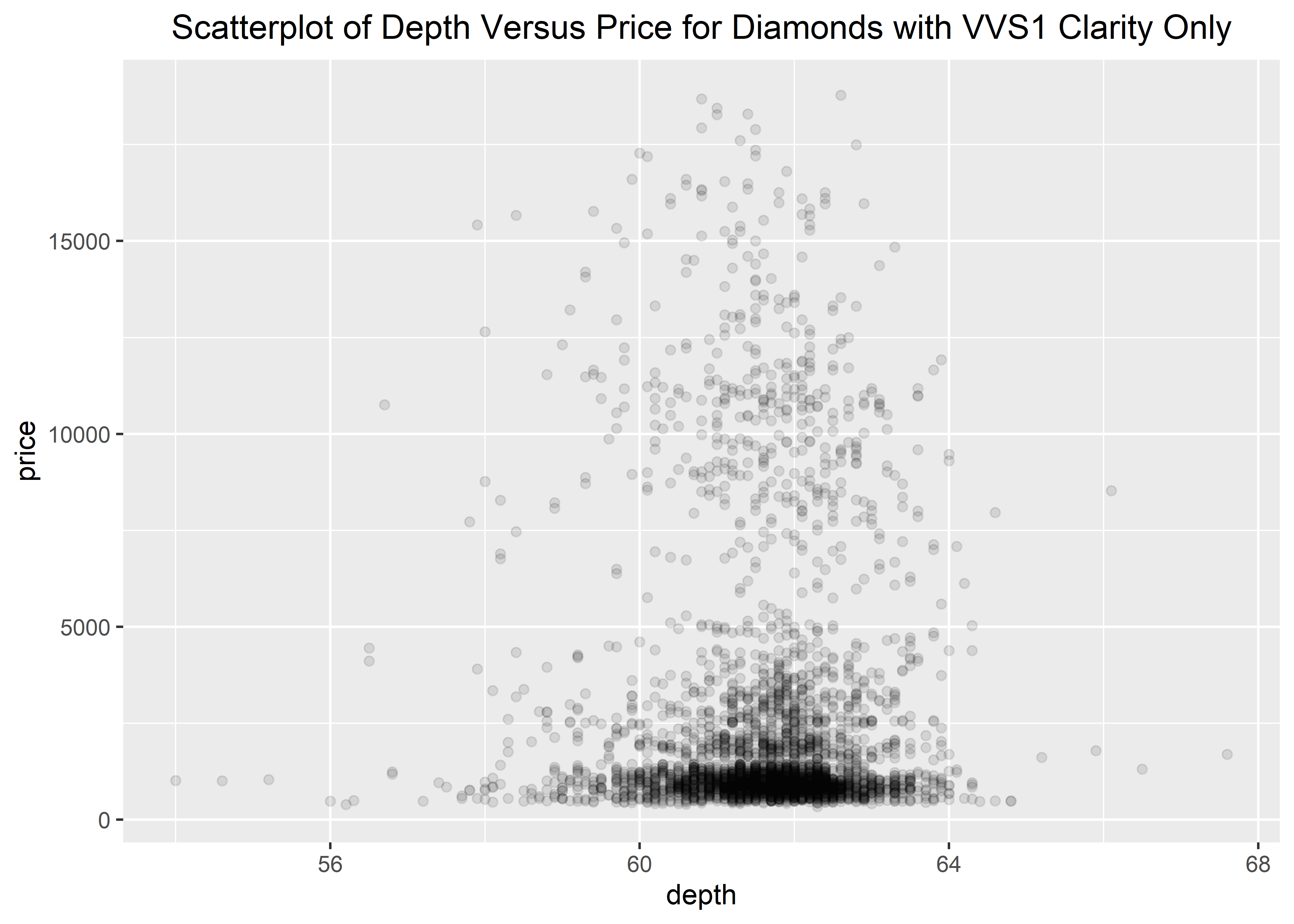
This particular skill will be learned in the How to Use Tidyverse section. Again, this graphing section assumes that you already have your data completely ready and organized for graphing. However, for these example using built-in datasets, we will do a tiny bit of wrangling. We will learn how data management/organization/wrangling works in the later sections.