11.2 Histograms
Similar to bar graphs, a histogram uses rectangular blocks to display data. The difference between a bar graph and a histogram is the x-axis variable. For bar graphs, the x-axis variable is categorical. For histograms, the x-axis is continuous (i.e., numeric). In both scenarios, the y-axis is a numeric dependent variable.
In the diamonds dataset, we could look at the price distribution for all diamonds. By default, the y-axis value for a histogram is the count (i.e., the stat argument’s default value is stat = "bin"). Within the geom_histogram() function, we can change how detailed we want the bars to look by altering the bin width:
diamonds %>%
  ggplot(aes(x = price, group = cut, fill = cut)) +
  geom_histogram(binwidth = 10) # small binwidth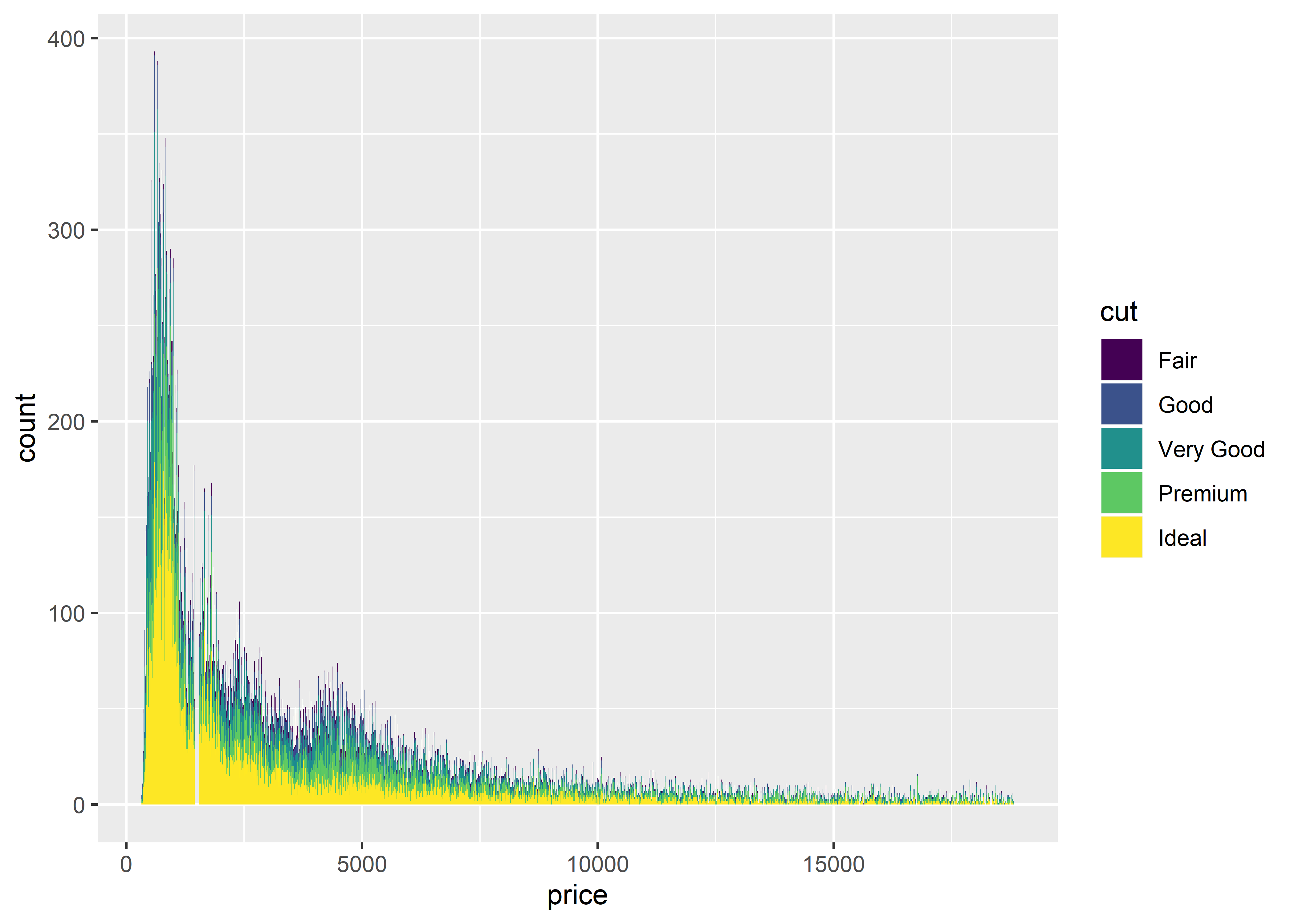
# facet wrapping by cut
diamonds %>%
  ggplot(aes(x = price, group = cut, fill = cut)) +
  geom_histogram(binwidth = 10) +
  facet_wrap(~cut)
### Exercises
Execute the same code above, but change the bin width to 100
Change the bin width to 500
Change the bin width to 1000