10.7 Facet Wrapping
Facet wraps are a useful way to view individual categories in their own graph.
For example, if you wanted to make a separate graph for each cut measuring the price (y axis) for each clarity (x axis), you could add facet_wrap(~cut).
The tilde (~) can be read as “by” as in: > “I want to make a new graph separated by cut categories.”
diamonds %>%
  group_by(clarity, cut) %>%
  summarize(m = mean(price)) %>%
  ggplot(aes(x = clarity, y = m, group = cut, color = cut)) +
  geom_point() +
  geom_line() +
  facet_wrap(~cut)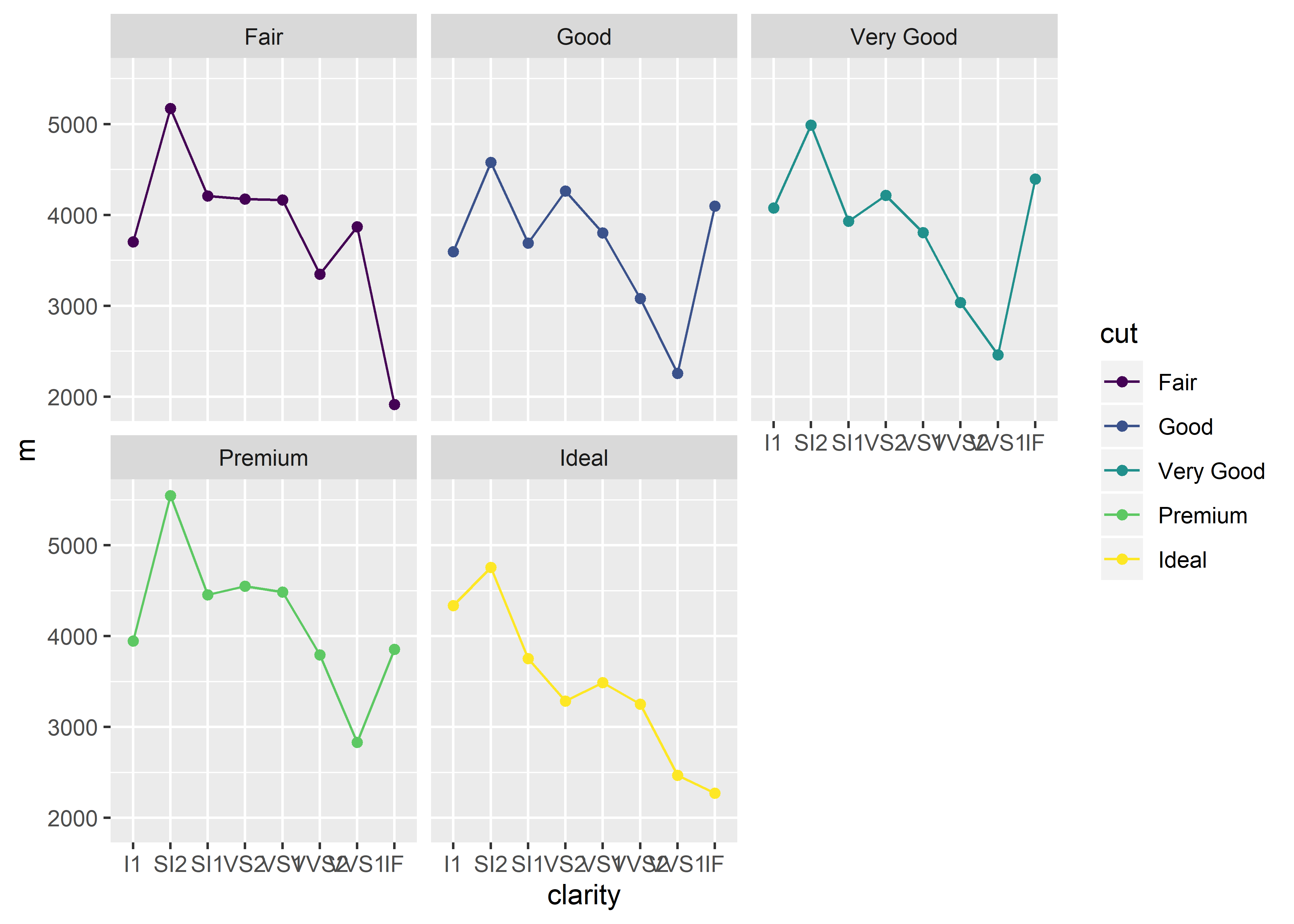
You can also separate by multiple variables by adding a + between each variable:
diamonds %>%
  group_by(clarity, cut, color) %>%
  summarize(m = mean(price)) %>%
  ggplot(aes(x = clarity, y = m, group = cut, color = cut)) +
  geom_point() +
  geom_line() +
  facet_wrap(~cut + color)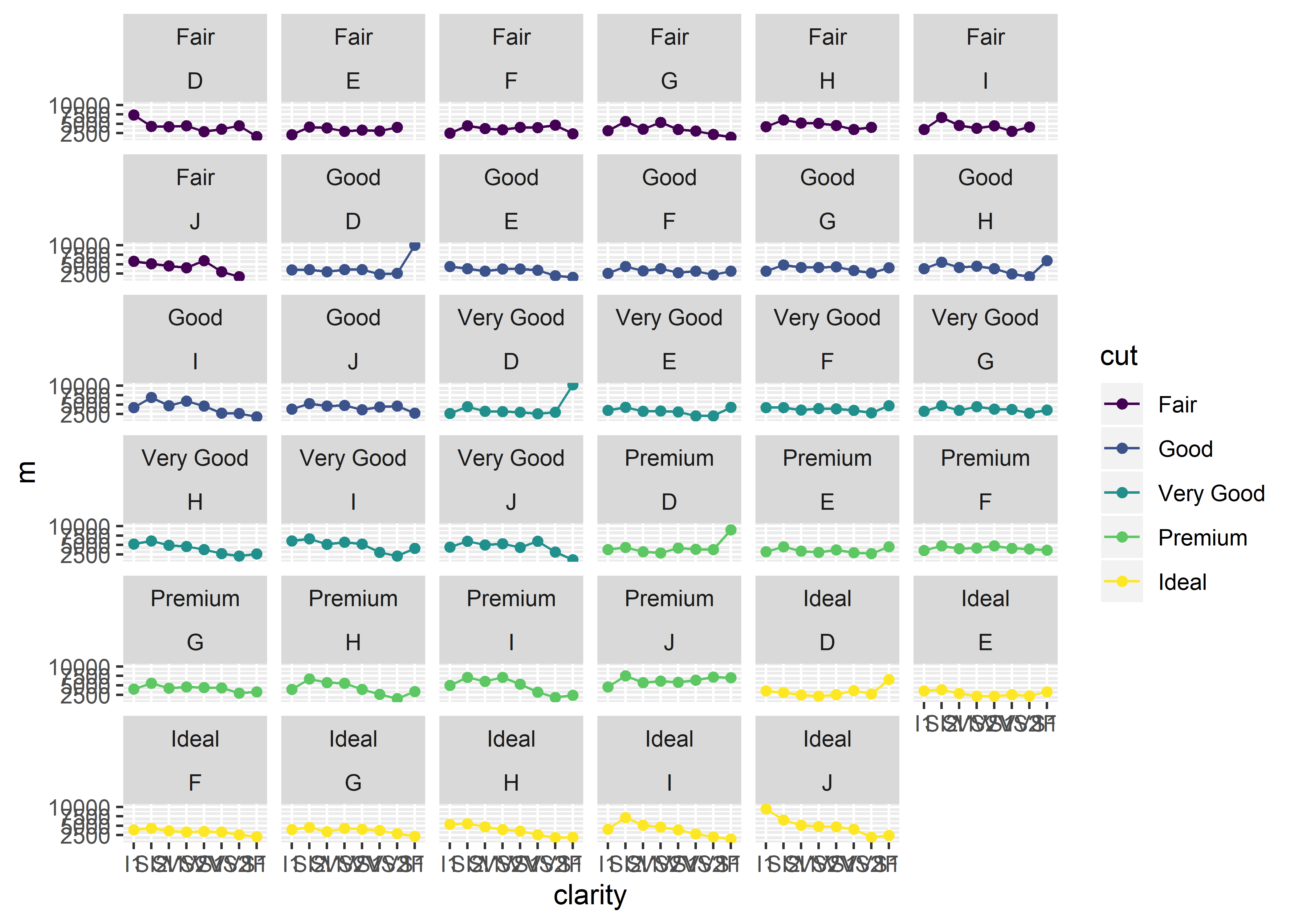
Note that color inside group_by() and facet_wrap() refer to the variable name (i.e., the color of the diamond, not the color of the graph elements)
Here, we’ve added a third grouping variable, color, which allows us to make separate graphs by cut and color. The cut category is listed as the first subheading and the color value is listed underneath. Note that you can add as many (categorical) variables as you’d like in your facet wrap, however, this will result in a longer loading period for R.
Further, you can specify the number of columns/rows to display as such:
diamonds %>%
  group_by(clarity, cut) %>%
  summarize(m = mean(price)) %>%
  ggplot(aes(x = clarity, y = m, group = cut, color = cut)) +
  geom_point() +
  geom_line() +
  facet_wrap(~cut, ncol = 2)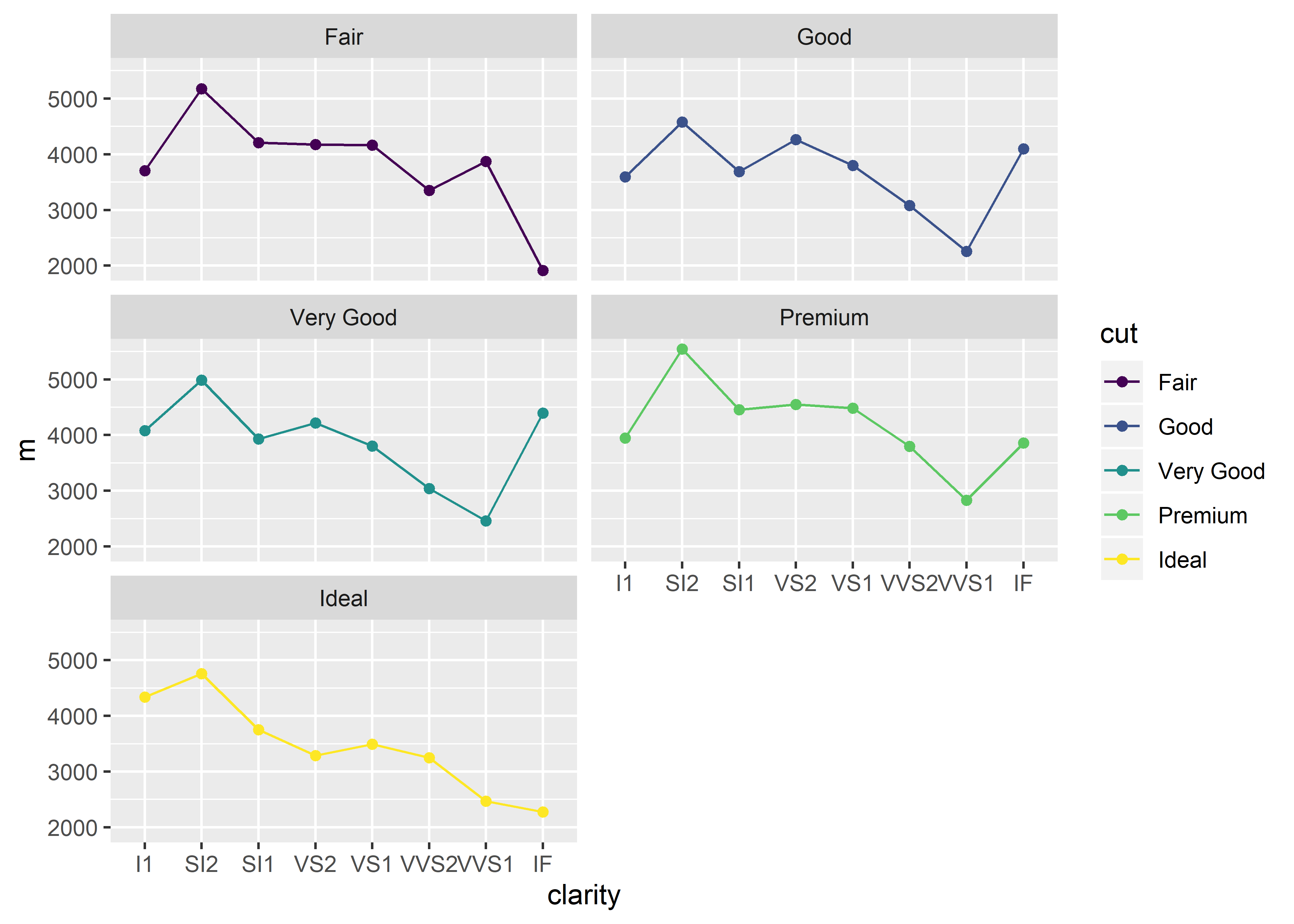
Notice that the graphs are now arranged with two columns instead of the previous default of three. Alternatively, executing facet_wrap(~cut, nrow = 3) would produced the same graph.