2.3 Advice to Beginners
You should:
Be patient. Learning a new skill can be frustrating. Like those before me, I have gone through the various stages of grief while looking blankly at error message on my screen. My best advice is to put your expensive computer down and clear your head (I recommend rock climbing).
Know that the hardest part is the beginning. Learning R is hard, but it’s not impossible. All it takes is practice and I can assure you that it will get easier. Be the envy of your peers: learn to update your data/graphs in a couple minutes rather than hours.
Learn to manage your data in addition to graphing it. Most people want to get right into graphing their data, but if the data is not already fully prepared, you will actually spend most of your time organizing/structuring your data. Graphing, by comparison, is far easier to learn.
Think of learning R as learning a new language. At first, you learn the basic vocabulary and master these individual words. Then, you master sentences and grammar, then paragraphs, and so on. Learning R will take some time, but everybody starts somewhere.
My best advice is to write down a list of what you need R to do. What outcome do you need? From there, you can fill in the various steps that you might need along the way. Let’s see an example.
In this example, we’re going to talk about a dataset called diamonds. This dataset contains information about – you guessed it – diamonds. Someone went out and collected a lot of information about diamonds and we’re going to use this example dataset to explain some of the concepts in this guide. Here’s a quick summary about diamonds if you don’t know much about diamonds:
Some attributes of diamonds include the: cut, clarity, color, and carat. Most people are also familiar with diamond shapes (round, square, pear, etc.), but this dataset only contains round diamonds.
Cut refers to how well light shines through the diamond. The better cut, the sparklier the diamond looks. This is more about how well the jeweler cuts the diamond.
Clarity refers to the cloudiness of a diamond. This is about the diamond’s natural features. A jeweler can’t change number of blemishes a diamond has naturally.
Color doesn’t really mean color of the diamond per se (i.e., a pink diamond vs. blue diamond). It actually measures how “colorless” the diamond is. Diamonds can be clear (colorless), white, or yellow-tinted (the actual values for color are measured from J to D). The more colorless a diamond is, the more expensive.
Carat refers to the weight/heaviness of a diamond.
I encourage everyone to Google these basic qualities of a diamond, because I will be using the diamonds dataset frequently throughout the book.
Now that we know about diamond features, here is an example of the coding process:
| Steps | Example |
|---|---|
|
|
|
|
|
How do I calculate the standard error of the mean for each diamond clarity? Is there a function I can use? My data needs to show at least 3 columns. The first column must contain the diamond clarity categories. The second column must contain the mean price for each clarity. The third column must contain the standard error for each clarity price. |
| Color | Mean | Standard Error |
|---|---|---|
| D | 3170 | 40.8 |
| E | 3077 | 33.8 |
| F | 3725 | 38.7 |
| G | 3999 | 38.1 |
| H | 4487 | 46.3 |
| I | 5092 | 64.1 |
| J | 5324 | 83.8 |
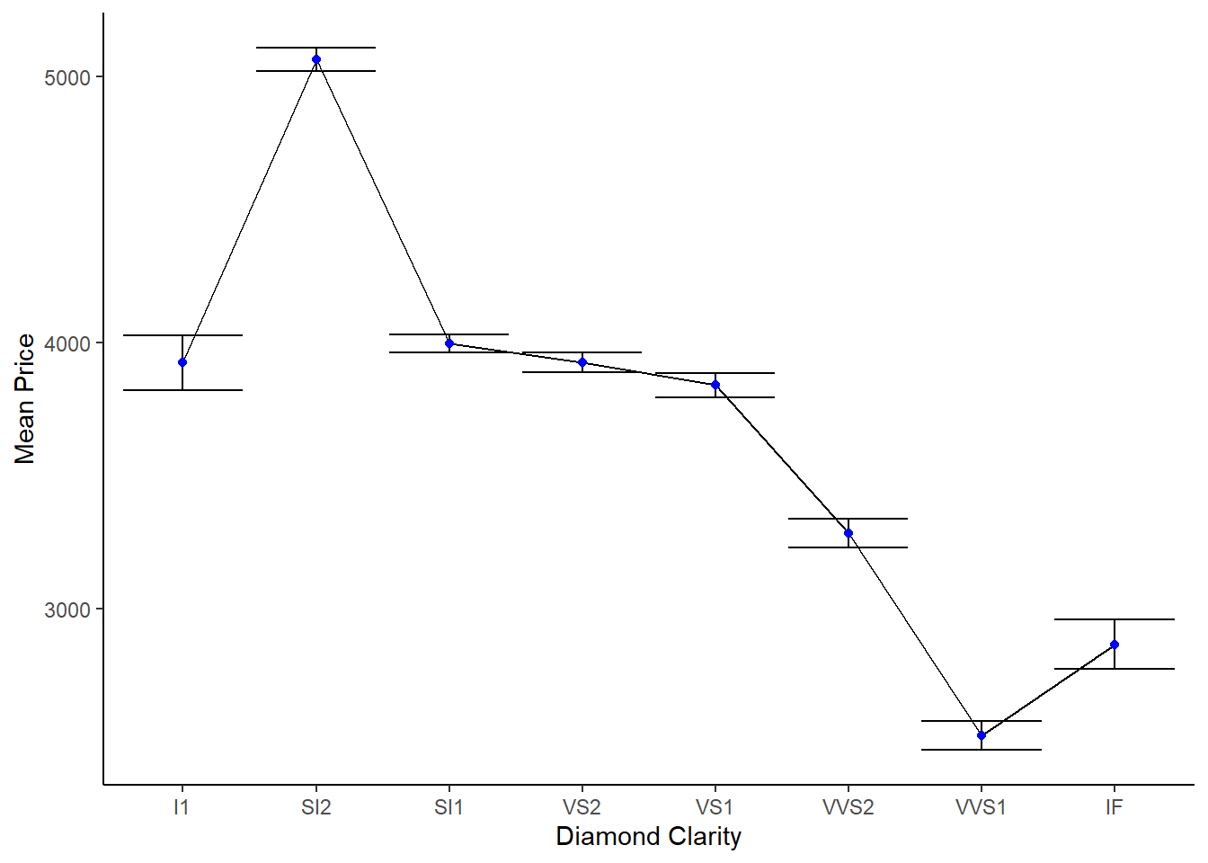
Figure 2.1: Visualizing the data and graph needed for the example task above
It is much easier to navigate R once you’ve got an itemized list of tasks. Throughout this book, we will go through many different examples of how to wrangle data. Once you’ve got these skills, you can apply them to your own data!
Many new programmers are concerned that they aren’t learning the code inside and out – that they’re simply “copying” code from examples. Learning to code is repetitively typing the same code (usually taken from some example found online) until the code becomes so familiar that you’ve memorized it and when to use it! Certainly, copying the exact code from examples will not get you far on its own. You must physically type it out yourself and troubleshoot it through trial and error. When I learn new code, I usually ask myself a few questions: “What happens when you do this? What happens when you delete that? Does it require this section, or is it optional?” You aren’t inventing the wheel here (i.e., wheel = coding) as a beginner. Maybe when you’ve become fluent in coding, you can invent new code. Right now, we’ll be focusing on what’s already available to us. Just like learning a new language, all you need repetition and trial and error. Be patient!
I hope that this guide helps you manage your data efficiently and confidently, showing you that coding can be fun, useful, and doable.